How To Implement Off-Canvas Navigation For A Responsive Website

Email Newsletter
Weekly tips on front-end & UX.
Trusted by 182,000+ folks.
 Register for Free
 Custom Web Forms for Angular, React, & Vue. Your backend.


 Celebrating 10 million developers
The varying viewports that our websites encounter on a daily basis continue to demand more from responsive design. Not only must we continue to tackle the issues of content choreography — the art of maintaining order and context throughout the chaotic ebb and flow of the Web browser — but we must also meet the expectations of users. They’re not sitting still.
With the likes of Firefox OS (Boot to Gecko), Chrome OS and now Ubuntu for phones — an OS that makes “Web apps” first-class citizens — delivering native app-like experiences on the Web may become a necessity if users begin to expect it. Many in our field have argued for a degree of separation between the Web and native platforms for both technical and philosophical reasons. They’re certainly wise to heed caution, but as consumer devices continue to blur the boundaries, it’s worth thinking about what we can learn from native app design.
A Demonstration
In this article, I’ll be walking through a build demo that centers on two topics. The first is responsive design patterns that embrace the viewport and that improve content discoverability beyond the basic hyperlink; in this case, off-canvas navigation. The second is the complexities of implementing such ideas in an accessible and highly performant manner. These are two topics that I believe are at the heart of the Web’s future.
With that in mind, let’s get building.
The Accessible Base
All good things begin with a solid foundation of semantic HTML and widely supported CSS. In theory, this baseline should function as a usable experience for all browsers that visit our website. (It might also be the final experience in less-capable browsers.)
As a starting point, I’ll use a technique very similar to Aaron Gustafson’s Smart Mobile Navigation Without Hacks. It requires no JavaScript to function.
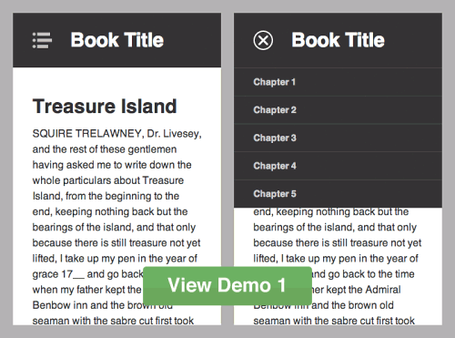
Step 1 of the responsive off-canvas menu.
- View demo 1 Be sure to view on a mobile or small screen, and take a while to inspect the code. Although our final design will be significantly different, starting simple is vital; retrofitting accessibility isn’t trivial.
The HTML body looks like this (I’ve stripped a few attributes for semantic clarity):
<header id="top" role="banner">
    <h1>Book Title</h1>
    <a href="#nav">Book navigation</a>
</header>
<nav id="nav" role="navigation">
    <h2>Chapters</h2>
    <ul>
        <li><a href="#">Chapter 1</a></li>
        <li><a href="#">Chapter 2</a></li>
        <li><a href="#">Chapter 3</a></li>
        <li><a href="#">Chapter 4</a></li>
        <li><a href="#">Chapter 5</a></li>
    </ul>
    <a href="#top">Return to content</a>
</nav>
<article role="main">
    <!-- [main content here] -->
</article>
You could consider the HTML alone, with little to no styling, as being “breakpoint zero.” If it’s not logical at this stage, then accessibility will not improve.
Demo 1 Breakdown
- Media queries are based on a viewport width of
45em(that’s content-dependent). Above this breakpoint, the navigation is permanently visible. I prefer em units because they allow breakpoints to maintain a relationship with text size. Lyza Gardner explains in detail in her post “The EMs Have It: Proportional Media Queries FTW!” - I’m using both
min-widthandmax-widthmedia queries to scope CSS. This adds a bit of complexity. Most people prefer a “mobile-first” build, using only progressively largermin-widthqueries. The downside with that technique is the amount of resetting required if an element has noticeably different visual states. Neither method is right or wrong. - The crux of this initial stage is the :target pseudo-class selector, utilized to show and hide the navigation. Only IE8 and lower lack support. However, this is a non-issue if you serve a semi-fluid desktop style sheet to old IEs. Jake Archibald, Nicolas Gallagher and Stuart Robson can tell you more.
As the demo takes shape, I’ll continue to introduce the main development principles. There’s a long way to go yet…
Going Off-Canvas
For some websites, the above may suffice — but not for us! We’re experimenting with off-canvas patterns and striving for that native experience. Because we cannot ignore older browsers, it’s now time to progressively enhance.
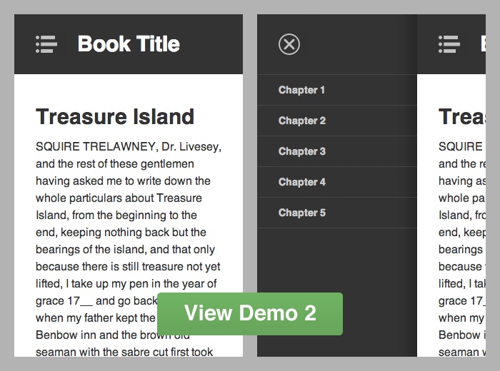
Step 2 of the responsive off-canvas menu.
- View demo 2 You will see the restyled navigation with basic functionality.
Demo 2 Breakdown
- I’m adding the class
js-readyto the document element after the DOMContentLoaded event fires. The selector.js-readyis used as a hook to safely restyle the navigation off-canvas. If for whatever reason JavaScript *doesn’t* load, then the original functionality from demo 1 still exists. - To show and hide the navigation, I’m toggling a class of
js-navon the document element when the user clicks (or taps) the relevant buttons. This simply applies a style ofleft: 70%to the#inner-wrapelement (#outer-wrapis used to hide any overflow and to avoid scrollbars).
This is a fairly basic enhancement, but importantly it remains usable before JavaScript is ready. It’s also notable that no inline styles are written with JavaScript; only classes are used to manage states.
Jumping between open and closed navigation states makes for a jarring user experience. Users need to understand — or even see — how an interface has changed. This is often the point where developers let the Web down. To be fair, building user interfaces is incredibly difficult. What I’m going to show below is far from perfect, but it’s certainly a step in the right direction.
So, we have the set-up. Now let’s add transitions.
Transitioning (The Wrong Way)
I’ll start by getting it all wrong, because this is how I would have done it a few years ago, and learning from mistakes is important.
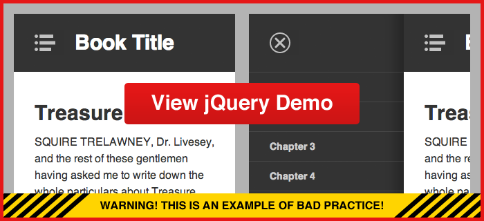
The responsive off-canvas menu using jQuery .animate for transitions.
jQuery is a resource that many front-end developers begin with to learn JavaScript. Personally, I am a big fan (never blame the tools), but unfortunately jQuery has a habit of making things look deceptively simple. It masks complexity and, with that, understanding.
Transitioning our off-canvas navigation with jQuery is very easy:
$('#nav-open-btn').on('click', function() {
    $('#inner-wrap').animate({ left: '70%' }, 500);
});

$('#nav-close-btn').on('click', function() {
    $('#inner-wrap').animate({ left: '0' }, 500);
});
Visually, this achieves the effect we’re after, but test it on mobile and watch the frame rate stutter. Performance is dreadful.
This method is bad for several reasons:
- jQuery’s
.animateincrements the element’sstyleattribute on every animation frame (as can be seen in the GIF above). This forces the browser to recalculate the layout. - It leaves inline styles in the DOM that have very high specificity and that will override our well-maintained CSS. This is a big issue if the viewport is resized and triggers different breakpoints.
- A separation of concerns is lost because styles are defined in JavaScript files.
Overall, it’s a performance and maintainability nightmare. There is a better way.
Transitioning With CSS
Putting the jQuery experiment aside, I’m now building from the second demo again, this time using CSS transforms and transitions. These enable us to smoothly animate the off-canvas navigation with great performance.
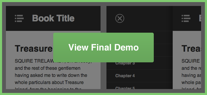
The final responsive off-canvas menu using CSS transforms and transitions.
- View final demo Performance has drastically improved compared to the jQuery example.
Final Demo Breakdown
- Returning to CSS, I’m once again using the
.js-navclass to toggle the navigation, while making no actual style alterations with JavaScript. - I’m progressively enhancing with the classes
.csstransforms3dand.csstransitions(applied to the document element by Modernizr). - Instead of moving the navigation with negative positioning (
left: -100%), I’m using thetransformproperty:transform: translate3d(-100%, 0, 0). - CSS transitions are used to animate
transformchanges:transition: transform 500ms ease. And I’ve added a few more transforms to enhance the visual effect.
With the help of Modernizr, this will fall back to demo 2 if browser support is lacking for CSS transforms and transitions. (In theory, I could fall back to jQuery animation, but it’s really not worth it.) When you download Modernizr, you can include only the feature detection that you need. It also includes the HTML5 shiv for IE. All in all, it’s a very useful script.
The benefits here are immense. First and foremost, by transitioning elements with 3-D transforms, the browser can generate render layers that are hardware-accelerated. Secondly, there’s no need for JavaScript to worry about style or media-query breakpoints. JavaScript need only interpret user interaction and apply classes to maintain states — CSS defines the visual changes.
We can look deeper into performance by using Chrome’s Developer Tools. The results below are from the desktop browser, but for mobile performance you could use USB Remote Debugging on Android devices.
jQuery Animation Performance
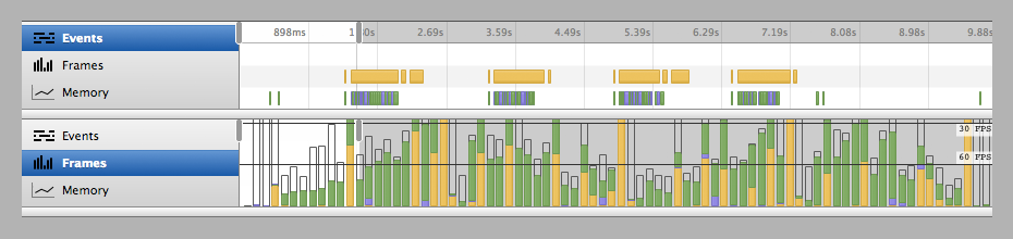
The four events above represent the opening and closing of the navigation twice. In the diagram, yellow represents the JavaScript running, purple is the rendering (recalculating the style and layout), and green is the painting to the screen. On mobile, we’d be shooting way below that 30 FPS line. I also tested on an iPhone 3GS and could literally count 3 FPS with my own eyes — it’s that slow!
CSS Transition Performance
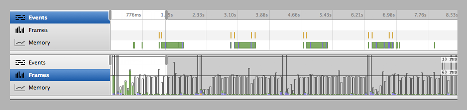
What a difference! The only JavaScript that exists is there to manage user interaction before and after the transition. The green we’re seeing is the minimum that the browser needs to repaint the transition at a respectable frame rate, using GPU acceleration.
Possible Concerns
As with all new Web standards, nothing is inherently perfect.
In WebKit-based browsers, the font smoothing may switch to antialiased from the default subpixel-antialiased when CSS transforms or transitions are applied. This could result in visually thinner text, which many designers actually prefer — but not something you should “fix.”
Flickering can also occur if an element goes between transform and no-transform. To avoid this, always start with a default like translate3d(0,0,0) on an element that will move later, so that the render layer is composed and ready.
The Next Step
Enhancing further, we could detect and take advantage of touch gestures, like swiping, to really bring this implementation closer to par with its native counterparts — “closer” being the operative word, but I do believe the gap is closer than many would have us believe.
It’s also — in my opinion — a gap that we need to bridge.
There are other clever ways to increase interaction speed. Mobile browsers tend to wait around 300 ms to fire click events.
Transition easing can radically change the visual effect and the user’s perception of what’s happening. Whether elements need to spring, bounce or accelerate into action, Lea Verou has a useful cubic bezier resource to generate custom easing functions.
Hopefully, this article has shown the improvements that can be made if we take extra care to understand the technology we’re using.
Download The Code
So, there we have it: a three-tiered responsive, interactive, off-canvas menu. I’ve set up a GitHub repository where you can view all the code. Have a play with it; there are a few bits and pieces I haven’t covered to avoid bloating this article.
Further Reading
To really understand why the techniques highlighted above are my preferred solution, I point you in the direction of these resources:
- “All You Need to Know About CSS Transitions,” Alex MacCaw MacCaw gets into the specifics of CSS transitions and JavaScript.
- “Why Moving Elements With translate() Is Better Than pos:abs top/left is better than pos:abs top/left”),” Paul Irish A superb video and article examining the different movement techniques.
- “Improving the Performance of Your HTML5 App,” Malte Ubl Looks deep into the intricacies of performance.
- “CSS3 vs jQuery Animations,” Siddharth Rao This article puts both methods head to head.
- “Understanding Hardware Acceleration on Mobile Browsers,” Ariya Hidayat Goes under the hood with a technical review.
- “Scrolling Performance,” Paul Lewis Looks at a related scenario.
Further Reading
- Exploring The Potential Of The Off-Canvas Pattern
- When Off-Canvas Isn’t Good Enough
- How To Keep Framework Development Simple And Bug-Free
- A Simple JavaScript Plugin For Responsive Navigation
 (al, mrn)

