If You Love Your Brand, Set It Free

Email Newsletter
Weekly tips on front-end & UX.
Trusted by 182,000+ folks.
 Register for Free
 Custom Web Forms for Angular, React, & Vue. Your backend.


 Celebrating 10 million developers
The practice of branding is undergoing a deep transformation — a change brought about by our kaleidoscopic postmodern culture, the development of communication technology and rapid globalization.
In prior decades, brand managers aimed to establish their products and services primarily by way of consistency and repetition. A brand’s voice and message were to be the same, independent of marketing channel. The goal of the designer was to define identity systems that would ensure compliance and coherence in all of the brand’s manifestations, as codified in brand identity style guides.
The Reasons For Brand Consistency
This approach to branding was solidified in the mid-20th century, when relatively simple printing methods and communication technologies were available, marketing and advertising practices were not yet sophisticated enough to surround the consumer in a holistic experience, communication technologies enabled only one-to-many broadcasting, and companies didn’t face the customer-service challenges and scrutiny they do now.
It was a post-war time of optimism about the capability of standardization to drive progress — a notion whose origins stem from scientism, the industrial revolution and the workings of capital.
From that standpoint, it made sense for corporate identity designers to apply standardization and aim for simplicity to make the most of what reproduction and communication methods were available to them, and to ensure that their designs were defined in a comprehensive and consistent way.
From this school of thought hail historic graphic identities such as UPS, American Airlines, Mobil and Chase Bank, brought to us by Paul Rand, Massimo Vignelli and Chermayeff & Geismar.
Embrace Brand Fluidity
But we now live in a different context. As Grant McCracken recently wrote in the Harvard Business Review:
“The consumer now appears to believe that the brand should earn its public attention the way all of us must. Say boring, repetitive stuff and you suffer the punishment that every bad conversationalist faces. First, we ignore you. Then, we exclude you.”
Our postmodern society is more fluid and diverse — a world bursting with myriad electronic media and display capabilities. A contemporary brand identity must reach beyond its visual manifestation in print or TV, to encompass how the brand speaks across a multitude of technology platforms, how it interacts with its audience and how people experience it at an emotional level.
Therefore, consistency — while still desirable — should not necessarily be the main driver of a brand identity system. In fact, we ought to consider total consistency an unachievable ideal: it’s impossible, and even counterproductive, to try to predict and codify all potential instances of a brand’s current identity. The vast number of stakeholders, marketers and agencies handling brand assets for the types of projects undertaken in our dynamic business and technology environments makes it very difficult to exercise constant control over how a brand is expressed. Better to embrace executional variance in a smart way, by establishing loose parameters that nonetheless can create a familial feel for an otherwise very rich group of brand applications across media and across continents.
This is not an entirely new concept. Precursors of this kinetic approach to identity design include Duffy & Partners’ work for The Islands of the Bahamas — in its own words, “a robust brand language that is endlessly adaptable, flexible and immediately recognizable.”
The Playful, Adaptive Brand
Brands should nowadays give themselves permission to be more surprising, to flirt with their customers, to listen to what they have to say and to cater to their desires. A modern brand should take leaps of faith, abandon self-obsessions and embrace risk. Conversely, by not doing this, the brand could become irrelevant in a hurry.
Because of the dominance of social media, brand identities can now be defined more by their customers than by the companies themselves. The ideal balance, however, stems from the ability to be flexible while keeping intact the core principles and attributes that formed the brand in the first place. Without such grounding, a brand becomes a changeling — morphing its shape to any external whim and impulse.
This fresh approach to defining a brand can be liberating for designers, brand managers and the public. It tends to result in more immersive, delightful and rewarding customer experiences, and it is at the heart of a recent spate of “loose” brand identity executions whose core elements nevertheless remain. Designers have yet to exhaust the full potential of this new method, but many instances already point the way.
Examples Of Fluid Brand Identities
Consider Irma Boom’s proudly “imperfect” book designs, Hella Jongerious’ organic products, Saks Fifth Avenue’s Pentagram-designed puzzle identity, Microsoft’s recent dynamic rebranding, the City of Melbourne, OpenIDEO, Sugarpova gummy candy, Barcelona pel Medi Ambient and EDP. All point to exciting new ways to approach branding and product development.
![]()
Logo for Saks Fifth Avenue and its graphic permutations based on slicing the grid. (Image: Brand New)
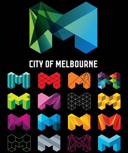
City of Melbourne logo variations. (Image: Behance)
Oreo, a particularly playful example, has been able to maintain its long-established brand idea of a happy snack time for both children and adults while successfully adapting to the fleeting social trends that surround brands in the current marketplace. With its Daily Twist campaign to commemorate its 100th anniversary, Oreo is posting 100 daily images on its social media channels of an Oreo cookie skillfully transformed to evoke a current event.
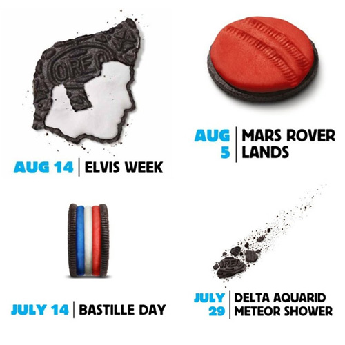
Oreo “Daily Twist” campaign. (Images: Huffington Post)
Likewise, to further distance itself from the failed Time Warner merger, America Online changed its wordmark from “AOL” to “Aol.”. It kept its brand equity as one of the Internet’s pioneers, while featuring an ever-changing, colorful mixed-media background that evokes the dynamic nature of the Web: photography, illustration, colorful splashes of paint — all work to surprising effect, while maintaining the familiarity of the Aol brand across the company’s websites and other communication channels.
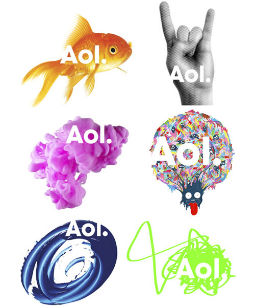
America Online’s new and playful brand identity. (Image: Brand New)
DC Comics accompanied its recent character revamp with a brand identity redesign that embraces the principles of variance and fluidity. The brand consultancy Landor explains its rationale for the change: “To represent DC Entertainment’s world, a place of opposing forces, we created a new visual expression that is a living identity easily adaptable to evolving characters and stories.”
The only constant is the name and typographic treatment of “DC Comics,” while the symbol’s fixed element is a peeling “D.” Everything else changes to evoke a particular character’s costume or the setting of a comic book series.
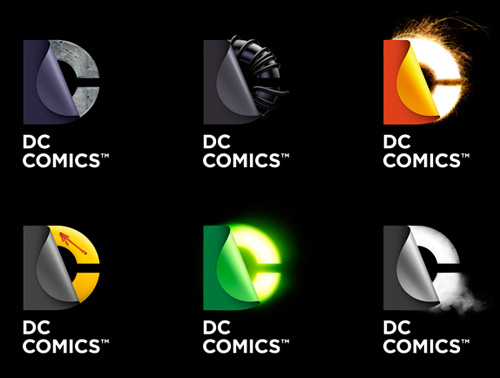
DC Comics’ new versatile logo. (Image: Landor)
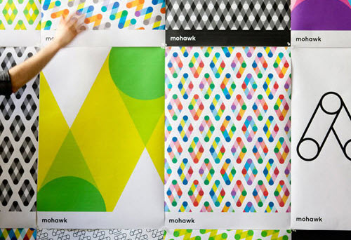
In turn, Pentagram’s rethinking of venerable Mohawk Paper relies on a solid idea — the rotating cylinders of traditional printing presses — to then launch into an explosion of colors, shapes and patterns that ably reflects the versatility of paper as support and vehicle for communication.
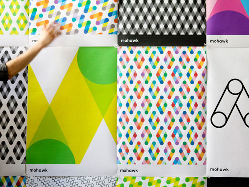
Different colorful patterns for Mohawk’s new brand identity. (Image: Pentagram)
The Brand As An Ecosystem Of Interactions
Beyond formal considerations, a brand is also defined by experiential parameters (and now more than ever): how and where do customers interact with a given brand, online and offline.
The explosion of digital and social media in recent years, as well as the increased adoption of Internet-enabled mobile devices, has evolved the way brands are seen, tasted, touched and felt: Google’s “New Multiscreen World” study indicates that 90% of all media consumption happens on a screen — a full 38% of which is on smartphones alone. 90% of people use multiple screens sequentially to interact with brands (shopping online, managing finances, planning a trip and more). comScore’s own data establish that 61% of Internet users are online while watching TV, and do it on a range of devices — laptops, smartphones and tablets.
Consequently, smart advertisers use their TV commercials as launching pads for deeper online experiences, knowing full well that interested audiences will be able to access those sites immediately, right from their couch, and to share them with people in their social graph. Also, companies use mobile technology to take their campaigns right to the streets in a personal and highly dynamic way.
Consider popular marketing initiatives such as the Mini Getaway Tokyo and Stockholm, in which fans of the brand used their augmented reality-equipped smartphones to search for a virtual Mini in a massive treasure hunt, literally running around the city and competing against each other in order to be the person with the virtual Mini on their screen at the end of the contest — thus becoming the proud owner of a real vehicle.
Location-based treasure hunt app for the Mini promotional campaign. (Image: Popsop)
Or consider this year’s launch of the Ford Fusion vehicle (Disclosure: as part of the WPP Communications team, my employer, Ogilvy, had a leading role in this project), which was gradually unveiled using an iOS and Android app featuring a Fusion test-driving game that was unlocked by taking a picture of any Ford logo anywhere with your mobile device’s camera.

Ford Fusion tablet- and mobile-optimized game promotes the unveiling of the vehicle. (Image: AutoGuide)
Other companies adopt the practices of co-creation, asking their audiences via social media what their preferences are for product customization, brand visualizations and more. Or they crowdsource the creation of content. For instance, the country of Sweden recently handed control of its Twitter account to regular citizens to provide an authentic, unadulterated feel for what Sweden is about to audiences all over the world. Chevy, Pepsi and Doritos asked their fans to create their Super Bowl ads.
A New Process To Define Brands
How does one go about loosely, yet effectively, defining a brand identity? This new approach is not an excuse to dilute the importance of brand strategy. Establishing a brand’s positioning, personality and attributes remains critical to the success of the brand’s identity.
Writing a good brand manifesto is also still important. It sets the vision for that brand’s emotional and sensorial expressions, and serves as a reference against which to evaluate future variations from the theme. However, the design process is now more akin to generating algorithms or creating vector-defining equations than to painting pixels.
Not that generative art is now an indispensable tool for the identity designer, but certain aspects of this practice resonate with fluid branding: the designer will need to find what makes a brand pliable, what set of its attributes lend themselves to flexibility and variance, and then organically build on those.
Furthermore, brand identity definition is no longer a one-way street, and it can’t solely rest on visual aspects either. As we have seen with the Mini and Ford, the way a brand interacts with its audiences online or offline is as integral to its personality, if not more so, as the logo. For example, if a company has 10 locations worldwide — and assuming that this fact is integral to what the company is as a brand — then its logo might be graphically constructed by joining these 10 geographic points in different random configurations.
Such a brand might also promote engaging experiences that are deployed at a local level but that connect globally to a meaningful larger story.
Designers need to pick a few graphic elements or parameters that can nevertheless effectively represent a brand, and then let additional considerations vary accordingly: Are the company’s name and a single color enough to build an identity around — while elements like mark, typeface, illustration, texture and editorial voice adapt incessantly to the context they inhabit at any given time?
Allowing such a succinct and flexible identity to further evolve according to the brand’s interaction with customers is an approach that applies the notion of “minimum viable product” to the process of designing brands.
A simplified set of parameters such as those described above will greatly enhance the ease of use of brand guidelines (or style guides). These documents can thus be relatively brief and inspirational, while still ensuring an appropriate level of consistency. Style guides can set designers free to experiment, adding to the richness of the brand while reinforcing its inner coherence and staying power.
After all, the best way for a company to differentiate itself is to be subtle within the visually heavy landscape that currently surrounds us, to provide a cone of silence amidst ubiquitous noise, to bend when every other brand is trying too hard not to break, and to adopt an organic feel and a human scale.
Further Reading
- What’s Brand?
- Why You Should Get Excited About Emotional Branding
- Transforming Lufthansa’s Brand Strategy: A Case Study
- How To Design Style Guides For Brands And Websites


