Designing For The Reading Experience

Email Newsletter
Weekly tips on front-end & UX.
Trusted by 182,000+ folks.


 Celebrating 10 million developers
 Custom Web Forms for Angular, React, & Vue. Your backend.
With the rise of web fonts as well as affordable hosted web font services and ready-made kits, typography is reclaiming its title as design queen, ruler of all graphic and web design.
At the same time, for far too many designers, the primary concern about typography today seems to be aesthetic in nature. The problem is, we tend to use typography and lettering as two interchangeable terms, which they are not. A quick look at the “typography” tag on Dribbble reveals this trend.
The allure of well-executed lettering — and, boy, I could spend hours just looking at lettering portfolios! — can affect the way we view typefaces, because both typography and lettering share common visual concepts. If we seek only the next most Beautiful Typeface™ all the time, this habit alone can drive us away from the functional role of typefaces and their advantages as versatile, reusable and flexible design systems.
Moreover, we are often eager to try the latest OpenType feature, prettify our copy with discretionary ligatures, slap on partially executed CSS hyphenation, and then stare at our masterpiece in awe, unaware that anyone other than a typography geek couldn’t care less. Of course, reality hits right at the moment that the text has to be read and understood by normal people on a variety of devices, from the latest Retina laptops to 72-DPI cathode-ray-tube monitors with Windows XP to a range of sci-fi smartphones that can measure your blood pressure.
"Good typography does not look nice to please type nerds. Primarily, well set type reads well." – Oliver Reichenstein
Most articles on the web are optimized for instant ingestion — does “reverse pyramid” sound familiar? Fast exchange of information is in the Internet’s nature and fits a reader’s short attention span. People visit websites and applications because they primarily seek information; rarely do they find typographic pleasure. Don’t get me wrong: I love typographically creative headlines and decks that grab my attention — but at the same time, we can’t neglect the need for overall balance and legibility in body copy.
Let’s start!
First Things First: Project Research
Seamlessly digesting written matter is possible only when the typography is well thought out and legibility is facilitated by a considered reading experience. As in other fields of design, before doing anything else we should conduct some research. In developing the habit of research, we will not only discover valuable data, but also develop our ability to quickly jump into the reader’s shoes, shifting focus from our worst enemy — our own ego (which I play tug-of-war with all the time).
As you are most likely aware, the main components of a digital experience are content, context and the user. You probably address all three in almost every design project. But if we focus exclusively on typography within each of these components, then we’d find a handful of assessment methods and some considerations that would be useful to take into account and that would ultimately improve the overall reading experience.
Content
The best way to start a typographic design project is by reading the content. Seriously, every designer is intelligent enough to evaluate who this content is for and what it should be communicating. But apart from rating the quality of the content and listing its structural elements, we can also gauge comprehensibility, reading time, purpose and, finally, lifespan.
Cover All Typographic Elements Upon reading the content, think about the structures or elements you have encountered and list them. Use the list as a starting point for a simple style guide. Apart from the normal paragraphs, headings and editorial accessories, you’ll find other — often overseen — elements, such as areas of emphasis, quotations, emphases within quotations and, crucial these days, data tables and figure captions. Your perfect font should have enough family members to cover all of these elements.
In plain hypertextese, make sure to cover all HTML elements. At this point, you could even create sample HTML and CSS files containing all of the required elements and rules and save it as Project-Typography.html. As you can probably guess, this file will be the foundation of the project’s typographic system and will come in handy when you start designing responsive breakpoints.
Gauge Reading Time
Reading rates range anywhere from under 100 words per minute to a few thousand; most adults read between 200 and 250 words per minute. We can calculate the reading time for any given text quite easily by dividing the number of words by 250. If sample content for your project is available, simply throw it into a local installation of your favorite CMS and run it through a simple script to estimate reading time.
Depending on the situation, estimating reading time can help us determine the spacing within paragraphs and establish just the right rhythm and reading pace. If the reading time is long, we could break the text into smaller parts or simply introduce a pull quote at a strategic point, where it would double as a milestone.
Assess Readability and Reading Ease Many readability tests provide an estimate of the school grade needed by the reader to understand the text, and knowing such parameters is useful. For example, if the matter is complex, you could probably introduce some editorial devices to keep the reader on track, or accommodate a greater number of footnotes with their own set of accessories.
Furthermore, when you are collaborating with a copywriter to tweak content and typography, these tools will make it easier to track differences between versions.
One such test is the Automated Readability Index (ARI). ARI focuses on the number of characters, words and sentences, thereby making it useful for real-time monitoring. The Flesch–Kincaid Grade Level test, on the other hand, focuses on syllables rather than characters, thus making it somewhat more processor-intensive for real-time assessments.
Another valuable test is Flesch Reading Ease. It is calculated according to words, sentences and syllables; the resulting score helps you determine the level of complexity of content. Most major languages have their own version. Although this tool is new to some of us in web design, textbook publishers and government agencies have been using it for years to gauge the complexity of learning materials for different grade levels.
Calculating the reading ease score manually for each piece of content would be an obvious sign of masochism, so I suggest checking out the handy Article Readability Stats, a PHP script that we at Creative Nights developed for our own projects.
Content Strategy, Information Architecture and Microcopy If we step out of typography for a moment into the field of content strategy (the discipline of planning and governing content and of defining editorial processes) and information architecture (the discipline of organizing and describing content), we can anticipate some potential issues.
Thinking about the content’s lifecycle protects us from the urge to typeset according to the latest trend. The next time an article is republished, we can prevent the editor’s rage from seeing leftover styles that weren’t removed in preparation for a redesign.
Category labels — typically defined by an information architect — can make the web designer’s life miserable, because the space in a navigation bar or column is limited. I’d bet that at some point in their career, every web designer has tried to rename or shorten category names in order to fit the available space. Of course, we could always reduce the font size or choose a condensed type, but if all else fails, we talk to the information architect to find a solution on their end.
Apart from articles, we must also typeset form labels, instructional copy, small print, interactive elements (such as buttons and links) and other text that clarifies tasks. All of this tiny copy is referred to as microcopy, and it is a fundamental ingredient in effective interaction design.
Context
With recent developments in web standards, designers are now building websites that are getting closer and closer to the ideal of “One Web,” accessible to everyone and everywhere. Even though achieving such universality with all types of projects is difficult, we know that mobile doesn’t just mean browsing the web on a smartphone while on the go.
We also know that tablets are used to give presentations, to check Twitter during breakfast or to read articles while sitting on the toilet (anyone who neglects this fact doesn’t understand the needs of users). The screen real estate of the coming generation of laptops puts a 96-DPI 30-inch desktop monitor to shame. We admire the web’s universality, but at the same time we should be aware of the diversity of users and devices.
Software Concerns Users on Windows systems with the ClearType rendering engine benefit from well-hinted fonts. The trouble is that hinting is a time-consuming process, and not all typefaces for the web are fully polished yet. Therefore, additional testing in Windows browsers should form part of your routine.
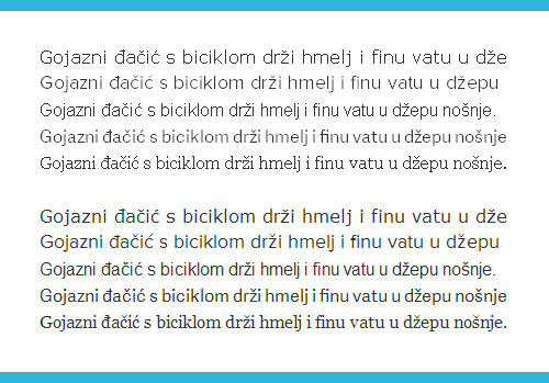
These screenshots of Verdana, Proxima Nova, Arial, Adelle Sans and Georgia at 16 pixels (except for Proxima, set at 18 pixels) were taken on Firefox 18 on Windows 7. Proxima and Adelle are rendered as web fonts, and the others are the usual suspects that come preinstalled on most OS’. The top five lines were taken with ClearType turned off.
Also, keep in mind that each web font service might deliver slightly different fonts. A font might yield good results when delivered through one service but look barely adequate when delivered through another. I’ll speculate that the reason for such differences, if any, is primarily a lack of time invested — that is, a lack of the time needed to properly hint a font, as well as a scarcity of font-hinting experts.
Luckily for us, web font service vendors are continually improving the quality of fonts, and eventually everyone’s fonts will be spruced up. Because a lot of work goes into maintaining proper fonts, I encourage you to buy fonts and to subscribe to paid web hosting plans, which (among other things) will speed up the hinting efforts of font foundries. The greater the demand, the faster the process.
If supporting Windows users is mission critical for your project, then consider manually hinted typefaces, such as TheSans Office from LucasFonts (these guys are known for their obsession with hinting) or the numerous other typefaces designed for Microsoft Office applications (their names will usually contain “Com,” “Offc” or “Office”). If selecting a specialized typeface for an audience with older Windows systems is not worth the trouble, then just stick with the tried and tested Arial, Georgia or Verdana.
For more in-depth information about font rendering, read “A Closer Look at Font Rendering” by Tim Ahrens.
Hardware Concerns A problem we are facing across the industry is the diversity of pixel densities; as a result, typography is not spared either. One interesting solution is to embed graded fonts for different densities, just as print designers use graded fonts to more precisely control the effects of ink on paper. Read more about this approach in Oliver Reichenstein’s article “New Site With Responsive Typography.”
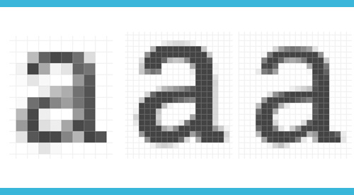
Glyphs are rendered differently even on devices from the same manufacturer. Shown here is Adelle set at 16 pixels as rendered on an iPhone 3G, iPad 3 and iPhone 4S, enlarged in Photoshop, from a web page screenshot.
Another example is typesetting for screen billboards and TV screens, which often require thicker weights and more weight contrast. In such cases, you would skip two weights on a scale and combine the regular style with the extra bold. Previewing such designs on your desktop or Retina laptop is not enough. As with designing for mobile, we have to test on real hardware.
The Interface Type Hardware and software aspects aside, context also refers to the type of interface. For instance, on content-driven news portals, magazines, novels and textbooks in a digital setting, strings of sentences should have a clear structure, directly connected to each other and that form a linear reading path.
Topics on content-driven websites are usually diverse (even on niche websites), and a story needs to be introduced clearly in order for the reader to understand it. (Remember the editorial devices from above?)
On the other hand, information in web applications is straightforward, usually bare-bones and factual, with easily comparable items or data, most often constrained to a certain timeframe. Unlike sentences in linear text, bits can be read and comprehended in isolation and are, therefore, open to the reader’s interpretation. We can safely assume that the user will jump randomly, in a non-linear fashion, from one bit of information to another.
With web applications, the context of content is mostly predictable. Some typical use cases are checking sales figures; analyzing website statistics in tables, diagrams and charts; editing date- and time-related notes; and, in the event of web mail, checking whether you are the lucky winner in the Nigerian Royal Lottery.
The User
On the Internet, everyone is our target customer, especially if we are building a multilingual system. If a button has just enough room for “Return” in English, then “Retour” in French, “Zurück” in German, “Povratak” in Croatian and “Visszatérés” in Hungarian might not fit.
Accessibility Concerns Dyslexia is an impairment to a person’s ability to read. For instance, a dyslexic brain sees characters as images and rotates and mirrors letters. As a result, a lowercase two-story “a” with a weak tail might appear the same to a dyslexic person as an italic “e.”
Most characters in geometric typefaces are hard for people with dyslexia to read because of similarities in form and shape. The mirrored “p” might look the same as a “q,” and a rotated “n” might look the same as a “u.” This doesn’t mean we should immediately switch to specialized typefaces, but being aware of such conditions is a part of the web designer’s literacy.
To complicate matters, dyslexia occurs with another learning disability, attention deficit disorder, in about every fourth case.
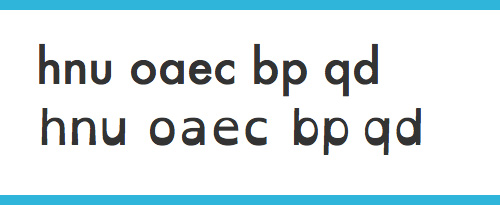
Added gravity keeps the letters in place. Shown here are Futura and Open Dyslexic.
Font smoothing on the screen is possible thanks to red, green and blue subpixels. Unfortunately, for a small percentage of the male population, some typefaces appear sharper or blurrier, lighter or fatter than for the rest of us, simply because the red subpixel isn’t distinctive enough. With free tools such as Color Oracle, seeing how your typeface of choice performs for the color-vision impaired is easy.
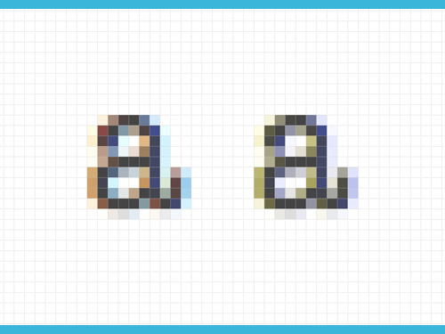
Those with color-vision impairments perceive anti-aliased letters differently.
Selecting A Typeface For Best Reading Experience
Contrary to popular belief, having an eye for the perfect typeface is not an innate gift. Sure, talent will give you an initial advantage, but that will take you only so far. Train yourself to learn about the project at hand, and insight into suitable typefaces will come, thus helping you narrow the pool to a few appropriate candidates.
A little digression. Many tutorials and how-tos have been written about choosing the appropriate typeface based on atmosphere and on look and feel. Designing atmosphere, evoking emotions and visually distinguishing a brand from its competitors is the responsibility of the graphic and UI designers. A typographic designer, or typesetter, takes a different angle, starting with the utilitarian needs and goals of the project, and developing from there. Both aspects are often required for a successful, well-rounded project.
Because these goals are so different, we have to be leery of suggesting font combinations and using less-than-specific adjectives such as “beautiful” and even the less-dramatic “nice” without providing context. A typeface can only be judged in the context of a particular situation. If a typeface is observed in isolation, then we must evaluate it at a strictly technical level.
When I see Comic Sans used on an invitation to a kindergarten party, the first thing I’ll do (of course) is roll my eyes. But at some point, I have to be honest and admit that it’s appropriate to the audience — my kids and their friends — as long as I don’t encourage them to use it everywhere. But if I saw Comic Sans on a company memo, I’d probably go postal.
Serif vs. Sans: Who Started It?
Many beginners have a hard time choosing between serif and sans-serif typefaces. As always, it depends on the situation, but it should never be a matter of the typographer or client’s personal taste. There is no difference in legibility between the two, especially in this era of high-density screens.
Sometimes a project allows us to cut corners, and if we do our homework and learn about the content, we can make informed decisions. For example, if we are presenting vertically oriented data (for example, a table of exchange rates or a list of product prices), then it would probably be better to use a typeface without serifs, which usually adds a horizontal emphasis. On the other hand, because serifs encourage horizontal flow along the line of text, they are more suitable for a set of linear thoughts or where vertical space is scarce.
We all know it, but we often forget to step back and see the bigger picture in a project. For instance, I like the reasoning of Vitaly Friedman and Elliot Jay Stocks in their decision to go with a sans serif for Smashing Magazine’s body text. Upon taking a bird’s-eye view and observing the page’s layout and interface as a whole, they concluded:
"Because there’s a lot going on visually on Smashing Magazine — screenshots, buttons and noisy ads — a sans-serif felt like a more sensible, uncluttered route for body copy." – Vitaly Friedman and Elliot Jay Stocks
Letter Legibility
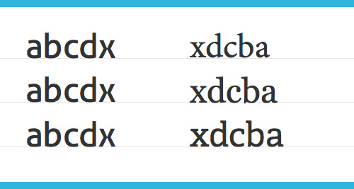
Another important test of legibility is how different each glyph is from the other glyphs in a single typeface. Designers use pangrams, or short test strings, to evaluate and compare typefaces; for examples, the famous “The quick brown fox jumps over the lazy dog,” “Handgloves” and “Hamburgefonstiv.”
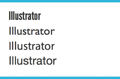
The text “aegh! iIl1 0O,” devised by designer Jon Tan, goes a little further. It is a good way both to get a sense of a typeface and to check the distinctness of the “i,” “I,” “l” and “1” and of the “0” and “O.”
We can extend such strings even further and include italics, small caps and numerals. For example, we could extend the string with an italic “e,” just to make sure it’s not too similar to a rotated lowercase “a,” especially at smaller sizes where character detail can get lost.
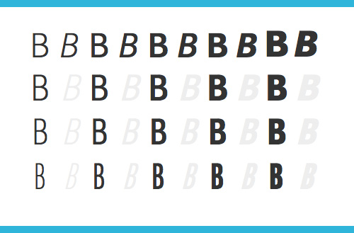
Try to avoid ambiguous letterforms. Top to bottom: League Gothic, Gill Sans, Myriad Pro, Neue Helvetica.
Foreign Affairs
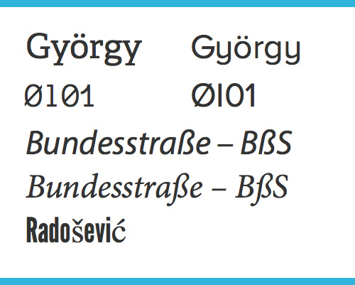
Support for international visitors is a must. If you are about to set the whole website in a language that you are not familiar with (say, Arabic or Vietnamese), then you’ll probably need a one-on-one lesson with a local typographer. But most web designers will build user profiles for their international audience, and we have to make sure that all characters are supported and that the typeface works in languages less common than English and Spanish. Each language has a particular critical combination or two.
It’s not uncommon to see a character sequence of “gy” in Hungarian or “ij” in Ijekavian dialects in some South Slavic languages, not to mention digraphs (“ch,” “dž,” “ij,” “lj” and “ty”) and trigraphs (“dzs” and “sch”), which are usually represented with two and three separate glyphs, respectively.
As a curiosity, in the Italian alphabet, the letters “k,” “j,” “w,” “x” and “y” are used only for words adopted from other languages, and some of them are used strictly colloquially — for instance, “k” as an emphasized “c” — or so I heard when I cut a guy off in traffic the last time I was in Italy. But I digress. The slightly reduced alphabet results in frequent letter combinations such as “cc,” “ll,” “tt” and “zz” next to — or surrounded by — “o” or “i.” You can already guess that these combinations can make for some awkward spacing.
In southeast Europe, family names often end with “č” or “ć,” and no one likes when a letter in their first or last name is stripped of a diacritic or, even worse, rendered in a fallback typeface. Danish and Norwegian, for example, use “ø,” and German uses “ß” — and those are still only within the Latin alphabet.
Know the characters and combinations in your target language.
To cover the extended Latin alphabet, we obviously have to choose a typeface that covers all Central European characters (i.e. use paid fonts). But in cases of the aforementioned letter combinations in less common languages, it wouldn’t hurt to consider typeface candidates that support those particular languages, because at the time of writing, kerning is still not possible with CSS (no pun intended).
We Read Familiar Typefaces Best, But We Learn Better With Unfamiliar Ones.
People are believed to read best in familiar typefaces. Even experts — namely, Zuzana Licko and Erik Spiekermann — say that we read best in what we read most. Learn about the history of the typeface you’re considering and compare it to the usual suspects for the target audience.
Skolar, a typeface by David Brezina, was designed for scholarly and multilingual publications, where people are used to seeing Times New Roman. Skolar is fresh and modern, yet similar enough in features and appearance to Times New Roman to be easily adopted by this user group. It’s a safe bet and a good option to begin with, but by all means do experiment and try alternatives that might appeal to your target audience.
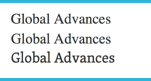
Skolar as a replacement for Times and Times New Roman? Can you spot the difference between the two Times’?
A recent study by Connor Diemand-Yauman, Daniel M. Oppenheimer and Erikka B. Vaughan on the “Effects of Disfluency on Educational Outcomes” (PDF, 1.3 MB) found that information rendered in hard-to-read fonts was more easily remembered than information rendered in fonts deemed easier to read. The study showed that deeper processing stimulated by disfluency led to improved memory performance. This doesn’t mean we should automatically select the strangest typeface on the planet, but considering an alternative to a popular typeface does make sense.
Display Typefaces In The Responsive Era
Condensed gothics and grotesques as well as specialized decorative typefaces are being rediscovered on the web. They add style and weight, functioning especially well as attention-grabbers in mastheads and as anchors in lengthy text. Stylistic suggestions are beyond the scope of this article, because headlines on the web are often written to conform to SEO best practices to attract more visitors, which is a somewhat different function from headlines in print material. However, let’s look at a potential pitfall in setting headlines in a condensed typeface on the web, where the context is never static.
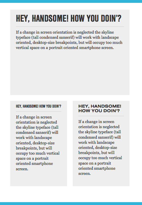
If changes in screen orientation and aspect ratio are neglected, then a multi-word headline set in a “skyline” typeface (i.e. a tall condensed sans serif) might work with landscape-oriented and desktop-sized breakpoints; at the same time, it might occupy too much vertical space on a smartphone in portrait orientation, especially if the original single-line headline is pushed onto a second line. Merely reducing the font size to fit the element could help, but the result might not be as legible as the text on a desktop screen.
The opposite also applies. If we are designing mobile first, then a big bold headline that works perfectly on a tiny screen might be too loud if literally transposed to desktop sizes.
An extended companion to a condensed typeface set at a smaller font size could provide a better match where vertical space comes at a premium. When the extended typeface is too tiny, the condensed partner could step in.
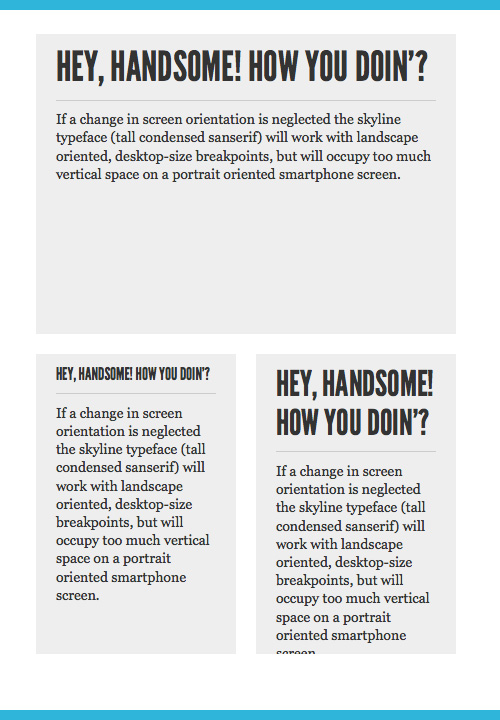
This headline, set in the League Gothic on a single line, is barely legible on mobile. Set on multiple lines, the headline occupies too much vertical space.
Nimbus Sans Condensed and Nimbus Sans Extended in action.
Combining Typefaces
Typefaces are combined to create tension and to generate interest in a design. In most cases, however, once the reader is pulled in, favoring order and structure of composition over the beauty of letterforms will improve the flow of reading, especially on low-resolution screens, where subtleties and details of typographic accessories are not immediately evident. Consider this piece of advice as a last attempt to talk you out of combining very different fonts, unless necessary.
As a rule of thumb and in order to avoid a complete typographic disaster, combine typefaces with matching x-heights. Comparing x-heights at the same font size is a litmus test to see whether words set in different types can coexist. Always keep in mind that typesetting for the web should be bulletproof and future-proof. That being said, maintaining typographic harmony is not the easiest task if elements sitting on the same baseline need different letter sizes as compensation for mismatching x-heights.
Aller combined with Minion Pro, Georgia and Adelle. Notice how Minion Pro and Georgia call for additional adjustments to line height.
A Safe Bet Approach
The easiest solution to combining typefaces is to follow type relationships and your own common sense.
A typeface that is a member of a bigger system can be combined with other family members along any of the axes (such as weight, width and cut), so being able to use typefaces from the same type family will come as a relief. Look for extended families or super-families that have more than a few basic styles (including regular, italic, bold and bold italic). Extended families include everything from thin to black weights and sometimes multiple widths, while super-families, also referred to as type systems, additionally contain sans-serif and serif companions, text and display cuts and sometimes graded fonts.
Don’t worry too much about exact classifications, because categories are not always consistent from foundry to foundry. Plus, the boundary between extended families and super-families is not always clear. For example, some collections include sans-serif and serif in multiple weights but not multiple widths. Remember, though, that most type families have only a limited number of basic styles, while only a few dozen are versatile enough to cover all typographic needs. (A few dozen out of the hundreds of thousands of typefaces in existence today is a tiny fraction.) If you have trouble combining typefaces, versatile collections are always a good option to begin with.
JAF Bernino Sans has multiple weights and widths. The grayed-out letters are fake italics, also referred to as slanted romans. Some browsers are capable of distorting fonts into a slanted shape on the fly with CSS, but pseudo-italics are considered a typographical crime.
Typefaces designed by the same designer are often a smart combination, because proportions, shapes, strokes and angles will share the same DNA. Note the typefaces designed by Jos Buivenga, Veronika Burian, Matthew Carter, Nikola Đurek, Adrian Frutiger, Jose Scaglione, Mark Simonson and Erik Spiekermann, to name just a few of my heroes, and try to spot each designer’s signature.
As a last resort, combine typefaces from the same foundry, because a foundry will normally offer typefaces that can be combined. A smart designer subscribes to typography-related newsletters and, consequently, gets exposed to a significant number of proven and reusable combinations, as suggested by the experienced designers and typographers who work at foundries. As a bonus, your newsletter folder will become a nice reference archive over time.
If you still want to experiment on your own, create enough contrast between typefaces to achieve a comfortable balance. Avoid typefaces with competing characters, which would create too much noise and distract the reader. If two typefaces are too similar, though, the reader might get irritated just because they can’t clearly see the differences. Combining two neighboring weights (such as regular and semibold or bold and extra bold) shouldn’t become a habit unless you know what you’re doing.
As with cooking, start by preparing simple edible meals. Then, after you’ve gotten some experience in not poisoning people, you can safely put the cookbook on the shelf and start experimenting with exotic spices and your routines. If you are dying for some practical examples, here are a few handy articles:
Editorial Accessories
Display and decorative typefaces are appropriate for short text snippets, such as headlines and pull quotes, because they set the tone and atmosphere and break up long copy (remember the reading-time assessment from above?). Text typefaces are utilitarian and suitable for long reading. Reading can get boring after a while, particularly on an attention-hostile technology such as an Internet-connected computer.
"Designers like even grayness, which is the worst thing for a reader." – Erik Spiekermann
Insert an occasional break with a heading or pull quote, to nudge the reader along. Pull quotes that highlight important facts from the text would benefit from a display typeface. Because headings are a part of the main text, they are best set with a variation of the primary typeface (small caps, for instance). As stated, this is more of a safe bet than a rule set in stone.
We Have A Responsibility
Two important factors should influence your decisions. First, if they don’t like your typographic choice, a reader can change it via the customization options built into the application or device. And if they do that, they will usually change it to something more generic, thus ruining your typesetting altogether. Back in the day, when we combined absolute units for line heights with relative units for letters in Internet Explorer (or so I’ve heard), even a slight increase in letter size would bring chaos to the page.
Secondly, the absence of a fold or any physical boundaries of the page is both a curse and a blessing. On the positive side, space for content on the screen is virtually infinite. On the negative side, designing a balanced layout becomes more difficult because, in most cases, it won’t be seen all at once from top to bottom. This is why editorial accessories are valuable features that can help us design a better reading experience. Once the user scrolls further down the page, we can’t expect them to run a marathon all the way to the end.
When designing for everyone, we shouldn’t assume anything. We ought to accept that our typographic designs will be seen on various hardware devices, in a range of pixel densities. We have to make sure our text is as legible as possible when seen in the virtually limitless combination of variables such as space, time, cognition, social conditions and physical conditions. The days of hard and fast rules are gone, and our responsibility is to learn everything we possibly can about a project to make informed decisions and establish a solid design concept.
Further Reading
- Designing Enjoyable Long-Form Reading Experiences
- 16 Pixels: For Body Copy. Anything Less Is A Costly Mistake
- 55 Wonderful Free High-Quality Fonts To Jazz Up Your Designs
- The Perfect Paragraph
 (al, mrn)

