Creating Exciting And Unusual Visual Hierarchies

Email Newsletter
Weekly tips on front-end & UX.
Trusted by 182,000+ folks.

 Celebrating 10 million developers
 Custom Web Forms for Angular, React, & Vue. Your backend.


Layout, for both print and screen, is one of the most important aspects of graphic design. Designs that extend across multiple pages or screens, whether containing large or small amounts of type, must be carefully controlled in a way that is enticing and is easy for all to access. Careful control of visual hierarchy is a key aspect of the design decisions we have to consider.
In this article, we will look at how frequently type needs to be broken down into different levels, such as topic, importance and tone of voice. We will explore how this can be achieved visually by relying on several things: texture and tone, seeing the designer as reader, combining typefaces, using color, employing multiple types and, of course, using the grid.
Seeing the complexities that can be expressed through typography is fascinating — not to say that images cannot help to order content, but simply that the most significant elements are expressed typographically.
The Designer As Reader
Letterforms make words, and words have meaning. While scale, tone, texture and composition will always be relevant, people’s recognition of the meanings of actual words has to be considered when designing with type. Reading through and trying to understand the copy used in a project is vital to deciding the order and relative importance of information. It is also valuable for the designer to identify highly topical subject matter, words and letters that make intriguing connections, challenging language and even shocking statements that are likely to attract attention.
In order to improve the target audience’s understanding of the design and facilitate their interaction with it, the designer needs to step into their shoes and interpret the hierarchy that they’re given, perhaps augmenting it or suggesting alternatives.

Rebecca Foster’s poster for the Young Vic theatre in the UK demonstrates a dramatic use of language, with a clever double meaning.
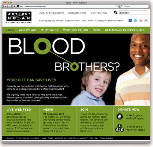
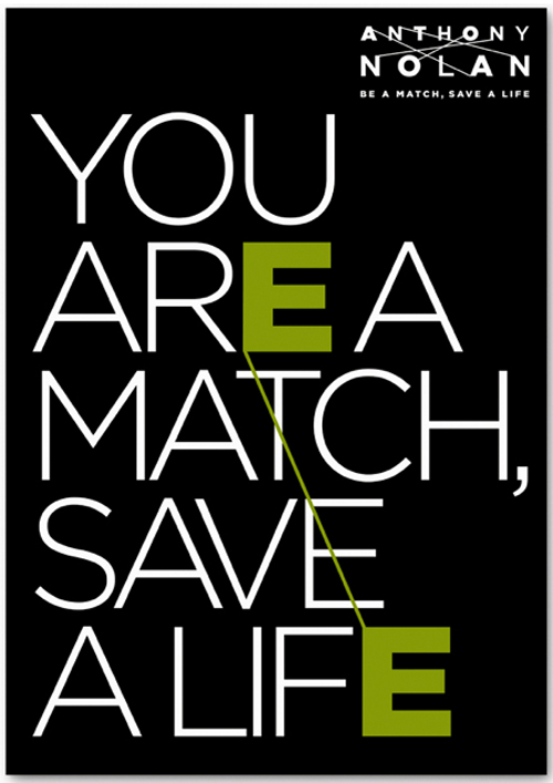
The Anthony Nolan Trust was set up in the UK in the 1970s to find bone marrow matches to help in the fight against leukemia. This poster and Web page, designed by Johnson Banks, reflect these matches by connecting the same letter in two different words.
Being able to interpret the connotations of different typefaces is valuable. For example, large, bold full-caps sans-serif typefaces are highly visible, but they are frequently used to warn of danger, and they dramatically increase the significance of certain words within the overall design.
More decorative typefaces can be attractive but might be more difficult to read, causing the reader to move on to simpler letterforms and words in the layout. Choosing typeface will inevitably affect the visual hierarchy but not necessarily in a straightforward way; all of the visual implications of a typeface need to be considered.
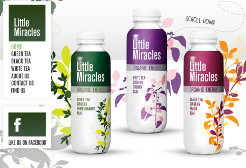
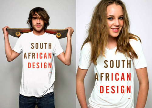
Little Miracles has an unusual design, featuring a strong, condensed sans-serif typeface, which is not often used to convey the delicate flavors and health-giving properties of an organic energy drink.
Another example: In Alison Carmichael’s design, the beautiful large white script set against pink is a deliberate challenge to read, causing you to quickly move on to the amusing crux of the message, typeset in a condensed, bold sans serif.
Texture And Tone
Hierarchy based on type is usually shaped by relationships of visual texture and tone; that is, letterforms, words and lines of type come together to form different tonal values and varying characteristics of patterns or texture. Depending on these tonal values and the scale and texture, the viewer will be attracted to a greater or lesser degree. Typeface, point size, tint, weight, letter spacing, line spacing and general spatial distribution are also important because they affect the density of type and, therefore, the lightness and darkness and the texture and tone.
These combinations similarly affect the kind of “pattern” or texture that is created. Logical, perhaps even mathematical, enlargements and reductions are a good place to start, but ultimately, as is so frequently the case when designing with type, visual judgment often brings the best results.
Texture and tone control the order in which the user reads the text. Although the main quote and the text in the gray box are not at the top of the page, they will be seen first, and consumption of the remaining type will be governed by nuances of tone, texture and positioning. Larger view. (Design: Bright Pink)
Position and orientation in a layout can have far less of an impact than depth of tone or typographic texture. A piece of type can be arresting wherever it is positioned, providing it has sufficient visual strength. If the information that follows is given lower tonal values, then a visual hierarchy will have been established, regardless of positioning.
We cannot ignore the Western convention of reading from left to right and top to bottom and, in particular, the Western viewer’s instinctive response to return to the left edge; these can be extremely valuable tendencies. However, carefully selected textures and tones should be the overriding influences on hierarchy.
Of course, all typographic textures and tones are relative to each other and to other elements on the page. Some of the most powerful uses of layout stem from choices of scale and composition. A lot of surrounding space can really make type stand out.
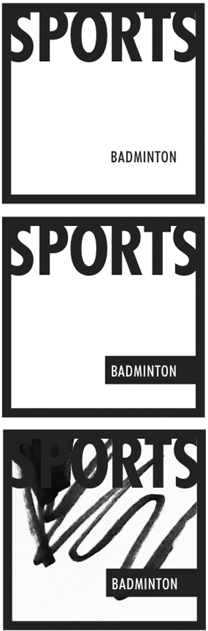
Above are three treatments of two words, “sports” and “badminton.” (Images: Bright Pink).
In the first image, despite “sports” being set in large black condensed all caps, “badminton” is prominent because it is surrounded by white space. The second image continues the same principles, but by making “badminton” white and setting it against a black bar, it becomes even more noticeable. However, by adding emphasis to “badminton,” a little confusion could be created. Where is the reader drawn first? Keeping the intended hierarchy clear is vital. In the third image, the drawing almost swallow up “sport,” leaving it hardly visible and giving “badminton” clear prominence.
Combining Typefaces To Create Hierarchy
In this section, we’ll discuss the value of combining typefaces to generate interest and excitement, to reinforce identity and to support hierarchy. The key to creating hierarchy is contrast, which can come from simple changes in weight, scale, positioning, color, tone or font. Although this might sound easy, it can be complex. For example, altering line spacing or inter-character spacing can certainly add character, but it could also increase or decrease the tone of the type.
So, despite using what seems to be a completely different typeface, you might not be having the effect you imagine. As with many other situations when working with type, visual judgment is crucial.
Two contrasting typefaces, Baskerville and Futura, have been combined. Larger view. (Design: Bright Pink)
In the above image, changes to line and inter-character spacing have reduced the contrast. The larger and seemingly more impactful type is very similar in tone to many of the other levels of information in the design, and so figuring out which element has greater importance becomes more difficult.
A simple and very general starting point for creating contrast is to combine one serif font with a sans-serif partner. Fonts with multiple weights prove to be the most useful. Faces from the same family also sit well together. Pairing two serif or two sans-serif fonts together would not be impossible, but would be much more demanding and time-consuming to pull off.
There are no shortcuts to combining fonts, and at the risk of sounding repetitive, visual judgement of texture and tone is key. If two different fonts need to have the same prominence, again, visual judgement is the best guide. Look carefully at the size of type, because simply using the same size can be problematic when x-heights and ascenders and descenders vary.
Museum and gallery websites are excellent demonstrations of complex hierarchy. Typefaces are combined to reinforce an institution’s visual identity, and different fonts are often adopted as part of the identity of special exhibitions. These websites also have complex grids and structures, making careful typographic choices even more important.
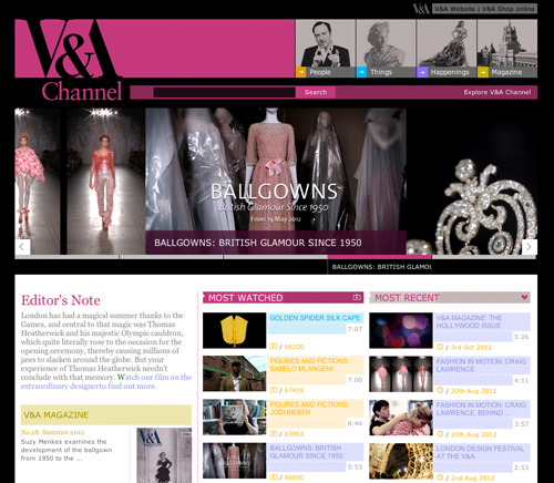
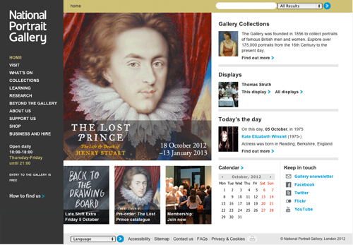
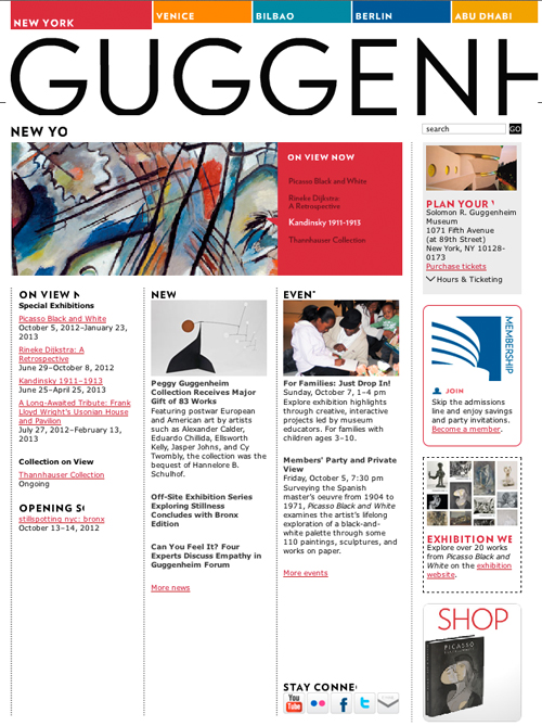
The websites for the Victoria and Albert Museum and the National Portrait Gallery (both in London) and the Guggenheim (in New York) are all hierarchically complex, and all use typefaces carefully to create order, structure and appeal.
Colorful Type
Color has numerous roles to play in creating hierarchy, adding a dimension to the order of information. Bright and vibrant colors tend to attract us, while softer paler colors can be used to subdue detail. Certain colors have different associations in different cultures. You’ll need to carefully select not only the hue, but also the tone of a color.
An excellent way to test prominence and priority created by combinations of color is to view a design in grayscale. Inevitably, if the background’s tone is dark, it will merge with darker shades and throw out lighter colors, and vice versa.
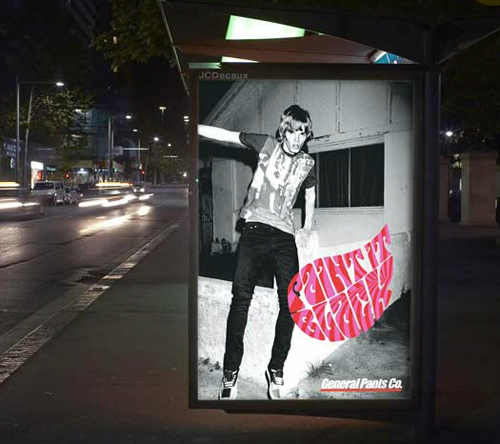
Frost Design uses color to dramatic, contrasting effect in this ad for General Pants Co. With “Paint it black” written in bright pink and red, color is used both ironically and to attract.
In this second ad from Frost Design, red is cleverly used for certain letterforms, guiding the viewer to read them first and extract a second level of meaning from the phrase.
Quantity Of Type
So far, we have looked at relatively few words and letterforms. Exciting hierarchies and visual interest, order and aesthetics can be created, regardless of context, when text is considerably less limited, including even multiple paragraphs, headings, captions and quotes. Again, the “designer as reader” comes to the fore, because selecting the appropriate order and hierarchy for the task in hand is essential.
The designer may not be particularly interested in the subject matter of a design, but they still have to ensure that the audience is attracted to it, sticks with it, enjoys the interaction and progresses in the intended manner. The reader needs to be tempted by digestible amounts of information, treated in a variety of considered styles, and put together from a coherent palette.
It could be argued that the design above has five or six levels of typographic hierarchy, but all are coordinated and serve to attract and guide the reader enthusiastically through the information, without making the process too complex. Larger view. (Design: Bright Pink)
Why Grids Are So Practical
Grids play a useful role in almost every area of graphic design. And in layout, a grid is an essential organizational tool. The grid provides a framework and structure for the combination of type and images. Across multiple pages, a consistent grid enhances communication, brings cohesion and improves legibility. We asked numerous designers to describe their approach to grid design.
One interesting result of these inquiries is that a surprisingly large number of professionals noted their preference for working with grids that have an uneven number of columns, which, they say, establishes a more intriguing dynamism and asymmetry.
Designing a grid with flexibility is important. We should seldom settle for a two-column structure, but should rather consider systems with a greater number of columns, providing plenty of scope for exciting groupings.

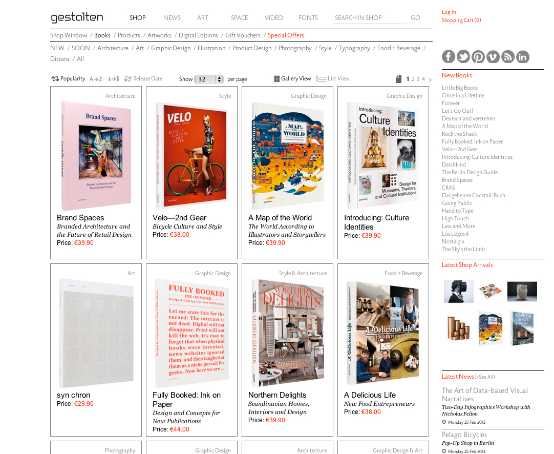
A grid with flexibility. Larger view.
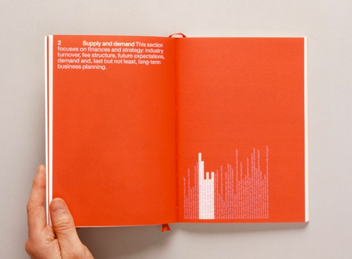
This page from the publisher Gestalten has plenty of columns. Five are used with great flexibility, with text and images extending across them, and the varying widths set priorities among the topics. Also, the different weights, faces, colors, cases and scales lead the user through different elements of the website in a particularly enjoyable flow.
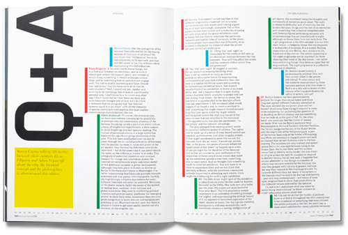
Pages of the art magazine MAP. (Images source: Map Magazine, Issue 1 & 12-20)
MAP is a quarterly international arts magazine, designed by Studio 8. The lively 10-column grid has varying numbers of columns, even on the same page, making for exciting spaces. The dynamism is established primarily by the enticing composition, rather than by any typographic changes. Color is also introduced to guide the reader.
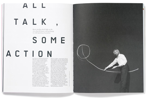
Most of the designs we have seen so far accommodate a fair amount of text. We haven’t really discussed pages with limited information. In these cases, type can be used almost as an image, and principles of composition can be used to produce contrasting scale, resulting in dynamic layouts. We might imagine that a small amount of type in a large amount of space is an ideal situation, but making the type, images and space work well together without seeming forced is rather hard. As with an odd number of columns, an asymmetric balance is likely more powerful, while a center-positioned design might appear static and less dynamic.
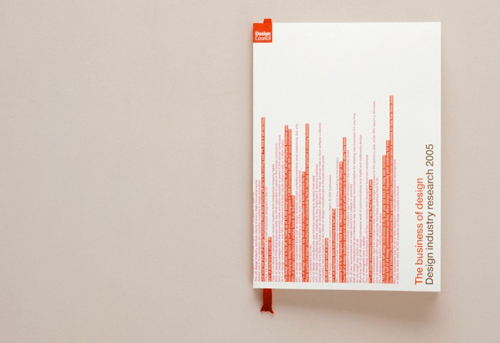
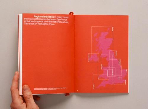
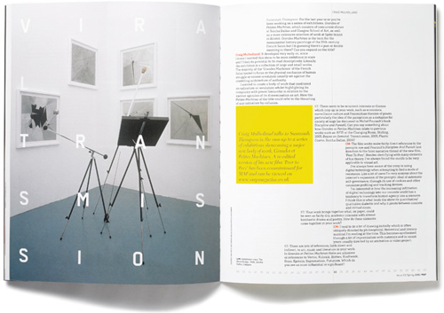
The Business of Design by London based design studio Cartlidge Levene.
Design company Cartlidge Levene designed the publication The Business of Design for the UK Arts Council. The book’s many spreads have little text and minimal images. The designers have cleverly positioned the type to lead readers to important details within the expanse of space. The arresting use of red adds to the dynamic.
Visual hierarchy is undoubtedly the key to memorability, persuasiveness and communication. As demonstrated by the designs we’ve looked at, regardless of context, comprehension is certainly enhanced by breaking text down into different levels. Structuring a design to reflect priority, emphasis and possibly tone of voice is the starting point in creating an exciting and unique hierarchy with type. Working in this way makes for a visually interesting form of communication and can be used very effectively to express and simplify information, not only enhancing understanding, but making the process of reading intensely enjoyable.
Useful Links
- The Anthony Nolan Trust, Johnson Banks
- Alison Carmichael
- Rebecca Foster Design
- Frost Design
- Gestalten
- Map ( By Matt Willey, previously of studio 8)
- Cartlidge Levene
- Little Miracles
- Victoria and Albert Museum, London
- National Portrait Gallery, London
- Guggenheim
- Create Impact With Type, Image and Color, Jessica Glaser and Carolyn Knight (RotoVision)
- The Graphic Design Exercise Book, Jessica Glaser and Carolyn Knight (RotoVision)
Further Reading
- When Typography Speaks Louder Than Words
- Visual Perception And The Principles Of Gestalt
- An Exploration Of Type-Focused Websites
- Massive Collection of Nature Inspired Typography
 (al, ea, mrn)

