5 Powerful Tips And Tricks For Print Style Sheets

Email Newsletter
Weekly tips on front-end & UX.
Trusted by 182,000+ folks.
 Register for Free


 Celebrating 10 million developers
 Custom Web Forms for Angular, React, & Vue. Your backend.
Print continues to be treated somewhat cursorily by most Web designers, who tend to be obsessed with pixels rather than printers. In the real world, a significant portion of people rely on pages printed from websites for reference: there’s still something about having a physical sheet of paper in one’s hands, even in this age of digital saturation.
Web developers can take several steps to bridge the gap between the worlds of printers and LCD screens:
- Treat print as an equal partner in adaptive and responsive design.
- Print background images and colors, where appropriate.
- Add visible URLs or scannable links for easy reference from the printed page.
- Use CSS filters to improve the result of printed graphics.
Design For Print, Not Screen
First, let’s cover the basics. Modern print style sheets are typically placed within a media query:
@media print {

}
Recreating the entire CSS for your website is not necessary because the default styles will, on the whole, be inherited by the print query; only the differences need to be defined. Most browsers will automatically reverse colors when printing in order to save toner, but this won’t have the same degree of quality as a handcrafted solution. For best results, make color changes explicit. At the very least, a basic print media query should consist of the following:
@media print {
   body {
      color: #000;
      background: #fff;
   }
}
While display: none has rightly been derided in responsive design, it is entirely appropriate for print style sheets: in most cases, our goal is not to recreate a screenshot of an entire page, but to provide a concise, well-designed print version of it. As a second step, eliminate page elements that are simply irrelevant in print, including navigation bars and background images.
/* Default styles */

h1 {
   color: #fff;
   background: url(banner.jpg);
}

@media print {
   h1 {
      color: #000;
      background: none;
   }

   nav, aside {
      display: none;
   }
}
Writing a print style sheet is one of the few times when you’ll ever use centimeters or inches in CSS. Largely irrelevant to screens, real-world measuring systems become very useful in print. To ensure that you are using the printed page effectively, write CSS to display your content edge to edge, negating any margins or padding that may be present, and balance this with an @page rule:
@media print {
   h1 {
      color: #000;
      background: none;
   }

   nav, aside {
      display: none;
   }

   body, article {
      width: 100%;
      margin: 0;
      padding: 0;
   }

   @page {
      margin: 2cm;
   }
}
For content to which users can be expected to add handwritten notes on the page, such as educational material, you might consider increasing the print margin.
We also need to ensure that content is not broken across pages when printed. One obvious step is to prevent headings from being printed at the bottom of the page:
h2, h3 {
   page-break-after: avoid;
}
Another rule will prevent images from bleeding over the edge of the printed page:
img {
   max-width: 100% !important;
}
A third will ensure that articles always start on a fresh page:
article {
   page-break-before: always;
}
Finally, we can prevent large elements, such as unordered lists and images, from being split across multiple pages.
ul, img {
   page-break-inside: avoid;
}
While these declarations are not exhaustive, they’re a good start.
Force Background Images And Colors
On some websites, such as portfolios, background images and colors are an important visual component. If the user is printing from a WebKit browser (Google’s Chrome or Apple’s Safari), we can force the printer to render the colors as seen on screen (i.e. force any background images and colors to appear on the printed page). Generally speaking, we would do this for color printers, which we can test for in a separate media query:
@media print and (color) {
   * {
      -webkit-print-color-adjust: exact;
      print-color-adjust: exact;
   }
}
Sadly, there is (as yet) no immediate equivalent in Firefox, Opera or Internet Explorer.
Expand External Links For Print
We can’t (yet) directly interface with a printed page to explore links, so link URLs should be visible on the printed version of the Web page. To keep the page relatively clean, I prefer to expand only outbound links in articles, and suppress internal ones. If you’ve used relative URLs on your website for local links, you can easily do this through an attribute selector and :after pseudo=classes, thus preventing internal links and links around images from being printed:
@media print {
   article a {
      font-weight: bolder;
      text-decoration: none;
   }

   article a[href^=http]:after {
      content:" <" attr(href) "> ";
   }
}
Take the following HTML code and content:
<p>You’ve explored this <a href="/blog">website</a>; now it’s time to <a href="https://www.webplatform.org/">read other Web development documentation</a>.</p>Here is the printed result:
One issue is that anchor links and links around images will also be expanded on the printed page. We can fix the anchor links fairly readily with a countermanding CSS rule:
article a[href^="#"]:after {
   content: "";
}
Links around images are rather more difficult, because CSS does not currently allow for the selection of an element based on its children. Ideally, links around images would have a class that we could target via CSS. Longer term, CSS4 features a parent selector that will do the job:
$a:after > img {
   content: "";
}
CSS4 will also make expanding external links easier:
a:not(:local-link):after {
   content:" <" attr(href) "> ";
}
All of these approaches assume that users will continue to type in URLs by hand. A better solution is to make the digital version of the page easier to access by providing a matching QR code.
Print QR Codes For Easy URL References
Often regarded as an advertising eyesore, QR codes have their place in certain circumstances. One obvious example is providing an easily-scanned sigil on a printed Web page that enables the user to return to the live version without having to type the URL.
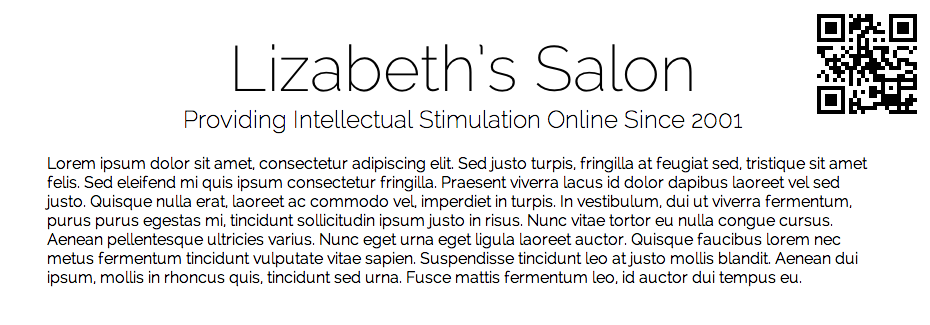
Web page printed with a self-referential QR code. Larger view.
To create the matching QR code, we’ll use Google’s Chart API, which has four required components:
- The kind of chart information we want Google to deliver (
qr, in our case); - The rendered size of the QR sigil, in pixels;
- The URL to encode;
- The form of character encoding to use.
We’d typically associate the URL with a heading element at the top of the page:
<header>
<h1>Lizabeth’s Salon</h1>
<h2>Providing Intellectual Stimulation Online Since 2001</h1>
</header>
To create the printed result, we’ll provide a margin on the right side of the h1 that is large enough for the heading, and then position a QR code in that area:
header h1 {
   margin-right: 200px;
   margin-bottom: 2rem;
   line-height: 1.5;
}
Because the QR code will be unique to each page, this would be added as an embedded style sheet:
@media print {
   header h1:after {
      content: url(https://chart.googleapis.com/chart?cht=qr&chs=150x150&chl=https://yourdomain.com&choe=UTF-8);
      position: absolute;
      right: 0;
      top: 0;
   }
}
This approach has the downside of forcing the developer to enter a URL individually for each page into the API code. If your Web host is running PHP, you can provide the URL of the current page automatically:
@media print {
   h1:after {
      content: url(https://chart.googleapis.com/chart?cht=qr&chs=150x150
&chl=https://<?=$_SERVER["SERVER_NAME"].$_SERVER["REQUEST_URI"];?>
&choe=UTF-8);
      position: absolute;
      right: 0;
      top: 0;
   }
}
For WordPress:
@media print {
   h1:after {
      content: url(https://chart.googleapis.com/chart?cht=qr&chs=150x150
&chl=https://<?phpthe_permalink();?>&choe=UTF-8);
      position: absolute;
      right: 0;
      top: 0;
   }
}
Obviously, both of the solutions above will only work on PHP and WordPress pages.
Use CSS3 Filters To Improve Print Quality
Browsers often have issues with printing out banner images, especially if the banners are white against a dark background:
In theory, you could use a CSS sprite to switch between different versions of the logo for print, but that would mean doubling the file size for potentially little benefit. Instead, I recommend using CSS filters (and their SVG equivalent, for Firefox) to invert the image just before it hits the printed page:
@media print {
   header {
      background: none;
      color: #000;
   }

   header img {
      filter: url(inverse.svg#negative);
      -webkit-filter: invert(100%);
      filter: invert(100%);
   }
}
CSS3 filters do what you’d expect — invert the colors in header images, turning black to white and vice versa — but they only work in Chrome and Safari. To cover Firefox, we need a different approach — the equivalent filter written as a separate SVG file:
<svg xmlns="https://www.w3.org/2000/svg">
<filter id="negative">
<feColorMatrix values="-1 0 0 0 1
0 -1 0 0 1
0 0 -1 0 1
0 0 0 1 0" />
</filter>
</svg>
The workings of the feColorMatrix SVG filter are a little complex to cover here. Much more information can be found in the article “Applying Color Tints to Web Pages With SVG Filters and JavaScript” on Dev.Opera.
The result of printing either form of logo (i.e. alpha-masked PNG or solid-black background) is now this:
Conclusion
Due in part to the fact that printer use is not tracked by website analytics software and, thus, lacks strong metrics (although achieving this is possible, too, which we may discuss in a future article), print tends to be broadly ignored by Web developers. This is somewhat understandable, because most of the time we only read and browse pages online. As a result, developers tend to develop websites for the screens and devices in front of them, rather than for the printer at the other end of the office.
On the other hand, even if people only occasionally need to print something from the Web, it would be ideal if the page design adapted to the printer, just as modern websites adapt to various screen sizes and devices. Print should be considered another aspect of adaptive design, usability and accessibility, and an equally important part of Web development.
By treating print as another aspect of adaptive design, we fulfill the needs of more website users — and at the same time, save ink, paper and other resources, all of which are important aspects of sustainable design.
More Resources
A List Apart has a long and laudable history of supporting print style sheets through its articles and tutorials. While some of the following resources are now fairly old, they remain relevant to anyone who wishes to explore print as an equal partner in Web design.
- CSS Design: Going to Print, Eric Meyer (10 May 2002)
- Improving Link Design for Print, Aaron Gustafson (19 September 2005)
- Building Books With CSS3, Nellie McKesson (12 June 2012)
Source of image on front page: Bottlerocket Creative.
Further Reading
- How To Set Up A Print Style Sheet
- Designing For Print With CSS
- Learning To Use The :before And :after Pseudo-Elements In CSS
- !important CSS Declarations: How and When to Use Them
 (al, mrn)

