Responsible Considerations For Responsive Web Design

Email Newsletter
Weekly tips on front-end & UX.
Trusted by 200,000+ folks.
 Register!
 Flexible CMS. Headless & API 1st

Responsive Web design has been evolving rapidly ever since Ethan Marcotte coined the term two years ago. Since then, techniques have emerged, become best practices and formed part of our ever-changing methodology. A few obvious examples are the multitude of responsive image techniques, conditional loading, and responsive design and server-side components (RESS), among many other existing and emerging strands stemming from the core concept of responsive Web design.
I’m going to discuss a few of the lesser practiced elements that are quietly becoming part of the responsive Web design ecosystem under the umbrella of responsible Web design. Responsible Web design practices are mainly concerned with responding to the user’s context by providing the ideal scenario in which they can experience your product.
Like responsive Web design, the responsible practices detailed in this article are open to interpretation and modification. I have covered what I feel are the most important elements: context-sensitive interactions, performance and progressive enhancement.
Context-Sensitive Interactions
Pattern Translations
In a responsive Web design project, each breakpoint defines the experience within a certain range of viewports: between the minimum amount of space and a maximum within the boundaries of that breakpoint. Some interactions that suit a breakpoint range over a large space — for example, a carousel with image thumbnails and pagination — might not suit the viewport boundaries defined by your breakpoints for smaller screens. The lack of available real estate could reduce the effectiveness of these superfluous navigation items if they end up obscuring the content or adversely affecting the user experience.
This is where the art of pattern translation comes into play. Pattern translation is the practice of taking the essence of a design pattern (whether it’s the content itself, the components or perhaps both) and ensuring that it applies across different breakpoint ranges and contexts.

The Great Discontent features pagination arrows that float in a fixed position as you read the page on large displays. Upon hover, it reveals the name of the interviewee on the next page. Larger view.
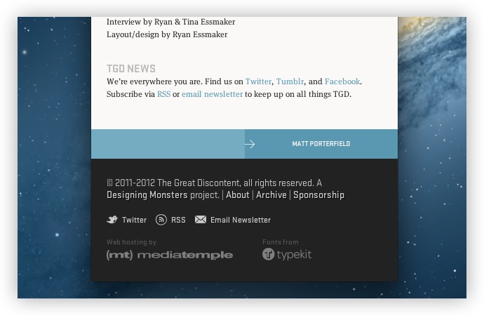
On smaller displays, hover states aren’t easy to achieve. To combat this, the designer (and interviewer), Ryan Essmaker, displays the pagination as big tappable blocks in the footer, showing the next interviewee’s name. Larger view.
When we talk about contexts, it could mean an array of things, such as the breakpoint range, the type of device (touchscreen or another form of input), or the environment surrounding and affecting the user. We need to be very careful when talking about contexts — design decisions related to context must be based on fact rather than assumption. For example, a context-based assumption would be to change the language of a Web page in response to the location of a device — a terrible idea because the reader might speak a language that isn’t native to the detected country.
A more definitive responsive design decision would be to react to screen size (which we have been most accustomed to doing in responsive Web design). Using our carousel example, we could provide a context-sensitive interaction for a user on a touchscreen by allowing them to swipe to advance the carousel rather than tapping on the pagination buttons.

Eden Spiekermann has a carousel on its home page, with pagination dots for precise pointing devices such as mice.

For smaller displays, the carousel’s appearance and behavior change to suit touch-based devices. Larger view.
Similarly, we know that mobile phones have a keypad for inputting numbers effectively. By using HTML5 input types for the numerical entry of credit-card numbers, phone numbers and any other fields that require only integers, we can help the user type quickly and eliminate the stress of having to change input methods to complete a straightforward task.
Media Queries Level 4 Module
At the time of writing, the current crop of browsers (in their stable channels) do not recognize some exciting media queries on the horizon, detailed in the “Media Queries Level 4” module, which will help us craft context-sensitive interactions more effectively. We will have the pointer media type at our disposal, which recognizes three types of pointers: coarse, fine and none.
coarse is essentially the same as saying that the device is a touch device, with a pointer that has a large surface area (for example, a finger). fine is the same as saying that the input device has a precise hit area (for example, a mouse). With this information about the user’s context at our disposal, we have the capability to deliver an experience suitable to their situation. The components we build can benefit the accuracy of a mouse pointer, and we can build alternatives within media queries that recognize that the input device requires a larger hit area, such as a finger.
Currently, three more media queries that will help us build responsive designs are due to find a permanent place in the specification: the script media query (which I will address in the section on “Progressive Enhancement”), luminosity (which I will talk about in the section on “Sensors in Responsive Web Design”) and the hover media query. The hover media query detects whether the device has hover capabilities, and it will be invaluable for pattern translations on touch devices.
Take a drop-down navigation menu as an example — some links may require hovering in order to reveal sub-menus for sub-sections within the parent link. The behavior of hovering on touch devices is inconsistent and unreliable across mobile platforms. By being able to detect whether the device supports hovering, we can craft the experience accordingly. Ideally, you would code with a mobile-first methodology (i.e. assume the device doesn’t support hovering), and then build the drop-down navigation within the hover media query using feature detection to see whether the browser recognizes the new media query.
@media (hover) {
   li {
      display: inline-block;
      position: relative;
   }
   li ul {
      display: none;
      position: absolute;
   }
   li:hover ul {
      display: block;
   }
   …
}
Sensors In Responsive Web Design
Mark Boulton describes a responsive experience as being comprised of sensors, systems and actuators. Sensors tell us about the user’s context and environment around them — they inform us of their situation, enabling us to tailor the experience to better suit their circumstances. Mark details the array of sensors that we have at present, although I feel we have a few more to help us respond accordingly.
Through PHP and JavaScript, we can detect the time of day of the user’s current location. Liz Danzico serves an alternate style sheet to her readers depending on the time of day that a user visits her blog. If you visit it during daylight hours, the style sheet presents the text as dark text on a light background. You’ll see the opposite if you visit the website during the evening or night, which Liz does to optimize readability based on the assumption that your surroundings will have less light. This is responsive design.

Liz Danzico’s Bobulate has an “Evening Edition” that responds by adjusting the reading contrast according to your local time.
Granted, this example makes an assumption — not a dangerous one, but an assumption nonetheless. In fact, while writing this article, the specification for “Media Queries Level 4” has evolved to include a luminosity media feature to detect ambient lighting levels, thus addressing this use case. It may be some time before this reaches a browser that is able to make use of the device’s light sensor so that we can more accurately predict the user’s environmental conditions.
I look forward to the day when we have safe access to hardware features such as, for example, the microphone, so that we can sensibly adjust the volume for a video according to the ambient noise around the user. I recognize that this is pushing the far reaches of responsive design and its ever-growing strands, but there will come a time when discussions like this will become a part of our product process.
I am a firm believer that to be a good Web designer, you need to be a good anthropologist. Studying people as they use Web products in different contexts is a key skill and one that shouldn’t be ignored if we are trying to figure out how to use sensors to meet users’ needs.
I have said in the past that the best sensor is the user’s preference. I feel this advice still applies, even if we have access to a new array of tools in the browser to cater to our users. Take the text-heavy app Readability as an example. Readability allows the user to choose a font size and background color that suit them, rather than making the decision for them. Sometimes giving the user a choice is the best solution for your product, sometimes not. It depends.

Readability’s elegant controls allow the user to adjust the reading experience until it feels comfortable.
As the specification evolves, so too will our ability to find out more about the user and to serve them according to their device and environment to ensure that they enjoy and are comfortable with our products. By establishing how design patterns translate across various contexts and by using anthropology to determine user needs, we can create context-sensitive interactions that quietly help our products shine.
Performance
Network Considerations
Speed is still a feature. This hasn’t changed since the days when dial-up modems were our main means of connecting to the Web. Since then, the landscape has become a lot more complex. When Internet use rose rapidly in the mid to late 1990s, most users were accessing the Web via either 28.8K or 56K modems. The Web was viewed at rates of 3.5 KBps and 6.8 KBps, respectively (when the modems were performing at their maximum rate). Then broadband was introduced, which brought much faster speeds. A short period of transition followed, and Web pages got a lot heavier as download rates improved.
Today’s Web is accessed over vastly different download rates. We now have 3G, 4G, LTE, Wi-Fi and all sorts of connections with different features and capabilities. It’s a different Web than it was in the late 1990s and early 2000s. We can’t safely bet on connection speed and build a page accordingly. A heavy page optimized for a speedy fiber-optic connection would put a good dent in a mobile user’s data plan when accessed over a 3G connection. The responsible Web designer would build for the lowest point of entry — a mobile-first approach, assuming for the slowest connection speed and building up from there to larger breakpoints for faster connections.
That’s the problem with the sensors that are available at the time of writing. The Network Information API isn’t widely available across browsers and platforms. The API will allow user agents set a value of a bandwidth attribute that indicates the characteristics of a connection. The user agent makes an estimation of the current bandwidth in megabytes per second and returns this value. If a value of “0” is returned, that means the user is offline and “infinity” if the bandwidth is unknown.
When this API arrives in major browsers, we will be able to make more informed decisions about the media that we display on our websites. We could serve compressed media with small file sizes to users when their bandwidth falls below a set value or if the value is unknown, and theoretically serve high-definition media for users with connections with ample bandwidth.
Think of the Network Information API as an extra dimension of responsive images. While the proposed <picture> and <img srcset="…"> elements and parameters would look for breakpoints and resolutions that allow you to control the shape of an image, the Network API will let you control the quality of an image based on the user’s connection speed, producing a result that fits the physical aspects and media capabilities of the user’s device.
One of the difficulties that browser vendors are experiencing with the Network Information API is that measuring bandwidth is a difficult task, in fact as Yoav Weiss writes - it may even not be worthwhile exercise.
"Bandwidth, by its very nature, is variable over time… This variability is the major reason why making predictions about future bandwidth is likely to be highly inaccurate and error prone."
Additionally we need to consider the effect that latency can have on how a user experiences a product. Latency is the time between when the browser requests a resource from the server and when it starts to receive the server’s response. As you can imagine, as the number of requests grows, the latency increases. It’s a similar scenario to those awkward pauses in conversation that you see in television interviews between people in remote locations. Smashing Magazine’s own Vitaly Friedman has some excellent notes on this subject from his recent talk “Responsive Web Design: Clever Tips and Techniques.”
Page Weight
Perhaps all of this sounds too idealistic when the solutions mentioned above aren’t ready to be used yet. But that isn’t a reason to avoid the issue of performance altogether. This is a current problem. Tim Kadlec recently wrote an article blaming irresponsible Web developers for poor implementations of responsive Web design. Implementations that burden users with heavy downloads, regardless of context, undermine our ability to sell responsive Web design as an adaptive, forward-thinking methodology to clients. Such implementations need a diet plan for more modest contexts, rather than a pair of Spanx.
For years, product makers in various media have worked with restrictions on capacity. Artists in the music industry have around 72 minutes or less to hold their work on a CD. Game makers have similar constraints; a game designer for Nintendo’s SNES console couldn’t develop a game that was any larger than 4 MB.

Other than Web creators, music and game makers work with restrictions on capacity. Image Credits: bochalla.
It’s a creative constraint. Its benefit is that it guarantees the maker that their product will be enjoyed in the ideal scenario, whether on a CD player or an SNES console. But what about us creators for the Web?
Our entry-level requirement is a much wider net: a Web-capable device. We have many more variables to consider, such as connection speed, device size and capabilities. There is no set maximum for page weight. The infinite canvas we work on creates the illusion of infinite size. The current worrying over page weight is a niggling concern that leads to thoughts like, “I’ll compress this later” or “The page won’t be too heavy…” How heavy?
Let’s assume that we complete a product for the Web and it weighs around 1.5 MB (not an unreasonable assumption). Sadly, we didn’t factor in performance from the beginning, and our “responsive” page weighs the same across all breakpoints and contexts. On a 3G connection (assuming the user can even get those speeds), our page would take a considerable amount of time to download. The Web isn’t about loading bars and progress indicators; we can do better than this.
A good starting point is ySlow, Yahoo’s tool for analyzing page performance. ySlow grades your page according to best practices and established techniques and metrics for a good Web page. I usually look at the “Components” tab, which gives a comprehensive list of all media, with individual and combined weights. It can be awkward but necessary viewing. Generally, I find that compressing images using services such as TinyPNG and ripping out those social button scripts can drastically reduce page weight. This should be more of an iterative exercise, rather than something done at the end of the project. Before doing this, a responsible Web designer would have used techniques such as conditional loading to keep page weight low.
Social widgets are often the worst culprits of page bloat. A standard Facebook “Like” button weighs in at a hefty 175 KB; Twitter’s sharing button is almost 100 KB lighter at 76 KB. Before adding these to your website, you really should question their effectiveness. How often will they be used? Are my users savvy enough to copy and share a URL. Does their device’s browser already have built-in sharing options (Safari on iOS does)? On his blog, Oliver Reichenstein offers some thoughts, research and sound advice on social widgets.
Sadly, one of the more elegant components of a Web page carries heavy bloat: Web fonts. Kits from font services can quickly escalate in size as you add more character sets. It’s a new creative constraint that we’ll have to get used to. Before the explosion in Web fonts, there were fewer than 10 fonts we could safely use in our designs — now, tens of thousands of fonts are at our disposal. This doesn’t mean we should use them like there is no tomorrow. It’s time to think about the baggage that comes with these fonts. The right balance between system and Web fonts can produce aesthetically pleasing results as well as reduce the hit on performance.
Conditional And Lazy Loading
Don’t confuse conditional loading with lazy loading, although both techniques are great methods of keeping page load down. Conditional loading queries the user’s conditions, mainly regarding screen width and resolution; then, if certain conditions are met, the appropriate content is loaded. People mainly use this technique to serve responsive images and media. For example, if the JavaScript indicates that the user has a small screen, then you could serve an image with smaller dimensions, rather than one for larger displays, which could waste bandwidth and (depending on the user’s connection) increase loading time.
Lazy loading is a similar technique in that you load media after the initial page load. Elements are loaded on demand. For example, if an image lies beyond the viewport’s perimeter, then not loading it right away would make sense, because the user might not want to scroll down the page and shouldn’t be burdened with images that they don’t intend to view. If they do decide to scroll, lazy loading detects when they are in range of the image and then loads it, ensuring that only what’s necessary gets loaded. I think of this technique as being akin to the “fog of war” in real-time strategy games: enemies on the map are obscured until you explore areas that reveal their units — the same goes for lazy loading media.
You can also use lazy-loading scripts to load other scripts — a technique used in large Web applications such as Gmail (although there is no reason not to use it in smaller Web pages and applications).
<script id="lazy">
// Make sure to strip out (or replace) comment
blocks in your JavaScript first.
/* JavaScript of lazy module */
</script>
<script>
function lazyLoad() {
var lazyElement = document.getElementById('lazy');
var lazyElementBody = lazyElement.innerHTML;
var jsCode = stripOutCommentBlock(lazyElementBody);
eval(jsCode); }
</script>
Code taken from slide 57 in Vitaly Friedman’s presentation “Responsive Web Design: Clever Tips and Techniques.”
It may sound like I am blaming page weight as the main cause of all Web performance issues, but it isn’t always the cause. I recommend using tools like ySlow and the Web Inspector’s “Resources” tab to get to the bottom of performance problems. Always remember to aim for speed above all else; page weight may be the most common cause of slow performance, but be sure to optimize, cache and compress to keep your product running like a well-oiled machine.
Progressive Enhancement
Enhanced Inputs
Progressive enhancement has evolved beyond the scatterings of border radiuses and of text and box shadows that have grown in popularity since the inclusion of these features in the specification. We now have subtler, more practical uses that respond to the context of visitors to your website.
Looking at the different keyboard layouts for iOS as an example, you may have seen the following layouts activate for different input states in apps. We can do this on the Web, too.

The various keyboard input types available on iOS. Other mobile platforms offer similar layouts depending on the specified input type.
The email input type is a cue to capable devices to show an email-friendly keyboard layout when the field is focused. This subtle progressive enhancement improves the usability of a product by saving the user the effort of switching keyboard modes and symbols to find email-specific formatting buttons, like the @ symbol and domain suffixes.
<input type="email" />The same applies to numeric entries. If a field requires user input that is purely numeric, then using the number field type makes sense. This will activate a keypad similar to the number keypad on a physical keyboard and the number dial on a phone. Both keypads are ergonomically designed for numeric entry. Responding to the user’s context when the user is on a device capable of showing the keypad will make this step easier and, thus, improve the experience.
<input type="number" />Enhanced Device Capabilities
Mobile operating systems are at war with each other to provide the best experience to consumers. As a result, companies such as Apple, Google and Microsoft push their software’s capabilities to enable us as developers to enhance our experiences for users. Smartphones and tablet computers are generally more technically advanced than desktop computers; when building a Web product that responds to different device metrics, we can use some of these features.
Most current mobile and tablet devices come equipped with GPS sensors that give developers access (when the user grants permission) to geolocation data returned by the device. We can use geolocation as an enhancement to location-based interactions, such as searching for nearby points on a map, thus saving the user from having to enter the data manually. Manual entry should be used as a fallback when you are progressively enhancing for geolocation, even if the device successfully returns a location — the result may be inaccurate or may need manual modification from the user in a text field.
Advanced Layout Methods
Earlier this year, I wrote about how we can perform content choreography , a term coined by Trent Walton, using pure CSS to alter the layout hierarchy on small screens. An example of content choreography would be to move the navigation menu from the top of the page to the bottom when doing so makes sense. The effect is achieved using flexbox, an advanced CSS layout technique for building intricate layouts that would otherwise be complex using older CSS methods.
The strange thing about flexbox is that (at the time of the original article) desktop support was limited, although support on mobile and tablet devices (where we actually do the choreography) was healthy and has continued to flourish across platforms. This has made the technique a pretty safe bet if you want to use it.

A demo of content choreography using flexbox to reorder a layout at different breakpoints.
Given the nature of our work, there will always be devices that are less capable than others. We’ll never have an even playing field — and that’s OK. That’s the nature of the software as well as the hardware; progress with one often results in the progress of the other, as happened with the getUserMedia method for capturing camera images and video.
Hardware cameras became standard on devices, which led to browser software being equipped with a method of obtaining their output. But with progressive enhancement, we need to ensure that solutions degrade gracefully; so, our flexbox example would revert to the default document order in browsers that don’t support the CSS rule. Responsive design requires designing with foresight; we need to anticipate such scenarios and ensure that the basic experience is robust before layering enhancements on top of it.
Tools such as Modernizr help us progressively enhance by running quick JavaScript tests to detect features. They essentially enable us to set rules for devices that can or can’t use particular browser features, such as SVG and CSS animations. Feature detection is making its way into CSS in the form of the @supports rule, which will eventually remove our dependency on JavaScript libraries, meaning we can set feature-based rules on devices that either do not support JavaScript or have JavaScript switched off.
@supports (display:flex) {
  .container {
     display: flex;
     flex-direction: column;
  }
  .nav {
     order:5;
  }
   …
}
I feel like progressive enhancement has the stigma of skeuomorphism because it’s used so much for shiny and bumpy design elements. Such flourishes of CSS may suit some designs, but the really useful enhancements are those that have a tangible benefit to the usability of a Web product.
In Summary
We can never guess who our next visitor will be or what their context, device or accessibility requirements will be. It’s impossible. We can, however, be ready for and responsive to them. By not anticipating for the device and by embracing and preparing for the unknown, we can provide true, honest responsive products that autonomously provide a “best fit” experience to the end user.
Responsive Web design is an ever-changing methodology that helps us address the unknown. Responsible Web design practices are merely one of many strands of this methodology — old practices being adapted to new ones. Our work is never done. We make, we adapt, we learn, and we make again. To me, that is the most comforting thought about what we do.
Resources
- ySlow, Yahoo
- “Responsive Web Design: Clever Tips and Techniques,” Vitaly Friedman
- Performance Calendar, Planet Performance Think of this as a 24 Ways for Web performance.
- Palm Reader, Jordan Moore A tool to show what media queries your device can read.
- Slowy A real-world connection simulator and bandwidth limiter.
- Mobile Perf bookmarklet, Steve Souders
- Chrome Dev Tools: Networking and the Console,” Umar Hansa A walkthrough of the “Network” panel in Chrome.
Further Reading
- Building A Better Responsive Website
- Responsible Considerations For Responsive Web Design
- Lightening Your Responsive Website Design With RESS
- How To Provide The Greatest Mobile User Experience Possible
 (al, mrn)

