How To Maintain Hierarchy Through Content Choreography

Email Newsletter
Weekly tips on front-end & UX.
Trusted by 182,000+ folks.
 Register for Free


 Custom Web Forms for Angular, React, & Vue. Your backend.
 Celebrating 10 million developers
One of the issues we need to be concerned with in responsive design is how to maintain hierarchy as elements on the screen are resized and reflowed. Trent Walton first called attention to the issue with his post “Content Choreography,” which showed how visual hierarchy gets lost when columns are dropped below one another.
While techniques exist to help with part of the problem, the solution also requires conscious thought in how you structure blocks of content in your HTML. You need to think about how you’ll want to rearrange blocks of content as your design moves from single to multiple columns.
What Is Content Choreography?
As a layout changes from a widescreen to a tablet to a smartphone, the number of columns is usually reduced from three or four down to one. The typical and easiest solution is to drop the columns one by one and stack them on top of each other.
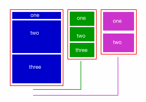
The figure above shows three columns of content. The lines below the two right columns indicate that each will drop below the main content as the screen’s width decreases.
Once you’re down to a single column, the layout is constrained by the source order of the content blocks in the HTML. Whichever column comes first in the HTML is displayed at the top; whichever column is next in the HTML goes right below; and so on down the stack.
Unfortunately, this means that information that is highly visible at the top of the page when multiple columns are present ends up being far down the page as one column drops below another. If content is important enough to show at the top of the page when viewed on a widescreen browser, do we want to bury it on a smartphone screen?
All of the information in your sidebar column probably isn’t as important as all of the information in your main content column, but some of the sidebar content is likely more important than some of the main content.
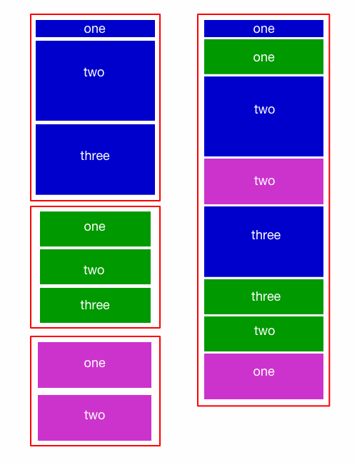
The left side of the figure above shows a single column layout, where each column drops in its entirety below the previous one. The right side shows elements from each column mixing with other elements.
The left side of the image above shows the typical column drop. As the design is reduced to a single column, the content inside each container or column is dropped below all of the content in another container.
Ideally, the visual hierarchy would be maintained, and the content in different columns would intermix as the design moves from three columns to two to one. We’d also like more control over the display order of content, beyond the HTML source order. Both scenarios are illustrated on the right side of the image above.
This greater control over the blocks inside containers is what’s considered content choreography. I assume Trent chose the word “choreography” as a metaphor for how we’d like to orchestrate the movement of blocks of content as our layout changes.
Our current development practices don’t make this choreography easy. What they do make easy is dropping entire columns one below the other, which means that everything inside one column must always end up in its entirety above or below everything in another column.
Two Problems In One
What I’ve described above are really two separate problems:
- Source order. In a single-column layout, blocks of content will display in the same order as they’re located in the HTML structure. Unfortunately, the best source order for one layout isn’t necessarily the best source order for another.
- Intermixing content. Instead of having to drop entire columns of content below one another, we’d like to mix blocks of content from the different columns in the single-column layout.
The first issue has some technical solutions on the way, one of which is just about here. The second issue will require that we change our thinking in how we develop layouts.
Solving The Source-Order Problem
In time, there will be several solutions to the source-order issue, in the form of new CSS specifications. Depending on which browsers you need to support and what you’re willing to do to support them, one of those specifications may already be here.
Three specifications that we’ll likely find ourselves using in the future are:
- “Flexbox,”
- “Regions,”
- “Grid Layout.”
The second and third of these specifications have almost no support in current browsers. Surprisingly, Internet Explorer is leading the way with both. IE 10 supports regions and grid layouts with the -ms vendor prefix. No other browser offers any support at the moment, so we’ll have to wait on these specs a bit longer.
Flexbox, however, has pretty good support. The spec has undergone some changes, and two versions are currently supported by browsers. If you don’t mind mixing the old and new syntaxes, you can get flexbox to work in the current versions of almost all browsers.
Opera mini and IE below version 10 don’t support any flexbox syntax. However, you can use the Flexie polyfill to add support for IE. Flexie uses the old flexbox syntax, but it does support IE as far back as version 6. Flexbox deserves its own article to be explained in detail, so I’ll point you to some articles I’ve written showing the old syntax and the new syntax, as well as one that walks you through the new syntax to set up a responsive layout that overcomes the issue of source order.
Suffice it to say that with a single CSS property, we can essentially tell our documents to display blocks of content in a different order than how the source code orders the blocks in the HTML. Jordan Moore has also written about flexbox and content choreography, and he’s created a demo to illustrate.
What you should take away from this section is that solutions to the source-order problem are coming soon — one of them very soon. It won’t be long before we can easily rearrange blocks inside a single container. However, rearranging blocks inside one container isn’t the same as rearranging them across several containers.
Solving The Intermixing Content Problem
Unlike the source-order problem, the issue of intermixing content across columns doesn’t have a technical solution. It’s up to us, and, ultimately, it means we need to wrap content in fewer HTML containers.
We’ll have to dig a little deeper into the problem to understand why this is so.
CSS Visual Formatting Models
CSS offers several visual formatting models, such as the normal document flow, floated elements and positioned elements. Flexbox is part of another, the flexible box layout model. In all of these models, elements are located relative to a containing element.
We can make it look as though elements are not bound by their containers, but they still are. For example, you could float an element that’s inside one column and give it a negative margin so large that it appears to be located in another column, however, elements in that other column won’t reorient themselves. To these elements, the floated element is still in the first column.
Other elements in the first column may relocate themselves to fill the now vacated space, but elements in the second column won’t. Even positioned elements are positioned relative to some parent, although that parent might be the html element itself. When you absolutely position an element and move it somewhere on the screen, other elements won’t get out of the way. We need them to get out of the way, though, if we’re going to intermix page elements.
With a little thought and CSS, you can usually figure out some way to rearrange elements inside one container however you like. With a little more thought, you can even make elements in one container appear to be located inside another, although you’ll usually have to position the elements in that other container with more complex CSS and with what Harry Roberts refers to as “magic numbers.”
If the term is new to you, magic numbers are those numbers we use to make something work in a single particular instance. They typically stop working as soon as some other value changes, and, given the nature of responsive design, other values are always changing. Magic numbers in CSS are best avoided.
We Need To Give Up Containers
For the last few years, whenever we’ve wanted to move a group of adjacent elements to a certain part of a layout, we’d wrap those elements in a container and write CSS to display the container somewhere in the design. I’m sure you’ve used CSS selectors like #wrapper and #container more than once.
We need fewer of these HTML containers and more CSS virtual container classes that we can apply to different elements as needed.
In other words, instead of this…
<div id="container">
  <div>Content here</div>
  <div>Content here</div>
  <div>Content here</div>
</div>
… we need more of this:
<div class="container">Content here</div>
<div class="container">Content here</div>
<div class="container">Content here</div>
In the latter block, each division might have a different class name or perhaps different additional classes applied. This allows for greater flexibility in rearranging them in the layout. In the first block of code, the three content divisions will always reside inside their parent container.
I’m not suggesting that the first block of HTML above should never be used. There will absolutely be times when wrapping several divisions of content with a container makes sense. However, if you want some of those blocks to intermix with elements in other columns, then you’ll have to think more in terms of the second block of HTML above.
With CSS, we have the ability to rearrange blocks inside a container. We don’t have the ability to break content out of one container and move it inside another container. If you want more mixing of blocks, then you’ll need fewer containers.
Examples
While there are currently far more instances of websites that are dropping columns wholesale, there are certainly websites that mix content in one column with content in another column.
Let me first offer a detailed look at my own website, since I’m most familiar with it. I’ll follow this up with a few other websites that intermix content in slightly different ways.
A Personal Example
Around the time that Trent coined the term “content choreography,” I was working on a redesign of my website and was trying to figure out how to mix content blocks as the layout changed.
The image below shows the top of a typical blog post on my website when the browser is wide enough to accommodate two columns. Click the image to see the live post.
Meta information such as my name and the publication date are in a column to the left, while the article’s title, main text, images, headings and so on are in a column to the right.

My website when the browser is wide enough to accommodate two columns.
Seeing the layout, you might instinctively think each “column” is wrapped in its own container and that I’ve floated both columns left or right; it’s how I would have developed this layout a few years ago. But doing that leads to the problem of one of the columns being forced to drop below the other on small screens.
Below is the same page as a single column on a narrower screen. The meta information from the left column sits below the article’s title from the right column but above everything else in that right column. Both “columns” of content have actually been inside the same container all along.

My website as a single column on a narrower screen.
The image below presents a more abstract view of what’s going on. On the left, you see the layout as it appears when displayed as a single column. On the right is the two-column version of the layout.
Every element is its own unique block and serves as its own container. The page’s main heading is its own contained block. All of the meta information is inside another container directly below it. After that, every paragraph, subheading and image is also its own self-contained block of content. The same goes for anything else that might end up in a post, such as a block quote or code block.
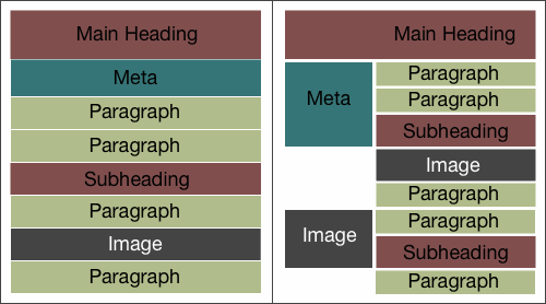
A more abstract view of what’s going on.
On small screens, all of the blocks display in the source order. On wider screens, I shift this entire single “column” to the right by adding a left margin to each individual block. In the CSS, I have a long list of selectors with a single line of declarations. When I want something to appear in the “left column,” I float it left and reset its margin to zero.
The solution is hardly perfect. Blocks pulled into the virtual left column won’t slide up or down. They simply move to the left. This solution doesn’t enable me to display something from the bottom of the article at the top of the left column. But, hopefully, this illustrates how rethinking containers can help us intermix content from different columns into a single column.
The Next Web
The Next Web mostly drops columns down as it rearranges from three columns to one, but it does intermix elements at the top of the page.
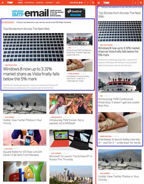
The image above shows the website displayed as two columns (on the left) and a single column (on the right). The blue outline shows the container around elements at the top of the page. You can see that the secondary stories to the right of the top story drop below it but remain above the other stories, due to the way the containers have been set up.
In the single column, the images in all of the first three stories are now physically the same size, so the hierarchy has changed. However, the second and third stories are still seen as “less important” because they come after the top story.
This intermixing is achieved by thinking in advance of which elements will shift columns and by placing elements that need to be rearranged in the same container, separate from other containers of content.
Time
Time magazine intermixes content across columns and containers. Notice how the “Latest Headlines” section (in the green container) moves from the right column at the top to just below the main image and story links in the single column.
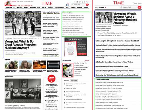
While not shown in the image above, the row of four images on the left follows the “Latest Headlines” in the single column. The remaining content in the right column drops much further down. You can see this by viewing the website directly.
The website achieves this intermixing by ignoring most of what I’ve said in this post about using fewer containers. Instead, it uses JavaScript to rewrite the HTML, moving elements in and out of different containers as the layout changes. It is another solution to this issue, although better planning up front is preferable.
Enoch’s Fish & Chips
The navigation on Enoch’s Fish & Chips’ website integrates with the logo and company blurb when the layout is a single column:

The navigation (and the tagline further down) moves to the right column when the browser is wide enough to accommodate multiple columns.
The website rearranges these elements similar to the way I rearrange elements on my own website; the logo, navigation, blurb and tagline are each a separate container. To move them around, the website uses positioning instead of floats, but otherwise, the principle is the same.

Closing Thoughts
Many of us have, understandably, been taking the easy way out with responsive layouts. When the width of a screen cannot accommodate a column, we’ve been dropping the column in its entirety below other columns. In some cases, this is perfectly fine. In others, it breaks the carefully designed hierarchy.
We face two issues in maintaining the hierarchy. The first is having to follow the HTML source order when the layout is a single column. The solution to this problem is a technical one and is coming in the form of new CSS specs that will allow the display order and the HTML source order to be different.
The second problem is less technical and more a challenge to how we think about structuring our HTML, particularly to how we use containers. Elements can’t move from one container to the next. We can fake it with complex CSS, or we can rewrite the HTML with JavaScript; but, ultimately, if we want to intermix elements, we’re best of using fewer HTML containers to create columns. Instead, we should leave more of our content blocks in their own containers and use CSS to create virtual columns in the layout.
This solution doesn’t confine our elements to structural containers and instead enables us to more easily rearrange the elements in different layouts.
Further Reading
- Content Strategy: Optimizing Your Efforts For Success
- Quick Course On Effective Website Copywriting
- Content: A Blessing, A Bubble, A Burden
- Content Knowledge Is Power
 (al, mrn)

