Content Knowledge Is Power

Email Newsletter
Weekly tips on front-end & UX.
Trusted by 200,000+ folks.


 Register!
 Flexible CMS. Headless & API 1st
“Content matters!” “Comp with real copy!” “Have a plan!” By now, you’ve probably heard the refrain: making mobile work is hard if you don’t consider your content. But content knowledge isn’t just about ditching lorem ipsum in a couple of comps.
Countless organizations now have a decade or two’s worth of Web content — content that’s shoved somewhere underneath their redesigned-nine-times home page. Content that’s stuck in the crannies of some sub-sub-subnavigation. Content that’s clogging up a CMS with WYSIWYG-generated markup.
Messy, right? Well, not as messy as it will be — because legacy content is the thing that loves to rear its ugly head late in the game, “breaking” your design and becoming the bane of your existence.

But when you take the time to understand the content that already exists, not only will you be able to ensure that it’s supported in the new design, but you’ll actually make the entire design stronger because you’ll have realistic scenarios to design with and for — not to mention an opportunity to clean out the bad outdated muck before it obscures your sparkly new design.
Today, we’re going to make existing content work for you, not against you.
What You Don’t Know Will Hurt You
When you’re working on something new and fun, ignoring the deep recesses of content is tempting. After all, you’ve got a lot to think about already: designing for touch, dealing with ever-changing screen sizes, adding geolocation features, maybe even blinging things out with a few badges.
But if content parity matters to you (and it damn well should if you care one whit about the “large and growing minority of Internet users” who always or mostly access the Web on a mobile device), then at some point you’ll have to deal with the unruly content lurking underneath your website’s neat surface.
Why? Because chances are there’ll be stuff out there that you’ve never thought about, much less designed for. And all that stuff has to go somewhere — too often, shoehorned into a layout it was never meant to inhabit, or perhaps not even migrated into a new template but instead left to wither in an outdated, mobile-unfriendly design.
Take navigation. As Brad Frost has written, designing small-screen navigation for small websites is simply tricky, any way you slice it.
Hard as it already is, it becomes downright impossible if you haven’t dealt with your legacy assets first. You’re sure to end up with problems, like a navigation system that only works for two levels of content when you actually have four levels to contend with, making all of that deeper information accessible only with hard to manage (and find) text links — or, worse, making it completely inaccessible except through search.
There’s a better way.
In The Belly Of The Beast
Mark Boulton has written eloquently on content-out design — the concept of determining how your design should shift for varying displays by focusing not on screen sizes, but on where your content naturally breaks down. It’s excellent advice.
But if you’re trying to work with a website with thousands of URLs — or anything more than a few dozen, really — you have to ask: Which content do I design with? Unless you’re relying on infinite monkeys designing infinite layouts to create custom solutions for every single page, you’re going to have to rely on representative content: a set of content that demonstrates the variety of information that the experience needs to support.
So, how do you know what’s representative? You get your arms around the size, scope, structure and substance of your content.
Yup. It’s time for the content audit.
People have been talking about content audits and inventories for more than a decade — in fact, Jeffrey Veen wrote about them on Adaptive Path back in 2002, calling them a “mind-numbingly detailed odyssey through your web site.” At the time, people were starting to yank their websites from static hand-coded pages and pull them into content management systems, and someone needed to sit down and sort it all out.
More than a decade later, I’d say content audits are more useful than ever — but in a slightly different way. Today, a content audit isn’t just an odyssey through your website; it’s a window into your content’s nature.
What To Look For
You could audit content for all kinds of things, depending on what you want to learn and be able to do with the information. Some audits focus on brand and voice consistency, others on assessing quality or identifying ROT.
There’s nothing wrong — and quite a lot right — with these priorities. But if you want to ready your content to be more flexible and adaptable, then you can’t just look at each page individually. You need to start finding patterns in the content.
It’s a simple question, really: What are we publishing? If your first answer is “a page,” look again. What’s the shape of this content? What is this content most essentially? Is it an interview, a feature story, a product, a bio, a recipe, an erotic poem, a manifesto? Asking these questions will help you see the natural pieces and parts that make up the content.
When you do, you’ll have a structural model for the content that matches your users’ mental model — i.e. the way they perceive what they’re looking at and how they understand what it means.
For example, I recently worked with a large publicly traded company whose website dates back to the early aughts. After a couple of responsive microsites, they’ve caught the bug and want to update everything. Problem is, the existing website’s a mess of subdomains, redirects and thousands of pages that are nowhere near ready for flexible layouts.
Our first step was to dig deep, like a geologist — except that instead of unearthing strata of shale and sandstone marking bygone eras, we identified and documented all of the forgotten templates, lost content and abandoned initiatives we could.
We ended up with a dozen or so content types that fit pretty much anything the company was producing. Sure, we still ended up with some general “pages.” But more often than not, our audit revealed something more specific — and useful — about the content’s nature. When it didn’t, that was often a sign that the content wasn’t serving a purpose — which put it on the fast track to retirement.
Once you’ve taken stock of what you have, gotten rid of the garbage and identified the patterns, you’ll also need to decide which attributes each content type needs to include: Do articles have date stamps? Does this need a byline? What about images? Features? Benefits? Timelines? Ingredients? Pull quotes? This will enable you to turn all of those old shapeless pages — “blobs,” as Karen McGrane has so affectionately labeled them — into a system of content that’s defined and interconnected:

This content model shows attributes for the “recipe” content type, and how recipes fit into a broader system.
Each bit of structure you add gives you options: new abilities to control how and where content should be presented to best support its meaning and purpose.
Regardless of what you want to do with your content — launch a responsive website, publish to multiple websites simultaneously, extract snippets of content for the home page, reuse the content in an app, mash it up with a third party’s content — this sort of structure will make it possible, because it enables you to pick and choose which bits should go where, when.
Tools For Auditing Content
The content audit may not be new, but some tools to help you get started are. Lately, I’ve been running initial reports with the ContentWRX Audit, which, for a few bucks, produces a detailed report of every single page of content that its spiders can find across your website.
Using CAT’s Web interface, you can sift through the report and see details such as page types, titles, descriptions, images and even the content in <h1> tags — super-useful if you’re assessing content of murky origin, because a headline often gives you at least a glimmer of what a page is about.
Here’s an excerpt of what it found for Smashing Magazine’s own “Guidelines for Mobile Web Development” page:

The CAT report shows a thumbnail of the page, as well as some data about its content. See the full screenshot for more.
While features such as screenshots of all pages and lists of links are useful for individual analysis, I prefer to export CAT’s reports into a big ol’ CSV file, where the raw data looks like this, with each row of the spreadsheet representing a single URL:

CAT also spits out detailed CSVs chockfull of raw data about all pages of a website. See the full screenshot for all of the fields.
It’s not perfect. For example, if content’s been abandoned and removed from navigation but left floating out there in the tubes, CAT typically won’t pick it up either. And if a website’s headlines aren’t marked up using <h1> (like Smashing Magazine, which uses <h2>s), then it won’t scrape them either.
What it is great for, though, is getting a quick snapshot of an entire website. From here, I usually do the following:
- Add fields for my own needs, such as qualitative rankings or keep/delete notations;
- Set up filtering and sorting so that I can slice the data by whichever field I want, such as according to the section where it’s located;
- Assess and rank each page according to whatever qualitative attributes we’ve settled on;
- Note any patterns in the content types and structures used, as well as relationships to other content;
- Define suggested meta-data types and tags that the content should have;
- Use pivot tables, which summarize and sort data across multiple dimensions, to identify trends in the content.
With this, I now have both the detailed information to drive specific page-level changes and the high-level patterns to inform structural recommendations, CMS updates, meta-data schema and other efforts to improve content portability and flexibility.
I like using CAT because it was designed by and for content strategists — and improved features are rolling out all the time — but you can also use a similar tool from SEOmoz (although it tends to sell you on fancy-pants reporting features), or even grab a report from your CMS (depending on which one you use and how it collects information).
Any of these tools will help you quickly collect raw data. But remember that they’re just a head start. Nothing replaces putting your eyes — and brain — on the content.
The Secret To Scale
You don’t have to love auditing content. You certainly don’t need to develop a sick addiction to pivot tables (but it’s totally OK if you do). What you will love, I promise, is what a deep knowledge of content enables you to do: create an extensible design system that doesn’t devolve at scale.
For example, let’s look at some of the larger websites that have started using responsive design. There’s higher education, of course, where early adopters such as the University of Notre Dame were quickly followed by a rash of college websites.
What do most of these websites have in common? Two things: a lot of complex content and a responsive system that carries through to only a handful of pages, like the UCLA’s website, where the home page and a few key pages are responsive, but the deeper content is not:
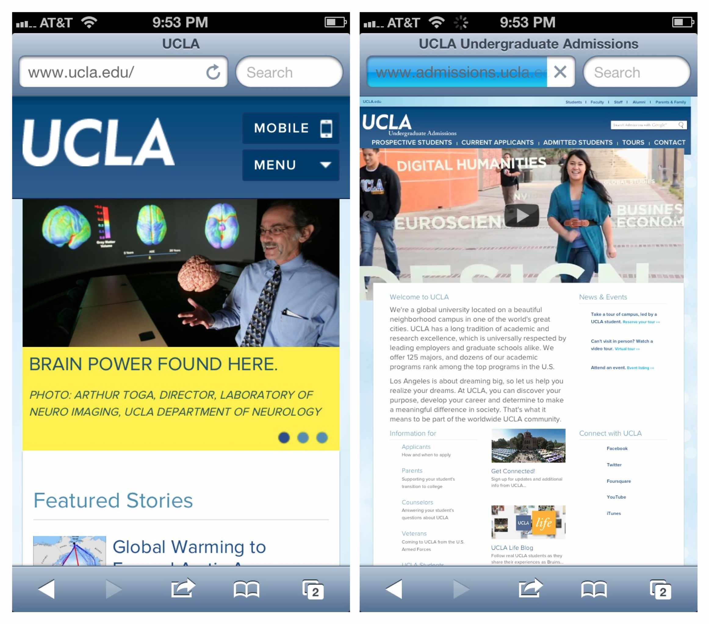
UCLA’s home page is responsive, but most of the website, like this landing page, is not. Larger view.
Why doesn’t that design go deeper? I’d bet it’s because making a responsive website scale takes work, as Nishant Kothary summed up brilliantly in his story of Microsoft’s new responsive home page from late 2012:
"The Microsoft.com team built tools, guidelines, and processes to help localize everything from responsive images to responsive content into approximately 100 different markets… They adapted their CMS to allow Content Strategists to program content on the site."
In other words, a home page isn’t just a home page. You have to change both your content and the jobs of the people who manage it to make it happen.
But one industry has had some luck in building responsively at scale: the media — including massive enterprises such as Time, People and, of course, the Boston Globe. These organizations manage as much or even more content than Microsoft and universities, but as publishers with a long history of creating professional, planned, organized content, they have a huge leg up: they know what they publish, whether it’s editorials or features or profiles or news briefs. Because of this, everything they publish fits into a system — making it much easier to apply responsive design patterns across all of their content.
Making Tough Choices
When you start breaking down your big, messy blobs of content and understanding how they really operate, you’ll realize there’s always more you could do: add more structure, more editing, more CMS customization. It never ends.
That’s OK.
When you understand the realities of what you’re dealing with, you’re better equipped to prioritize what you do — and what you choose not to do. You can make smart trade-offs — like deciding how much time you’re willing to invest now in order to have the flexibility to do more later, or what level of process change the current staff can handle versus the amount of flexibility you could use in the content.
There are no right answers. All we can do is find the right balance for each project, team and audience — and recognize that some structure is going to serve us a whole lot longer than none will.
Everyone’s Job
I get it. Going through endless reams of content ain’t your thing. You’re a designer, a developer, a project manager, damn it. You just want to get on with it, right?
We all do. But the more you seek to understand your content, the better your other work will be. The less often your project will go off the rails right around the time it’s supposed to launch. The fewer problems you’ll have with designs that “break” when real content gets inputted. The more the organization will be able to keep things in order after launch.
Best of all, the more your users will get the content they need — wherever and however they want it.
Thanks and credits go to Ricardo Gimenes, for preparing the front page image.
Further Reading
- Make Your Content Make a Difference
- Content: A Blessing, A Bubble, A Burden
- Content Prototyping In Responsive Web Design
- Quick Course On Effective Website Copywriting


