How To Design For A Maturing Android

Email Newsletter
Weekly tips on front-end & UX.
Trusted by 182,000+ folks.
 Register for Free
 Custom Web Forms for Angular, React, & Vue. Your backend.
 Celebrating 10 million developers


Android is huge: 480 million people currently use Android devices, and 1 million new devices are activated daily. This means that every three weeks, the number of people who activate new Android devices is equal to the entire population of Australia. (Recent studies by Nielsen show that more Android devices are on the market than iOS devices.)
Popular apps that become available on Android experience huge growth. For example, Instagram grew by 10 million users with the launch of its Android app — in just 10 days.

Despite this unprecedented expansion of the platform, the majority of Android apps are… well, not great. Fewer quality apps are in Google Play than in the iTunes Store. Part of the reason for this is that Android has been going through puberty in the past few years. It was disorganized and erratic, and many designers avoided it — even hated it — and naturally gravitated towards iOS.
Some of Android’s problems no longer exist, and others have been blown out of proportion. For the ones that do exist, we’ll provide guidance on how to deal with them and how to start designing your first great Android app.
Symptoms Of Puberty
Many Android apps underperformed because the platform wasn’t mature enough to allow great apps to emerge. Though a powerful laboratory — it offered manufacturers and developers the freedom and openness to create whatever they wanted — not many wanted to work in a sandbox environment every day. But that sandbox has since coalesced into a foundation for great design.

The points below are what you might remember about Android — and possibly what curbed your desire to give it a try — but these issues have also been eliminated or improved. If your concerns appear in this list, then the next section will demonstrate how they’ve been resolved with Android’s maturation and how you can design a better app as a result.
Lack Of Consistency In Google’s Own Apps
Not long ago, almost all of Google’s own Android apps looked different from each other.
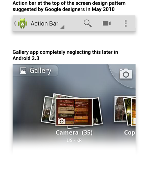
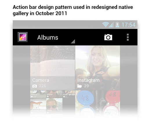
Google took more than a year to start following its own advice. The action bar design pattern was presented in 2010 but wasn’t implemented until October 2011, with Android OS 4.0.
Lack Of A User-Centric Design Culture In The Android Community
Google’s failure to set an example for other developers (because of its own inconsistencies) and the lack of consistent design guidelines and patterns contributed to another bigger problem: poor user experience. Good design starts with people; it leverages technology to help users accomplish their goals. Google wasn’t communicating this to developers clearly enough (unlike Apple).
Dramatically Inconsistent Experience Between Devices And OS Versions
Manufacturers often customize the system’s UI and hardware buttons. This contributed to fragmentation, made testing and quality control much harder and made consistency in app design nearly impossible.
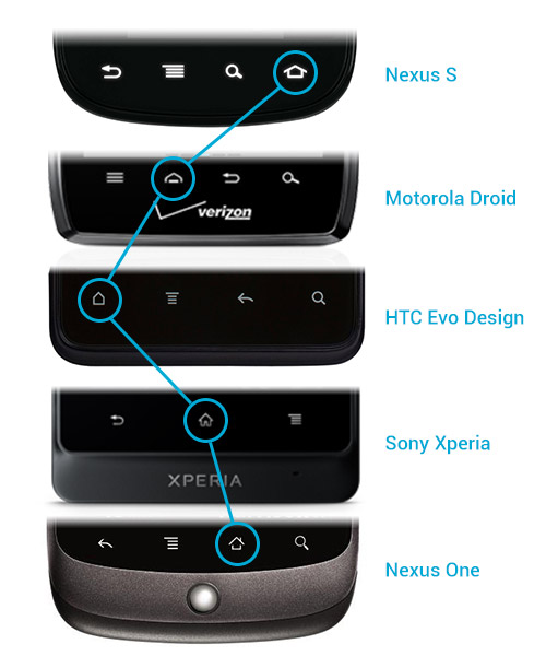
Manufacturers used to put hardware buttons in different orders. Switching between devices was a pain.
Properly testing apps in the changing and fast-growing market was difficult for developers. Thus, a majority of apps didn’t function as they should have or were poorly designed.
Those apps are still there, but yours doesn’t have to be one of them. Android has since improved, enabling you to create a better and more consistent experience for your users.
Android Has Matured
The Android user experience today is more robust than ever before, making it easier for app designers and developers to deliver great apps. While some of the earlier problems still exist, most have become more manageable — and many more have been solved altogether.
One fundamental problem remains, however: there aren’t enough great apps. But with an improved and mature Android platform, designers and developers can solve this problem. All we have to do is give Android another chance.

The areas below are what the mature Android has to offer.
Better App Discovery
Previously, the discovery process was limited to searching by keyword and then trying out all of the results. The new Google Play store offers better discovery through featured apps and staff picks.
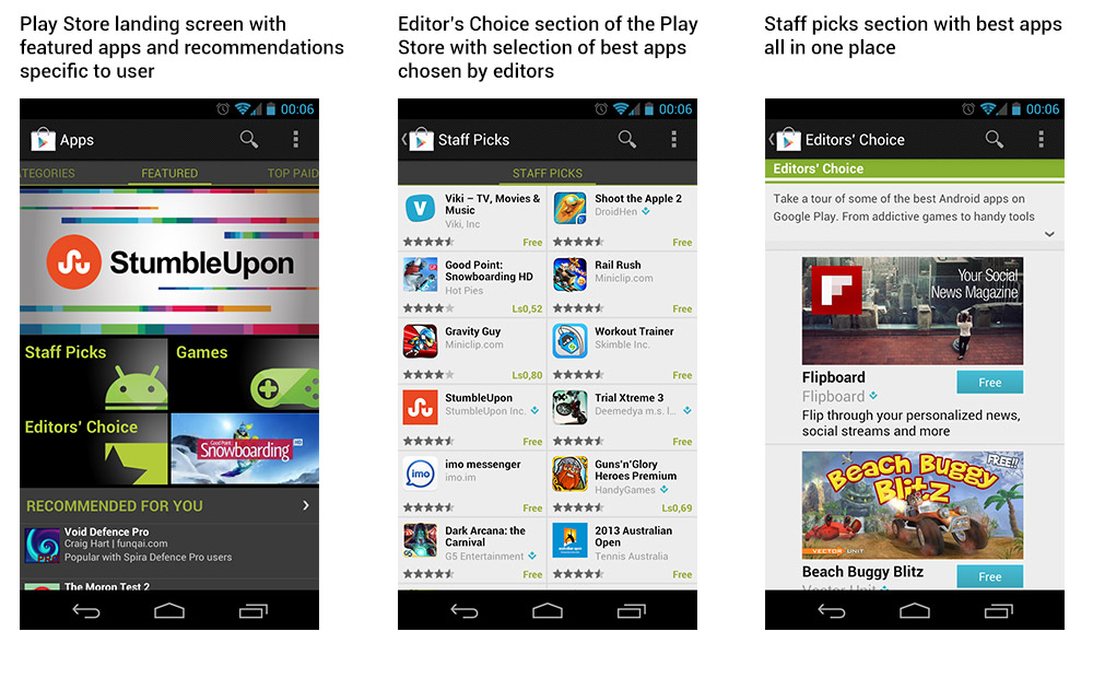
The new Google Play store offers more ways to discover cool new apps than its predecessor, Android Market.
Proper Android Design Guidelines
Until recently, no direction was provided for the basic elements that every app requires. Google has since created design guidelines, which remove the burden of small design decisions from app designers and developers. We can finally focus on the core value of the apps we’re creating and ensure a consistent experience across devices.
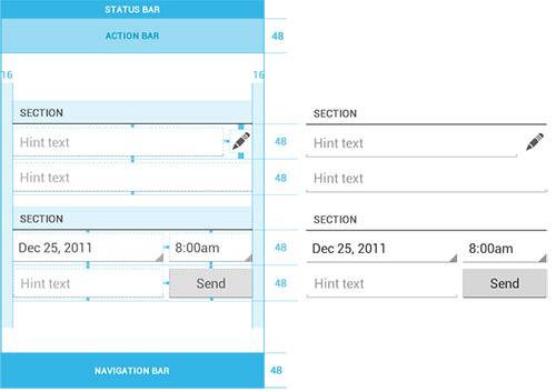
Example of a grid and a 48 density-independent pixel (DP) rhythm, taken from the “Metrics and Grids” section of the guidelines.
Menu And Search Hardware Buttons Are Gone
Google has started removing hardware buttons from its devices, uniting the hardware and software and making Android devices more elegant and easier to use.
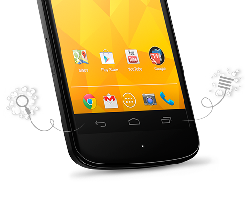
The Nexus 4 is an instance of Google’s new approach to hardware buttons. They are always there, always in the same order. And gone are the search and menu buttons.
A variety of Android device types still exist (for example, LG still produces devices with Android 4.0 and hard menu buttons), yet this diversity is one of the main reasons why Android apps are able to excel.
Fragmentation Isn’t All Bad
Fragmentation may be the biggest remaining challenge facing designers and developers, and it’s built into Android’s DNA — a permanent part of the Android experience. This diversity offers designers an opportunity to reach an unprecedented number of people globally.
Learning to work within this fragmentation will make you a better designer or developer overall, with broader knowledge and an improved skill set. Given the rewards, the challenge is worthwhile to pursue. And to succeed in this pursuit, here are a few things to keep in mind when creating your Android app.
Tips For Creating A Successful Android App
Get To Know Android
To understand Android, you should learn how to use it and get to know its users. The best way to do this is by buying several devices from different manufacturers, with different screen sizes and maybe even OS versions. This will help you not only to understand user diversity but also to test your app.
To choose the best devices for your app, check the latest statistics from Google and select a device with your desired specifications. Independent studies, such as OpenSignal’s August 2012 report, can also help you select devices.
Something to keep in mind is that Android updates are controlled by service providers and, as a result, usually arrive earlier on devices that are created in collaboration with Google, such as the Nexus series. Picking up the latest Nexus devices will keep you on the cutting edge of platform releases. You can save money by buying a used device, but make sure it runs the version of Android that you need before purchasing it (many old devices are no longer updated).
Talk to your Android-using friends about how they use their devices and what they are happy and unhappy about. That will help you get to know the environment and bring you into the culture.
Follow The Guidelines
Following the guidelines will help you create an app that feels native to any device. But that’s just one of many reasons why following them is worthwhile. They can also help you achieve the following:
- Create an app fit for virtually any device,
- Make the app feel true to Android,
- Provide a UI that is familiar to users,
- Make the app easier to develop and support,
- Increase the app’s chances of being featured in Google Play.
Keeping Android navigation patterns in mind and using elements that are native to the platform will also help you create a consistent experience across devices.
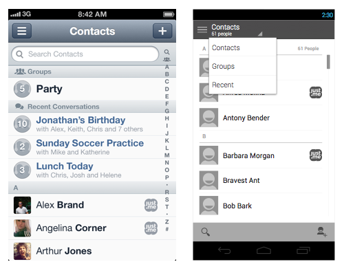
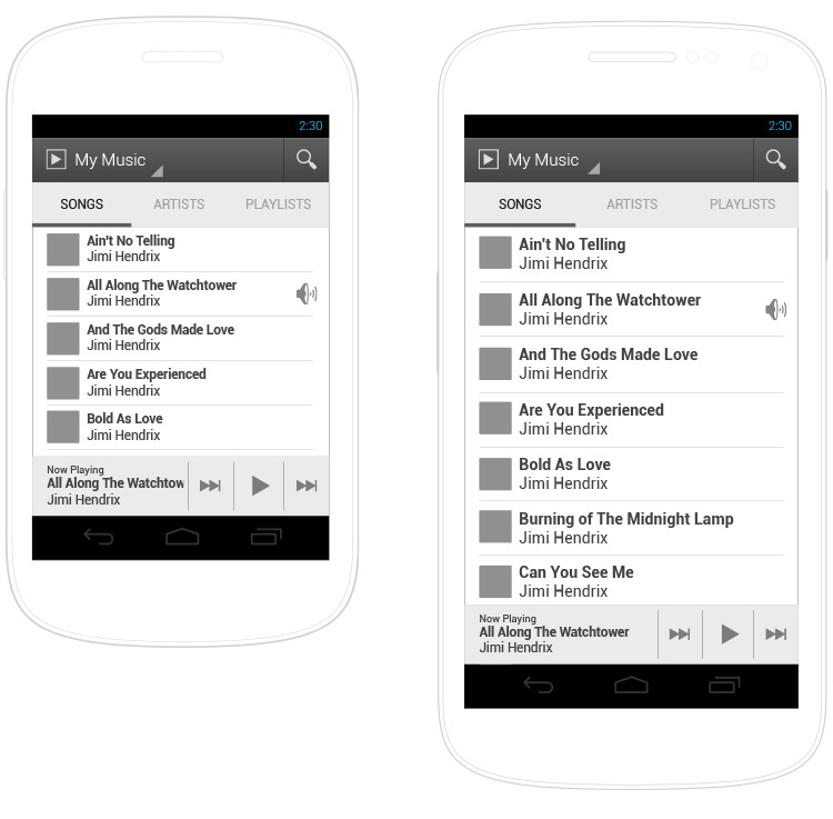
When bringing an iPhone design (left) to Android (right), use elements that are native to the platform: this table view is styled for Android; the buttons for searching and adding contacts are moved to the split action bar at the bottom; and switching between data views is done through the view control.
Custom apps are more difficult not only to support, but also to design when ensuring operability across devices. New Android apps look great thanks to the new design guidelines; they are also very different from apps created before Android 4.0.
Understand Android’s Look And Feel
Google has invested a lot of effort in bringing a consistent visual experience to all of its products, including Android. Android 4.0 introduced its own style: simple, plain, clean — more about function than form.
Although this provides great freedom in styling, you still have to consider the subtlety of Android’s visual style: saying more with less. Simply copying the styles and elements from an iOS app might not work. And releasing a new app with old styles or with elements that look like they belong on another platform could make users react negatively — which happened to Microsoft.
Browsing Android Niceties is a great way to grasp Android’s style and to find inspiration.
Google’s Search app is a great instance of Android’s look and feel.
A good way to distinguish your app is through its icon. App icons for Android can take any shape or form. Users love great-looking icons and will gladly put your app on their home screen even if they don’t use it often. For tips on designing your icon, read the “Iconography” section in the guidelines.
![]()
App icons for Android can take any shape and form you want.
Build For Different Hardware Types
When designing your app, ensure that it will run properly on most devices. Keep in mind not only different screen sizes and aspect ratios, but also screens with low brightness or poor contrast and color, as well as slow, weak hardware.
For example, less-expensive devices might have smaller displays with lower contrast, so text that appears big enough on new devices with large screens might appear illegible there. Low contrast of text and visual elements might compromise the user experience as well.
Designs created according to the guidelines will easily scale to fit virtually any screen.
A few more things to keep in mind:
- Use contrasting colors for text and elements. For example, don’t use white on gray for important elements; they’ll just blend together on bad displays.
- Check your design on several devices with different brightness settings (low, high, auto) and in different lighting conditions.
- Even when using standard sizes, make sure your text and UI elements appear big enough on small screens (i.e. screens with a DPI lower than 240). You might want to adjust these elements specifically for small devices.
For a great example of designing for diversity, read Sebastiaan de With describe the process of creating the Alarm app.
Use Density-Independent Pixels To Define Layout
Part of providing a consistent experience is ensuring that UI elements stay roughly the same size across Android devices with varying pixels per inch (PPI). This doesn’t have to be a laborious task of calculating the number of pixels a button or font should contain in order to look great on a particular screen size. You can make the device do the work for you.
The recommended size for buttons in the action bar is 48 DP, which will result in different pixel sizes on different screens, but you don’t have to worry about that.
By defining sizes with density-independent pixels (DPs), you ensure that elements will appear at about the same physical size on any screen. Text will remain readable, and buttons will be comfortable to tap on any Android device, regardless of screen size or DPI. (See the section “Use Density-Independent Pixels” in the guidelines for more.)
In our practice, giving developers guidelines on sizes of elements and fonts has proven useful.
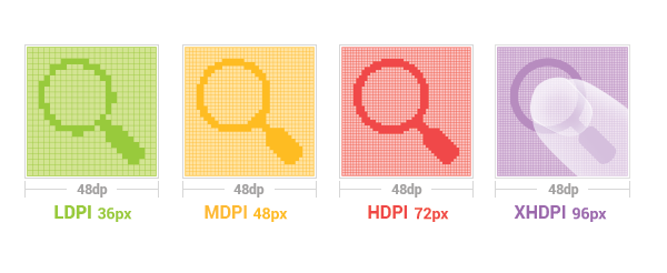
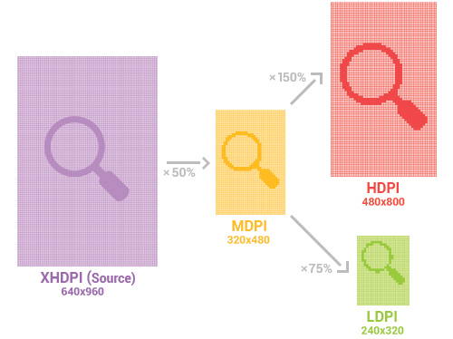
6. Create Assets For All Densities
Four sets of assets are required to accommodate all Android devices and to make the interface crisp: low density (LDPI), medium density (MDPI), high density (HDPI) and extra-high density (XHDPI). Start with a 640 × 960 screen for XHDPI assets, and then scale them down for other densities.
![]()
Start with XHDPI, and then scale down to other densities. Compare the actual sizes of these assets.
MDPI and XHDPI resolutions are exactly the same as the iPhone’s regular and Retina screens. So, if you have an iPhone design, you can use it to style the Android counterparts, or you could even test your designs on iPhone or iPod screens. But don’t forget about Android’s unique look and feel.
An XXHDPI bucket has been added to support the next generation of mobile devices, those with approximately 480 DPI screens. Although no such devices exist yet, the XXHDPI bucket is used today for launcher icons on XHDPI 10-inch tablets, such as the Nexus 10. (Because these devices are so large, the launcher icons are scaled up using the XHDPI assets.) To accommodate the next generation of screens, all you’ll need to do is scale your HDPI assets up by 200%.
Consider Different Versions Of The OS
Many Android devices will never be updated to the latest OS; it takes a couple of years for new versions to dominate the market. But users with newer devices won’t be pleased with apps whose looks or controls are outdated (as demonstrated by Microsoft’s Outlook app, mentioned earlier). So, deliver the most up to date experience possible. If you intend for the app to run on older platforms, create a separate version of the app for those devices.
Expand Your App With Widgets And Live Wallpapers
Take advantage of Android’s engaging features, such as widgets, live wallpapers and notifications. Widgets enable users to receive updates without running the app, and notifications are improving with each version of Android. Google is providing great support for designers and developers on how to notify users.
Widgets are a convenient way to peek into an app without opening it. This enables you to focus a user’s attention on a small portion of information, which would then expand within the app.
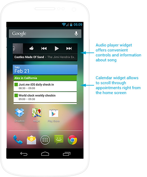
Widgets may have buttons and scrollable areas. Think of them as advanced app icons.
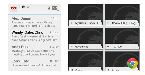
Gmail’s widget offers a sneak peek into the mailbox and enables users to compose mail right from the home screen. Chrome’s grid-view widget displays favorites or history.
Android users love to customize their devices and make them personal, and these items give them greater flexibility to do so.
Properly Test On Devices You Support
One of the most common reasons for negative reviews in the Play store is an app not functioning as promised. Target your design to the most popular devices, and release only for the ones you have tested; otherwise, you’ll end up with bad reviews from people frustrated by your app not working properly.
The highly successful Dead Space game receives most of its one-star reviews because the game doesn’t run on certain devices.
Design For Tablets, Too
Although several great Android tablets are on the market, they are not as popular as competitors such as the iPad. But if your goal is to build a truly universal Android app, then you need to consider tablets as well. The guidelines advise designers to use multi-pane layouts for tablet UIs and to build their interface using fragments.
Tablets use the same graphical assets as phones, but consider the context in which tablets are used. For instance, people usually hold tablets further away from their eyes than phones and, thus, are less precise in their tapping. So, the UI will require larger fonts, bigger buttons and more white space around elements.
Don’t forget to run your app through the “Tablet App Quality Checklist” as well.
Give Android A Chance
Designing for Android might be challenging in the beginning — it’s not as simple as it looks — but by following these 10 steps, you’ll have a head start on delivering a fantastic user experience and building a truly great app.
Give Android a chance. Designing for this newly matured platform is an interesting and educational process, and you’ll deliver a great-looking app while obtaining a new set of skills. You might find the experience to be very rewarding.
Update: While we were writing this article, case study has been published by The Verge about the Facebook Home application — next big thing for Facebook. But this isn’t about Facebook anymore. Thought this particular application is quite controversial, with limited device support and experience far from perfect, Fb designers have proven that with enough effort 100% of your ideas can be implemented and delivered on Android with no compromise. They have revealed a great opportunity and may even have marked the beginning of a new trend of creating greater presence on Android.
Examples Of Great Android Apps For Inspiration
- The Verge
- doubleTwist Alarm
- Skype
- Evernote
- Foursquare
- Tumblr
- New York Times
- Path
- Endomondo
- Expedia
Further Reading
- How To Design For Android
- Mobile Design Practices For Android
- How To Simplify Networking In Android
- Bringing Your App’s Data To Every User’s Wrist


