Making Sense Of Type Classification (Part 2)

Email Newsletter
Weekly tips on front-end & UX.
Trusted by 200,000+ folks.

 Register!


 Flexible CMS. Headless & API 1st
In the first installment of this two-part series on type classification, we covered the basics of type classification — the various methods people have used, why they are helpful, and a brief survey of type history, classifying and identifying typefaces along the way. Unfortunately, we only got as far as Roman (traditional serif) typefaces and the early-19th century. Now we’re back for part 2!
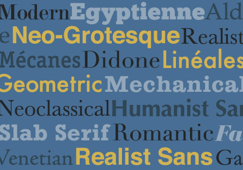
Part 2 will primarily cover sans typefaces, with a nod to display typefaces and other less common categories, as well as address a few of the questions people have about whether type classification is helpful and necessary.
If you haven’t read part 1, now’s your chance to go over it. It lays important groundwork for this article, covers the categories of serif typefaces, and contains plenty of useful information about the development of serif type. If you already have read it, here is a quick recap to get us started before we move on to the new material.
Review
Type Classification Systems
Type has been classified in many ways over the years, both formal and informal — Thibaudeau, Vox, British Standards, etc. None of these are complete or all-encompassing, but they’re helpful as an aid to study as well as for learning to use type correctly and effectively. The material in this two-part series draws heavily from the Vox-ATypI system, which is the most “official” of the systems today, having been adopted by the Association Typographique Internationale in 1962 and still the most commonly referenced system.
Is it perfect? No, but it provides a good overview of what is out there; and when you describe typefaces using the terms you’ll learn in this series, anyone who is reasonably familiar with typography will know what you’re talking about.
Here is a quick overview of the type categories we covered in part 1.
Humanist/Venetian
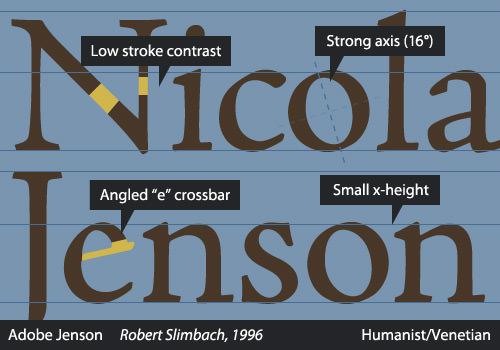
- Notable calligraphic influence, patterned after handwriting.
- Strongly angled axis or stress.
- Based on typefaces designed in Renaissance cultural hubs such as Venice.
Garalde
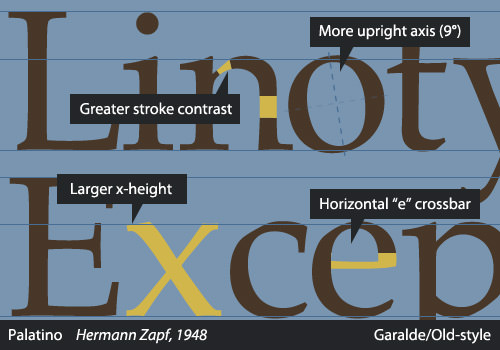
- Less calligraphic influence because type began to be viewed as separate from writing.
- Named after influential type designers Claude Garamont and Aldus Manutius.
- Still has a tilted axis but less obvious than in Humanist type.
Transitional/Neoclassical
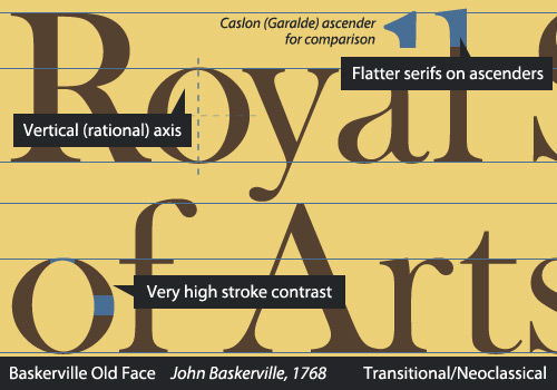
- No calligraphic influence. Designed independently, sometimes on a grid.
- First appeared in the late-17th century.
- Virtually vertical axis and high contrast between heavy and thin strokes.
Didone
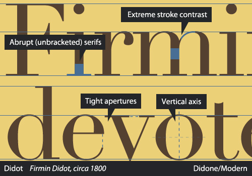
- Extreme contrast between thick and thin. Rigidly vertical axis.
- Abrupt, or unbracketed, serifs. Very precisely designed.
- Named after Firmin Didot and Giambattista Bodoni.
Slab Serif
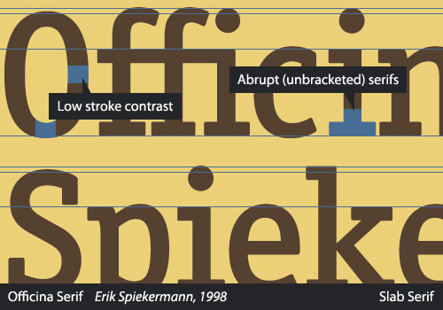
- Very heavy weight and low contrast between thick and thin.
- Unbracketed, prominent serifs.
- First typefaces created expressly for display purposes.
Sans Serifs
When we left off in part 1, it was circa 1815, with the first appearances of slab serifs, also called Mechanistics or Egyptiennes. By the time slab serifs were being popularized, early sans serifs had already been around for some time in a variety of forms. To follow the progression of sans serifs, we must step back in time a number of years.
History Of Sans Serifs
The earliest sans-serif letterforms were, of course, not type, but inscriptions, dating back to as early as the 5th century BC, and enjoyed a resurgence in engraving and inscriptions in the 18th century.
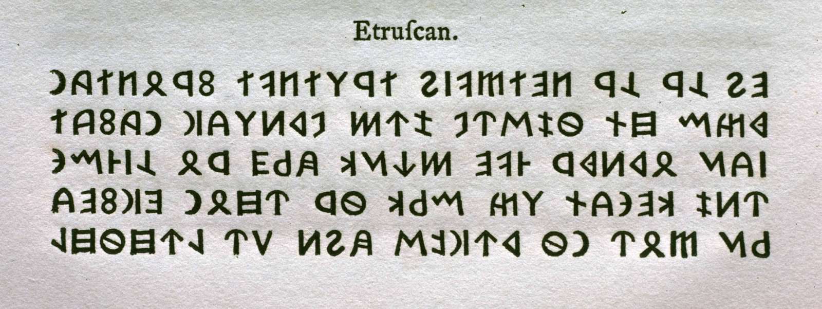
Caslon’s Etruscan type, as seen in a 1766 specimen book. Larger view. (Image source: Typefoundry)
Strangely enough, the first “sans serif” type was created not for the Latin alphabet, but for use in 18th-century academic works on Etruscan culture, which preceded the Roman Empire in the geographical area of modern-day Italy. Circa 1748, the foundry of William Caslon (with whom you should be familiar) cut the first known sans-serif Etruscan type for the Oxford University Press, although there are earlier usages of sans serifs in similar applications.
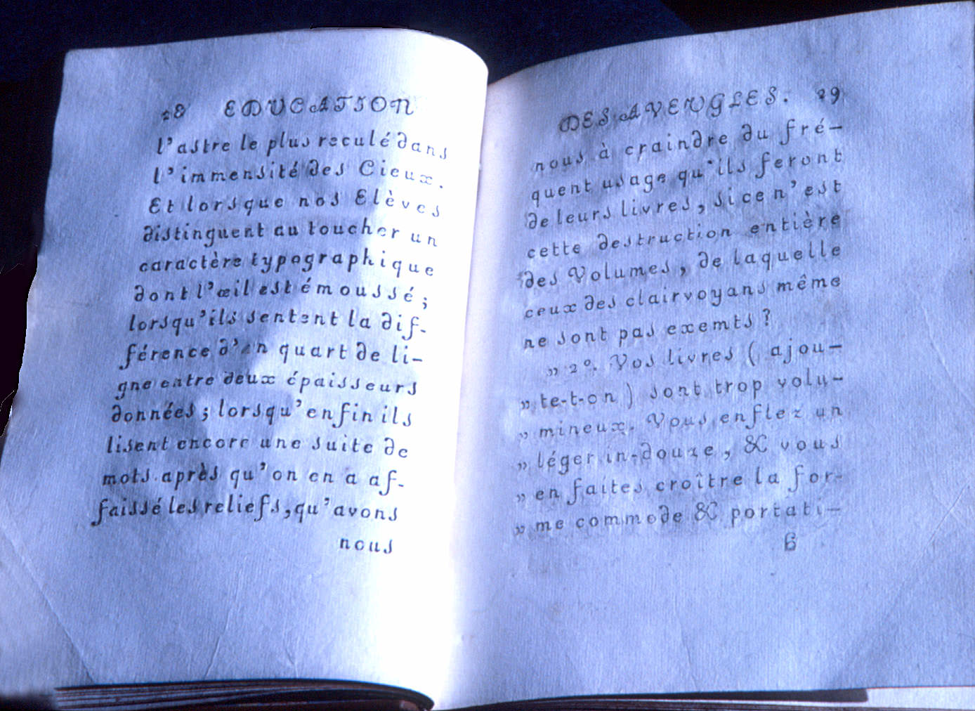
Haüy’s type, created to emboss pages so as to be read by touch, was oddly ornate for its purpose. Larger view. (Image source: Camille Sourget)
Another interesting typographic innovation was the work of Valentin Haüy, who founded a school for blind children in 1785. In 1784, a year of preparation during which he devoted himself to educating a single student, Haüy developed an embossing typeface with which to make tactile books. The typeface, which, along with his method, is called the Haüy System, is an early form of sans serif, but it reads more like an upright italic or a disconnected script.
It was first embossed and then often carefully inked over the top so that it could also be read visually, as in the photo above. It looks lovely, but was superseded in both practicality and readability by the system devised by Louis Braille, himself a student at the school Haüy founded.
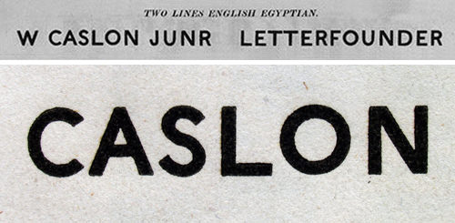
William Caslon IV’s sans serif was categorized as “Two Lines English Egyptian,”. (Image source: typophile)
William Caslon IV — who inherited the type foundry, as well as his name, from four generations back — is credited with the first sans-serif printing type for the Latin alphabet, appearing first in the 1816 Caslon specimen book. It featured only capitals and was marketed as “Two Lines English Egyptian,” the “Two Lines” being a reference to the size of the set type. There was much confusion over this new style, being variously called Egyptian (despite early slab serifs also being marketed as Egyptians), Gothic, Grotesque and Antique, among others.
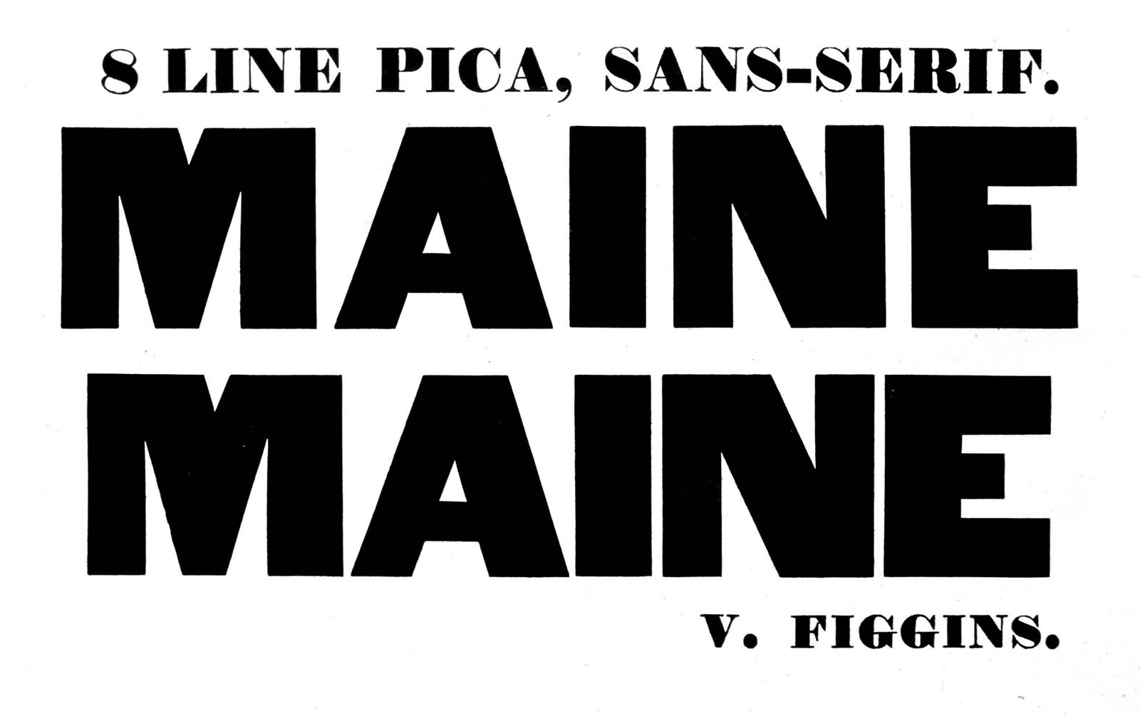
A sans from an early Vincent Figgins type specimen. Larger view. (Image source: Typefoundry)
Eventually Vincent Figgins (whom you may remember as being credited with the first slab-serif type) called the new style “sans serif,” which became the widely accepted term, although you’ll see many of the old terms in use on some typefaces.
Classifying Sans Serifs
At first glance, you might think that sans serifs can’t be classified the way that serifs can, since fewer variables are apparent in the ones we see most often. However, plenty of details can aid specificity when discussing, using and pairing typefaces, even within the broader category of sans serifs or, as Maxmilien Vox termed them, “linéales.” Subcategories were implemented by the British Standards classification, a permutation of Vox’s system, and they provide excellent means of discerning characteristics. I am presenting here a slight variation of those four, with a couple of minor differences for the sake of practicality.
Grotesque
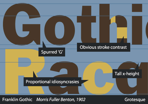
The Grotesque category covers the early sans serifs, specifically those designed in the 19th century and the first decade or two of the 20th. Many of these typefaces had only capitals or exist only in centuries-old specimen books, but a number of them are still quite commonly used. These typefaces tend to be very idiosyncratic, with awkward weight distribution around bowls of characters and irregular curves.
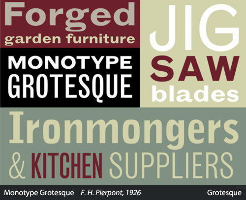
(Image source: MyFonts)
Monotype Grotesque (above, 1926), based on Berthold’s much earlier Ideal Grotesque (1832), is an excellent example of the quirks commonly evident in Grotesques. Note the awkward “a” and “g,” the squarish bowls, the odd curves and angles at the tips of strokes in the “J” and “S,” and the overall irregularity.
The capital G in a Grotesque is usually spurred, and the British Standards specifies a curled leg on the capital R, although that is not apparent in many typefaces of the period. They tend to display some variation in the thickness of strokes, but the contrast does not show calligraphic influence or a logical pattern. The style became more sophisticated over the course of the 19th century. Perhaps the finest sample of this category appeared in the Berthold Type Foundry’s 1896 release of Akzidenz-Grotesk, which, along with Schelter Grotesk (1886), served as an archetype for many Neo-Grotesques, most notably Neue Haas Grotesk and Univers.
Interestingly enough, it has been postulated that Akzidenz-Grotesk was based on Walbaum or Didot. Despite looking extremely different at first glance, a simple comparison of the basic forms shows that the metrics are very similar.
Examples of the Grotesque category include Franklin Gothic, Monotype Grotesque and Schelter Grotesk.
Neo-Grotesque
The Neo-Grotesques, also called Transitionals or Realists, include many of the most commonly used sans. They are based on the later Grotesques and take the design of the sans-serif to a new level with their careful construction and aesthetics. They are much more refined than the Grotesques, during which period type designers were still feeling their way around the new style; thus, the Neo-Grotesques lose many of the awkward curves and idiosyncrasies that are common in earlier sans serifs. You’ll see much less variation in line weight, and most often a single-story “g.”
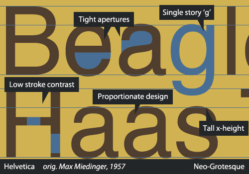
Created with an emphasis on neutrality and simplicity, they were extraordinarily popular among the Modernists and remain popular today. Despite many claims otherwise, simplicity does not directly translate into legibility: A tight vertical rhythm and pinched apertures keep many Neo-Grotesques (including Helvetica) from being good choices for body text. In fact, in the 2013 edition of the DIN 1450 (the German standards on legibility in typefaces, published by the Deutsches Institut für Normung), Helvetica is used as a negative standard. That’s an entirely different topic, however.
In 1957 — a big year for Neo-Grotesque sans serifs, as Frutiger’s Univers as well as Folio (originally thought to be a stronger competitor, although history has proved otherwise) were released — Haas Foundry released Max Miedinger’s Neue Haas Grotesk, which drew heavily on Schelter and Akzidenz Grotesks. In 1960, Haas, in an effort to market it more effectively, rebranded Neue Haas Grotesk to what we know as one of the most ubiquitous typefaces of all time — you guessed it — Helvetica.
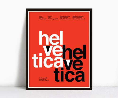
Many people love Helvetica so much that they’ll hang prints of vintage Helvetica specimens as decoration. (Image source: etsy)
The quintessential members of this group are, of course, Univers and the immortal Helvetica, which has gone through quite a number of permutations over the years (as have all of these typefaces) and was recently revived by Christian Schwartz as a rerelease of Neue Haas Grotesk. A nice informational minisite was created by Indra Kupferschmid and Nick Sherman for the release. Other typefaces in this category include the DIN 1451 and its derivatives, and Bell Gothic and its successor Bell Centennial.
Humanist
If you remember the most important quality of Humanist serif type, you’ll be relieved to learn that the same quality carries over to the sans serifs! The primary characteristic of Humanist type, both serif and sans serif, is a strong calligraphic influence, basing its shapes and flow on forms that could originate from a pen or brush. This means a much higher stroke contrast, and some Humanist sans even feature some stress, whereas nearly all other sans serifs have a completely vertical axis.
Another interesting characteristic of Humanist sans serifs is that their proportions often derive largely from Roman inscriptions and early serif typefaces, rather than 19th-century sans serifs as the Neo-Grotesques did. Because of this design process involving older letterforms, the lowercase “a” and “g” are most often two-story in Humanist sans serifs. All of these characteristics combine to make most Humanists a more legible choice than other types of sans faces.
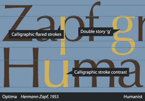
Hermann Zapf’s Optima is one example that clearly shows the calligraphic heritage, with an unusually obvious difference between thick and thin strokes, while many others in this category have more subtle features. The Humanist sans group includes classics such as Gill Sans and Frutiger as well as more recent releases like Myriad (1991), Trebuchet (1996) and Calibri (2005).
Geometric
Geometric sans serifs are exactly what their name suggests. Instead of being derived from early Grotesques, like a Neo-Grotesque, or from calligraphic and engraved forms like the Humanist sans, they are built on geometric shapes. The characters often have optically circular bowls and are otherwise typically very rectangular, sharing many components between the various glyphs.
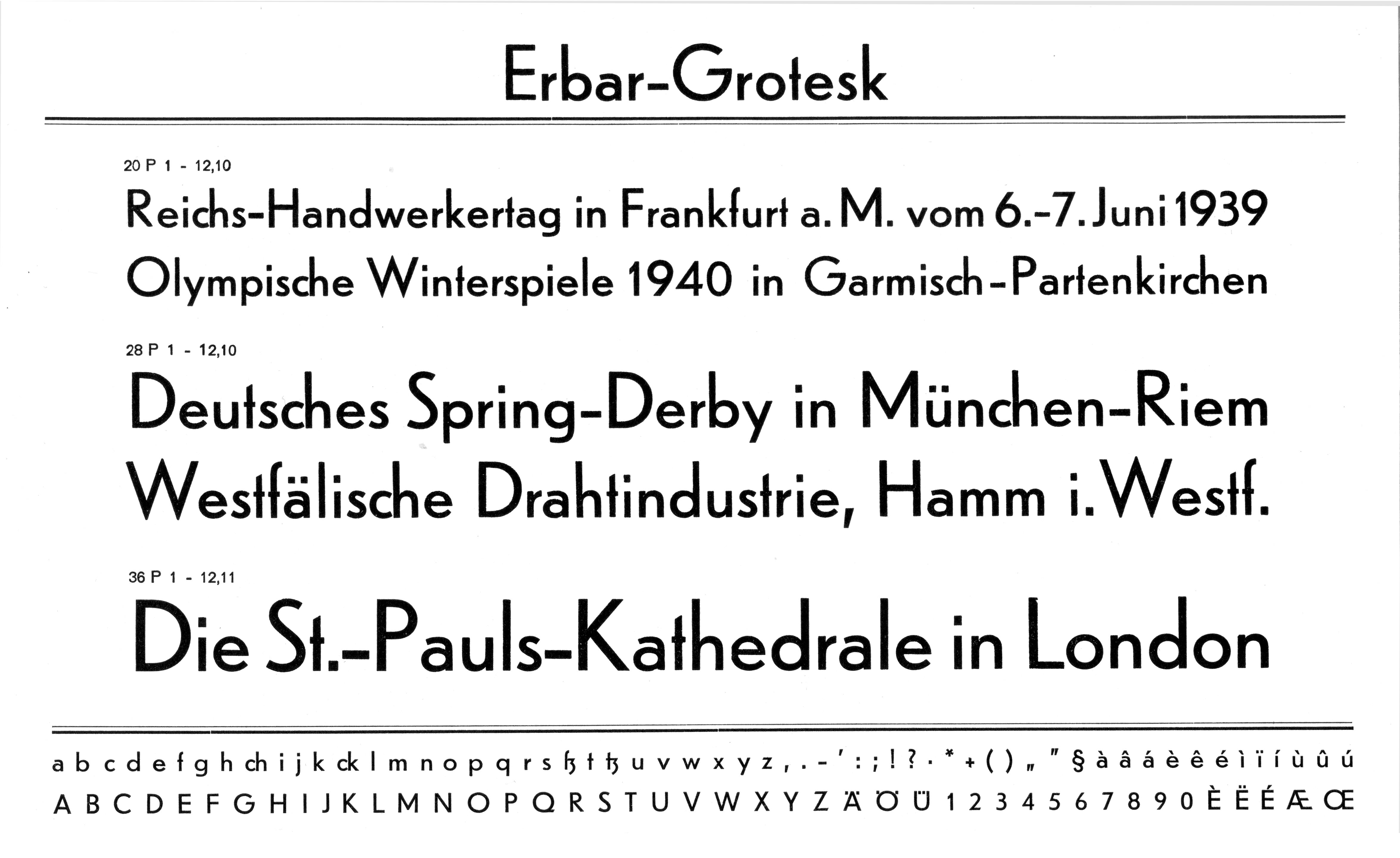
Erbar’s small x-height, among other factors, renders it difficult to read. Larger view.
Jakob Erbar, whose eponymous typeface is credited as being the first Geometric sans, reportedly based his construction on the circle. Released in the 1920s, Erbar-Grotesk was intended to be legible. Ironically, because of the awkward visual rhythm, resulting from strict adherence to geometric forms, Geometric lineals are among the least legible of sans serifs and are usually suitable only for display type. Geometric sans serifs usually show little or no stroke contrast and usually feature a single-story lowercase “a.”
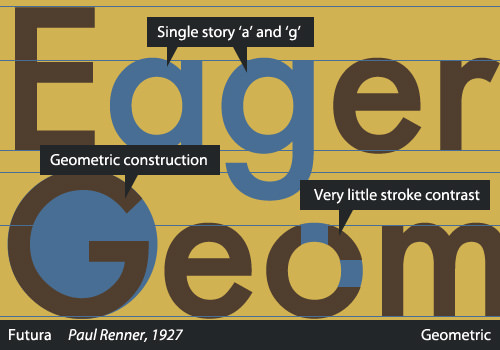
Paul Renner’s Futura, Koch’s Kabel and Lubalin’s Avant Garde are typical examples of the style. H&FJ’s Gotham is also a Geometric sans, although it is less strictly geometric than some and allows for more variation in the heavier weights.
The Rest Of The Story
That’s the basic classification for sans serifs! While the two parts of this series primarily deal with serif and sans type, there are many other styles to consider. The Vox-ATypI system also provides five subcategories of “calligraphics” (i.e. type that is derived from handmade letters), but as they are largely self-explanatory, I won’t dedicate much space in this already lengthy article to them. Here is a brief summary of each category.
Scripts
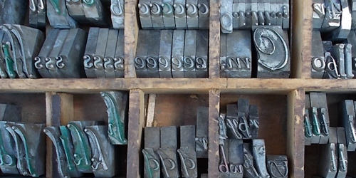
A case of script metal type. (Image source: Etsy)
Scripts are, of course, typefaces based on handwriting, particularly formal scripts. The letters often connect, but not necessarily so. They range from the very formal — Matthew Carter’s Snell Roundhand, named after the author of a 1694 booklet on penmanship, originally released in 1966 — to the very casual — Ashley Havinden’s eponymous Ashley Script, from 1955.
Glyphic
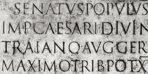
Carol Twombly’s Trajan was based on this inscription at the base of Trajan’s Column in Rome.
Glyphic typefaces are those derived from engraved or chiseled letters. Many of these typefaces look like they could be classified as serifs but are based on the work of a chisel, rather than having gone through the traditional design process and referencing the stroke of a pen. As such, Glyphics, also called “incised” typefaces, sometimes contain only capitals, and the serifs tend to be small, as a natural detail of the chiseling process rather than as a design feature. Trajan and Friz Quadrata are excellent examples of this style.
Graphic
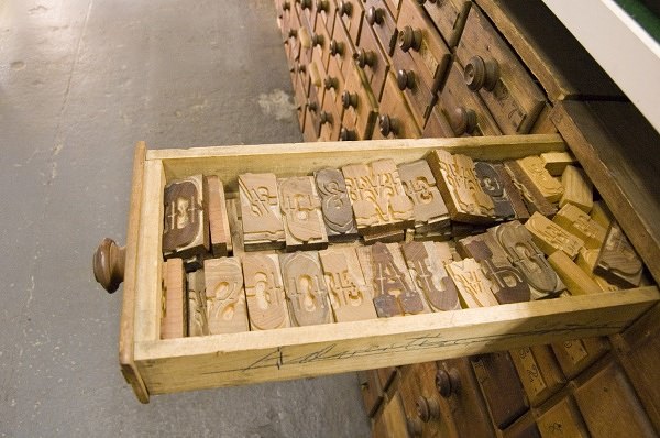
Graphic wood type from the extensive Hamilton Wood Type collection.
Graphic is essentially a sort of catch-all label for display type that doesn’t fit into any other category. It includes anything that would be drawn or designed, with a brush, pen or any sort of tool. If it’s not exactly a sans, not exactly a serif, and you’re not really sure what it is, it is most likely a Graphic typeface!
Blackletter
Gutenberg printed with type designed to mimic the late-medieval Fraktur style of handwriting. (Image credits: JMWK)
Blackletter type began with Gutenberg and was used in printing, even printing body text, until the early- to mid-20th century in Germany. It is based on a medieval scribal hand, written with a broad-nib pen, and differs from graphic typefaces and scripts in that it has been used at length in body text. It has a very dense type style. When the traditional style that Gutenberg had used began to give way to the more readable early serifs (the Humanist/Venetian designs of Aldus Manutius and his colleagues), printers called the new style “Whiteletter,” in reference to the negative space-to-ink ratio on the page; thus, the old type was termed Blackletter, and we still use this term today.
Gaelic
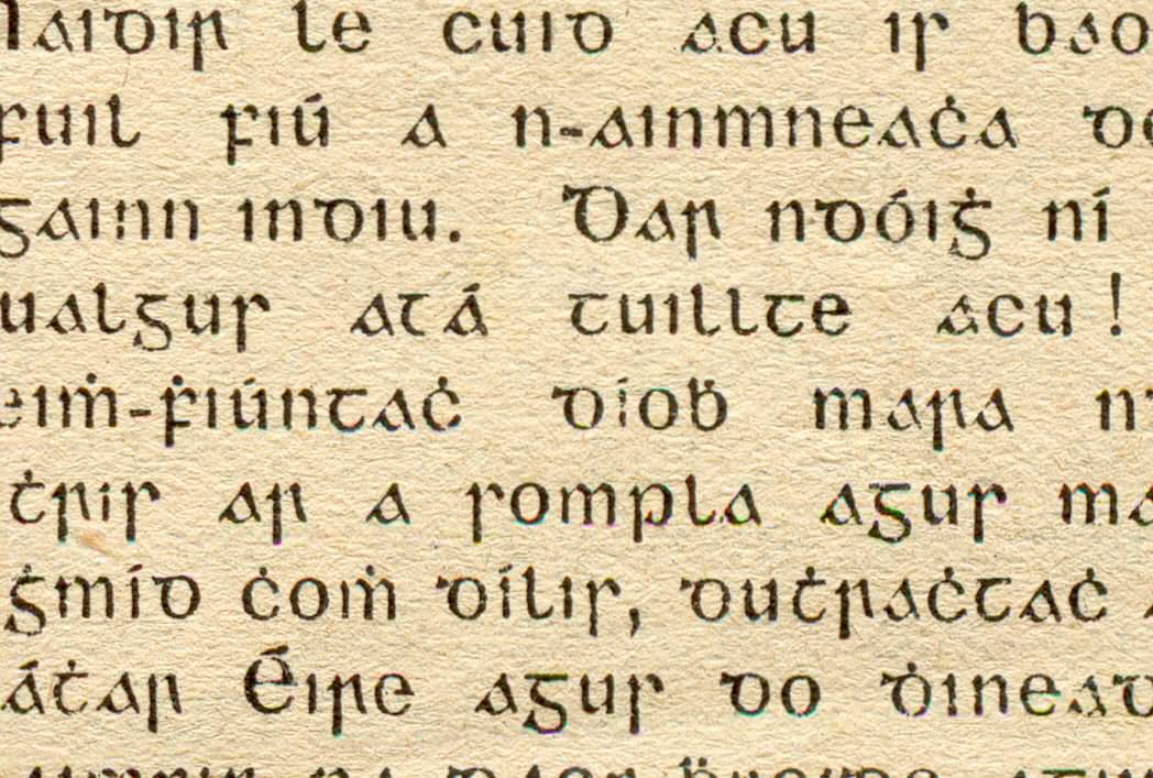
Gaelic type includes the Latin alphabet as well as some additional glyphs. Larger view. (Image source: mathewstaunton)
Gaelic type is based on the insular script found in manuscripts throughout the UK. As with Blackletter, it has been used in printing body text in Ireland, from its earliest appearances in the 16th century all the way through to the mid-20th century, but is no longer popular as a text typeface. The Vox-ATypI system was amended to include the Gaelic category in 2010 at the ATypI annual conference, appropriately held in Dublin.
Non-Latin Type
Beyond that, there is still another world of type to discover. The entirety of these two articles on the subtleties of type (and, believe me, it can get much more complicated!) have discussed only the Latin alphabet, which, while quite commonly used, is merely one of many writing systems used today. I encourage you to learn more about, and get involved in, the typography of other writing systems! Some are very widespread and used daily by hundreds of millions of people; others are used by mere thousands.
Regardless of how many people use it, each writing system needs quality typefaces. From the commonly used (check out Nadine Chahine’s interview on Arabic type) to the rarely seen (Jean-Baptiste Levée gave a fascinating talk at last year’s TypeCon on creating Air Inuit Sans, supporting Inuktitut glyphs), the typography of non-Latin writing systems promises an exciting future.
Closing Remarks
We’ve barely scratched the surface of the fascinating subject of typography and type history in this two-part series “Making Sense of Type Classification.” Hopefully, it has piqued your interest in this intriguing field. Knowing your way around the typographic resources available to today’s designers is essential, and it is helpful to understand a little behind the characteristics, history, visual character and idiosyncrasies that make each typeface unique and that define how it communicates.
At one point in the history of Web design, an extensive knowledge of type history was unnecessary because a Web or interactive designer was limited to half a dozen typefaces, and those in limited weights and variants.
Today, however, the landscape of Web design is completely different, and the typographic possibilities are endless! Also, while this material is covered in many design schools, a significant portion of designers today haven’t had a formal design education, so now is the best time to catch up!
That being said, we also must remember that, while type classification is an important aid to studying type, it is not a hard and fast system that cannot be questioned. Many typefaces combine characteristics and could easily fit into multiple categories, and no classification system can cover all of the possibilities. In the end, type classification is an excellent means of learning to recognize common patterns and distinguishing characteristics of typefaces, and we get to learn some type history along the way.
With this short series, you’re now equipped with a strong knowledge of categories of type; you’ve learned to analyze typefaces and pick out unique aspects of letterforms; you’ve seen how type has evolved with culture; and, most importantly, you have a solid foundation for further study of typography and type history! It cannot be overstated how immensely important sound knowledge of typography is for anyone in the broad field of design, and the material we’ve covered here will serve you well in navigating the world of type.
Further Reading
- Beautiful Handwriting, Lettering and Calligraphy
- Brush Lettering: It Only Gets Better After Practice
- A Critical Approach To Typefaces
- Respect Thy Typography


