My (Simple) Workflow To Design And Develop A Portfolio Website

Email Newsletter
Weekly tips on front-end & UX.
Trusted by 182,000+ folks.
 Register for Free


 Celebrating 10 million developers
 Custom Web Forms for Angular, React, & Vue. Your backend.
A long time ago in a galaxy far, far away… a young designer embarked on an epic journey strewn with perilous layout challenges, constant procrastination, devious jQuery errors and deadly Internet Explorer bugs. It was a rite of passage that all designers must take in order to stand proud with their peers in this wide world we call the Web. Yes, I’m talking about creating your own portfolio website.
I recently redesigned my own portfolio website. It was a challenging but enjoyable experience that I really learned a lot from. My goal was to create a unique online presence that represents my personality and displays my design work in detail, while of course serving as a promotional medium to gain more exposure and business.
A look behind the scenes of my design and development workflow
After receiving a bunch of emails asking me about the design decisions I made during the redesign of my website, I decided to write this article to give a peek at my journey and some of the things I learned along the way. I’ll discuss best practices in modern Web design and go through the entire design and development workflow that I followed to create my website, from the initial planning stage to the final live website, including these steps:
- project planning,
- branding,
- wireframes,
- responsive design and flexible grids,
- LESS and SASS,
- high-definition screens,
- flexible images,
- content animation,
- WordPress development,
- testing and analytics.
I hope this helps and inspires other designers out there who are looking to create their own unique portfolio website. We’ve got a lot to get through, so let’s get started.
Plan The Project
Define Your Brief
The first thing I do with any project is figure out exactly what I want to achieve, and I write it down. What is the purpose of the project? What problem am I trying to solve? My goal was to create an online profile to promote my design work and gain more exposure. I needed to be able to write articles, display my design work and have people contact me easily. I also wanted it to be unique and memorable, while representing my personality.
At this point, we simply need to figure out our ultimate goal; we’re not worried about how we will get there. Write down your goals, and look back at them in later stages of the project to ensure that you’re on track.
Initial Research And Idea Generation
Do some initial research to get the creative juices flowing. Inspiration can come from anywhere and can strike at any time, often while you’re in bed and on the verge of falling asleep (with, of course, not a notebook in sight). Sometimes you might want to look at other sites for inspiration, but sometimes not looking at what other designers have done is best, because once you’ve seen it, thinking of your own ideas can be hard.
Instead, make a cup of tea, find a comfortable spot and brainstorm your own solutions to the problem at hand. All you need at this stage is a pen, a sketchbook and your thoughts. Hopefully, you’ll come up with something innovative that hasn’t been done before. You can employ plenty of methods to generate ideas. Have a think about your personality and what makes you unique as a designer. What are your interests? How are you different? Do you have a particular design style? Do you specialize in a certain aspect of design? Do you have unusually big ears? Find an angle that represents you and integrate that into your design.
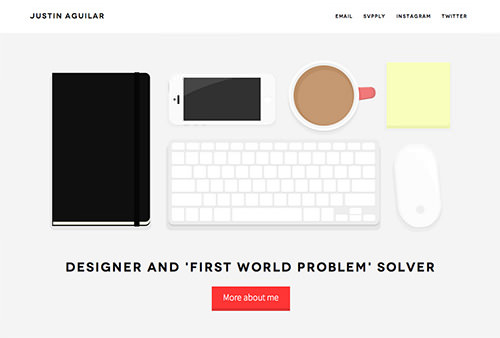
Justin Aguilar illustrates his workspace in his portfolio.
Meng To gets straight to the point with his case studies.
Stephen Burgess is a developer but shows a great understanding of design and UX with his unique website.
After some initial research, I wrote down a few ideas and elements to include in my portfolio:
- My skill set is a mix of both coding and design, and I wanted this to be prominent.
- I’m a big fan of minimalist design and wanted to stick with a mainly black and white palette to allow the design to shine through.
- I wanted to use my own photo as a hero image to inject some personality into the website.
- I enjoy the experience of seeing animation as I scroll down a page.
- I’ve never liked the way in which one Web page jerks to another, so I wanted my transitions to be smooth.
- I like a generous amount of white space and a full-width layout.
- Responsiveness is important to me because I want mobile and tablet users to also have an optimal experience.
- I wanted my case studies to tell a story about my design process, rather than just be a gallery of random images without context.
Create A Timeline
Once your ideas are together and you know which direction to head in, draw a rough timeline. I’m not talking about strict deadlines or anything, but more of a guide to help you organize tasks and stay productive and motivated. Simply list the tasks that you need to do, and estimate the amount of time each will take. This will give you a rough estimate of how long the project will take, as well as create a task list to work from. Of course, some of your estimates might be a little off, but that’s fine; you can adjust the timeline as you go. A bit of organization goes a long way, so get into this habit.
Design
Design Your Brand
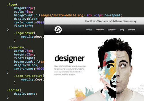
Your brand is basically the visual language that describes who you are and that determines how others see you. I wanted to convey a clean, sleek and minimal look and feel. I kept things quite simple and decided to create a logo mark from my initials, using a minimal black and white palette. I sketched some ideas and experimented with typography and letter arrangement before deciding on the final logo (which I drew in Adobe Illustrator). If you’re having trouble coming up with a logo, you might want to read “A Systematic Approach to Logo Design.”
My final logo design
As part of my branding, I also wanted to design an avatar for my website and various social media platforms. It would need to represent me as a designer and developer, while being unique and memorable. After countless hours of brainstorming (more like procrastination), I finally had an idea that makes sense. The idea was to take a photo of my face and cut it in half. One side would depict the creative designer in me, while the other would show my logical coding side. After numerous sketches and a lot of fiddling in Photoshop, I was finally happy with the concept. I used pastels, grunge-style brushes and masks to achieve the aesthetic I was after.
My final avatar
Create Content
Many designers leave content creation until the end because they’re more interested in layout and aesthetics (the fun stuff). Create content early on in the project because it will determine the design. What information do you need to convey to visitors? Think about what you want to say and how to say it. Should a given point be written as simple text, or would it make more sense as an image or diagram?
Be concise and friendly in your copy. I like to write in the first person to make it feel more personable. Break your copy into small chunks to improve readability and scannability. I wrote a draft of my content and broke it down into six main parts: home page introduction, a bit about me, places I’ve been featured, my design work, my blog, and my contact details.
Show Your Work
Your work is the most important piece of content in the portfolio because it is what most visitors have come to see. Gather your best projects, and explain the process and workflow behind each. Nothing is worse than a vague portfolio of random images with no context or explanation. Including only the type of work you’re looking to do more of, rather than all of your work, will help you target the right clients.
Your potential customers will want to see your work in as much detail as possible, so don’t shrink it to a small size. I decided to keep the actual sizes if possible to make it easy for visitors to quickly navigate my work. I also decided to talk about the challenges I encountered and how I tried to solve them. Design is all about solving problems, so letting visitors know why a design looks and works the way it does is very useful, and it also gives you an opportunity to reflect on your work and your design process and perhaps improve it next time. Remember that you’re telling a story, so it’s been important to me to make it as interesting and informative as possible.
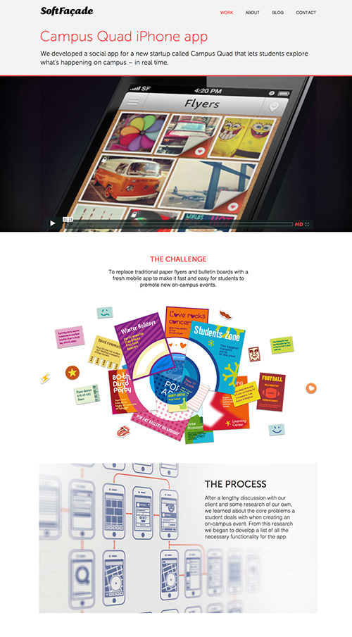
Soft Facade has beautiful, in-depth case studies.
Now that our content is figured out, we can move onto sketching wireframes.
Sketch Wireframes
The approach I take to wireframes is simple but effective, and all you need is a pen and sketchbook. I first list all of the elements to include on a Web page. I then group related elements, before prioritizing these groups according to importance. Here is my list of elements for the contact page.
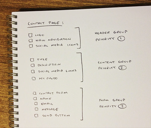
List of elements for my contact page
Once the page’s elements are grouped and prioritized, arranging them on the page will be much easier. Place more important elements towards the top of the page, and use white space to create groupings. I took a desktop-first approach because I wanted to focus on displaying my work in detail on large screens. When we come to write the CSS later on, we’ll take a mobile-first approach, which will simplify the code (we’ll get to that shortly). I usually sketch my wireframes with pen and paper, but you can use tools such as Balsamiq or even Photoshop or Illustrator. Below is a wireframe for my contact page. It doesn’t need to look pretty — it’s simply a plan of a Web page to work from.
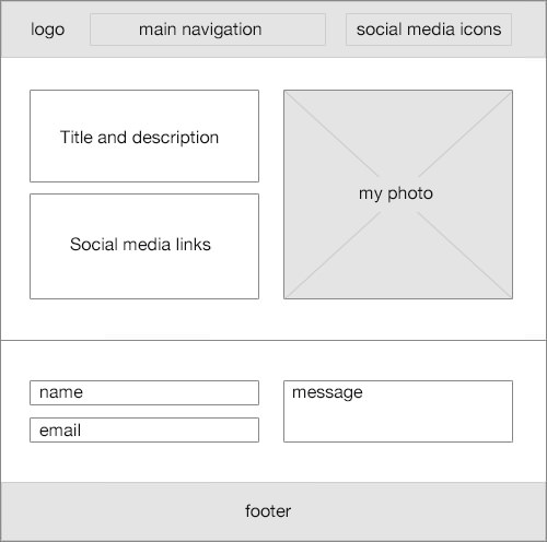
Contact page wireframe
Responsive Design And Flexible Grids
I wanted to make my website responsive to ensure an optimal experience for visitors on desktop, tablet and mobiles. When designing websites, I like to use a grid because it provides a structural foundation, while making the development process easier and more efficient. Joshua Mauldin sums up a grid pretty well:
"Think of it like a house’s foundation. With a solid foundation, the house is stable, and building on it is easy. With a solid grid, your design can easily be adapted to accommodate whatever changes come along."
Some designers find a grid to be limiting, but it really depends on the design. I find that it results in a neater and more organized design. My design is quite simple, so I used a custom 12-column flexible grid, but a 16-column grid would give more definition and accuracy. I also defined a maximum width of 1040 pixels to ensure that the design doesn’t look stretched on larger monitors.
Using a flexible grid (rather than three separate fixed widths for mobile, tablet and desktop) enables a website to scale dynamically to fit any device width. Below is the CSS for my responsive grid, but feel free to create your own to suit the design. Use tools such as Gridpak, Responsive Grid System, Golden Grid System and Responsify to create your own responsive grid. I’ve used ideas from a few of these tools to create my own custom flexible grid.
/* 12-column responsive grid */

.row {
    clear: both;
    max-width: 1040px;
    margin: 0 auto;
}

[class^="col-"] {
    float: left;
    margin: 0 3.84615384615% 0 0;
    list-style: none;
    position: relative;
}

[class^="col-"]:last-child {
    margin: 0;
}

.col-1 { width: 4.8076923077% }
.col-2 { width: 13.4615384615% }
.col-3 { width: 22.1153846154% }
.col-4 { width: 30.7692307692% }
.col-5 { width: 39.4230769231% }
.col-6 { width: 48.0769230769% }
.col-7 { width: 56.7307692308% }
.col-8 { width: 65.3846153846% }
.col-9 { width: 74.0384615385% }
.col-10 { width: 82.6923076923% }
.col-11 { width: 91.3461538462% }
.col-12 { width: 100%; margin: 0 }
Upon looking at the CSS above, you might be wondering how the [class^=“col-”] CSS selector works. It’s actually called a substring matching attribute selector, and all it does is select any class that begins with the string col-. You can also use substring matching to select other attributes that end with a certain string, or even those that contain a certain string. Substring matching is a handy way to create more complex and powerful CSS selectors, and they’re well supported, too, going as far back as Internet Explorer 7.
The HTML is quite simple, too, consisting of rows and columns, much like a table. Here is a simple two-column responsive grid that I use on my website. The left column spans five columns, while the column on the right spans seven.
<div class="row">
    <div class="col-5">Content spans five columns</div>
    <div class="col-7">Content spans seven columns</div>
</div>
Set Logical Breakpoints
When you design a responsive website, at certain widths the layout will break or the text will become squished and difficult to read (45 to 75 characters is a comfortable length per line). These special widths are known as breakpoints, and they’re often set to common device widths, such as 320 to 480 pixels for mobile, 768 to 1024 pixels for tablets, and 1024 pixels and up for desktops. The problem is that “common” widths don’t really exist anymore with the growing number of devices, so this solution doesn’t scale well.
Setting breakpoints based on content rather than device width is a more scalable solution. For example, rather than blindly setting a breakpoint at 768 pixels wide for tablets, I instead looked at my content and found that it looked fine until it got squashed under 600 pixels. I thus set a breakpoint at 600 pixels to change the layout to ensure that the content remains legible at and below this width. Yes, you will need to optimize the presentation of your website for various devices, but your content should always determine where the breakpoints lie. These are the four breakpoints I needed for my design: 320, 600, 1024 and 1140 pixels.
When writing the CSS media queries for my website, I took a mobile-first approach. This basically meant writing the mobile styles first as my base, followed by the tablet and then the desktop styles. Mobile styles are generally simpler than desktop styles, so writing them first makes sense. They form the foundation of your styles, and we can then add more complex styles for wider screens. Cascading your style sheet in this way keeps your code clean and DRY (“don’t repeat yourself”).
Here are the media queries I used:
/* Mobile styles go first, without media queries. */

@media only screen and (min-width: 321px) {
    /* Larger mobile styles (wider than 320 pixels) */
}

@media only screen and (min-width: 600px) {
    /* Tablet styles (wider than 600 pixels) */
}

@media only screen and (min-width: 1024px) {
    /* Large laptop styles (wider than 1024 pixels) */
}

@media only screen and (min-width: 1140px) {
    /* Desktop styles (wider than 1140 pixels) */
}
With the breakpoints defined, I could sketch the tablet and mobile wireframes. Sometimes hiding or omitting content on small devices makes sense, but I wanted as much content to be available across all devices as possible. Why should mobile users miss out on valuable content? People are used to scrolling on phones anyway, so think first before you remove or hide content. The easiest solution isn’t always the best one.
Design High-Fidelity Mockups
Once the desktop and mobile wireframes were sketched, I moved into Photoshop and started mocking up the website in more detail. I don’t like spending much time in Photoshop because it slows down the development process. Don’t worry too much about creating a pixel-perfect design; you’ll have time to refine it during the coding process. Instead, simply mock up the main page templates, along with any other design elements and assets you need. I mocked up the header and footer, along with the basic elements of the “About me” page below, to make sure I was happy with the aesthetic.
“About me” page mockup
Similarly, I didn’t mock up any mobile or tablet designs in Photoshop, because I find that simply coding these based on the wireframes to be quicker. I did, however, spend some time on details such as icons and textures, which can make a big difference in the polish of the final website.
Develop
Now that our website is planned and all of our image assets are ready to go, it’s time to start coding. So, get your headphones and favorite text editor! My text editor of choice is Sublime Text. It’s simple, fast, powerful and easy to use. If you’re a Windows user, I’d recommend Notepad++.
I usually start from the top of the Web page and build each element one by one. Let’s start with the header navigation. I like to write out the HTML for the element first, and then move on to the CSS. Remember that we are actually creating the mobile version first to reduce code bloat. Depending on the complexity of the project, you can either code from scratch or use a framework such as HTML5 Boilerplate, Foundation or Compass.
CSS Preprocessors (LESS/Sass)
If you’re not yet familiar with CSS preprocessors such as LESS and Sass, definitely familiarize yourself with them because they’ll save you a lot of time and effort and will streamline your CSS. A preprocessor gives you more power when coding CSS, enabling you to use object-oriented programming practices when writing styles.

LESS and Sass CSS preprocessors
We’ve all wished that we could use variables in CSS, define functions and reuse code snippets without having to continually copy and paste. CSS preprocessors enable you to do that and much more, while keeping your styles clean and organized. Your LESS or Sass code is then compiled and outputted as regular CSS.
I used LESS to create the CSS for my website. However, after experimenting with both LESS and Sass, I feel that Sass is more powerful, so I’ll be sticking with it from now on. Chris Coyier compares LESS and Sass and shows the subtle yet important differences between the two. The deciding factor for me was that Sass uses Compass and gives you access to a library of useful and well-maintained mixins; LESS doesn’t. Feel free to play with both to see which you prefer.
Progressively Enhance With Modernizr
Modernizr is a JavaScript library that detects HTML5 and CSS3 features in the user’s browser and adds those features as classes to the <html> element. We all want to take advantage of the latest CSS3 and HTML5 features, but what happens in older browsers that don’t support them? Modernizr basically tells us which features are supported in the visitor’s browser, allowing us to write conditional CSS and JavaScript for each situation. Thus, we can easily progressively enhance, providing everyone with basic features, while enhancing the experience for those with modern browsers.
Create Flexible Images
Flexible images are a simple yet important part of any responsive website. To make your images flexible, simply place them in your responsive grid container and add the CSS below to your style sheet. Insert them using the <img> tag, although there are ways to achieve flexible images using CSS background images, too. If you want to get more technical and serve different images according to the device being used (for example, serving small images to phones to conserve bandwidth), you can look into certain techniques for serving truly responsive images and avoiding duplicate image downloading.
img {
  max-width: 100%;
  height: auto !important;
}
Use CSS Image Sprites
We all know to combine our icons and image assets into CSS sprites, rather than leave multiple individual images to load one after another. This decreases loading time and makes it easy for you to edit and maintain image files later on. I usually create several sprites for the different sections of a website. For example, one of my sprites contains all of my icons, while another contains global elements (including logo, header icons, navigation background and footer icons).
Recommended reading: An Analysis Of Navigation In Portfolio Websites
When creating sprites, think about how your website will load. If a bunch of icons are only used on a single page of the website, then separate them from the main sprite. This will ensure that they’re loaded only when needed, while keeping your main sprite small. Using sprites will also make it easier to prepare your images for high-definition screens later on. The process can be cumbersome, so use a handy tool such as Sprite Cow to create them quickly and easily. You can also use a combination of Sass and Compass to generate sprites automatically from separate images.
Catering To High-Definition Screens
To ensure that your website looks crisp on high-definition (or “Retina”) screens, use CSS as much as possible for presentation. Remember that some of the newer CSS styles won’t render in old browsers — this is where progressive enhancement makes sense. In most cases, you won’t be able to build the website completely from CSS; you’ll need images. Luckily, preparing your images for high-definition screens is not hard.
Basically, you’ll need to create larger versions of your images to be used on high-definition screens. Because our images are contained in a sprite, all we need to do is create another version of the sprite that is exactly twice as large. Let’s say our sprite is named sprite.png; we would name our high-definition sprite sprite@2x.png. To decrease loading time (especially on mobile devices), compress your images using JPEGmini, TinyPNG or, if you’re on a Mac, ImageOptim.
Simply create another image twice the size of the original for high-definition devices.
Once you’ve created the larger images, simply use media queries to show the large images on high-definition screens. Be careful with your media queries because iPhones aren’t the only high-definition devices around at the moment. There are other mobile phones, along with Retina iPads and MacBook Pros, too. I use two high-definition media queries on my website: the first for high-definition mobile devices, and the second for tablets and laptops.
Here are the media queries to target high-definition screens:
@media
only screen and (-webkit-min-device-pixel-ratio: 1.5),
only screen and (min--moz-device-pixel-ratio: 1.5),
only screen and (min-device-pixel-ratio: 1.5) {
    /* Target all high-definition screens. */
}

@media
only screen and (min-width : 600px) and (-webkit-min-device-pixel-ratio: 1.5),
only screen and (min-width : 600px) and (min--moz-device-pixel-ratio: 1.5),
only screen and (min-width : 600px) and (min-device-pixel-ratio: 1.5) {
    /* Target high-definition devices with screens wider than 600 pixels. */
}
Wouldn’t it be great if we could eliminate the need for media queries and separate high-definition images altogether? An even better way to cater to high-definition screens is to use images that are vectors, which will scale to fit any screen size and look crisp on any device. You can draw your images or icons in Illustrator and export them as scalable vector graphics (SVG) files. The SVG file basically consists of XML-based code that describes the image to the browser.
Another clever way to get scalable vector icons that look crisp on high-definition devices is to use icon fonts, such as those from IcoMoon and Font Awesome. I didn’t use these methods on my website, mainly because I don’t have many icons or vector images. But if you’re looking to use vector images and icons more heavily on your website, then these techniques will come in handy.
Page Transitions
I’ve never been a fan of the abrupt way in which one Web page jumps to another. When the user clicks a link, there’s usually a sharp jump, followed by images loading awkwardly on the page in no particular order. I wanted to control the way my content appears, to create a smooth transition from one page to the next as the visitor navigates the website. When a visitor clicks a link to another page, the current page should fade to white before the next page loads. The next page would start from a white background, and then the content would animate smoothly onto the page. This makes for a pleasant and consistent user experience.
To achieve this transition effect, I needed to use a jQuery preloader plugin, such as jPreLoader or QueryLoader2. This ensures that images load before being animated onto the page (otherwise, the animations would occur before the images have loaded). When it comes to Web development, jQuery plugins shouldn’t be your first option because you rely on jQuery and it’s a performance hit. It’s always a better idea to search for more lightweight, single-purpose JavaScript libraries and use them instead. You could also use CSS transitions in some cases.
I’m not a fan of preloaders in general because the user has to wait until the page loads to see anything, but using one is necessary to achieve the effect I want. I’m going to experiment with hiding the preloader when the page loads quickly, and introduce it only on long page loads. This means that most people would simply see one page seamlessly fade to the next, without a preloader being shown. I’d be interested to hear of any other methods to achieve page transitions without the need for a preloader.
Here is a simple jQuery function to fade out the page when the visitor clicks a link:
/*
* Function to animate leaving a page
*/
$.fn.leavePage = function() {

  this.click(function(event){

    // Don't go to the next page yet.
    event.preventDefault();
    linkLocation = this.href;

    // Fade out this page first.
    $('body').fadeOut(500, function(){

      // Then go to the next page.
      window.location = linkLocation;
    });
  });
};

/*
* Call the leavePage function upon link clicks with the "transition" class
*/
$('.transition').leavePage();
I want the leavePage animation to happen when visitors click on a link to another page of my website, so I simply added a transition class to the appropriate links. When a visitor clicks on any link with the transition class, the leavePage animation is triggered. This example is simple, but you can build on it for more complex animation.
So, the user has clicked a link, the current page has faded out, and they’ve landed on the next page. What happens now? Our jQuery preloader takes care of the rest. The preloader basically displays an overlay that covers the page as it loads. Once the loading is complete, the overlay fades away to reveal the page. Of course, you can create your own custom animation to animate content onto the page in a more interesting way.
I won’t get into much detail because there are many ways to animate content onto the page. You could slide content in from the side, one element after another, or fade in elements from top to bottom. Basically you just need to write a function to animate content onto the page, and then call this function once the page has completely loaded. Luckily, both jQuery preloaders mentioned above have callback functions that enable you to call an animation function after the page has completely loaded.
Prevent Flash Of Unstyled Content
One of the most annoying issues I faced in trying to achieve the smooth transition between pages was the flash of unstyled content (FOUC) before the jQuery preloader had even started. It wasn’t always there, but every now and then I saw some content flash onto the page before the animation had even started. Luckily, I found a clean and simple way to prevent FOUC that works perfectly.
Animate Content On Scroll
I love the idea of including subtle animations as the visitor scrolls down the page. It’s become a bit of a trend recently, and I think it improves the user experience and adds a touch of polish. I use a simple yet powerful jQuery plugin called Waypoints to create the on-scroll animations. It enables you to trigger animations at different page scroll distances.
If you’re looking for an easy way to do more complex animations on scroll, then check out the SuperScrollorama jQuery plugin.
Custom WordPress Development
I decided to build my website in WordPress, mainly because I’m familiar with it and wanted blogging functionality. Being able to easily install plugins to add functionality is also a nice time-saver. Installing WordPress on a server and turning static HTML pages into a WordPress theme is a pretty simple process. If you’re not familiar with WordPress, you could always use another platform, such as Drupal. Or feel free to just build from scratch in PHP (depending on the complexity of the website).
Because some of my pages have quite varied layouts, I needed a few custom page templates. For instance, I couldn’t use a standard WordPress page for my home page because that design is quite different. So, I created a custom template for the home page. Creating a custom page template in WordPress is quite easy. I also created custom templates for my portfolio item pages and contact page.
In order to separate my portfolio item posts from my blog posts, I created a custom post type especially for my portfolio items. You might be able to get away with displaying your portfolio items as blog posts and categorizing them in a “portfolio” category, to separate them from standard blog posts. I needed the flexibility of a custom post type with a different layout. I won’t get into any more detail about WordPress development because plenty of great WordPress documentation is already out there.
Testing And Analytics
Test Across Browsers
I’m sure you’re all aware of the importance of testing to ensure that your website renders correctly across relevant browsers. You’ll notice that I didn’t say “all browsers,” because you really only need to ensure that your website renders properly for your particular audience. If you know that all of your visitors will be using modern browsers, then you don’t need to spend valuable time and effort supporting old ones.

Test your website on the major browsers.
So, how do you test a website across all relevant browsers? If you’re on a Mac like me, then just download all modern browsers, including Chrome, Safari, Opera and Firefox. But how do you test Internet Explorer on a Mac? One simple and free way is to set up a virtual machine running Windows.
You can also use an Internet Explorer emulator, such as IE Tester. Or sign up to a service such as Spoon Turbo or BrowserStack, which allows you to test the website on all major browsers, including Internet Explorer 6, 7, 8, 9 and 10. Rather than leave cross-browser testing until the end, test the website every now and then during the development process.
Set Up Google Analytics
Add Google Analytics to your website to collect valuable statistics on visitors. You’ll know the location of visitors and whether they’re arriving via Google searches or from referring websites. One of your blog posts could get mentioned on another website; if you’re not monitoring your traffic sources, you might not even know about it. Analytics also help you build a profile of visitors, including their country of origin and browser. You can use this data on an ongoing basis to optimize the website for visitors. Setting up Google Analytics on your website is free and takes only a few minutes. Simply sign up, copy and paste the small JavaScript snippet into the footer of your website, and you’re ready to go!
Time To Launch
So, we’ve designed, built and tested our new portfolio, and we’re finally ready to launch — high five! This is one of those experiences you simply shouldn’t miss out on as a designer. I had a great time creating my website and learned a lot in the process. Sure, there were hurdles along the way, but isn’t that what makes design so interesting? I’d love to hear about your experiences in creating your own portfolio.
Hopefully, hearing about my journey will help and inspire you to create your own website or to finally start that redesign you’ve been contemplating for the past few years. So, get out your headphones, knuckle down, and start pushing those pixels. I wish you all the best on your epic quest ahead. Good luck, and may the force be with you.
Further Reading
- Retiring The Portfolio Screenshot
- Design Systems: Useful Examples and Resources
- Responsive Web And Desktop Development With Flutter
- What Leonardo Da Vinci Can Teach Us About Web Design
 (al, mrn)

