Mojo Motors’ Responsive Redesign With Fireworks: UX And Interaction Design

Email Newsletter
Weekly tips on front-end & UX.
Trusted by 200,000+ folks.

 Register!
 Flexible CMS. Headless & API 1st


When I joined Mojo Motors in May 2012 as head of UX, it had only a desktop website — but 21% of its total Web traffic was already coming from mobile devices. Of that number, 64% were from iOS devices and 34% from Android devices. It was quite clear to me that we had to think carefully about our mobile strategy when redesigning the new website. After carefully assessing the situation, we ended up adopting the responsive design approach, for the following reasons:
- We were planning to redesign the entire website from scratch.
- Our content lends itself well to this approach, and we did not have to deal with ads like our competitors.
- A large number of our users were already viewing, sharing and linking to retargeting emails on mobile devices.
- It was the fastest point of entry to mobile for us, and the cost of development, management and maintenance was lower compared to building separate websites and native mobile apps alongside a desktop website.
- Our UX and development teams are very small, agile and nimble — a key ingredient to helping a small startup such as ours get a minimum viable product to market quickly.
In this article, I’ll shed some light on the whole process and on how Adobe Fireworks fit into it.
Recommended reading: Switching From Adobe Fireworks To Sketch: Ten Tips And Tricks
Our Design Process And Adobe Fireworks
As any team that has taken on a responsive design project recently will tell you, the process is different and challenging, and it stretches the limits of what traditional Web design tools such as Photoshop, Fireworks and OmniGraffle are capable of accomplishing. So, to get things done, our design team adopted a hybrid approach of designing in visual tools and directly in the browser. For us, Adobe Fireworks became the workhorse visual tool that we depended on to get things done.
I’ll share the whole process that we used to craft our responsive website and the role that Adobe Fireworks played in it. To keep the content easy to digest while still providing enough detail, I will present it in two separate articles:
- Part 1: UX and interaction design stage;
- Part 2: Visual design and front-end development stage.
UX And Interaction Design
In this first article, I’ll share our interaction design process, the role of Adobe Fireworks and some of the other design tools that helped us bring our vision to life.
Research
Naturally, we began the process by doing user research to understand how people engaged with our non-responsive website. Armed with this information, we came up with design principles, product principles, personas, scenarios and so on to help us determine and prioritize the project’s requirements.
We came away from this process with a core set of features that would provide a consistent user experience across all platforms. The key for us was to quickly go through discovery so that we could move into the iterative design process.
Designing From The Content Out
We decided earlier in the project that we would adopt a content-first approach by allowing the website’s content to shape the grid’s structure and layouts.
Why? On a responsive website, you have very little control over content because it scales across varying device widths — and because users explicitly zoom the viewport. In addition, some content, such as images, video and ads, can wreak havoc on the layout and affect overall performance. Identifying the different types of content, their value to users and the constraints they present early on is important. It will help you to avoid headaches later on in the process.
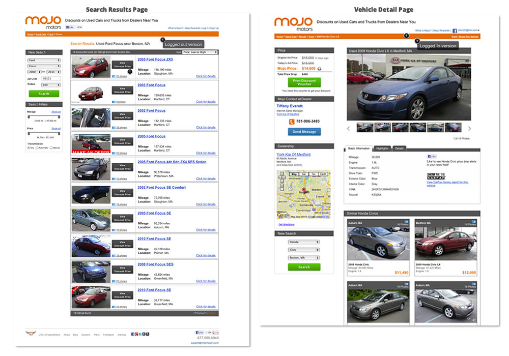
The old Mojo Motors website, showing photo placement. (Large version)
In our project, the image dimensions, aspect ratios and placement drove the overall layout because these needed to be flexible. The reason is that, on most automotive marketplace websites such as ours, car photos are one of the primary drivers of the user’s initial engagement, next to the selling price. Furthermore, these photos are typically consumed from a feed in formats and sizes that are uploaded directly to the dealer’s system.
Another thing we decided up front was to use real content wherever we could and to avoid placeholder copy like “Lorem Ipsum” and image placeholders with unknown dimensions. We were able to rise to this challenge early on by engaging our copywriter as soon as we identified missing copy throughout the project.
Breakpoints And Grids
Before diving deep into design exploration, we knew that determining the screen widths we would support was important. For us, a healthy range between 320 and 1024 pixels was practical, based on our analytics data. We settled on three major breakpoints to support desktop and the most popular mobile and tablet device resolutions of current users. But this is not always optimal — why?
Because device specifications frequently change, as in the case of the recent taller iPhone 5 (which would be wider in landscape orientation). To mitigate this, we planned to introduce minor breakpoints and even adjust our three breakpoints as needed later during the HTML prototyping iteration stages.
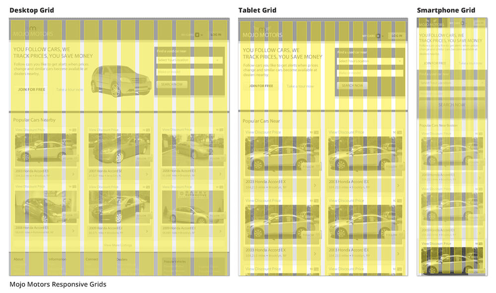
Mojo Motors’ responsive grids, via the Gridset app. (Large version)
To aid in the creation of our grids, I played with a bunch of responsive grid systems from the endless choices of frameworks in the wild. We narrowed our choice to Gridset, by Mark Boulton’s team, and Gridpak, by the good folks at Erskine. Both of these apps provide a grid image file for designing in Fireworks (or Photoshop) and an HTML framework for prototyping.
One of the factors that influenced our choice of grids was the need to accommodate the “vehicle listing module” image across breakpoints. Because we had sketched out the mobile “vehicle listing module” first, we wanted to find opportunities for reuse as we scaled up to the desktop.
In the end, we went with a 12-column grid for the desktop, a 12-column grid for tablets, and a 6-column grid for mobile in portrait orientation, via Gridset. This grid choice enabled us to reuse the module from the mobile layout proportionally across the three main breakpoints. For instance, the mobile and desktop modules are exactly the same dimensions, except that we display three modules side by side for desktop.
Sketching Mobile First
I can’t stress enough how important it is to resist the urge to jump into your favorite visual tool during the initial phase of generating ideas! Trust me, this stuff is hard enough — the last thing you need to worry about at this point is setting up the technical layouts and pixel perfection. So, if you must, work in your favorite wireframing tool — just solve the problem at hand.
Recommended reading: Sketch, Illustrator or Fireworks?
For me, making a few sketches of the website’s key pages at the three major breakpoints — starting with the mobile layouts and working my way up to the desktop version — and then iterating between them made sense. I personally found designing for mobile first to be an effective way to identify problems and resolve constraints presented by touch and small-screen devices.
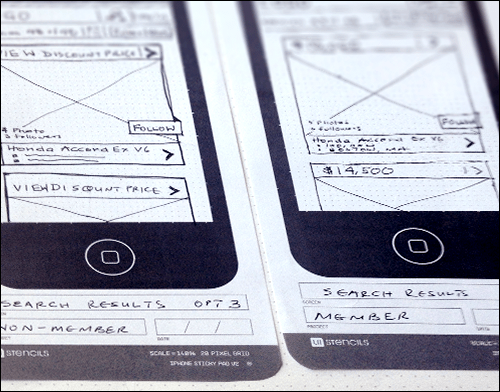
Initial sketches for mobile screens.
To aid in creating your layouts, you might want to consider the Responsive Design Sketchbook by App Sketchbook, or the Dot Grid Book by Behance.
Creating Wireframes And Prototypes
Before discussing in more detail why we used Adobe Fireworks in our project, I’d like to be clear that I find the endless debates about which design tool is better and whether to just code the darn thing to be fruitless banter.
In the end, a good designer is a creative problem-solver, and the tools are just a means to an end. Remember that users and clients don’t really care what tool we’ve used to create the final product. With that out of the way, I will focus the rest of these articles on why Adobe Fireworks made sense for our project.
High-Fidelity Wireframes In Fireworks
The great thing about creating products at a startup is that you have no external client, so you can avoid artifacts that do nothing to move the ball forward. On the other hand, the clock is winding down as your competitor tries to get the next best thing out before you can launch yours. With this in the back of my mind, the choice of using Adobe Fireworks came down to speed, familiarity and capabilities.
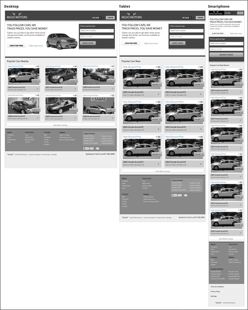
High-fidelity home page wireframes for desktop, tablet and smartphones.
Because we needed to create a clickable prototype for user testing quickly, we decided to skip lo-fi wireframes and go straight from sketches to high-fidelity grayscale wireframes. Below are a few other reasons why we used Fireworks to create wireframes:
- Compared to other tools I had considered, Fireworks has the best vector and bitmap features suitable for creating both low- and high-fidelity wireframes, detailed visual UI designs and clickable prototypes, without having to switch between multiple tools.
- It offers a built-in set of symbol libraries, suitable for functionality that made our work quicker.
- The native Fireworks PNG file format is at least three to five times smaller than a comparable Photoshop PSD file and is easily sharable with stakeholders without requiring any software other than a browser or simple image viewer.
- The Pages and States features work really well for creating multi-screen layouts within a single file.
- I was in the process of hiring the rest of my team when the design phase began, and I needed to work pretty quickly.
Multi-Page vs. Multi-Breakpoint File Set-Up
In the past, I would have advocated setting up a single file with multiple pages and a master page for this project. But due to the constraints of creating responsive layouts, I decided that using the Pages functionality for different breakpoints of the same page was more efficient. I found this to be the best way to quickly switch between breakpoints during the iterative process. This method also allowed us to keep the file sizes small and made it easy for my team to share files and work concurrently on different screens.
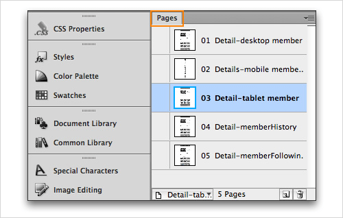
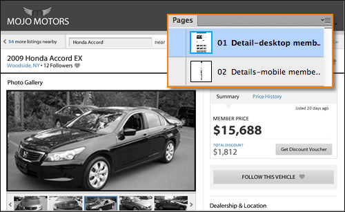
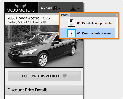
The Pages panel in Adobe Fireworks is used for different screen sizes of the same page.
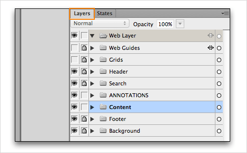
The Layers panel in Adobe Fireworks is used to manage layout elements.
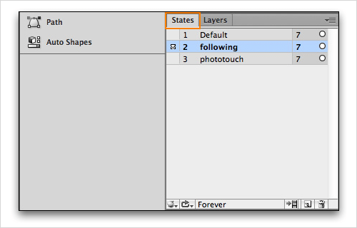
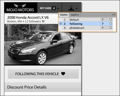
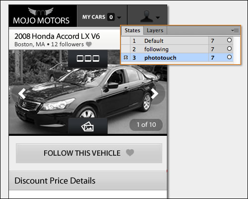
The States panel in Adobe Fireworks is used to show different states of the same screen.
The other benefit was that we could still use the States panel to document interaction states associated with each breakpoint independently. The final file structure consisted of a “Page” for each breakpoint, a Web layer, a grid layer and other layers for the website’s content. In our template file, the grid layer was placed between the content and Web layer, as shown.
Creating Reusable Modular Elements Using Symbols
In a design like this, thinking in terms of modular reusable components that can be converted to symbols is really helpful. Doing this saves a lot of time and makes it easy to update as you iterate.
One element that benefited from this approach was the car listing module. As illustrated below, it is composed of a few different elements, including a photo with a non-destructible saturation filter applied, heart and camera icons from the library, as well as styled text. Elements such as headers, branding, navigation and footers are good candidates for symbol conversion as well.
To create a symbol in Fireworks, all you have to do is select the objects and go to Modify → Symbol → Convert to Symbol, or just right-click on the selection and choose “Convert to Symbol.”

Car-listing module symbol.
Another neat thing about the symbols feature is its nesting capability. You can include symbols inside a module that you want to convert to a symbol using the same process as above. We took advantage of this feature to make it easy to vary the listing photo and flags during prototyping and in preparation for user testing.
Creating a unique module to show a different car or flag was as simple as swapping the embedded symbol within the new main symbol variation. To do this, follow these steps:
- Select a copy of the main symbol and go to
Modify → Symbol → Break Apart. - While it’s still selected, save it as a new symbol variation.
- Double-click the new symbol to enter symbol-editing mode. Then, select the embedded symbol to update.
- Go to
Modify → Symbol → Swap Symbolin the menu bar, choose the replacement symbol from the “Swap symbol” dialogue box, and you are done.

Photo symbols embedded into car listing module symbol
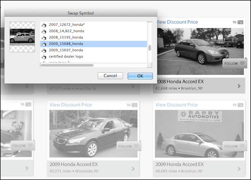
Swapping embedded photo symbols to create other similar modules.
Visual Scaling During Design And Live View
Another thing that is quite disorienting when creating mobile screens is mapping resolutions as you lay things out on your large monitor. Without careful planning or knowledge of best practices for things like touch target sizes and legible text sizes, you could end up creating layouts that are hard to use.
One tool that I cannot live without and I highly recommend is the Live View App. It is available for the Mac, iPhone and iPad. All you have to do is place the app window over your Fireworks layout and it will let you see how things scale on a real device such as an iPhone or iPad.
Preparing And Sharing Wireframes For Design Review
Clear and frequent communication between stakeholders, developers and designers was essential to the successful completion of our project. It ensured that everyone understood the implications of design decisions and were able to ask questions.
To prepare screens for our design reviews, we just exported Fireworks PNG files directly from Fireworks into a folder. During the review, we simply dragged the PNGs into multiple tabs of the browser and discussed things. I personally prefer this method of testing desktop screens because the width of the wireframes is rendered closest to how a user would see them (compared to testing with PDF files).
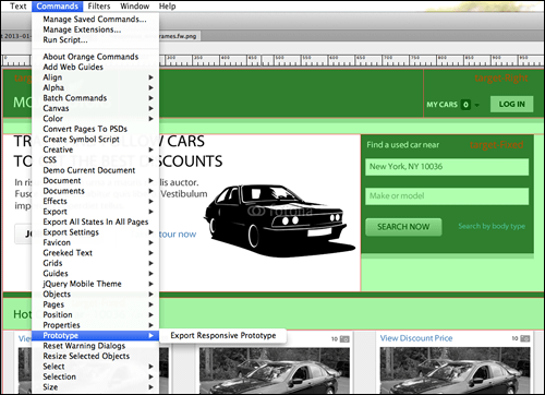
“Export Responsive Prototype” Extension To The Rescue
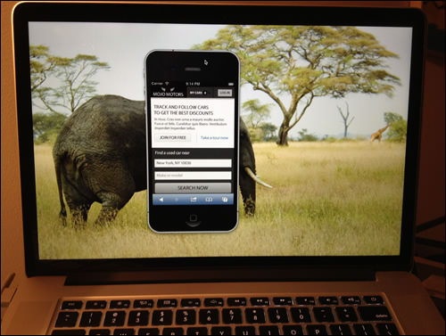
While the method described above also worked for showing mobile and tablet screens, it was sometimes difficult for the team to visualize the scale, context and fixed viewport constraints of real devices. This is where the Export Responsive Prototype extension for Fireworks (by Matt Stow) came in handy.
Creating the quick prototype using the existing wireframe file was really easy. The first thing I needed to do was define which areas of the wireframe would be fixed width and which would be flexible widths using slices. By default, areas that have not been given slices are converted to percentage-based widths. To make a sliced area fixed width or absolutely positioned left, right or center, I assigned keywords in the “Target” attribute of the Property Inspector (PI) panel (or Properties panel). Note that slices without “Target” keyword assignments are also converted to percentage-based widths.
Visualizing responsive design wireframes using Fireworks extension.
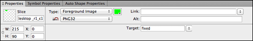
Slices are assigned “Target” attributes in the PI panel.
Once I was done setting up the file, all I had to do was go to Commands → Prototype → Export Responsive Prototype and export as “HTML and Images” files using the default settings. These files were then uploaded to a Web sharing folder on my computer or a Web server where it could be hosted. Next, we shared the URL with everyone, and from there anyone could view the mockup on any desktop, smartphone or tablet browser. For more details on using the extension, watch the screencast on YouTube.
A screencast by Matt Stow that explains this workflow.
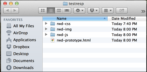
“HTML and Images” exported files.
Note: The prototype that is created is not a responsive HTML production framework. It is only illustrative and to be used during the wireframe review process.
To keep the distraction down in a larger group, you could also mirror your iPhone or iPad onto a projection screen using Reflector.
Projecting a mobile screen using the Reflector app.
Creating The Prototype For User Testing
Putting together a clickable prototype in Fireworks is easy and flexible because Fireworks will accept almost any graphic file format and all HTML embeds such as videos, maps and social plugins.
For us, the first step was to plan the scenarios and determine what screens would be needed to simulate the tasks that we are asking our users to perform. In our case, we used some of the wireframes that we created and modified existing screenshots for others.
To complete the prototype, each existing wireframe and screenshot was imported as a page into a new Fireworks file and given an appropriate page name. Making edits to screenshots was a snap with the help of the bitmap tools, the vector tools and the “Fill with background” command (by John Dunning). Using these, we removed elements before compositing to reflect our own data.
Once assembled, all we needed to do was add hotspots to each page and select a destination from the PI panel. On some pages, elements were added to the States panel to simulate things like hover states.
(You can check “Creating Interactive Prototypes With Adobe Fireworks” by André Reinegger and “Interaction Design and Rapid Prototyping With Fireworks” by David Hogue for more in-depth exploration of the prototyping features available in Fireworks.)
Finalizing the prototype just required exporting the file using the “HTML and Images” option, and the project was ready to be hosted on the testing machine.
Note: The purpose of the prototypes at this stage was to test the website’s flow and structure. As such, we opted for this method to export separate non-responsive prototypes for each breakpoint to get initial feedback quickly. You may also decide just to use an HTML prototype framework such as Bootstrap or Foundation if your timeline and resources allow it — we opted for the quickest way to maintain our project’s velocity.
In The Next Article
Well, that’s it for this article. I know that so many workflow options are out there, which you may want to consider when designing responsively. I hope some of the ideas and workflows discussed in this article will come in handy and inspire you to consider Adobe Fireworks for your next project.
In the next article in this series, I will share our transition from the UX and interaction design phase of the project to the visual design and front-end development iterative cycle. Stay tuned!
Note: Even with the recent announcement by Adobe that it no longer plans to add >new features to Fireworks, the tool is still very powerful and offers some of the best UI design features. Also, since Adobe plans to continue to sell Fireworks (version CS6) and provide updates to support the next major releases of both Mac OS X and Windows, it is still worthwhile considering Fireworks for your next project, because of its workflow efficiency, lightweight file size and many other advantages.
Further Reading
- “Developing a Design Workflow in Adobe Fireworks
- “Useful Fireworks Techniques and Features for Large Design Teams
- “Meet Codux: The React Visual Editor That Improves Developer Experience
- “Switching From Adobe Fireworks To Sketch: 10 Tips And Tricks
 (al, mrn)

