Addressing The Responsive Images Performance Problem: A Case Study

Email Newsletter
Weekly tips on front-end & UX.
Trusted by 182,000+ folks.

 Custom Web Forms for Angular, React, & Vue. Your backend.


 Celebrating 10 million developers
Five-inch mobile devices are on the market that have the same screen resolution as 50-inch TVs. We have users with unlimited high-speed broadband as well as users who pay money for each megabyte transferred. Responsive design for images is about optimizing the process of serving images to users. In this article, we will share our responsive image technique, the “padding-bottom” technique, which we researched and implemented on the mobile version of the Swedish news website Aftonbladet.
The techniques presented here are the result of a few weeks of research that we did in October 2012. We were fortunate enough to be a part of the team that built a new responsive mobile website for Aftonbladet. Aftonbladet is Sweden’s largest website, and its mobile version gets about 3 million unique users and up to 100 million page views per week.
With that amount of users, we felt it was our responsibility to make a fast and well-optimized website. Saving just 100 KB of image data per page view would translate into a lot of terabytes of data traffic saved in Sweden per year. We started out by researching other responsive image techniques, but because none of them was a perfect match, we ended up combining some of the best hacks into our own solution. Please note that this project covered only a responsive mobile website; but do not worry — the technique presented here applies to all types of responsive websites.
The Specification
We started out by creating a simple specification in order to select a suitable responsive image solution. The solution had to:
- be easy to cache,
- multiserve images.
Let’s go through these requirements and see what they mean.
Easy To Cache
With a website that gets traffic peaks of over 10,000 requests per second, we wanted to keep the server logic as simple as possible. This means that we didn’t want to use server-side device detection or a cookie-based solution that serves multiple versions of the HTML. We needed a single HTML file to be served to all users, although manipulating the HTML with JavaScript after it has loaded is acceptable. The same rules apply to images; we needed to be able to put the images on a content delivery network (CDN), and we did not want any dynamics in the image-serving logic.
Multiserving Images
We wanted to serve different image versions to different devices. One big complaint about our previous mobile website was that high-DPI iPhones and Android devices did not get the high-resolution images they deserved. So, we wanted to improve image quality, but only for the devices that were capable of displaying it.
Loading Images With JavaScript
JavaScript, if placed in the footer where it should be, will load after the HTML and CSS has been parsed. This means that, if JavaScript is responsible for loading images, we can’t take advantage of the browser’s preloader, and so an image will start downloading a fair bit later than normal. This is not good, of course, and it reveals another problem: The page might reflow every time the JavaScript inserts an image into the DOM.
Reflowing happens when the browser recalculates the dimensions of the elements on the page and redraws them. We have set up a demo page and a video that demonstrate this effect. Note that the demo page has an inserted delay of 500 milliseconds between each image in order to simulate a slow connection speed.
As you can see from the video, another very annoying feature is that the user will likely get lost in the reflowing when returning to a page with the “Back” button. This is actually a serious problem for websites such as Aftonbladet. Having a functional “Back” button will keep users longer on the website.
The reflowing problem would not really be present on a website that is not responsive because we would be able to set a width and height in pixels on the image tag:
<img src="img.jpg" width="60" height="60"/>
One important aspect of responsive Web design is to remove those hardcoded attributes and to make images fluid, with CSS:
img {
    max-width: 100%;
}
No More max-width: 100%
We needed to find a solution whereby we could reserve space for an image with only HTML and CSS and, thus, avoid reflowing. That is, when the JavaScript inserts an image into the page, it would just be inserted in the reserved area and we would avoid reflowing. So, we threw out one of the cornerstones of responsive Web design, img { max-width: 100% }, and searched for another solution that could reserve space for a responsive image. What we needed was something that specifies just the aspect ratio of the image and lets the height shrink with the width. And we found a solution.
The Padding-Bottom Hack
This technique is based on something called intrinsic ratios, but because none of our team’s members could remember, understand or pronounce the term “intrinsic” we just called it the “padding-bottom hack.”
Many people learned about this feature back in 2009 in A List Apart’s article “Creating Intrinsic Ratios for Video,” by Thierry Koblentz, and the technique is often used to embed third-party content and media on responsive websites. With the technique, we define the height as a measure relative to the width. Padding and margin have such intrinsic properties, and we can use them to create aspect ratios for elements that do not have any content in them.
Because padding has this capability, we can set padding-bottom to be relative to the width of an element. If we also set height to be 0, we’ll get what we want.
.img-container {
    padding-bottom: 56.25%; /* 16:9 ratio */
    height: 0;
    background-color: black;
}
The next step is to place an image inside the container and make sure it fills up the container. To do this, we need to position the image absolutely inside the container, like so:
.img-container {
    position: relative;
    padding-bottom: 56.25%; /* 16:9 ratio */
    height: 0;
    overflow: hidden;
}

.img-container img {
    position: absolute;
    top: 0;
    left: 0;
    width: 100%;
    height: 100%;
}
The container reserves the space needed for the image.
Now we can tweak our demo, applying the padding-bottom hack, and the user will no longer get lost in the reflowing that we saw earlier. Also, the “Back” button functions as expected. See the new video and demo.
This technique improves the user experience of the website quite a bit over the traditional max-width approach, but the experienced reader will by now have noticed two things:
- We need to know the aspect ratio of the image before we load an image.
- Images could be scaled up larger than their original size.
To handle the aspect ratios, you need either to have a content management system with which you can control the templates or to have a limited, fixed set of aspect ratios for images. If you have something in between, whereby you cannot affect how image tags are rendered, then this method will probably be hard to use.
At Aftonbladet, we decided to calculate the padding-bottom percentage on the server and print it out as an inline style in the HTML, as you will see in the following code snippets. For the second problem, we found that, for our use case, letting the image scale up if needed (and losing some quality) was actually better than setting a fixed maximum width for the image.
Choosing An Image-Loading Technique
Now that we’ve allowed ourselves to load images with JavaScript, because we’ve minimized the reflowing, we can set up the requirements for this:
- The resulting HTML should be a single
imgtag. - The DOM elements should be minimal.
- It should execute as quickly as possible.
- It should not break when JavaScript is disabled.
Based on this simple specification, we created an inline vanilla JavaScript, based on the “noscript” technique. The idea is to add the information about different image sizes to the HTML as data attributes in a noscript tag. The content of the noscript tag would be an img tag and would be shown to browsers that have JavaScript turned off. Let’s look at the markup:
<noscript data-src-small="img-small.jpg"
    data-src-medium="img-medium.jpg"
    data-src-high="img-high"
    data-src-x-high="img-x-high.jpg">
        <img src="img-small.jpg">
</noscript>
The job of the JavaScript, then, is to parse the content of the page, identify images that should be lazy-loaded, check the size of the device’s screen and pick the correct image. The following code would look for images to load and insert them into the DOM. It is important that the JavaScript be inline and load as soon as possible after the HTML. The script would also retrieve the alt tag from the noscript tag and insert it into the newly created img tag.
    var lazyloadImage = function (imageContainer) {

        var imageVersion = getImageVersion();

        if (!imageContainer || !imageContainer.children) {
            return;
        }
        var img = imageContainer.children[0];

        if (img) {
            var imgSRC = img.getAttribute("data-src-" + imageVersion);
            var altTxt = img.getAttribute("data-alt");
            if (imgSRC) {
                var imageElement = new Image();
                imageElement.src = imgSRC;
                imageElement.setAttribute("alt", altTxt ? altTxt : "");
                imageContainer.appendChild(imageElement);
                imageContainer.removeChild(imageContainer.children[0]);
            }
        }
    },
    lazyLoadedImages = document.getElementsByClassName("lazy-load");

    for (var i = 0; i < lazyLoadedImages.length; i++) {
        lazyloadImage(lazyLoadedImages[i]);
    }
Picking The Perfect Image
So far, the techniques described here generally apply to any website that implements responsive images. The last step, selecting the image to send to the browser, is different in the way that it has to be adapted to the needs of the website.
Many factors need to to be considered when choosing the optimal image to send to a particular device, such as screen size, network speed, cacheability, overall page weight and the user’s preference. The website we built for Aftonbladet mainly targets mobile browsers, and we were lucky enough to have a lot of statistics on the average user’s behavior. By analyzing the numbers, we could identify some trends.
First, the vast majority hold their device in portrait mode. For reading and browsing articles, portrait mode is the natural choice. And while screen size varies a lot, over 99% of the traffic we analyzed represent devices with a viewport width of either 320 or 360 pixels.
Secondly, most of the visiting devices have high-density screens, with a native width of 480, 640, 720 or 1080 pixels. The highest resolutions come from newer phones, such as the Galaxy S4 and Xperia Z; while a 1080 pixel-wide image looks great on those phones, tests showed that a 720 pixel-wide image would look good enough, with less of a bandwidth cost.
After analyzing the data, we settled on three versions for each image:
- small (optimized for a 320 pixel-wide screen),
- medium (optimized for a 640 pixel-wide screen),
- large (optimized for a 720 pixel-wide screen).
(Devices without JavaScript would get the small image.) We believe these settings are reasonable for a mobile website, but a fully responsive website that targets all kinds of devices would probably benefit from different settings.
We give the versions logical names, instead of specifying media queries in the markup. We choose to do it this way for flexibility. This makes it easier to evolve the JavaScript in the future to, for example, adapt to network speed or enable a user setting that overrides which image to use. In its simplest form, the engine for selecting image versions could be implemented as in the following example (although, to support Internet Explorer, we’d need another function as a workaround for the absence of window.devicePixelRatio).
var getImageVersion = function() {
            var devicePixelRatio = getDevicePixelRatio(); /* Function defined elsewhere.*/
            var width = window.innerWidth * devicePixelRatio;
            if (width > 640) {
                        return "high";
            } else if (width > 320) {
                        return "medium";
            } else {
                        return "small"; // default version
            }
};
We also tried to take the screen’s height into account when selecting the right image. In theory, this would have been a nice complement to make sure that the image is well suited to the device. But when we tested the theory in the real world, we soon found too many edge cases that made it impossible to detect the height in a way that was good enough.
Apps that embed Web views inside scroll views reported a seemingly random height between 0 and 3000 pixels, and features such as Samsung’s TouchWiz system, which has a split-screen mode, made us abandon the screen’s height as a reliable value for choosing image sizes.
We created a simple demo page that has all of the JavaScript and CSS needed. But keep in mind that our code is targeted at mobile devices, so it doesn’t work out of the box in, say, old Internet Explorer browsers.
Making Smaller Images
Large beautiful images use up a lot of bandwidth. Downloading a lot of 720 pixel-wide images on a cellular network can be both slow and costly for the user. While a new image format such as WebP would help some users, it is not supported by enough browsers to be viable as the only solution. Fortunately, thanks to research by Daan Jobsis, we can take advantage of the fact that a high compression rate doesn’t affect the perceived quality of an image very much if the image’s dimensions are larger than displayed or if the image is displayed at its native size on a high-density screen.
With aggressive JPEG compression, it is, therefore, possible to maintain a reasonable download size while still having images look beautiful on high-density displays. We already had an image server that could generate scaled, cropped and compressed images on the fly, so it was just a matter of choosing the right settings.
This is also one reason why we didn’t include an image version for 480-pixel screens. Scaling down a 640 pixel-wide image with a high compression level made for a better-looking image at a smaller size than we could achieve with an image that had the native resolution of the 480-pixel screen. In this case, we decided that making the device scale the image to fit was worth it.
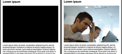
Red Areas Don’t Compress Well
A high compression rate is no silver bullet, though. Some images look terrible when compressed, especially ones with prominent bright-red areas, in which JPEG compression artifacts would be clearly visible and could spoil the overall impression of the image. Unfortunately, the editors at Aftonbladet have a fondness for images with prominent bright-red areas, which made our task just a little more challenging.

These two images are saved with a 30% quality setting. While the image on the left might be passable even on a normal screen, the red circle in the right image looks bad even on a high-density screen.
Finding A Compromise
We could solve this problem in a few ways. We could increase the dimensions and compression of the images even more, which would make the artifacts less visible. This would mean that the browser has to scale images while rendering the page, which could have a performance impact. It would also require larger source images, which in practice are not always available. Another solution would be to let the editors choose how compression should be handled for each image, but this would add another step to the editors’ workflow, and we would need to educate them on the intricacies of how image compression, size, performance and mobile devices work together.
In the end, we settled on a compromise and avoided using high compression rates for important images and image galleries, instances where the image is the center of attention. In these cases, we also make sure to load only the visible images, to not waste the user’s bandwidth.
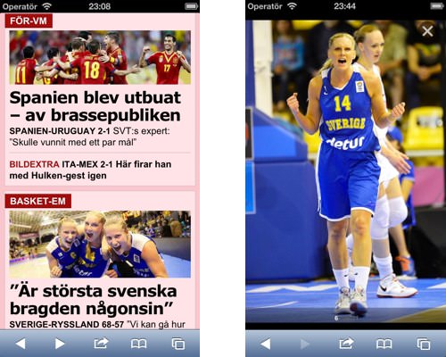
The teaser images on Aftonbladet’s section pages (left) work really well with high compression levels, while a full-screen image gallery (right) benefits from higher-quality images.
Generating the different images can be problematic. We have the luxury of an existing back end that can scale, compress and crop images on demand. Rolling your own might entail a lot of work, but implementing it as, for example, a Wordpress plugin (using the WP_Image_Editor class) would actually be pretty straightforward.
The Bottom Line
Three years after Ethan Marcotte introduced responsive Web design, we’re still struggling to find a good solution to the problem of how to handle images. All responsive image solutions are more or less a hack, and so is this one. But we have managed to escape the excessive reflowing problem, we have not introduced a lot of unneeded DOM elements, we have a cacheable website, and we prevent images that aren’t used from being downloaded.
Aftonbladet’s home page on a mobile device has around 40 images and, with this technique, ends up being around 650 KB on a “large screen,” 570 KB on a medium screen and 450 KB on a small screen (although the size varies according to the content). Without the high compression rate, the large and medium versions would be over a megabyte in size. And compared to the old website, we’ve managed to move from blurry low-resolution images to high-quality images tailored to each device, with just a 25% increase in download size.
So, we are still waiting for the perfect solution to responsive images. In the meantime, what we have outlined above has been a success for Aftonbladet’s new responsive website and hybrid apps. The new website (whose perceived loading time is twice as fast as that of the old one) has led to a huge boost in traffic and user interaction; and all through the summer, traffic to Aftonbladet’s mobile version has been higher than traffic to the desktop and tablet versions.
Further Reading
- One Solution To Responsive Images
- Efficient Image Resizing With ImageMagick
- Leaner Responsive Images With Client Hints
- Losing Users If Responsive Web Design Is Your Only Mobile Strategy
 (al, ea, mrn)

