Data-Driven Design In The Real World

Email Newsletter
Weekly tips on front-end & UX.
Trusted by 200,000+ folks.

 Flexible CMS. Headless & API 1st


 Register!
After more than five years helping content and design teams capture, measure and understand website performance data (client-side at Bazaarvoice and now at Volusion), I’ve learned a lot about connecting the dots between data and design improvements. Today, I want to share some of those lessons with you.
In this article, we’ll:
- see what a good data-driven model looks like on paper,
- look at a real-life example of the model,
- share some resources to help you get started with testing.
Defining “Data-Driven” Design
Before we can talk about using data to improve design, we have to define what we mean by “data.” This will help with a very common challenge: no shared language between designers and writers and their analytics team and tools.
Qualitative Vs. Quantitative Data
In most Web-based projects, there are two general types of data, and you’ll often see these discussed in articles about website optimization:
- Quantitative data. Numerical data that shows the who, what, when and where.
- Qualitative data. Non-numerical data that demonstrates the why or how.
Most analytics tools, such as Google Analytics, provide a lot of quantitative data, such as who has come to your website, how they got there and what actions they took.
What these tools don’t tell you is why. Why does a certain group of visitors take one action, while a different group of visitors choose another? Why does one piece of content keep visitors on your website longer than another? That’s when we turn to qualitative data. Whereas quantitative data shows scale, qualitative data gives perspective. It helps us understand not just what happened, but why and how it happened.
“The qualitative/quantitative issue is really a misunderstood area in research, especially to people who haven’t been exposed to broad-based training,” says Dave Yeats, senior UX researcher at Bazaarvoice. In his over 10 years of conducting user research, Yeats has developed a greater appreciation for the qualitative side of things:
“I’ve come across too many instances of people dismissing qualitative research as ‘anecdotal’ because they don’t understand how non-numerical data is still data.”
A good data-driven model must include both. And a good working understanding of how the two relate to each other will not only provide better insights, but also improve communication between team members.
The Key To Success: Be Empirical, Be Specific
The very best data, be it qualitative (i.e. non-numerical) or quantitative (i.e. numerical), is always empirical. Empirical data is any type of information gathered through observation or experimentation. The best empirical data answers specific questions — because when data is specific, taking action on it becomes easier.
When looking for general empirical data, such as “metrics for the website” or “how the website is performing,” you can end up with data that, while interesting, doesn’t lead directly to specific actions. Or, as Google Analytics evangelist Avinash Kaushik colorfully puts it:
“All data in aggregate is crap.”
You can’t isolate variables when looking across big aggregated metrics (such as overall page views or downloads.) This makes it difficult to hypothesize about why you’re seeing what you’re seeing. There are just too many moving parts to know.
Plus, different portions of a website — indeed, even different pages within subdirectories — have different, smaller goals. Sure, they all feed into large site-wide goals, such as sales or downloads or content consumption, but optimization must happen within smaller visitor groups, traffic segments or groups of pages. Let’s look at an example.
A Textbook Example Of Good Data-Driven Design
To better understand how to focus on empirical data, both qualitative and quantitative, let’s look at a hypothetical problem for a content-oriented website.
Let’s suppose you run an online periodical or research website. Keeping visitors engaged is a big goal! You’ve been asked to make design and content changes that will help retain visitors. Where do you start?
You could log into your analytics account and check exit and bounce rates. For our purposes, we can define these as follows:
- Exit rate. The number of times a visitor leaves your domain from a page, divided by that page’s total views. Generally expressed as a percentage.
- Bounce rate. The number of times a visitor enters a domain on a page but leaves before viewing any other page in the domain, divided by the total number of views of that page. Also generally expressed as a percentage.
Upon sorting all of your pages by exit rate and then bounce rate, you find that two pages have much higher rates than the website’s averages. Based on this quantitative data, you look up the pages. One page contains a prominent link to a sister website — this means you’re intentionally sending people someplace else. You’re not as concerned, then, by the high exit and bounce rates on that page, because that page is designed to be an exit point. But the other page contains a long, important article and no direct, intentional reason to leave.
Why are visitors bouncing and exiting so often, then? Time to turn to qualitative data! “My favorite thing to do is combine observational research (watching somebody use a site) with in-context, self-reported data asking people about their presence,” says Yeats:
“‘What are you thinking about right now?’ ‘What is your response to that?’ This combination of observation, stimulus and probing for data paints the full picture.”
Yeats is right! This is a great opportunity for user testing. And because you’ve narrowed down your efforts to a single page (maybe a couple for additional context), testing becomes more practical. You’ll also be able to determine whether any design changes you make are working, because you’ve identified specific, empirical metrics that quantify success: exit and bounce rates.
Setting Your Data Up For Success
As you look to improve your use of data in making decisions about design and content, do the following:
- Develop a common language with your analytics team or, if you’re also pulling the data, then with your analytics tool. Educate your team on specifically what you mean so that they understand the importance of the metrics you’re providing.
- Use quantitative and qualitative data together — even if people are skeptical at first of the qualitative points.
- Always use specific, empirical data — don’t offer “high-level” metrics. Find data points that answer specific design questions and, thus, illustrate whether design or content changes “worked.” (In our example, we used bounce and exit rates.)
- Remember that success does not mean the same thing for all pages or types of visitors. Consider how returning visitors might have different needs from new visitors, or how visitors from an email might have different needs from visitors from organic search. Think about the goals of individual pages and subdirectories and how they might differ.
So far, we’ve talked about the best-case scenario for data-driven design: using quantitative data to identify issues and to benchmark current performance, and then using real-time qualitative user testing to understand why you’re seeing those numbers and how to improve them.

Now, let’s walk through a recent project that I worked on at Volusion, in which we applied these principles as best we could with the resources provided.
Case Study: Optimizing The Trial Page At Volusion
Volusion offers a free 14-day trial of e-commerce software, which helps us to introduce potential customers to the product and (ideally) convert those users into active store owners.
This is the primary conversion path for our customers, which means two things:
- Our key success metric for the corporate subdomain is the percentage of visitors who sign up for a trial and then convert their trial into a paying store.
- The trial registration page (where people sign up for a trial) is an important ending point for much of our traffic.
In the last quarter, our corporate Web team was assigned the goal of improving conversions for that page (and, hopefully, by extension, store conversions). To that end, we created a new registration page with more detailed product information, and then ran that in an A/B test against the then-current trial page.
Our previous trial page provided a lot of information about the product and included a lot of different calls to action and places to click around.
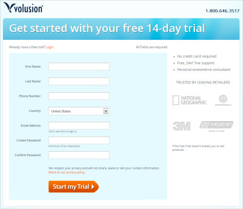
Our newly designed trial page now includes some information about the trial (“No credit-card required,” etc.) and removes distractions.
"The theory was that more information would increase the audience’s comfort level with our product, and increase conversions. Of course, we didn’t want to overload the page and distract from the primary task. So, that was the balance: keep the call to action clear, while providing helpful decision-making information." – Nathan Stull, Volusion’s website merchandising manager.
But after two weeks of testing, we saw no significant improvement either way. The pages essentially performed the same. We killed the test and asked ourselves why.
We would have loved to have gotten these pages in front of users, but that was out of scope (due to time limitations and cost). And as we started segmenting our audience in our analytics by source or location or other factors to help us hypothesize about their behavior, we saw differences in metrics for different groups.
We began to realize that what seemed like a good change for some people would likely prove unhelpful or even distracting to others. Trying to drive meaningful change across all demographics at once just wasn’t working. For example, some people would have landed on the registration form never having heard of us, while others might have returned to the website several times, already familiar with our product. We needed to narrow our test.
Fine-Tuning The Test
To get a more controlled group, we selected a subset of our pay-per-click (PPC) audience. Narrowing our test to this group served two purposes. First, it focused our test to a smaller subset that we could optimize for. Secondly, it meant that any conversion improvement would also give us more bang for our PPC bucks.
The subset we chose included only visitors from our PPC “remarketing” program. Remarketing in PPC is when you buy placement ads on a content network and then display them only to people who have previously visited your website but who did not take some action that you wanted them to take. This gave us a much clearer understanding of the audience, because we knew these visitors were already aware of Volusion and our products.
Now that we had identified the audience we wanted to focus on (how they came to us, where they were in the purchasing funnel, etc.), we could provide a lot of quantitative metrics to our designer and copywriter as they created the new trial page. In the absence of user testing, which, in this case, was cost- and time-prohibitive, this data provided some specific customer insights and ideas for improvement, including the following:
- Visits by placement URL. The placement URL tells us the location of the ad that the user clicked to get to our website. By looking at the audience demographics of the placement URL, you can learn about your remarketing demographic. Just put those websites into a third-party analytics tools, such as Quantcast or Alexa.
- Other pages visited. What other pages did they visit on our website, besides the trial registration page? This can help you understand what content would be helpful to feature on a page such as the trial page, so that visitors don’t have to search for it elsewhere.
- Top visitor paths for non-converting versus converting visits. How did this audience navigate our website? Did most of them sign up for a trial right away, or did they return to the trial page after conducting additional research? Are there navigation loops that suggest they want to learn something about our product that they are not finding?
- Website search metrics. What terms did the remarketing segment search for on our website? Is there a very common term that indicates an aspect of our product that we need to talk about in the trial form?
Most analytics products will provide you with metrics such as those listed above. Here’s how we found them.
Collecting Quantitative Metrics
At Volusion, we use Google Analytics and rely primarily on Google’s content network for our remarketing campaigns.
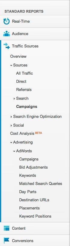
Visit counts by placement URL are available in the “Campaigns” section of Google Analytics, which you can find under “Traffic Sources” in the left-hand menu (as highlighted in the screenshot above). We just filtered the campaigns for “Remarketing” so that we saw only those campaigns.
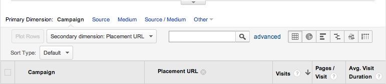
When you load this report, you can set the secondary dimension to “placement URL.” This option is available directly above the traffic results in the report (see the screenshot above). By default, this will tell you the number of visits and unique visits and the bounce rate by placement URL. Look for placement URLs that have high visit counts and a low bounce rate with high conversion rate. This signifies a good source (i.e. a lot of visits) of highly engaged traffic that converts rather than bounces.
Check out those websites to get a little qualitative information on your ideal demographic!
For the other metrics in our list (navigation paths, pages viewed, etc.), we set up an “advanced segment” in Google Analytics for the “remarketing” traffic demographic. This allowed us to view all of the reports available for only a subset of visitors — in this case, wherever the campaign equalled remarketing. In case you haven’t used custom segments, the Google Analytics website has a great explanation of how to use advanced segments.
If you’re also a Google customer but do not see AdWords data, then make sure to link your AdWords and Analytics accounts. If you’re not a Google customer, then similar data is available from all of the other major analytics providers: CoreMetrics, Webtrends, Omniture, etc. Your accounts person should be able to point you to similar reports.
Based on our research, we developed a new trial page (below), which includes a new screenshot, content changes, and icons that call out the product features we thought best speak to the remarketing demographic. We then reran our original trial page against this new one.
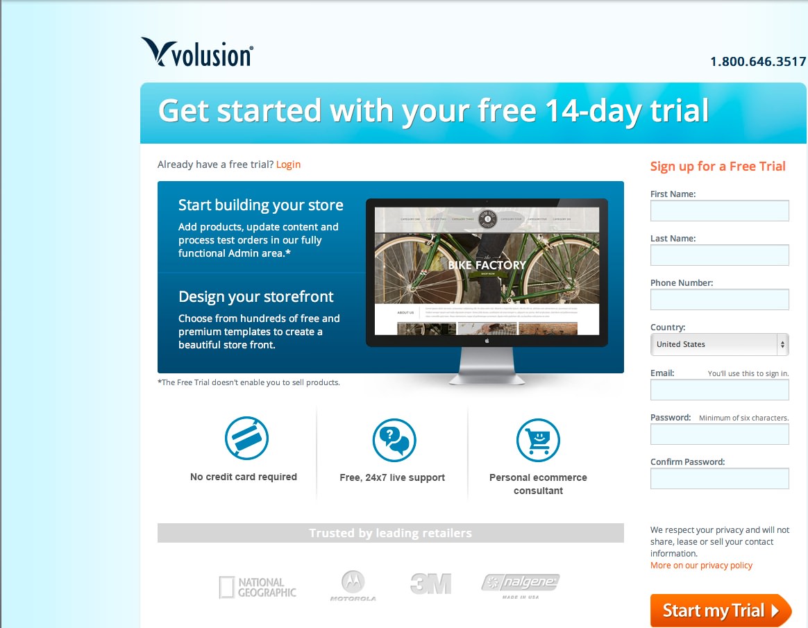
New trial page with content and features customized to the remarketing demographic. (Larger view)
Running The Successful Second Test
Over the next month, half of our remarketing traffic saw the original landing page, and half saw the newly optimized landing page.
The result? We saw a 48% increase in trial registrations for the new page!
But that boost in registrations was only half of our metric for success. Now, we had to see whether those users converted over to new paying stores. What if, for example, we saw an influx of new trial users who didn’t convert their trials over to stores? These new users would tie up our sales team and marketing efforts, while hindering our ability to convert qualified users into paying customers.
The trial lasts two weeks, so it would take at least that long for a trial-to-store conversion report to verify the quality of these new leads. We had to find another source of information to put our minds at ease.
Risk Management: Qualitative Data From Our Sales Team
When our sales team reaches out to trial users, they score the quality of the lead (i.e. the likelihood that the person will convert to a store) in our customer relationship management (CRM) system. (A CRM is a tool that businesses use to track all kinds of customer interactions, including sales and support tickets. Salesforce is probably the most common.)
The score is calculated using specific factors, such as whether the salesperson spoke verbally with the trial user, what kinds of questions the user asked, and whether the user already had an online store with another provider. So, while direct user testing for qualitative feedback was out of scope, we used these lead scores and qualitative notes from our sales team to draw conclusions about the types of visitors we were attracting. To our relief, the scores looked good!
When the first round of new trials reached their two-week limit, the trial-to-store conversion rate for this new page had improved by 57% — adding good news to the already significant increase in demos that those pages were bringing in.
Conclusion
In the end, we created a trial page that attracted more of the right kind of customers, or — in other words — more qualified customers and that, ultimately, led to more store purchases. This page is still live today. To see it, you have to be in the remarketing visitor demographic.
Our big take-away from this round of testing was that trying to optimize one page for all our traffic wasn’t leading to notable results. So we created different pages that catered to different users based on traffic source. If you visit Volusion’s website via any page, and then return by a remarketing source, such as an ad from Google Content Network, then you’ll see it on this special landing page.
We’re currently working on additional optimizations for different demographics, but today’s average visitor on their first visit will still see the original page. Depending on how they return later, they might see something different.
Applying Our Lessons To Your Work
As you apply some of these lessons to your work, do the following:
- Tailor your landing pages to specific audiences. This will benefit both your customers and your business.
- Identify the specific business goal of the test (for example, to improve the trial conversion rate of qualified leads), and clearly identify the traffic segment (for example, PPC remarketing traffic).
- If you’re on the testing and analytics team, take specific demographics and data to your content and design team. (If you’re on the content or design team, demand details!)
- Know what success looks like, and then get buy-in from everyone involved. Many pages, audiences and websites have multiple goals. You can’t achieve all of those goals at once. Make sure everyone agrees on the goal of this particular task.
- Testing like this can be resource-intensive, so focus your efforts. We’re going to restrict this type of testing to our PPC traffic, at least in the short term.
- Don’t just randomly test pages and elements. Inconclusive results from a poorly designed test can lead you in the wrong direction and even reduce your company’s interest in A/B testing. (For instance, we tried to test the home page and saw no actionable results, which hurt our credibility when we asked for more testing opportunities and more of our designers’ time.)
- When you receive inconclusive results, don’t give up! Develop a new hypothesis about why, and then keep testing.
- Remember that qualitative data is still data! It has great applications in discovering the “why” behind user behavior, and even in mitigating internal apprehensions about testing. (In our test, we used lead scores and notes from our sales team to support our claims; you could also use interviews and surveys.)
- Focus on the empirical data! We didn’t distract our writer and designer with a 30-slide presentation on traffic trends for the whole website for the past five years. Instead, we isolated the traffic base to just remarketing, and then only provided metrics that would help the writer and designer create a page tailored to that audience.
Tools For Getting Started
A lot of tools are available to help you advance data-driven design in your organization. As mentioned, at Volusion, we use Google Analytics for our analytics and Google Experiments for most of our on-site A/B testing. They’re free and work great! Here are five other optimization and testing tools we love:
- Optimizely is a great A/B testing tool for websites. It comes in plans lower than $100 a month.
- Email on Acid provides email testing. All plans are less than $100 a month, and there is a free option.
- Attention Insight uses an algorithm to generate attention heat maps.
- User Testing provides summaries and videos of people talking about your website as they use it.
- BrowserSize is a free super-simple Google Labs tool that shows what portion of a website appears in what percentage of browsers without scrolling.
Last but not least, Internet, Mail, and Mixed-Mode Surveys is a great book for getting started with surveys and worth checking out!
Further Reading
- Effectively Planning UX Design Projects
- The Ultimate Guide To A/B Testing
- A Roadmap To Becoming An A/B Testing Expert
- Algorithm-Driven Design: How Artificial Intelligence Is Changing Design


