Dear Web Font Providers

Email Newsletter
Weekly tips on front-end & UX.
Trusted by 200,000+ folks.


 Register!
 Flexible CMS. Headless & API 1st
When you buy something, I bet you want it to work. Heck, even if you use something for free — maybe borrowed from a friend — I bet you want it to work. No one prefers hiking boots that are too tight (or too loose), a car that shimmies when you drive faster than 40 miles an hour, or a kitchen knife that can’t cut a tomato. And Web designers don’t prefer fonts that don’t fit a project, fall apart in different browsers or can’t be used in a mock-up.
We also don’t like wading through all of the fonts that won’t work for us in order to find the ones that will. It takes precious time away from other tasks and responsibilities.
You’ve Come A Long Way, Baby!
Six years ago, A List Apart published “CSS @ Ten: The Next Big Thing,” in which Håkon Wium Lie describes the @font-face declaration and announces:
"Two things must happen before Web fonts can take web design to the next level… First, we must ensure the validity of the approach.… Second, we must convince browser makers to add support for web fonts."
You Helped Make It Happen: Validity And Browser Support
Today, browsers support Web fonts, and we’ve got the valid CSS to make the fonts work. Of course, as old browsers changed and new browsers (and extended font families) emerged, valid CSS became an ever-moving target.
On the DIY side, a big “Thank you!” to Paul Irish, who gave us the “Bulletproof Syntax” to fool Internet Explorer (IE) into loading the correct font file (remember using a smiley face for the local font name?); to Richard Fink, who gave us “Mo’ Bulletproofer Syntax” to fix a font-loading problem in Android; and to Ethan Dunham, who gave us the “Fontspring @font-face Syntax,” which even works in IE 9. You all thoroughly explained why your syntax works, which enabled each to pick up where the other left off. On top of that, Dunham, your @font-face generator brought valid syntax to those of us who (please, I beg of you) just want our fonts to work.
Web font hosts such as Typekit and Fontdeck deserve a shout out, too. You worked to support multiple weights and styles of a font family cross-browser. Your variation-specific font-family names (which is a shorter and sweeter way of saying, “Hey everyone, you need to use a unique font-family name for each weight and style of a family”) require longer CSS, but they are valid and allow more than four weights and styles to load in IE 7 and 8. Those of us who can’t live without light, regular, bold, extra bold, and black weights are in Web font heaven!
You Went Above And Beyond: Responding To The Needs Of Type Designers
One aspect that Lie missed in his article was the need for more Web fonts — how could we take Web design to the next level if we didn’t have a lot of fonts to use? This, of course, meant that you had to gain the trust of the type design community.
You had to protect the fonts.
Remember when type designers wouldn’t design or provide Web fonts without the guarantee that their files were secure? Typekit, your article “Serving and Protecting Fonts on the Web” (2009) laid out how you set up hurdles to “discourage casual misuse” and created a reasonably secure system for serving fonts.
Thanks to everyone’s tenacity, at some point in the last four years, “reasonably secure” was enough for type designers to take a chance. And now they’re hooked. In a recent interview, Jonathan Hoefler and Tobias Frere-Jones of H&FJ said: “We’re requiring that every new project have a way to thrive not only on paper, but on desktop and mobile screens.” How freaking awesome is that?
So, in the span of only six years, you’ve come a long way, baby. Web font syntax is valid and supported by most browsers (our fonts load!); we have thousands of Web fonts to work with; we have multiple options to deliver Web fonts (DIY or through a service provider; and free, monthly, yearly or a one-time purchase); and you are constantly improving your services, so Web fonts are easier to implement and they (usually) load seamlessly!
What else could a Web designer need from you?
I am so glad you asked.
“What About Us?”: What Web Designers Need
Web designers — especially those of us who care about type and are trying to be thoughtful about the fonts we use — need more than access to thousands of Web fonts. Frankly, we need access to high-quality, appropriate Web fonts. And we need to be able to find them.
We’ve visited your websites. Some of you have thousands of fonts for us to use. But you know what? More isn’t always better. Sometimes more becomes more-stuff-to-wade-through-to-find-what-I-want. In 2010, a New York Times article, “Too Many Choices: A Problem That Can Paralyze,” reported on the debilitating effect of too many choices. Too many choices make it harder to choose. How do we know our choice is the best one? How do we know it’ll fit when we go for a hike? And if it does fit, how do we know another one won’t fit better?
Benjamin Scheibehenne, a research scientist at the University of Basel in Switzerland, suggests in the article that debilitation comes not only from too many choices, but also from a “lack of information or any prior understanding about the options.” Hmm. While we’re at it, how do we know it won’t shimmy on the highway?
You’ve given us thousands of Web fonts. Now give us useful information about the options. Help us understand them. Help us ascertain which ones will work best for us. Which ones will work for a particular project. Which ones hold up cross-browser. Which ones will integrate seamlessly in our workflow.
Show Us Your Web Fonts in Context
Most of you show us how your fonts will sort of look in context. You give us just enough to see whether a font might be appropriate to use (“Hmm, this one is a slab serif, so it might work.”), and you help us to eliminate those that definitely won’t work (“Nope, I don’t want such a round-looking font.”). OK, that’s a start. But that’s not enough.
Take a page from history. Before type went digital, printers and type designers sold their typefaces to clients by showing how they looked in context. They’d provide broadsides or books, often setting each typeface in paragraphs at various sizes. They’d show available weights and styles of each family. And because the specimen sheets and books were printed, publishers and designers could see how the typefaces held up when the ink hit the paper.
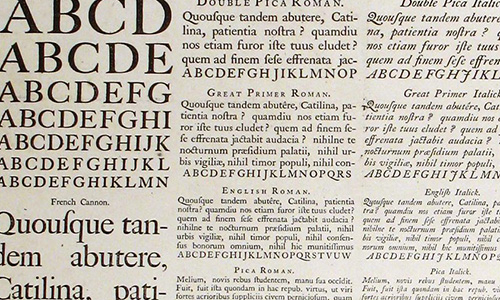
A specimen sheet by William Caslon, 1728. The typeface is shown in paragraphs of various sizes in both roman and italic. A larger digital image shows other fonts available in the family. If I were in the market for a typeface back in 1728, I’d know exactly what to expect from Caslon.
Not to name names, but Fontdeck, Fontspring, Font Squirrel and MyFonts, you guys only offer the opportunity to test-drive Web fonts in a sentence. The problem with a sentence is that it doesn’t show how the font looks in body copy. Body copy has visual texture, and texture can be pleasing (lively but not intrusive, promoting horizontal movement of the eye) or jarring (with uneven spaces or a strong vertical pull, hindering horizontal movement of the eye). Texture affects readability.
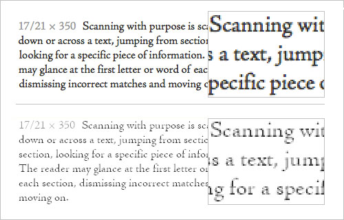
Texture also affects the look of a Web page, and Web designers need to know whether they are picking a font with the texture they need. A sentence doesn’t help us to make a good choice. If you don’t believe me, take a look at the images below. Two fonts that look really similar when set in a sentence look different when set in paragraphs of text.
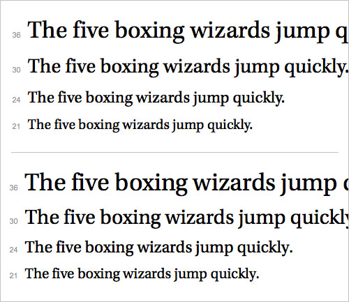
Cascading sentences from Typekit. Top: Kepler Standard by Adobe. Bottom: Utopia Standard by Adobe. Both are serif fonts with a slightly oval bowl (look at the shape of the “o”) and a high contrast between thick and thin strokes. They look pretty similar to the casual eye. Heck, they even look pretty similar to the trained eye!
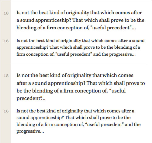
The same fonts set as text in paragraphs from Typekit. When shown in paragraph format, we can see the difference. Top: Kepler Standard by Adobe. Kepler has a rounder, “bubblier” feel and looks slightly smaller when set at body-copy sizes. Bottom: Utopia Standard by Adobe. Utopia feels more structured, less round. And, of course, it looks bigger when set at body-copy sizes. Neither of these fonts is “wrong” when set in text. But they look different in paragraphs, and each might be appropriate for different projects.
Now, for the rest of you, Google Fonts, Fonts.com, Webtype and Hoefler & Frere-Jones, you show your fonts in paragraphs. Thank you. But just so you know, not all of the paragraphs are as helpful as they could be.
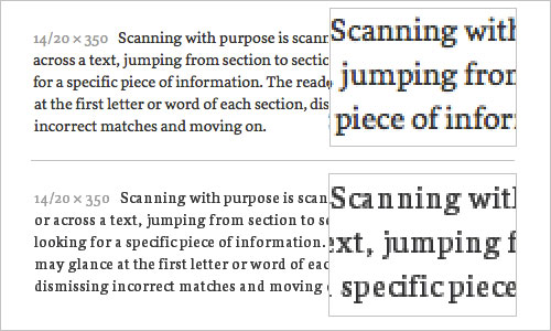
Google Fonts, your text has too tight a line height, so your fonts all look clunky (see the image below). Fonts.com, you don’t offer enough text sizes; if a font looks too small at 14 pixels and too big at 18 pixels, we can’t tell what it would look like at 16 pixels (just so you know, 16 pixels is a really popular type size for Web text). Webtype, you use a string of capitalized words, so there are too many capital letters, and your fonts look clunky; if you want to show us what your fonts really look like, just use plain text. Hoefler & Frere-Jones, your paragraphs are limited to three lines, with a super-long 725-pixel line length; these paragraphs aren’t delightful to read, and they undermine the quality of your fonts.
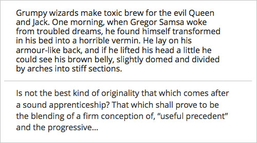
Which font would you choose? How paragraphs are set makes a difference. Top: Google Fonts paragraphs have a tight line height. Open Sans looks clunky and hard to read, making it hard to tell whether the font would look good in body copy. Bottom: Open Sans on Typekit. A looser line height helps us to see that the same font is actually a pleasure to read.
Typekit and Typotheque, of all the Web font services I’ve visited or used, you provide the best on-site examples of how your fonts look in body copy. You both provide multiple paragraphs at various sizes, with a good line length and a good line height. WebINK, your off-site solution is also pretty good. Using the FontDropper 1000 bookmarklet, I can drop any of your fonts onto an existing Web page and see how it looks in context. One problem I noticed, though: Your bookmarklet doesn’t drop in an entire font family, so we can’t see a font’s true bold and italic.
Which brings us to font families. I’m sure you’ve noticed that bold and italic versions of a font are sometimes too similar to the regular font, which undermines hierarchy. Other times, the bold is too heavy or the italic too squished, and one or both are hard to read. These are all reasons why we might not want to use a particular font. Plus, sometimes a bold or italic has letterforms that a client simply doesn’t like.
So, to really see how a font works in context, we would need to see how the entire family of weights and styles works together. Unfortunately, none of you do this yet.
Show Us What Your Fonts Look Like On Other Systems And Browsers
I’ve been talking a lot about context. Context is not just a font’s texture in a paragraph or how the font family works together. Context is also where a font “lives.”
As Web designers, we know that our designs are ephemeral, constantly changing based on operating system, browser and screen size. For example, we know that fonts behave differently cross-browser — if they aren’t hinted correctly, then letter shapes, strokes and letter spacing will change in unexpected ways.
If fonts aren’t hinted well, their strokes can change significantly from browser to browser. This font looked great on my Mac (top). When I tested it cross-browser, I ran into problems (bottom). The font is too light to read easily.
If fonts aren’t hinted well, then spacing (both inside and between letters) can change significantly from browser to browser. This font looked great on my Mac (top). When I tested it cross-browser, I ran into problems (bottom). The font gets narrower, and the spacing between letters is erratic.
The only way to know whether a font will work cross-browser is to test it. And let me tell you, testing Web fonts is mind-numbing and time-consuming. (I once cleaned out my garage to avoid testing fonts for a project.)
Thank you Fonts.com, MyFonts and Typekit for providing screenshots of your fonts in different browsers. You present only cascading sentences, but even that helps. Much like Caslon’s printed specimen sheet showed what his typeface looked like in print, you three give Web designers a glimpse of what your fonts look like in use. You show us which fonts to reject and which to consider for further testing.
Hoefler & Frere-Jones, you claim that your new Cloud.typography service creates multiple font files (each hinted and built for a specific browser and platform) and supplies each browser with its unique font file. If this is true, then your fonts should look great across all browsers. If this is true, I might just have to bake you some cookies. But I sure wish you’d provide screenshots to back up your claims. Some things I need to see for myself.
Let Us Use Your Fonts In Mock-Ups
Some Web designers comfortably go from a pencil-and-paper wireframe to building a partial-website-as-mock-up. Others prefer (or are required) to include an intermediate step and mock up pages with a tool such as Photoshop, Illustrator or InDesign.
I know — now it’s your turn to tell me to take a page from history.
Before type went digital, designers didn’t mock up projects using real fonts. Clients certainly couldn’t expect to see such a thing — comps were fine. But since the late 1980s, mock-ups have been expected to “look like the real thing.” And if we want (or need) to show a realistic mock-up to a client, we need access to the Web fonts.
Fonts.com, Font Squirrel, Google Fonts and WebINK, you all supplement Web fonts with free access to desktop (or “mock-up”) fonts for subscribers. Thank you.
Again, unfortunately, none of your solutions are perfect. Fonts.com, you allow access to mock-up fonts for only one day, to “kick off the design process.” I don’t know how it works in your office, but I can’t get anything done in one day. Font Squirrel and Google Fonts, you specialize in free fonts. While I (and my students) love having free fonts to use, access to good-quality body fonts is sort of limited. WebINK, your plugin for Photoshop is a great solution — unless a Web designer prefers to use Illustrator, InDesign or another tool.
Fontspring, MyFonts, Typotheque and Hoefler & Frere-Jones, I know you all offer bundles or discounts for purchasing both Web and desktop fonts, and bundling does take some of the pressure off a Web designer’s wallet. But if you’re a small company or an independent designer, like me, shelling out the extra money just to mock up an idea is hard.
The most promising approach for mock-up fonts might be just around the corner. Typekit, I know you’re working with Adobe Creative Cloud to bring us desktop font sync. I’ve tested it out, and I’m happy to report that it works like a charm. (OK, my old Mac laptop runs more like a tortoise than a hare when I’m running Creative Cloud — but, hey, I can turn it off when I’m not using it.)
I was cynical (who me?) about font synching actually working. I use CS6 out of the box and the free Creative Cloud membership level. But you promised me that it would work with a paid Typekit membership (which I have), and it did! The fonts even stay synced when I’m working offline. This has exciting possibilities.
In Conclusion
I know you guys are busy, so I’ll wrap this up.
One more thing needs to happen before Web fonts can truly take Web design to the next level, and only you can do it. You need to meet the needs of the people who actually choose and use the Web fonts (ahem, Web designers).
Sure, we can all work around these issues. Personally, I’ve got a font specimen page that I use to test the fonts I’m interested in. After I narrow down the options, I can test fonts cross-browser myself. Hours later, if one of the fonts I like actually works, I can go straight to HTML and CSS from my pencil sketch and avoid the need for mock-up fonts.
But here’s the question:
"Why should we have to work around these issues?"
(All Web designers who love to use new fonts, repeat after me, “Why should we have to work around these issues?”)
If it’s important that fonts load in every browser, why isn’t it important to identify which fonts actually look good in every browser?
If it’s important to woo font designers so that you have a lot of fonts to offer, why not show us how those fonts actually work in copy?
Look, Web fonts aren’t just font files that need to be secure and easy to implement. They affect the overall look and usability of a website. They need to be chosen with care. And thanks for the thousands of fonts, but quantity is not as important as quality. A hundred knives that can’t cut a tomato won’t meet my needs when I’m making my kid a BLT.
So, make our lives a little easier. Make our work a little better. Help us find the Web fonts we want to use.
I dare say, you’ll win some affection from every Web designer who has ever looked at the thousands of Web font options and said, “Oh shit. Which one should I use?”
Sincerely yours,

P.S. In case you’re interested, I’ve summarized how you’re all doing so far. Web designers who love to use new fonts, I hope you find it useful.
P.P.S. Below you’ll find the official bibliography of the articles quoted above. Otherwise, my students would be very disappointed by my lack of scholarly detail.
- “CSS @ Ten: The Next Big Thing” Håkon Wium Lie, A List Apart
- “Serving and Protecting Fonts on the Web,” Typekit by Adobe
- “Too Many Choices: A Problem That Can Paralyze,” Alina Tugend, The New York Times
(Credits of image on front page: Michael Bundscherer)
Further Reading
- Review of Popular Web Font Embedding Services
- The @Font-Face Rule And Useful Web Font Tricks
- Avoiding Faux Weights And Styles With Google Web Fonts
- A Closer Look At Font Rendering


