The 10 Commandments Of Efficient Design In Axure

Email Newsletter
Weekly tips on front-end & UX.
Trusted by 182,000+ folks.
 Custom Web Forms for Angular, React, & Vue. Your backend.

 Celebrating 10 million developers

Axure is a powerful tool for creating software prototypes quickly. Getting started with it is really easy; however, therein lies a danger. The tool is so intuitive that many users can be productive without undergoing any formal training. What they might not be aware of is that they probably aren’t using Axure optimally.
In my experience as a UX designer, I seldom draw a page and get it right the first time. Most of the time, I go through five to ten iterations. When your UX design is used as the blueprint of an agile project, you might need to keep the entire project up to date with the scope of development. Sometimes these changes will affect a dozen or more other pages. It is at these times when some of the less evident features of Axure can become huge time-savers.
I generally work in teams to create wireframes and prototypes. To do this, I make use of Axure’s “shared projects” functionality (“team” projects in Axure 7). Multiple people being able to work on a design project at the same time remains my favorite feature of Axure, but it does demand a tidy and structured way of working. You will undoubtedly find someone else working on a page that you’ve designed or yourself working on another’s page. I’ve written these commandments with Axure in mind, because that is the tool I presently work with, but I’m certain many of the principles apply to other tools.
This list of 10 commandments is what I’ve found to be crucial techniques to save time in the long run. This way of working does not always provide the quickest results in the short term, but it does allow for optimal flexibility further down the line.
I) Thou Shalt Never Use Two Widgets When One Will Do.
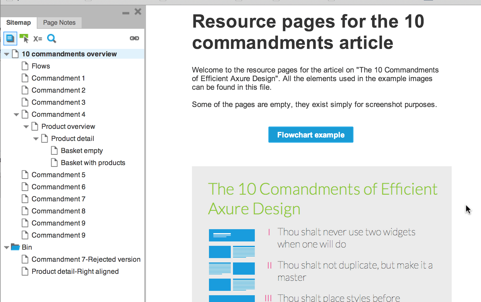
The most common time-consuming behavior that I see with beginner and advanced Axure users is the use of unnecessary widgets. I still catch myself making this mistake and have to remind myself constantly of this first commandment. Each widget that you add to your project will require a bit more work when you need to make changes in the future. All of these little bits of work start to add up after ten iterations. Below is a simple example of how two visually identical objects can be built up in different ways.
Both examples show a situation in which someone uses a separate widget for the text and the button. When this person then wants to add onClick behavior to the entire object, they have two options. The first option is to add a hotspot over the group, which results in three widgets to maintain. The second option is to create the onClick interaction for both elements, which results in two behaviors to maintain.
Both of these options will cost unnecessary time when changes need to be made. A much leaner way is to create this object by adding text to a box widget.
Your text can then be positioned using the “alignment and padding” tools. You will now have only one widget to maintain and will need to connect only one behavior to it.
II) Thou Shalt Not Duplicate, But Rather Make The Object A Master.
When I find myself in a late stage of a design and realize that we need to change the main navigation on every single page, I experience tremendous joy. Not because I enjoy a big pile of repetitive work, but because all I need to do is edit my single master object and — presto — the whole project has been updated.
Using a master for the main navigation would seem to be quite obvious, but it pays to create a master for anything you use more than once. Whenever you find yourself copying and pasting a group of widgets, always remember that creating a master is probably better.
After creating a master, such as the product tile above, if you decide to change the button’s label to “Buy now,” you will need to edit it only once to see the change in every instance of the master.
Remember not to turn overly large groups into masters. The larger a group of objects, the higher the chance you will need a variation of that master at some point. Combining masters into another master is often better. This can be convenient when you need some variations of one master, with certain elements always included and other elements varying, as below:
This base master has no pricing information included, but it can be combined with one of the other masters to create new masters for full product tiles.
III) Thou Shalt Place Styles Before Masters.
Masters are great for creating reusable elements, but they do not allow for variations. Each instance of a master will be exactly the same as the others. This is where styles come in. Suppose you have a button design that needs to be replicated on multiple pages, but the labels on the button need to vary. Styles can help you achieve this easily. Every property of a button can be managed through styles; all you need to do is change the label.
The affordance of buttons is often enhanced with mouseOver and related behaviors. These behaviors are often created in Axure by using dynamic panels. The different states are then placed in different panel states and selected with scripts. With this method, however, you would need to go into each of the panel states to change the copy of the button.
A much faster way of dealing with button behavior is to use the “Interaction Styles” dialog box. With this feature, simply set different styles for each behavior state, and then you would need to set the copy and size of your button only once.
Tip: Use the “Auto fit width” function, introduced in Axure 7, on your buttons. If you set up the left and right padding in your style, all you will need to change is the button text, and then the size of the button will automatically adapt.
IV) Thou Shalt Keep Thy Project Organized And Shalt Name Clearly.
Axure provides many options for keeping things organized. Every element that you place on a page can be given a unique name. Pages may be named and organized in a tree structure. Masters may be given names and sorted in folders and so on. But why go through the effort of giving everything a clear name?
- Keep things organized for yourself. When you have an elaborate page and you want to create an interaction with a dynamic panel, you will have to sift through a long list of elements to find the one you are looking for. You can use the search field — but only if you have thoughtfully named your items.
- Allow for team members to step in. If, like me, you work in teams on your projects, unexpected things will always happen. You or your colleague could become ill or unexpectedly have to work on another project. It is critical, then, that the project be so clearly set up that the other can just step in and take over. Interactivity built by another can be particularly complicated to step into.
- You will be sharing with third parties. In the average project that I work on, my wireframes get shared with at least 10 people. Some people will sit at a table with me and can be carefully guided through. Others, I will never meet and will have no idea of their understanding of wireframes. Ideally, a prototype should be viewable autonomously.
Several things I do to achieve this are the following.
Create A Landing Page
You could set up the home page of your prototype as a starting page that explains what people are looking at and how they can use it. Additionally, you could provide your contact information or links to flowcharts.
Give The Pages Unique And Self-Explanatory Names
The prototype will be easier to understand if the page names are clear and explain what the pages are. People will also use these names in future communication. If, for example, a graphic designer works on a comp based on your design, they will likely use the same names for the pages as you did. If a page’s name is not unique, then different names for the page will appear.
Create a Flowchart Of The Most Common User Flows
Most people don’t think of a design as a tree of pages; they think in terms of a flow of activity. You can create flowcharts in Axure to reflect the important user flows and to link the nodes to the relevant pages. You would then provide an extra way to navigate the prototype. (The names in the flowchart would be based on those in the site map. Thus, it would become evident whether you are naming clearly.)
V) Useth Always Global Guides And A Grid.
Axure allows users to create two kinds of guides: local guides, which exist only on one page, and global guides, which are visible on all pages. The guides can be set up using the “Create Guides” dialog box. If you set up guides in, for instance, a default 960 grid, then consistently positioning elements over the different pages becomes a lot easier. Also, your team members will see these global guides in a shared project.
Using a grid can help you keep your designs clean and structured. I usually set my grid to 10 × 10 pixels and create all of my objects with dimensions of multiples of 10; for example, a button of 60 × 20 pixels, and not 55 × 18 pixels. When you place these objects on the grid, everything becomes easier to align and will satisfy any obsessive-compulsiveness you may have. Of course, allow yourself to stray from the grid for special objects that need different dimensions.
Tip: In Axure 7, you are able to set up different sets of global guides for mobile and desktop pages. Here’s an example of a mobile grid I like to use:
VI) Forgeteth Not The Import Tool.
In most projects, people create elements that are useful in other projects. Instead of reinventing the wheel for each project, reuse things that have worked in the past. Many of the basics will remain the same throughout projects, such as styles, guides and certain masters. Although copying and pasting objects from one .rp file to another is possible, not all information would be carried over. When you paste a button that has a particular style, that style will not be pasted along with it.
The best way to reuse elements is by using the powerful import function. This enables you to import pages and masters, but also styles and guides.
Tip: Create a “mother” .rp file, in which you keep all of your standard masters, to import for new projects.
VII) Thou Shalt Keep Old Versions Of Pages.
I often find that I need to go back to an old version of a project. In the “good” old days (I won’t bore you with the reasons why “good” is in quotation marks), when I was often required to create wireframes in Visio, managing projects with many pages was difficult, so I would end up taking out the legacy pages. I would also save a new file every few days with an incremental number, so that I had some sort of history of the project. In other words, I ended up with a folder of hundreds of pretty large files, wasting space.
In Axure, keeping track of old versions is easy. Simply create a folder (or a page in Axure 6.5 and earlier) named Bin.
Place old versions of pages in there, so that you can easily refer to them when you need to go back in time. When exporting, simply use the option to not export all pages. This way, you can share a clean version with clients and still have old versions be directly accessible.
VIII) Thou Shalt Not Make Unnecessary Interactions.
First-time users of Axure are often impressed by the ease with which interactivity can be added to a prototype. When I started out, I couldn’t resist creating every possible interaction on my pages. However, in many cases, my designs could be clearly communicated without any interactivity — simply as still images. I now add interactivity only if the answer to one of the following questions is yes.
1. “Do I Need Interactivity To Communicate My Design Unambiguously?”
Could your design be interpreted incorrectly if you supplied only still images, instead of an interactive element? This might be the case for an interaction that relies on certain animations to be understood.
2. “Will This Interactivity Save Time In The Long Run?”
Would making an element interactive be quicker than showing different states on different pages? For example, creating and maintaining an interactive page with tabs would be easier than creating multiple pages for each tab.
3. “Do I Need To Convince Someone Of A Concept For An Interactive Element?”
When I come up with what I believe to be the best solution for a problem, but I know it will be heavy to develop, then I need people to support the idea. I have found that making something interactive can help sell the idea.
But if the answer to all of these questions is no, then I prefer to create multiple versions of a page that simply show different states of an interactive element.
IX) Useth Font Icons Instead Of Images.
Another simple but often overlooked way to keep Axure projects manageable is by minimizing the number of images. To change the color of an icon image in a prototype, you would have to go through several steps. You would need to open an image editor, make the changes to the icon, export to a new bitmap, and finally import into your Axure project.
Another option would be to use an icon font. With one, you can change color and scale within Axure. A great source of basic icon fonts is CopyPasteCharacter, whose fonts work right out of the box on most platforms.
With an icon font, you can add a graphic to a button and still obey the first commandment.
X) Previeweth Thy Prototype In The Browser Or On A Device.
Designers get frustrated upon learning that their prototype doesn’t look the same in the browser as it does in Axure. In particular, text spacing and positioning look off. What’s more, there are even differences between browsers. To avoid surprises, constantly preview your prototype in a browser or on a device if you are designing for mobile.
Even though you will never be able to eliminate all differences between Axure and the browser, there are some ways to limit them.
Text Wrapping
Here is how Axure wraps text:
And here is how a browser wraps text:
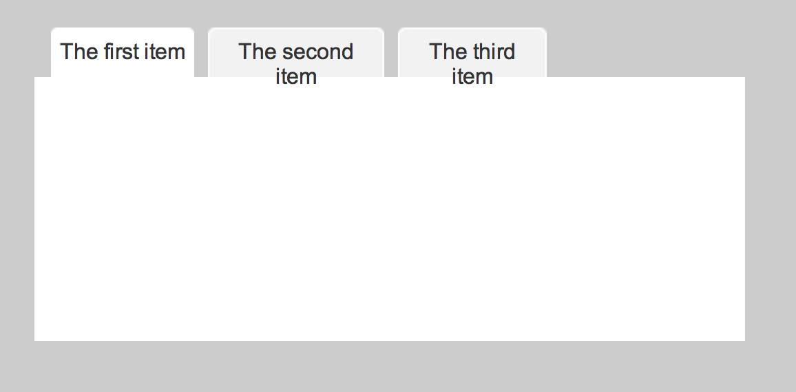
To prevent text from wrapping to the next line, make sure your text boxes have sufficient breathing space. The safest bet is to always give text the maximum amount of space that it might need. Thus, if you need to edit your text in the future, you won’t need to resize the text box; it will wrap the way text should.
Vertical Spacing
Vertical spacing can look significantly different between a browser and Axure. You can tweak the spacing in Axure until you find the setting at which the text will look good in the browser, but this is quite an effort with an uncertain outcome. The only way to be certain of the positioning of text is either to break up the copy into chunks or to convert the text to an image. The first option breaks the first commandment, unfortunately, although it is sometimes unavoidable.
Summary
A few of these commandments bring results in the short term, but most yield benefit in the long run. All will save time and, perhaps more importantly, keep your work pleasurable.

I hope these commandments become as useful to you as they are to me. I’m certain that other people think other rules are more important, and it would be interesting for us all to hear about them, so post your ideas in the comments.
If you haven’t yet, try out the beta version of Axure 7. Some of the changes really help to keep one’s work organized.
One last point: These rules, like any others, are made to be broken. Never let them hinder your work. As smart designers, we need to know when to break the rules.
- Sample RP file (ZIP)
Further Reading
- A Deep Dive Into Axure 8: A Comprehensive Review
- Creating Responsive Prototypes With Adaptive Views In Axure RP 7
- How To Integrate Motion Design In The UX Workflow
- Mobile Prototyping With Axure RP


