Challenging CSS Best Practices

Email Newsletter
Weekly tips on front-end & UX.
Trusted by 182,000+ folks.
 Custom Web Forms for Angular, React, & Vue. Your backend.
 Celebrating 10 million developers


*Editor’s Note: This article features techniques that are used in practice by Yahoo! and question coding techniques that we are used to today. You might be interested in reading Decoupling HTML From CSS by Jonathan Snook, On HTML Elements Identifiers by Tim Huegdon and Atomic Design With Sass by Robin Rendle as well. Please keep in mind: some of the mentioned techniques are not considered to be best practices.*

When it comes to CSS, I believe that the sacred principle of “separation of concerns” (SoC) has lead us to accept bloat, obsolescence, redundancy, poor caching and more. Now, I’m convinced that the only way to improve how we author style sheets is by moving away from this principle.
For those of you who have never heard of the SoC principle in the context of Web design, it relates to something commonly known as the “separation of the three layers”:
- structure,
- presentation,
- behavior.
It is about dividing these concerns into separate resources: an HTML document, one or more cascading style sheets and one or more JavaScript files.
But when it comes to the presentational layer, “best practice” goes way beyond the separation of resources. CSS authors thrive on styling documents entirely through style sheets, an approach that has been sanctified by Dave Shea’s excellent project CSS Zen Garden. CSS Zen Garden is what most — if not all — developers consider to be the standard for how to author style sheets.
The Standard
To help me illustrate issues related to today’s best practices, I’ll use a very common pattern: the media object. Its combination of markup and CSS will be our starting point.
Markup
In our markup, a wrapper (div.media) contains an image wrapped in a link (a.img), followed by a div (div.bd):
<div class="media">
  <a href="https://twitter.com/thierrykoblentz" class="img">
        <img src="thierry.jpg" alt="me" width="40" />
  </a>
  <div class="bd">
    @thierrykoblentz 14 minutes ago
  </div>
</div>
CSS
Let’s give a 10-pixel margin to the wrapper and style both the wrapper and div.bd as block-formatting contexts (BFC). In other words, the wrapper will contain the floated link, and the content of div.bd will not wrap around said link. A gutter between the image and text is created with a 10-pixel margin (on the float):
.media {
    margin: 10px;
}
.media,
.bd {
    overflow: hidden;
    _overflow: visible;
    zoom: 1;
}
.media .img {
    float: left;
    margin-right: 10px;
}
.media .img img {
    display: block;
}
Result
Here is the presentation of the wrapper, with the image in the link and the blob of text:
A New Requirement Comes In
Suppose we now need to be able to display the image on the other side of the text as well.
Markup
Thanks to the magic of BFC, all we need to do is change the styles of the link. For this, we use a new class, imgExt.
<div class="media">
    <a href="https://twitter.com/thierrykoblentz" class="imgExt">
        <img src="thierry.jpg" alt="me" width="40" />
  </a>
  <div class="bd">
    @thierrykoblentz 14 minutes ago
  </div>
</div>
CSS
We’ll add an extra rule to float the link to the right and change its margin:
.media {
    margin: 10px;
}
.media,
.bd {
    overflow: hidden;
    _overflow: visible;
    zoom: 1;
}
.media .img {
    float: left;
    margin-right: 10px;
}
.media .img img {
    display: block;
}
.media .imgExt {
    float: right;
    margin-left: 10px;
}
Result
The image is now displayed on the opposite side:
One More Requirement Comes In
Suppose we now need to make the text smaller when this module is inside the right rail of the page. To do that, we create a new rule, using #rightRail as a contextual selector:
Markup
Our module is now inside a div#rightRail container:
<div id="rightRail">
    <div class="media">
        <a href="https://twitter.com/thierrykoblentz" class="img">
            <img src="thierry.jpg" alt="me" width="40" />
        </a>
        <div class="bd">
            @thierrykoblentz 14 minutes ago
        </div>
    </div>
</div>
CSS
Again, we create an extra rule, this time using a descendant selector, #rightRail .bd.
.media {
    margin: 10px;
}
.media,
.bd {
    overflow: hidden;
    _overflow: visible;
    zoom: 1;
}
.media .img {
    float: left;
    margin-right: 10px;
}
.media .img img {
    display: block;
}
.media .imgExt {
    float: right;
    margin-left: 10px;
}
#rightRail .bd {
    font-size: smaller;
}
Result
Here is our original module, showing inside div#rightRail:
What’s Wrong With This Model?
- Simple changes to the style of our module have resulted in new rules in the style sheet.
There must be a way to style things without always having to write more CSS rules. - We are grouping selectors for common styles (
.media,.bd {}).
Grouping selectors, rather than using a class associated with these styles, will lead to more CSS. - Of our six rules, four are context-based.
Rules that are context-specific are hard to maintain. Styles related to such rules are not very reusable. - RTL and LTR interfaces become complicated.
To change direction, we’d need to overwrite some of our styles (i.e. write more rules). For example:
.rtl .media .img {
    margin-right: auto; /* reset */
    float: right;
    margin-left: 10px;
}
.rtl .media .imgExt {
    margin-left: auto; /* reset */
    float: left;
    margin-right: 10px;
}
Meet Atomic Cascading Style Sheet
- a·tom·ic
- /ə'tämik/
- of or forming a single irreducible unit or component in a larger system.
As we all know, the smaller the unit, the more reusable it is.
"Treat code like Lego. Break code into the smallest little blocks possible." — @csswizardry (via @stubbornella) #btconf — Smashing Magazine (@smashingmag) May 27, 2013
To break down styles into irreducible units, we can map classes to a single style, rather than many. This will result in a more granular palette of rules, which in turn improves reusability.
Let’s revisit the media object using this new approach.
Markup
We are using five classes, none of which are related to content:
<div class="Bfc M-10">
    <a href="https://twitter.com/thierrykoblentz" class="Fl-start Mend-10">
        <img src="thierry.jpg" alt="me" width="40" />
    </a>
    <div class="Bfc Fz-s">
        @thierrykoblentz 14 minutes ago
    </div>
</div>
CSS
Each class is associated with one particular style. For the most part, this means we have one declaration per rule.
.Bfc {
    overflow: hidden;
    zoom: 1;
}
.M-10 {
    margin: 10px;
}
.Fl-start {
    float: left;
}
.Mend-10 {
    margin-right: 10px;
}
.Fz-s {
    font-size: smaller;
}
Result
What Is This about?
Let’s ignore the class names for now and focus on what this does (or does not):
- No contextual styling
We do not use contextual or descendant selectors, which means that our style sheet has no dead weight. - Directions (left and right) are “abstracted.”
Rather than overwriting styles, we serve a RTL style sheet that contains rules such as these:
.Fl-start {
    float: right;
}
.Mend-10 {
    margin-left: 10px;
}
Same classes, same properties, different values.
But the most important thing to notice here is that we are styling via markup. We have changed the context in which we style our modules. We are now editing HTML templates instead of style sheets.
I believe that this approach is a game-changer because it narrows the scope dramatically. We are styling not in the global scope (the style sheet), but at the module and block level. We can change the style of a module without worrying about breaking something else on the page. And we can do this without adding any rule to the style sheet, let alone creating a new class and rule:
.someBasicStyleForThisElementHere {...}
We get no redundancy. Selectors are not duplicated, and styles belong to a single rule instead of being part of many. For example, the style sheets that this page links to contain 72 float declarations.
Also, abandoning a style — for example, deciding to always keep the image on the left side of the module — does not make any of our rules obsolete.
Sound Good?
Not sold yet? I hear you saying, “This goes against every single rule in the book. This is no better than inline styling. And your class names are not only cryptic, but unsemantic, too!”
Fair enough. Let’s address these concerns.
Regarding Unsemantic Class Names
If you check the W3C’s “Tips for Webmasters,” where it says “Good names don’t change,” you’ll see that the argument is about maintenance, not semantics per se. All it says is that changing styles is easier in a CSS file than in multiple HTML files. .border4px would be a bad name only if changing the style of an element required us to change the declaration that that class name is associated with. In other words:
.border4px {border-width:2px;}
Regarding Cryptic Class Names
For the most part, these class names follow the syntax of Zen Coding — see the “Zen Coding Cheat Sheet”)” (PDF) — now renamed Emmet. In other words, they are simple abbreviations.
There are exceptions for styles associated with direction (left and right) and styles that involve a combination of declarations. For example, Bfc stands for “block-formatting context.”
Regarding Mimicking Inline Styles
Hopefully, the diagram below clears things up:
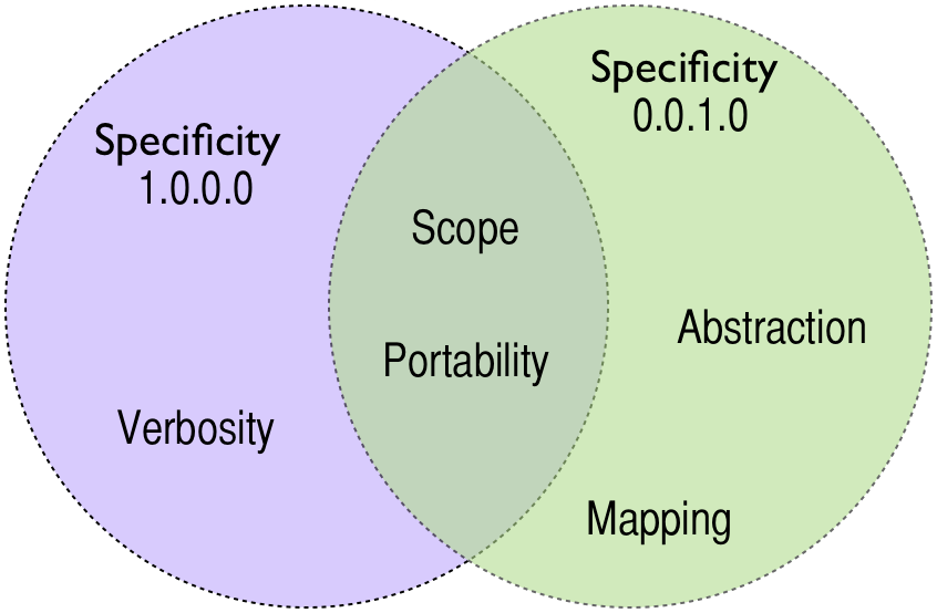
- Specificity
The technique is not as specific as@style. It lowers style weight because rules rely on a single class, as opposed to rules like.parent .bd {}, which clocks in at 0.0.2.0 (see “CSS Specificity: Things You Should Know”). - Verbosity
Most classes are abbreviations of declarations (for example,M-10versusmargin: 10px). Some classes, such asBfc, refer to more than one style (see “Mapping” in the diagram above). Other classes use “start” and “end” keywords, rather than left and right values (see “Abstraction” in the diagram above).
Here are the advantages of @style:
- Scope
Styles are “sandboxed” to the nodes they are attached to. - Portability
Because the styles are “encapsulated,” you can move modules around without losing their styles. Of course, we still need the style sheet; however, because we are making context irrelevant, modules can live anywhere on a page, website or even network.
The Path To Bloat
Because the styles of our module are tied only to presentational class names, they can be anything we want them to be. For example, if we need to create a simple two-column layout, all we need to do is replace the link with a div in our template. That would look like this:
<div class="Bfc M-10">
    <div class="Fl-start Mend-10 W-25">
        column 1
    </div>
    <div class="Bfc">
        column 2
    </div>
</div>
And we would need only one extra rule in the style sheet:
.Bfc {
    overflow: hidden;
    zoom: 1;
}
.M-10 {
    margin: 10px;
}
.Fl-start {
    float: left;
}
.Mend-10 {
    margin-right: 10px;
}
.Fz-s {
    font-size: smaller;
}
.W-50 {
    width: 50%;
}
Compare this to the traditional way:
<div class="wrapper">
    <div class="sidebar">
        column 1
    </div>
    <div class="content">
        sidebar
    </div>
</div>
This would require us to create three new classes, to add an extra rule and to group selectors.
.wrapper,
.content,
.media,
.bd {
    overflow: hidden;
    _overflow: visible;
    zoom: 1;
}
.sidebar {
    width: 50%;
}
.sidebar,
.media .img {
    float: left;
    margin-right: 10px;
}
.media .img img {
    display: block;
}
I think the code above pretty well demonstrates the price we pay for following the SoC principle. In my experience, all it does is grow style sheets.
Moreover, the larger the files, the more complex the rules and selectors become. And then no one would dare edit the existing rules:
- We leave alone rules that we suspect to be obsolete for fear of breaking something.
- We create new rules, rather than modify existing ones, because we are not sure the latter is 100% safe.
In other words, we make things worse because we can get away with bloat.
Nowadays, people are accustomed to very large style sheets, and many authors think they come with the territory. Rather than fighting bloat, they use tools (i.e. preprocessors) to help them deal with it. Chris Eppstein tells us:
"LinkedIn has over 1,100 Sass files (230k lines of SCSS) and over 90 web developers writing Sass every day."
CSS Bloat vs. HTML Bloat
Let’s face it: the data has to live somewhere. Consider these two blocks:
<div class="sidebar">
<div class="Fl-start Mend-10 W-25">
In many cases, the “semantic” class name makes up more bytes than the presentational class name (.wrapper versus .Bfc). But I do not think this is a real concern compared to what most apps onboard these days via data- attributes.
This is where gzip comes into play, because the high redundancy in class names across a document would achieve better compression. And the same is true of style sheets, in which we have many redundant sequences:
.M-1 {margin: 1px;}
.M-2 {margin: 2px;}
.M-4 {margin: 4px;}
.M-6 {margin: 6px;}
.M-8 {margin: 8px;}
etc.
Caching
Presentational rules do not change. Style sheets made from such rules mature into tool sets in which authors can find everything they need. By their nature, they stop growing and become immutable, and immutable is cache-friendly.
No More .button Class?
The technique I’m discussing here is not about banning “semantic” class names or rules that group many declarations. The idea is to reevaluate the benefits of the common approach, rather than adopting it as the de facto technique for styling Web pages. In other words, we are restricting the “component” approach to the few cases in which it makes the most sense.
For example, you may find the following rules in our style sheets, rules that set styles for which we do not create simple classes or rules that ensure cross-browser support.
.button {
    display: inline-block;
    *display: inline;
    zoom: 1;
    font-size: bold 16px/2em Arial;
    height: 2em;
    box-shadow: inset 1px 1px 2px 0px #fff;
    background: -webkit-gradient(linear, left top, left bottom, color-stop(0.05, #ededed), color-stop(1, #dfdfdf));
    background: linear-gradient(center top, #ededed 5%, #dfdfdf 100%);
    filter: progid:DXImageTransform.Microsoft.gradient(startColorstr='#ededed', endColorstr='#dfdfdf');
    background-color: #ededed;
    color: #777;
    text-decoration: none;
    text-align: center;
    text-shadow: 1px 1px 2px #ffffff;
    border-radius: 4px;
    border: 2px solid #dcdcdc;
}
.modal {
    position: fixed;
    top: 50%;
    left: 50%;
    -webkit-transform: translate(-50%,-50%);
    -ms-transform: translate(-50%,-50%);
    transform: translate(-50%,-50%);
    *width: 600px;
    *margin-left: -300px;
    *top: 50px;
}
@media \0screen {
    .modal {
        width: 600px;
        margin-left: -300px;
        top: 50px;
    }
}
On the other hand, you would not see rules like the ones below (i.e. styles bound to particular modules), because we prefer to apply these same styles using multiple classes: one for font size, one for color, one for floats, etc.
.news-module {
    font-size: 14px;
    color: #555;
    float: left;
    width: 50%;
    padding: 10px;
    margin-right: 10px;
}
.testimonial {
    font-size: 16px;
    font-style: italic;
    color: #222;
    padding: 10px;
}
Do We Include Every Possible Style In Our Style Sheet?
The idea is to have a pool of rules that authors can choose from to style anything they want. Styles that are common enough across a website would become part of the style sheet. If a style is too specific, then we’d rely on @style (the style attribute). In other words, we’d prefer to pollute the markup rather than the style sheet. The primary goal is to create a sheet made of rules that address various design patterns, from a basic rule that floats an element to “helper” classes.
/**
 * one liner with ellipsis
 * 1. we inherit hyphens:auto from body, which would break "Ell" in table cells
 */
.Ell {
    max-width: 100%;
    white-space: nowrap;
    overflow: hidden;
    text-overflow: ellipsis;
    -webkit-hyphens: none; /* 1 */
    -ms-hyphens: none;
    -o-hyphens: none;
    hyphens: none;
}
/**
 * kinda line-clamp
 * two lines according to default font-size and line-height
 */
.LineClamp {
    display: -webkit-box;
    -webkit-line-clamp: 2;
    -webkit-box-orient: vertical;
    font-size: 13px;
    line-height: 1.25;
    max-height: 32px;
    _height: 32px;
    overflow: hidden;
}
/**
 * reveals an hidden element on :hover or :focus
 * visibility can be forced by applying the class "RevealNested-on"
 * IE8+
 */
:root .NestedHidden {
    opacity: 0;
}
:root .NestedHidden:focus,
:root .RevealNested:hover .NestedHidden,
:root .RevealNested-on .NestedHidden {
    opacity: 1;
}
How Does This Scale?
We have just released a brand new My Yahoo, which relies heavily on this technique. This is how it compares to a few other Yahoo products (after gzip’ing):
| CSS Assets | |
|---|---|
| answers.yahoo.com | 30.1 KB |
| sports.yahoo.com | 67.4 KB |
| omg.yahoo.com | 46.2 KB |
| yahoo.com | 45.9 KB |
| my.yahoo.com | 21.3 KB |
Our style sheet weighs 17.9 KB (about 3 KB of which are property-specific), and it is shareable (unlike the style sheets of other properties). The reason for this is that none of the rules it contains relate to content.
Wrapping Up
Because presentational class names have always been deemed “out of bounds,” we — the community — have not really investigated what their use entails. In fact, in the name of best practice, we’ve dismissed every opportunity to explore their potential benefits.
Here at Yahoo, @renatoiwa, @StevenRCarlson and I are developing projects with this new CSS architecture. The code appears to be predictable, reusable, maintainable and scalable. These are the results we’ve experienced so far:
- Less bloat
We can build entire modules without adding a single line to the style sheets. - Faster development
Styles are driven by classes that are not related to content, so we can copy and paste existing modules to get started. - RTL interface for free
Using start and end keywords makes a lot of sense. It saves us from having to write extra rules for RTL context. - Better caching
A huge chunk of CSS can be shared across products and properties. - Very little maintenance (on the CSS side)
Only a small set of rules are meant to change over time. - Less abstraction
There is no need to look for rules in a style sheet to figure out the styling of a template. It’s all in the markup. - Third-party development
A third party can hand us a template without having to attach a style sheet (or astyleblock) to it. No custom rules from third parties means no risk of breakage due to rules that have not been properly namespaced.
(Note that if maintenance is easier on the CSS side than on the HTML side, then the reason is simply that we can cheat on the CSS side by not cleaning up rules. But if we were required to keep things lean and clean, then the pain would be the same.)
Final Note
I was at a meetup a couple of weeks ago, where I heard Colt McAnlis say, “Tools, not rules.” A quick search for this idiom title=“https://notrulestools.com/Main_Page">returned this:
“We all need to be open to new learnings, new approaches, new best practices and we need to be able to share them.”
Further Reading
- 53 CSS-Techniques You Couldn’t Live Without
- The Road To Reusable HTML Components
- Semantic CSS With Intelligent Selectors
- Creating A High-Contrast Design System With CSS Custom Properties
 (al, ea, mrn)

