SEO For Responsive Websites

Email Newsletter
Weekly tips on front-end & UX.
Trusted by 200,000+ folks.
 Flexible CMS. Headless & API 1st


When Google announced its preference for user-friendly responsive websites in June 2012, I immediately saw an influx of posts that equated responsive design with search engine optimization. This is unfortunate because, while responsive websites can be SEO-friendly, some responsive websites are not.
I’ve detailed some of the common errors that give responsive websites problems in search results in an article on Search Engine Land earlier this year, so it’s nice to be able to do a more in-depth SEO audit of a responsive website here on Smashing Magazine.
I know not everyone’s definition of SEO is the same, so for those of you who don’t know my work, it should be emphasized that fixing all of these issues with SEO will improve the user experience in general; and like most credible SEOs these days, I don’t believe in manipulating search engine algorithms for short term ranking benefits.
The website I’d like to audit today is the US version of Disney Junior. I’ve chosen this website for three reasons: it’s not run by a client or a partner; it exhibits a lot of the SEO issues of many responsive websites; and my two and four year olds are huge fans of the brand and often use my smartphone or our family iPad to visit it. Hopefully, Disney can use this free advice to make its website better for my kids and kids like them who search.
It’s worth noting that because Disney Junior is not a client or partner, there may be information about business requirements that I am not privy to. In these cases the recommendations might not be helpful to Disney Junior, but should at least be valuable as SEO best practices for responsive sites.
This audit of Disney’s beautiful but often frustrating website shows that mobile SEO doesn’t end once you’ve made a website responsive, and it gives Disney a framework to make its website more usable and findable on search engines.
Is The Website Indexed?
Disney Junior doesn’t seem to have any real issues with indexing; many of its pages have been indexed by Google. See for yourself with a simple site:domain.com search, or verify it in Google’s Webmaster Tools if you use it.
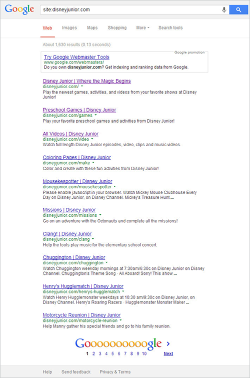
Google has indexed approximately 1,630 pages of Disney Junior. However, the descriptions indicate that we might have problems with content parity.
Obviously a website that isn’t in a search engine’s index will be invisible when people search for it. This is true for responsive websites as well as for websites that use dynamic serving or dedicated mobile URLs. That being said, this tends to be more of a problem with mobile URLs because of the common practice of intentionally nofollow’ing mobile websites in the robots.txt file in order to prevent the mobile pages from competing with the “canonical” pages for link equity.
This practice is misguided because bidirectional annotations (or switchboard tags) can harness that link equity and bring mobile URLs into search results, but that’s neither here nor there when it comes to responsive websites.
While Disney Junior is indexed, some responsive websites, such as Idis are not so lucky. Idis is responsive and innovative, yet only one page of the website has been indexed by Google. Because the website is dynamic and because escaped_fragment hasn’t been used, the URL does not change when a user clicks on different website elements, thus depriving search engines of deep links to include in their indices. If anyone searches for text on any of these pages, they won’t find this interactive, award-winning website.
This could happen to any website that doesn’t have static URLs, of course, but mobile SEO isn’t done once the developer has decided whether to make their website responsive or use dynamic serving or use dedicated mobile URLs.
Is The Website Crawlable?
In order for any website, responsive or not, to be indexed, Google must be able to crawl the website — that is, to follow a link to every unique piece of content and then store that new URL.
To check this, run any website crawler, such as Xenu or Screaming Frog. I prefer Rob Hammond’s SEO Crawler for mobile SEO audits because it allows you to set the smartphone Googlebot as your preferred crawler. The number of URLs is limited but enough to give you a pretty good idea of any crawlability issues. If you own the website, verifying it with Google and with Bing is imperative. Both search engines have tools for developers that specify the crawl errors they encounter, and Google even lets you tell it to ignore certain parameters that might be causing problems. If you don’t own the website or can’t verify it, you can still identify most problems by crawling the website as described above.
When I crawled Disney Junior, it quickly became apparent that the content is hosted on several URLs: DisneyJunior.com, DisneyJunior.Disney.com, WatchDisneyJunior.Go.com and Disney.Go.com/DisneyJunior. This could hinder a search engine from assigning page authority, because a search engine’s spider has a limited crawl budget for every website, based on that website’s PageRank, so if you’re splitting your PageRank between four URLs and three domains, then you’re possibly presenting to Google a website architecture that is less than optimal. More on this later in the section about duplicate content.
Disney’s URLs themselves don’t seem to have any major issues with crawlability because they are mainly static URLs, which search engines have an easier time with. However, the site map could certainly be improved upon. Search engines jointly announced Sitemaps a few years ago as the convention for finding content on websites to index. DisneyJunior.Disney.com does have a site map, but there are a few problems with it, the biggest being that it’s a video site map that contains more than just videos.
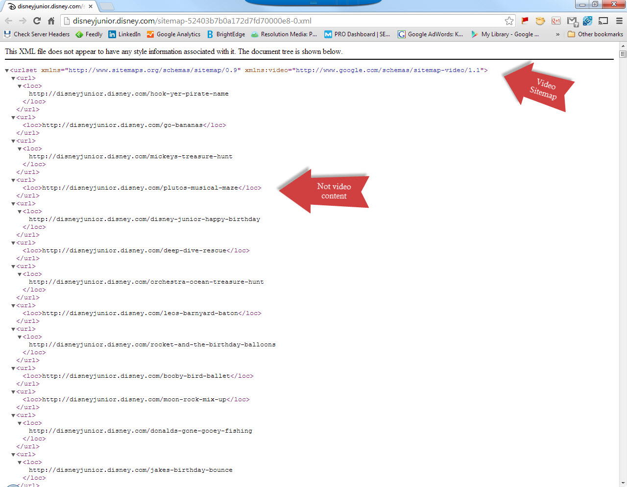
Site maps are a way for site owners to communicate directly with search engines, so making the information as accurate as possible and not confusing search engines are imperative. Google has site maps for the many different kinds of content included on Disney Junior, so presenting separate maps for images, videos, HTML documents and so on would be best.
Crawlability is not a mobile-specific problem, but getting it wrong can harm a website intended for mobile users just as easily as it can harm a traditional website, and it needs to be done right regardless.
Recommendation
- Disney should consider hosting all content on a single subdomain to ensure that search engines can properly identify page authority and to ensure that all relevant URLs are crawled efficiently.
- Disney should also consider breaking down its single video site map, which contains all types of content, into individual site maps for HTML content, image content, video content, etc.
Is The Website Readable Without Images, Flash Or JavaScript Enabled?
A search engine cannot factor what it can’t see into the overall relevance of a page. And while Google can do some amazing things with optical character recognition in Google Glass, Google Drive and Google Goggles, it still only reads text for Google Search. As it says in its “Webmaster Guidelines”:
- Create a useful, information-rich website, and write pages that clearly and accurately describe your content.
- Think about the words users would type to find your pages, and make sure that your website actually includes those words within it.
- Try to use text instead of images to display important names, content, or links. The Google crawler doesn’t recognize text contained in images. If you must use images for textual content, consider using the “ALT” attribute to include a few words of descriptive text.
Is Disney’s responsive website text-based and information-rich, and does it include terms that people would actually use when searching? Not really. If we look at the website through a simple text browser, like SEO-Browser.com, to get a better sense of how a search engine sees the website, then we get a much different picture than accessing it in a browser:
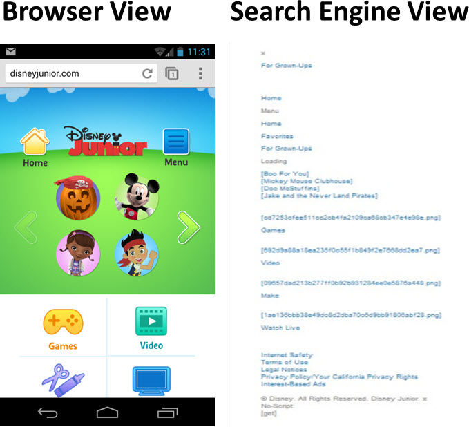
Unlike websites that embed keywords in images or in Flash, search engines aren’t blocked from seeing relevant content here — there’s just not a lot of relevant content to see. The website isn’t readable in this case because there are no words to read.
If we look at a deeper-level page, we’d see some graphic text that search engines would have a hard time accurately processing.
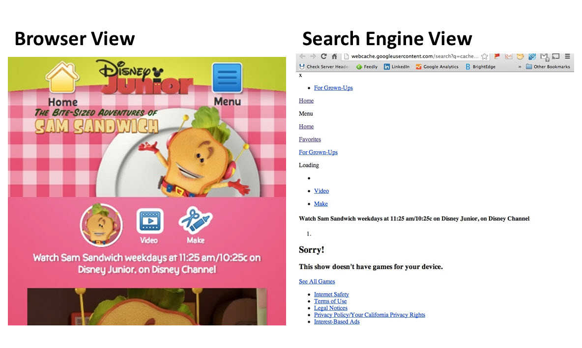
The text beginning with “Watch Sam Sandwich…” is accessible, but the words in the logo “The Bite-Sized Adventures of Sam Sandwich” are not because they are embedded as a graphic.
Recommendation
- At the very least, Disney should make embedded text accessible as
alttext. - When the text is substantial, the developer should consider making it accessible in a Web font, rather than as an embedded graphic.
- Furthermore, the volume of relevant keywords, such as “games for kids” and other non-brand words, should be increased. This could be done by slightly expanding the text block on each page or, ideally, by designing the page to include some scannable text, keeping progressive enhancement in mind.
Is The Website Easy To Link To And Share?
Many websites, both responsive and not, have URLs that don’t seem to be intended for human consumption. This is detrimental to SEO, of course, mostly because the URLs aren’t memorable and are difficult to share. Given how important search engines view sharing and linking when ranking pages, the more we can do to facilitate linking and sharing, the better off we’ll be in search results.
The print and video URLs for Disney Junior fall into this category, adding random characters to otherwise memorable paths (https://disneyjunior.com/print/stethoscope-4e4e43e2e8368d71cf2086da). For the most part, though, the URLs include keywords and are easy for users and search engines to understand.
The website could go one step further and include social bookmarklets to enable users to share content on social networks. Disney Junior has an active presence on Facebook, Twitter and YouTube, so its creators must understand the value of social media. But they might not understand that leveraging social media is becoming important to organic discovery and search. And given that 78% of Facebook’s user base is mobile and that mobile users spend more time on social networks than PC users, then helping mobile searchers share content whenever they’d like makes sense. Of course, the Children’s Online Privacy Protection Act (COPPA) prohibits this for sites intended for children, but Disney Junior for Grown-Ups is fair game.
This isn’t a tutorial on how to make social buttons work on a responsive website, but Facebook’s mobile “Like” button works on responsive websites. However, for performance considerations, it’s a good idea to use social sharing buttons or SocialCount that use lazy loading to load the actual social scripts on click. If you use a third-party plugin, such as AddThis, there are ways to make those compatible with a responsive website as well.
Recommendation
To increase referrals from social networks and to facilitate content discovery, Disney Junior for Grown-Ups should incorporate social-sharing buttons that are responsive, that add to the overall experience but that don’t significantly increase page-loading time.
Does The Website Display Content For Users’ Needs, Regardless Of The Device Used?
Those who champion “content parity” have a worthy cause in making websites accessible to everyone, regardless of device. Unfortunately, the issue is a little complicated. Making content available on all platforms is sometimes good for users, other times not.
Disney Junior is fairly representative. It deprives users of relevant content, fails to connect relevant content to users who need it, and gives users content that they have no chance in the world of ever using. Unfortunately, in my experience this is fairly typical of responsive websites, many of which don’t go far enough to make all content accessible, regardless of device, and which provide content that’s unusable on mobile devices.
Google sees one weakness so often on mobile websites that it has threatened to penalize for it in smartphone search results: unplayable videos. In June 2013, Google said this:
"We recommend using HTML5 standard tags to include videos and avoid content in formats, such as Flash, that are not supported by all mobile devices. Regardless, try your best to offer smartphone users the best experience possible to make sure that the videos are playable on as many devices as possible."
So, when I encounter many screens like the following when trying to play Disney Junior videos, I get a little concerned:
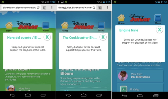
Not supporting a piece of content for mobile users could lower your ranking in smartphone search results.
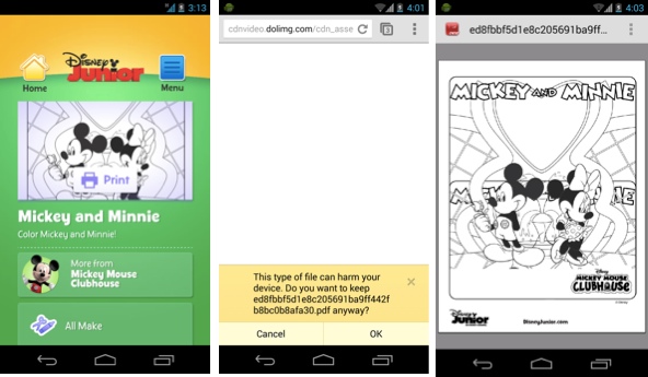
In some cases, though, Disney Junior goes too far with content parity. The four main sections of the website are games, videos, printables and a live feed. The problem is that unless a user is not only aware of Google Cloud Print but is one of the handful of people who has it installed on their device, they won’t have any way to print the coloring pages or other printables.
I have no idea how many people have actually printed these PDFs from mobile devices, but I’m guessing that the vast majority of people who attempt to access this content leave in frustration. I have no evidence that Google actively penalizes a website for unplayable videos, but it announced that it would more than four months ago, and it could start any day. Regardless of the impact on ranking, fixing this issue would make the website more usable to whoever visits.
One quarter of the content on Disney Junior is inaccessible on mobile devices.
No doubt, printables and coloring pages are a popular feature on desktops and laptops, and users actively look for such content. On mobile devices, it’s an entirely different story.
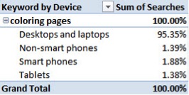
According to Bing Ads Intelligence, which lets you see search volume by device, less than 5% of the total search volume for “coloring pages” comes from mobile devices. The reason is that most mobile devices aren’t connected to a printer, thus rendering such content unusable.
It’s worth noting that Disney has made huge strides on its responsive website at Disney.com since I addressed this issue in April 2013. None of its Flash games had been accessible to smartphone users, and it’s since made most of them compatible with HTML5. So, fixing these issues that plague both responsive and dedicated mobile websites is possible, but it won’t happen by itself.
Making this content available to all users is fine, but if Disney is going to do this, then it needs to explain that, before printing it from a mobile device, the user will have to download Google Chrome and/or the Google Cloud Print app and connect their device to a printer. If Disney doesn’t do that, then a lot of confused and unhappy kids will be left staring at a PDF on their mobile device, wondering how to print it. Disney could also consider making the feature less prominent on its home page for mobile users.
Finally, what’s missing from Disney Junior’s responsive website is any mention of the mobile content that is actually available. Assumptions on user behavior are always tricky, but in this case it’s quite safe to assume that mobile users would be looking more for apps and mobile games than for printables. However, the first search result for “Disney junior apps” in Google takes the user to a non-responsive page, before giving them an error message due to the absence of Flash.
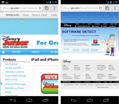
“Dad, what is this?!” says my four-year-old son as he tries to watch Disney Junior on my smartphone but is redirected to a page that tells him to download Flash.
What’s more, when it comes to “mobile games,” a phrase that people search for more than 12,000 times a month, Disney is nowhere to be found. It’s a shame, because Disney’s games, being compatible with smartphones, are relevant to the term, but they won’t be found in relevant search results because the term isn’t included. And not appearing in relevant search results is definitely not search engine optimization.
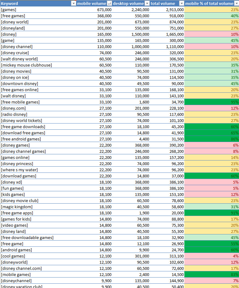
These figures for search volume of Disney-related keywords by platform show that mobile users often search for different things and at a different frequency than users on desktops and laptops.
Recommendation
Disney Junior has three opportunities to improve the accessibility and relevance of its responsive website:
- Ensure that all videos and games are playable on most smartphones before Google makes good on its promise to penalize websites for unplayable videos. This will also improve the user experience and reduce the number of frustrated visitors.
- Rethink the website’s information architecture. Highlighting printables and coloring pages for mobile users doesn’t make sense if these users have no way to print them from their device.
- Ensure that the website contains all relevant keywords, regardless of platform, so that the many people who search with platform-specific keywords, like “mobile games” and “iphone apps,” can find relevant content on Disney Junior.
Does The Website Load Quickly?
When I echoed the claim of Guy Podjarny, Akamai’s evangelist, in Search Engine Land that responsive websites are often bloated and slow, I was met with a lot of hostile comments. Many thought I was saying that responsive websites cannot be fast. Of course they can be made fast; unfortunately, most are not (PDF).
This is not just bad for performance, but can be detrimental to SEO as well. When Google pointed out common mistakes that it might soon penalize for, it put slow-loading pages on the hit list. Fortunately, Google has given developers many resources to make their websites faster, including the PageSpeed Insights tool. Following the recommendations made by this tool will go a long way to making your website load in one second or less, which is what Google recommends for optimum mobile performance.
Disney Junior takes more than seven seconds to load on average, and Google gives it a score of 71 out of 100 for page speed.
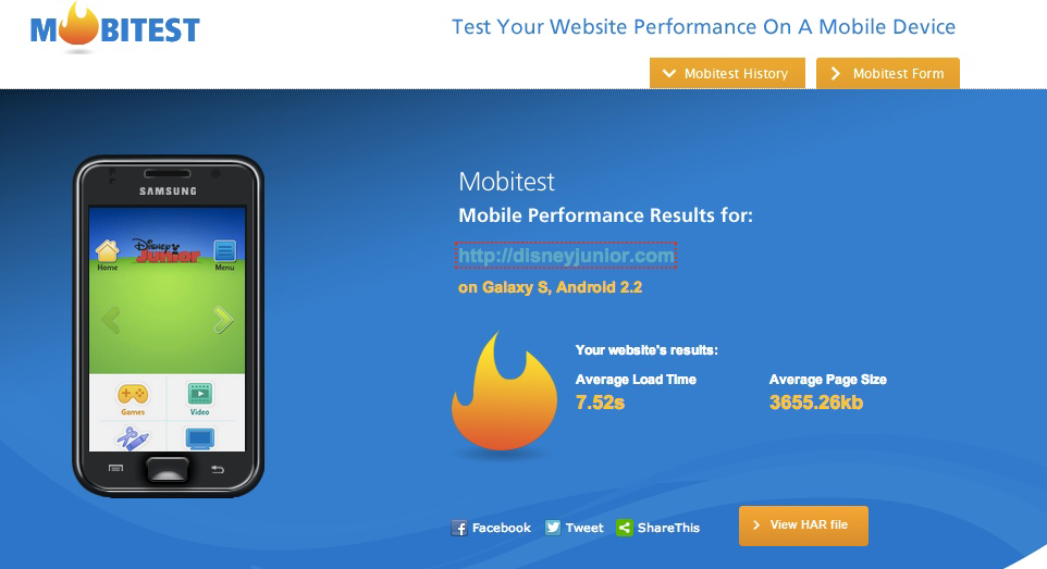
Akamai’s Mobitest tool is great for showing how long a page takes to load on mobile devices.
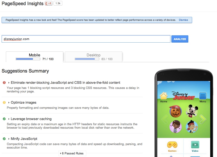
Google’s PageSpeed Insights follows the color coding of stop lights to indicate the priority of its recommendations.
Much has been written in the design community about the performance of responsive websites. At the very least, a responsive website should follow Google’s guideline of loading in less than a second.
Recommendation
Disney Junior should follow Google’s PageSpeed Insights and optimize its images, eliminate render-blocking JavaScript and CSS in content above the fold, and reduce page-loading time overall to one second or less.
Does The Website Try To Get You To Download An App Instead Of Showing What You Asked For?
WTF Mobile Web lists many websites that attempt to get users to download an app, instead of immediately showing them relevant content — a technique known as a door slam. Rotten Tomatoes is typical:

An app interstitial is shown to smartphone users who access Rotten Tomatoes’ website.
This used to be merely annoying to users — until June 2013, when Google added it to its list of things to penalize websites for. Now it should annoy all website owners, too.
These door slams usually happen when the website detects the user agent to be a mobile device. They’re rarer on responsive websites, in my experience, because most owners of responsive sites are happy to let users freely access their content, instead of trying to persuade them to switch to the app experience.
Disney Junior is the exception to the rule. If you attempt to watch one of its videos on your mobile device, the page will redirect you to an app. If you’re on an Android device, you will be redirected to an app that doesn’t exist:
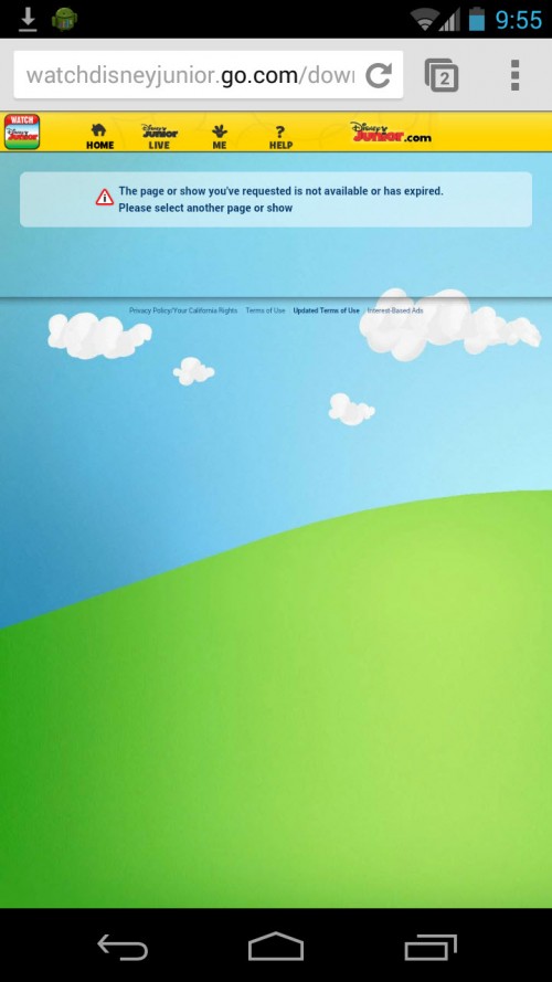
Android users who click on the “Watch Disney Junior” link on the home page are greeted with this message.
If you include app interstitials on your responsive website, then now is the time to consider whether their business value outweighs the prospect of not appearing as often in Google search results for relevant queries on smartphones. As far as I can tell, Google hasn’t yet begun to penalize for this infraction; however, as with unplayable videos, it’s only a matter of time before it does.
Recommendation
Disney Junior should remove the app interstitial or at least turn it into a banner that is not disruptive. Smart banners are available on Android and on iOS as replacements for app interstitials.
Including a smart banner on iOS is as simple as adding the following meta tag to the head of the page, with the relevant App Store details:
<meta name="apple-itunes-app" content="app-id=myAppStoreID, affiliate-data=myAffiliateData, app-argument=myURL">
Adding a smart banner on Android is not quite as simple, but it can be done through AdMob. Some developers have simulated iOS’ banner on Android using jQuery.
Does The Website Contain Duplicate Content?
Duplicate content has been preventing relevant pages from ranking for given queries long before smartphones came around. Now, it gets even more complicated. In case you don’t know, duplicate content is a single piece of content that exists on more than one URL. It makes a page less competitive because its PageRank indicators are dispersed.
Mobile subdomains are usually the culprit of duplicate content, as my case studies demonstrate. However, just because a website is responsive doesn’t mean that duplicate content is not possible. In fact, checking for it is important for any website, mobile-friendly or not. Neglecting it means letting Google itself identify the canonical page for a given piece of content, which doesn’t always end well for the website owner.
We shouldn’t take chances. Instead, we should ensure that search engines can understand which pages are intended for users and which pages are just copies of canonical pages. We can give search engines as many signals as possible to alert them to canonical pages (such as by including canonical tags, by adjusting the handling of parameters in Webmaster Tools, and so on).
As mentioned earlier, Disney Junior has quite a bit of duplicate content. But according to the source code, it has added canonical tags to tell Google and Bing which pages to rank. So, we have no recommendation for Disney on this one.
If you’re not familiar with canonical tags, it’s as simple as adding the following tag to the head of any duplicate page:
<link rel="canonical" href="https://www.disneyjunior.com"/>
The URL referenced in this tag should be the canonical URL for the given content. Some of Disney Junior’s properties do have a slight problem of duplicate content. Chuggington.com, for example, has equivalent content on DisneyJunior.com/Chuggington. If Disney wanted to set Chuggington.com as the canonical URL, it would simply add the following tag to DisneyJunior.com/Chuggington:
<link rel="canonical" href="https://www.chuggington.com"/>
Does The Website Take Advantage Of Mobile Devices To Deliver Extra Value?
Disney Junior doesn’t show anything unique to mobile devices. This might or might not be intentional, but it ignores opportunities to delight the consumer with device-specific content.
Back in 2008, one analyst predicted that mobility would create an entirely new Internet, filled with voice-recognition apps, GPS and scannable content, and hosted on .mobi domains. He called it the mobile ’net and thought that it would be separate from the Internet as we knew it.
It reads a little like science fiction today, with silver mylar-clad people jetting around in flying cars and on hoverboards, but the author was spot on with one thing. He basically predicted Uber, the mobile ride-sharing app that is disrupting the taxi industry. And the article foreshadows the purchase of mobile-first photo app Instagram by Facebook for $1 billion in April 2012. Smartphones and tablets have different properties than PCs, and they are often used in situations where a PC would be impractical, thus instilling behaviors and patterns that previously did not exist on the Internet.
GPS enables users to find things around them with Google and Bing, and search data is showing that users are taking advantage of it, using terms like “navigate to,” “closest” and “near me” primarily on smartphones and tablets. Shopping-related searches are two times more likely to happen in-store now, and 70% of mobile searchers call businesses directly from search results — something they can’t really do on a PC. Granted, many people search for the same things on their mobile devices as they do on their desktop computers, and they often do it when they’re not on the go. However, 17% of them are on the go, and all of them have access to things like GPS, the camera, the accelerometer and the phone, which aren’t available on desktops and laptops.
Today, these mobile-first experiences are sometimes built on the Web (i.e. not a separate mobile Web) and more often in apps. From an SEO standpoint, they make the most sense on the Web. In its “Webmaster Guidelines,” Google says, “Think about what makes your website unique, valuable, or engaging. Make your website stand out from others in your field.” And it echoes this sentiment in its “SEO Starter Guide” (PDF), saying that “creating compelling and useful content will likely influence your website more than any of the other factors discussed here.”
In short, great content that people find useful will be linked to and shared, which will alert Google to its quality. But an app probably won’t appear in search results unless the user types the word “download” or “app” or the app’s name in their query, and Google cannot process or index deep links within apps. The way to make content as accessible to mobile users as possible is not to put it in an app, but to put it on the Web.
The problem is that doing this with a responsive Web design, as Google defines it, is difficult. Many responsive websites make great use of geolocation (such as Starbucks’), but most use JavaScript or server-side components to accomplish it, which is beyond Google’s scope of a responsive website.
Still, some websites do offer content that would be very useful to someone on a smartphone or tablet, which might differentiate those websites just enough for Google to rank them higher than competitors. One of my favorite examples is Sears, which uses dynamic serving on its mobile website to give smartphone users a scanner to compare competitors’ prices with Sears’ online prices. This empowers consumers to find the best price, while combatting the practice of “showrooming” by making it easy for people to find the best prices at Sears.

Sears’ mobile website enables smartphone owners to scan items to compare against Sears’ prices.
Another great example is Lowe’s, which provides an in-store map on the location-related pages of its mobile website. It’s a small addition, but it helps users find what they’re looking for faster once they get to the store, and it potentially differentiates the brand.

Lowe’s provides an in-store map on the location-related pages of its mobile website.
Recommendation
Disney Junior should consider mobile-specific opportunities to differentiate its content from that of competitors and to add value for users.
Conclusion
Unfortunately, creating a responsive website alone won’t be enough to be properly optimized for search results. If you’re keeping score, more than half of the content that Disney Junior’s responsive website highlights is unusable on smartphones. The website is beautiful, to be sure, and Disney deserves credit for trying to make its content accessible to users, regardless of device. But can a website like this really be called “responsive”? It contains all the ingredients of a responsive design; however, responsive means “reacting quickly and positively,” which this website fails to do in many ways.
User-friendly responsive Web design is preferred by Google, and Google doesn’t (intentionally) send traffic to websites that frustrate users, or to websites that don’t contain the keywords that people are including in their queries, or to websites whose content is not more compelling than that of competitors. Hopefully, this audit has taken you beyond just thinking about mobile configurations when tackling mobile SEO. And hopefully you feel equipped to really make your own responsive website competitive in search results.
Start with these basic SEO tips, which many responsive websites do not follow:
- Make sure your responsive website has been indexed by doing a
site:domain.comsearch in Google and Bing. If it hasn’t, then merely making the website responsive will not improve its visibility. - Ensure that search engine spiders can crawl your website and that they index every unique piece of content once. Responsive websites should have static URLs, without difficult-to-crawl characters such as hashbangs, if possible.
- A site map will make your website more crawlable. But use the proper type of site map for the content, and follow protocol.
- Include enough plain text that search engines can understand what the website is about, without needing access to image- or Flash-based content. Progressive enhancement is a useful method of building pages that are accessible to search engines. Use SEO-Browser.com to check your work.
- Try to include relevant keywords in your URLs, and make pages easy to remember and share by avoiding long strings of human-unreadable characters.
- Include responsive social bookmarklets to help mobile users share your content on their social networks. But keep an eye on page speed.
- Don’t highlight content that users can’t access on their device. Content parity is great, but serving device-specific content to the wrong devices goes too far.
- Don’t make all of your content adaptive. Users often look for device-specific content (such as mobile games, apps, mobile coupons, etc.). Including relevant keywords is the only way to get traffic from search engines.
- Make your responsive website load in less than a second, using Google’s PageSpeed Insights and Akamai’s Mobitest. Not doing so could hurt you in search results for smartphones.
- Use smart banners to promote your app, instead of the more disruptive interstitials.
- Identify content that exists on more than one URL, and use canonical tags and permanent redirections to tell search engines which pages to show in search results.
- Make sure that adaptive content and responsive Web design are really the best way to serve your users. Not every website is a traditional publication, and sometimes users have needs that are difficult to address with a single information architecture.
- If responsive Web design truly is best for your users, then enhance your adaptive content by adding useful features (such as a scanner or GPS locator), using server-side components.
Further Reading
- The Inconvenient Truth About SEO
- The 3 Fundamental Principles Of Technical SEO
- What The Heck Is SEO? A Rebuttal
- How Content Creators Benefit From The New SEO
 (al, ea, il, mrn)

