Pragmatic UX Techniques For Smarter Websites

Email Newsletter
Weekly tips on front-end & UX.
Trusted by 182,000+ folks.
 Register for Free
 Celebrating 10 million developers
 Custom Web Forms for Angular, React, & Vue. Your backend.

What is “User Experience Design” exactly? Should you not start it unless you are fully dedicated, or should you embrace it in the process as soon as possible? Are all designers also user experience designers, or is it a separate expertise?
The debate is as old as the discipline itself, and while picking up a bucket of popcorn, sitting back and watching the drama is sometimes fun, let’s try to figure out which user experience techniques are useful for startups, in-house teams, big corporations and anyone who wants to improve their website, product or service.
Multiple Definitions Of UX
User Experience Design is a very broad and vague field, and most commentators say that it’s a superset of all of the other disciplines. Is there one definition to rule them all? In my opinion, no. Do the definitions provided below describe some aspects of your day-to-day activities? Most likely, yes.
Christina Vodtke, author of Information Architecture: Blueprints for the Web, recently tweeted the following:
"There are three core disciplines in UXD: Visual/Interface designers, Interaction designers and Information Architects."
— Christina Wodtke (@cwodtke) November 14, 2013Steve Psomas offers “The 5 Competencies of User Experience Design,” which encompass information architecture, interaction design, usability engineering, visual design and prototype engineering, with a list of activities and artifacts produced by each activity.
In “The State of User Experience,” Jesse James Garrett, author of The Elements of User Experience, defines experience design thus:
"The design of anything, independent of medium or across media, with human experience as an explicit outcome and human engagement as an explicit goal."
Peter Merholz, author of Subject to Change, argues that UX is strategy, not design:
"A UX designer is coordinating, orienting, helping all of the other folks [designers] achieve some common goal, a singular intent… UX designers lead organizations to ensure that great experiences get out into the world."
Dr. Leslie Jensen-Inman and Jared Spool established the Unicorn Institute to identify which skills UX designers need. They’ve found that managers need UX designers to have a holistic skill set, including front-end development, visual design, mobile integration, project management, information architecture, interaction design, copywriting, content strategy and user research. According to this definition, UX design is the Swiss Army knife of Web design.
Become A UX Practitioner
If you can remotely recognize yourself in any of the definitions above, then there’s a good chance you are already practicing UX design and that you could become a seasoned UX designer with a little more strategy, a dozen of relevant books (check out the links at the bottom) and 10,000 hours of practice. While that’s a compelling proposition, it obviously takes time.

Disregarding the fact that it takes time to become a good UX practitioner, firms should still consider adopting UX techniques for their business in the meantime. (Image credit: baldiri)
Most businesses — especially small companies and startups — can’t afford to hire a dedicated UX designer, but that shouldn’t stop them from adopting some UX techniques. Trust me, it’s much easier than you think.
A Not-At-All-Definitive List Of UX Techniques
I like to divide the techniques into two main categories: learning about the website or application, users needs, business goals, the industry and the competition, and generating ideas, solutions and communication artifacts that will help to align the team and shape the product.
Learn
- website analytics
- cognitive walkthrough
- heuristic evaluation
- stakeholder interviews
- SWOT analysis
- user interviews
- usability testing
- ethnography
- contextual inquiry
- card sorting
- affinity mapping
Generate
- personas
- brand persona
- voice and tone
- microcopy
- navigation patterns
- search patterns
- content strategy
- customer journey map
- ideation workshops
- tasks and use cases
- workflows
- page priorities
- prototypes
- UI patterns
Everyone wants to see the results immediately. Taking urgency into account, how do you decide which technique to use? There’s no definitive answer, but in my experience, usability testing, interviews, journey mapping and microcopy tables are all very effective for quick and dirty experience improvements.
I’ve chosen these particular four because they don’t require you to create polished artifacts. Use them to improve the user experience, not to create unrealistically perfect candy for your portfolio.
Start With Empathy
The most important skill one needs to develop as a user experience designer is empathy. Empathy, however, cannot be practiced behind closed doors. To truly understand users, their challenges, their pain points as well as their dreams and desires, you need to go out and learn about them. Observe them while they live their lives, discover their habits and watch them use your design.
Usability Testing
Test every project on every major milestone. For best results, conduct before, during and preflight testing.
Usability testing is essentially watching people using your design.
Before
With redesigns, knowing what’s wrong with the old design is helpful. Secondly — and people rarely do this — test the competition. Create an equivalent set of tasks for a competing website or application and test it. Running a usability test on the competition’s product will reveal a lot of opportunities to delight users and seize competitive advantages. Just by avoiding the errors discovered there, you will automatically provide a much better UX.
During
Transitional tests are usually done with prototypes. Have a fresh pair of eyes look at your concept and make sure you haven’t overlooked something. Expect this to be not the final confirmation, but rather a prevention of the kind of forehead-slappers that usually slip by if only insiders with domain-specific knowledge are involved. If you have the time and budget, conduct these at each major turn. These are the most important and the least used tests.
Preflight
The most commonly requested yet least effective are preflight usability checks. A pre-flight evaluation is effective if the main concept is already tested and proven. Test the design before going live to reveal the last few bugs or typos that might have been overlooked.
If this is the first test on the project, it will probably reveal deeper issues. Much deeper than an easy to fix button miss-alignment or a typo.
We’ve conducted quite a few preflight usability studies and many times we discovered a core problem. On one occasion, the registration steps hadn’t been ordered in a sequence that had been logical to the user. On another, the touch-screen equivalent to drag ‘n’ drop with a mouse was missing.
Fixing a broken experience that’s discovered only a day or two before launch is usually postponed until the next release. Many more times still, there’s no clear roadmap after the project delivery, so the issue is never repaired. The solution? Test your designs early.

Usability testing techniques are well explained in Steve Krug’s classic “Rocket Surgery Made Easy”, the sequel to the legendary “Don’t Make Me Think”.
Need recording software? Just use Silverback, which is dead simple to use and quite reliable. TechSmith Morae for Windows can be a considerate investment, so if you are on a tight budget, try CamStudio. But don’t fuss about the software. If you don’t have any, test anyway and write down your observations.
Remote viewers can observe sessions with Google Hangouts. In such cases, install Mouseposé to track mouse clicks and keyboard strokes. For offscreen recording, a set of GoPro cameras or a set of smartphones should work. If you opt for smartphones, make sure there’s enough space for an hour-long recording.
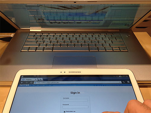
Recording and sharing touch interface testing sessions is effortless if you have a laptop with a camera nearby.
An easy way to record sessions on touch devices is with your laptop camera. Turn on the recording software, angle the laptop screen at about 45° and place the device next to the laptop’s trackpad. Another way is to strap a GoPro camera to the user’s chest or forehead, which is especially handy if you need to test in an unusual context.
Interviews
By “interviews,” do I mean user interviews? Not exclusively. Apart from interviewing (in plain language) users and customers (the ones who are spending money on us), we should also interview stakeholders, managers and other team members, as well as domain experts.
Discussing your product is pointless, especially by asking “Would you use [our product]’s feature XYZ?”. That’s an interview gone wrong. But let’s forget about you for the moment. Be genuinely interested in the person you are interviewing. Get to know them and understand them.
Unbiased Interviewees
When the user doesn’t know what the interview is about, you’ll get the most honest and least biased insights. No matter how disappointed they are in your product or service, the user might sugarcoat their answers if they know the purpose of the interview. The opposite could happen, too! On one occasion, we interviewed a user who was recruited by the very company we were redesigning for. Because he knew who we were, he couldn’t stop complaining about the price and value, so we wasted the interview listening to mere rants.
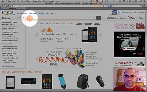
Even worse, you could end up writing down a lengthy list of feature requests. Back in 2007, I worked on a redesign of Croportal.net, at the time one of the 10 most visited websites in Croatia. One of the first usability test-interview hybrids we conducted ended with a couple of users recommending a Gmail log-in form right there on the home page. The craziest part was that the product team actually debated whether to do it. It was a nightmare, but we learned our lesson. Inviting users to specify the product is the highway to feature-creep hell. Our responsibility was to uncover users’ problems, habits and motivations and then design the product to match those findings — not to ask users to design it for us.
![]()
Milica and Janko Jovanović explain how to translate user needs into product features in “Get Your Hands Dirty”.
Focus on facts, not opinion. Pride and resentment are easy to spot and, depending on the situation, can be a pleasure to hear, but behavior patterns are gold. Of course, write down everything, but sport a poker face when users start talking about the bits that you find the most valuable to the project. This doesn’t mean being serious and cold. In fact, be enthusiastic — but equally enthusiastic — about everything interviewees talk about.
How to Start?
Prepare more questions than you’ll be able to ask. This way, the conversation won’t end prematurely. We usually split our questions into two major groups: general questions and those that are more specific to the domain.
- General questions Learn about their daily life, general schedule, tedious and enjoyable errands, habits and patterns. You are looking for potential pain points, so the strokes should be broad. A good way to start an interview is to ask, “What does your typical day look like?” Depending on the context, the questions could be about life in general or just business.
- Domain specific Start with general questions, and then get more specific when you see there’s room to probe. For instance, ask, “What have you bought on the Internet lately?”… “And before that?”… “And before that?” Then ask for more detail about each experience, such as onboarding, findability and the checkout process. Remember to give every experience the same level of attention. Don’t focus too much on one particular experience; rather, try to identify patterns. With business interviewees, start with, “What was your most recent project?”… “And before that?” Then, unearth the patterns there.
Once you have spoken with users, use that data to create personas, journey maps, workflows and microcopy.
Customer Journey Mapping
Customer journey mapping is a collaborative activity to discover pain points and opportunities with a product. It’s conducted as a half-day or full-day workshop, with participants from all over the company. If your startup is small, then gather all of your advisors and mentors. If you are big, then bring in a person or two from customer support, billing, retail, marketing and strategy.
Everyone should participate in the workshop, because it could be the perfect opportunity to synthesize all internal goals, connect different roles and give everyone a sense of ownership of the product, making for a cohesive UX.
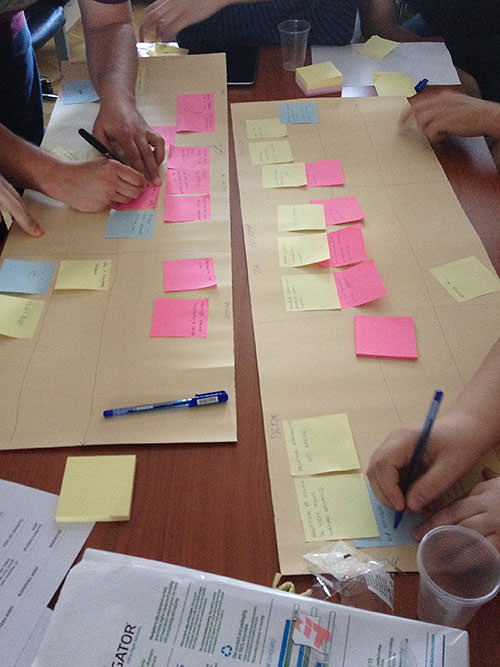
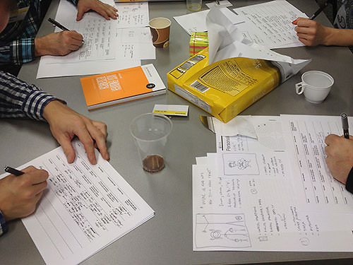
A customer journey group exercise. This picture is taken at a public workshop, but you can easily conduct it in-house as well.
Again, depending on the purpose and the goal, the maps may be more or less detailed. Be as objective as possible by gathering enough data about users (via website analytics, pools, surveys and interviews). By the time you become skilled in UX design, you will have used personas extensively in your customer journey mapping.
How do you do it? As an exercise, do it on your own first or with one or two colleagues who won’t roll their eyes the moment you introduce something new to the process. Take a sheet of paper big enough to accommodate a 9 × 6 grid of sticky notes; the paper used on flip charts is a good size. Gather a bunch of sticky notes and a marker or two and you’ll be good to go.
Draw a grid of three columns and six rows. It doesn’t need to be perfect, but if you find drawing straight lines to be challenge, I learned a trick at one of Eva-Lotta Lamm’s sketching workshops: Draw the lines by pulling the marker towards you, instead of from side to side. Label the columns “Before”, “During” and “After,” to represent time. The rows represent different aspects of the journey. Label them, too:
- Activities. For example, planning a family trip, asking friends, Googling top destinations, visiting websites, taking the trip, sharing photos, etc.
- Thoughts. For example, “Is this the right product for me?”
- Feelings. Frustration, delight, anxiety, relief, etc.
- Touch points. A friend, an AdWords ad, a TV commercial, the home page, a product page, a 404 page, etc. Be as detailed as needed.
- Pain points. Landing on the wrong landing page; not finding shipping details; etc.
- Opportunities. For example, populate the form with data that you can assume based on the visitor’s session data, such as location and currency.
Start using the sticky notes with just two simple rules: first, only one idea or comment for each sticky; secondly, stickies are expendable and affordable. Just add anything you can think of, and edit later once you’ve mapped all aspects of the journey.
Tweak this template to suit your needs, but I strongly suggest keeping “Activities,” “Thoughts” and “Feelings” because understanding what happens beyond our reach will lead to a better user experience.
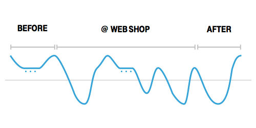
Experience evaluation will reveal opportunities to fix issues as well as to delight users.
Once the experience has been charted, use the pointing system of your choice to evaluate each step of the journey and generate a graph. If you need to present the map within the company, make a poster of it, focusing on storytelling. In this case, your notes and data will just be there for support.
Microcopy
How many times have you encountered an error message that basically means that recovery from the error is impossible? These things don’t happen because no one involved gave it a thought. They happen because it was on no one’s to-do list.
Prevent such situations by adding a microcopy table to your project checklist. Microcopy is all of the instructional copy, small print and labels on a website. You want to communicate with the same voice, but adapt the tone to the audience, brand and context.
Workshop attendees learning how to write better content with a microcopy exercise.
Ensure consistent communication — and leave no critical bit behind — by creating a cheat sheet. I like to call such a guide a “microcopy table”. The industry exemplar is MailChimp’s “Voice and Tone,” created by Kate Kiefer, but yours need not be so sophisticated. Never mind the form at this point; focus on the content.
Create a List of Interactions
For starters, open a spreadsheet in Google Docs or on your computer and start entering user tasks, each on its own row. Start with common ones, such as registering, logging in and recovering a password, and then get more specific, such as uploading a photo and updating a status. Lastly, break down basic tasks into smaller bits, such as first name, phone number, VAT number and small print about shipping and handling costs. Where applicable, create two rows for each task, a success row and an error row.
The following columns are typical:
- Tasks. For example, logging in.
- Type of communication. For example, success or error.
- User thoughts. For example, “Why do I need to enter that?”
- User feelings. List the emotions that the user has or might have.
- Communication tips. What needs to be explained, and in what tone?
- Draft copy. For example, “We need this information so that we can suggest products that are relevant to you.”
- Where does the user go next? Or what should they do? If you want them to take an action, include instructions in your confirmation message.
Once you start to think about microcopy, listing all scenarios is a quick and fun way to think about how people will use your interface, to prevent misunderstanding and to delight users by anticipating their reactions. For best results, make it a group exercise!
Don’t worry if you are not good at writing copy. Describe all interactions and hand over the table to someone who is comfortable with it.
Everyone Can Should Do It
No, seriously, everyone should. There is something life-changing about listening to how strangers view the world and watching them use the product of your labor. Always be aware of the user’s real needs and you will design great user experiences. At the very least, a different perspective will do you no harm.
If you need more practice or wish to dive deeper, join me at the “Pragmatic UX” workshop in Berlin this 17 February 2014.
Other Resources And Viewing
- Information Architecture: Blueprints for the Web, Christina Wodtke and Austin Govella
- Subject to Change: Creating Great Products and Services for an Uncertain World, Peter Merholz, Brandon Schauer, Todd Wilkins, David Verba
- Rosenfeld Media books
- “A Five-Step Process for Conducting User Research,” David Sherwin
- “Get Your Hands Dirty” (video), Milica and Janko Jovanović
- Just Enough Research, Erika Hall
- “Guide to Experience Mapping,” Adaptive Path
- “Five Ways to Prevent Bad Microcopy,” Bill Beard
- The Craft of Words, Part Two: Microcopy, Christopher Murphy and Nicklas Persson
- “The Evolution of User Experience,” Whitney Hess
Further Reading
- How To Build An Agile UX Team
- Effectively Planning UX Design Projects
- How To Spark A UX Revolution
- How To Become A UX Leader


