Interview With Graphic Designer Anthony Burrill
Anthony Burrill is one of the most distinctive voices in contemporary graphic design, known for his thought-provoking posters, printed traditionally in letterpress. He has never worked for another design firm, and his first studio was at home — at his kitchen table.
Upon graduating in 1991, he has worked independently in loose collaboration with friends, designers, artists and a number of institutions such as the Design Museum. Some of his most famous work is self-published making graphic design, a standalone discipline in itself.

I first came across Anthony’s work in the early 2000s, traveling by the London Underground, and I was impressed by the timeless quality of those posters, projecting a sophisticated approach to travel safety. Those posters made a strong impact and had almost grim undertones that made them very memorable.
Anthony’s work echoes Bauhaus: simple compositions of type, primary colors and geometric shapes that convey a message in a very direct way. In the following interview, conducted at a Typo London conference, Anthony speaks about the integrity of making work by hand and the importance of reaching out to people.
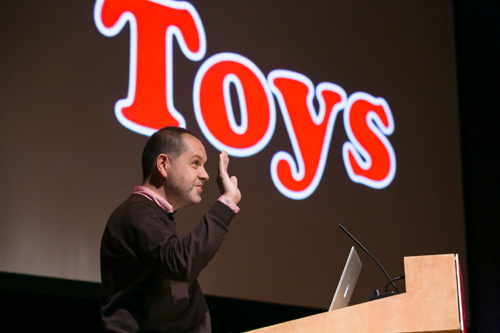
Anthony Burrill at Typo London in 2012. (Image credit: Gerhard Kassner)
Q: It’s been 20 years that you’ve been working in graphic design. Do you remember what art college was like for you?
I suppose it was quite traditional back then. Although, in the degree course I was in, the borders were quite blurred between printmaking, illustration, graphic design and typography. You could do anything really. And then I got to the Royal College, and that was more about ideas and more about the context than the craft.
Q: Was there a big difference between undergrad and grad school?
Yes, I think so, because for post-graduate you had to be more determined and able to write your own brief. And actually the postgraduate encouraged me to go off and do it on my own really.
Q: Your education was in the pre-digital era; so, not many computers involved.
Analog, yeah, definitely.
Q: Did you intentionally carry that aesthetic on?
Because I am traditionally trained to make camera-ready artwork and to produce work using a photocopy machine, that [aesthetic] is very much hand-crafted. So, when computers came along, I kind of resisted them for a while; I thought I could carry on doing it the traditional way. It took a long time for me to embrace the technology. But now I still use technology with that analogue mindset. I like things that are physically produced.
Q: Did you ever think, when computers came along and you could do things so much more easily — was that a barrier or did it feel strange in a way?
In the early days, computers were hard to use. There weren’t the easier programs like now. I think computers are incredible tools, but they don’t have the soul, that quality, that human quality.
Q: Nowadays, I suppose you split your work between analogue and digital?
It depends on the situation, because I spend a lot of time setting type, making very traditional posters. But there is also technology like Instagram and Twitter. I think it’s about using the best things from each medium really.
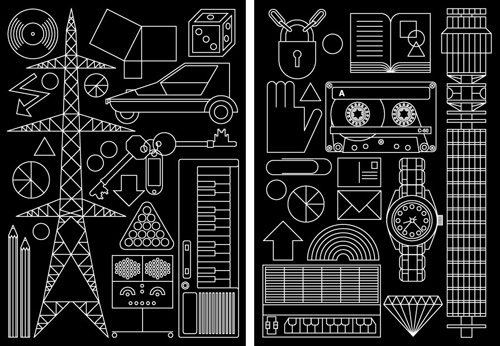
A series of simple geometric drawings of some of Anthony’s favorite things, inspired by a technical drawing manual. (Self-published as limited-edition giclée prints, 2004)
Q: Sounds like you’re quite comfortable with digital then.
Yes, it depends on how it gets used in the end. Whether it’s a print or a film, you can do things now that were impossible twenty years ago, definitely. Well, it affects the work, but I think I am always looking for that thing that’s got soul.
Q: Could you tell me the story about the lady at Sainsbury’s who inspired your poster, “Work hard and be nice to people”? How did you come up with this poster?
I was just in the supermarket where I always go, and that lady was in the queue and said the secret to a happy life: Work hard and be nice to people. And it was just one of those phrases. You know, I try to remember things that people say that have a nice ring to them, nice honesty, really. It was one of the things that, at the time, I didn’t realize would be that popular.
Q: Was that a highlight for your studio?
Yes, I think so. It’s the thing that people know me for best. And that’s fine by me, because it’s positive. After that, I thought I could carry on doing more work like this.
Q: Seems like you’ve become a curator of phrases in a way.
Yes, it’s almost like the graphic design becomes less and less important. Like, I feel now that I am going beyond graphic design, because I’ve been doing it for twenty years. Now it’s more about reaching out to people, communicating. It’s about being social, as we all are.
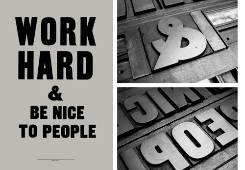
Possibly one of the breakthrough posters of Anthony Burrill, a simple message he heard from a lady in a supermarket queue. The poster was produced using traditional woodblock techniques. It is part of an ongoing poster series and was self-published (2004 – 2011).
Q: What’s the part of the process you enjoy the most?
It’s when you pick up on something that you think other people will pick up on. It’s almost like finding something that everyone gets, at a certain time.
Q: Do you have an example that hasn’t worked for people?
I made that poster that said, “It’s OK for me to have everything I want,” and I thought it was an interesting phrase. But I put it out there and I saw people started saying, “Yeah, I can have everything I want.” But that not what I meant! There was a twist to it, so I stopped doing it. You realize you have to be careful about the phrases you use and consider the way people can read them.
Q: Does it depend on the context?
I think so. When you’re talking to the designers, they appreciate the typography, letterpress, things like that. But to the broader range of people, you have to realize that people can read things in ways you wouldn’t expect really. Definitely, you have to think about it.
Q: Speaking of posters, how do you see the future of the poster?
I think the poster will always be powerful, but it has to exist in the world that we’re in, whether that’s through social media or other means. If the statement and the tension are strong enough, then it is still going to be relevant. Good design is about understanding and it is about the people. It is not about throwing things out there to see what happens. Design is about having integrity. People will always respond to those things.
Q: Are you optimistic about the poster?
I think it’s always about the message, and the way that that is communicated is irrelevant sometimes. People also always like to have objects, to give things to each other, to their children, and these have more of a longevity. Who knows where we’re going to be in twenty years — things are changing so rapidly — but I think there’s always a place if something has integrity and value.
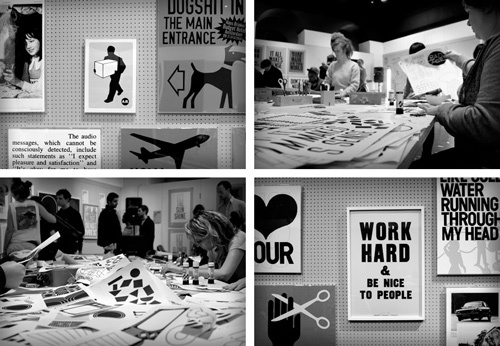
Ten-day studio residency, including graphic art workshops and daily collaborations with fellow designers, musicians and photographers. (Pick Me Up Contemporary Graphic Art Fair at Somerset House, 2011)
Q: Do you think there’s a comeback to basic tactile things?
Things are much more connected now. There’s a kind of shared humanity, and I think people want authenticity, they want things that are real. There is so much stuff that isn’t real and that’s just irrelevant. The real things are human relationships.
Q: You have moved out of London, living in the country. How do you find the move from the big town out to the fields?
I think it gives you a broader understanding and also, being close to nature, in a very rural place, gives you a kind of grounding. As you get older, you want things at a slower pace.
Q: Where do you find inspiration in a place where design talk isn’t an everyday thing? Is it good or bad that you don’t have daily chats with peers?
I think that’s a good thing! Events like today (at Typo London) are fantastic. You get to meet people and see interesting things. But I like to have time for reflection, to not be constantly bombarded. So, living down in Kent, I can switch the computer off, not look at it all weekend.
Q: Your posters are quite typographic. What’s the relationship between the type and the meaning.
The wood type that I use is always especially bold, and it fits. I mean what I’m saying, and I want it to be pretty strong, simple and non-designed, really. Because, the way it works with the letterpress printers, we work together. It’s as much their work as it is mine.
Q: So, in selecting the appropriate type, is it about the selection or about type as a found object?
Yes, it is like a found object, because it already has a weight to it, because it’s made physically. So, it’s almost that you can pretty much say anything and print it beautifully. But people do that and it doesn’t work, because you‘ve got to mean it. People do know when you don’t mean it.
Q: Getting back to the idea of curating words and letters…
Because I am always qing my design technique and skills, I like to use pre-existing things. If I’ve only got a blank page, there’s no reference, no starting point, nothing to hang anything onto. But when you find things that exist already or a system or a nice piece of wood type, there’s already something that you can work on.
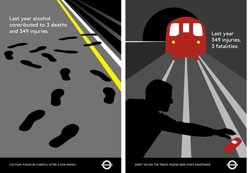
A series of public safety posters commissioned by the London Underground (2001 – 2002)
This reminds me that graphic design is about the editing process, about selecting and putting things next to each other — because nothing is created in a vacuum. There’re always reference points, always things you want to draw into. Whether that’s history, tips that are repeated then technology pacman things that people instantly understand.
Q: I suppose your inspiration doesn’t come from the [design] discipline itself.
Yes, it’s from the real world, being a human in the world. Everyone’s an individual; we have our own way of doing things, our own history and perception of how the world is. It’s about reaching those things that are universal.
Related Resources
- “Oil and Water Do Not Mix” A video about Anthony’s screen-printed poster made with oil from the 2010 Gulf of Mexico disaster.
- “Working Hard and Being Nice to People” Watch Anthony’s talk from Typo London 2012.
Further Reading
- Women In Web Design: Group Interview
- The Stefan Sagmeister Interview
- Killing Contracts: An Interview With Andy Clarke
- The Milton Glaser Interview


 See User Testing Live
 Custom Web Forms for Angular, React, & Vue. Your backend.
 Celebrating 10 million developers


