One Solution To Responsive Images

Email Newsletter
Weekly tips on front-end & UX.
Trusted by 182,000+ folks.
 See User Testing Live

 Celebrating 10 million developers

 Custom Web Forms for Angular, React, & Vue. Your backend.
Responsive images have been, and are, one of the hardest problems in responsive Web design right now. Until browser vendors have a native solution, we have to think on the fly and come up with our own solutions. “Retina” images are especially a challenge because if you have sized your layout with ems or percentages (as you should!), then you cannot be sure of the exact pixel dimensions of each image being displayed.
In this article, we’ll look at one solution to the problem that we implemented on our portfolio website at Etch, where you can see an early working version in the wild.
Requirements For Responsive Images
We used a content-first approach on Etch. We knew we wanted to use a lot of images to quickly convey the atmosphere of the company. These would be accompanied by small snippets, or “soundbites,” of text.
The next decision was on image sizes and aspect ratios. To get maximum control over the design, we knew we needed maximum control over the images. We decided to use Instagram as the base for our imagery for the following reasons:
- The aspect ratio is fixed.
- Most employees here already use it.
- Those lovely filters.
Instagram allows for a maximum image size of 600 pixels, so we now had our first set of content constraints to work with: images with a 1:1 aspect ratio, and a maximum image size of 600 × 600. Having constraints on the content side made the design process easier because they limited our options, thus forcing decisions.
When the content was completed, we began looking at the design. Again, to keep maximum control, we decided on an adaptive design style with fixed column sizes. We used grid block elements that match our maximum image size. Each grid block would either be 600 × 600 or 300 × 300, which also conveniently fit our rough plan of a minimum width of 320 pixels for the viewport on the website.
During the rest of the design process, we noticed that we needed two other image sizes: thumbnails at 100 × 100, and hero images that stretch the full width of the content (300, 600, 900, 1200, 1600, 1800). All images would also need to be “Retina” ready — or, to put it another way, compatible with displays with high pixel densities. This gave us the final set of requirements for a responsive images solution for the website:
- Potential image widths (in pixels) of 100, 300, 600, 900, 1200, 1600, 1800
- Retina ready
- Must be crisp with minimal resizing (some people notice a drop in quality with even downsized images)
Having to resize that many images manually, even using a Photoshop script, seemed like too much work. Anything like that should be automated, so that you can focus on fun and interesting coding instead. Automation also removes the chance for human error, like forgetting to do it. The ideal solution would be for us to add an image file once and forget about it.
Common Solutions
Before going over our solution, let’s look at some common solutions currently being used. To keep up with currently popular methods and the work that the Web community is doing to find a solution to responsive images, head over to the W3C Responsive Images Community Group.
Picture Element
First up, the picture element. While this doesn’t currently have native support and browser vendors are still deciding on picture versus srcset versus whatever else is up for discussion, we can use it with a polyfill.
<picture alt="description">
  <source src="small.jpg">
  <source src="medium.jpg" media="(min-width: 40em)">
  <source src="large.jpg" media="(min-width: 80em)">
</picture>
The picture element is great if you want to serve images with a different shape, focal point or other feature beyond just resizing. However, you’ll have to presize all of the different images to be ready to go straight in the HTML. This solution also couples HTML with media queries, and we know that coupling CSS to HTML is bad for maintenance. This solution also doesn’t cover high-definition displays
For this project, the picture element required too much configuration and manual creation and storage of the different image sizes and their file paths.
srcset
Another popular solution, srcset, has recently been made available natively in some WebKit-based browsers. At the time of creating our plugin, this wasn’t available, and it looks like we’ll be waiting a while longer until cross-browser compatibility is good enough to use it without a JavaScript fallback. At the time of writing, srcset is usable only in the Chrome and Safari nightly builds.
<img src="fallback.jpg" srcset="small.jpg 640w 1x, small-hd.jpg 640w 2x, large.jpg 1x, large-hd.jpg 2x" alt="…">
The snippet above shows srcset in use. Again, we see what essentially amounts to media queries embedded in HTML, which really bugs me. We’d also need to create different image sizes before runtime, which means either setting up a script or manually doing it, a tiresome job.
Server-Side Sniffing
If you’d rather not use JavaScript to decide which image to serve, you could try sniffing out the user agent server-side and automatically send an appropriately sized image. As a blanket rule, we almost always say don’t rely on server-side sniffing. It’s very unreliable, and many browsers contain inaccurate UA strings. On top of that, the sheer number of new devices and screen sizes coming out every month will lead you to maintenance hell.
Other Solutions In The Wild
We chose to make our own plugin because including layout code in the HTML seemed undesirable and having to create different image sizes beforehand was not enticing.
If you’d like to explore other common solutions to decide which is best for your project, several great articles and examples are available on the Web, including one on this very website.
- “Choosing a Responsive Image Solution,” Sherri Alexander, Smashing Magazine Alexander looks at the high-level requirements for responsive images, and then dissects the variety of solutions currently available in the wild.
- “Which Responsive Image Solution Should You Use,” Chris Coyier, CSS-Tricks Coyer takes us through imaging requirements while suggesting appropriate solutions.
- Adaptive Images A solution very similar to Etch’s in its implementation. It uses a PHP script to size and serve the appropriate images. Unfortunately, this wasn’t available when we were coding the website.
- Picturefill This is a JavaScript replacement for markup in the style of the
pictureelement. - “Responsive Images Using Cookies,” Keith Clark Clark uses a cookie to store the screen’s size, and then images are requested via a PHP script. Again, it’s similar to our solution but wasn’t available at the time.
Onto our solution.
Our Solution
With both picture and srcset HTML syntaxes seeming like too much effort in the wrong places, we looked for a simpler solution. We wanted to be able to add a single image path and let the CSS, JavaScript and PHP deal with serving the correct image — instead of the HTML, which should simply have the correct information in place.
At the time of developing the website, no obvious solution matched our requirements. Most centered on emulating picture or srcset, which we had already determined weren’t right for our needs.
The Etch website is very image-heavy, which would make manually resizing each image a lengthy process and prone to human error. Even running an automated Photoshop script was deemed to require too much maintenance.
Our solution was to find the display width of the image with JavaScript at page-loading time, and then pass the src and width to a PHP script, which would resize and cache the images on the fly before inserting them back into the DOM.
We’ll look at an abstracted example of the code, written in HTML, JavaScript, PHP and LESS. You can find a working demo on my website. If you’d like to grab the files for the demo, they can be found on GitHub.
Markup
The markup for the demo can be found in the index.html file on GitHub.
We wrap the highest-resolution version of an image in noscript tags, for browsers with JavaScript turned off. The reason is that, if we think of performance as a feature and JavaScript as an enhancement, then non-JavaScript users would still receive the content, just not an optimized experience of that content. These noscript elements are then wrapped in a div element, with the image’s src and alt properties as data attributes. This provides the information that the JavaScript needs to send to the server.
<div data-src="img/screen.JPG" data-alt="crispy" class="img-wrap js-crispy">
    <noscript><img src="img/screen.JPG" alt="Crispy"></noscript>
</div>
The background of the image wrapper is set as a loading GIF, to show that the images are still loading and not just broken.
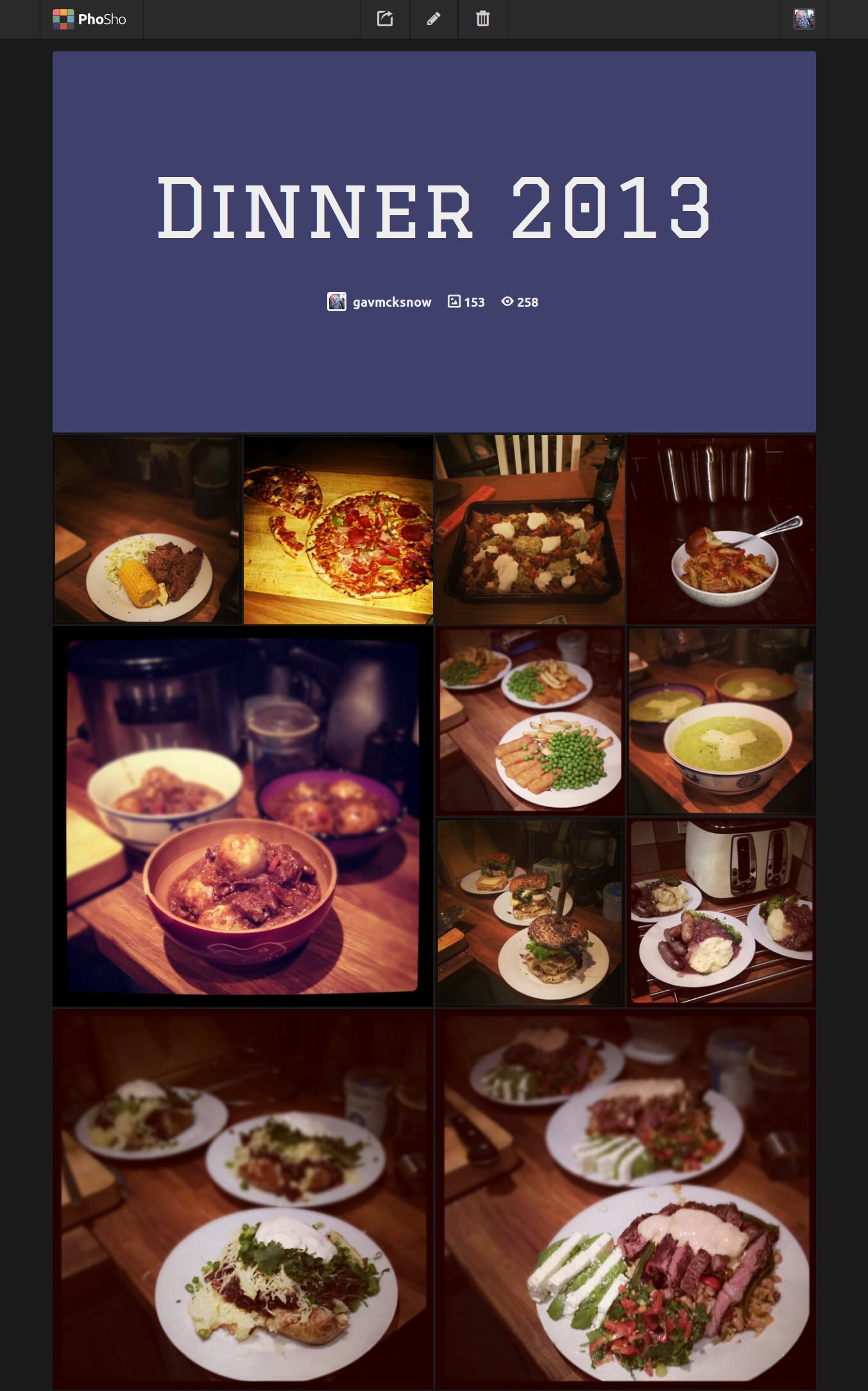
An alternative (which we used in one of our side projects, PhoSho) is to use the lowest-resolution size of the image that you will be displaying (if known), instead of the loading GIF. This takes slightly more bandwidth because more than one image is being loaded, but it has an appearance similar to that of progressive JPEGs as the page is loading. As always, see what your requirements dictate.
JavaScript
The JavaScript communicates for us between the HTML and the server. It fetches an array of images from the DOM, with their corresponding widths, and retrieves the appropriate cached image file from the server.
Our original plugin sent one request to the server per image, but this caused a lot of extra requests. By bundling our images together as an array, we cut down the requests and kept the server happy.
You can find the JavaScript plugin in /js/resize.js in the GitHub repository.
First, we set an array of breakpoints in the plugin that are the same as the breakpoints in the CSS where the image sizes change. We used em values for the breakpoints because they are based on the display font size. This is a good practice because visually impaired users might change their display’s default font size. This also makes it easier to match our CSS breakpoints with the JavaScript ones. If you prefer, the plugin works just fine with pixel-based breakpoints.
breakpoints: [
    "32em"
    "48em"
    "62em"
    "76em"
]
As we pass each of these breakpoints, we need to check the images to make sure they are the correct size. At page-loading time, we first set the current breakpoint being displayed to the user using the JavaScript matchMedia function. If you need to support old browsers (Internet Explorer 7, 8 and 9), you might require the matchMedia polyfill by Paul Irish.
getCurrentBreakpoint: function() {
      var bp, breakpoint, _fn, _i, _len, _ref,
        _this = this;

      bp = this.breakpoints[0];

      _ref = this.breakpoints;

      _fn = function(breakpoint) {
        // Check if the breakpoint passes
        if (window.matchMedia && window.matchMedia("all and (min-width: " + breakpoint + ")").matches) {
          return bp = breakpoint;
        }
      };

      for (_i = 0, _len = _ref.length; _i < _len; _i++) {
        breakpoint = _ref[_i];
        _fn(breakpoint);
      }

      return bp;
    }
After setting the current breakpoint, we gather the images to be resized from the DOM by looping through them and adding them to the plugin’s images array.
gather: function() {
      var el, els, _i, _len;

      els = $(this.els);

      this.images = [];

      for (_i = 0, _len = els.length; _i < _len; _i++) {
        el = els[_i];
        this.add(el);
      }

      this.grabFromServer();
    }
The PHP script on the server needs the image’s src and current width in order to resize it correctly, so we created some serialized POST data to send to the server. We use jQuery’s param method to quickly convert the image into a usable query string.
buildQuery: function() {
      var image = { image: this.images }
      return $.param(image);
    }
The images are then sent via an AJAX request to the server to be resized. Note the single request, to minimize server load.
grabFromServer: function() {
      var data,
        _this = this;

      data = this.buildQuery();

      $.get("resize.php", data, function(data) {
          var image, _i, _len;
          for (_i = 0, _len = data.length; _i < _len; _i++) {
            image = data[_i];
            _this.loadImage(image);
          }
        }
      );
    }
Once we have retrieved the images from the server, we can add them to the DOM or replace the image already in place if it has changed. If it’s the same image, then nothing happens and the image won’t need to be redownloaded because it’s already in the browser’s cache.
loadImage: function(image) {
var el, img,
_this = this;
el = $("[data-src='" + image.og_src + "']");
img = $("![]() ");
img.attr("src", image.src).attr("alt", el.attr("data-alt"));
if (el.children("img").length) {
el.children("img").attr("src", image.src);
} else {
img.load(function() {
el.append(img);
el.addClass('img-loaded');
});
}
}
");
img.attr("src", image.src).attr("alt", el.attr("data-alt"));
if (el.children("img").length) {
el.children("img").attr("src", image.src);
} else {
img.load(function() {
el.append(img);
el.addClass('img-loaded');
});
}
}
PHP
With the JavaScript simply requesting an array of images at different sizes, the PHP is where the bulk of the action happens.
We use two scripts. One is a resize class (found in /php/lib/resize-class.php in the demo), which creates cached versions of the image at the sizes we need. The other script sits in the Web root, calculates the most appropriate size to display, and acts as an interface between the JavaScript and the resizer.
Starting with the sizing and interface script, we first set an array of pixel sizes of the images that we expect to display, as well as the path to the cached images folder. The image sizes are in pixels because the server doesn’t know anything about the user’s current text-zoom level, only what the physical image sizes being served are.
$sizes = array(
    '100',
    '300',
    '600',
    '1200',
    '1500',
);

$cache = 'img/cache/';
Next, we create a small function that returns the image size closest to the current display size.
function closest($search, $arr) {
    $closest = null;
    foreach($arr as $item) {
        // distance from image width -> current closest entry is greater than distance from
        if ($closest == null || abs($search - $closest) > abs($item - $search)) {
            $closest = $item;
        }
    }
    $closest = ($closest == null) ? $closest = $search : $closest;
    return $closest;
}
Finally, we can loop through the image paths posted to the script and pass them to the resize class to get the path to the cached image file (and create that file, if necessary).
$crispy = new resize($image,$width,$cache);
$newSrc = $crispy->resizeImage();
We return the original image path in order to find the image again in the DOM and the path to the correctly sized cached image file. All of the image paths are sent back as an array so that we can loop through them and add them to the HTML.
$images[] = array('og_src' => $src, 'src' => '/'.$newSrc);
In the resize class, we initially need to gather some information about the image for the resizing process. We use Exif to determine the type of image because the file could possibly have an incorrect extension or no extension at all.
function __construct($fileName, $width, $cache) {

    $this->src = $fileName;
    $this->newWidth = $width;
    $this->cache = $cache;
    $this->path = $this->setPath($width);

    $this->imageType = exif_imagetype($fileName);

    switch($this->imageType)
    {
        case IMAGETYPE_JPEG:
            $this->path .= '.jpg';
            break;

        case IMAGETYPE_GIF:
            $this->path .= '.gif';
            break;

        case IMAGETYPE_PNG:
            $this->path .= '.png';
            break;

        default:
            // *** Not recognized
            break;
    }
}
The $this->path property above, containing the cached image path, is set using a combination of the display width, a hash of the file’s last modified time and src, and the original file name.
Upon calling the resizeImage method, we check to see whether the path set in $this->path already exists and, if so, we just return the cached file path.
If the file does not exist, then we open the image with GD to be resized.
Once it’s ready for use, we calculate the width-to-height ratio of the original image and use that to give us the height of the cached image after having been resized to the required width.
if ($this->image) {
    $this->width  = imagesx($this->image);
    $this->height = imagesy($this->image);
}

$ratio = $this->height/$this->width;
$newHeight = $this->newWidth*$ratio;
Then, with GD, we resize the original image to the new dimensions and return the path of the cached image file to the interface script.
$this->imageResized = imagecreatetruecolor($this->newWidth, $newHeight);
imagecopyresampled($this->imageResized, $this->image, 0, 0, 0, 0, $this->newWidth, $newHeight, $this->width, $this->height);

$this->saveImage($this->newWidth);

return $this->path;
What Have We Achieved?
This plugin enables us to have one single batch of images for the website. We don’t have to think about how to resize images because the process is automated. This makes maintenance and updates much easier, and it removes a layer of thinking that is better devoted to more important tasks. Plug it in once and forget about it.
TL;DR? Let’s summarize the functionality once more for good measure.
In our markup, we provide an image wrapper that contains a <noscript> fallback. This wrapper has a data attribute of our original high-resolution image for a reference. We use JavaScript to send an AJAX request to a PHP file on the server, asking for the correctly sized version of this image. The PHP file either resizes the image and delivers the path of the correctly sized image or just returns the path if the image has already been created. Once the AJAX request has been completed, we append the new image to the DOM, or we just update the src if one has already been added. If the user resizes their browser, then we check again to see whether a better image size should be used.
Pros And Cons
All responsive image solutions have their pros and cons, and you should investigate several before choosing one for your project. Ours happens to work for our very specific set of requirements, and it wouldn’t be our default solution. As far as we can tell, there is no default solution at the moment, so we’d recommend trying out as many as possible.
How does this solution weigh up?
Pros
- Fast initial page download due to lower image weight
- Easy to use once set up
- Low maintenance
- Fast once cached files have been created
- Serves image at correct pixel size (within tolerance)
- Serves new image when display size changes (within tolerance)
Cons
- Unable to choose image focus area
- Requires PHP and JavaScript for full functionality
- Can’t cover all possible image sizes if fluid images are used
- Might not be compatible with some content management systems
- Resizing all images with one request means that, with an empty cache, you have to wait for all to be resized, rather than just one image
- The PHP script is tied to breakpoints, so it can’t be dropped in without tweaking
Responsive image solutions have come a long way in recent months, and if we had to do this again, we’d probably look at something like the adaptive images solution because it removes even more non-semantic HTML from the page by modifying .htaccess.
Wrapping Up
Until we have a native solution for responsive images, there will be no “right” way. Always investigate several options before settling on one for your project. The example here works well for websites with a few common display sizes for images across breakpoints, but it is by no means the definitive solution. Until then, why not have a go at creating your own solution, or play around with this one on GitHub?
Further Reading
- Choosing A Responsive Image Solution
- Responsive Images Done Right: A Guide To
And srcset - Leaner Responsive Images With Client Hints
- Simple Responsive Images With CSS Background Images
SmashingMag front page image credits: PhoSho’s front page showcase.
 (al, il, mrn)

