A Type Design Brief: What Is In It, And Why Does It Matter?

Email Newsletter
Weekly tips on front-end & UX.
Trusted by 182,000+ folks.
 Register for Free


 Celebrating 10 million developers
 Custom Web Forms for Angular, React, & Vue. Your backend.
Type design is equal parts suffering and euphoria. It is a walk along a winding road that goes on for many weeks and months before it’s done. A type design brief is like a charter path: It asks you questions, and the answers will guide you to where you want to be.
It will not make the walk much shorter, but the chances of getting lost will be much lower. Below are six questions that will shape the typeface through its first moments of creation and serve as guiding principles through the various stages of the design.
1. What Is The Intended Function Of The Typeface?
A typeface is a group of symbols destined to be rendered as words. The purpose of all letters is to communicate a visual or linguistic message to you, the reader. Sometimes they tell a story in a novel, sometimes the news of the day. At times, they direct you on the highway, while other times they update you on what your friends are having for dinner.
A typeface is a bunch of drawings that come to life when used as text. The words and their context will differ, and, therefore, the function of the typeface will vary according to the intended usage. A typeface designed to shout news headlines at people rushing about to get to work will be different from a typeface designed to capture the delicacy of a French wine.
Deciding on the function of a typeface is the first question that needs to be answered in a design brief. It will be the principle that guides you (the reader and, here, a designer) to judge whether the design works. It is similar to deciding what to wear every morning. Are you going to the beach or the office? Are you going to a party or the gym?
The thing is, even the most gorgeous high heels are not suitable for a treadmill. In the course of designing, you might draw letterforms that look great but do not perform well when put to use. If you’ve already decided on the intended function of the typeface, then the dilemma of choice is less scary.
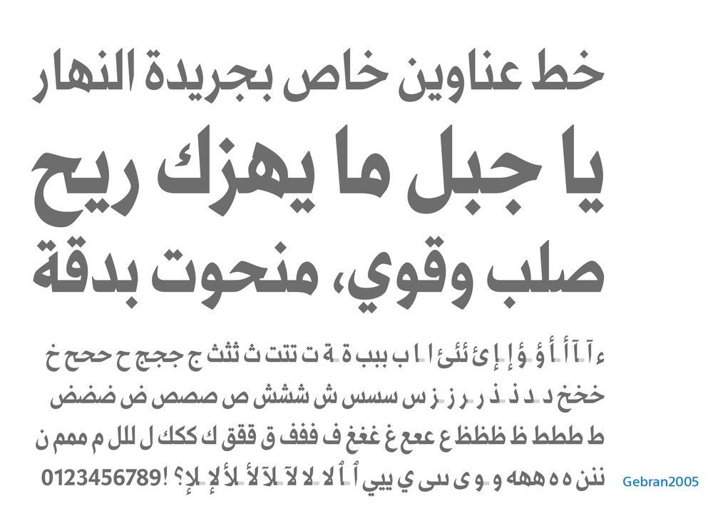
Gebran2005 is a newspaper headline typeface meant to have a bold and strong visual presence. (View large version)
2. In What Sort Of Media Will It Be Used?
There was a time when all books were printed, and the main use of type was either for text or display. Today, we have added one word that modifies how we read and how we design typefaces: text or display, and where? The nature of ink, paper and the pressure needed to imprint the former onto the latter is very different from the nature of the light emitted from a glowing screen.
The way this affects a design is either subtle or pronounced, depending on how small the text size is and how high the resolution of the screen is. In either case, one needs to know whether the typeface is to be read in print, on screen or both.
Another qualifier quickly presents itself: and in which country? There are regional variations in typographic trends and visual language. Some typefaces are meant to be universal in appeal, and some dedicated to particular regions. Knowing where it will come to life will help you to design a more robust typeface.
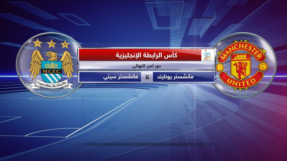
Neue Helvetica Arabic for SKY was custom modified to be used in SKY News Arabia’s TV broadcasts and websites. The height of the font has been restricted in order not to require a tall space. (View large version)
3. What Language Does It Speak?
For many years now, typefaces have been conceived to speak in many different scripts and languages. Some design concepts are quite difficult to translate across script systems. With this in mind, map out your character set in order to plan how the design will extend across various scripts. This is also important for managing time, projecting costs (for the client) and collaborating with other designers.
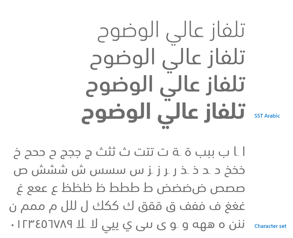
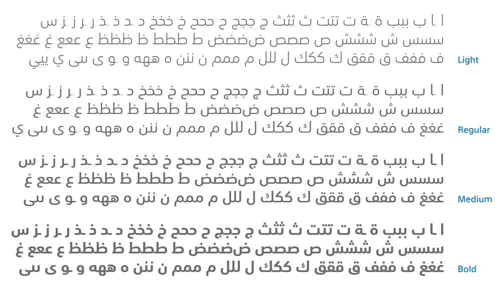
SST was designed as the corporate typeface for Sony, and it supports several scripts, including Latin, Greek, Cyrillic, Arabic, Thai and Japanese. (SST Arabic by Nadine Chahine, and SST Latin by Akira Kobayashi.) (View large version)
4. What Personality Does It Convey?
If the typeface were a person, who would it be? Would it be male or female? Young or old? Hip or conservative? Sometimes it’s not about the personality, but rather the behavior. Formal or informal? Relaxed or tense? And sometimes it’s about the voice. Loud or soft? Confident or shy?
Determining these traits will help you to visualize the kind of impact the typeface should have, and these are usually connected to function. A typeface meant for newspaper headlines will be loud and confident, rather than shy and soft.
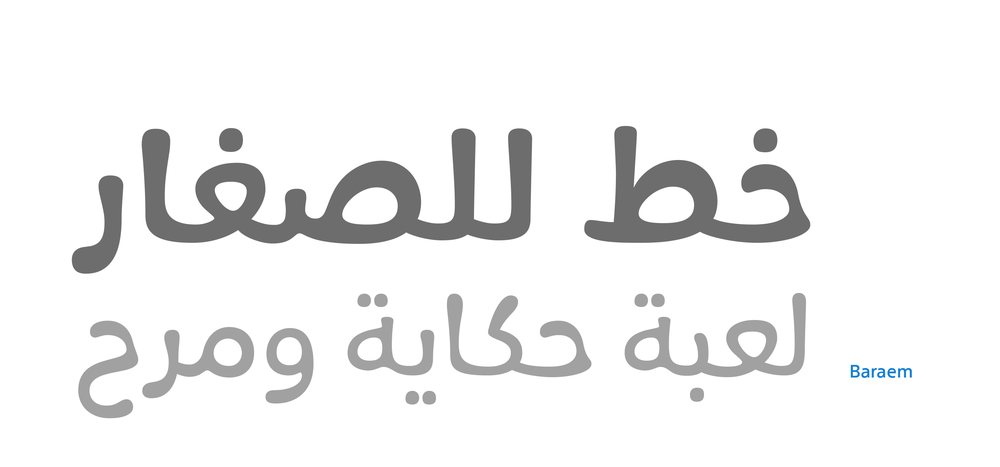
Baraem is the corporate typeface of Baraem TV, targeted at children between the ages of 3 and 6. It’s personality is fun, informal and childlike. (View large version)
5. What Design Characteristics Are Needed Or Desired?
Finally, it is time to talk about the design. Does the intended function call for a serif or sans serif? A handwriting script or all-caps wood blocks? High contrast or mono-linear?
Starting with these questions and staying within the realm of curves and outlines is possible, but a typeface that is strongly tied to a particular function or environment has a better chance of transcending the boundaries of black and white and representing more than just letters and words.
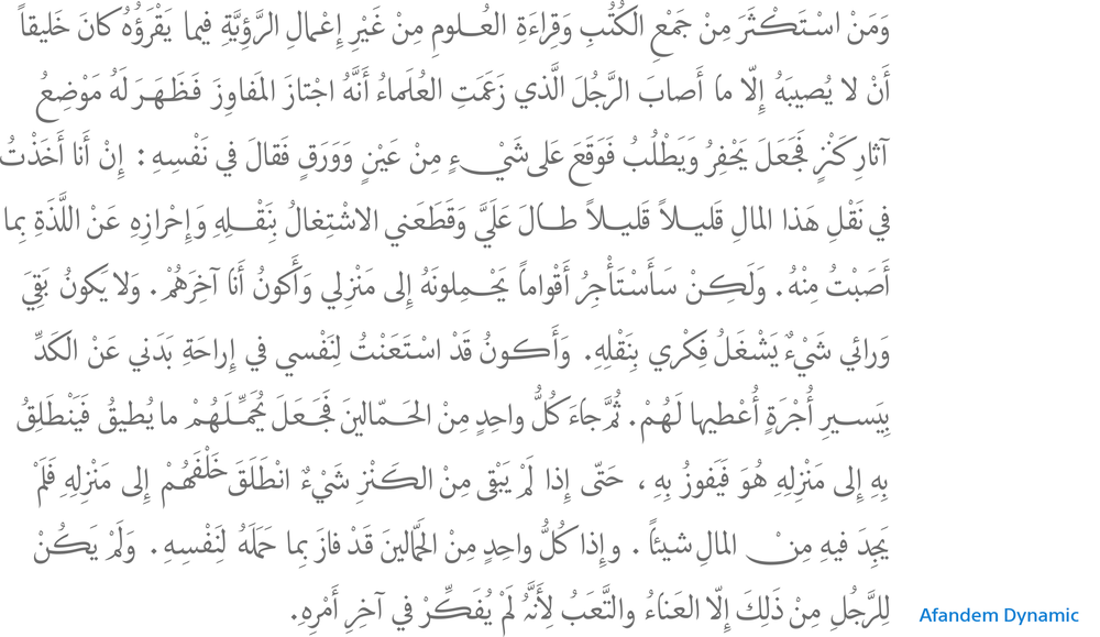
Afandem Dynamic’s is intended as a full-fledged text face in the style of Ottoman Naskh calligraphy. (View large version)
6. Which Calligraphic Or Typographic Style Are You Referencing?
This is where the design engine starts running. If you are designing a sans serif, will it be a humanist or grotesque? Each style has its own conventions of structure, proportion and modulation of strokes.
A typeface is like the human body. The skeleton is the structure underlying the letters. You will see it by drawing a line in the middle of the inner and outer edges. The structure conveys proportion and movement: fast or slow, energetic or relaxed, wide or narrow.
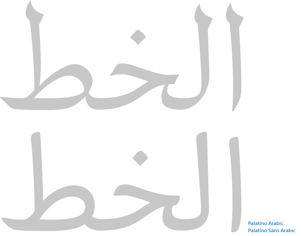
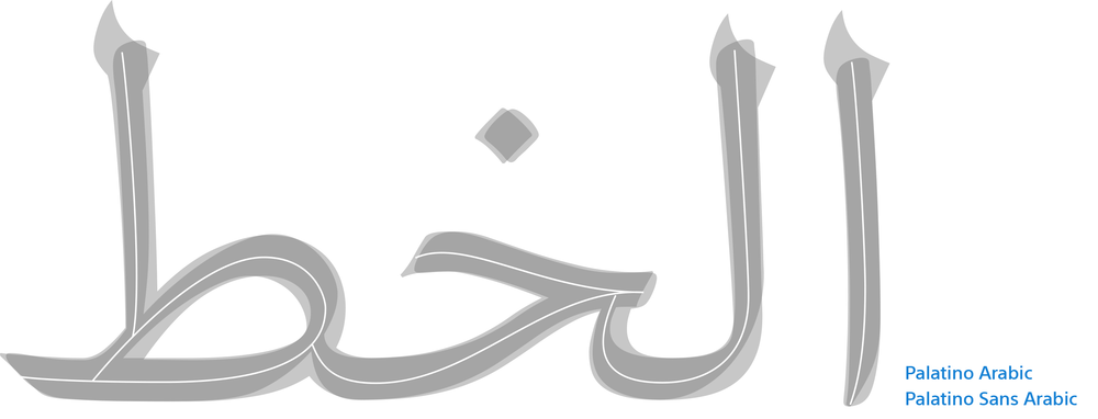
Palatino Arabic and Palatino Sans Arabic have the same skeleton, but the modulation is different. (View large version)
Then you have the flesh. This is the weight around the skeleton. Where you put the thins and thicks will largely be determined by the tool you use to trace the skeleton. Now that you almost have a full body, you must think of the head and feet. Will you have serifs, or do you prefer flats? This is where the design brief splits from a single path into many. If you were to present the first five questions to five different designers, you would likely get different answers to the sixth question and, by extension, different designs.
As such, the sixth question is more of a transitional phase between the conceptual definition of the typeface (i.e. what it is supposed to do and represent) and what it will actually look like.
This is when the real fun begins.
Note: All typefaces included this article were designed by Dr. Nadine Chahine herself.
Further Reading
- The Art And Craft Of Arabic Type Design
- Showcase Of Web Design In The Arab World
- Writing Systems And Calligraphy Of The World
- “Type Design Is Not Only About Drawing Letters”


