Making Embedded Content Work In A Responsive iFrame

Email Newsletter
Weekly tips on front-end & UX.
Trusted by 182,000+ folks.

 Custom Web Forms for Angular, React, & Vue. Your backend.
 Celebrating 10 million developers

iframe is one of the few HTML elements that don’t play nice with responsive layouts. You may need to use it when embedding content from external sources such as YouTube, so in this article, Rachel McCollin will show you how to make embedded content responsive using CSS. For those occasions when non-coders will be embedding video on your website and you don’t want to rely on them adding extra markup, she’ll also look at a solution that uses JavaScript instead of CSS.A few HTML elements don’t play nice with responsive layouts. One of these is the good ol’ iframe, which you may need to use when embedding content from external sources such as YouTube.
In this article, we’ll show you how to make embedded content responsive using CSS, so that content such as video and calendars resize with the browser’s viewport. For those occasions when non-coders will be embedding video on your website and you don’t want to rely on them adding extra markup, we’ll also look at a solution that uses JavaScript instead of CSS.
Note: This technique was originally detailed in Thierry Koblenz’s excellent tutorial ‘Creating Intrinsic Ratios for Video’. I’ve used techniques I learned from his tutorial and expanded on them here for additional content types such as calendars.
The Markup For Embedded Content
Services such as YouTube provide code that you can copy and paste into your own website to embed content. I tend to recommend to my clients that they host video with YouTube because it will save them server space and, regardless of the user’s browser or device, YouTube will display the video correctly. The two main ways to embed video on a website are the HTML5 video element, which doesn’t work in legacy versions of Internet Explorer, and Flash, which doesn’t work on iOS devices and isn’t standards-compliant.
When you embed content from an external source, the code will include an iframe:
<iframe src="https://youtube.com/embed/4aQwT3n2c1Q" height="315" width="560" allowfullscreen="" frameborder="0"></iframe>
This iframe enables external content to be displayed on your website, because it includes a URL that points to the source of the streamed content.
However, you’ll notice that our iframe includes width and height attributes. Remove these and the iframe will disappear because it would have no dimensions. And you can’t fix this in your style sheet, unfortunately.
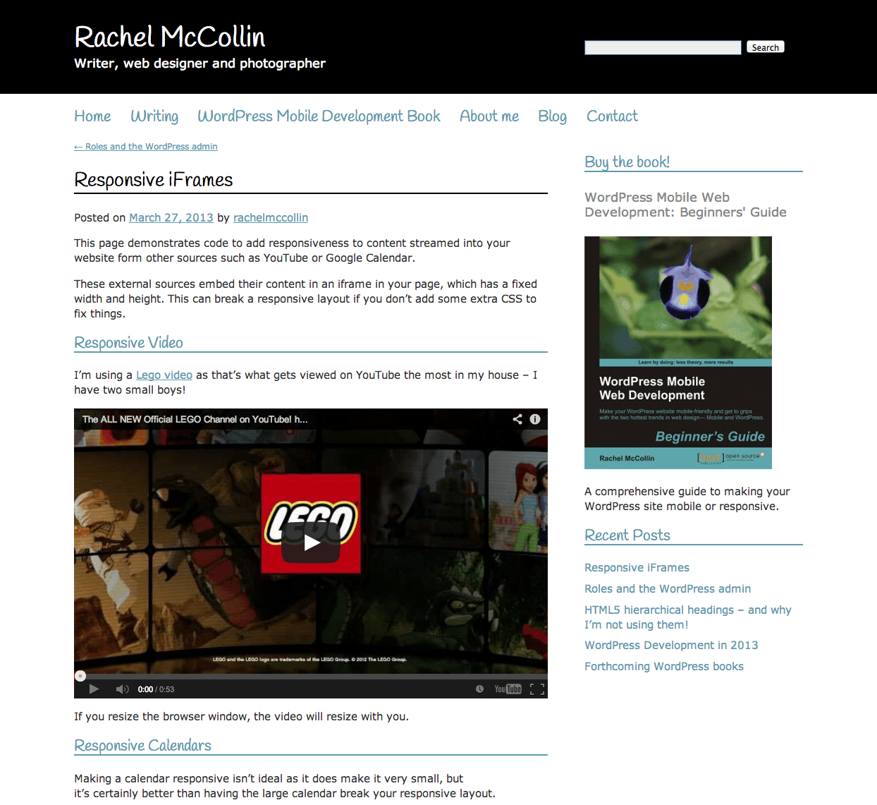
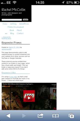
The width attribute means that, on a screen narrower than 560 pixels, the embedded content will protrude outside of its containing element, breaking the layout. In the example below, I’ve added the code above to a page of my blog. The screenshot is taken from an iPhone in portrait mode (320 pixels wide), and the rest of the page has been shrunk so that the embedded content fits the screen. Far from ideal!

Screenshot taken from an iPhone in portrait mode (320px wide). (Larger view)
Fortunately, there is a way around this using CSS. First, I’ll show you how to do this with embedded video, and then with calendars.
Responsive iFrame Video
The Markup
To make embedded content responsive, you need to add a containing wrapper around the iframe. Your markup would be as follows:
<div>
    <iframe src="https://youtube.com/embed/4aQwT3n2c1Q" height="315" width="560" allowfullscreen="" frameborder="0">
    </iframe>
</div>
The next step is to add styling to this new wrapper and the iframe within it.
The CSS
First, we style the containing wrapper with the .video-container class. As proposed by Thierry Koblentz in his ALA article “Creating Intrinsic Ratios For Video”, we can use the following snippet in our style sheet:
.video-container {
    position: relative;
    padding-bottom: 56.25%;
    padding-top: 35px;
    height: 0;
    overflow: hidden;
}
This does a few things:
- Setting the
positiontorelativelets us use absolute positioning for theiframeitself, which we’ll get to shortly. - The
padding-bottomvalue is calculated out of the aspect ratio of the video. In this case, the aspect ratio is 16:9, which means that the height will be 56.25% of the width. For a video with a 4:3 aspect ratio, we setpadding-bottomto 75%. - The
padding-topvalue is set to 30 pixels to allow space for the chrome — this is specific to YouTube videos. - The
heightis set to0becausepadding-bottomgives the element the height it needs. We do not set the width because it will automatically resize with the responsive element that contains this div. - Setting
overflowtohiddenensures that any content protruding outside of this element will be hidden from view.
We also need to style the iframe itself. Add the following to your style sheet:
.video-container iframe {
    position: absolute;
    top:0;
    left: 0;
    width: 100%;
    height: 100%;
}
This targets iframes inside containers with the .video-container class. Let’s work through the code:
- Absolute positioning is used because the containing element has a height of
0. If the iframe were positioned normally, we would have given it a height of0as well. - The
topandleftproperties position the iframe correctly in the containing element. - The
widthandheightproperties ensure that the video takes up 100% of the space used by the containing element (which is actually set with padding).
Having done this, the video will now resize with the screen’s width. Here’s how it will look on a desktop:
Desktop screenshot of the video resizing the screen’s width. (Larger view)
And here’s how it will look on a screen that is 320 pixels wide:
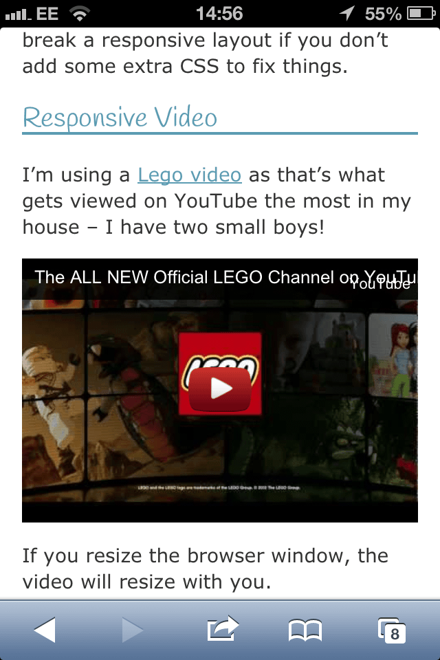
The video on a 320 pixels wide screen. (Larger view)
Let’s move on to other sources of embedded content — specifically, Google calendars.
Responsive Calendar
The Markup
The CSS to make any form of embedded content responsive is essentially the same, but different content will have different aspect ratios, which means you’ll need to set the padding-bottom value accordingly.
Below is a screenshot of a website that I manage for a primary school, a website that embeds a Google calendar. As you can see, the calendar breaks the layout on a small screen. In this case, the website is displayed at the correct width, but the calendar goes beyond the screen’s width.
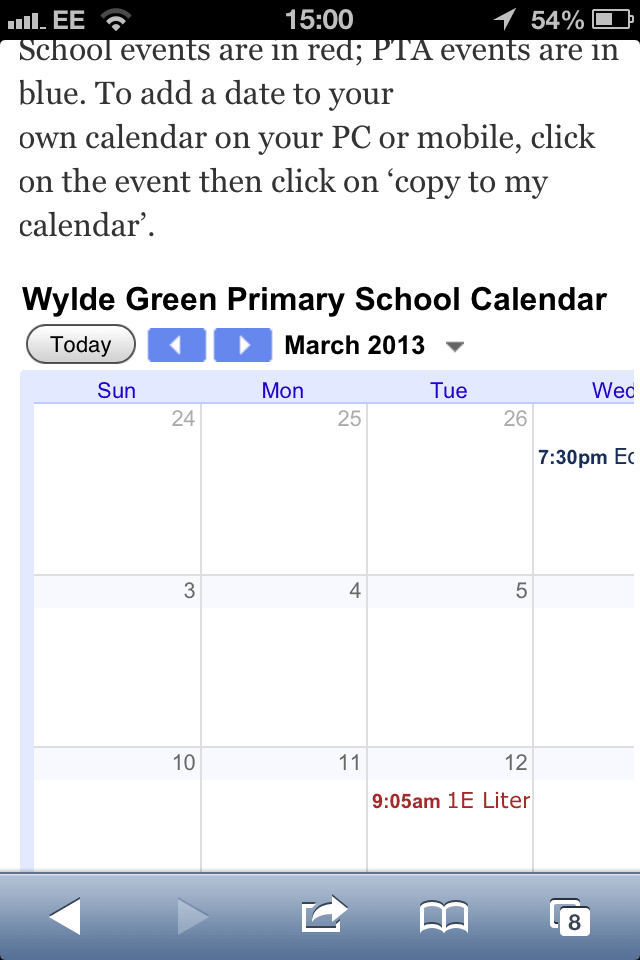
The calendar breaks the layout on a small screen. (Larger view)
The markup for the embedded calendar is as follows:
<iframe src="https://www.google.com/calendar/embed?height=600&wkst=1&bgcolor=%23FFFFFF&src=60aqhusbghf7v0qvvbfu1ml22k%40group.calendar.google.com&color=%232952A3&ctz=Europe%2FLondon" style=" border-width:0 " width="800" height="600" frameborder="0" scrolling="no"></iframe>
To make a calendar responsive, add a div with a class of .calendar-container to contain the iframe:
<div>
<iframe src="https://www.google.com/calendar/embed?height=600&wkst=1&bgcolor=%23FFFFFF&src=60aqhusbghf7v0qvvbfu1ml22k%40group.calendar.google.com&color=%232952A3&ctz=Europe%2FLondon" style=" border-width:0 " width="800" height="600" frameborder="0" scrolling="no">
</iframe>
</div>
The next step is to style this div.
The CSS
The CSS for a calendar is almost identical to the CSS for a video, with two exceptions: The aspect ratio will be different, and padding-top isn’t needed.
Add the following to your style sheet:
.calendar-container {
    position: relative;
    padding-bottom: 75%;
    height: 0;
    overflow: hidden;
}
In this case, the iframe is 800 pixels wide and 600 pixels high, which gives us an aspect ratio of 4:3. So, set padding-bottom to be 75%.
Having done this, we need to apply the same styling to the iframe element in this new container:
.calendar-container iframe {
    position: absolute;
    top:0;
    left: 0;
    width: 100%;
    height: 100%;
}
This is exactly the same styling that we applied to the video.
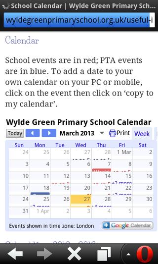
Now, the calendar will resize with the browser window, as shown here in Opera Mobile on an Android phone:
As long as you remember to wrap your embedded calendars and videos with the appropriate containing element, then this CSS will work for any new videos and calendars that you add to your website.
The problem, however, is that although you can fit the whole calendar on a page, it’s still almost unusable because click targets are so small and no information is visible. If you absolutely have to display Google Calendar, you can, but if you can use more usable responsive calendar solutions like simple CSS (setting display: block on table rows, for example), or w3widgets Responsive calendar or Calendario for your own calendars, your users might appreciate it.
Responsive Video With CSS Or JavaScript
If you’re developing a responsive website using a content management system, then one or more of the website’s editors will probably have to embed video at some point. You can point your editors to EmbedResponsively.com which generates responsive for embedding rich third-party media with one click, with CSS alone. Alternatively, you could use a JavaScript solution, to relieve nervous editors from having to add extra CSS and markup. However, as long as you can avoid this path, the better, of course.
Until recently, most solutions were plugins, which are OK to an extent but can have performance issues. A popular plugin is FitVids.js, developed by Chris Coyier and Paravel.
A more current solution is to use just a script — such as FluidVids.js, developed by Todd Motto. FluidVids.js is simple to use:
- Download the script (ZIP) from GitHub and upload it to your server with the same folder structure that the downloaded files come in. This will place the script itself in a folder named
dist. - Call the script in each page’s
<head>section with the following code:
<script src="dist/fluidvids.js></script>
That’s all you need to do to make videos resize on all devices that support JavaScript. It works not only for YouTube, but for Vimeo, too. The problem, however, is that if you users don’t have JavaScript support or the JavaScript hasn’t loaded yet or JavaScript hasn’t loaded correctly, the only fallback you can use is to add the following to your style sheet:
iframe {
    max-width: 100%;
}
This will ensure that video resizes to the width of the browser’s window. But it won’t resize the video’s height; unfortunately, iframe just doesn’t work this way. So, the video won’t break your layout, but it won’t look very good either. This is not really a good option, so if you can avoid using JavaScript for videos, it’s a good idea to do so.
Responsive Google Maps
Apart from videos and calendars, another common issue is the embedding of Google maps, responsively. Basically, we again use the same intrinsic ratio technique, and when setting padding-bottom for the wrapper, we just divide the height by width and add the aspect ratio in CSS.
Usually, the code generated by Google Maps would look like this:
<iframe src="https://www.google.com/maps/embed?pb=!1m14!1m8!1m3!1d3022.260812859955!2d-73.990184!3d40.756288!3m2!1i1024!2i768!4f13.1!3m3!1m2!1s0x0%3A0xb134c693ac14a04c!2sThe+TimesCenter!5e0!3m2!1sen!2suk!4v1393485725496" width="500" height="450" frameborder="0" style="border:0"></iframe>We just wrap a div around the iframe and apply the familiar CSS styling to it:
.google-maps {
    position: relative;
    padding-bottom: 90%; // (450 ÷ 500 = 0.9 = 90%)
    height: 0;
    overflow: hidden;
}
.google-maps iframe {
    position: absolute;
    top: 0;
    left: 0;
    width: 100%;
    height: 100%;
}
And this is what the markup will look like:
<div class="google-maps">
<iframe src="https://www.google.com/maps/embed?pb=!1m14!1m12!1m3!1d7098.94326104394!2d78.0430654485247!3d27.172909818538997!2m3!1f0!2f0!3f0!3m2!1i1024!2i768!4f13.1!5e0!3m2!1sen!2s!4v1385710909804" width="500" height="450" frameborder="0" style="border:0"></iframe>
</div>
Voilá! Again, we can just use EmbedResponsively to generate the copy-paste-code with one click.
Summary
Embedded content has a habit of breaking responsive layouts, because it’s contained in an iframe with a fixed width. In this article, we’ve seen how to add a single containing wrapper, and some CSS, to ensure that all embedded content contained in an iframe resizes with the browser’s window.
Sometimes it’s good enough, but sometimes you might need to come up with more advanced solutions, since resizing isn’t always a solution. We’ve also looked at embed code generators and alternative solutions, using JavaScript, which might be necessary in some cases, especially if editors have to deal with many videos and don’t have technical skills required, or CMS doesn’t allow for inline styling.
How do you embed third-party content on your responsive websites? Have you discovered any particular tricks or techniques? What does your workflow for embedding such content look like?
Further Reading
- Ways To Reduce Content Shifting On Page Load
- The State Of Responsive Web Design
- How To Create An Embeddable Content Plugin For WordPress
- Content Security Policy, Your Future Best Friend
Front page image credits: Juhan Sonin.
 (al, vf, il, mrn)

