Design Principles: Visual Perception And The Principles Of Gestalt
Email Newsletter
Weekly tips on front-end & UX.
Trusted by 182,000+ folks.
 Register for Free

 Custom Web Forms for Angular, React, & Vue. Your backend.
 Celebrating 10 million developers
In 1910, psychologist Max Wertheimer had an insight when he observed a series of lights flashing on and off at a railroad crossing. It was similar to how the lights encircling a movie theater marquee flash on and off.
To the observer, it appears as if a single light moves around the marquee, traveling from bulb to bulb, when in reality it’s a series of bulbs turning on and off and the lights don’t move it all.

This observation led to a set of descriptive principles about how we visually perceive objects. These principles sit at the heart of nearly everything we do graphically as designers.
This is the start of a series of posts about design principles. It begins with these principles of gestalt, because many of the design principles we follow arise out of gestalt theory. In this post, I’ll walk you through a little bit of theory and offer some basic definitions of gestalt principles.
Future posts in this series will consider aspects of design like space, balance and visual hierarchy. In upcoming posts, I’ll point out which gestalt principles influence the aspects of design being discussed, and I’ll offer more practical uses and examples of how the gestalt principles are used in Web design.
The Key Ideas Behind Gestalt Theory
“The whole is other than the sum of the parts.” — Kurt Koffka
The quote above is gestalt in a nutshell. When human beings see a group of objects, we perceive their entirety before we see the individual objects. We see the whole as more than the sum of the parts, and even when the parts are entirely separate entities, we’ll look to group them as some whole. There are several key ideas behind gestalt and gestalt therapy.
Emergence (The Whole Is Identified Before The Parts)
Emergence is the process of forming complex patterns from simple rules. When attempting to identify an object, we first seek to identify its outline. We then match this outline pattern against shapes and objects we already know to find a match. Only after the whole emerges through this outline pattern matching, do we start to identify the parts that make up the whole.
When designing, keep in mind that people will identify elements first by their general form. A simple well defined object will communicate more quickly than a detailed object with a hard to recognize contour.
Reification (Our Mind Fills In The Gaps)
Reification is an aspect of perception in which the object as perceived contains more spatial information than what is actually present. As we attempt to match what we see to the familiar patterns we have stored in memory, there isn’t always an exact match. Instead we find a near match and then fill in the gaps of what we think we should see.
Reification suggests that we don’t need to present the complete outline in order of viewers to see it. We can leave out parts of the outline as long as we provide enough of it to allow for a close enough pattern match. You can see examples of this a little further down under the principle of closure.
Multi-stability (The Mind Seeks To Avoid Uncertainty)
Multi-stability is the tendency of ambiguous perceptual experiences to move unstably back and forth between alternative interpretations. Some objects can be perceived in more than one way. An example from below in the section of figure/ground is one you’ve likely seen before. The image can be seen as either two faces in profile or as a vase.
You can’t see both at once. Instead you bounce back and forth quickly between the two stable alternatives. One will tend to be your dominant perception and the longer you go without begin able to see the other, the harder it will be to see that other perception.
From a design perspective if you want to change someone’s perception, don’t try to change it all at once. Find a way to get them to see an alternative. Then work to strengthen that alternative view, while weakening the original.
Invariance (We’re Good At Recognizing Similarities And Differences)
Invariance is a property of perception in which simple objects are recognized independent of their rotation, translation and scale. Since we often encounter objects from different perspectives, we’ve developed an ability to recognize them despite their different appearance.
Imagine if you could only recognize someone you knew if they stood directly in front of you and faced you, but you couldn’t recognize them once they turned in profile. Despite the different visual perspective we can still recognize people.
You can see these ideas in play in the principles below. The main idea is that gestalt principles are about perception and what is visually communicated by objects. The principles speak to the core of the visual language within which we work.
Gestalt Principles
Most of the principles are relatively easy to understand. There’s a common theme running through many of them.
“All else being equal, elements that are related by X tend to be grouped perceptually into higher-order units.” — Stephen Palmer
Many of the principles below will follow this pattern. The principles either define X or the higher order that’s perceived.
Law Of Prägnanz (Good Figure, Law Of Simplicity)
“People will perceive and interpret ambiguous or complex images as the simplest form(s) possible.”
This is the fundamental principle of gestalt. We prefer things that are simple, clear and ordered. Instinctually these things are safer. They take less time for us to process and present less dangerous surprises.
.")
When confronted with complex shapes, we tend to reorganize them into simpler components or into a simpler whole. You’re more likely to see the left image above composed of the simple circle, square and triangle like you see on the right than as the the complex and ambiguous shape the whole forms.
In this case, seeing three distinct objects is simpler than seeing one complex object. In other cases, it’s simpler to see a single object, which brings us to…
Closure
“When seeing a complex arrangement of elements, we tend to look for a single, recognizable pattern.”
As with Prägnanz, closure seeks simplicity. Closure is the opposite of what we saw in the Prägnanz image above where three objects were simpler than one. With closure, we instead combine parts to form a simpler whole. Our eye fills in the missing information to form the complete figure.

In the left image above, you should see a white triangle even though the image is actually comprised of three black Pac-Man-like shapes. On the right image, you see a panda even though the figure is several random shapes. Seeing the triangle and panda is simpler than trying to make sense of the individual parts.
Closure can be thought of as the glue holding elements together. It’s about the human tendency to seek and find patterns.
The key to closure is providing enough information so the eye can fill in the rest. If too much is missing, the elements will be seen as separate parts instead of a whole. If too much information is provided, there’s no need for closure to occur.
Symmetry And Order
“People tend to perceive objects as symmetrical shapes that form around their center.”
Symmetry gives us a feeling of solidity and order, which we tend to seek. It’s our nature to impose order on chaos. This principle leads us to want balance in composition, though our compositions don’t need to be perfectly symmetrical to be in balance.

In the image above, you should see three pairs of opening and closing brackets. The principle of proximity, which we’ll get to later in this post, might suggest we should see something else. That suggests symmetry takes precedence over proximity.
Since our eyes will quickly find symmetry and order, these principles can be used to effectively communicate information quickly.
Figure/Ground
“Elements are perceived as either figure (the element in focus) or ground (the background on which the figure rests).”
Figure/ground refers to the relationship between positive elements and negative space. The idea is that the eye will separate whole figures from their background in order to understand what’s being seen. It’s one of the first things people will do when looking at any composition.

The figure/ground relationship can be either stable or unstable depending on how easy it is to determine which is which. The classic example of where the relationship is unstable is the left image above. You either see a vase or two faces depending on whether you see the black color as figure and the white as ground, or vice versa. That you can easily bounce back and forth between the two perceptions demonstrates the unstable relationship.
The more stable the relationship, the better we can lead our audience to focus on what we want them to see. Two related principles can help us:
- Area. The smaller of two overlapping objects is seen as figure. The larger is seen as ground. You can see this in the right image above. The smaller shape is the figure regardless of color.
- Convexity. Convex rather than concave patterns tend to be perceived as figures.
Uniform Connectedness
“Elements that are visually connected are perceived as more related than elements with no connection.”
In the image below, lines connect two pairs of elements. This connection leads us to perceive that the connected elements are related to each other in some way.

Of all the principles suggesting objects are related, uniform connectedness is the strongest. In the image above, even though we see two squares and two circles, we see the square–circle pairs as more strongly related because they are visually connected.
Notice that the lines don’t need to touch the elements for the connection to be perceived.
Common Regions
“Elements are perceived as part of a group if they are located within the same closed region.”
Another way to show a connection between elements is to enclose them in some way. Everything inside the enclosure is seen as related. Everything outside the encloser is seen as separate. The circles in the image below are all the same, yet we see two distinct groups, with the circles in each enclosure related in some way.
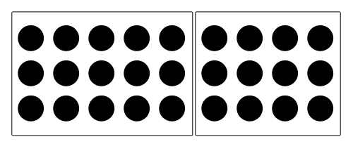
The typical way to show a common region is to draw a box around the related elements like I’ve done above. Placing the elements on a different background color than their immediate surroundings will also work.
Proximity
“Objects that are closer together are perceived as more related than objects that are further apart.”
Proximity is similar to common regions but uses space as the enclosure. When elements are positioned close to one another, they are seen as part of a group rather than as individual elements. This is especially true when the elements in the group are closer to each other than they are to any elements outside the group.

The objects don’t need to be similar in any other way beyond being grouped near each other in space in order to be seen as having a proximity relationship.
Continuation
“Elements arranged on a line or curve are perceived as more related than elements not on the line or curve.”
It’s instinct to follow a river, a path or a fence line. Once you look or move in a particular direction, you continue to look or move in that direction until you see something significant or you determine there’s nothing significant to see.

Another interpretation of this principle is that we’ll continue our perception of shapes beyond their ending points. In the image above, we see a line and curve crossing instead of four distinct line and curve segments that meet at a single point.
Common Fate (Synchrony)
“Elements that move in the same direction are perceived as more related than elements that are stationary or that move in different directions.”
Regardless of how far apart the elements are placed or how dissimilar they appear, if they are seen as moving or changing together, they’ll be perceived as being related.
The elements don’t need to be moving for the principle of common fate to be present. It’s more that they are seen as having a common destination. For example, if four people are clustered together, but two are observed heading toward the right, they will be seen as having a common fate. Even if two are only looking in the same direction, they’ll be perceived as having a common fate.
.")
In the image above, the arrows are enough to indicate the elements share a common fate. While movement or change isn’t necessary, both are still a stronger indication of common fate than things like arrows or looking in the same direction which only imply movement.
Parallelism
“Elements that are parallel to each other are seen as more related than elements not parallel to each other.”
This principle is similar to the common fate principle above. Lines are often interpreted as pointing or moving in some direction. Parallel lines are seen as either pointing or moving in the same direction and are thus related.

It should be noted that for parallelism to be perceived, the lines can also be curves or shapes, though with the latter the shapes should be somewhat line-like in order for them to appear parallel.
Similarity
“Elements that share similar characteristics are perceived as more related than elements that don't share those characteristics.”
Any number of characteristics can be similar: color, shape, size, texture, etc. When a viewer sees these similar characteristics, they perceive the elements as being related due to the shared characteristics.
In the image below, red circles are seen as related to the other red circles and black circles to black circles due to the similarity in color. Red and black circles are seen as dissimilar to each other even though they’re all circles.
An obvious place to find similarity online is in the color of links. Typically, links within content will be styled the same way, often blue and underlined. This lets the viewer know that the different pieces of text are related. Once one is discovered to be a link, it communicates the others are also links.
Focal Points
“Elements with a point of interest, emphasis or difference will capture and hold the viewer’s attention.”
This principle suggests that our attention will be drawn toward contrast, toward the element that is unlike the others in some way. In the image below, your eye should be drawn to the square. It’s a different shape and color from the other elements. I’ve also given it a drop shadow to further emphasize it.

The principle of focal points likely arises out of our need to quickly identify the unknown to alert us to potential danger.
The principles of similarity and focal points are connected, and focal points can’t be seen without the presence of similarity among other elements.
Past Experiences
“Elements tend to be perceived according to an observer's past experience.”
Past experience is perhaps the weakest gestalt principle. In conjunction with any of the other principles, the other principle will dominate over the past experience principle.
Past experience is unique to the individual, so it’s difficult to make assumptions about how it will be perceived. However, there are common experiences we all share. For example, a lot of color meaning arises out of past experience.

Having seen traffic lights throughout our lives, we expect red to mean stop and green to mean go. You probably see the image above as a traffic light on its side, because of the three common colors. That’s past experience at work.
Many of our common experiences also tend to be cultural. Color again provides examples. In some countries, white is seen as pure and innocent and black as evil and death. In other countries, these interpretations are reversed. Conventions can arise when the experience is commonly shared, though again it’s important to remember that we don’t all share the same experiences.
Summary Of Gestalt
Gestalt principles are important to understand. They sit at the foundation of everything we do visually as designers. They describe how everyone visually perceives objects.
The principles above should be relatively easy to understand. For most of them, the definition and the image are probably all you needed to understand the principle. At the same time, understanding the basic ideas of these principles isn’t the same as understanding how they influence design.
In the coming weeks we’ll look more at how gestalt influences design. We’ll see how symmetry helps us balance a composition and how combining focal points and similarity allows us to create a visual hierarchy in a design.
Before we get to either, though, we’ll take a deeper look at the figure/ground relationship and consider the space in which we place elements. That’s where I’ll pick up the series.
Additional Resources
- Visual Design Principles
- Laws of Organization in Perceptual Forms (Max Wertheimer)
- Gestalt principles
- Gestalt Principles & Web Design
- Gestalt principles of form perception
- Gestalt Principles Applied in Design
- Gestalt Theory of Visual Perception
- 6 Principles of Gestalt Psychology That Can Improve Your Photography
I especially recommend this five-part series by Andy Rutledge.
- Gestalt Principles of Perception 1: Figure Ground Relationships
- Gestalt Principles of Perception 2: Similarity
- Gestalt Principles of Perception 3: Proximity, Uniform Connectedness, and Good Continuation
- Gestalt Principles of Perception 4: Common Fate
- Gestalt Principles of Perception 5: Closure
Further Reading
- Design Principles: Space And The Figure-Ground Relationship
- Improve Your Designs With The Principles Of Similarity And Proximity
- Designing for the Mind
- Authentic Design


