Responsive Images Done Right: A Guide To srcset

Email Newsletter
Weekly tips on front-end & UX.
Trusted by 182,000+ folks.

 Custom Web Forms for Angular, React, & Vue. Your backend.
 Celebrating 10 million developers


<picture> element and srcset, with simple fallbacks for legacy browsers. There is no reason to wait for responsive images; we can actually have them very soon.Images are some of the most important pieces of information on the web, but over the web’s 25-year history, they haven’t been very adaptable at all. Everything about them has been stubbornly fixed: their size, format and crop, all set in stone by a single src.
"Everything I’ve said so far could be summarized as: make pages which are adaptable.… Designing adaptable pages is designing accessible pages. And perhaps the great promise of the web, far from fulfilled as yet, is accessibility, regardless of difficulties, to information."
— John Allsopp, A Dao of Web Design
HTML authors began to really feel these limitations when high-resolution screens and responsive layouts hit the web like a one-two punch. Authors — wanting their images to look crisp in huge layouts and on high-resolution screens — began sending larger and larger sources to everyone; the average size of an image file ballooned; very smart people called responsive web design “unworkably slow”.
Images have been the number one obstacle to implementing truly adaptable and performant responsive pages — pages that scale both up and down, efficiently tailoring themselves to both the constraints and the affordances of the browsing context at hand.
That is about to change.
The latest specification of the <picture> element is the result of years of debate on how to make images adapt. It gives authors semantic ways to group multiple versions of the same image, each version having technical characteristics that make it more or less suitable for a particular user. The new specification has achieved broad consensus and is being implemented in Chrome, Opera and Firefox and Edge (link) as I type.
The time to start learning this stuff is now!
Before we get to any of the (shiny! new!) markup, let’s look at the relevant ways in which browsing environments vary, i.e. the ways in which we want our images to adapt.
- Our images need to be able to render crisply at different
device-pixel-ratios. We want high-resolution screens to get high-resolution images, but we don’t want to send those images to users who wouldn’t see all of those extra pixels. Let’s call this thedevice-pixel-ratiouse case. - If our layout is fluid (i.e. responsive), then our images will need to squish and stretch to fit it. We’ll call this fluid-image use case.
- Note that these two use cases are closely related: To solve both, we’ll want our images to be available in multiple resolutions so that they scale efficiently. We’ll call tackling both problems simultaneously the variable-sized-image use case
- Sometimes we’ll want to adapt our images in ways that go beyond simple scaling. We might want to crop the images or even subtly alter their content. We’ll call this the art-direction use case.
- Finally, different browsers support different image formats. We might want to send a fancy new format such as WebP to browsers that can render it, and fall back to trusty old JPEGs in browsers that don’t. We’ll call this the type-switching use case.
The new <picture> specification includes features for all of these cases. Let’s look at them one by one.

The device-pixel-ratio Use Case
Let’s start simply, with a fixed-width image that we want to adapt to varying device-pixel-ratios. To do this, we’ll use the first tool that the new specification gives us for grouping and describing image sources: the srcset attribute.
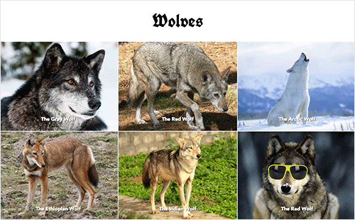
Say we have two versions of an image:
small.jpg(320 × 240 pixels)large.jpg(640 × 480 pixels)
We want to send large.jpg only to users with high-resolution screens. Using srcset, we’d mark up our image like so:
<img srcset="small.jpg 1x, large.jpg 2x"
   src="small.jpg"
   alt="A rad wolf" />
The srcset attribute takes a comma-separated list of image URLs, each with an x descriptor stating the device-pixel-ratio that that file is intended for.
The src is there for browsers that don’t understand srcset. The alt, of course, is included for browsers that don’t render images at all. One element and three attributes gets us an image that looks crisp on high-resolution devices and efficiently degrades all the way down to text. Not too shabby!
The Fluid- And Variable-Sized-Image Use Cases
What that markup won’t do is efficiently squish and stretch our image in a fluid layout. Before addressing this fluid-image use case, we need a little background on how browsers work.
Image preloading is, according to Steve Souders, “the single biggest performance improvement browsers have ever made.” Images are often the heaviest elements on a page; loading them ASAP is in everyone’s best interest. Thus, the first thing a browser will do with a page is scan the HTML for image URLs and begin loading them. The browser does this long before it has constructed a DOM, loaded external CSS or painted a layout. Solving the fluid-image use case is tricky, then; we need the browser to pick a source before it knows the image’s rendered size.
What a browser does know at all times is the environment it’s rendering in: the size of the viewport, the resolution of the user’s screen, that sort of thing. We use this information when we use media queries, which tailor our layouts to fit particular browsing environments.
Thus, to get around the preloading problem, the first proposals for fluid-image features suggested attaching media queries to sources. We would base our source-picking mechanism on the size of the viewport, which the browser knows at picking-time, not on the final rendered size of the image, which it doesn’t.
As it turns out, that’s a bad idea. While it’s technically workable, calculating the media queries needed is tedious and error-prone. A better idea is to simply tell the browser the rendered size of the image!
Once we tell the browser how many pixels it needs (via a new attribute, sizes) and how many pixels each of the sources has (via w descriptors in srcset), picking a source becomes trivial. The browser picks the smallest source that will still look reasonably crisp within its container.
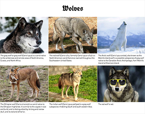
Let’s make this concrete by developing our previous example. Suppose we now have three versions of our image:
large.jpg(1024 × 768 pixels)medium.jpg(640 × 480 pixels)small.jpg(320 × 240 pixels)
And we want to place these in a flexible grid — a grid that starts out as a single column but switches to three columns in larger viewports, like this:
Here’s how we’d mark it up:
<img srcset="large.jpg  1024w,
      medium.jpg 640w,
      small.jpg  320w"
   sizes="(min-width: 36em) 33.3vw,
      100vw"
   src="small.jpg"
   alt="A rad wolf" />
We’re using srcset again, but instead of x descriptors, we’re attaching w descriptors to our sources. These describe the actual width, in pixels, of the referenced file. So, if you “Save for Web…” at 1024 × 768 pixels, then mark up that source in srcset as 1024w.
You’ll note that we’re specifying only image widths. Why not heights, too? The images in our layout are width-constrained; their widths are set explicitly by the CSS, but their heights are not. The vast majority of responsive images in the wild are width-constrained, too, so the specification keeps things simple by dealing only in widths. There are some good reasons for including heights, too — but not yet.
So, that’s w in srcset, which describes how many pixels each of our sources has. Next up, the sizes attribute. The sizes attribute tells the browser how many pixels it needs by describing the final rendered width of our image. Think of sizes as a way to give the browser a bit of information about the page’s layout a little ahead of time, so that it can pick a source before it has parsed or rendered any of the page’s CSS.
We do this by passing the browser a CSS length that describes the image’s rendered width. CSS lengths can be either absolute (for example, 99px or 16em) or relative to the viewport (33.3vw, as in our example). That “relative to the viewport” part is what enables images to flex.
If our image occupies a third of the viewport, then our sizes attribute should look like this:
sizes="33.3vw"
Our example isn’t quite so simple. Our layout has a breakpoint at 36 ems. When the viewport is narrower than 36 ems, the layout changes. Below that breakpoint, the image will fill 100% of the viewport’s width. How do we encode that information in our sizes attribute?
We do it by pairing media queries with lengths:
sizes="(min-width: 36em) 33.3vw,
   100vw"
This is its format:
sizes="[media query] [length],
   [media query] [length],
   etc…
   [default length]"
The browser goes over each media query until it finds one that matches and then uses the matching query’s paired length. If no media queries match, then the browser uses the “default” length, i.e. any length it comes across that doesn’t have a paired query.
With both a sizes length and a set of sources with w descriptors in srcset to choose from, the browser has everything it needs to efficiently load an image in a fluid, responsive layout.
Wonderfully, sizes and w in srcset also give the browser enough information to adapt the image to varying device-pixel-ratios. Converting the CSS length, we give it in sizes to CSS pixels; and, multiplying that by the user’s device-pixel-ratio, the browser knows the number of device pixels it needs to fill — no matter what the user’s device-pixel-ratio is.
So, while the example in our device-pixel-ratio use case works only for fixed-width images and covers only 1x and 2x screens, this srcset and sizes example not only covers the fluid-image use case, but also adapts to arbitrary screen densities.
We’ve solved both problems at once. In the parlance set out at the beginning of this article, w in srcset and sizes covers the variable-sized-image use case.
Even more wonderfully, this markup also gives the browser some wiggle room. Attaching specific browsing conditions to sources means that the browser does its picking based on a strict set of conditions. “If the screen is high-resolution,” we say to the browser, “then you must use this source.” By simply describing the resources’ dimensions with w in srcset and the area they’ll be occupying with sizes, we enable the browser to apply its wealth of additional knowledge about a given user’s environment to the source-picking problem. The specification allows browsers to, say, optionally load smaller sources when bandwidth is slow or expensive.
One more thing. In our example, the size of the image is always a simple percentage of the viewport’s width. What if our layout combined both absolute and relative lengths by, say, adding a fixed 12-em sidebar to the three-column layout, like this?
We’d use the surprisingly well-supported calc() function in our sizes attribute.
sizes="(min-width: 36em) calc(.333 * (100vw - 12em)),
   100vw"
And… done!
The Art-Direction Use Case
Now we’re cooking with gas! We’ve learned how to mark up varible-sized images that scale up and down efficiently, rendering crisply on any and all layouts, viewports and screens.
But what if we wanted to go further? What if we wanted to adapt more?
When Apple introduced the iPad Air last year, its website featured a huge image of the device. This might sound rather unremarkable, unless you — as web design geeks are wont to do — compulsively resized your browser window. When the viewport was short enough, the iPad did a remarkable thing: it rotated to better fit the viewport!
We call this sort of thing “art direction.”
Apple art-directed its image by abusing HTML and CSS: marking up its image — which was clearly content — as an empty div and switching its background-image with CSS. The new <picture> specification allows authors to do this sort of breakpoint-based art direction entirely in HTML.
The specification facilitates this by layering another method of source grouping on top of srcset: <picture> and source.
Let’s get back to our example. Suppose that instead of letting our image fill the full width of the viewport on small screens, we crop the image square, zooming in on the most important part of the subject, and present that small square crop at a fixed size floated off to the left, leaving a lot of space for descriptive text, like this:
To achieve this, we’ll need a couple of additional image sources:
cropped-small.jpg(96 × 96 pixels)cropped-large.jpg(192 × 192 pixels)small.jpg(320 × 240 pixels)medium.jpg(640 × 480 pixels)large.jpg(1024 × 768 pixels)
How do we mark them up? Like so:
<picture>
   <source media="(min-width: 36em)"
      srcset="large.jpg  1024w,
         medium.jpg 640w,
         small.jpg  320w"
      sizes="33.3vw" />
   <source srcset="cropped-large.jpg 2x,
         cropped-small.jpg 1x" />
   <img src="small.jpg" alt="A rad wolf" />
</picture>
This example is as complex as it gets, using every feature that we’ve covered so far. Let’s break it down.
The <picture> element contains two sources and an img. The sources represent the two separate art-directed versions of the image (the square crop and the full crop). The (required) img serves as our fallback. As we’ll soon discover, it does much of the actual work behind the scenes.
First, let’s take a close look at that first source:
<source media="(min-width: 36em)"
   srcset="large.jpg  1024w,
      medium.jpg 640w,
      small.jpg  320w"
   sizes="33.3vw" />
This source represents the full uncropped version of our image. We want to show the full image only in the three-column layout — that is, when the viewport is wider than 36 ems. The first attribute here, media=“(min-width: 36em)”, makes that happen. If a query in a media attribute evaluates to true, then the browser must use that source; otherwise, it’s skipped.
The source’s other two attributes — srcset and sizes — are mostly copied from our previous variable-sized-image example. One difference: Because this source will be chosen only for the three-column layout, our sizes attribute only needs a single length, 33.3vw.
When the viewport is narrower than 36 ems, the first source’s media query will evaluate to false, and we’d proceed to the second:
<source srcset="square-large.jpg 2x,
                square-small.jpg 1x" />
This represents our small square crop. This version is displayed at a fixed width, but we still want it to render crisply on high-resolution screens. Thus, we’ve supplied both 1x and 2x versions and marked them up with simple x descriptors.
Lastly, we come to the surprisingly important (indeed, required!) img.
Any child of an audio or video element that isn’t a source is treated as fallback content and hidden in supporting browsers. You might, therefore, assume the same thing about the img here. Wrong! Users actually see the img element when we use <picture>. Without img, there’s no image; <picture> and all of its sources are just there to feed it a source.
Why? One of the main complaints about the first <picture> specification was that it reinvented the wheel, propsing an entirely new HTML media element, along the lines of audio and video, that mostly duplicated the functionality of img. Duplicated functionality means duplicated implementation and maintenance work — work that browser vendors weren’t keen to undertake.
Thus, the new specification’s reuse of img. The <picture> itself is invisible, a bit like a magical span. Its sources are just there for the browser to draw alternate versions of the image from. Once a source URL is chosen, that URL is fed to the img. Practically speaking, this means that any styles that you want to apply to your rendered image (like, say, max-width: 100%) need to be applied to img, not to <picture>.
OK, on to our last feature.
The Type-Switching Use Case
Let’s say that, instead of doing all of this squishing, stretching and adapting to myriad viewport conditions, we simply want to give a new file format a spin and provide a fallback for non-supporting browsers. For this, we follow the pattern established by audio and video: source type.
<picture>
   <source type="image/svg" src="logo.svg" />
   <source type="image/png" src="logo.png" />
   <img src="logo.gif" alt="RadWolf, Inc." />
</picture>
If the browser doesn’t understand the image/svg media type, then it skips the first source; if it can’t make heads or tails of image/png, then it falls back to img and the GIF.
During the extremely painful GIF-to-PNG transition period, web designers would have killed for such a feature. The <picture> element gives it to us, setting the stage for new image formats to be easily adopted in the years to come.
That’s It!
That’s everything: every feature in the new <picture> specification and the rationale behind each. All in all, srcset, x, w, sizes, <picture>, source, media and type give us a rich set of tools with which to make images truly adaptable — images that can (finally!) flow efficiently in flexible layouts and a wide range of devices.
The specification is not yet final. The first implementations are in progress and are being staged behind experimental flags; its implementors and authors are working together to hash out the specification’s finer details on a daily basis. All of this is happening under the umbrella of the Responsive Images Community Group. If you’re interested in following along, join the group, drop in on the IRC channel, weigh in on a GitHub issue or file a new one, sign up for the newsletter, or follow the RICG on Twitter.
Further Reading
- Choosing A Responsive Image Solution
- One Solution To Responsive Images
- Responsive Images In WordPress With Art Direction
- 53 CSS-Techniques You Couldn’t Live Without
 (il, al, mrn)

