Design Principles: Space And The Figure-Ground Relationship

Email Newsletter
Weekly tips on front-end & UX.
Trusted by 200,000+ folks.
 Register!


 Flexible CMS. Headless & API 1st
If you see graphic design as a process of arranging shapes on a canvas, then you’re only seeing half of what you work with. The negative space of the canvas is just as important as the positive elements that we place on the canvas.
Design is an arrangement of both shapes and space. To work more effectively with space, you must first become aware of it and learn to see it — learn to see the shapes that space forms and how space communicates. This is second part of a series on design principles for beginners. The first part covered an introduction to gestalt; the rest of the series (including this post) will build on those gestalt principles and show how many of the fundamental principles we work with as designers have their origin there.
The Figure-Ground Relationship
The gestalt principle that applies most to space is that of figure-ground. Everything in a design of yours will be seen as one or the other, and the relationship between them is mutually exclusive. Neither can be perceived except in relation to the other, and changing one is impossible without changing the other as well.
The figure-ground relationship is also complementary. Figure and ground can enhance or detract from each other, and organizing the two in relation to each other is one of the more important aspects of design. It sets a context for how your design communicates and how it will be interpreted.
“White space is to be regarded as an active element, not a passive background.”
— Jan Tschichold

Consider the three panels in the image above. On the left, we see a series of black lines with an equal amount of white space between them. Together, the black lines and white space form a gray field, each contributing equally to the result. Removing the space (in the second panel) completely changes the field, rendering it as a solid-black shape. Not only is the space gone, but the individual elements have become a single element.
In the third panel, two of the black lines have been removed. This activates the space, making it appear to be sitting on top of the gray field. The ground has become the figure and adds more depth to the design.

There are three types of figure-ground relationships:
- Stable (above left)
It’s clear what’s figure and what’s ground. One or the other usually dominates the composition. - Reversible (above center)
Both figure and ground attract the viewer’s attention equally. This creates tension, whereby either can overtake the other, leading to a dynamic design. - Ambiguous (above right)
Elements can appear to be both figure and ground simultaneously. They form equally interesting shapes, and the viewer is left to find their own entry point into the composition.
Depending on which relationship you set up and how you balance both figure and ground, you direct the audience to look at different parts of the design and interpret what they see in different contexts.
Figure-ground is not the only gestalt principle in which space plays a prominent role. Two others are these:
- Proximity
Proximity uses space to connect and separate elements by enclosing some elements in space. An example we might take for granted is paragraphs of text on the page. The space between paragraphs is greater than the space between lines of text within a paragraph. - Closure
This makes use of space as gaps between elements. Viewers fill in the gaps with their own information to complete a whole from the parts. Too much space and no closure occurs. Too little space and no closure is needed. Only the correct balance between space and filled-in space will activate the space and lead to closure.

Space As A Design Element
Think about music for a moment. If every note or chord were played at the same time, you wouldn’t have music. You’d have noise. Music occurs when sounds are contrasted against silence. Varying the pattern of sound and silence creates rhythm and melody. Without the silence, there is no music.
Space performs the same function visually. It gives positive elements room to breathe. It gives the eye freedom to move through a design and to discover the elements it’s looking for. The positive is seen only in contrast with the negative. Without space, you don’t have design. You have visual noise.
Unless noise is what you’re trying to communicate, lean toward space. People are less likely to complain about too much space than about too little.
Space can do the following:
- establish contrast, emphasis and hierarchy;
- generate drama and tension;
- provide visual rest between groups of elements.
As the figure-ground relationship implies, you have space only when something is present inside it. Prior to the addition of positive elements, space is undefined. The figure-ground relationship has to be established before space can exist and its communication begins.
One of the more important functions of space is to improve readability and legibility. Macro-space makes text more inviting. Micro-space makes it more legible.
- Micro-space
This is space within elements in a group. It’s the space between letters, words and paragraphs. - Macro-space
This is space between major elements. It separate elements or groups of elements and provides avenues for the eye to follow and places to rest between elements.
Space correlates to quality. More space entails fewer elements or a rarity of elements. Compare high-end and discount retail stores. Which one typically has more space inside, and which one packs products into every bit of available space? What does the space communicate to you?
Space can also convey attributes other than quality, such as:
- sophistication,
- simplicity,
- luxury,
- cleanliness,
- solitude,
- openness.
You waste space when you fail to consider it. You can waste space by overfilling it. You can waste space by trapping it inside elements of a design and not allowing it to connect to other space in the design.
Design is ultimately an arrangement of shapes, and that includes the shapes formed by space. Don’t be afraid to use space. View it as an important design element under your control.
A Few Examples Of Space In Websites
To better use space, you first need to become consciously aware of it. Learn to recognize space in different designs. Notice the shape it forms, and think about what the space is communicating. To that end, let’s look at the design of some websites, taking notice of how space is used.
Old Guard
The design of Tom Johnson’s Old Guard uses plenty of white space, giving text and other elements room to breathe. There’s no mistaking what’s figure and what’s ground.

Information is contained and separated by space (recall the principle of proximity), distinguishing groups of elements. You can easily tell where one post ends and the next begins, solely by the space between them.
The main content is slightly off center on the page, with generous space on either side. This space is occasionally interrupted by elements, activating both the space and the interrupting elements. This helps to draw attention to the area and especially the elements within.
Heroku’s Staus Page
The image below shows part of the status page for Heroku as being mostly space. I happened to catch the website on a particularly good day, because additional positive elements would mean more reported incidents on the platform. Here, more white space signifies better service.

Notice how the white space doesn’t need to be white. While the page is overly generous with space, you’re unlikely to complain that there’s too much of it. Only important information — in this case, status updates and reports of incidents — interrupt the space.
Introducing The Novel
The space at the top of Introducing the Novel is asymmetric and active. Notice how the large block of space on the left leads your eye directly to the content. If you click through to the website and scroll down from the top, you’ll see that space is also used to separate and group blocks of information.

Thin light lines are also used to group and separate these blocks. When viewing the website, notice how the lines don’t always touch, allowing the space to flow around them and connect to other space. This prevents the space from being trapped.
Elliot Jay Stocks
The website of Elliot Jay Stocks should be familiar to all of you, since he’s behind the design of this one. Asymmetrical space on Elliot’s website again leads to active space.

The large image at the top of this page could potentially stand as a temporary block to accessing the content below; however, a generous amount of space next to the image provides ample and inviting room for the eye to move around it. If the sidebar on the left had the same background color as the main content, then it would probably be easier for the eye to move around the image, but the change in color hardly makes it difficult.
As with the websites above, space is used to both enclose and separate groups of distinct information, allowing each group to stand out and allowing the eye to find what it wants and to rest in between.
Phil Coffman
The content on Phil Coffman’s website forms a single shape that sits in mostly empty space. The absence of many positive elements increases the importance of those that are present.
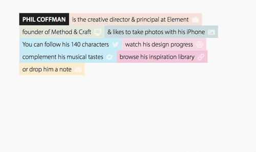
Even within the colored rectangular backgrounds, the text has enough space around it to be easily read and not to be mistaken for another category of text on the page.
The positive shape (and the shape of the space) adjusts responsively to different browser widths, but the pattern of a single large shape surrounded by space remains.
New Adventures In Web Design
Like many of the websites here, The 2013 website for the New Adventures in Web Design conference leaves generous room around elements. Distinct groups of information are contained by space, and the space is active throughout the design.

Something interesting to note is the gray circular arrows between the image in the upper-left and the main content to the right.
Do these arrows block the flow of space? Because they don’t touch and because each is dashed where it interrupts the space, the space can flow through, although it’s clearly more restricted in that flow.
The lighter-gray color helps. It prevents the arrows from dominating, and it’s not hard to imagine the space flowing over the lines.
In fairness, if my browser was wider when I grabbed the screenshot, the arrows wouldn’t overlap with the main content. However, around 1280 pixels down to where the design becomes a single column, they do. Overall, it works, although I wonder whether the space would flow better without the arrows present.
A Few Examples Of Logos
I’ll leave you with some logos in which space is incorporated as an integral part of the design. Instead of pointing out the use of space in each, I’ll make a few general comments and then let you explore the spaces for yourself.
Notice how the logos below make use of the figure-ground relationship. With some, until you see both figure and ground, you don’t see the full logo. Both are necessary contributors to what is being communicated.
Several of these logos rely on the principle of closure. What you’re meant to see isn’t really there, but you see it nonetheless. A few of these logos also play around with figure and ground. What’s figure when you take in the whole logo against its background becomes ground for a smaller figure within. This reversible figure-ground relationship is central to what’s being communicated.

Summary
I hope you take away two main things from this post. First is the connection between the use of space in design and the gestalt principle of figure-ground. Gestalt principles underly much of what we do as designers.
Secondly, and perhaps more importantly, make an effort to spend time observing how space is used in design. Don’t let space be a byproduct of your positive elements. Learn to design space as much as, if not more than, positive elements. The layout of any page is ultimately an organization of space.
Consciously analyze that space, and deliberately use it to create a better design. Don’t allow it to be what’s left over. View it as an essential design element, and then view the relationship between space and positive elements as a design element that you shape.
Next time, we’ll add more gestalt principles to the mix and explore how focal points, continuation and common fate lead us into ideas such as visual weight and compositional balance.
Further Reading
- Mind Your En And Em Dashes: Typographic Etiquette
- Design Principles: Visual Weight And Direction
- How Geometry Influences Logo Design
- About Art
 (al, ml, il, mrn)

