Interface designers use affordances all the time. They have to. Unlike physical objects, web and mobile interfaces must gain all of their affordance through design. For most designers, this is intuitive and instinctive, based on the thousands of design patterns we see every day. But have you ever thought about the qualities that make an object afford clicking, sliding, pulling or pushing? By deeply understanding how affordance works, you’ll better master interface or product design. Better affordance can have a dramatic impact on conversion rates, registration rates and the user actions that matter most to the website, app or product you’re designing for. This is why “affordance” is the most underrated word in web design.
An “affordance” is a perceived signal or clue that an object may be used to perform a particular action. A chair sits at around knee height and appears to provide support. It affords sitting. A toothbrush has a handle a little longer than the human palm. It affords gripping.
All of the objects that surround us have affordances: some are explicit (the “Push” sign above a door handle), and others are hidden (a chair could be used to break a window or used as a weapon). The term was first coined by psychologist James G. Gibson, then introduced to human-computer interaction by Donald Norman in his book The Psychology of Everyday Things, required reading for budding industrial and product designers everywhere.
Interface designers use affordances all the time. They have to. Unlike physical objects — which often have affordances based on their size, shape and weight — web and mobile interfaces must gain all of their affordance through design. For most designers, this is intuitive and instinctive, based on the thousands of design patterns we see every day. But have you ever thought about the qualities that make an object afford clicking, sliding, pulling or pushing?
By deeply understanding how affordance works, you’ll better master interface or product design. You’ll be able to use affordance as a tool to make your designs easier to use and encourage users to undertake the actions you want, like signing up for a product, generating content or connecting with another user. Better affordance can have a dramatic impact on conversion rates, registration rates and the user actions that matter most to the website, app or product you’re designing for. This is why “affordance” is the most underrated word in web design.
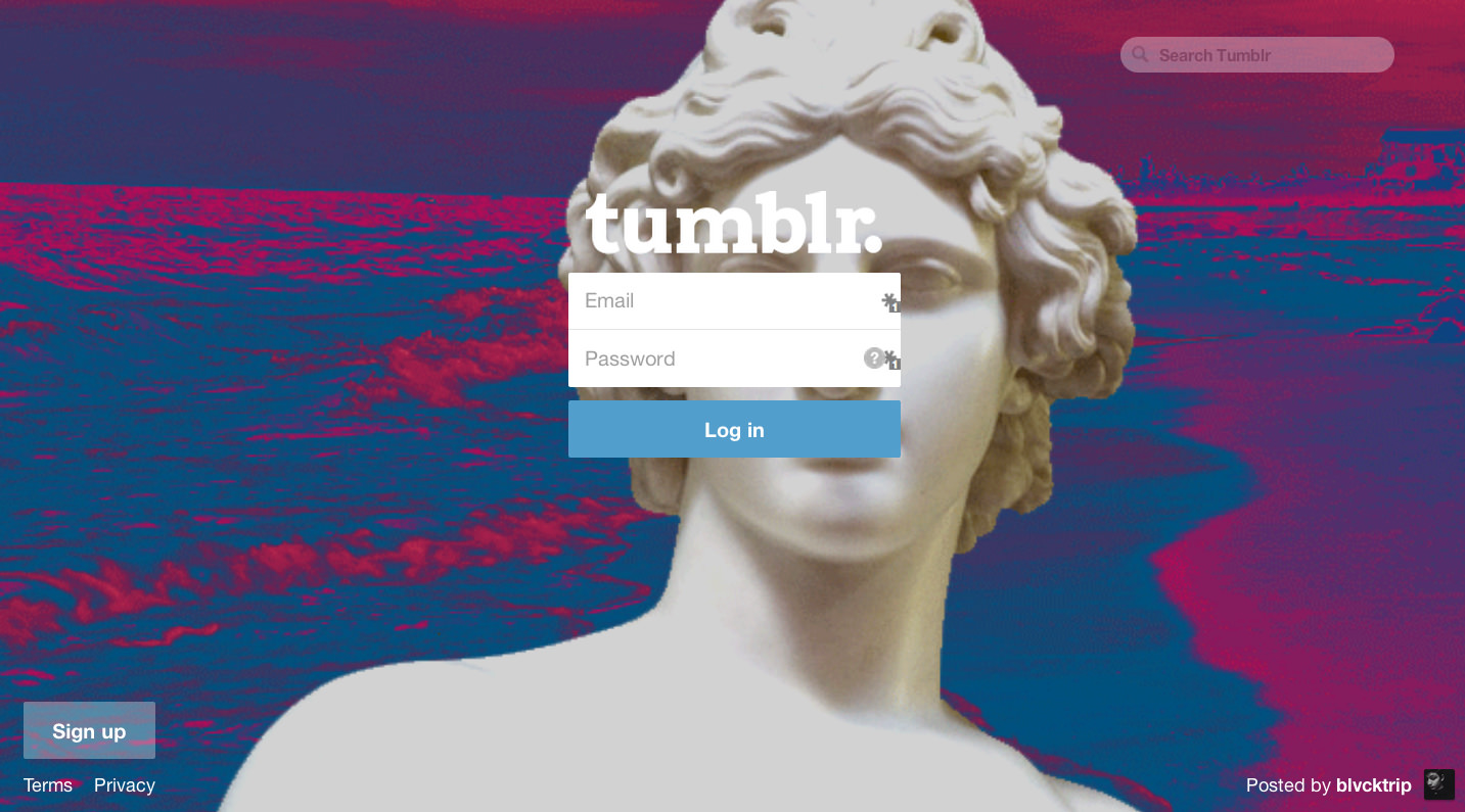
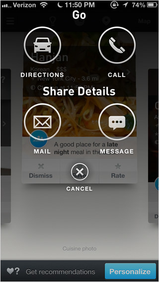
Can you count the number of actions a user can take on Tumblr’s home page?
Though it appears to be a very simple screen, you might surprised that eleven actions are possible on Tumblr’s home page:
input an email address,
input a password,
click the question mark icon (which leads to a password-recovery screen),
click the “Log in” button,
click the “Sign up” link,
click the “Terms” link,
click the “Privacy” link,
click the “Posted by blvcktrip” link,
click blvcktrip’s avatar image.
click the ‘Search Tumblr’ input field
hit enter to search for the inputted term
If you were able to guess any of these actions, you did so by recognizing affordance, which is the way that an interface “affords” its capabilities to the user. All you had to work with was a flat screenshot of Tumblr’s page. By recognizing patterns and explicit affordances, you were able to survey the capabilities of the interface.
Not all affordances are equal, and some are stronger than others. Understanding the types of affordances one can use in an interface is important. Affordances are generally categorized into one of the following types: explicit, pattern, metaphorical, hidden, false and negative. We’ll delve into each of these categories for the rest of this article.
Explicit Affordance
Explicit affordance is signaled by language or an object’s physical appearance. Text that reads “Click here” explicitly affords clicking. A button that appears raised from the surrounding surface seems tactile and affords pushing. A door handle with the word “Push” above it affords pushing. An input field that reads “Write a comment” explicitly affords a comment being written.
These affordances are explicit because any human being could guess at how to interact with the element, even if they have never been exposed to the interface before. These affordances do not rely on patterns. An object that looks pushable invites pushing, whether on screen or off. A link that says “Click here” invites clicking even if the user has never seen a link before. As long as the user knows how to click or push, the affordance will be discoverable.
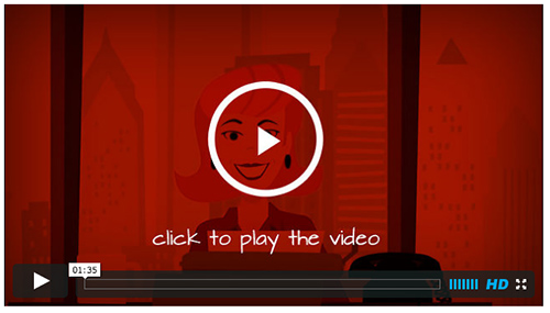
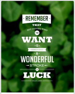
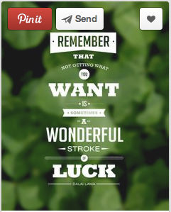
This UI element on PayPal is a good example of explicit affordance. The raised appearance of the button affords pushing down. The text explicitly signals the result of the action. This video on Copyblogger’s website uses explicit affordance with its “Click to play the video” instruction.
Explicit affordance is especially important in the following cases:
When an interface’s users are unlikely to have been exposed to many affordance patterns in the past This occurs most commonly with users who are not tech-savvy or who do not regularly interact with web or mobile interfaces. These users are less likely to recognize affordance through design patterns. This might also hold true with unique or innovative interfaces. The first mobile apps made heavy use of explicit affordance for actions like tapping or swiping.
When no patterns have been established to signal the affordance of an action It might be unclear how to visually communicate that an object in a mobile interface affords pinching inwards to close and outwards to expand. In this case, the designer would probably use explicit affordance (i.e. by adding “Pinch to expand” text to the object).
Whether to use explicit affordance depends on the context. Being too explicit can introduce redundancy into a design. If every link reads “Click here,” the page will become monotonous. Consider how likely your audience would understand the affordance of an object without explicit instruction. For example, users of an app for tech startup founders have probably seen an input field before. They might feel patronized if the interface instructs them to “Click to enter an email address.”
Pattern Affordance
This is the most common type of affordance in modern interface design. For example, we implicitly understand that words not part of a sentence and located outside the main area of content on the page are usually links that afford clicking. We recognize that a strip across the top of the screen containing disjointed words is usually a navigation bar and that the words afford navigation. We recognize that a single word or phrase on a button-like background is usually a clickable button that performs an action. We guess that a word or phrase with a downwards arrow beside it usually expands into a drop-down menu.
A pattern metaphor is an established metaphor for communicating a particular set of affordances. For example, email is often represented by an envelope icon (even though sending an email has never involved physical envelopes). This metaphor is effective because it is an established pattern. We will discuss this in more detail in the section on metaphorical affordance.
Pattern affordance is elegant in that it allows a complex interface to quickly signal many affordances to the user. As we interact with a greater variety of websites and apps, we become better at quickly parsing the myriad of affordances available on a given screen.
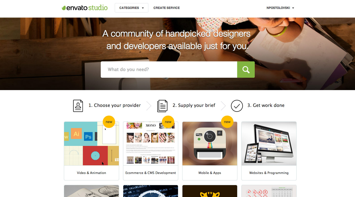
Here’s my list of the pattern affordances on Envato Studio’s home page:
Element
Affordance type
Affords
Navigation bar
Pattern
Navigating the website
Links
Pattern
Clicking
Logo
Pattern
Returning to home page
Link in top-right corner
Pattern
Managing account
“Categories” drop-down
Pattern
Accessing more options
Magnifying glass icon
Pattern metaphor
Searching
Content modules
Pattern
Clicking modules
The home page of Envato Studio, a freelance services marketplace, is full of pattern affordances. Can you list them all? (View large version)To understand a design’s reliance on pattern affordances, ask yourself, if you had never interacted with the web or a smartphone before but you knew how to perform basic actions like clicking and tapping, would you understand the actions afforded to you by this interface?
Patterns provide us with wonderful shortcuts to easily communicate affordances. Remember that they rely on the wealth of time already spent interacting with apps, websites and other interfaces. When you’re designing for a tech-savvy audience, pattern affordance will make up the bulk of your design. When designing for an audience that might not have this wealth of experience with interfaces (such as children, the elderly and people in areas where Internet access is minimal), then you’ll want to rely less on pattern affordance.## Hidden Affordance
A subtler form, hidden affordance becomes apparent only once a certain condition has been met — for example, link text that affords clicking only when it has been moused over (and responds by changing color). On an iOS device, each screen of app icons affords being swiped only when you have tapped and dragged on the home screen. On Pinterest, a pinned item affords favoriting only when it is hovered over. By default, an element’s affordance isn’t revealed until the user has taken some action to activate a hint. The affordances of images on Pinterest are hidden by default and revealed only on hover. Once you hover over an item, three new actions for that item are revealed.Hidden affordance is commonly used in complex interfaces where making every single affordance immediately apparent would clutter the interface or confuse the hierarchy of available actions. Hidden affordance can be cleverly used to de-emphasize less important actions. It’s great when a capability is rarely necessary (for example, reporting an image as being inappropriate).
The risk is that a user might not intuitively know how to reveal the affordance.
Lastly, never use hidden affordance for vital actions. Instead, reduce clutter around vital actions by fading less essential actions into the background.
When considering whether to use hidden affordance, ask yourself, could a user happily use this interface without ever knowing about this action? If the answer is yes, then hidden affordance would be suitable for this action.
For example, enabling users to “like” an item in a gallery by hovering over it is acceptable. A user could happily visit the gallery every day without feeling the urge to like it. But granting access to the gallery’s images only by hovering over a certain part of the website would be a barrier for many people.
An iPhone application that relies heavily on hidden affordance is Clear, a to-do app. Yet, it has been lauded for its design.Is it beautiful? Yes. Yet, it relies mainly on hidden affordance. When you pull a list of items down, the top of the screen folds down, instructing you to “Pull to create an item.” Unlocking these instructions requires experimentation. Swiping left deletes an item, while swiping right marks it as complete. Pinching two list items apart creates a new item between them. Pinching inwards closes a list.
These hidden affordances don’t mean that Clear has a poor user experience. Upon first opening the app, you can scroll through a tutorial on some of its capabilities. In case you forget the instructions from the tutorial, the to-do items look like physical panels that invite experimentation. You’d understand that a to-do app probably allows for items to be added, deleted or marked as complete. The panels look like they can be manipulated. By sticking it through the initial learning curve, the user is rewarded with the ability to comfortably use and interact with a clean, minimal interface.
The design philosophy embodied in Clear isn’t appropriate to all interfaces, however. The steeper the learning curve, the greater the rate of drop-off among users. Clear costs money to buy, and so the user has a reason to invest time in learning the interface. Consider the other end of the spectrum: a user who has found themselves on the landing page for your product. They have no reason to spend time searching for hidden affordances. In fact, if the available actions aren’t immediately clear, they will most likely go somewhere else.Hidden affordance is suitable only when the user has some buy-in. The less buy-in they have, the more explicit your affordances must be in order to quickly direct them to the actions you want them to undertake.
## Metaphorical Affordance
Sometimes the easiest way to communicate affordance is by using a real-world object as a metaphor. Most interface icons, for example, rely on such metaphors to communicate affordance. An envelope icon affords sending an email. A house icon affords going “home.” A handset icon affords making a phone call. A printer icon affords printing the document. A chain icon affords creating a link.Some metaphors are contextual. A magnifying glass icon in a document-viewing app most likely affords zooming. However, a magnifying glass icon next to an input field on a website most likely affords searching.
By using metaphors drawn from real-world objects, we can communicate affordance much more quickly for complex tasks than we could using explicit affordance. For example, if you had to include a button in your interface that allows users to make a phone call but you couldn’t use a phone icon or use the text “Make a phone call,” how would you communicate this affordance?
Because real-world metaphors for affordance are so powerful, choosing the best metaphor for the job is important. Consider the iPhone app Ness (recently acquired by OpenTable): Icons in the UI of the Ness mobile appDo you think the icons above need descriptive labels? If they were taken away, would you understand that the car icon affords sharing directions? If you weren’t driving to the location or you wanted to share directions with someone on public transportation, you’d have to think about this for a second. A more common pattern metaphor in this case would be a map marker.## Pattern Metaphor
A pattern metaphor is an established metaphor for communicating a particular set of affordances. For example, most designers now use an old-school handset to signal the affordance of making a phone call. Most use an envelope icon to signal the affordance of sending an email. Most use a heart icon to signal the affordance of favoriting something. The designer can break a pattern if they believe a better metaphor exists, but remember that your users will also have learned the established pattern. Consider the rich set of affordances communicated by a single heart icon:
* “Clicking this will ‘favorite’ an item.”
* “This allows me to save an item I like.”
* “I will probably be able to access a collection of my favorites somewhere in my account area.”
* “The user who added this item might be notified that it has been favorited.”
* “This is a positive gesture towards the item.”
A heart is usually understood to be a symbol of love or fondness. By consistently being used to communicate the same set of affordances associated with favoriting, it has begun to communicate these affordances in interface design.
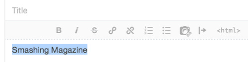
Also, think carefully before changing the style of an established pattern metaphor. Look at Tumblr’s WYSIWYG editor. Can you identify the icons to create a link and remove a link?The established pattern metaphor for a link is two or three links in a chain, joined together — nowhere to be found in this interface. The closest match is the icon fourth from the left, which looks kind of like a tilted infinity symbol. Next to it sits a tilted infinity symbol with a strikethrough. Are these icons stylistically more beautiful than a linked chain? Probably. Is an extra ounce of mental effort required to understand the affordances they communicate? I think so. Is it worth it? I’m not sure. The new icon looks very much like an infinity symbol. While one could argue that a web link connects people to the infinity that is the Internet, a link in a chain is a much less abstract metaphor.## False Affordance
A false affordance seems to afford a particular capability but actually affords a different capability or none at all. For example:
* an element that looks like it can be pushed or clicked because it is raised from its surroundings, but can’t be;
* a logo image that does not return users to the root of the domain;
* a word that displays the pattern affordances of a link (colored and underlined) but isn’t a link;
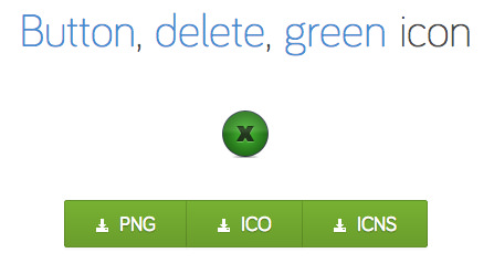
* a green button (a pattern to signify the affordance of creating something) actually deletes data;
* a grayed-out word, which seems to afford no action, is actually a link;
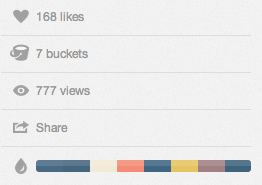
* an envelope icon, which seems to afford sending an email, actually sends a text message. A green “Delete” or “Close” button on Icon FinderAn interface design pattern is that green buttons afford saving or creating data. By using a green button to trigger a destructive action, users might accidentally delete data when they mean to save it. What affordances do you see in this UI element on Dribbble?It might surprise you that every single element in Dribbble’s UI element above, except for the view count, can be clicked to perform an action. This is because the elements don’t signal their affordance for clicking. They are gray against a gray background, not underlined, and unbolded. They falsely signify a lack of affordance, when in fact they have a rich set of capabilities (viewing who has liked the item, viewing the buckets that the item is in, downloading the color scheme).
Though the subtlety of these UI elements yield more attention to the rest of the design, the designer must consider whether the trade-off is worth it. For example, if the “Share” link was bolded and more clearly afforded clicking, would Dribbble items be shared more often?
A simple rule: If you really want people to do something, add more signals of affordance.## Negative Affordance
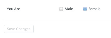
Sometimes it’s necessary to signal that a UI element does not afford any capabilities at the moment. Most commonly, this is achieved by graying out the element. Take the input field in Rdio’s app.The password-input field is grayed out because it does not currently afford clicking or inputting data. To unlock these affordances, you have to hit the “Change” button.In this UI element, the “Save changes” button is grayed out because we haven’t made any changes yet; therefore, we can’t save them. The style signals that the button does not currently afford any capabilities.
The grayed-out button in the (otherwise beautiful) design below explicitly affords clicking with its instructions to “Visit our list of design services.” But the way that the button is styled follows patterns of negative affordance (flat, gray, faded into the background). Because grayed-out buttons so commonly signify a lack of affordance, users might not realize it can be clicked.Gray is also sometimes used to signify that a word or phrase that is usually a link, isn’t. In Google.com’s UI shown below, it looks like my email address cannot be clicked. Yet, clicking it somewhat surprisingly opens a drop-down menu with account options.Smart use of negative affordance can help your users more quickly home in on the parts of the interface that bear useful capabilities.## An Affordance Review: iOS 7’s Weather App
iOS 7’s default Weather app has a variety of affordances. Of the six types, which ones does it have and which are missing?
* explicit
* pattern
* metaphorical
* hidden
* false
* negative
Let’s examine each of these.### Explicit Affordance
This app’s primary interface has no explicit affordances, no elements that look particularly clickable, no verbal instructions on how to interact with the interface. Besides the navigation elements at the bottom of the screen, the app’s interface looks like a flat display of data. Even the navigation elements at the bottom rely on patterns.### Pattern Affordance
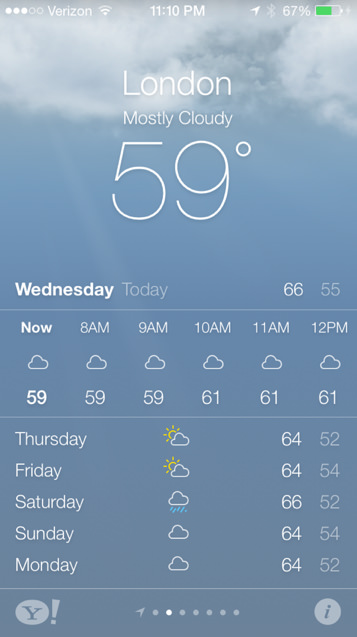
I can identify two pattern affordances in Weather’s interface, both located at the bottom of the screen.The dots in a row at the bottom are an iOS design pattern to signify the number of screens to swipe through. The highlighted dot represents your current position in the chain. This pattern is also used at the bottom of the iOS home screen when multiple screens of app icons are available.
The Yahoo logomark is another example of pattern affordance. A person who uses web interfaces regularly would know that clicking on a logo will usually take them to a page about that business or organization (usually the home page). In this case, it takes us to some Yahoo search results.### Metaphorical Affordance
While a few metaphors are used in this app, only one is an affordance. The weather icons are all metaphors. The icon of the sun peeking out from behind a cloud doesn’t mean that there will be one cloud with the sun behind it; it means the weather will be sunny and cloudy. A sun icon doesn’t represent the sun, but is a metaphor for sunny and clear weather. Yet, tapping on these icons does not afford any capability. They are purely informational.
The only affordance metaphor in this interface is in the bottom-right corner. The icon looks like it represents a list or menu of items. Tapping it opens a menu of weather locations, allowing you to add and remove items. The icon uses a visual metaphor to describe its affordance.### Hidden Affordance
Two hidden affordances are on this screen. The temperature is reported hourly, but only within a six-hour window. The small slice of data hints that more might be available. If we swipe the hourly temperatures to the left, more hours slide into view from the right, enabling us to review all available hourly temperatures in the small screen space.
The interface gives no clue of this, but tapping the top of the screen replaces the temperature with several detailed readings of humidity, wind speed, chance of rain and the “feels like” temperature. I frequently use the Weather app, but I discovered this only after tapping all over the screen, looking for any hidden affordances for this article.
I suspect that a large proportion of the app’s users have never discovered this functionality. In this case, it is questionable whether this hidden affordance is good design. Adding affordance to the top of the screen would have been better — for example, by making the temperature appear raised to afford clicking, by underlining the weather reading, by adding an icon, or by displaying the details to the left and right of the temperature and city name.### False Affordance
This app does not have a problem with false affordances. A user might try tapping on other days of the week to see if they bring up a detailed view, but a detailed view is available only for the current day. A user might also try tapping on today’s low, thinking it might switch to a view of all lows, rather than highs. But the interface does not have strongly misleading cues that suggest this functionality.### Negative Affordance
The app does not make strong use of negative affordance. The bolded “Monday,” accompanied by the thinner, fainter “Today,” suggests that Monday is higher in the hierarchy and that “Today” is informational. Tapping either switches to a detailed view at the top of the screen (as does tapping any part of the top of the screen).## Summary Of Affordances
Type
Pros
Cons
Use case
Explicit
Unambiguous; low risk of user missing the affordance
Messier interface; might seem patronizing to some users
Low-tech audience; to explain unintuitive affordances
Pattern
Communicates affordance quickly and cleanly
Relies on previous experience with similar interfaces
When patterns are firmly established; when audience is tech-savvy
Hidden
Clean interface
Capabilities might not be discovered
Inessential capabilities; when user has enough buy-in to experiment
Metaphorical
Easiest way to communicate complex affordances
Metaphors mean different things to different people
When affordances are too complex to explain without metaphors
False
None
Wastes the user’s time by suggesting affordances that aren’t there
Avoid false affordance
Negative
Helps prevent frustration by signalling that an element has no affordance
If an element has no affordance, it might not be necessary
When supporting information and elements are necessary but do not have capabilities
Conclusion
You’ve most likely designed interfaces with many of these types of affordance, perhaps without realizing it. Recognition of affordance, for both users and interface designers, is usually instinctual.
By using affordance deliberately, we can help users understand our interfaces more quickly and subtly encourage them to take one action over another.
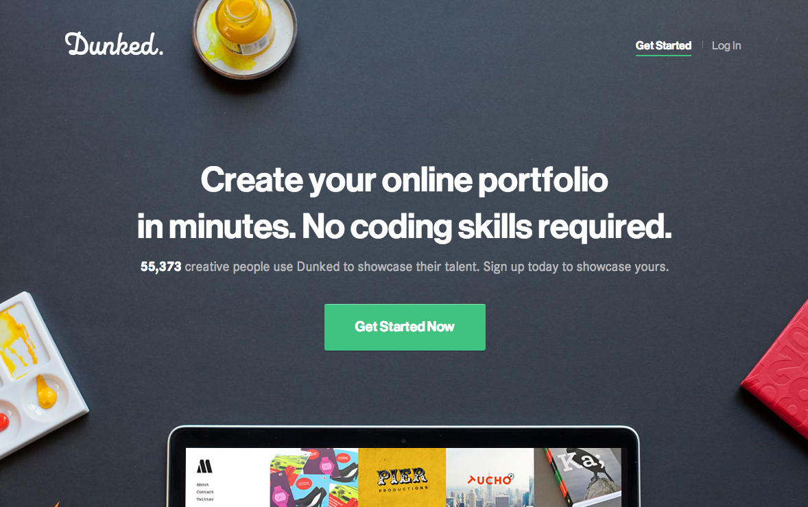
By understanding affordance, we could evaluate the interface below and quickly see that it is imperative to the founders of Dunked.com that users “Get Started” without delay. You can use affordance to add a similar hierarchy of actions to your own designs.
For these reasons, the most underrated word in web design is “affordance.”


 Celebrating 10 million developers
 Custom Web Forms for Angular, React, & Vue. Your backend.


 (al, il)

