Server-Side Device Detection With JavaScript

Email Newsletter
Weekly tips on front-end & UX.
Trusted by 182,000+ folks.
 Register for Free
 Custom Web Forms for Angular, React, & Vue. Your backend.
 Celebrating 10 million developers


There are many strategies to choose from when developing a modern, device independent website nowadays. How should capabilities of the device or browser be determined? Should the presentation logic be server side or client side? Traditionally, mobile optimization had to happen server side.
Over the last couple of years, Responsive Web Design and tools like Modernizr have become very popular. Recently, combination techniques (often called RESS), where optimization is done both server-side and client-side, has become a trend. The recently launched WURFL.js tool, fits into this category.
In this article, we will look at some basic use cases of how to use WURFL.js to optimize the user experience both in HTML and CSS, and an example of how to choose the right ads to display on different devices. We will also see how WURFL.js is different from, but complements, the popular feature-detection library Modernizr.
Once Upon A Time, Device Detection
Whether we are using regular expressions in JavaScript, Modernizr or a complete device-description repository (DDR) for server-side detection, the purpose is usually the same: to give users a better experience. This typically happens at two levels:
- presentation of content and interaction with the service,
- analysis of user behavior to determine usage patterns.
The challenge is to do this in ways that are both scalable, maintainable and, as much as possible, easy to implement. For some projects, the cost and complexity of deploying third-party tools on servers is too high. Yet a low-maintenance solution that lets a website look good and perform well is possible, despite the constant diversification of devices. This is where WURFL.js plays a role, by providing a scalable alternative to traditional server-side device detection, all the while complementing other client-side techniques and tools.
Before diving in, let’s look at the basics.
Copy, Paste, Done
No registration is required, and WURFL.js can be used at no charge. So, the first thing to do is copy and paste this line of HTML into your page:
<script type='text/javascript' src=“//wurfl.io/wurfl.js"></script>
Both HTTP and HTTPS are supported. If you plan to use the device information provided by the script to make rendering decisions, then you might want to include the script in the <head> element. Otherwise, you can load it asynchronously.
Now that the script is in your HTML page, you can access the WURFL object in JavaScript. The WURFL object looks like this and is ready to use:
{
  complete_device_name:"Apple iPhone 5",
  form_factor:"Smartphone",
  is_mobile:true
}
The object has three properties:
complete_device_nameThis is the name by which the device is known — typically, the make and model or a category of devices or a more generic definition.form_factor- desktop
- app
- tablet
- smartphone
- feature phone
- smart TV
- robot
- other non-mobile
- other mobile
is_mobileThis istrueorfalse—trueif the device is a tablet or other mobile device.
Of course, you can immediately do things like this:
console.log(WURFL);
Or this:
alert(WURFL.complete_device_name);
Under The Hood
Because WURFL.js detects the device based on the User-Agent string and other information provided in the HTTP header, the contents of the JavaScript file will depend on the device. So, you can’t just copy the contents of the file and put it inline in the HTML or combine it with another JavaScript resource.
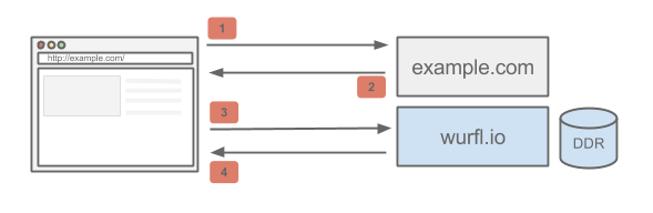
To understand this in detail, let’s look at the illustration above. The browser makes a request for example.com (1). The markup returned by the Web server (2) contains the <script> reference to WURFL.js. Next, the browser renders the HTML and starts fetching assets — among them, wurfl.io/wurfl.js (3). When the request reaches WURFL.io, the HTTP request is analyzed by WURFL. Usually, based on that request, there will be an instant hit, and the device is identified without further ado, and a single WURFL JavaScript object is returned. However, in certain cases when the device cannot be identified on the server side alone (notably, in the case of iOS devices), the JavaScript file will contain a few more checks to determine the device. The browser then evaluates the JavaScript, and the WURFL object is ready to use (4).
WURFL.js is capable of, for example, distinguishing between an iPhone 5 and an iPhone 5S, thanks to this extra client-side logic. This is a big deal because this use case is supported neither by sheer User-Agent analysis nor by Modernizr tests.
A Note On Performance
If you use WURFL.js to make rendering decisions or, for some reason, you need to place the <script> tag inside <head> (without deferring it), then the browser will wait for the script to be downloaded and evaluated before rendering the page. Depending on the use case, this might be the only way; but, for the record, WURFL.js can also be loaded asynchronously to increase rendering performance.
The size of the returned JSON object will be fairly small, varying from 0.5 to 3 or 4 KB, depending on the device. Compared to Modernizr (about 14 KB) and jQuery (96 KB), WURFL.js is arguably light.
Use Cases
Assuming that you have WURFL.js up and running, let’s look at some cases in which using WURFL.js makes the most sense, either by itself or in conjunction with Modernizr and/or other solutions. To illustrate, we’ll refer to the WURFL.io website itself, which utilizes WURFL.js in multiple ways.
Optimizing The User Experience
When it comes to mobile, responsive and adaptive design and all that, the most common thing to do on a website is improve the user experience for certain device families or form factors. Much can be handled by media queries, of course, but sometimes you need the help of some JavaScript.
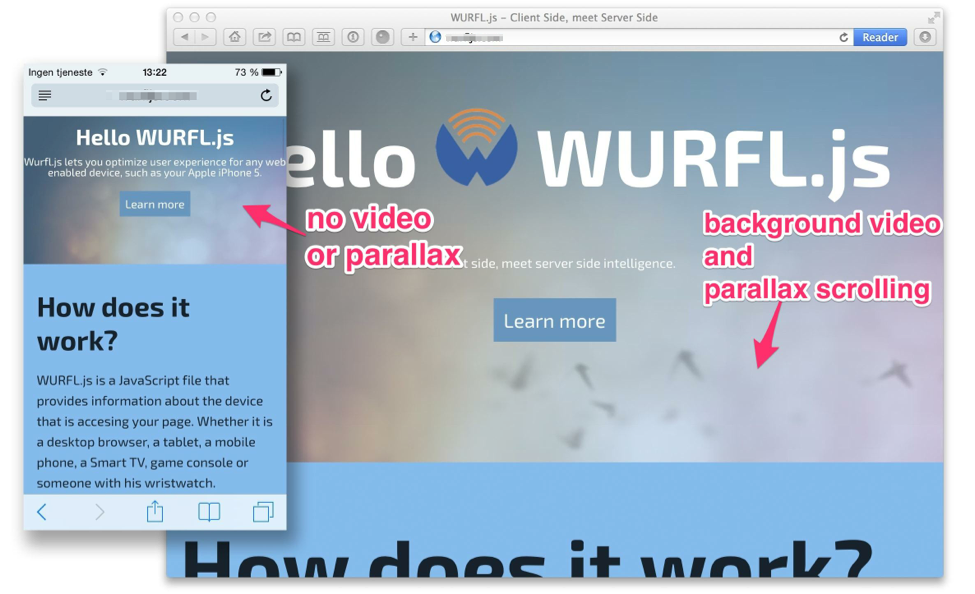
When you visit WURFL.io on your laptop, the top section of the page has a video background, some simple parallax scrolling and text that changes dynamically according to the device or browser. It looks very cool on a laptop, but video backgrounds, not to mention parallax scrolling, would not be ideal on a tablet or smartphone, to put it mildly.
We could use Modernizr, of course, or decide whether to implement these features in other ways. But in many cases, knowing the physical device is just as important as — perhaps more important than — knowing whether the browser claims support for a feature. We might encounter a problem whereby the browser claims support, but the support is actually not good enough to make a great user experience.
To avoid these situations, you would use WURFL.js and Modernizer together. Note also that comparing WURFL.js and Modernizr directly is not quite fair. Modernizr detects features claimed by the browser, whereas WURFL.js categorizes the device in different ways. So, if you don’t know whether a particular device or form factor supports a certain browser-detectable feature, then you are better off with Modernizr or a full-fledged device-detection solution.
However, in this example, we’ll rely on WURFL.js and demand that only non-mobile clients get the video background and parallax scrolling:
/*video background*/
if(!WURFL.is_mobile){
  $('#vid').videoBG({
    mp4:'assets/Birds_Animation.mp4.mp4',
    ogv:'assets/Birds_Animation.oggtheora.ogv',
    webm:'assets/Birds_Animation.webmhd.webm'
  });
}

/*The parallax scrolling*/
window.onscroll = function () {
  if (!WURFL.is_mobile){
    heroImage.style[prefixedTransform] = "translate3d(0px," + window.scrollY / 2.3 + "px, 0px)";
    herovid.style[prefixedTransform] = "translate3d(0px," + window.scrollY / 1.1 + "px, 0px)";
    heroText.style["opacity"] = (1 - ((window.scrollY / 6) / 100));
  }
}
The example above simply checks whether the device is mobile (a phone or tablet) and introduces features accordingly. Of course, we could also leverage the more fine-grained WURFL.form_factor.
Put More In CSS?
The examples above show how to make use of the device’s data in JavaScript. However, we can make the device’s information available in CSS, too. We can assign different styles depending on the device, form factor and whether it is mobile. The first technique we will look at is similar to how Modernizr works. Modernizr adds a certain class to the HTML document depending on whether its test returns true or false.
Let’s say you want some specific behavior defined in the CSS for mobile devices. You would need to add the following JavaScript snippet to your page:
document.documentElement.className += ' ' + (WURFL.is_mobile ? ’ : 'no-') + "mobile";
This will add a class to the html element. For mobile devices, it would say <html class=”is_mobile”>; for other devices, it would say <html class=”no-is_mobile”>.
If you know Modernizr, then you are probably familiar with this approach. Your CSS might take the following form:
.mobile #menu a{
  padding .5em;
}

.no-mobile #menu a{
  padding .1em;
}
In this simple example, we’ve increased the padding on menu items so that they are easy to tap with a fat thumb.
This method can be used for all of WURFL.js’ capabilities. However, because complete_device_name and form_factor are not boolean values (like is_mobile), the CSS part can become quite a headache. A bit more flexibility might come in handy, then. Here is an example using data- attributes:
document.documentElement.setAttribute('data-device_name', WURFL.complete_device_name);
document.documentElement.setAttribute('data-form_factor', WURFL.form_factor );
This will put data attributes with WURFL capabilities in the html element. We get several cool features with this method: We can target specific devices, form factors and even groups of devices combined with form factors by using CSS selectors:
html[data-form_factor = 'Smartphone'] #menu a{
  background: green;
}
Thanks to the wildcard attribute selector *, we can even match strings:
html[data-device_name*='Nokia'] [data-form_factor = 'Feature Phone'] {
  background: yellow;
}
The CSS above will match Nokia feature phones of any model. It also illustrates what the DOM looks like with the two methods implemented — in this case, with an iPhone 5S.
Help With Banner Ads
Many different ad networks are out there, each with its own specialization. Some are good for mobile, others for desktop. Some support text ads, other have ads of fixed size. If you are beyond a beginner’s level in ad networks, then you might want to assume some control over this. WURFL.js can help you make your own decisions or influence the network to make the right decisions for you.
The obvious approach is to ask WURFL.is_mobile to choose networks or ads that are good for mobile and others that are good for non-mobile.
if(WURFL.is_mobile){
  displayMobileAd();
}else{
  displayDesktopAd();
}
Moreover, from a design perspective, being able to fit the sizes and proportions of ads to your breakpoints and to design for different form factors of ads is nice. In the extreme, you could do something like this:
switch(WURFL.form_factor){
  case "Smartphone":
    if(WURFL.complete_device_name.indexOf("Apple") !=-1){
      showAppStoreAds();
    }else(
      showWebAds();
    )
    break;
  case "Tablet":
    showSpecificProportionAds();
    break;
  case "Feature Phone":
    showTextAds();
    break;
  default:
    showGoogleAdwords();
    break;
}
Conclusion
If you’ve tackled the diversity of devices in the past, then you’ll know that many developers have been looking for JavaScript tricks to detect browsers, devices and their respective features. Traditionally, a DDR required server-side libraries and data to be installed and for the device-description repository to be updated. WURFL.js is a freely available option to manage these issues.
You might want to consider WURFL.js or similar libraries for analytics, optimization of the user experience or advertising, and the library can complement Modernizr nicely. While Modernizr detects support for certain features of the browser, WURFL.js provides information about the user’s physical device.
WURFL.js is a bridge between the server side and the client side, making it easier for front-end Web developers to take advantage of functionality that used to belong on the server. It can also be used for current websites that have been designed responsively or that enhance progressively.
Further Reading
- Building A Better Responsive Website
- Lightening Your Responsive Website Design With RESS
- Losing Users If Responsive Web Design Is Your Only Strategy
- Testing For And With Windows Phone
 (al, il, mrn)

