Mobile Onboarding: A Beginner’s Guide

Email Newsletter
Weekly tips on front-end & UX.
Trusted by 182,000+ folks.
 Register for Free
 Celebrating 10 million developers
 Custom Web Forms for Angular, React, & Vue. Your backend.


Nowadays, displaying onboarding screens to first-time users has become a common practice in mobile apps. The purpose of these onboarding screens — also referred to as walkthroughs — is to introduce the app and demonstrate what it does.
Given that these are often the first set of screens with which users interact, they also set the users’ expectations of the app. Therefore, it is essential that those involved in creating the product — product managers, designers, developers — take the time to evaluate whether onboarding is necessary for the app and, if so, to determine the best way to implement it.
In this article, we’ll provide some good tips on how to approach onboarding, some common implementations, alternative techniques, as well as resources to help you provide the best experience for users.
To Onboard Or Not To Onboard?
In recent years, we’ve seen plenty of discussion on the usefulness of onboarding in mobile apps. A popular argument against onboarding is that if an app needs it, then it is fundamentally flawed, lacking the cardinal elements of simplicity and user-friendliness. While this line of thought does have logic, it’s too sweeping a conclusion.
The digital design world has plenty of rules and best practices, which is good. These rules save designers and developers from having to reinvent the wheel every time they work on a product. More importantly, they save users from stressing out whenever they use a new app; instead, they can rest assured knowing that the editing function will be represented by a pencil icon and that a “thumbs up” icon means “like.” Rules are good.
But the reality is that every app is unique in what it does, how it does it and who uses it. These variations make onboarding a reliable, pragmatic and user-friendly feature in certain instances. Let’s consider some use cases.
Use Case 1: Unfamiliar Interaction
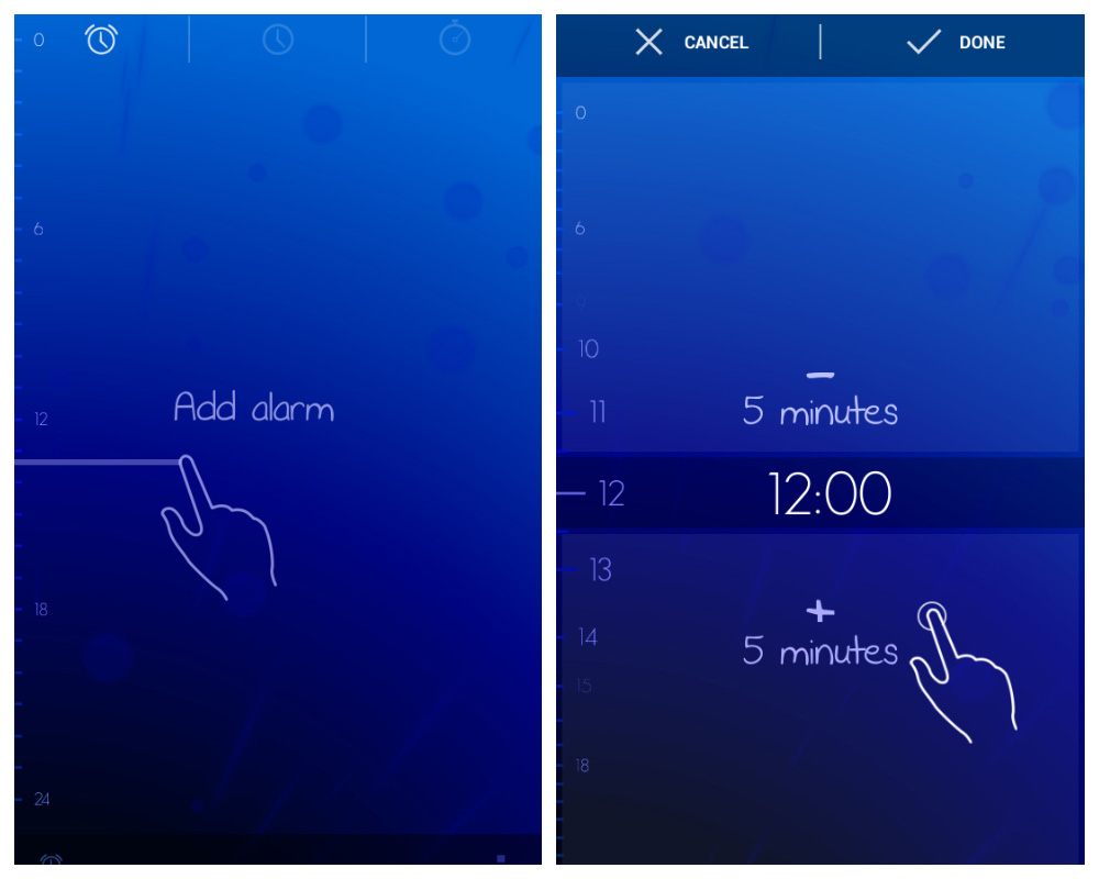
If you are releasing an app that supports interaction methods that most users would not have been exposed to on a regular basis — particularly a gesture-driven app — then onboarding is essential. Gesture-driven apps are still in the experimental and exploratory phase. As such, developers need to guide users on how to interact with them, clearly presenting each gesture and its corresponding function.
For example, the alarm clock Timely, indicates to the user that tapping a particular part of the screen will add or subtract five minutes from the clock.
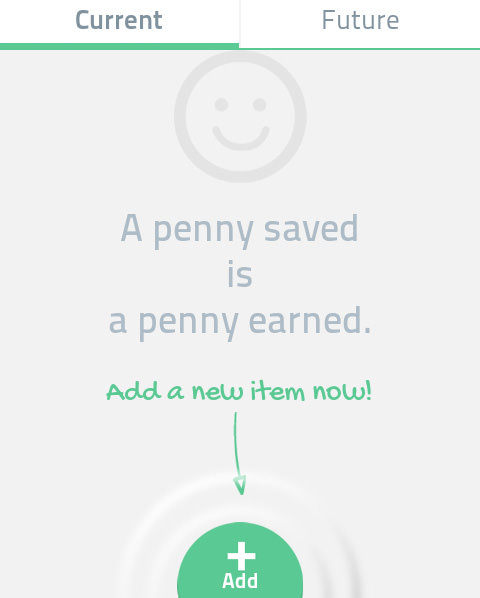
Use Case 2: Empty State
An app whose default state is empty and requires users to go through one or more steps to populate it with content is also well suited to onboarding. Even if the onboarding process consists of just one step, the guidance will reassure users that they are doing the right thing.
Use Case 3: Suite Of Products
If your app is part of a suite of products — say, with desktop and web companions — then onboarding could greatly improve the user’s experience, especially if the mobile app doesn’t have all of the functionality of the other versions. This is especially important in complex business apps, many of which have a variety of user roles, each with specific access rights and security restrictions.
Very often the web and desktop versions will support full functionality (such as for creating, viewing, editing and deleting content), while the mobile app limits it (such as viewing only). In such cases, a brief presentation explaining what the app does would help existing users understand how the mobile app fits into the suite of products.
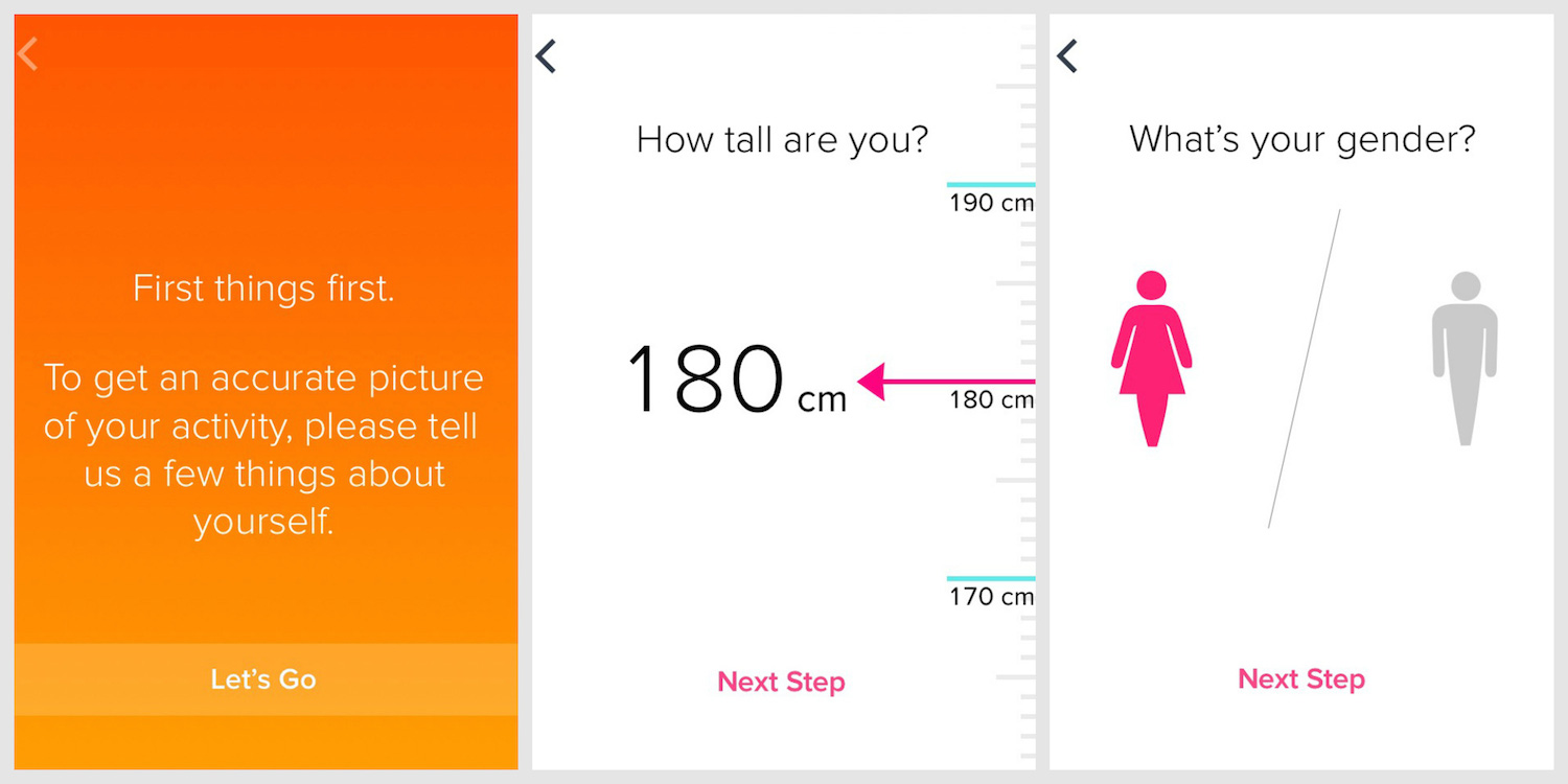
Use Case 4: Personal Information
If your app relies on personal information (such as age, weight, gender, marital status), then collect and store this information via onboarding. Guide the user step by step so that they are clear on why this information is being requested. And be sure to allow the user to change this information whenever they want (usually from the settings screen).
Even if your app doesn’t fit any of the examples above, your users might still benefit from onboarding. Keep in mind that anyone who interacts with a product will at least want to know how the product will benefit them. You can present this information in onboarding, as we’ll discuss later in the section on function-oriented onboarding.
Sure, our primary responsibility is to design products that are intuitive and easy to use. However, we shouldn’t dismiss onboarding because when it provides value to the user, it makes for a much more pleasant experience.
Which Technique To Use?
These three techniques are the most common:
- benefits-oriented onboarding,
- function-oriented onboarding,
- progressive onboarding.
We’ll look at each in turn and review some general guidelines for implementing them.
Technique 1: Benefits-Oriented Onboarding
This is pretty self-explanatory. With this technique, you present the benefits (i.e. the value) of the app, communicating one or more of the following to the user:
- What does the app do?
- How can the user integrate it into their life?
- What value will this integration provide?
When implementing this technique, consider the following principles:
Present A Maximum Of Three Key Benefits
This number is not based on hard science, but because the point is to give the user a quick overview of the app, three is a safe number (excluding the title screen). This way, the user gets to learn about the app without getting bored or slowed down by too much information.
Apply The “One Slide, One Concept” Rule
Think back to presentations from which you retained the most information. The slides with a clear, focused message probably had the greatest impact on you and were the most memorable. The same goes for onboarding screens. The “one slide, one concept” rule helps the user to focus on and digest every little piece of information. Presenting everything at once would be visually noisy and distract the user from your key message.
Prioritize, Prioritize, Prioritize
Resist the urge to show off everything cool about your app. Always return to your user data and remind yourself of the problem that the user is facing and what they need. Then, figure out how to reassure them through onboarding that the app does indeed answer their need.
Use Consistent Vocabulary
Evernote Food, mentioned above, uses verbs to quickly grab attention and communicate its key benefits. The approach is effective, efficient and succinct. If you can’t boil things down to a few high-impact verbs or adjectives, then a short phrase or two would suffice. Just be sure to stick with it all the way through. A harmonious and coherent presentation, both in visuals and terminology, will help to kick off the user’s experience on a positive note.
Onboard Before Registration
Because onboarding is meant to be an overview, present it before the user signs up for or logs into the service. Once they decide to log in, the user will be ready to explore the app and should not be interrupted by reminders on the benefits of the app.
Keep It Brief
Perhaps you’re wondering whether onboarding really is necessary. After all, doesn’t it just repeat the description in the app store? Not at all. App store descriptions come in all shapes and sizes, whereas onboarding has to be succinct and, as such, focus on the absolute essentials. In addition, many people skip the app store description, preferring instead to dive right into the experience. So, a brief presentation once they’re engaged with the app could help them understand what the app does.
What Not To Do
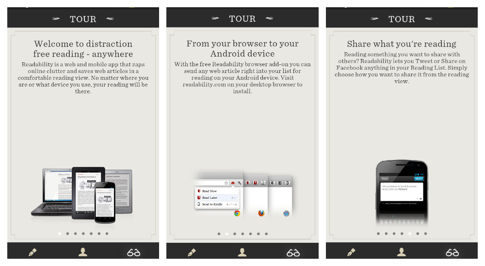
Readability is a wonderfully practical app that, unfortunately, is inconsistent across platforms. This is particularly evident in the onboarding in the Android version, which makes several missteps:
- The user has to digest a total of seven slides and corresponding messages.
- The text for some slides runs a bit long. For example, the slide about sharing could have been simplified by showing icons of the social networks on which content may be shared.
- One slide encourages the user to install a Firefox plugin, which seems misplaced given that it’s a mobile platform. Plus, the previous slide already tells the user that “Readability is a web and mobile app.” Onboarding in the mobile app should not serve as a catch-all for marketing the full suite of products, but rather should be relevant to the mobile platform.
Technique 2: Function-Oriented Onboarding
Another option is to forgo a presentation on benefits and to focus instead on the app’s key functionality. This is sometimes referred to as coach marks. If you take this approach, communicate the following:
- What is the key functionality (for example, how to get started or what actions are most common);
- When to use the functionality (for example, when viewing search results);
- How to use the functionality (for example, tapping or swiping left).
When putting together function-oriented onboarding, keep the following in mind:
Don’t Explain The Obvious
Since the dawn of the Internet, from desktop apps to the web to mobile apps, the “x” has consistently represented closing, exiting or cancelling. So, unless that icon has a different purpose in your app, including it in your onboarding won’t provide any value to users.
Three Slides, One Function Per Slide
If you are explaining the functionality in a slideshow, then follow the same principle that we covered with benefits-oriented onboarding: a maximum of three slides (excluding the title slide), presenting one function per slide.
Help The User Get Started
If your app is empty by default, focus on this in your onboarding. Don’t let the user face a blank screen the first time they open the app. Include a quick note to show them how to get started, so that they don’t wonder — even if only for a second — whether the blank screen is a bug or a feature.
Onboard Before Log-In Or Sign-Up
As with the last technique, onboard users before they sign up for or log into your service.
What Not To Do
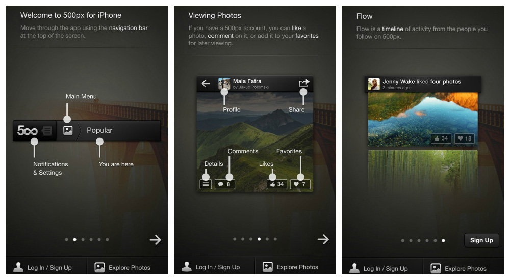
Photography showcase app 500px boasts some amazing content and a rich set of functionality to go along with it. However, the onboarding process for the iPhone app commits some faux-pas:
- The navigation bar and its functionality are showcased. Telling users that they can navigate via the navigation bar falls under the category of obvious.
- Some slides show buttons such as for liking, favoriting and sharing. All three of these functions are represented by icons that are universally associated with them, so explaining them in the onboarding is unnecessary. Let’s suppose, for the sake of argument, that a portion of 500px’s target audience is not familiar with these icons. In this case, progressively onboarding these users by presenting the functions in context would better serve them (for example, when the user is viewing a picture and might want to “like” it).
- One slide shows the “flow,” a timeline that showcases the activity of people whom the user is following. Because you can only benefit from the flow once you have followed others, progressively onboarding the user by telling them about this feature after they’ve followed at least one person would have been better.
Technique 3: Progressive Onboarding
In general, people learn best by doing. This probably explains the popularity of progressive onboarding, which is a true walkthrough in that it presents information to users as they use the app. For example, when the user is on the dashboard, they would see only dashboard-related information; when they’re viewing search results, they would be shown only functions related to search results.
Here are a few things to keep in mind when progressively onboarding:
Save For Complex Workflows
If your app has a fairly complex workflow or handles complex tasks (such as finances), then progressive onboarding is a good choice. You would feed the user information only when it’s appropriate and logical in the workflow, giving the user time to digest it.
Use For Hidden Functionality
When developing mobile apps, we’re always focused on efficiently using the small screen, which sometimes requires menus and functions to be hidden, visible only via, say, a double tap or long press. In this case, walk the user through those hidden functions.
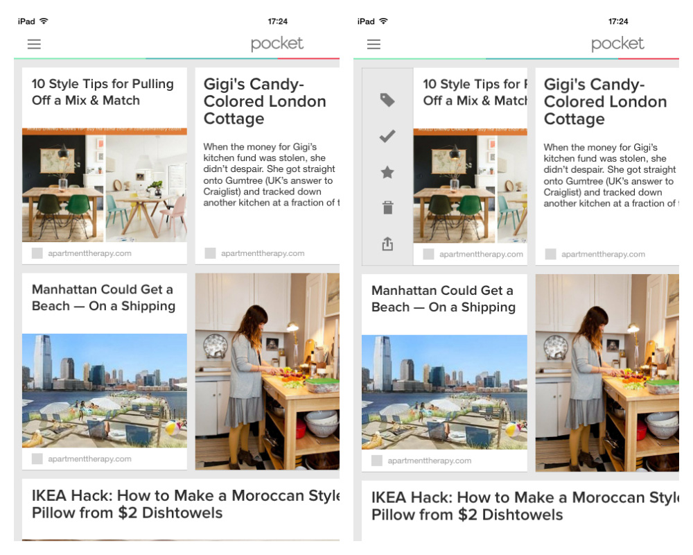
For example, take the app Pocket, shown below. In it, functions are available for each item in the reading list, but the user has to swipe left in order to access them. Because the user has to populate the app with content, a nice touch would have been to wait until the user has added at least one item to the reading list, and then immediately point out that a left swipe reveals the hidden functions.
Ideal For Gesture-Driven Apps
If your app is strictly gesture-driven, then this hands-on approach is best. Getting the user to take action over time as functionality is introduced will help the information stick.

Make It Persistent
For gesture-driven apps, provide a shortcut to a list of gestures and their corresponding actions, perhaps in the settings screen.
Remember that the more gestures you have, the more the user has to memorize. And the more gesture-driven apps a user has installed on their device, the more confused they can get, trying to remember the difference between a double-tap in one app and a double-tap in another. Making the information permanently accessible adds an extra layer of comfort.

What Not To Do
Because progressive onboarding complements a user’s exploration of an app, the biggest risk is that incessant hints as the user moves from screen to screen will ruin the experience of an otherwise wonderful app. So, take even greater care with this technique to show only the most useful information.
Also, avoid highlighting features on every screen. Give the user some breathing room so that they get some satisfaction from exploring your app. A walkthrough is not a substitute for poor design. It should simply enhance the experience.
Alternative Solutions
The techniques presented above are the most popular. But you do have other options to play with!
Alternative 1: Hybrid
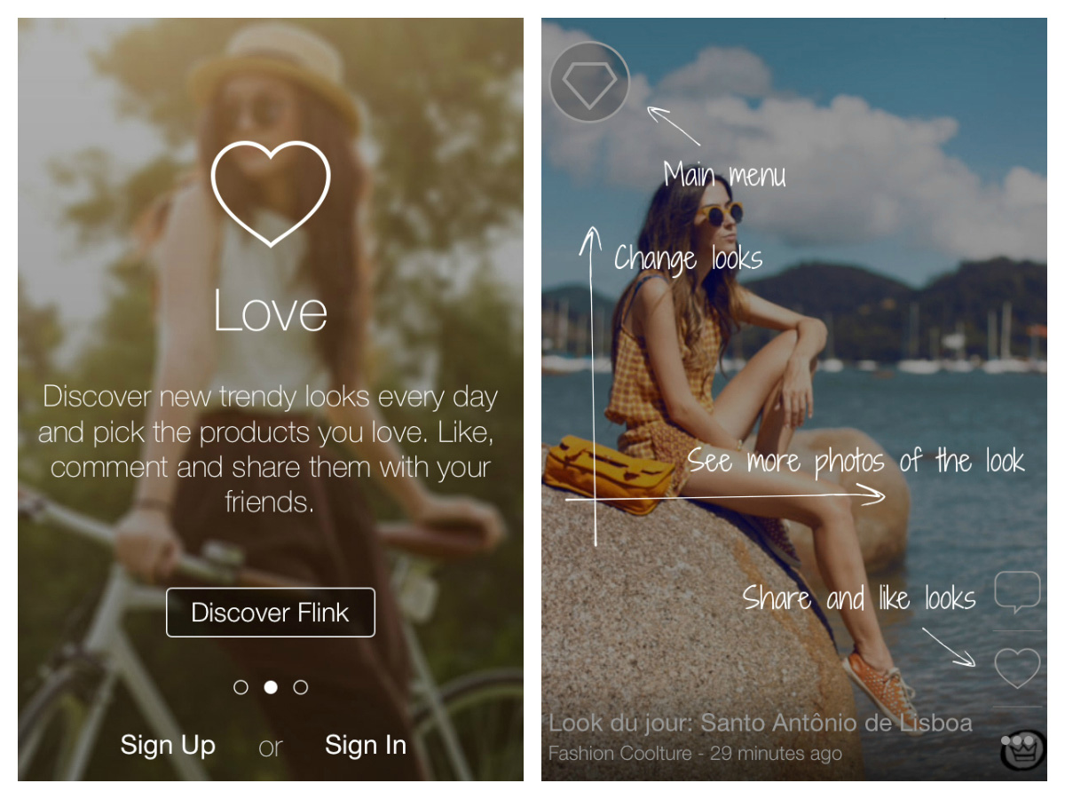
A hybrid approach — blending one, two or all three techniques — is sometimes viable, as Flink shows:
Alternative 2: Video
Video onboarding is used in some apps and is worth looking into. This can be taken in different directions, with some videos being more practical, like a tutorial, while others are basically advertisements. As with videos on websites, playing them automatically would be invasive and jarring for the user. And the user might be in a public space, where blasting sound from a mobile device would be inappropriate.

Alternative 3: Sample Data
Providing some sample data for the user to play with might also be worthwhile. This is particularly helpful in apps that handle sensitive data, such as finances and human-resources data. If the app is preloaded with sample data, the user will feel comfortable experimenting, making mistakes and learning how the app works, and they will feel better prepared to input real data.
Conclusion
The guidelines and examples in this article will jumpstart your onboarding project; however, as always, the user is at the heart of all of this. So, as you evaluate which technique to use, remember to revisit your personas, user scenarios and any user data you have, whether from analytics or market research.
If you’re still unsure about which technique to go with, test one or two techniques on users and analyze the feedback to see what works and what doesn’t. No solution is one-size-fits-all, so, as always, use the data on hand to make the most informed decision.
As you take your first steps, monitor what other developers are doing. The following websites provide a variety of onboarding patterns to draw inspiration from:
If you’re interested in platform-specific guidelines, then check out Apple’s and Google’s.
Further Reading
- A Roadmap To Building A Delightful Onboarding Experience
- The Role Of Empty States In User Onboarding
- Refining Your Mobile Onboarding Experience Using Visual Analytics
- Smart Transitions In User Experience Design


