Ways To Avoid Overwhelming Users: Lessons Learned From My High-School Teachers

Email Newsletter
Weekly tips on front-end & UX.
Trusted by 182,000+ folks.

 Celebrating 10 million developers
 Custom Web Forms for Angular, React, & Vue. Your backend.

High school. I won’t lie: I did not have the highest grades in my graduating class. Some classes and lessons were so poorly designed and delivered that I would frequently become frustrated and fatigued and would ultimately shut down. The contents of the lessons would just wash over me. The experience wasn’t pleasant, and the results were obvious from my transcripts.
But I did well in a few classes. The major difference was the teaching style. Currently, I am a user experience (UX) and user interface (UI) designer of mobile and web applications. In a way, like a teacher, I need to present information in an easily understandable way to new visitors. I need to consider how my students (end users) consume the information that I provide. So, reflection on my high-school experience serves a purpose (aside from painful fashion memories).
A Trip Down Memory Lane
My environmental science and algebra classes stand out as good sources of answers as to what does and doesn’t work when learning new lessons. I remember the former class as being a very positive experience. I would want to use an application or website the same way I learned from my environmental science teacher: simply and intuitively.
On the other hand, my algebra teacher taught the class like an application or website that I would have great difficulty using, the kind that I would spend half of my mental energy trying to learn how to use, rather than learning about what I came for. Let’s compare my two experiences:
- Algebra
It start off well. The chalkboard was clean and organized as the teacher wrote a problem and worked out a solution. “OK, I’m getting this.” Then slowly the chalkboard became cluttered as he added another problem somewhere else on the board. Then another. Then another, never erasing old problems to clear up space. The board became cluttered and busy. His pace sped up. I was still hung up on a problem from 10 minutes ago and I was losing my grasp. I looked up from my notebook at a chalkboard that now looked like a lesson in quantum mechanics, rather than simple algebra equations. I felt frustrated, defeated. I retained almost nothing. I gave up and checked out.

- Environmental science Again, it started off well. My teacher helped this process continue by putting a lot of effort into organizing her materials and lesson plans. She used the overhead projector often. This forced her to display one visual at a time, which I definitely preferred. She passed out print-outs of the visuals towards the end of class, so that we did not get distracted by what was on our desk, but rather focused on and absorbed the lesson. My teacher had a unique way of tying together real-world examples that supported what she was teaching. The subject matter didn’t feel as abstract to me this way. I was able to retain almost all of the information. This way of giving real-world examples and sharing stories that the audience can directly relate to can be useful in creating a great experience.

It’s obvious that my science class, like a well-planned and well-executed website or app, was by far a more educational and enjoyable experience. The teacher designed her lessons in a way that helped the students avoid cognitive overload and maintain the focus needed to learn.
So, now that I’ve learned something about myself, how can I apply these findings to UX design?
Understand And Know Your Audience
Teachers And UX Designers Are Alike
Teachers are not very different from UX designers. A teacher’s responsibility, like a UX designer’s, is to present content in a format known as instructional design. In other words, teachers and UX designers must both perform an audience analysis to be aware of their population as a whole. Teachers must understand the students’ curriculum level, goals, skills, learning styles, skill gaps and attention spans to make lesson plans work in everyone’s favor and close any skill gaps that may exist. They need to understand how much information their students can handle and when to deliver that information.
Audience analysis brings to light important insights, such as the students’ goals, frustrations, likes and dislikes. Teachers, like UX designers, decide which content is relevant and how to visually present it. Then, they design a lesson plan that meets their students’ needs without overwhelming their current abilities. The same goes for UX designers as they begin a prototype or wireframe.
Students And End Users Are Also Alike
What happened to me in high-school algebra happens to users on websites, web apps and mobile apps every day. A user will visit a website or try out an application that is designed in such a way that they at once become overwhelmed with content and features that are too quickly displayed. Very often the user will not be able to retain the information and will simply get frustrated and leave the site or app. That’s the worst case for a business that wants to retain and convert users.
For the purpose of this article, I’ll loosely compare students with end users. Unlike users of applications, students do not have the option to try out a teacher or class and decide to move on to another if the first doesn’t meet their needs; however, students and end users do both need to absorb new information from an outside source, process it and ultimately retain it.
Understand Your Subject And Content Types To Minimize Cognitive Overload
Intrinsic Cognitive Load
“Intrinsic” here refers to the complexity that is inherent in certain tasks or materials. In plain terms, some lessons and content are harder to consume than others, and the more complex the content, the more likelihood of cognitive overload.
My algebra class would have been better had the teacher presented one problem at a time, explained the solution at an even pace, cleared the board and then presented the next problem. Print-outs of what was on the board could have been handed out, helping to eliminate the distraction of trying to recreate those problems and solutions in a notebook.
Extraneous Cognitive Load
This form of content consists of superfluous elements, such as an infographic that isn’t necessary for the text it accompanies and that requires the user to do extra mental processing, which can lead to cognitive overload. Or perhaps text is being used when an infographic is called for instead; for example, by explaining in words what a square is when a drawing would get the point across more quickly.
My environmental science class avoided this because the teacher omitted the unnecessary or cumbersome content in our textbooks and provided simple examples and explanations of complex ideas.
How To Avoid Cognitive Overload
Let’s put this into practice and review some ways of avoiding overwhelming your users when they visit your website or app. Below are some tips and examples on how to avoid cognitive overload when designing.
1. Simplify
Audit all of your content and remove anything that isn’t absolutely required for your user to realize their goal. This means auditing the content itself, the amount of content (see point 2 below), as well as the layout, design, graphics and typography (see point 6). Distractors and extraneous elements will most likely lead not to increased stimulation, but to cognitive overload.
Decorative graphics might seem to make content more interesting, but they require extra mental processing and will increase the cognitive load. If the content doesn’t support the instructional goal, then remove it. Use your judgment, and be mindful of branding and design aesthetics that the targeted audience would expect.
Good example: A great example is TED’s redesign. Using the Wayback Machine I accessed the 2013 version of TED, and the simplification is easy to see.
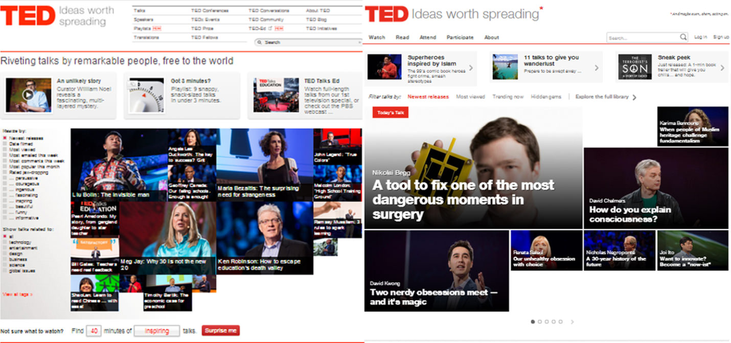
Working with the design firm Huge, TED audited its website’s content, listened to its users and developed an experience that feels much more personalized and exploratory. TED got away from bombarding the user with many types of navigation and filters. It picked only those that are necessary, giving the interface more breathing room and allowing for larger and cleaner typography, as well as larger and more vibrant images from its talks.
The redesign has been a great success, with more visits, more awards and more participation. It’s a perfect example of how simplicity can draw in the user and help them orient themselves and not be frightened by the density of content.
2. Bite-Sized Information
If the content is too complex and the layout too dense and clustered, then the user might not be able to, or even want to, process the information effectively. Breaking complex content into smaller chunks and enabling the user to control their consumption of this content will help them process the information more effectively.
Good example: The designers at Teehan + Lax do an outstanding job of chunking information. They set a high standard for how to lay out a lot of content, while keeping a nice rhythm, intuitive content breakers (including visuals and block quotes) and great design elements (such as typography and color).
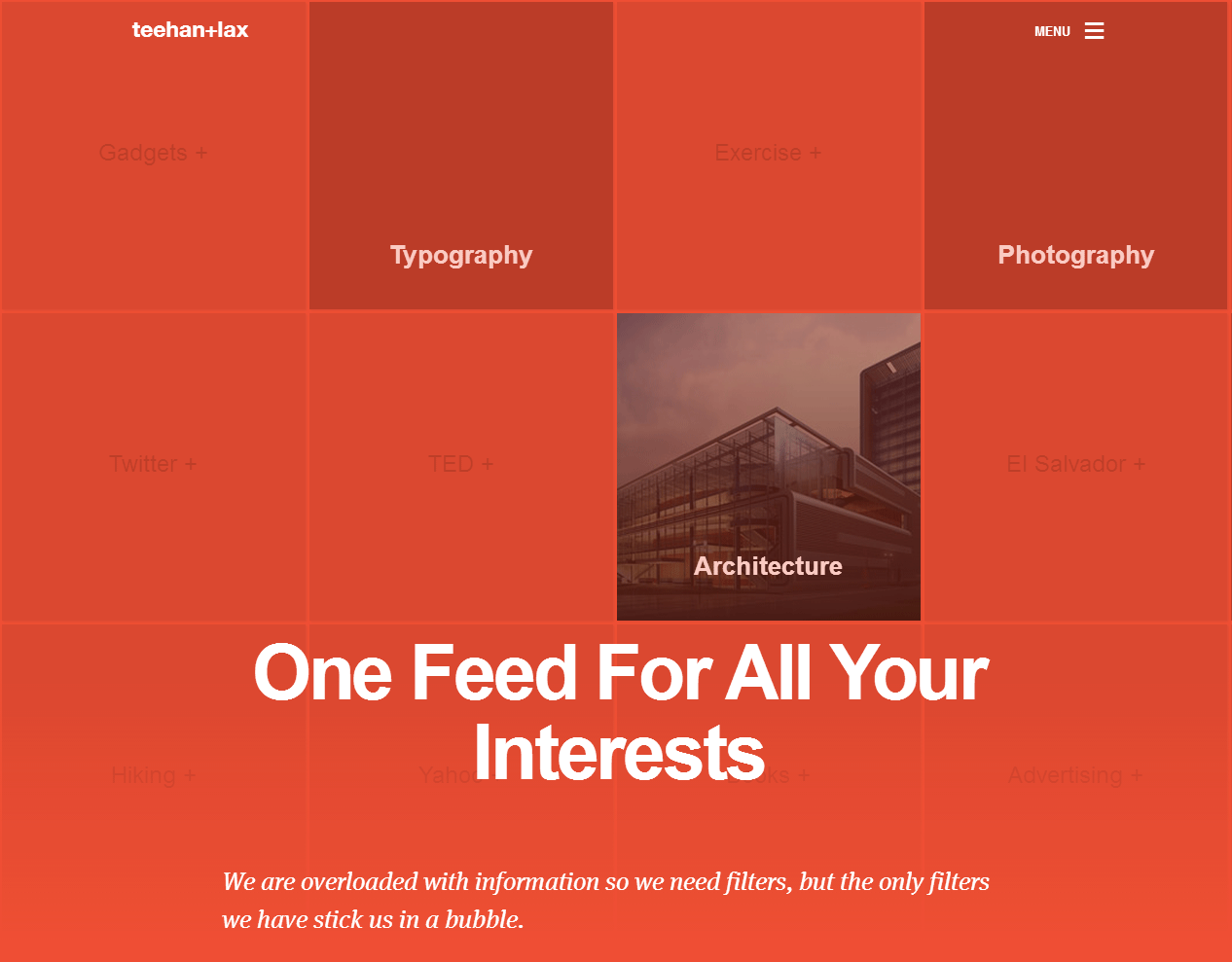
Teehan + Lax does this particularly well with its case studies. Intrinsically complex, the case studies are easy and enjoyable to read because the designers have chunked the well-written content with large typography, interesting parallax scrolling effects and animations, and stunning graphics and colors. The case study of Prismatic illustrates just this.
Bad example: Y&R’s “About Us” page is an example of intrinsically dense content that’s made even more difficult to consume.
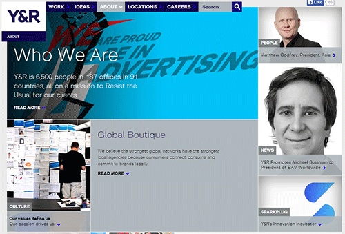
The page is much too dense with content and cluttered with distractors. Comparing it to Teehan + Lax, you should be able to see the difference that well-implemented chunking makes.
Using a grid for a copy-heavy subject was a risky decision that makes this page appear cluttered. The actual “About Us” content is buried beneath large boxes of related articles and quick links to sections below. The type is too small and its alignment and width change three times on the page. Too many seemingly random and busy images appear that don’t support the text. And the “Related Content” links, much like the images, are too many in quantity and seem randomly placed. All of these distractors force the user to orient themselves and understand the page’s layout before actually learning about Y&R and its culture.
3. Be Creative
Present information in different ways. Because the web is visual, try to present content graphically, through images or graphs. This is a great way to exploit the user’s different processing methods, freeing up their mind as they consume content, which in turn reduces their cognitive load. Most importantly, design the visuals in a meaningful way and not with such unorthodoxy that they become frustrating to use.
Good example: Well-produced annual reports creatively merge gorgeous infographics, photographs and illustrations to capture and hold the reader’s attention. Even though they’re digital now, they uphold the principles forged by their printed forefathers. Philips’ annual report for 2013 (PDF) is a fine example of bite-sized headlines and facts, undistracting photographs, simple infographics and well-paced layouts, helping the user absorb information without being turned off.
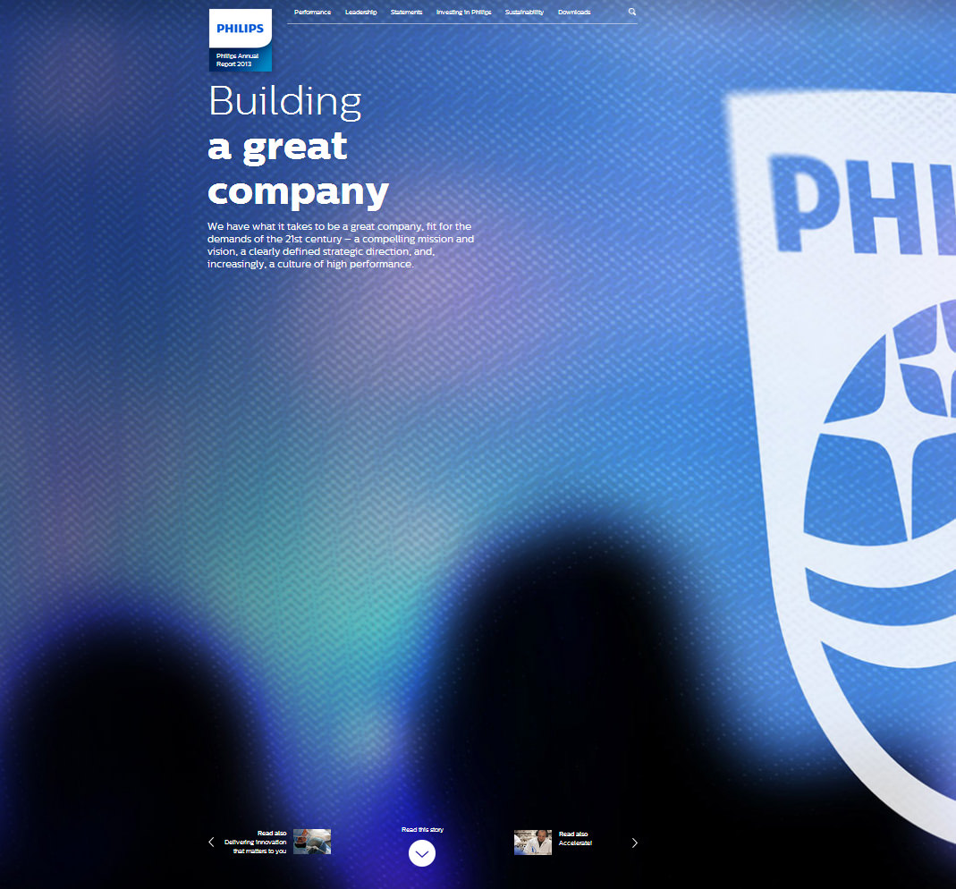
Philips’ designers and writers introduce great creative elements along with standard tactics (including chunking). The information architecture is set up so that users can find new articles through “Read More” links, rather than everything being squeezed into one space.
Bad example: GE’s annual report for 2012 is similar to Phillip’s in that the website is a vertical-scrolling storyboard with parallax effects. Unfortunately, it is not as effective in preventing cognitive overload. It starts off well, but as soon as the user arrives at the “Letter to Shareowners,” the volume of text clearly becomes overwhelming. Even with the infographics and pictures, the small text demands that shareowners absorb a lot. If the content could not have been made less complex, then perhaps more editing, auxiliary navigation, clear headings and section dividers would have made it easier to digest.

4. Keep The Story Interesting And Free Of Redundancy
It’s easy for designers and content strategists to get boxed into templates. Templates are great for many reasons. They make writing, designing and development easier, especially when you’re dealing with multiple content types (such as products and company departments). They also indicate to the user what to expect from page to page.
On the other hand, they can become repetitive. When every page is based on the same template, unique storylines are lost because everything becomes homogenous. This can create apathy in the user for the brand. To counter this, make high-level pages visually unique, and tell a story from the top of the page to the bottom to capture and hold interest.
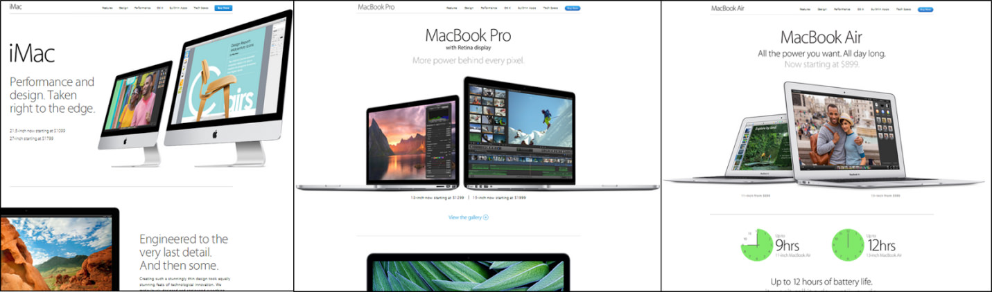
Good example: Apple shows how product pages can adhere to an overall template and design style yet not come across as repetitive or uninspired. The pages for MacBook Air, MacBook Pro and iMac all have the same secondary navigation, photography and typographic style, but within each product area lies a distinct and fresh layout. This engages the user and prevents cognitive overload.
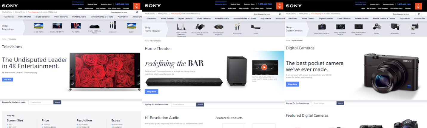
Bad example: Granted, Sony has a much larger catalog of products than Apple, and the case for adhering more closely to a template for its product pages is much greater. With Sony’s product page template, pages become easy to produce, write, develop and update in bulk. Nevertheless, the story gets lost, and the products are homogenized. The user can easily read and understand the content, but the excitement is lost. That excitement and energy, exemplified by Apple, captures the user’s attention and focus (two of the main ingredients in the process of learning).
5. Make It Multimedia
People learn better when words and graphics are combined — that is, when graphics on their own would not be self-explanatory. Just be sure to make the relationship between the two very clear, whether by embedding the text in the graphic or by showing the elements in close proximity.
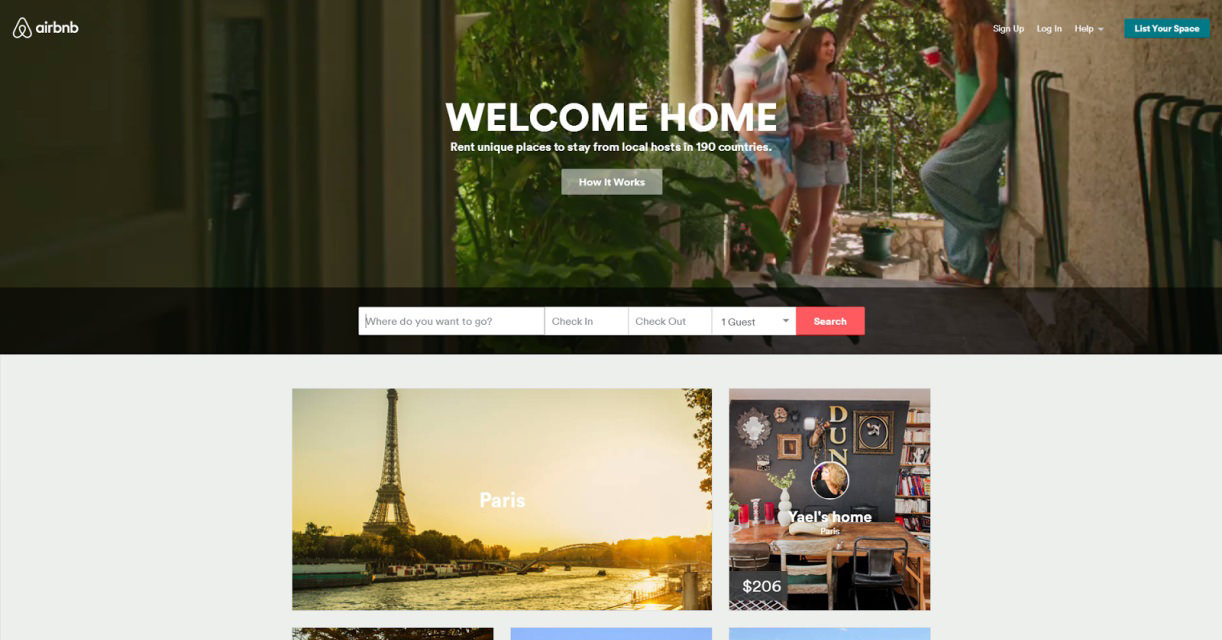
Good example: Airbnb is a great example of multimedia done right. Videos of lifestyle vignettes rotate on its home page, under the powerful headline “Welcome Home.” People tend to be drawn in by video, so this approach (which includes persisting the headline) works well as a branding vehicle.
Bad example: Another apartment-sharing company, HomeAway, does not engage its users as well as Airbnb. HomeAway has a single static image and headline — no movement, no energy to the content, which forces the user to expend extra energy to orient themselves and figure out what’s marketing and what’s relevant. While the layouts of both websites are similar and well designed, any extra energy the user has to exert is a negative.

6. Follow Basic Design Principles
Any good designer instinctively understands the following principles, but we’ll mention them anyway because they are extremely relevant to the presentation of content and the user’s experience:
- Make the typography big.
- Choose readable font faces.
- Employ summaries and headings.
- Make the layout clear.
- Use generous white space.
- Clarify with examples.
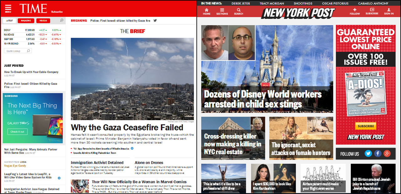
Good example: Big Human’s redesign of Time’s completely adaptive website is a perfect example of superb design considerations. Like the other good examples above, Time’s redesign is a lesson in the principles listed above. The website is easy to read, in large part due to the white space, the well-sized typefaces (Franklin Gothic and Georgia) and adherence to a vertical as well as a baseline grid. As a result, the intrinsic complexity of the content does not feel overwhelming. The user can easily parse the headlines, blurbs and sections. Quite a few options are presented to the user, but done in a way that minimizes cognitive overload.
Bad example: The New York Post struggles with what Time does so well. The layout is a grid of uninspiring images that are hard to view because they are overlaid with a condensed typeface that is hard to read (Founders Grotesk). The lack of white space makes the content difficult to navigate and read. The layout in general is conducive to cognitive overload. With the abundance of photos, repetitive typeface styles and minimal white space, the user will most likely not respond well to the presentation and shut down.
Prevent Cognitive Overload To Be A Successful UX Designer And Teacher
My old science teacher could have probably become a solid UX designer. She knew her target audience, and she knew how to connect with them. Her lesson plans were clean and thoughtful, designed around intrinsically complex material. She provided helpful visuals and supporting documentation to help her students retain the material.
Following these six rules when designing a website or lesson plan will minimize cognitive overload and keep your users (or students) easily informed and happy. Simplify and chunk complex information, eliminate extraneous content to reduce repetitiveness, and follow the basic design principles above.
If I could, I would invite you to contact my science teacher with any design questions or comments you may have. Unfortunately, we are no longer in contact, so you are stuck with me. Please post any questions or comments you have below.
Further Reading
- Stop Shouting. Start Teaching.
- Lessons Learned From Leading New Web Professionals
- Teaching Web Design To New Students In Higher Education
- Rekindling Your Passion For Web Design


