How I Built The One Page Scroll Plugin

Email Newsletter
Weekly tips on front-end & UX.
Trusted by 182,000+ folks.
 Register for Free


 Custom Web Forms for Angular, React, & Vue. Your backend.
 Celebrating 10 million developers
Scrolling effects have been around in web design for years now, and while many plugins are available to choose from, only a few have the simplicity and light weight that most developers and designers are looking for. Most plugins I’ve seen try to do too many things, which makes it difficult for designers and developers to integrate them in their projects.
Not long ago, Apple introduced the iPhone 5S, which was accompanied by a presentation website on which visitors were guided down sections of a page and whose messaging was reduced to one key function per section. I found this to be a great way to present a product, minimizing the risk of visitors accidentally scrolling past key information.
I set out to find a plugin that does just this. To my surprise, I didn’t find a simple solution to integrate in my current projects. That is when One Page Scroll was born.
What Is One Page Scroll?
One Page Scroll is a jQuery plugin that enables you to create a single-scroll layout for a group of sections on a page with minimal markup.
I will explain how I built this plugin, right from its inception through to planning, testing and finally putting the code out there for free.
Note: Before building this plugin, I was aware of the controversy over “scroll-hijacking,” whereby a website overrides the native scrolling behavior of the browser to create its own interaction, which confuses some visitors. One Page Scroll would inevitably go against this principle, so I decided to come up with ways to ease the frustration. One good thing about the plugin is that developers may set a fallback that reverts scrolling from its “hijacked” state to its native behavior for certain screen sizes. This way, developers can maintain the high performance and quality of their websites on low-power devices, such as smartphones and tablets. Other than that, you can also control the length of the animation that takes the visitor from one section to the next, thus allowing you to avoid the slow transition seen on Apple’s iPhone 5S website.
What Is Its Purpose?
As mentioned, most of the plugins that I found offer way too many unnecessary features, making them difficult to integrate. The purpose of this plugin is to solve this issue. The plugin had to:
- be simple to use,
- be easy to integrate,
- require minimal markup,
- do one thing well (i.e. scroll a page the way the iPhone 5S website does).
1. To The Drawing Board
I started by visualizing the plugin as a whole. It should enable visitors to scroll through each section of the page individually. To do that, I needed a way to disable the browser’s default scrolling behavior, while stacking each section in order and moving the page manually when the scrolling is triggered.
After that, I broke the concept down into small tasks, trying to come up with a solution to each task in my mind. Here is a list of the functions and tasks that I came up with:
- Prepare the layout and position the sections.
Disable the browser’s default scrolling behavior with CSS by applyingoverflow: hiddento thebodytag. Position each section in sequence, while calculating and attaching all of the necessary information and classes. - Set the manual scrolling trigger.
Detect the scrolling trigger using jQuery, and then determine the direction, and then move the layout using CSS. - Add features.
Add responsiveness, looping, mobile swipe support, pagination, etc. - Test across browsers.
Make sure the plugin runs fine in all modern browsers (Chrome, Safari, Firefox, Internet Explorer 10) and on the most popular operating systems (Windows, Mac OS X, iOS and Android 4.0+). - Open-source the plugin.
Create a new repository, structuring it and writing instructions on how to use the plugin. - Widen support.
Explore other ways to increase support of the plugin.
2. Building The Foundation
Now that I had visualized the whole concept, I began to build the plugin with this template:
!function($) {

   var defaults = {
      sectionContainer: "section",
      …
   };

   $.fn.onepage_scroll = function(options) {
      var settings = $.extend({}, defaults, options);
      …
   }

}($)
The template starts off with a !function($) { … }($) module, which provides local scoping to the global variable for jQuery. The purpose of this function is to reduce the overhead for the jQuery lookup ($) and prevent conflicts with other JavaScript libraries.
The defaults variable at the top holds the default options for the plugin. So, if you don’t define any options, it will fallback to these values.
The $.fn.onepage_scroll function is the main function that initiates everything. Don’t forget to replace onepage_scroll with your own function name if you are creating your own.
Disabling the scrolling behavior can be done easily by adding overflow: hidden to the body tag via CSS through a plugin-specific class name. Coming up with a plugin-specific class naming convention is important to avoid conflicts with existing CSS styles. I usually go with an abbreviation of the plugin’s name, followed by a hyphen and a descriptive word: for example, .onepage-wrapper.
Now that all of the fundamentals are laid out properly, let’s build the first function.
3. Prepare The Layout And Position The Sections
Let’s get to the most interesting part: working out the calculation and instantly dropping all of my effort later in the process. I thought I needed to position each section in sequence by looping through each one and then positioning them, so that they do not overlap with each other. Here’s the snippet I came up with:
var sections = $(settings.sectionContainer);
var topPos = 0;

$.each(sections, function(i) {
   $(this).css({
      position: "absolute",
      top: topPos + "%"
   }).addClass("ops-section").attr("data-index", i+1);
   topPos = topPos + 100;
});
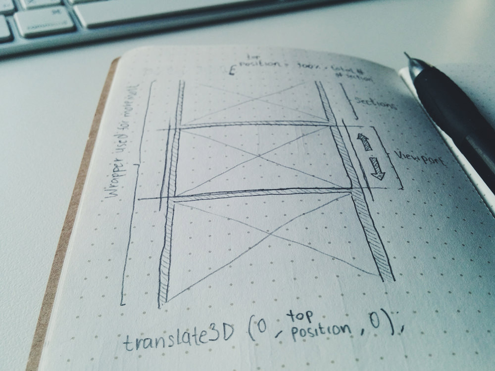
This snippet loops through each presented selector (sectionContainer is defined in the defaults variable), applies position: absolute and assigns each one with the correct top position that it needs to align properly.
The top position is stored in the topPos variable. The initial value is 0 and increases as it loops through each one. To make each section a full page and stack up correctly, all I had to do was set the height of each section to 100% and increase the topPos variable by 100 every time it loops through a section. Now, each section should stack up correctly, while only the first section is visible to visitors.
This might seem easy, but it took me a couple of hours to implement and to see how reliable it is, only to realize in the next step that I did not need any of this at all.
4. Manual Trigger And Page Transformation
You might think that the next step would be to move each section to its new position when the scrolling is triggered — I thought so, too. As it turns out, there is a better solution. Instead of moving every single section every time the user scrolls, which would require another loop through and another calculation, I wrapped all of the sections in one container and used CSS3’s translate3d to move the whole wrapper up and down. Because translate3d supports percentage-based values, we can use our previous top position calculation to move each section into the viewport without having to recalculate it. Another benefit is that this gives you control over the timing and easing settings of your animation.
As you may have noticed, this solution makes the positioning snippet illustrated in the previous step unnecessary because the wrapper that we’ve introduced makes each section stack up correctly without any extra styling required.
Now, all we have to do is detect the direction of the user’s scrolling and move the wrapper accordingly. Here’s the code to detect the scrolling direction:
function init_scroll(event, delta) {
   var deltaOfInterest = delta,
   timeNow = new Date().getTime(),
   quietPeriod = 500;

   // Cancel scroll if currently animating or within quiet period
   if(timeNow - lastAnimation < quietPeriod + settings.animationTime) {
      event.preventDefault();
      return;
   }

   if (deltaOfInterest < 0) {
      el.moveDown()
   } else {
      el.moveUp()
   }
   lastAnimation = timeNow;
}

$(document).bind('mousewheel DOMMouseScroll', function(event) {
   event.preventDefault();
   var delta = event.originalEvent.wheelDelta || -event.originalEvent.detail;
   init_scroll(event, delta);
});
In the snippet above, first I bind a function to the mousewheel event (or DOMMouseScroll for Firefox), so that I can intercept the scrolling data to determine the direction of the scrolling. By binding my own init_scroll function in these events, I’m able to pass the available wheelData to init_scroll and detect the direction.
In a perfect world, all I would have to do to detect and move each section is retrieve the delta from the wheelData variable, use the value to determine the direction and perform the transformation. That, however, is not possible. When you are dealing with a sequencing animation, you must create a fail-safe to prevent the trigger from doubling, which would cause the animation to overlap. We can use setInterval to sort this problem out by calling each animation individually, with its own time set apart to create a sequence. But for precision and reliability, setInterval falls short because each browser handles it differently. For example, in Chrome and Firefox, setInterval is throttled in inactive tabs, causing the callbacks not to be called in time. In the end, I decided to turn to a timestamp.
var timeNow = new Date().getTime(),
quietPeriod = 500;
…
if(timeNow - lastAnimation < quietPeriod + settings.animationTime) {
   event.preventDefault();
   return;
}
…
lastAnimation = timeNow;
In the snippet above (extracted from the previous one), you can see that I have assigned the current timestamp to the timeNow variable before the detection, so that it can check whether the previous animation has performed for longer than 500 milliseconds. If the previous animation has performed for less than 500 milliseconds, then the condition would prevent the transformation from overlapping the ongoing animation. By using a timestamp, instead of setInterval, we can detect the timing more accurately because the timestamp relies on the global data.
if (deltaOfInterest < 0) {
   el.moveDown()
} else {
   el.moveUp()
}
The moveUp and moveDown are functions that change all attributes of the layout to reflect the current state of the website. Data such as the current index, the name of the current section’s class and so on are added in these functions. Each of these functions will call the final transform method to move the next section into the viewport.
$.fn.transformPage = function(settings, pos, index) {
   …
   $(this).css({
      "-webkit-transform": ( settings.direction == 'horizontal' ) ? "translate3d(" + pos + "%, 0, 0)" : "translate3d(0, " + pos + "%, 0)",
      "-webkit-transition": "all " + settings.animationTime + "ms " + settings.easing,
      "-moz-transform": ( settings.direction == 'horizontal' ) ? "translate3d(" + pos + "%, 0, 0)" : "translate3d(0, " + pos + "%, 0)",
      "-moz-transition": "all " + settings.animationTime + "ms " + settings.easing,
      "-ms-transform": ( settings.direction == 'horizontal' ) ? "translate3d(" + pos + "%, 0, 0)" : "translate3d(0, " + pos + "%, 0)",
      "-ms-transition": "all " + settings.animationTime + "ms " + settings.easing,
      "transform": ( settings.direction == 'horizontal' ) ? "translate3d(" + pos + "%, 0, 0)" : "translate3d(0, " + pos + "%, 0)",
      "transition": "all " + settings.animationTime + "ms " + settings.easing
   });
   …
}
Above is the transform method that handles the movement of each section. As you can see, I’ve used the CSS3 transformation to handle all of the manipulation with JavaScript. The reason I did this in JavaScript, rather than in a separate style sheet, is to allow developers to configure the behavior of the plugin — mainly the animation’s timing and easing — through their own function calls, without having to go into a separate style sheet and dig for the settings. Another reason is that the animation requires a dynamic value to determine the percentage of the transition, which can only be calculated in JavaScript by counting the number of sections.
5. Additional Features
I was reluctant to add features at first, but having gotten so much great feedback from the GitHub community, I decided to improve the plugin bit by bit. I released version 1.2.1, which adds a bunch of callbacks and loops and, hardest of all, responsiveness.
In the beginning, I didn’t focus on building a mobile-first plugin (which I still regret today). Rather, I used a simple solution (thanks to Eike Send for his swipe events) to detect and convert swipe data into usable delta data, in order to use it on my init_scroll function. That doesn’t always yield the best result in mobile browsers, such as custom Android browsers, so I ended up implementing a fallback option that lets the plugin fall back to its native scrolling behavior when the browser reaches a certain width. Here’s the script that does that:
var defaults = {
   responsiveFallback: false
   …
};

function responsive() {
   if ($(window).width() < settings.responsiveFallback) {
      $("body").addClass("disabled-onepage-scroll");
      $(document).unbind('mousewheel DOMMouseScroll');
      el.swipeEvents().unbind("swipeDown swipeUp");
   } else {
      if($("body").hasClass("disabled-onepage-scroll")) {
         $("body").removeClass("disabled-onepage-scroll");
         $("html, body, .wrapper").animate({ scrollTop: 0 }, "fast");
      }

      el.swipeEvents().bind("swipeDown",  function(event) {
         if (!$("body").hasClass("disabled-onepage-scroll")) event.preventDefault();
         el.moveUp();
      }).bind("swipeUp", function(event){
         if (!$("body").hasClass("disabled-onepage-scroll")) event.preventDefault();
         el.moveDown();
      });

      $(document).bind('mousewheel DOMMouseScroll', function(event) {
         event.preventDefault();
         var delta = event.originalEvent.wheelDelta || -event.originalEvent.detail;
         init_scroll(event, delta);
      });
   }
}
First, I’ve defined a default variable to activate this fallback. The responsiveFallback is used to determine when the plugin should trigger the fallback.
The snippet above will detect the browser’s width to determine whether the responsive function should run. If the width reaches the value defined in responsiveFallback, then the function will unbind all of the events, such as swiping and scrolling, return the user to the top of the page to prepare for realignment of each section, and then reenable the browser’s default scrolling behavior so that the user can swipe through the page as usual. If the width exceeds the value defined, then the plugin checks for a class of disabled-onepage-scroll to determine whether it has already been initialized; if it hasn’t, then it is reinitialized again.
The solution is not ideal, but it gives the option for designers and developers to choose how to handle their websites on mobile, rather than forcing them to abandon mobile.
6. Cross-Browser Testing
Testing is an essential part of the development process, and before you can release a plugin, you must make sure that it runs well on the majority of machines out there. Chrome is my go-to browser, and I always start developing in it. It has many benefits as one’s main development browser, but your personal preference might vary. For me, Chrome has a more efficient inspection tool. Also, when I get a plugin to work in Chrome, I know that it will probably also work in Safari and Opera as well.
I mainly use my Macbook Air to develop plugins, but I also have a PC at home to check across platforms. When I get a plugin to work in Chrome, then I’ll test manually in Safari, Opera and (lastly) Firefox on Mac OS X, followed by Chrome, Firefox and Internet Explorer (IE) 10 on Windows.
The reason I test only these browsers is that the majority of users are on them. I could have tested IE 9 and even IE 8, but that would have prevented me from releasing the plugin in time with the launch of the iPhone 5S website.
This is generally not a good practice, and I’ll avoid doing it in future. But the good thing about making the plugin open-source is that other developers can help patch it after its release. After all, the purpose of an open-source project is not to create the perfect product, but to create a jumping-off point for other developers to extend the project to be whatever they want it to be.

To ease the pain of cross-browser testing, every time I complete a plugin, I’ll create a demo page to show all of the features of the plugin, and then I’ll upload it to my website and test it, before sharing the plugin on GitHub. This is important because it enables you to see how the plugin performs in a real server environment and to squash any bugs that you might not be able to replicate locally. Once the demo page is up and running on my website, I’ll take the opportunity to test the plugin on other devices, such as phones and tablets.
With these tests, you will have covered the vast majority of browsers out there and prepared the plugin for the real world.
7. Open-Sourcing Your Plugin
When you think the plugin is ready, the final step is to share it on GitHub. To do this, create an account on GitHub, set up Git and create a new repository. Once that is done, clone the repository to your local machine. This should generate a folder with your plugin’s name on your local machine. Copy the plugin to the newly created folder and structure your repository.
Repository Structure
How you structure your repository is all up to you. Here’s how I do it:
- The demo folder consists of working demos, with all required resources.
- The minified and normal versions of the plugin are in the root folder.
- The CSS and sample resources, such as images (if the plugin requires it), are in the root folder.
- The readme file is in the root directory of the generated folder.
Readme Structure
Another important step is to write clear instructions for the open-source community. Usually, all of my instructions are in a readme file, but if yours require a more complex structure, you could go with a wiki page on GitHub. Here is how I structure my readme:
- Introduction
I explained the purpose of the plugin, accompanied by an image and a link to the demo. - Requirements and compatibility
Put this up front so that developers can see right away whether they’ll want to use the plugin. - Basic usage
This section consists of step-by-step instructions, from including the jQuery library to adding the HTML markup to calling the function. This section also explains the options available for developers to play with. - Advanced usage
This section contains more complex instructions, such as any public methods and callbacks and any other information that developers would find useful. - Other resources
This section consists of links to the tutorial, credits, etc.
8. Widening Support
This plugin doesn’t really need the jQuery library to do what it does, but because of the pressure to open-source it in time for the iPhone 5S website, I decided to take a shortcut and rely on jQuery.
To make amends, and exclusively for Smashing Magazine’s readers, I have rebuilt One Page Scroll using pure JavaScript (a Zepto version is also available). With the pure JavaScript version, you no longer need to include jQuery. The plugin works right out of the box.
Pure JavaScript And Zepto Version
Rebuilding The Plugin In Pure JavaScript
The process of building support for libraries can seem daunting at first, but it’s much easier than you might think. The most difficult part of building a plugin is getting the math right. Because I had already done that for this one, transforming the jQuery plugin into a pure JavaScript one was just a few hours of work.
Because the plugin relies heavily on CSS3 animation, all I had to do was replace the jQuery-specific methods with identical JavaScript methods. Also, I took the opportunity to reorganize the JavaScript into the following standard structure:
- Default variables
This is essentially the same as the jQuery version, in which I defined all of the variables, including the default variables for options to be used by other functions. - Initialize function
This function is used for preparing and positioning the layout and for the initialization that is executed when theonePageScrollfunction is called. All of the snippets that assign class names, data attributes and positioning styles and that bind all keyboard inputs reside here. - Private methods
The private method section contains all of the methods that will be called internally by the plugin. Methods such as the swipe events, page transformation, responsive fallback and scroll detection reside here. - Public methods
This section contains all of the methods that can be called manually by developers. Methods such asmoveDown(),moveUp()andmoveTo()reside here. - Utility methods
This section contains all of the helpers that replicate a jQuery function to speed up development time and slim down the JavaScript’s file size. Helpers such asObject.extend, which replicates thejQuery.extendfunction, reside here.
I ran into some annoyances, such as when I had to write a method just to add or remove a class name, or when I had to use document.querySelector instead of the simple $. But all of that contributes to a better, more structured plugin, which benefits everyone in the end.
Rebuilding The Plugin In Zepto
The reason why I decided to support Zepto, despite the fact that it only supports modern browsers (IE 10 and above), is that it gives developers a more efficient and lightweight alternative to jQuery version 2.0 and above, with a more versatile API. Zepto’s file size (around 20 KB) is considerably lower than jQuery 2.0’s (around 80 KB), which makes a big difference in page-loading speed. Because websites are being accessed more on smartphones, Zepto might be a better alternative to jQuery.
Rebuilding a jQuery plugin with Zepto is a much easier task because Zepto is similar to jQuery in its approach to the API, yet faster and more lightweight. Most of the script is identical to the jQuery version except for the animation part. Because Zepto’s $.fn.animate() supports CSS3 animation and the animationEnd callback right off the bat, I can take out this ugly snippet:
$(this).css({
   "-webkit-transform": "translate3d(0, " + pos + "%, 0)",
   "-webkit-transition": "-webkit-transform " + settings.animationTime + "ms " + settings.easing,
   "-moz-transform": "translate3d(0, " + pos + "%, 0)",
   "-moz-transition": "-moz-transform " + settings.animationTime + "ms " + settings.easing,
   "-ms-transform": "translate3d(0, " + pos + "%, 0)",
   "-ms-transition": "-ms-transform " + settings.animationTime + "ms " + settings.easing,
   "transform": "translate3d(0, " + pos + "%, 0)",
   "transition": "transform " + settings.animationTime + "ms " + settings.easing
});
$(this).one('webkitTransitionEnd otransitionend oTransitionEnd msTransitionEnd transitionend', function(e) {
   if (typeof settings.afterMove == 'function') settings.afterMove(index, next_el);
});
And I’ve replaced it with this:
$(this).animate({
      translate3d: "0, " + pos + "%, 0"
   }, settings.animationTime, settings.easing, function() {
      if (typeof settings.afterMove == 'function') settings.afterMove(index, next_el);
   });
}
With Zepto, you can animate with CSS3 without having to define all of the CSS styles or bind the callback yourself. Zepto handles all of that for you through the familiar $.fn.animate() method, which works similar to the $.fn.animate() method in jQuery but with CSS3 support.
Why Go Through All The Trouble?
Because jQuery has become many people’s go-to library, it has also become increasingly complex and clunky and at times performs poorly. By providing versions for other platforms, you will increase the reach of your plugin.
Going back to the foundation will also help you to build a better, more compliant plugin for the future. jQuery and other libraries are very forgiving of minor structural problems, like missing commas and $(element) — the kinds of things that have made me a little lazy and could compromise the quality of my plugins. Without all of these shortcuts in pure JavaScript, I was more aware of what’s going on in my plugin, which methods are affecting performance and what exactly I can do to optimize performance.
Even though JavaScript libraries such as jQuery have made our lives easier, using one might not be the most efficient way to accomplish your goal. Some plugins are better off without them.
Conclusion
There you have it, the process I went through to build One Page Scroll. I made many mistakes and learned from them along the way. If I were to develop this plugin today, I would focus more on mobile-first and would add more comments to the code so that other people would be able to extend the plugin more easily.
Without the support of design and development communities such as GitHub, StackOverflow and, of course, Smashing Magazine, I wouldn’t have been able to create this plugin in such a short time. These communities have given me so much in the past few years. That is why One Page Scroll and all of my other plugins are open-source and available for free. That’s the best way I know how to give back to such an awesome community.
I hope you’ve found this article useful. If you are working on a plugin of your own or have a question or suggestion, please feel free to let us know in the comments below.
Resources
- One Page Scroll live demo
- Download One Page Scroll, including demo (ZIP)
- One Page Scroll repository, jQuery
- One Page Scroll repository, pure JavaScript
- One Page Scroll repository, Zepto
Further Reading
- Infinite Scrolling: Let’s Get To The Bottom Of This
- Get the Scrolling Right
- Reapplying Hick’s Law of Narrowing Decision Architecture
- Advanced Navigation With Two Independent Columns
- Takeaways From Mobile Web Behavior
 (al, il, ml, mrn)

