Is Your Responsive Design Working? Google Analytics Will Tell You

Email Newsletter
Weekly tips on front-end & UX.
Trusted by 182,000+ folks.


 SurveyJS: White-Label Survey Solution for Your JS App
 Celebrating 10 million developers
 Register Free Now
Responsive web design has become the dominant method of developing and designing websites. It makes it easier to think “mobile first” and to create a website that is viewable on mobile devices.
In the early days of responsive web design, creating breakpoints in CSS for particular screen sizes was common, like 320 pixels for iPhone and 768 pixels for iPad, and then we tested and monitored those devices. As responsive design has evolved, we now more often start with the content and then set breakpoints when the content “breaks.” This means that you might end up with quite a few content-centric breakpoints and no particular devices or form factors on which to test your website.
However, we are just guessing that our designs will perform well with different device classes and form factors and across different interaction models. We need to continually monitor a design’s performance with real traffic.
Content-centric breakpoints are definitely the way to go, but they also mean that monitoring your website to identify when it breaks is more important. This information, when easily accessible, provides hints on what types of devices and form factors to test further.
Google Analytics has some great multi-device features built in; however, with responsive design, we are really designing for form factors, not for devices. In this article, we’ll demonstrate how WURFL.js and Google Analytics can work together to show performance metrics across form factors. No more guessing.
Why Form Factor?
Speeding up and optimizing the user experience for a particular device or family of devices is always easier. In reality, though, creating a device-specific experience for all types of devices is not feasible, given that the diversity of web-enabled devices will just continue to grow. However, every device has a particular form factor. Luke Wroblewski, author of Mobile First, outlines three categories to identify device experiences:
- usage or posture,
- input method,
- output or screen.
Because devices vary between these categories, we get different form factors. Hence, treating form factor as the primary dimension through which to monitor a responsive website makes sense. This will indicate which type of device to test for usability.
The examples in this article all use WURFL.js, including the form factors provided by it, which are:
- desktop,
- app,
- tablet,
- smartphone,
- feature phone,
- smart TV,
- robot,
- other non-mobile,
- other mobile.
Feeding Data To Google Analytics
The first step is to put WURFL.js on the pages that you want to track. Simply paste this line of code into your markup:
<script type="text/javascript" src="//wurfl.io/wurfl.js"></script>
This will create a global WURFL object that you can access through JavaScript:
console.log(WURFL.form_factor);
Now that the script tag is in place, the only other thing to do is add the highlighted lines of code to Google Analytics’ tracking code:
/* Google Analytics' standard tracking code */
_gaq.push(['_setAccount', 'UA-99999999-1']);
_gaq.push(['_setDomainName', example.com']);
_gaq.push(['_trackPageview']);

/* Tell Google Analytics to log WURFL.js' data */
 _gaq.push(['_setCustomVar',    1,’complete_device_name’,WURFL.complete_device_name,1]);
 _gaq.push(['_setCustomVar',    2,'form_factor',WURFL.form_factor,1]);
 _gaq.push(['_setCustomVar',    3,'is_mobile',WURFL.is_mobile,1]);

/* The rest of Analytics' standard tracking code */
(function() {
var ga = document.createElement('script'); ga.type = 'text/javascript'; ga.async = true;
ga.src = ('https:' == document.location.protocol ? 'https://ssl' : 'https://www') + '.google-analytics.com/ga.js';
var s = document.getElementsByTagName('script')[0]; s.parentNode.insertBefore(ga, s);
})();
Or, if you have updated to Google Analytics’ new “Universal Analytics“, you would add this:
/* Google Analytics' new universal tracking code */
(function(i,s,o,g,r,a,m){i['GoogleAnalyticsObject']=r;i[r]=i[r]||function(){(i[r].q=i[r].q||[]).push(arguments)},i[r].l=1*new Date();a=s.createElement(o),m=s.getElementsByTagName(o)[0];a.async=1;a.src=g;m.parentNode.insertBefore(a,m)})(window,document,'script','//www.google-analytics.com/analytics.js','ga');
ga('create', 'UA-99999999-1, 'auto');

/* Define the custom dimensions */
ga('send', 'pageview', {
  'dimension1': WURFL.complete_device_name,
  'dimension2': WURFL.form_factor,
  'dimension3': WURFL.is_mobile
});
Further, if you are using GA Universal Analytics, you must remember to define the custom dimensions. You do that by clicking Admin → Custom Definitions → Custom Dimensions.
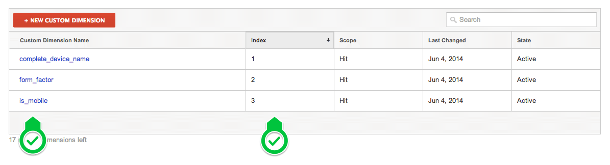
Admin section. (Large preview)Analyzing The Data In Google Analytics
Now that the data is in Google Analytics, we need to make it available for inspection. We can use custom variables in Analytics in a number of ways, the most obvious being to look in the menu on the left and click Audience → Custom → Custom Variables:
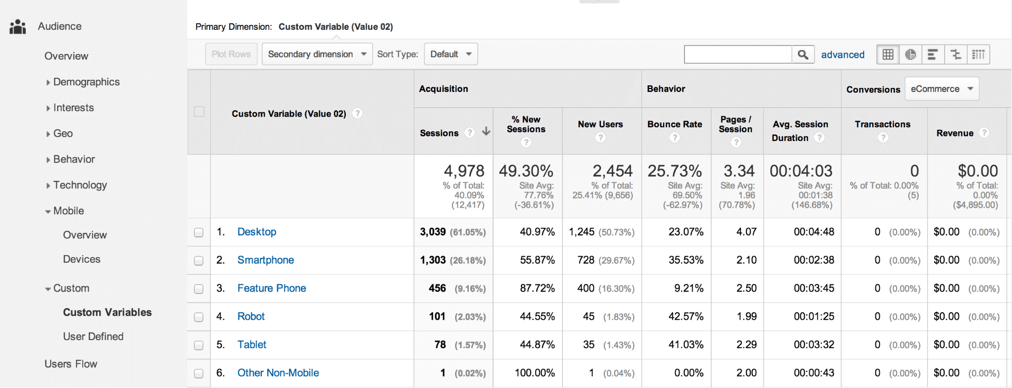
If you are are using Universal Analytics, you’ll have the custom dimensions available as any other dimension in all reports in GA:
Already, we’re getting a pretty good picture of how form factors behave differently. The best metrics to focus on will obviously depend on your website, but in general, pay attention to bounce rate and pages per visit.
Big Picture With Dashboard Widgets
With dashboards in Google Analytics, we get a high-level overview of the most important metrics. This is a good place to monitor how your website performs across form factors. Once again, bounce rate and page impressions per visit are good metrics to start with. The purpose of the dashboard widgets is to alert you and to visualize how your website’s performance changes for certain form factors.
Let’s create a few widgets to display the status of different form factors. First, create a pie-chart widget that shows how much your website is being used by different form factors.
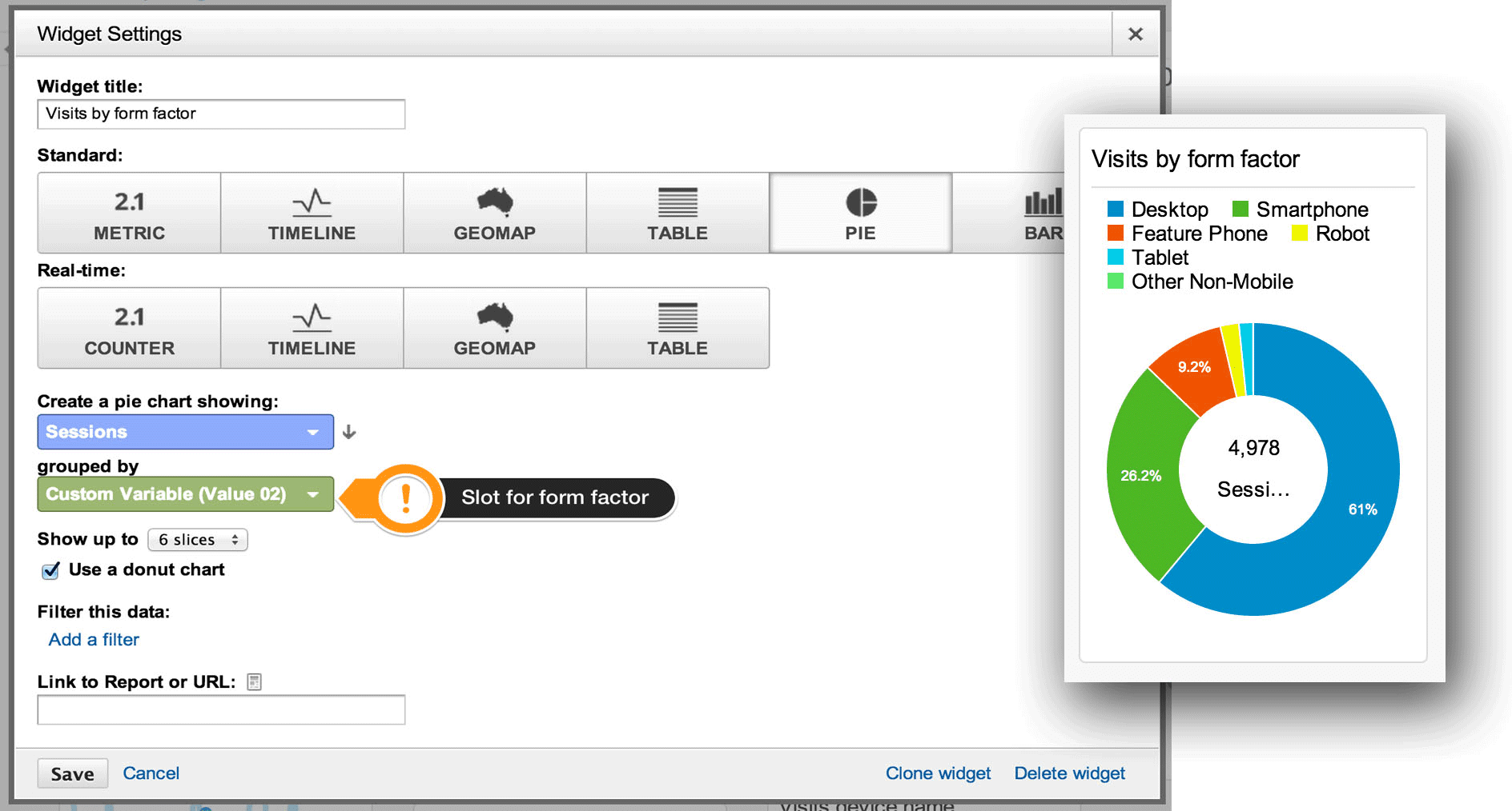
In the Dashboard, click Add Widget, select Pie, then the Sessions metric, and group it by the form factor custom variable. Note that the label in the green drop-down list is Custom Variables, not the actual name. In our example, the form factor variable is in the second slot, but make sure to choose the right slot if you’ve implemented it in a different order. Again, if you have converted to Universal analytics, the procedure is similar, but in stead of selecting custom variables, you simply add the name of your custom dimension as you would with any other dimension.
Next, create a few widgets to display visits and bounce rates per form factor. The widgets will indicate whether changes to the website have had a positive or negative impact. Obviously, you want higher visits and a lower bounce rate.
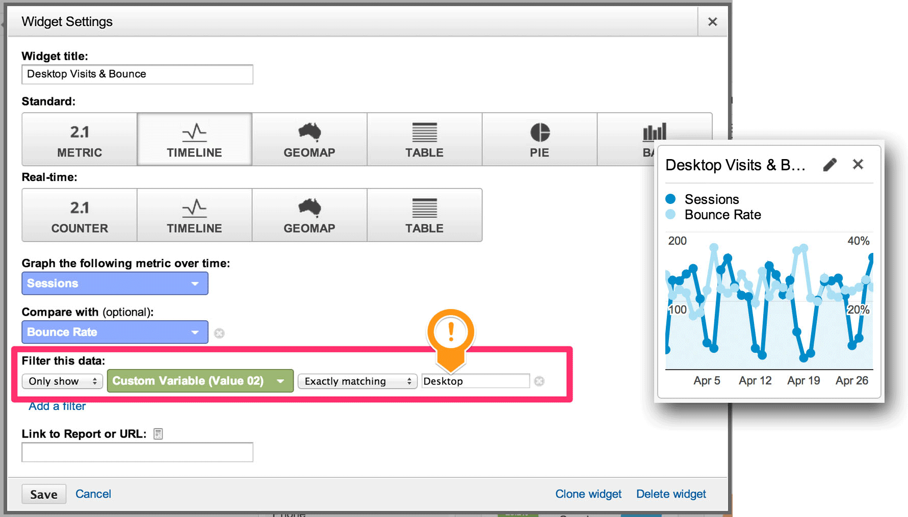
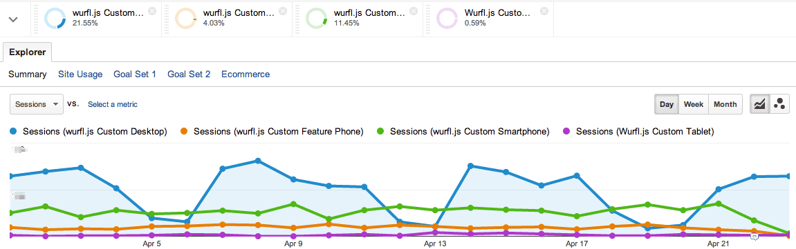
Create this widget by adding a filter to the standard metrics. Choose a timeline diagram and filter the data with your custom variable where you have stored the form factor. Create one widget for each of the form factors that you want to monitor:
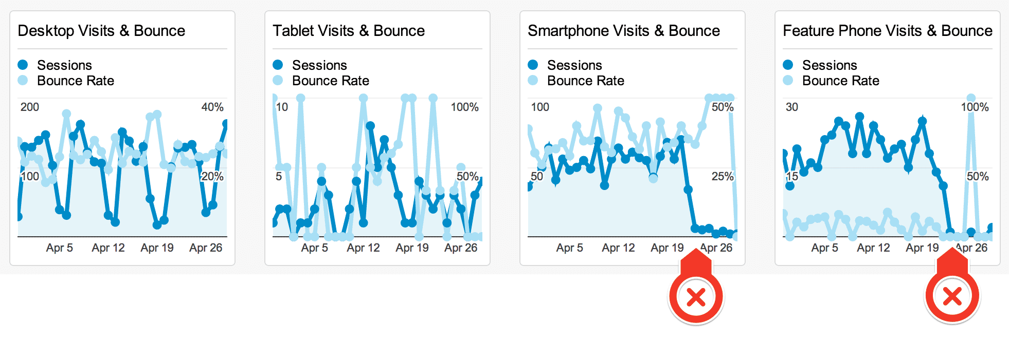
You might find that some form factors disappear in the statistics for global bounce rates because the data set is now bigger (as in the example above). As indicated by the red arrows, something dramatic has happened with smartphones and feature phones. Specifically, some changes were made to the landing page to increase traffic from tablets, and the changes clearly had a negative impact on traffic from smartphones and feature phones. Identifying the reason for the drop in traffic requires more fine-grained Analytics reports, and the drop might not have been easy to spot without having monitored form factors.
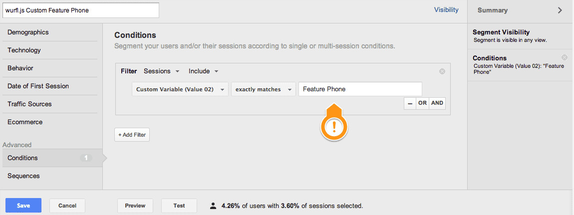
Form Factor Segments
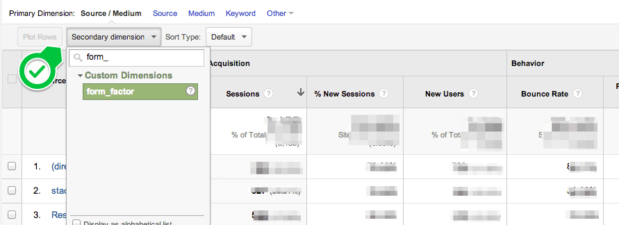
Any custom variable that you put into Google Analytics is, of course, available in most reports as filters or dimensions, so tweaking them to your needs is quite easy. Another way to keep form factors at the top of mind is to put them in segments by creating conditions. Here is one segment per form factor that you’ll want to track:
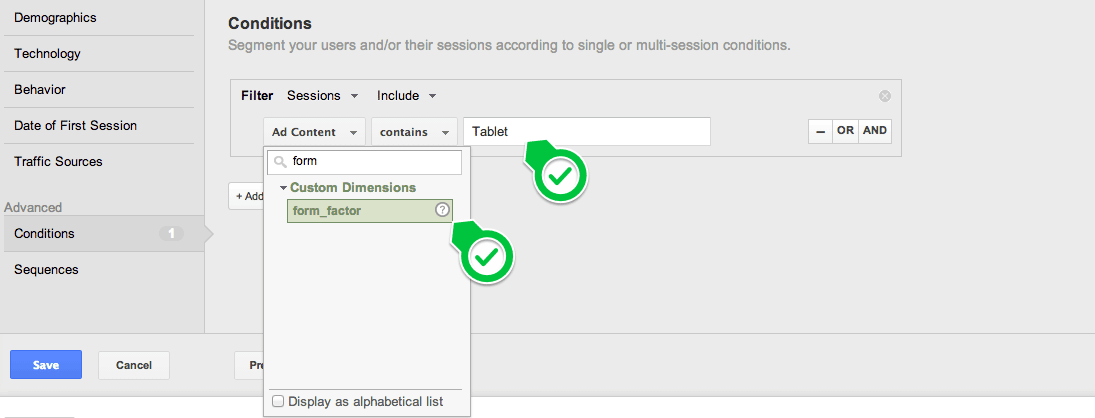
The same, but in Universal Analytics:
Google Analytics will show these segments in most of its standard reports as separate dimensions in charts and tables:
You can make “form factor” a dimension in most reports. As mentioned, bounce rate and general engagement are key metrics to follow, but goals and conversion rate are obviously interesting, too. You might find the need to create new goals or at least review your funnel for certain form factors.
After monitoring form factors for a while, you might conclude that you need to offer different user experiences for one or more form factors. Furthermore, you might need to tweak goals, funnels and advertising campaigns to account for differences in usage per form factor or device type.
We have used Google Analytics here, but WURFL.js is, of course, compatible with other analytics tools, as long as custom variables like the ones above are allowed.
Conclusion
In this article, we have looked at how performance per form factor is a key metric for monitoring a website and how WURFL.js and Google Analytics help to visualize this data. Once you put WURFL.js’ data into Analytics, it will be available in most standard reports as filters or dimensions, so tweaking the reports to your needs is quite straightforward. And the dashboard widgets will give you a high-level overview of their status. Also, bounce rate and page impressions per visit are key metrics, at least to start; so, defining form factors as segments will give you nice visualizations in most standard reports.
As a next step, look into conversions and goals in Google Analytics to see how to integrate and monitor form factors, which will vary according to the website’s function and purpose. To give you a head start, we have made a template that you can install in your Google Analytics dashboard (This template uses custom variables, not custom dimensions). Just follow the instructions to assign an Analytics property, which will then appear under Dashboards → Private.
Further Reading
- A Guide To Google Analytics And Useful Tools
- Keep Your Analytics Data Safe And Clean
- Enabling Multiscreen Tracking With Google Analytics
- How To Use Analytics To Build A Smarter Mobile Website
 (al, ml, il, mrn)

