Designing Badges (And More) For A Conference

Email Newsletter
Weekly tips on front-end & UX.
Trusted by 182,000+ folks.


 Custom Web Forms for Angular, React, & Vue. Your backend.

 Celebrating 10 million developers
To badge or not to badge? That is the question. Because badges — and a lot of stuff designed for conferences — often look the same. But if you have a little, different conference, you need different kinds of things. Badges included.
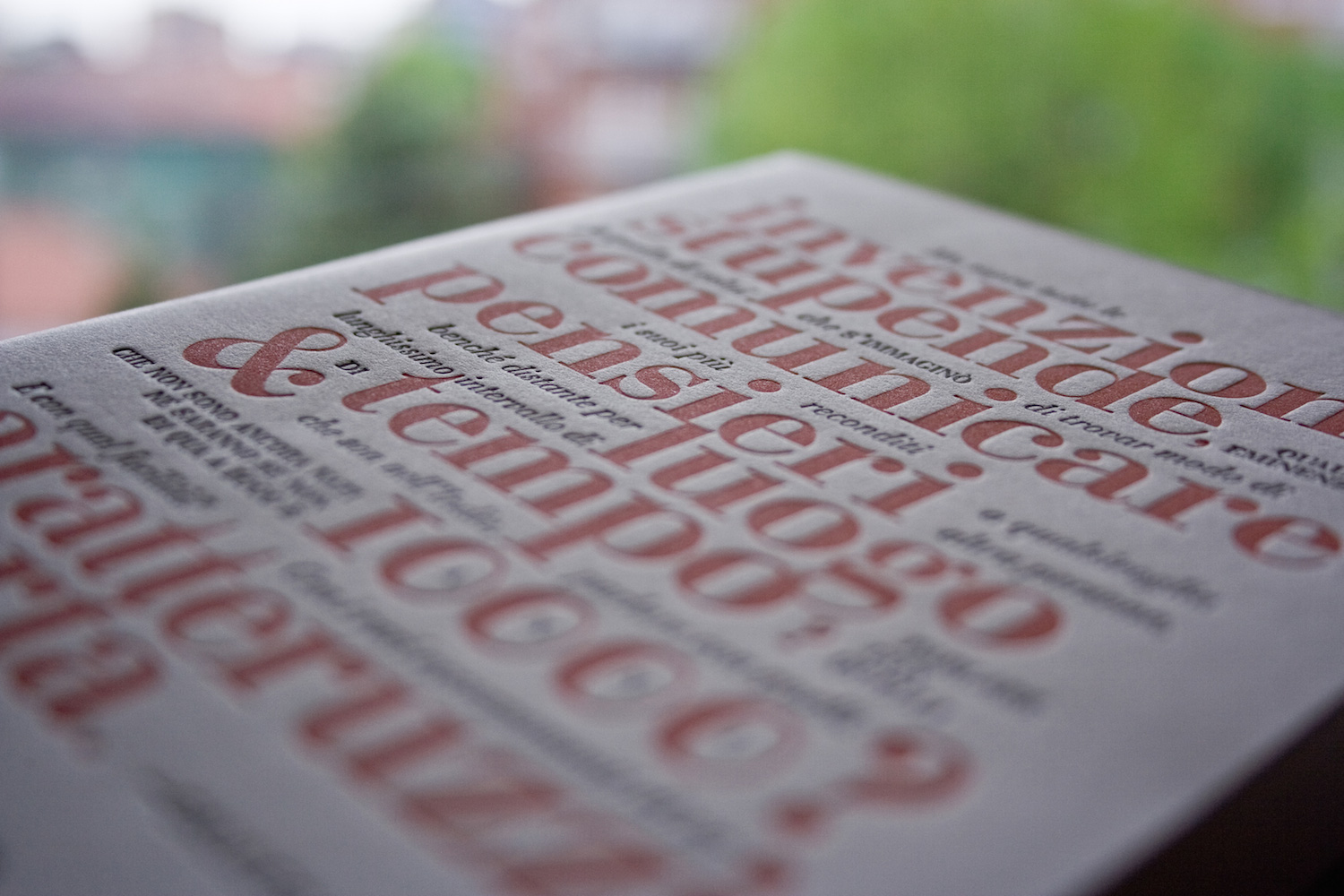
It all started in 2013 with the first Kerning conference. I was asked to design the official notebook: we ended up with a really typographic design for the cover and a funny pattern on the back. And an Easter egg on the cover — more on that later. It was a really funny project, so when my dear friend Cristiano Rastelli, a member of Kerning’s organizing committee, asked me to design the notebook and some printed materials for Kerning 2014 I immediately said “Yes, let’s start!”
Kerning’s Calling
I’m really passionate about letterpress, so there was no doubt about the notebook: letterpress printing again. But what about the cover? After the first really typographical design in 2013, I wanted to make some changes. I love to draw with pencil on paper and I love caricatures, too. I had drawn a lot of them over the past few years, so with all the photos of the speakers on Kerning’s website I decided to go that way: the cover would be full of caricatures.
I had to decide how to draw them. When you use letterpress printing, costs can rise very quickly if you use a lot of colors. Each color is printed separately, so you have to take into account the budget from the very first second. As we had in 2013, we decided to use only the two official colors of the conference: black and red (Pantone 7417, to be precise). This was an important element because I also had to design other printed stuff too: badges for speakers, organizers, attendees and workshops. Oh, and some postcards too. This stuff had to be printed in digital offset, so we could use a lot of colors if we wanted; but since we had already set the boundaries with letterpress, both for style and colors, we decided to go the same way.
The Idea Behind The Notebook And Badges
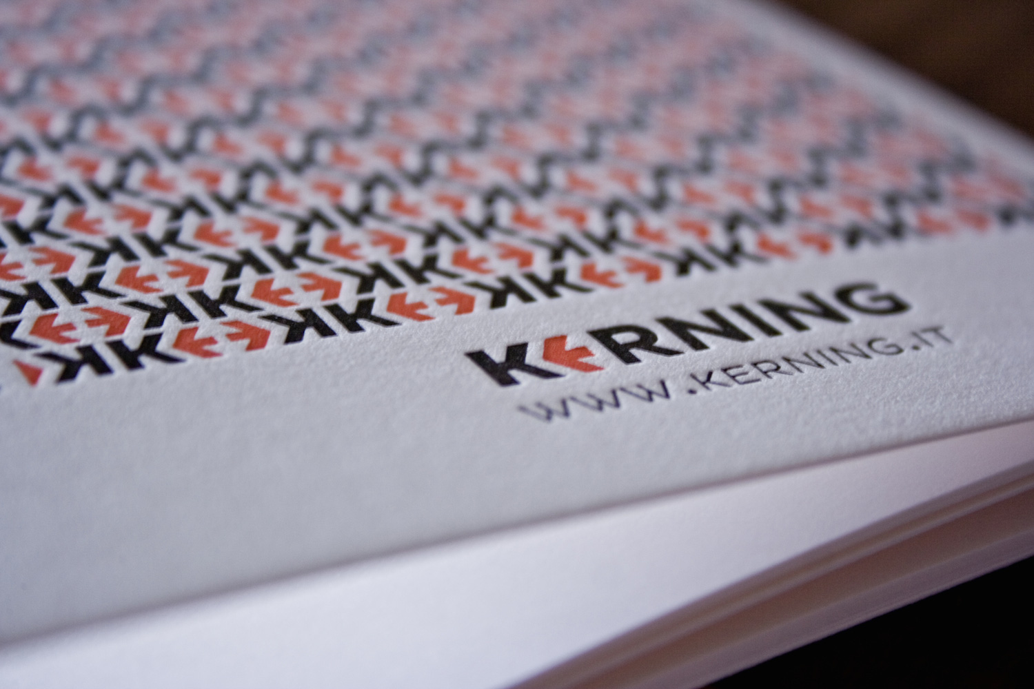
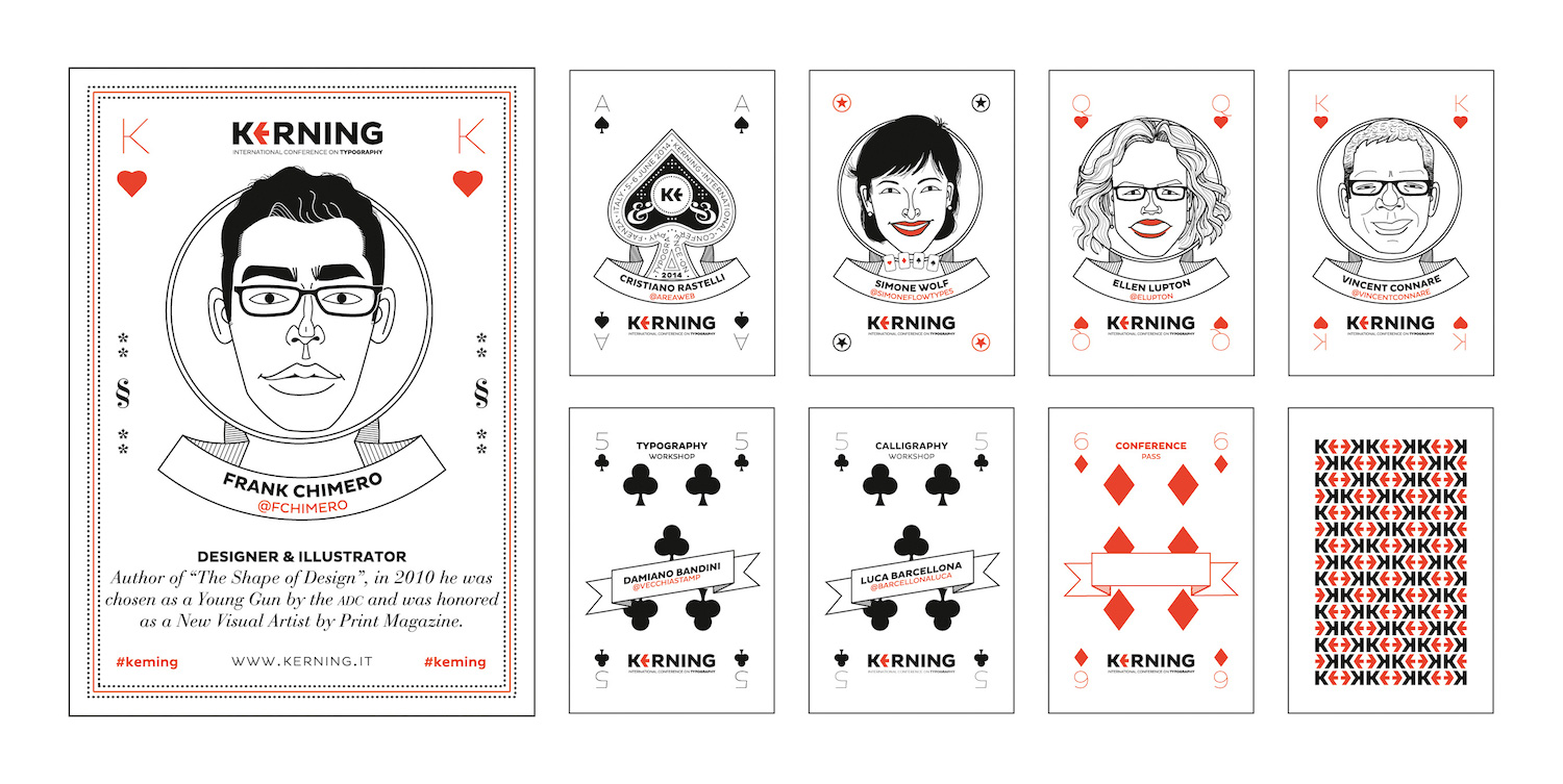
Caricatures and two colors: that was OK, but how to match the design of the notebook and the badges? They had to be part of the same project and convey the same mood. The idea came from the back cover of the notebook: I had decided to use the same pattern from 2013, to establish some continuity. Looking at the pattern, I realized that it reminded me of playing cards. Not the face side obviously, but the back.
So why not design the badges like playing cards? I had to design several different kinds of badges: those for workshops (leaders and attendees) plus those for the conference day: speakers, organizers, and attendees. And a badge for the conference host, too. With an idea for the design, I then needed to undertake some research about playing cards.
The Importance Of Research
I did some research online, reading and viewing some really interesting websites about playing cards. Some playing cards have great drawings and are really complex, too. There are a lot of different styles, but what I needed was a more simple approach, suitable for both digital offset and letterpress. I identified the cards I had to design: kings for male speakers, queens for female speakers, a joker for the host, the ace of spades for organizers, as well as five and six for attendees and workshop presenters (in fact, the conference took place on June 5–6, 2014).
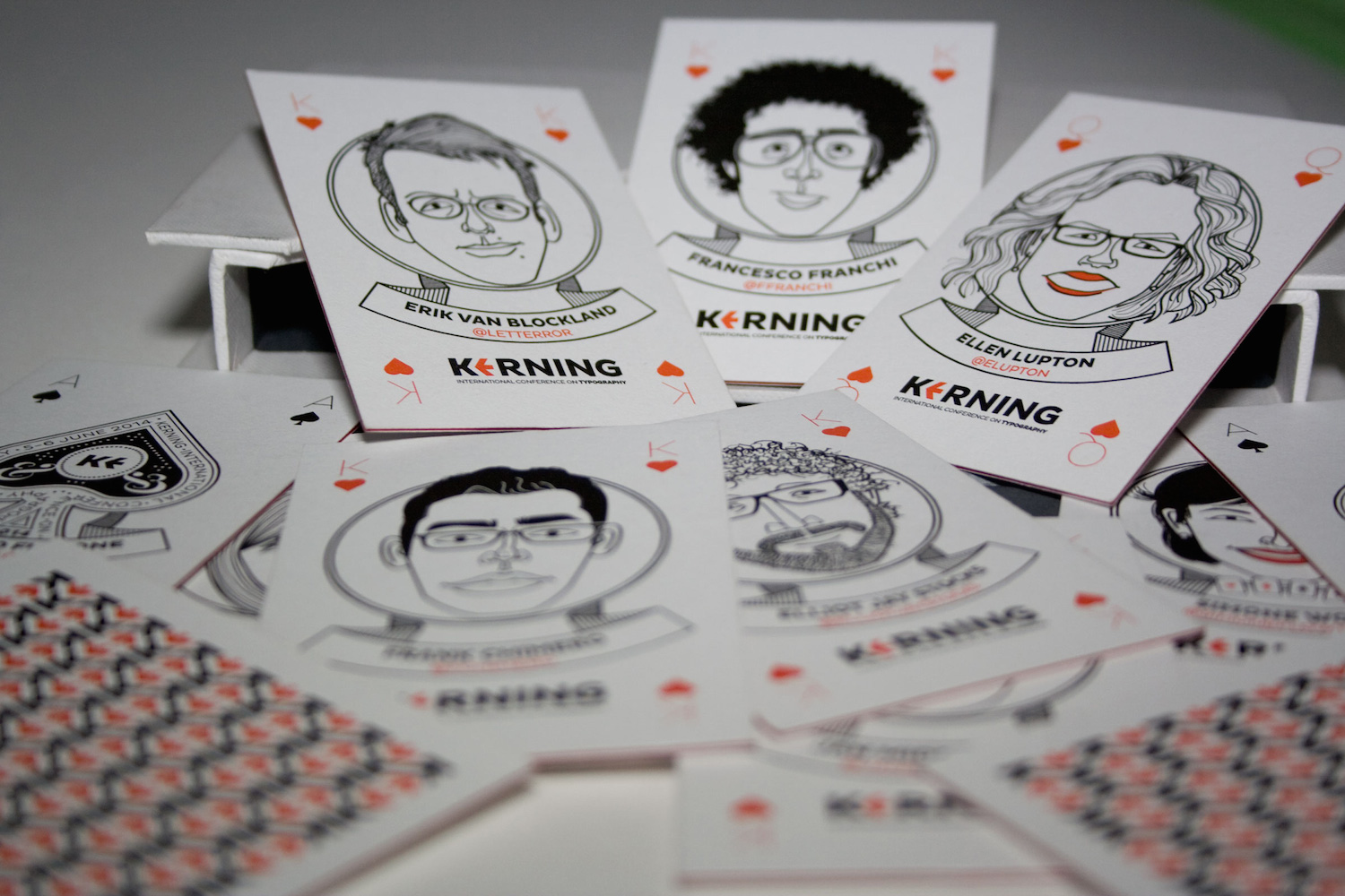
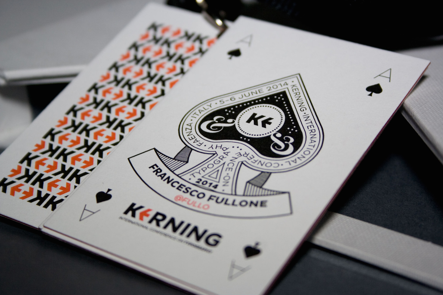
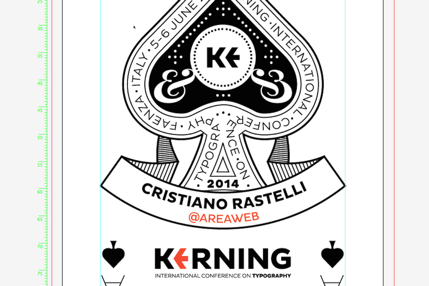
The kings, queens and the joker would be simpler than the usual version we’re used to seeing on playing cards, but since I really love details — even the smallest ones — I found the right card for these small, crazy things: the ace of spades. Aces of spades are always full of details, beautifully designed and so it had to be the one for Kerning. But a typographical ace of spades, since the conference is about typography.
Even though my research didn’t result in a striking new idea, it gave me a foundation. Often I find that research can either confirm the idea I already have or make me change it totally. Research helps me to find a good approach. Even if I design a completely new thing, my decision is based on what I’ve just seen. It’s not just a matter of style or taste or something like that: with research and analysis I have something strong to base my project on.
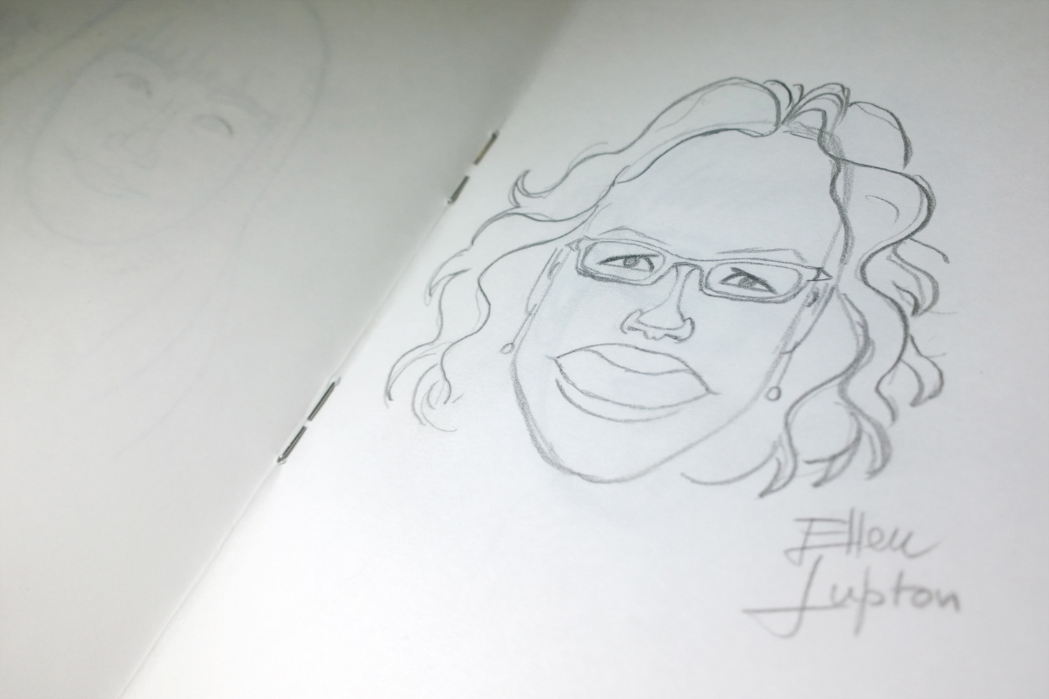
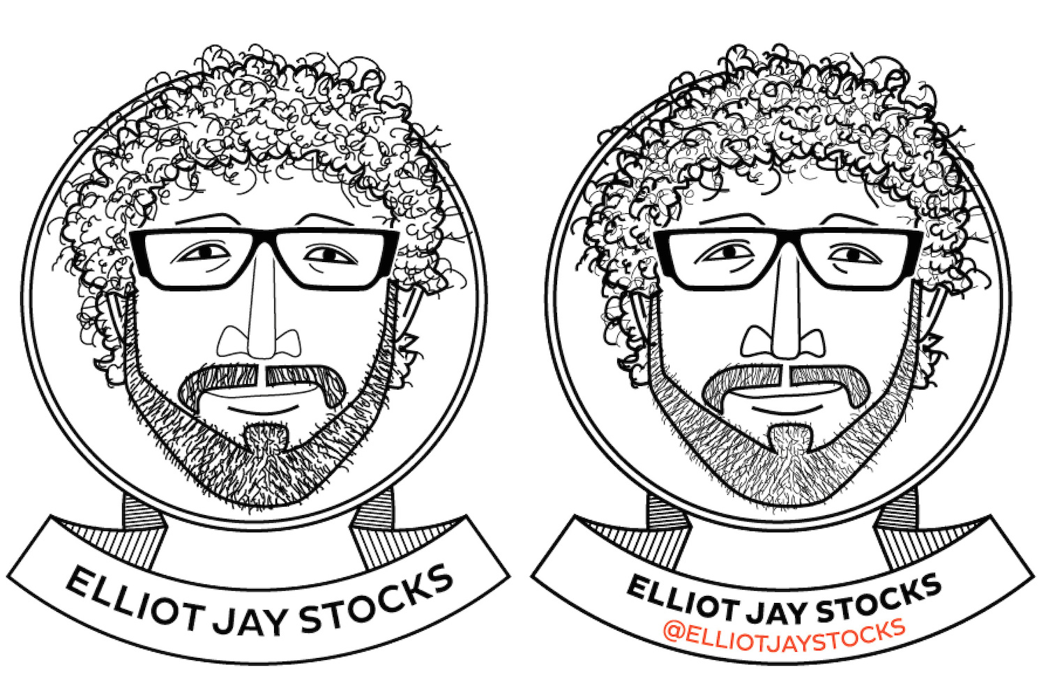
Research for illustrations of caricatures is very important, because the more pictures you collect the more details you can draw. There were some pictures of the speakers on Kerning’s website, but I looked online for more references. After having collected some more photos, I was ready to start.
The Process
I always start with pencil on paper. Logos, illustrations, graphic projects, it doesn’t matter — pencil and paper give me a lot of freedom. If you start drawing in Illustrator or other software, you are bound by the limits and style of that software. And when you start sketching the basic concepts, you have to be free to experiment.
There’s no way to be influenced by some marvellous feature or effect: black on white only. Freedom is fine, but I always take into account the boundaries of the project: in this case, just two colors and a really flat mood because of letterpress. Drawing some sketches and then developing a quite finished design only using pencil allowed me to concentrate on the most important things.
That said, I really love colors too, even if I’m not so good at painting with water colors or in oils. I really love flat design, so I like to draw with Illustrator. And Illustrator is the software I usually use for tracing drawings. So once my illustrations with pencil on paper are complete, I scan them to start the tracing job. I decided to draw only the caricatures by hand, making all the other graphic elements directly in Illustrator. There was an official font to use — Pluto Sans by HvD Fonts — and other things were really basic, so no need to draw them with pencil.
Sketching Is A Game Of Trial And Error
These first caricatures were really simple in style. I had tried to be as simple as possible to have something that was fine for letterpress. The eyes were just small dots and other elements were really simple. Unfortunately, I didn’t like the final result. I couldn’t — and didn’t want to — draw realistic caricatures, but what I had drawn was just too basic. I scanned the drawings and I tried to trace one or two of them, just to understand if I could make some changes directly in Illustrator: no way.
Since tracing your drawings in Illustrator is quite a time-consuming job, I decided to start again from scratch with pencil and paper. There was not much time left before having to print everything, but I decided to start again anyway, since this was the best option to achieve exactly the final result I had in mind.
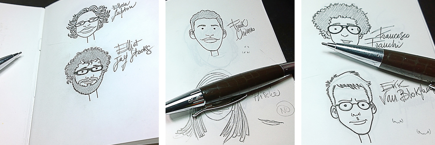

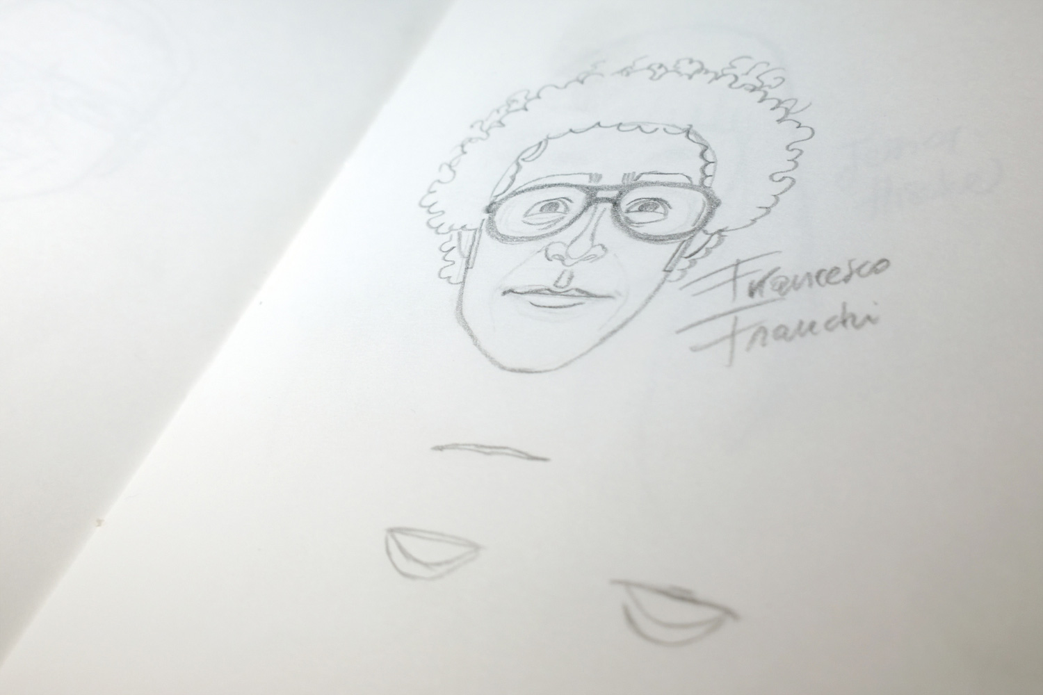
The second attempt was better: more detailed caricatures — not naturalistic, but something that was good for both letterpress and digital offset printing. I scanned all the caricatures again, and started tracing them in Illustrator with the pen tool. As you know, I really like pencil, so I really like using a graphics tablet and pen too. In fact, I use them every time I can, because it speeds up the process. I’m so used to it that sometimes I catch myself using a tablet with a word processor. I know, I know…
Tracing Sketches With Adobe Illustrator
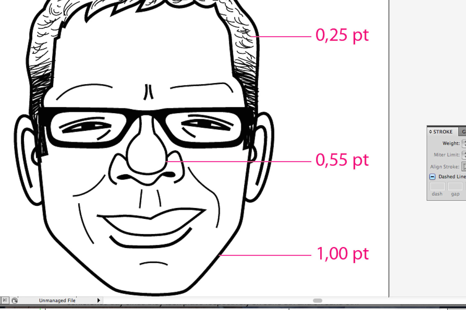
I usually use a very bright hue, like magenta or cyan, to be sure I can clearly see the lines against the black and white of the pencil drawings. I usually decide which weights I want to use for lines, especially if I draw illustrations with a few colors or only strokes with no fill. If I have a simple design style — a few colors, no complex shapes — I try to be as clean as I can. I think that “To complicate is easy. To simplify is difficult” by Bruno Munari is always good advice.
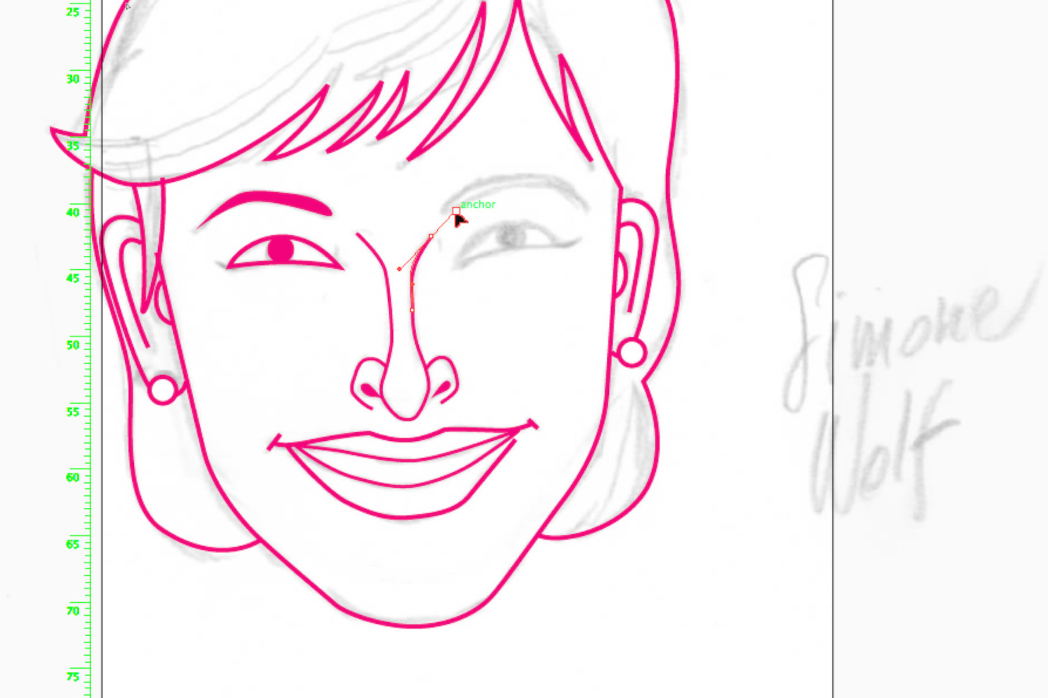
For these caricatures I went with these weights: 1pt for contour and very important lines, 0.25pt for subtle details and 0.75pt for everything in between. If you decide on line weight before you start working it’s easier to maintain a consistent mood in all your drawings. Establishing line hierarchy also helps with establishing hierarchy between elements. If something is important, give it some weight. If it’s less important, make it thinner.
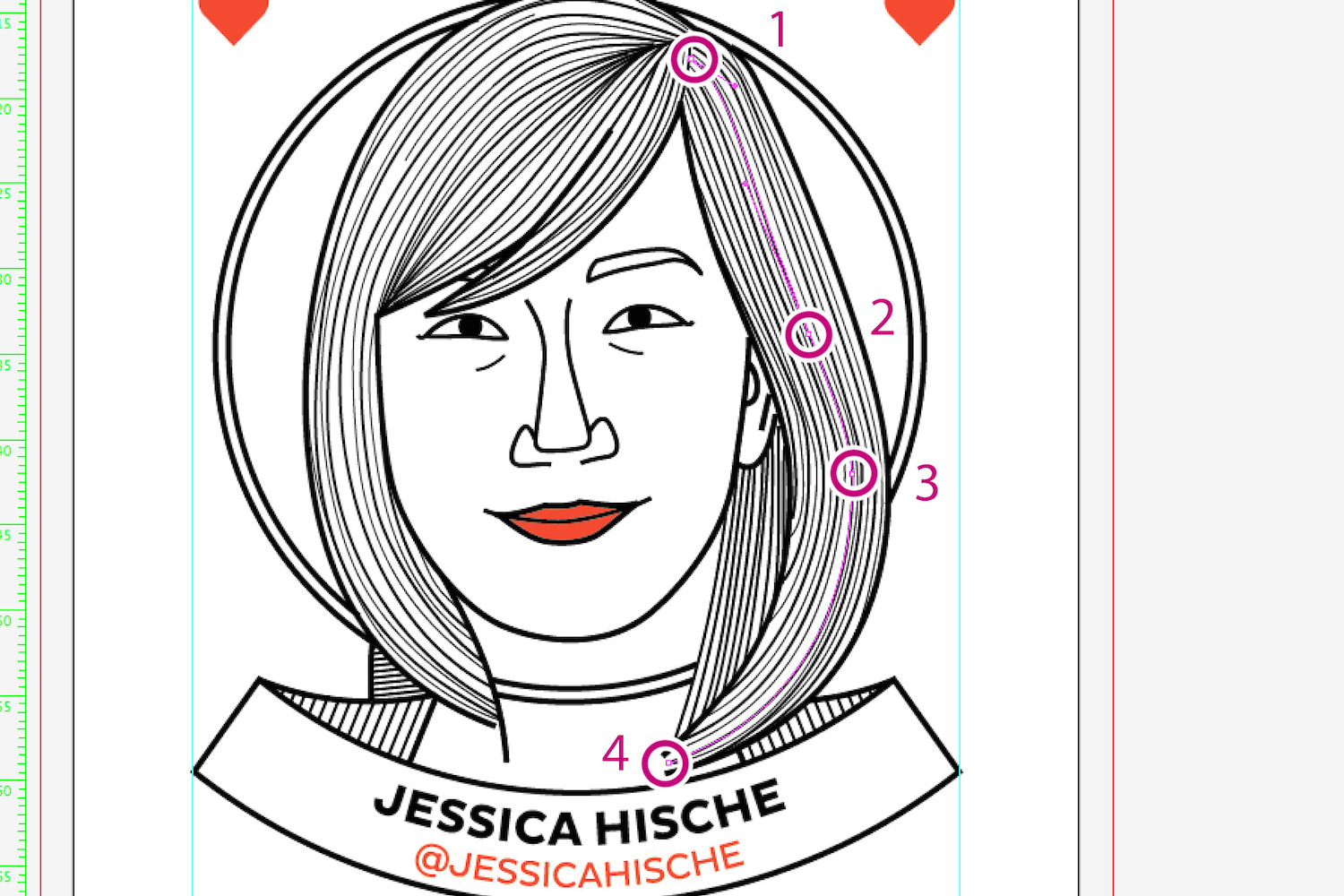
Tracing is a matter of time and patience. Graphics tablets can help you a lot, but I usually spend a lot of time tracing my drawings with as few control points as I can. Lines are smoother and if you are working on complex illustrations, the fewer control points you have, the better the result will be. And — last but not least — fewer control points are great if you have to change a shape: think about having to change ten control points instead of four if you want to change just one hair!
Let’s Finish The Design!
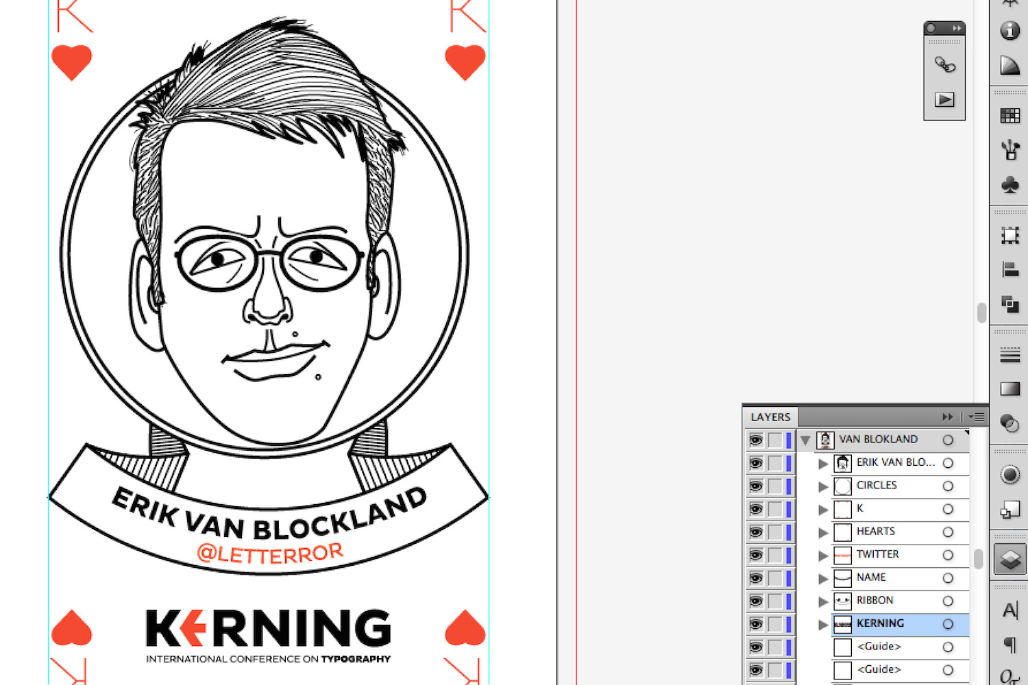
With all the caricatures traced, it was time to add the other elements: letters (K, Q and the star for the joker), the Kerning logo, and the person’s name and Twitter handle inside a ribbon. Not such a complex job, but there were badges for attendees, presenters, and organizers, too. I had just used hearts for speakers, so I decided to go with clubs and diamonds for workshops and conference. And for the organizers, the ace of spades.
Workshop and conference day cards were not so difficult: five of clubs was the badge for workshops — both for presenters and attendees — while six of diamonds was for the conference day, since they took place respectively on June 5 and June 6. These cards were very simple, so I won’t cover them here. But aces of spades are usually really complex and full of details. Because Kerning is a conference about typography, letters were the right way to add some details to the card. Since these were the organizers’ badges, I used the same ribbon with names and Twitter handles that I had already used for speakers’ badges.
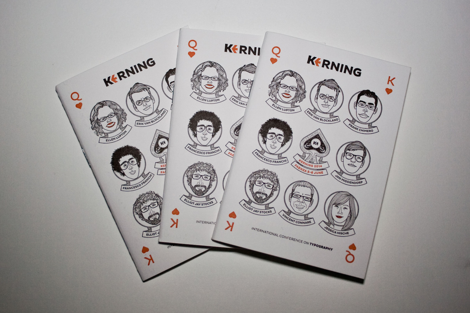
Once I had finished all the badges, I designed the postcards. These had the same layout as the badges but more space, so I decided to include a really short bio of the speakers. Last, but not least, Cristiano came up with a great idea: to design another type of postcard, displaying the official conference hashtag — #keming. We used two slab (red background), two serif (black background), and two sans serif fonts (white background); and two green cards with Comic Sans and Buttermilk (fonts respectively by Vincent Connare and Jessica Hische, both speakers at the conference), plus a calligraphic version by Luca Barcellona (workshop presenter).
Let’s Go Print!
So, everything was fine, but I had to check some more things before printing the notebooks. If you use really soft paper with letterpress — and we used a 100% cotton paper for the cover — you have to carefully consider what happens to thin lines and smaller details when printed under high pressure.
The small dots inside the black area of the ace of spades, for instance, could disappear when printed, because of the pressure and the amount of ink all around them. So I made them a little bit bigger for the letterpress version. The same is true when thin lines are really close to one another: the risk is to lose details and have a kind of colored spot. So I simplified the hair a little bit for letterpress.
In general, when you use letterpress with cotton or soft paper and high pressure, take care of this aspect: small and fine details are OK, but lines might be slightly modified by pressure.
Final Thoughts (That Is, Always Have Fun!)
What more to say about this project? It started with a letterpress notebook in 2013, and developed into something more organic in 2014. It was a really great project I enjoyed a lot. And what about a complete deck of cards? I’ve been dreaming about designing a deck of cards since forever. Perhaps sooner or later I’ll design one. Who knows? With a lot of letters, obviously.
Talking about letters, the Easter egg in the first edition of the Kerning notebook was the small caps words that created a phrase. A sentence inside a sentence. And that’s all!
Further Reading
- Smashing Conferences and Workshops
- How To Transform Conference Takeaways Into Real-Life Results
- How To Plan And Run A Great Conference Experience
- Taking A Closer Look At Tech Conferences


