How To Improve Your Email Workflow With Modular Design

Email Newsletter
Weekly tips on front-end & UX.
Trusted by 182,000+ folks.
 Register for Free

 Custom Web Forms for Angular, React, & Vue. Your backend.
 Celebrating 10 million developers

Whether you’re in a Fortune 500 company or part a two-person team launching your first web app, email is one of the most important tools for reaching your customer base. But with the ever-growing number of emails to send, getting them all out the door can seem a little overwhelming. By putting in place a solid email design workflow, you’ll be able to regularly ship engaging and mobile-friendly emails with ease.
Complexity Meets Adaptation
In addition to the increasing number of emails, the need for personalization and high quality and the introduction of responsive design have turned what was once a simple process of writing HTML and CSS in your favorite text editor into something seemingly more complex. A number of customizable templates, editors, tools and even full-fledged email frameworks have popped up to deal with this newfound complexity.
All of these new tools have their advantages, and many can be combined into a workflow that best fits you and your team. But even with a great set of new tools at your disposal, how do you structure your workflow to allow for continual iteration and quick turnaround?
Enter Modular Design
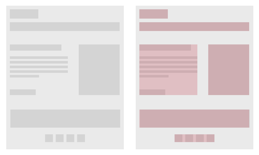
Modular design is the method of creating a system of self-contained components that can be stacked, rearranged and used or not used, case by case. The goal is to be able to easily change or adapt individual design patterns without altering the system as a whole. Adopting modular design and reusable patterns into your email design workflow can improve the quality and consistency of what you send, while speeding up your daily output.
Setting up a modular email design workflow involves three basic steps:
- Create the design system.
- Set up a reusable framework.
- Test and iterate on what you send.
Let’s look in depth at how we can accomplish each step in the process.
1. Create A Design System
The easiest way to streamline iteration is to break down each of your common design use cases into a system of self-contained components, each one a LEGO block, made up of content and media, that you can snap together into numerous configurations. Doing this will enable you to build a nearly infinite number of emails with ease.
Anticipate Use Cases
When designing your modular email system, the first step is to anticipate your use cases. Ask yourself what type of emails you typically send. Are they mostly transactional? Promotional? Informational? While all emails will likely have the same basic elements, such as a header and footer, a transactional email might need shipment information, ordering details, payment details, a contact section, and product upsells or similar products.
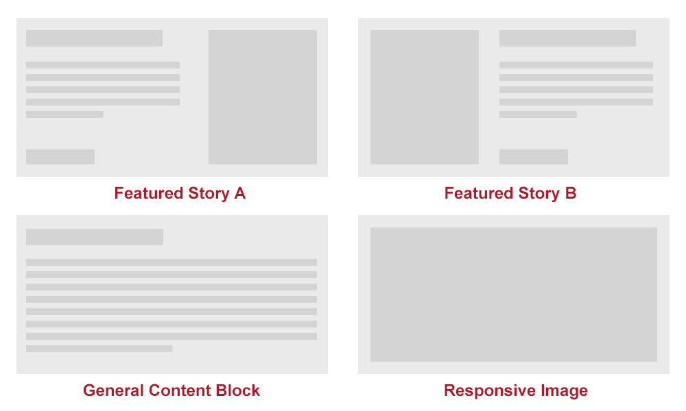
A newsletter might have simpler needs, such as introductory copy, a featured story, a hero image and secondary stories. Defining the content needs of the emails that you send will enable you to anticipate the common use cases that you’ll need to plan for along the way.
Design A Pattern Library
Once you determine common use cases, you can start to design individual components according to your needs. Whether you use Photoshop or jump right into the browser, remember to keep each component as self-contained as possible. Designing several variations of each use case might also be helpful.
Having several options for a “featured story” component, for instance, allows for flexibility and keeps things from getting stagnant over time. The patterns in your library will eventually become partials within your framework, easily referred to and called upon when needed.
Keep Your Pattern Library Up To Date
As new use cases arise, use your existing patterns as necessary. However, unexpected use cases will probably arise; one benefit of the modular system is that you need to design only a single component to address this situation. As you create and add patterns, make sure to keep the entire design system up to date and organized. Leaving components scattered or out of sync will make the system difficult to use. The easiest way to keep everything in sync is to turn your system into a framework.
2. Set Up A Framework
From here, incorporating your design patterns into an out-of-the-box templating system or framework is possible. And if you’re not interested in navigating the chaotic world of Outlook or Gmail, with all of their quirks, or if you need to get something out the door with minimal configuration, then options like Zurb’s Ink will do a lot of the heavy lifting for you.
But if you send a decent volume of email, then creating your own custom framework could lead to huge gains. By creating your own framework, you can add in time-saving custom helpers, keep the markup light and easy to work with, and even hook directly into your email service provider. Not to mention that you can create more customized layouts to complement all-in-one solutions. The long-term gains in quality and efficiency from setting up your own framework can be huge.
Build On Top Of A Static Website Generator
Adding features and tools such as Sass, YAML data and localization to your framework could also be beneficial. The easiest way to do this is by integrating your framework with a static website generator. The building blocks that are common to email and the web will enable you to repurpose almost any website generator for your email workflow.
Middleman is a great option and one that I’ve found ticks all of the major boxes:
- The structure of projects as layouts, partials and pages perfectly fits our mental model of modular email.
- Sass is already integrated. Sass is an amazing addition to any responsive email workflow. Common workarounds such as the one for Yahoo Mail’s attribute selector become an afterthought through the clever use of selector inheritance. Sass also provides powerful features such as variables, mixins and CSS minification to cut down on file size.
- YAML data and front matter allow you to fully separate content from design and loop through data for easy prototyping.
- If you’re sending to a large and diverse audience in multiple languages, then localization can dynamically generate that diverse set of data relatively painlessly.
- A myriad of hooks enable us to easily create custom helpers for email platform-specific needs.
- Middleman is Ruby-based, making it easily extensible.
Set Up A Boilerplate
Once you’ve chosen a static website generator that meets your needs, then it’s time to set up your base boilerplate. A boilerplate includes such things as a reset file, the CSS or Sass structure, an optional custom grid system and a base template.
Base Layout Template
A basic template will serve as your base layout structure and will allow global elements to be shared across all emails. Preheaders, headers and footers will usually stay consistent across emails. If this is the case with your designs, then you can safely build these into your layout’s template. The safer approach is either to build out and include these elements as partials or, if these elements will likely move or change in particular emails, to wrap the markup in conditional statements.
Your base email template should include at least the following:
DOCTYPEHTML5 is the friendliest for designing responsive emails. Remember that certain clients will either strip out or change yourDOCTYPE.headA lot is important to include here: meta tags for proper character encoding, title tags for anyone viewing the standalone version of your email in a browser, reset styles, embedded media query styles, any styles to be inlined and theviewportmeta tag to set the viewport’s width.bodyIn addition to the standardbodytag, wrap your entire email in a 100%-width table and cell structure, as shown below. The table with thebodyclass will act as thebody, thereby overcoming the drawback of certain clients removing thebodytag.yieldThis is from where all of your modules for individual emails will be pulled.
<!DOCTYPE html>
<html lang="en">

<head>
  <meta http-equiv="Content-Type" content="text/html; charset=utf-8" />
  <meta name="viewport" content="width=device-width">
  <title><%= data.page.title %></title>

  <%= inline_stylesheet 'template/inline' %>
  <%= stylesheet_link_tag 'template/mq' %>
</head>

<body>
  <table class="body">
    <tr>
      <td class="header" >
        [Header content]
      </td>
    </tr>
    <tr>
      <td class="main" >
        <%= yield %>
      </td>
    </tr>
    <tr>
      <td class="footer" >
        [Footer content]
      </td>
    </tr>
  </table>
</body>
</html>
Partials Based on Modules
Keep the markup of your individual design patterns inside of partials, to keep the design system truly modular. This will allow the markup for each module to be self-contained. Taking a modular approach with both your designs and your markup becomes truly powerful. Once it’s built, you should be able to move each design pattern around to different areas of the template without breaking the module, the template or any other modules surrounding it. When you’re setting up the framework, build out each module that you’ve planned for in this way.
Taking the use case from our last example, the modular markup for a featured story would look like this:
<table class="featured-story">
  <tr>
    <td class="col">
      <img src="#" alt="" />
    </td>
    <td class="col">
      <table>
        <tr>
          <td class="title">
            [Story Title]
          </td>
        </tr>
        <tr>
          <td class="abstract">
            [Story Abstract]
          </td>
        </tr>
        <tr>
          <td class="cta">
            <a href="#">CTA</a>
          </td>
        </tr>
      </table>
    </td>
  </tr>
</table>
Sass Structure
Following OOCSS or SMACSS will maintain the modularity of your Sass. In general, keep your styles as modular as possible, just like your designs and markup.
One caveat when writing CSS or Sass in an email framework is that all media query-based styles must begin with an attribute selector (such as td[class=example]{}) in order to avoid rendering issues in Yahoo Mail. An easy workaround is Sass’ ability to nest styles. Nesting all media queries in a single attribute-based selector will prevent them from being applied to each individual style. Writing your Sass in this way will increase both readability and speed while maintaining visual consistency across clients.
Following this method, the basic media queries for optimizing the template and content area above for mobile would be this:
td[class=body] {
  @media only screen and (max-width: 600px) {
    .col {
      display: block;
      width: 100%;
    }
    .title {
      font-size: 22px !important;
    }
    .abstract {
      font-size: 16px !important;
    }
    .cta a {
      display: block;
      width: 100%;
    }
  }
}
Put It All Together
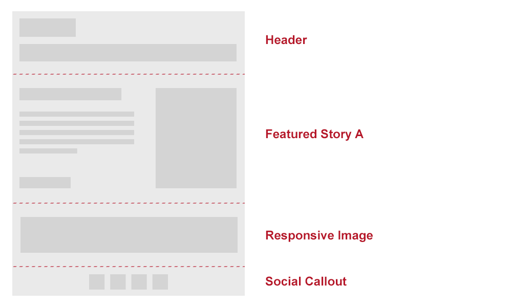
With a base framework and modular design patterns in place, it’s now time to snap all of the LEGO blocks together. Create a page for each email that you’re building for your framework. This page should be wrapped with your base template and should call any modular patterns that you need.
---
title: Example Email
layout: template
---
<%= partial "featured-story" %>
<%= partial "responsive-image" %>
<%= partial "social-callout" %>
Automate Common Tasks
One of the greatest efficiencies you can gain in your workflow is to automate frequent tasks. This typically means inlining CSS, optimizing images, sending tests, and integrating templates and modules with your email service provider. Most common tasks can be easily integrated with Rake tasks, Ruby Gems and/or Grunt.
CSS Inlining
The safest method is to inline styles whenever possible because certain email clients strip out styles from the head of documents. If you’re used to the common web workflow of writing styles in a separate sheet, then getting used to this will be hard. It can become a hindrance to modularity, and if you’re trying to use Sass to style, then this obviously becomes impossible to do manually.
Luckily, we have several options to automatically inline styles at build time. If you’re using a Ruby-based tempting engine, then the best option is to include the Premailer Gem in your project. Premailer automatically runs through your style sheet and inlines styles while preserving any existing styles when called. This is a huge time-saver, and it keeps markup manageable.
Testing
There are several ways to test how your email looks. The first stage in my process is to design and check the rendering in Chrome. Once the designs are completed, it’s time to jump into a more automated tool to check rendering across the board. Litmus is a web application, like BrowserStack but focused on delivering screenshots of your email across a wide variety of clients.
You can send your emails to Litmus in a variety of ways, but if you’re using Grunt in the framework, then the easiest way is by using Grunt-Litmus. Grunt-Litmus automates the process of getting tests to your account and lets you check rendering in clients of your choice.
module.exports = {
  test: {
    src: ['email.html'],
    options: {
      clients: ['android22', 'android4'...]
      username: "username",
      password: "password",
      url: "https://yourcompany.litmus.com"
    }
  }
};
Testing on real devices is another common approach, especially vital with things like CSS animation and embedded video. If you have a device lab set up with a common email address, an easy way to trigger an email delivery directly from your framework is to use the Ruby Mail Gem.
Hook Into Your Email Service Provider
If you’re using an email platform that provides access (such as ExactTarget or MailChimp), then you can set up your project to hook directly into the API and push your template along with individual modules into the system on command. Doing this allows you to build locally in the framework, keeping everything modular and under source control, and still push to your email service provider quickly and easily as you iterate. How you hook into your provider will obviously vary by platform, but definitely keep this in mind when setting up a modular framework.
3. Iterate On Your Designs
The periodical nature of email lends itself well to design iteration. If you’re sending emails daily or weekly, then you have ample room to A/B test your design decisions. No matter what workflow options you adopt, make sure to track important email metrics and use available data to improve your core design, remembering that a better experience is usually more important than any single data point.
Don’t reinvent the wheel every time you send an email; rather, make continual incremental changes as warranted by your metrics. The benefits of a modular design workflow should make these incremental changes fairly painless as you swap components in and out. The important thing is not to let your designs stagnate.
Conclusion
Incorporating a modular approach and a custom framework into your email workflow can lead to increased productivity and make it easier for you to iterate on your designs. You will have to make an initial investment of time to get everything up and running, but if you send a decent volume of email and can afford the initial investment, then the result will improve your designs, the customer experience and your engagement rates, leading to happier customers and increased revenue.
Links
- Ink, Zurb A framework for rapid development of responsive emails.
- “A Workflow for Responsive Emails Using Ink and Grunt,” Victor Garcia, Medium
- Middleman Email Template, DEG A Middleman project template customized for building emails.
- Middleman 3.0.x Project Template: HTML Email Boilerplate HAML, Danny Prose A Middleman template for HTML Email Boilerplate, converted to HAML.
Further Reading
- The Art And Science Of The Email Signature
- Email Is (Still) Important And Here Is Why
- Making Responsive HTML Email Coding Easy With MJML
- An Introduction To Building HTML Email For Web Developers
 (al, , il, ml, mrn)

