Creating Clickthrough Prototypes With Blueprint

Email Newsletter
Weekly tips on front-end & UX.
Trusted by 182,000+ folks.
 Claim Your Free Spot!
 Celebrating 10 million developers
 SurveyJS: White-Label Survey Solution for Your JS App
 Register Free Now
In a previous article, I discussed using POP to create sketch-based clickthrough prototypes in participatory design exercises. These prototypes capture well the flow and overall layout of early design alternatives.
The same piece briefly mentioned another category of clickthrough prototypes: widget-based mockups that are designed on the target device and that expand on sketches by introducing user interface (UI) details and increased visual fidelity. These prototypes can be used to pitch ideas to clients, document interactions and even test usability. In this article, I will teach you how to use the iPad app Blueprint to put together such prototypes in the form of concept demos, which help to manage a client’s expectations when you are aligning your visions of a product.
Given the software’s rich feature set, I will cover the most useful functionality that helps designers get up and running with the tool. To make the exercise more realistic, I will reuse the earlier POP scenario. A link to the Blueprint work file is shared in the “Resources” section at the bottom. An exciting exploration lies ahead of us, so let’s jump right in!
Where Do Concept Prototypes Fit In The Design Process?
Clients As Knowledge Ambassadors
Stakeholders and user experience designers (UXers) come to participatory design meetings with experience from other projects, research knowledge and background information. Many clients bring a fresh perspective by offering specific ideas, but some need extra help from designers to translate business requirements into usable experiences. To do so, designers need to learn about the client’s domain. This is where stakeholders’ expertise becomes an invaluable resource for clarifying problematic aspects of the product.
Stakeholders will also gain insight into the design process and will feel that their voices are being heard. Regardless of their level of enthusiasm or participation, however, many will be ill-equipped to understand the activity’s outcomes: How many times have you been met with blank stares when explaining flow diagrams and UI layouts?
Don’t Just Explain: Tell A Story
To more clearly communicate the design direction of a project, you must revisit the communication from the perspective of a stakeholder: UXers must show how a concept will solve users’ problems and how it will do so by distinguishing itself from the competition through unique selling points. Storytelling, a very inclusive activity, welcomes the audience to the experience intended for end users.
One approach is to use widget-based clickthrough prototypes to show off various user scenarios in a story: The interactivity of the design concepts paint a picture of the envisioned product. You can reinforce the narrative with highly polished prototypes, but their visual fidelity should be driven by the motivation of your audience and the goals of the project. Just as storytellers did around campfires, use visual aids: Present the prototypes on the target device for greater impact. The demo might be interrupted by feedback from stakeholders, but remember that you are there to present a vision, not a complete product, so unsolicited input won’t affect the throwaway concept.
Building Concept Prototypes
Underlying Consideration
Personal experience has shown me that prototyping several key concept scenarios, which takes 45 minutes to 1 hour to walk through, leave the most lasting memory. If your delivery is longer, the audience will get uneasy. Show off a single flow with high interactivity or several more linear flows, but be cognizant of what you want to accomplish with the demo: Sometimes it is to sell the work, and other times to guide the team to the next design step.
Because concept prototypes communicate design vision, they must be of high fidelity. The fidelity, however, could become distracting: Stakeholders might grab onto less important details, such as a button’s color, rather than pay attention to the overall design. Avoid this situation by clearly setting their expectations for the demo up front: This is not a design critique. Rather, you are there to present a vision of the product. This will help to get agreement on the direction before you move to a large-scale evolutionary prototype as the final deliverable.
Designing Directly On The Device
Building concept designs directly on the target device has many benefits:
- simulates UX of target device (for example, the platform’s input methods and the OS’ metaphors);
- prototype is usable in different environments;
- facilitates audience involvement;
- easy to reproduce demo on external computers (wireless mirroring, wired video duplication, etc.);
- easier access to visual assets (Dropbox, device’s photo gallery, etc.).
But it also has some inherent limitations:
- Creating large widget-based clickthrough prototypes is not cost-effective.
- Screen covers and enclosures can affect screen sensitivity.
- A stylus is needed to avoid the fat-finger problem.
- Neck and back fatigue can set in (leverage a stand to help).
- Light reflection could also be a problem.
How Blueprint Fits In The Picture
Blueprint, a $20 app by groosoft, enables you to create iPhone and iPad clickthrough prototypes on an iPad. The tool’s quality is best illustrated by building UIs with the ready-made widgets and the event model. The prototypes can be demoed in the application or via a free companion tool, Blueprint Viewer. There is also Blueprint Lite, but it limits the user to two projects and no external projects. Blueprint requires no user account because prototypes are distributed as a .blueprint file, a PDF specification or a series of PNG images. See the “Exploring the Export Options” section below for more.
Create The Project’s Container
You are assigned to create a mobile news website! After meeting the stakeholders, you put some initial ideas for pages on paper, including the portal, individual articles and other ideas. Having heard about Blueprint, this new prototyping tool, you want to give it a shot! I will guide you by covering its main functionality, which we will use to build an interactive prototype. For detailed coverage of its features, feel free to browse groosoft’s “Tutorials” section.
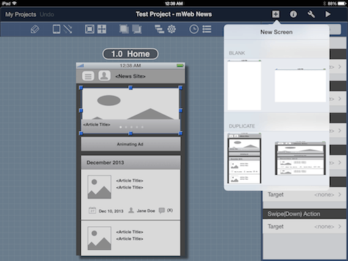
As with other design tools, you must store your project somewhere. To do this in Blueprint, you start by creating a project container first for all of your screens. In the “Home Screen,” tap the “+” (third icon in bottom toolbar). This will bring up a menu with two options (not shown here) to create a new project or duplicate an existing one. Duplicating an existing project is handy if you need to create different versions of the same project or to leverage assets in an existing prototype.
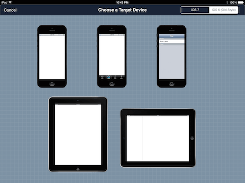
Your stakeholders have data from Google Analytics showing an iPhone user base of over 30%! Upon selecting “New Project,” you have to select an iPhone app, mobile website or iPad app in portrait and landscape orientation. Given the large iPhone population, let’s select the entry for mobile website!
The top-right tab toggles between prototyping for iOS 6 and 7. As a good practice, pick the latest version of iOS because the majority of users upgrade quickly. For our example, let’s pick iOS 6, which will enable you to play with the iOS Converter later (a $10 add-on that updates the look and feel of iOS 6 projects to match iOS 7).
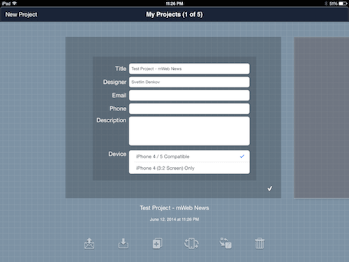
Once you select the target device, you will see the project’s first screen. Before we discuss it, let’s backtrack to the “Home Screen” for a second. Because you’re a designer, the quality of your deliverable speaks to your professionalism; therefore, you will need to provide details about the project. Tapping the “i” icon in the bottom-right corner reveals fields to capture the project’s title, a description, the author’s name and other information. It’s easy to forget to enter this data later on, so do this before you start to prototype. Tap the white checkmark to save.
Import An Existing Project
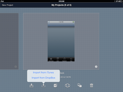
As a first time user, you have no reusable assets. However, a colleague who is experienced with Blueprint has offered to share their .blueprint files with you. To view these files, you will need to import them. Go to the “Home Screen” and tap on the second icon: You can import .blueprint files from iTunes or Dropbox.
You must grant Blueprint access to your Dropbox account for this method. More on this is shared in the “Exploring the Export Options” section near the end of this article. Once you’ve granted permission, you will find the folder containing your .blueprint files and, upon tapping a .blueprint file, it will be added to your list of projects. For more information on using Blueprint with iTunes, consult groosoft’s FAQ page. As long as your iOS mobile device is connected to the computer, you can drag a previously saved .blueprint file from the computer to Blueprint or to Blueprint Viewer in iTunes “Apps.”
Design Modes
You’re doing great! Let’s cover the design modes, which will help you to understand how Blueprint works. The app has two modes: the site map and the screen views. Both share functionality, including ways to center or view in full screen the workspace, to review the screen list and to take actions on items. You can toggle the views using the L13 icon in the “Local” toolbar (see the next section).
For most new projects, you will start in the screen view, with one working screen. At the screen level, you will be able to add widgets and cross-screen interactions. In contrast, the site map view enables you to organize screens spatially and to visualize the links (or paths) between screens in user flows.
Controls
Jumping to the screen design is easy, but a quick description of the controls will situate you in the application. Both views share the same toolbars, which have functionality specific to screens or their widgets. There are two of them: Global (named here “G”), which offers app-wide functionality, and Local (named “L”), which controls aspects of the current project. Throughout the prototype exercise, I will refer to entries from both toolbars. Notable entries in Global are “My Projects,” which returns you to “Home Screen” (G1), the self-explanatory “Add New Screen” (G3), and “Tools,” which contains help information and controls for on-screen guides (G5).

The second toolbar lists tools associated with editing (some are disabled in site map view). A few less commonly used but practical features are the “Pen Tool” for drawing custom shapes in widgets (L1), the “Clock” to show the history of recently edited screens (L10), and the “Device Toggle” to change between iPhone 4S and 5 shells (L12).

There is also the side panel, which is contextual. In the site map view, it shows screen links grouped by color (see the “Adding Interactivity” section below). In the screen view, the panel updates with two tabs, “Widgets” and “Accessories.” The first displays configurable iOS components in the “Controls,” “Tables,” “Bars” and “Views” areas. The second shows annotation components, which are handy for capturing problems and questions.
Additionally, the side panel changes its contents according to whether the user is focused on a screen (in site map view) or a widget (in screen view). Two new tabs are revealed, “Properties” and “Actions.” The first includes configurable options for the selected screen or widget, while the second allows you to modify interactions. More on this in later sections!

Using Images
Now that we have the project’s container, let’s create the individual screens and, lastly, layer on interactivity. Why do I say “create”? Are there no sketches from the earlier POP exercise? After meeting the stakeholders, you learn that you have additional time and so decide to improve the prototype by increasing its interactivity and visual fidelity (and not simply duplicate the POP sketches).
However, you can reuse the previously created images in Blueprint with a little trick. Paste the images into a background “View,” and layer transparent “Buttons” on top to link to other screens. This might be confusing now, but it will make sense when we build the first screen. Our prototype will have grayscale fidelity and (similar to POP) single-tap interactions. You can create colorful comp-like designs, and you are welcome to explore this as an exercise using the .blueprint file shared at the end of this article!
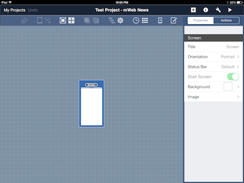
Setting Up Your First Screen
Web experiences in Blueprint come with an initial empty screen, with the generic name “Screen.” For the experience you are designing, you will see a starting visitor portal. To navigate screens more easily, you’ll need to update their names to be human-readable. While in the site map view, under “Properties,” tap on “Title” and enter “1.0 Home.” To match the experience you are targeting, set how the status bar should be displayed by selecting “Black,” “White” or “None.” The “Start Screen” option is disabled because we have only one screen, but with multiple screens you can redefine the starting point.
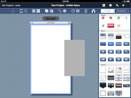
Populating The Screen With Widgets
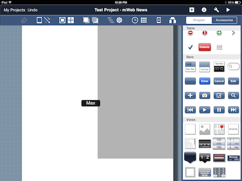
You now know enough about Blueprint to start prototyping the concept! Let’s add some widgets to the screen. Double-tap the screen to enter the screen view. Add a background (the first entry in the “Views” collection) as the container for what’s to follow. This will give you control over the background color for the experience! Double-tap the widget in the panel or drag and drop it, thereby adding it to the screen.
 A blue border highlights the container into which the widget is being dropped.
Don’t be confused by the updated side menu, which now shows the “Properties” and “Actions” tabs. What do I mean? We just dropped a “View” onto the “Screen.” You will notice that the side panel lists the options for “View,” then the options for “Screen.” This hierarchy helps when you’re deep-nesting widgets (for example, when building toolbars or list items).
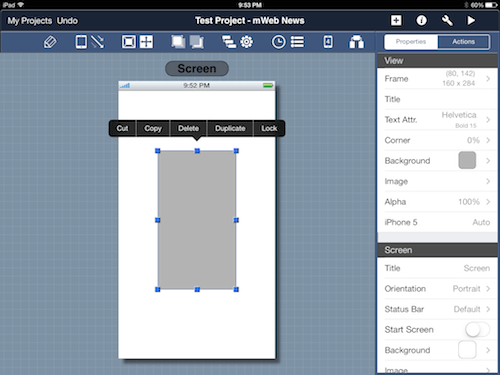
Once you’ve dropped the widget onto the screen, you’ll see blue-dot handles to resize the widget. Tapping the widget again shows a flyout menu, with the options “Cut,” “Copy,” “Delete,” “Duplicate” and “Lock.” Your client is demanding, so these little features (especially “Select Subwidgets”) will help you to tackle changes. The folks behind Blueprint offer a shortcut to this via the gear icon, L9. For increased productivity, you can toggle between the “Properties” and “Actions” views by retapping a widget or the “i” icon, G4.
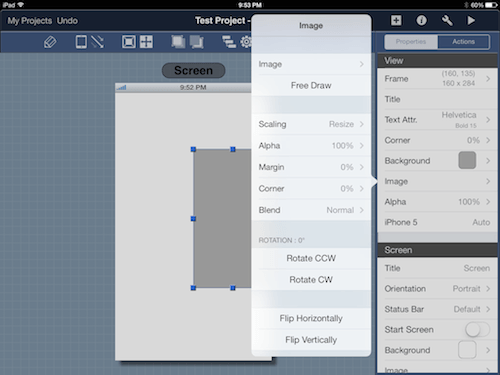
I’ll let you in on a little secret! Backgrounds come with a hidden extra: When you resize a background, all child widgets get resized accordingly, thus saving you even more time and keeping your client happy! Earlier, I hinted at reusing sketch captures if you are pressed for time. To do this, just pick “Images” under “Properties” in the side menu. “Camera Roll” is one of the options, giving you access to all images on the device.
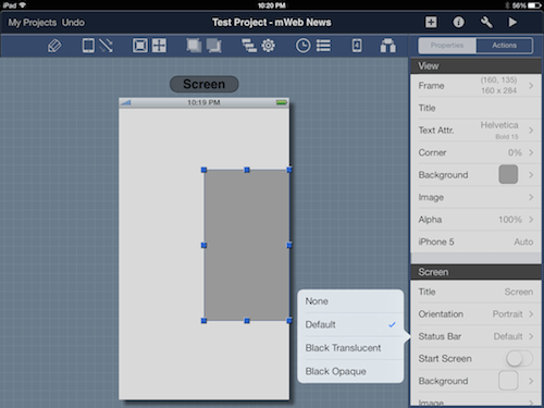
If you choose to show only the sketch on the screen, there is a way to hide the status bar. Turning it off is as easy as one, two, three: Go to “Properties” → “Screen” → “Status Bar” and voila! The sketch approach is limited because you are still locked to iOS’ resolution and aspect ratio. Use it wisely.
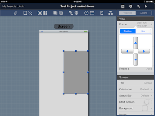
You’ve just added your first widget, and now you want to create the remaining assets. Hold your horses, partner! Let’s first talk about a big problem. When you add closely positioned widgets, accurate placement becomes harder. Many a time I have tried to resize a widget only to end up moving it! Therefore, use a stylus to avoid the fat-finger problem. For extra precision, try the “Position” and “Size” adjustments under “Frame.”
Pinching in and out of “1.0 Home” will zoom in and out of details, a helpful technique to align widgets. Maintaining your workspace is a must in Blueprint: You can fit the screen within the workspace area again via L4, and you can reveal more vertical space by entering full screen via L5 (then double-tapping the screen to exit).
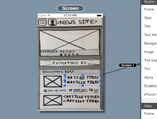
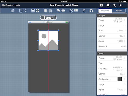
Awesome! You are fully armed to tackle the featured article’s hero space, the navigation toolbar and the month’s list of articles. First, change the color of the background to dark gray. Next — because we’ll want to show the client that rich imagery and meaningful titles will capture the visitor’s attention — drag an image widget, and resize it to fit the background widget, with gutter space of roughly 10 pixels. You can round the widget’s corners, or make it transparent if you are stacking layers of information. I will let you finish by adding the article’s title and the dot navigation. Refer to the .blueprint file for the completed widget!
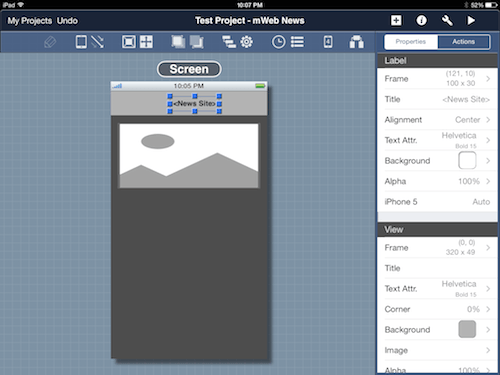
We anticipate a growing information architecture, so let’s select the side menu navigation pattern. To build the header toolbar that contains the hamburger toggle, drag another “View” and resize it to approximately 40 pixels in height. Then, drop a label widget on top of it for the title “News Site.” Next, add two text-free buttons with custom images. See whether you can figure out this part on your own. Here is a hint: Use the built-in icon libraries, and customize the images’ color to white!
After you’ve built the hero space and toolbar, you will want to move both of them at the same time via multi-selection. To add widgets with this method, tap and hold on the first widget and then, with another finger, tap on all following widgets. I recommend doing this with the tablet resting on a flat surface because you will need to use both hands. The tool has no alignment or distribution options — maybe in the next release!
The geek in me is tempted to cover the remaining steps here, but I will let you continue working on the project on your own. No fear! I am still here to guide you with best practices as you wrap up. For example, remember to duplicate reusable components, and expect to spent time building custom widgets. Blueprint offers many options, and you will keep finding useful functionality as you become comfortable with the tool (cool features are buried in submenus). Once you’ve dragged all widgets to the screen, you will end up on the final “1.0 Home” screen. Congratulations! You’ve just finished your first screen!
Maintaining Design Flexibility
You are ahead of schedule and want to finish the remaining screens, including the “Articles,” “Individual Article” and “Authors” views, but you notice that identifying a particular screen widget is hard. Blueprint nests widgets, and getting lost is easy if the widgets are of the same type. Before introducing any interaction and wowing your client, we should discuss features of the app that will make your design more flexible.
For example, the “Hierarchy” tool (L8) shows the nesting of a widget by using a top-down approach, with parent widgets shown on top. At each level, widgets are selectable and, when selected, are highlighted on the screen. You can also vary the depth of a widget via “Bring Forward” (L6) and “Send Backward” (L7). Lastly, it is worth reiterating L9, the gear icon and its “Select Subwidgets” option. This aids with copying multiple widgets without having to copy the parent. Phew, that was tiring!
Iterating Screens
Time is a wasting, and we don’t want to keep the client waiting. Let’s build the remaining screens already! Click the top “+” icon in the first toolbar (G3) to create a new screen or to duplicate the existing “1.0 Home” in either orientation. Unfortunately, Blueprint currently offer no master or template functionality. The duplication option will save you time because you won’t have to recreate the toolbar and background in other screens.
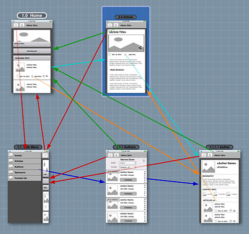
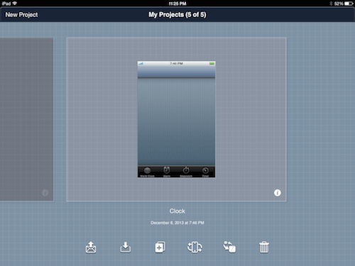
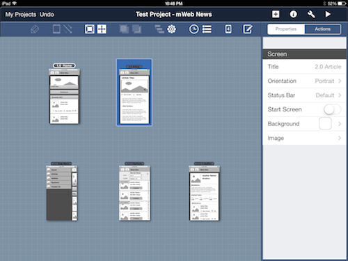
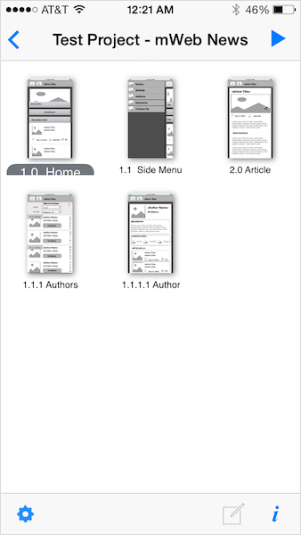
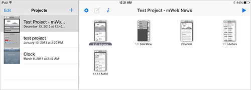
Designing clickthrough prototypes in Blueprint is iterative. You will complete one screen, then move on to the next, constantly switching between screen and site map view using the L13 icon. Upon finishing all screens, you will end up with a grid of thumbnails (as seen below) and with a sense of accomplishment for being closer to delivering a great presentation to the client. The screen’s layout may be modified to reflect the project’s flow(s). Making the design even more realistic is effortless: Toggle the device shell via the L2 icon for instantaneous results (in screen view only).
Adding Interactivity
The concept demo has many different paths and flows, so let’s add some interactivity. Key tasks include accessing an article from the home portal, accessing author information from anywhere on the website, and providing global access to the side menu navigation. With little time left, you decide to enable single-tapping with no transitions.
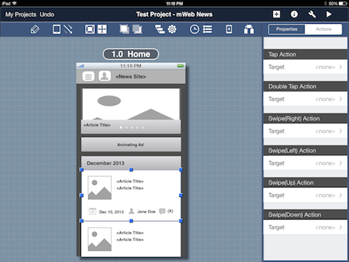
Double-tap “1.0 Home” to view all of its widgets. We want the user to be able to view an article’s details by tapping the list item. So, select the list item for the top article (a “View” widget). This will update the side menu to the “Properties” and “Actions” view. Select “Actions” and, under “Tap Action” (i.e. single-tap), tap on the target.

This will bring up a screen with a site map view of all screens and existing clickthrough links. The triggering list item is highlighted in yellow in “1.0 Home,” identifying where the tap comes from. Here, you can assign a target for the interaction by tapping on a different screen, by tapping “New Screen” in the top left of the title toolbar or, if you’ve changed your mind, by tapping the “No Target” option. Go ahead and tap on “2.0 Article”!
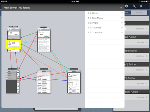
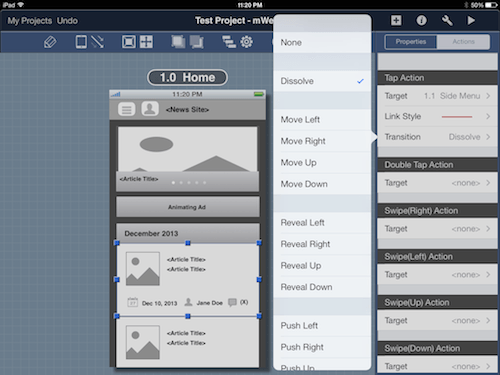
Your first interaction is almost complete. After you’ve selected a target, you will notice that “Link Style” and “Transition” are shown. The “Link Style” lets you choose the color and format of the link line (remember the site map’s side panel from earlier?). This helps with labeling inbound and outbound scenario paths.
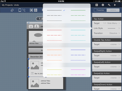
“Transition” allows you to select an effect for switching between screens. “Dissolve” is the default choice, and “None,” “Move,” “Reveal,” “Push,” “Curl” and “Flip” are also available. If you re-enter the “Target” screen, you will see both the UI trigger and the link arrow to the target screen highlighted in yellow. Select “None” for the transition. You can test other transitions later!
Manipulating Links
The visibility of links can be modified both in the screen and site map views. Earlier, I covered how the side panel in the site map view can be used to hide and show groups of color links. In contrast, all links may be hidden in the screen view via L3. Surprisingly, links pointing to their parent screen are not shown at all. I hinted at using custom hotspots in the section on “Using Images”: To do this, drop a “Button” and make it transparent via “Properties” → “Background.” Hide its border by setting the widget to “Custom” in “Properties” → “Type” to complete the look.
Playing The Prototype
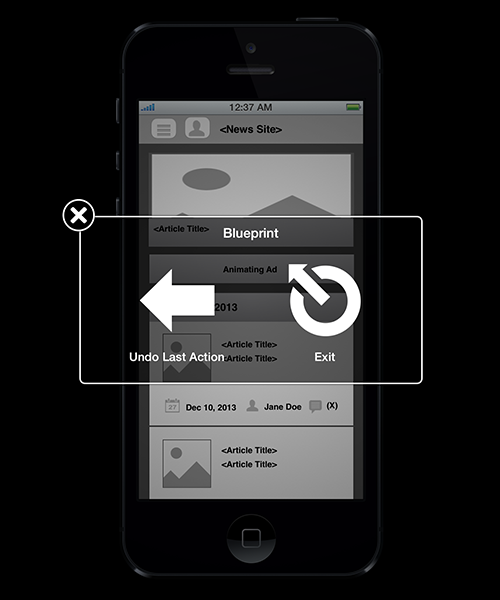
Layering interactions is fun because it brings the prototype to life. After you’ve added the clickthrough interactions to the remaining screens, you will be ready to test the concept demo! Press the play icon (G6) to start the demo in full screen with the device shell shown. As seen below, a two-finger tap either exits the demo or backtracks in the flow. The app does not highlight active screen links, so know your prototype scenarios well.
Once the clickthrough demo is perfected, you can rock the audience! Presenting the concept directly on the device is best. Sometimes your viewership will be larger — in which case, to keep everyone engaged, you’ll want to mirror the tablet’s output either via software (such as Reflector) or hardware (such as a
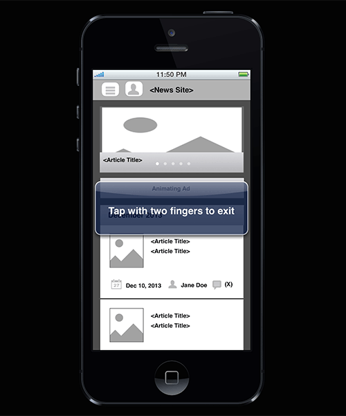
The notification disappears shortly after the demo begins.
The presentation went off without a hitch! The demo clearly impressed the stakeholders because you received positive feedback and many relevant questions. Your client even asked to share the work with partners overseas. In this situation, you can prescribe the free Blueprint Viewer app and teach people how to load the sharable .blueprint source file. Let’s cover how to do that next!
Exploring The Export Options
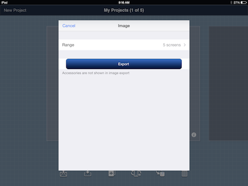
You are ready to share the work with the geographically distributed team. Luckily, unlike POP’s cloud-based distribution, Blueprint allows users to freely share assets via email, Dropbox and iTunes. To export a project, in the “Home Screen” of a project, tap the leftmost icon to access the options.
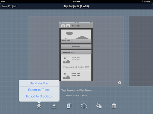
The overseas team consists of several departments: marketing, development and product management. Your stakeholders ask to send the interactive demo to the product manager and developers, whereas the marketing representatives have requested large images. You can send marketing a PDF of all screens or a ZIP archive of individual PNG images. As for the developers, that’s easy! Just send them the .blueprint file.
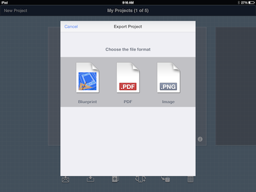
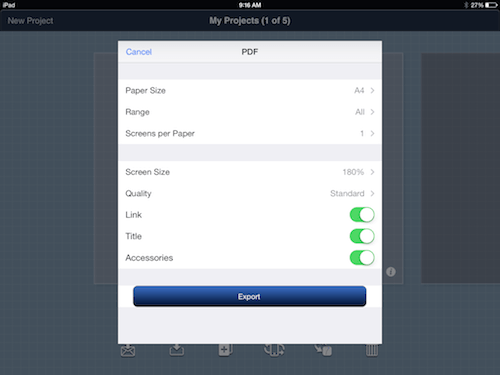
The PDF and PNG options are handy for capturing any documentation included in the file. However, this is rarely done for concept prototypes because of their fluid nature. Both have settings for adjusting the outputted deliverable.
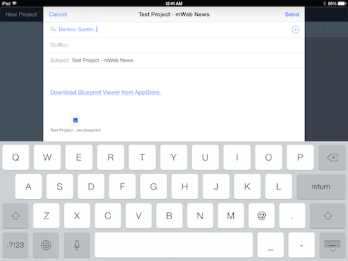
Having learned about the exporting options, you are ready to send your work to the team. “Send via Mail” is the logical choice because the team is not familiar with Dropbox. Tap this option to create two messages, with the relevant deliverables attached in each draft. When you send the .blueprint file to the developers, a link to the free Blueprint Viewer is embedded in the message’s body. All you have to do is tell them to download the app!
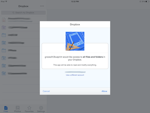
In the future, you might be working with avid Dropbox users, so let’s cover that option as well! Blueprint will redirect you to the Dropbox application if you have it installed on your iPad. After you log in, Blueprint will ask for permission to access all folders and files. You must grant this in order to export files to Dropbox. Afterwards, you can select where in your Dropbox account to store the .blueprint file, the ZIP file of PNGs or the PDF.
Exporting to iTunes is best done for internal testing and for sharing with colleagues. Personally, I have used this feature also to back up .blueprint files on an external drive. For directions on how to use iTunes with Blueprint, read “How do I send a mockup to other people?” on groosoft’s FAQ page.
Related Solutions
You now have the basics down on how to put together a quick concept prototype with Blueprint. The tool can be used for larger, more complex prototypes, but these take much longer to create, and maintenance time must be factored in.
Other applications are on the market to help with creating iOS experiences directly on a tablet. Below, I’ll briefly discuss a couple of alternatives that I’ve come across! I am continuing my search for equivalent tools on other platforms, including Android.
AppCooker
AppCooker is a $15 tool developed by Hot Apps Factory. It lives in a similar ecosystem: The application is used to create experiences on an iPad that are viewable in AppCooker or the free AppTaster. The viewer is available for the iPhone and iPad, but tablet experiences are viewable on the iPad only.
AppCooker stands out with the following:
- It includes an exporting option for Box, direct posting of projects to the viewer, and exporting to JPEG and PDF formats.
- Each project includes features such as “Notepad” (to capture ideas), “Definition Statement” (to outline a project’s value proposition), “Revenue & Expenses Tracker” (to develop a distribution plan) and more.
- The prototyping tool has support for taking multi-finger actions, customizing transitions, grouping widgets and specifying multiple link paths for a single hotspot.
Its advanced features make AppCooker a powerful tool for creating full app prototypes that illustrate complex interactions and that prove an app’s technical feasibility.
Interface HD
Interface HD, also known as Interface 3, is a $10 tool developed by LessCode. Interface HD makes clickthrough prototypes for the iPad and iPhone. The app shares many of Blueprint’s features, but minor limitations exist. For example, the event model includes widget swipes and taps but no screen-level interactions (such as rotation); you have five transitions to choose from; and the software offers no way to visualize links between screens. The app is constantly being updated, so these features might be introduced soon!
Interface HD has many unique selling points:
- It includes a “Stock Asset Manager” for downloading third-party icons and background patterns.
- Password protection is built in, and web demonstrations require pin authentication.
- The OS’ chrome can be customized in detail, including dynamic control of all aspects of the status bar (color, placement, icons, etc.).
- Video tutorials are built in.
This tool is best suited for illustrating flows with light interaction and for designing UIs with customizable widgets. If you need to mock up a quick clickthrough prototype of high visual fidelity, then this is the tool for you!
Takeaways
Pros Of Blueprint
- The collection of transitions and actions is rich.
- Customizable widgets are included.
- Blueprint Viewer allows anyone to view prototypes for free.
- Viewing prototypes requires no Internet connectivity.
Cons Of Blueprint
- The learning curve is noticeable at first.
- iOS is the only platform supported out of the box.
- Multi-finger actions and third-party widgets are not supported (at least, not yet).
- Dynamic states and master templates are not provided.
Closing Thoughts
Widget-based clickthrough prototypes are great for communicating design concepts that emerge from sketching exercises. These prototypes bridge the gap between what the stakeholders envision and what the UXers plan to create. Blueprint, one tool that handles the creation of such prototypes, provides an effective way to capture UI details, while allowing for higher visual fidelity. Furthermore, it introduces a way to design directly on the device, allowing stakeholders to be more intimately involved in demos. If you have $20 lying around, then spend a weekend exploring this tool. It could bring many benefits to your design process. Prototype away, fellow designers!
Useful Resources
Here are the iPad prototyping tools we’ve discussed:
- Blueprint
- Blueprint Viewer (viewing only)
- AppCooker
- AppTaster (viewing only)
- Interface HD
Further Reading
- Optimizing Your Design For Rapid Prototype Testing
- Choosing The Right Prototyping Tool
- Content Prototyping In Responsive Web Design
- Building Clickthrough Prototypes To Support Participatory Design
 (al, ml, mrn)

