Efficiently Simplifying Navigation, Part 3: Interaction Design

Email Newsletter
Weekly tips on front-end & UX.
Trusted by 182,000+ folks.


 Celebrating 10 million developers
 Custom Web Forms for Angular, React, & Vue. Your backend.
Having addressed the information architecture and the various systems of navigation in the first two articles of this series, the last step is to efficiently simplify the navigation experience — specifically, by carefully designing interaction with the navigation menu.
When designing interaction with any type of navigation menu, we have to consider the following six aspects:
- symbols,
- target areas,
- interaction event,
- layout,
- levels,
- functional context.
It is possible to design these aspects in different ways. Designers often experiment with new techniques to create a more exciting navigation experience. And looking for new, more engaging solutions is a very good thing. However, most users just want to get to the content with as little fuss as possible. For those users, designing the aforementioned aspects to be as simple, predictable and comfortable as possible is important.
Symbols
Users often rely on small visual clues, such as icons and symbols, to guide them through a website’s interface. Creating a system of symbolic communication throughout the website that is unambiguous and consistent is important.
The first principle in designing a drop-down navigation menu is to make users aware that it exists in the first place.
The Triangle Symbol
A downward triangle next to the corresponding menu label is the most familiar way to indicate a drop-down menu and distinguish it from regular links.
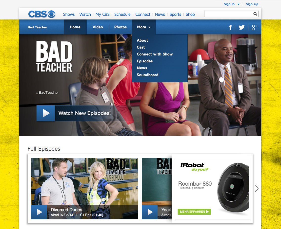
A downward triangle next to the menu label is the most reliable way to indicate a drop-down. (Source: CBS) (View large version)
If a menu flies out, rather than drops down, then the triangle or arrow should point in the right direction. The website below is exemplary because it also takes into account the available margin and adjusts the direction in which the menu unfolds accordingly.
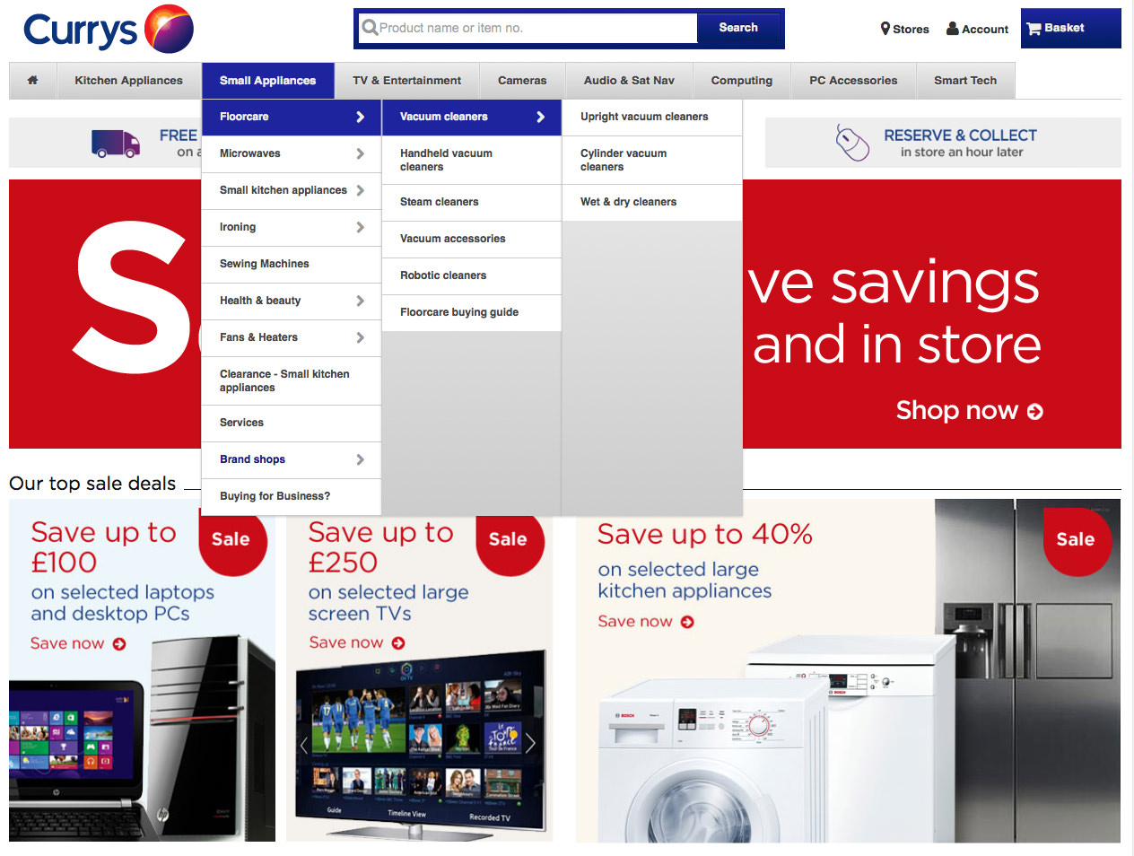
A triangle or arrow pointing in the right direction is the most reliable way to indicate a fly-out menu. (Source: Currys) (View large version)
The Plus Symbol
Another symbol that is used for opening menus is the plus symbol (“+”). Notice that the website below mixes symbols: an arrow for the top navigation menu and a “+” for the dynamic navigation menu to the left (although an arrow is used to further expand the dynamic menu — for example, to show “More sports”).
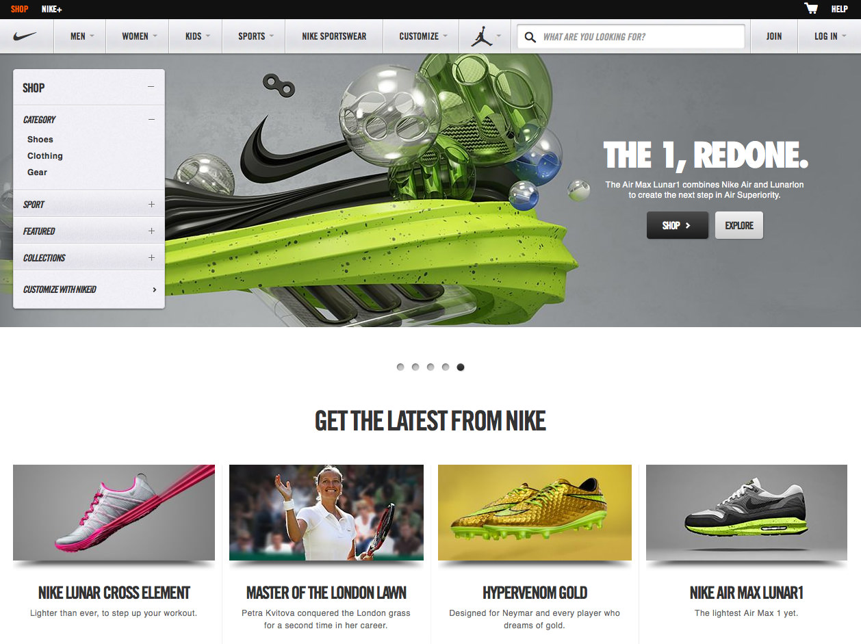
Some websites use a “+” to drop down or fly out menus. (Source: Nike) (View large version)
Mixing symbols can be problematic, as we’ll see below. So, if you ever add functionality that enables users to add something (such as an image, a cart or a playlist), then “+” would not be ideal for dropping down or flying out a menu because it typically represents adding something.
The Three-Line Symbol
A third symbol often used to indicate a navigation menu, especially on responsive websites, is three horizontal lines.
Three horizontal lines is frequently used for responsive navigation menus. (Source: Nokia) (View large version)
Note a couple of things. First, three lines, like a grid and a bullet list icon, communicate a certain type of layout — specifically, a vertical stack of entries. The menu’s layout should be consistent with the layout that the icon implies. The website below, for example, lists items horizontally, thus contradicting the layout indicated by the menu symbol.
Three lines do not work well if the menu items are not stacked vertically. (Source: dConstruct 2012) (View large version)
The advantage of the more inclusive triangle symbol and the label “Menu” is that they suit any layout, allowing you to change the layout without having to change the icon.
Secondly, even though three lines are becoming more common, the symbol is still relatively new, and it is more ambiguous, possibly representing more than just a navigation menu. Therefore, a label would clarify its purpose for many users.

An accompanying label would clarify the purpose of the three lines. (Source: Kiwibank) (View large version)
Consistent Use Of Symbols
While finding symbols that accurately represent an element or task is important, also carefully plan their usage throughout the website to create a consistent appearance and avoid confusion.
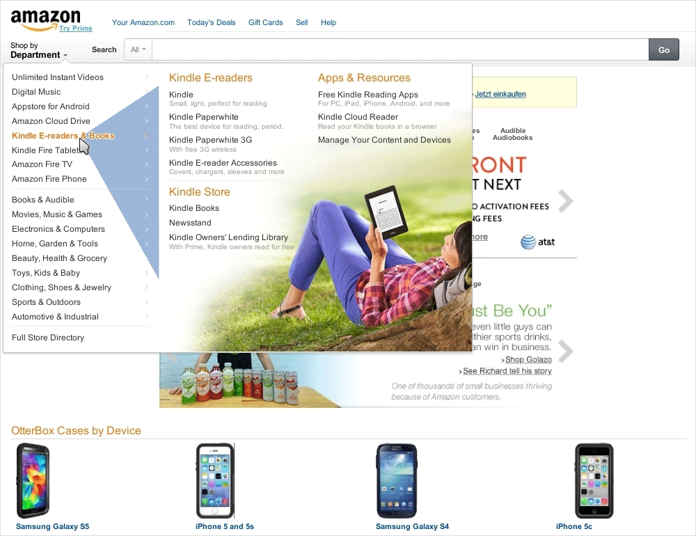
Notice the inconsistent use of symbols in the screenshot below. The three lines in the upper-right corner drop down the navigation menu. The three lines in the center indicate “View nutrition info.” The “Location” selector uses a downward triangle, while the “Drinks” and “Food” menus, which drop down as well, use a “+” symbol.
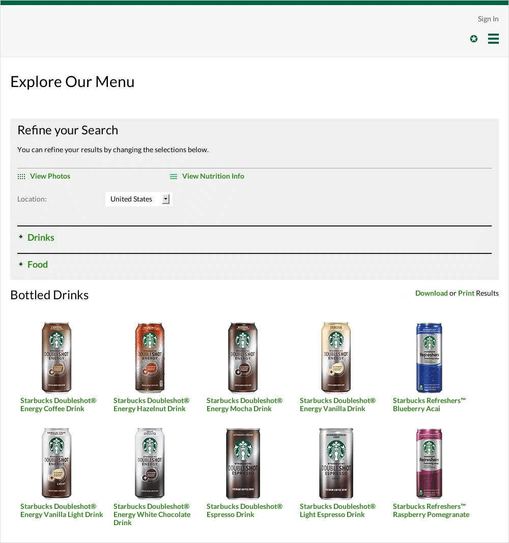
Inconsistent symbols lead to confusion. (Source: Starbucks) (View large version)
While using multiple symbols for a drop-down menu is inconsistent, using arrows for anything other than a drop-down menu causes problems, too. As seen below, all options load a new page, rather than fly out or drop down a menu.
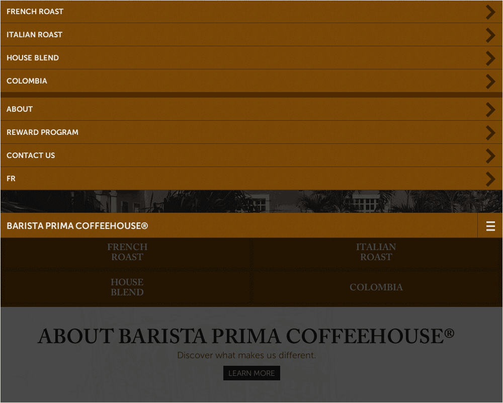
Using a triangle or arrow for anything other than a drop-down or fly-out menu can cause confusion. (Source: Barista Prima) (View large version)
This leads to a couple of problems. First, using arrows for regular links — whether to create the illusion of space or for other reasons — puts pressure on you to consistently do the same for all links. Otherwise, users could be surprised, not knowing when to expect a link to load a simple menu or a new page altogether. Secondly, a single-level item, such as “Products”, could conceivably be expanded with subcategories in the future. A triangle could then be added to indicate this and distinguish it from single-level entries, such as the “About” item.
Users generally interpret an arrow to indicate a drop-down or fly-out menu. And they don’t have any problem following a link with no arrow, as long as it looks clickable. It is best not to mix these two concepts.
Target Areas
A simple yet important rule is that links in a navigation menu should be easy to read, large and consistently located. The area in the interface that is assigned to and activates a link is typically referred to as the target area.
Legibility
Before clicking a target, a user will obviously want to read its label. Therefore, consider the font’s size and the legibility of the label and description accordingly. Notice below that the link labels in the center (“Laptops,” “Desktops,” etc.) are large and contrast with the background, enabling the user to comfortably read and distinguish between them, unlike the labels in the drop-down menu.
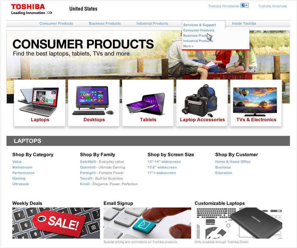
Links should be easy to read and allow for comfortable navigation. (Source: Toshiba) (View large version)
Also, consider how a font performs in dim lighting, which is especially an issue on mobile. While many recommendations about font settings can be followed, still test your settings because individual preferences will vary.
Size
The larger and closer a target is, the easier and faster it is to hit. This simple rule predates the digital era and is one that Paul Fitts tried to quantify in human-computer interaction.
One common suggestion is to use every available pixel by extending the clickable area of a link to the entire space reserved for it. As a result, less precision will be required to click the link, which will speed up navigation. Below, notice how the target area on the left lets a few pixels go to waste. The target area on the right is larger and quicker to click because it occupies every pixel at its disposal.

Fitts Law tells us to exploit every available pixel. (Source: left:Philly, right: Apple) (View large version)
Similarly, make the images in mega-menus and separate pages into target areas as well, not only their labels.
The downside of large targets is that they can break the balance of an interface and quickly eat up screen space. However, even with plenty of space to spare, enlarging the target areas to be as big as possible is not necessary because there is not a one-to-one correlation between the size of a target and its usability.
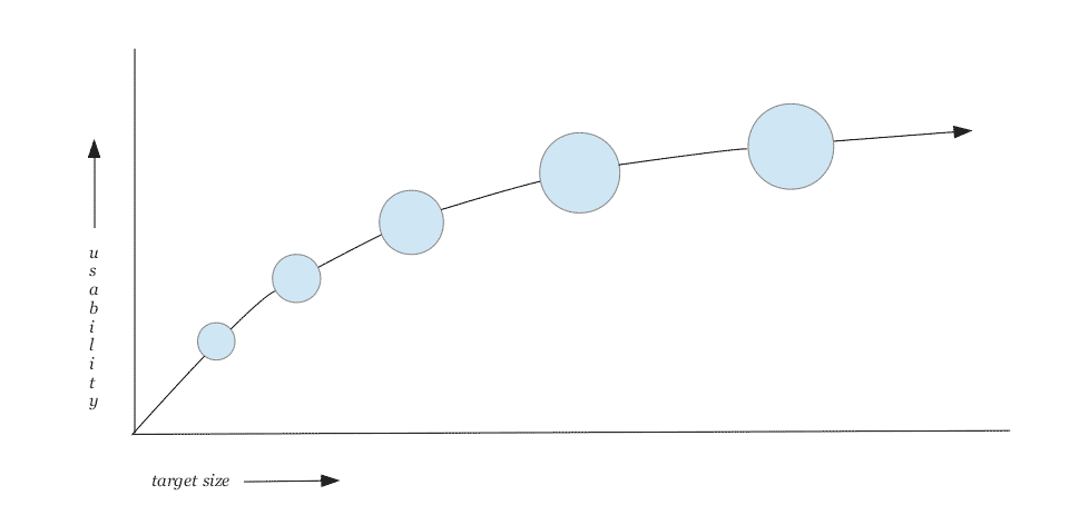
The relationship between the size and usability of a target is not linear. (View large version)
Thus, if a small target is made 10% larger, it will become much more usable, but if an already big target is made 10% larger, it will not gain much more in usability.
Consistency Of Location
Apart from being large enough and easy to read, target areas should be consistently located. This builds muscle memory in the user, further facilitating navigation.
One type of multi-level navigation that creates inconsistent target areas is the nested menu. In a nested menu, a subcategory appears directly under its parent category, which constantly pushes the items below into new locations.
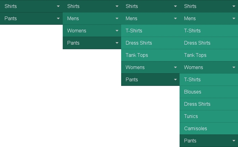
Nested menus create inconsistently positioned target areas. (Source: “Big Menus, Small Screens: Responsive, Multi-Level Navigation,” Tessa Thornton, Tuts+) (View large version)
A better way to display multiple levels is to fly out or slide to the submenus, as we’ll discuss in more detail below.
However, single-level navigation menus can have inconsistent target areas as well, especially when the user is trying to close the menu. When some menus are opened, the clickable area moves to a different location. Below, the “close” button is pushed down whenever a menu or submenu is opened.
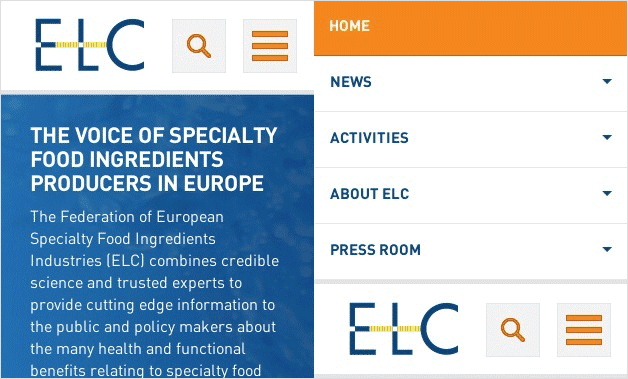
A repositioned button makes it more difficult to close the menu. (Source: ELC) (View large version)
This requires the user to look for the “close” and then move their cursor or hand to the new spot. Reserving the same spot for opening and closing a menu is easier. In addition, the user should be able to click any non-linked spot outside of the menu to close it.
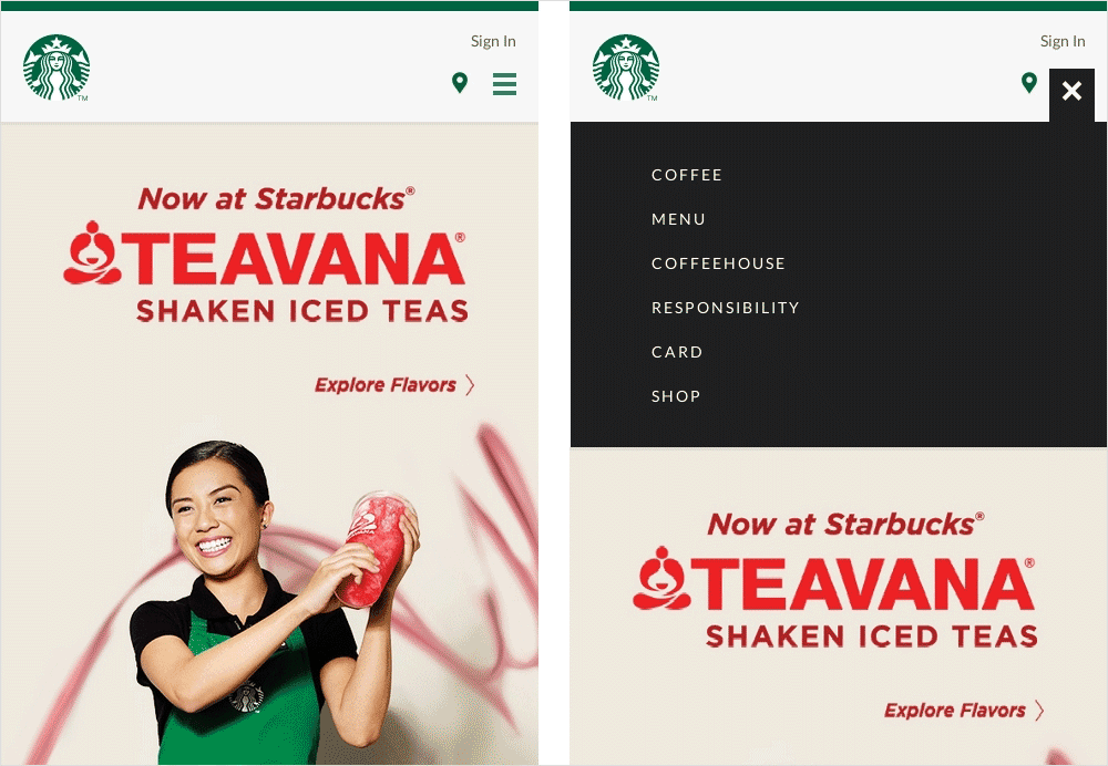
Consistent clickable areas and generous targets make it easier to close the menu. (Source: Starbucks) (View large version)
Interaction Event
The interaction event describes the type of input that users have to perform to interact with an interface. The four most common interaction events in navigation menus are:
- hovering,
- clicking,
- scrolling,
- typing.
Hovering
Hovering (or mousing over) is the most common interaction event in navigation menus. The problem with hovering, however, is that accidentally moving the cursor just inside or outside the target area will immediately activate or close the menu. One workaround that is often suggested is to use a delay.
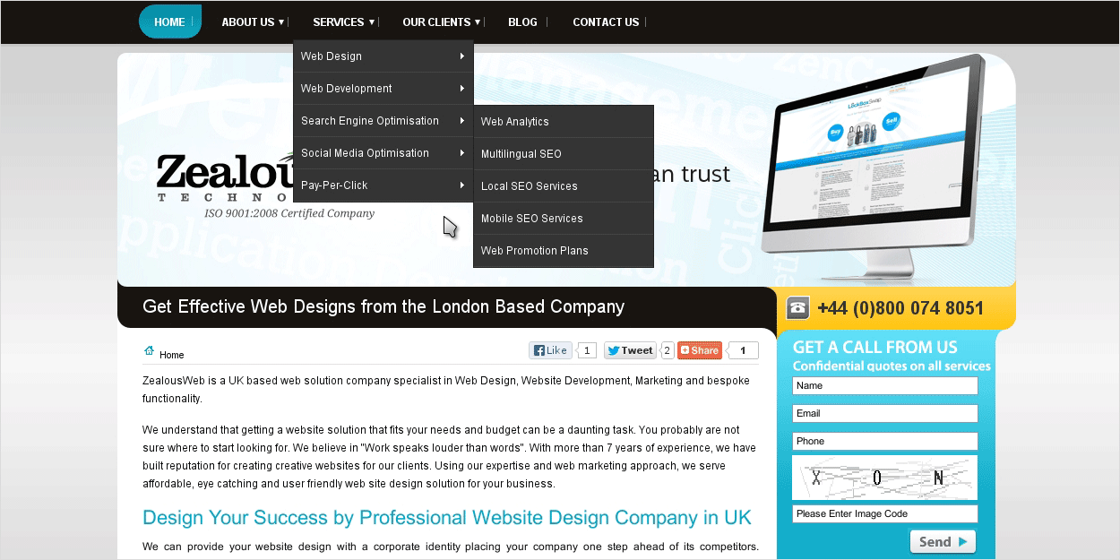
A delay is often used to account for accidental hovering. (Source: ZealousWeb) (View large version)
Of course, if the delay is too long, interaction will become sluggish and annoying. There is no “correct” value for the delay because proficiency in moving the cursor varies not only by individual, but by fatigue level and the user’ familiarity with the menu.
A second workaround is to create temporary invisible target areas based on predicted path of the cursor’s movement. The blue overlay in the screenshot below depicts such an invisible area, where users can access the contents of a submenu without accidentally opening another menu in the process.
Invisible target areas minimize mistakes and facilitate navigation based on predicted cursor paths. (Source: “Breaking Down Amazon’s Mega Dropdown,” Ben Kamens) (View large version)
However, this workaround has its own problems. Because the user has no way of knowing that the invisible areas exist in the first place, they will still try to carefully move the cursor along visible paths. Even if they do know, invisible areas invariably produce their own share of mistakes. Finally, because the areas are temporary, the issues related to variations in cursor movement speed still hold true.
Another problem is tooltips. Some authors suggest using tooltips in navigation menus to explain the options.
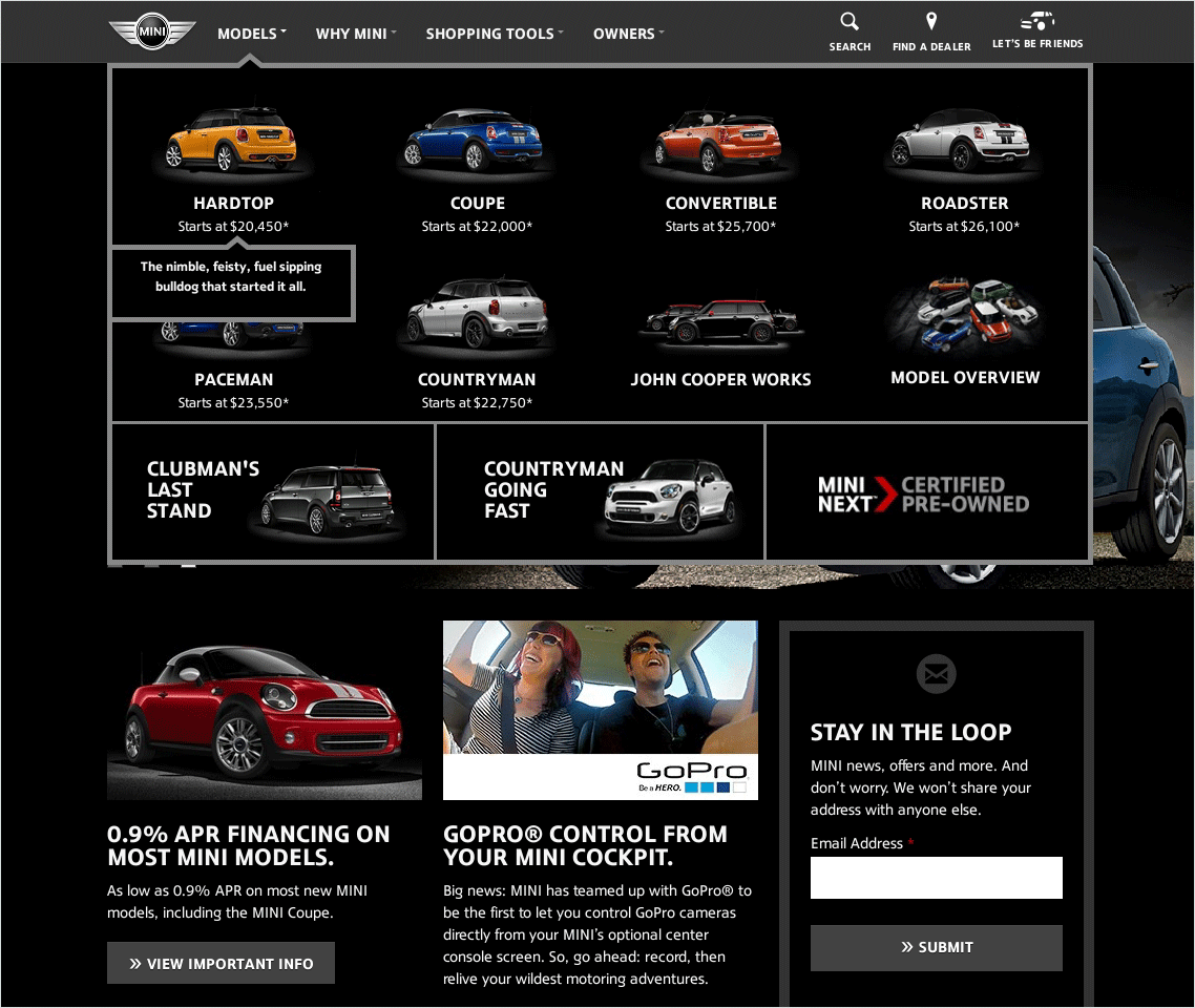
Tooltips do not work well in navigation menus. (Source: Mini) (View large version)
However, because tooltips require hovering, users encounter the following problems, in this order:
- Because tooltips appear on hover, users might not know that they exist and, thus, not discover them. If tooltips are important for explain the options, this is rather unfavorable.
- Tooltips could obstruct adjacent items.
- The delay problem strikes again. If the delay is too short, the tooltip will flicker. If it is too long, then getting the tooltip for each item will be slow and annoying.
- As a consequence, comparing items will be more difficult.
- Hovering does not work on touchscreens, thus inhibiting a consistent cross-device experience.
Note, however, that link titles that appear in the body of text are not bad at all because the context is different. A body of text is meant mainly for reading, not navigation, so many users will just want to read the article and won’t care much about the links. However, if they do care, the hypertext and its context are often sufficient clues about the link’s target. In case they are not, a link title can be indeed very useful, especially because it probably will not cover other hyperlinks in the article.
Link titles can be useful additions to hyperlinks. (Source: Six Revisions) (View large version)
However, a navigation menu is a different story, as explained above. So, if descriptions are necessary to explain the options, then use regular text, rather than tooltips.
All in all, hovering is not a good technique for enabling interaction with menus, and the workarounds do not alleviate the problems.
Clicking
Clicking to open a drop-down menu and its submenus should become the standard, not hovering. This would yield the following benefits:
- Individual proficiencies would be better accounted for. High-proficiency users would still be the fastest.
- Mistakes would amount to virtually zero, thus reducing stress.
- This would allow for multi-tasking. Users could pause navigation in any state, switch to another tab or application and then resume where they left off.
- Hovering does not work on touchscreens. Clicking would make for a consistent, unified experience.
The increasing prevalence of clicking as the interaction pattern for navigation menus is a positive trend.
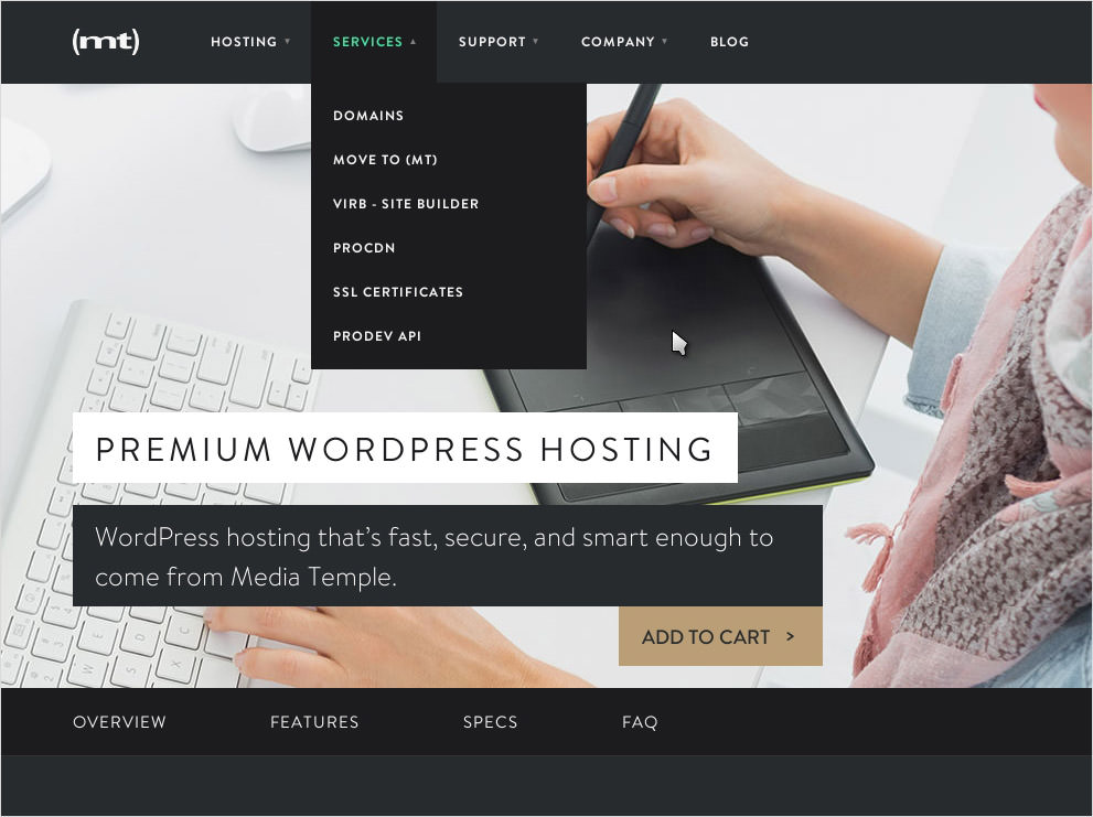
Opening and closing menus should be done by clicking, not hovering. (Source: Media Temple) (View large version)
Scrolling
While users do not mind a certain amount of scrolling, avoid excessive or unnecessary scrolling.
Having users scroll to see all options is sometimes inevitable, especially when you’re using a separate page for a navigation menu. However, reserve scrolling only for browsing categories, not for navigating between categories. Below, users have to scroll to the bottom of the page to see all categories.
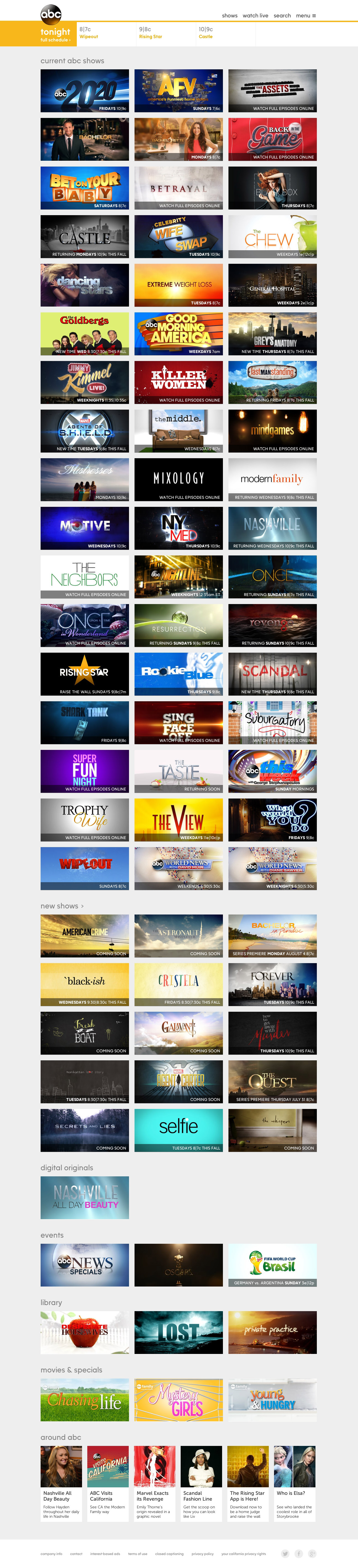
Scrolling should be used to browse categories, not to navigate between categories. (Source: ABC) (View large version)
The design above forces the user to scroll through a lot of undesired content to get to the category they want. A better solution would be to present the categories at the top of the page. This would allow users to skip unwanted sections. I’ve mocked this up to illustrate:
Linking to categories at the top of the page enables users to go directly to their desired categories. (View large version)
Apart from that, be aware that including labels, images and descriptions is a better way to explain media content such as TV shows.
Typing
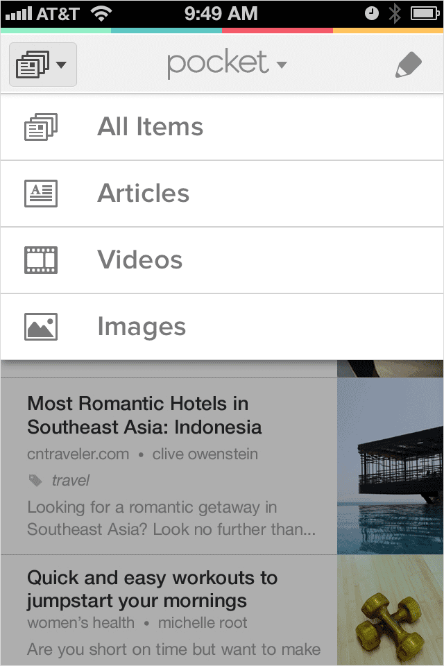
A fourth type of interaction event is typing. The two common techniques here are search and typing to filter. The difference between them is that search does not require a navigation menu. Whereas, when users type to filter, they have already navigated to a content category and are typing a term to dynamically narrow down a list of already visible entries. The app below shows the latter technique, although the designers labeled it “search”. Still, this is unlikely to cause confusion as “search” and “filter” are, indeed, very similar concepts.
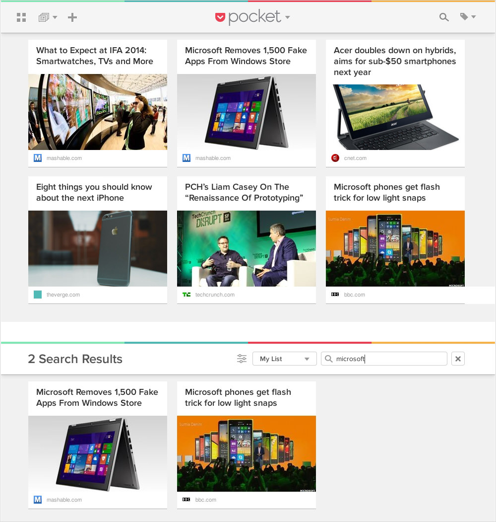
Typing to filter is similar to search but is used to navigate within, rather than to, content categories. (Source: Pocket) (View large version)
The purpose of typing to filter is to spare users from having to scroll through and read a long list. However, it does come with the same problems of uncertainty and the heavy cognitive load that we mentioned with search. However, it is somewhat alleviated by the fact that the user has already navigated to a content category. Therefore, if a list is very long, it is worth breaking down the content category into subcategories or offering dynamic filters, as the app shown below does.
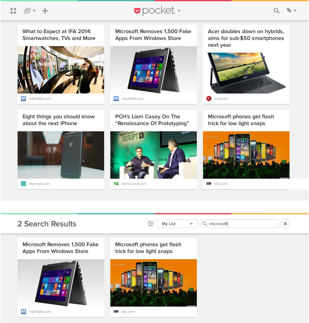
Subcategories and dynamic filters help to break down long lists. (Source: Pocket) (View large version)
Be aware, though, that typing to filter, like search, works better with large personal databases in applications, such as file managers and email clients, rather than for websites, because the user would more likely know the particular string they are looking for related to the item they want.
Levels
Designing a single-level navigation menu is hard enough as it is. Incorporating multiple levels complicates the matter, especially on small screens.
Removing Navigation Levels
To reduce the complexity of multiple levels, some authors suggest reducing the number of navigation levels, especially for mobile screens. The rationale is to spare users from having to navigate many levels. However, removing levels could have an adverse effect. Below, the category “Products” consists of two levels.
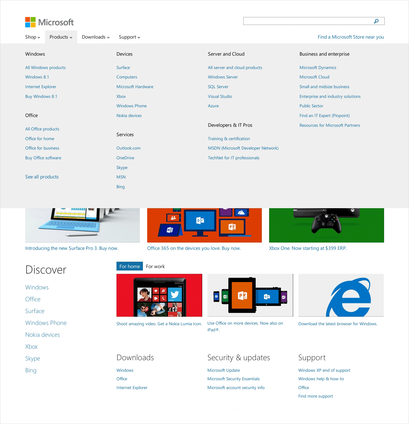
Some websites display more levels in their desktop view than in their mobile view. (Source: Microsoft) (View large version)
In its menu for mobile screens, Microsoft removes the first level (“Windows”, “Office”, “Devices”, etc.). The result is a very long list that lacks structure and requires the user to work more to find and navigate to the product they are looking for.
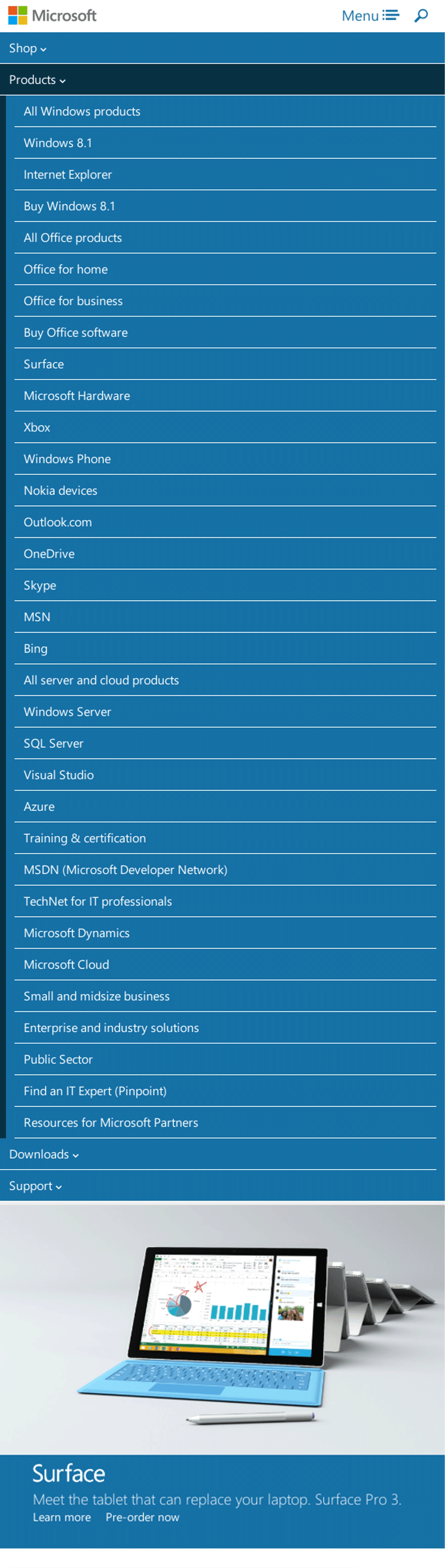
Removing levels creates long lists and obscures entries. (Source: Microsoft) (View large version)
By contrast, keeping the additional level makes for shorter, more informative lists. I mocked up this solution to illustrate:
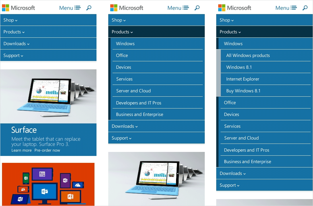
Subcategories make for lists that are shorter, more descriptive and easier to interact with. (View large version)
Of course, even with the right number of levels, multiple-level navigation remains a tricky affair and requires careful design and implementation — on all types of devices.
Levels And Mobiles
Large, wide screens offer space for fly-out submenus.
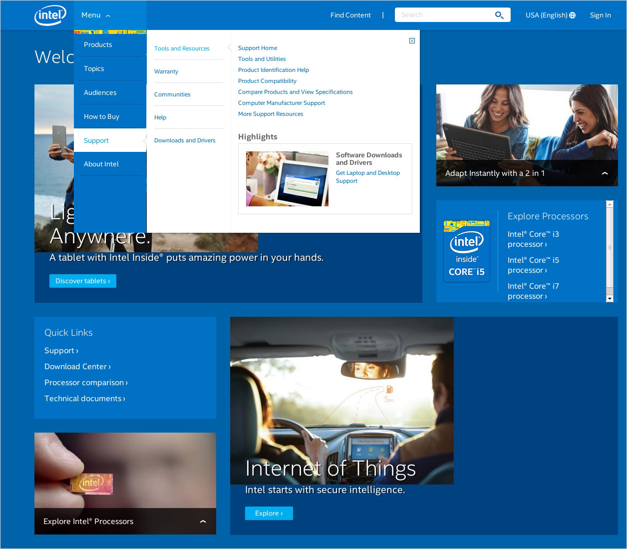
Large screens can get fly-out submenus. (Source: Intel) (View large version)
Mobile devices are not wide enough for fly-out menus. There are two ways to deal with this limitation.
As soon as the user selects a menu option, you could slide them right to a separate screen that displays the content of the submenu.
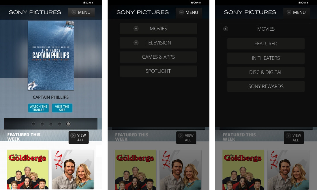
Sliding to submenus on a separate screen is the mobile equivalent of a fly-out submenu. (Source: Sony Pictures) (View large version)
Above, the submenu’s title is displayed in a heading, along with a “<” button that enables users to slide back to the parent category. Two things to note about sliding menus. First, the symbol should be relevant to the type of animation. Sony correctly uses the “<” symbol to slide users to the left, but why it uses “+” to do the opposite is not clear. The sliding menu below uses symbols that are more in line with their animations.
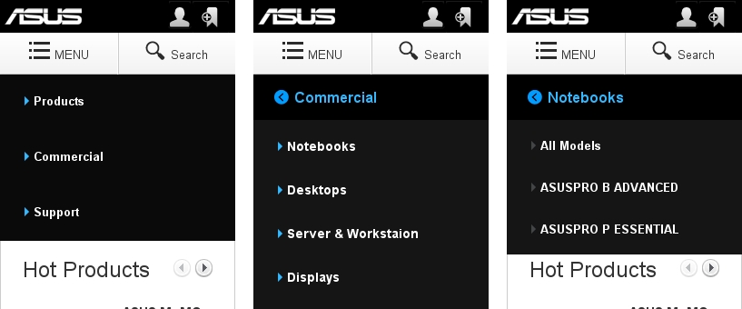
Symbols should be relevant to the type of animation. (Source: Asus) (View large version)
Secondly, consider the fold. I cropped the screenshot above to highlight this problem. The “Commercial” category actually has five entries, but users might miss the bottom one.
A second way to display multiple levels is to nest them. Nested menus are stacked, and the levels are visually distinguishable with the help of gradients or indentation.
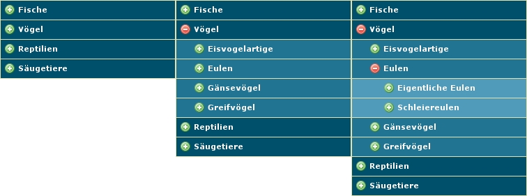
The levels of nested menus are stacked. (Source: “MooTools: Nested Accordion” (standard demo with MooTools 1.11), Media Notions Blog) (View large version)
However, because the items are stacked, not only are the target areas inconsistent, but they also take up vertical space, which can push entries out of the viewport and require users to scroll. Sliding menus are a simpler, more space-efficient way to navigate to a content category.
Levels And Mega-Menus
A mega-menu, which structures options into panels and subareas, is another way to display multiple categories. Nonetheless, displaying the contents of no more than a single category at a time is recommended. The menu pictured below displays the contents of eight categories. Obviously, users will be interested in the contents of only one particular category at any time. Consequently, the space taken up by the other seven categories goes to waste, cluttering the menu as well.
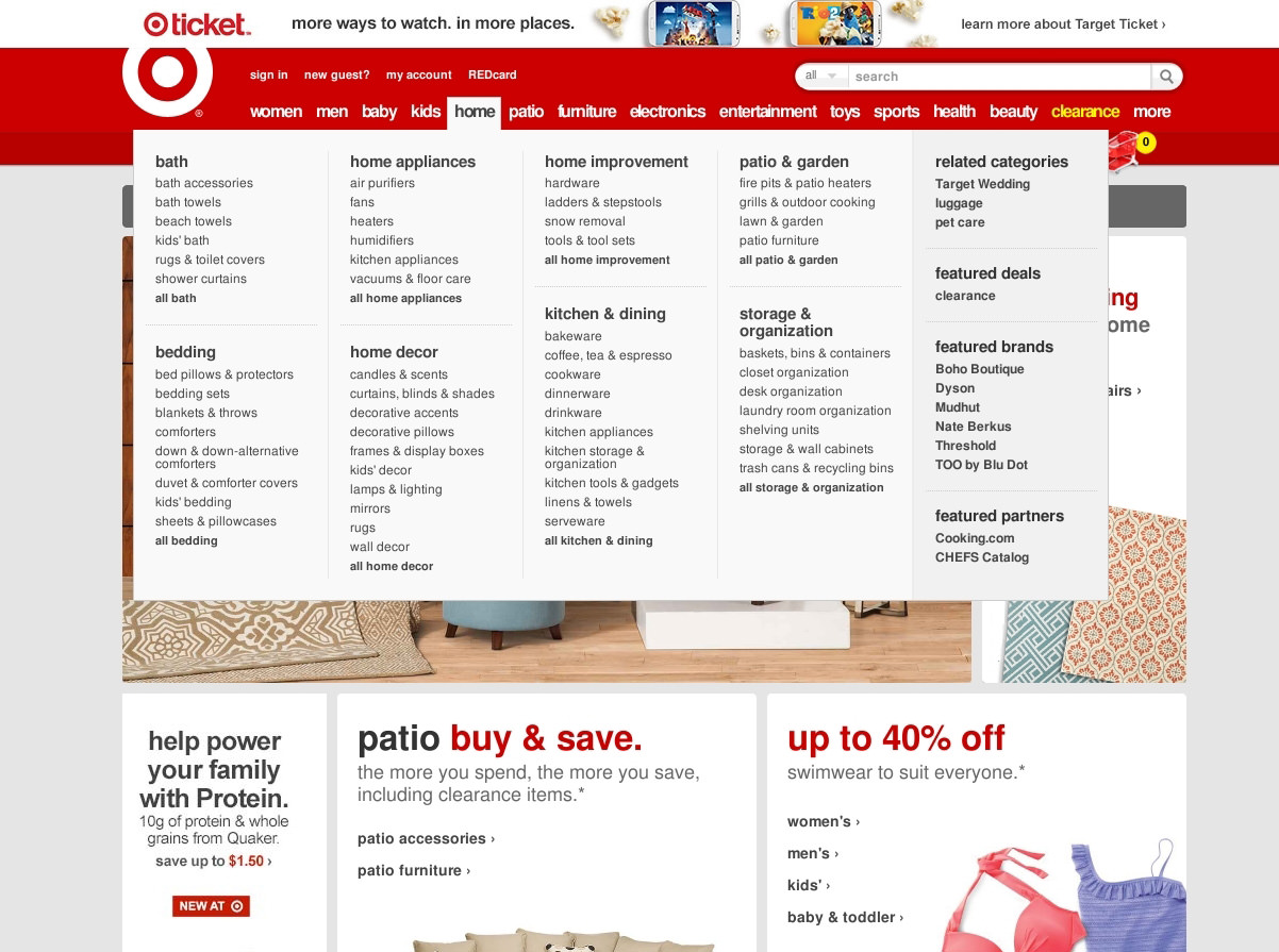
Displaying the contents of multiple categories clutters the menu and is redundant. (Source: Target) (View large version)
A better solution is to organize subcategories into tabs. Best Buy, pictured below, has to accommodate similar types and numbers of products. However, it has chosen to tab its menu. As a result, the user sees only the contents of the category that they have explicitly selected. Also, because the tabs reduce the number of items displayed, the menu looks much cleaner, allowing space for pictures and icons with the items.
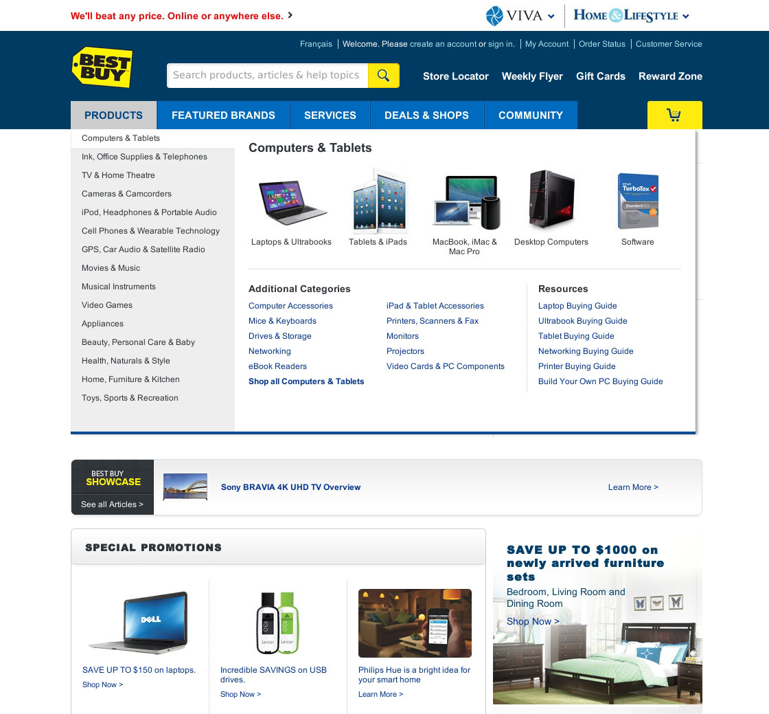
A tabbed mega-menu reduces the number of items displayed and frees up space for pictures. (Source: Best Buy) (View large version)
Dynamic Filters
Websites with many items and, thus, many levels often employ a dynamic filter but, interestingly, always implement the dynamic filter on the same level.
Dynamic filters can be implemented in one of several ways. Below, the filters are implemented as nested menus. The problem with nested menus, however, is that just one or two open filters will likely push the other filters below out of the viewport, requiring users to scroll. Also, unless the user closes the nested menus after selecting the values they need, a lot of the menus will be cluttering the interface.

Nested menus can clutter the interface with unneeded options and require a lot of scrolling. (Source: Sears) (View large version)
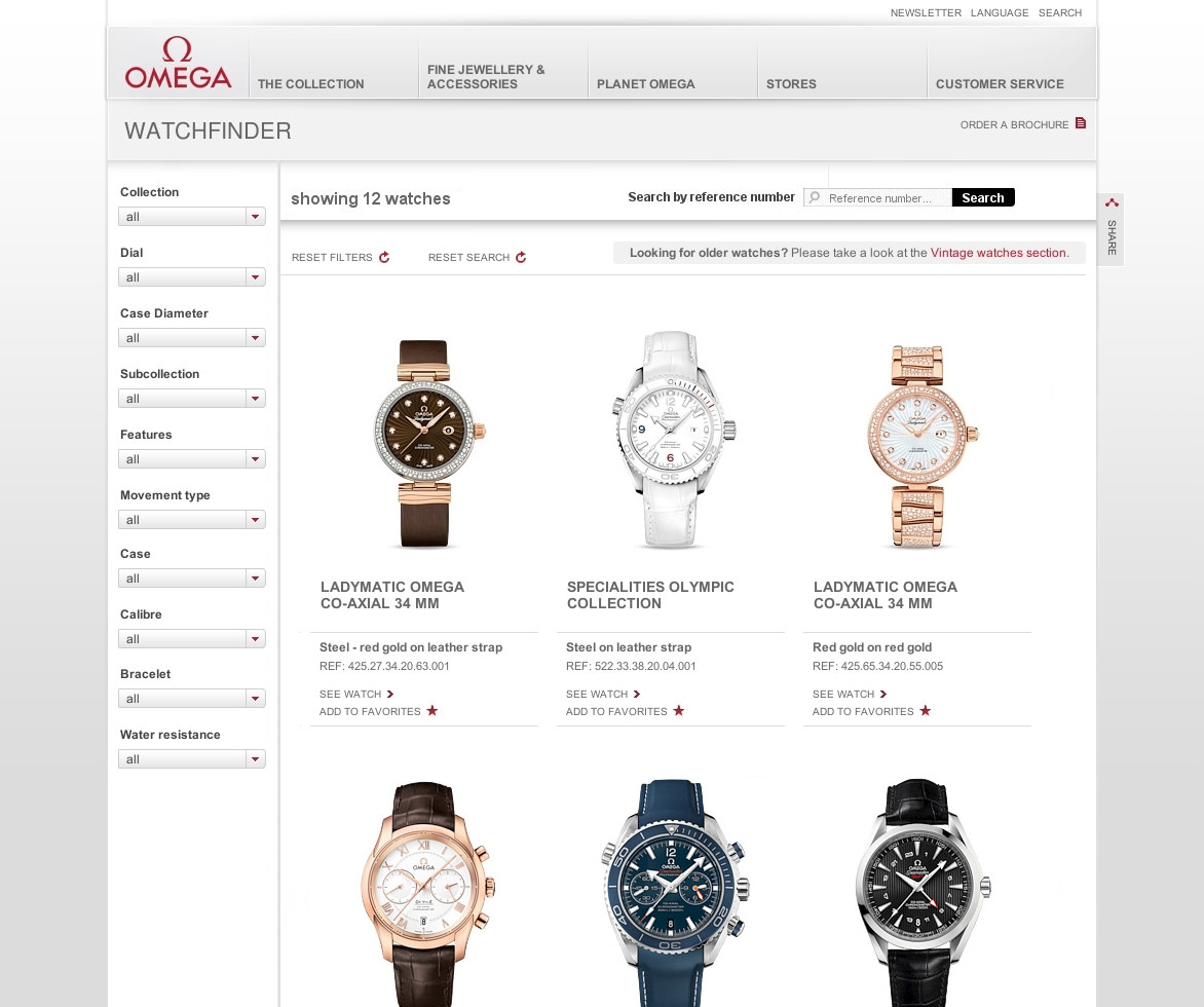
An alternative is to use drop-down menus, which keep the interface clean and the interaction consistent.
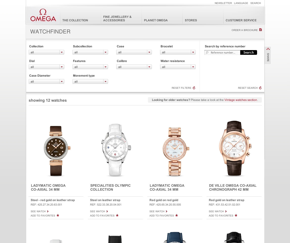
Implementing dynamic filters as drop-down menus keeps the interface clean and the interaction consistent. (Source: Omega) (View large version)
The downside is that users have to open a drop-down menu each time to view and select its values.
If you go with drop-down menus for the filters, consider their placement carefully. Shown above, Omega places its filters above the products. On a tablet held in portrait orientation, this would be the best arrangement. However, on a wide screen, multiple lines of filters would take away space from the products and visually emphasize the filters, rather than the products.
Placing the filters beside the items, as mocked up below, has the opposite effect. It slightly transfers space and emphasis from the filters to the products.
Placing the filters beside the products on a wide screen emphasizes the products rather than the filters. (View large version)
On mobile, the user almost necessarily has to toggle one screen to select and confirm the values and another to display the results, which is what the website shown below does.
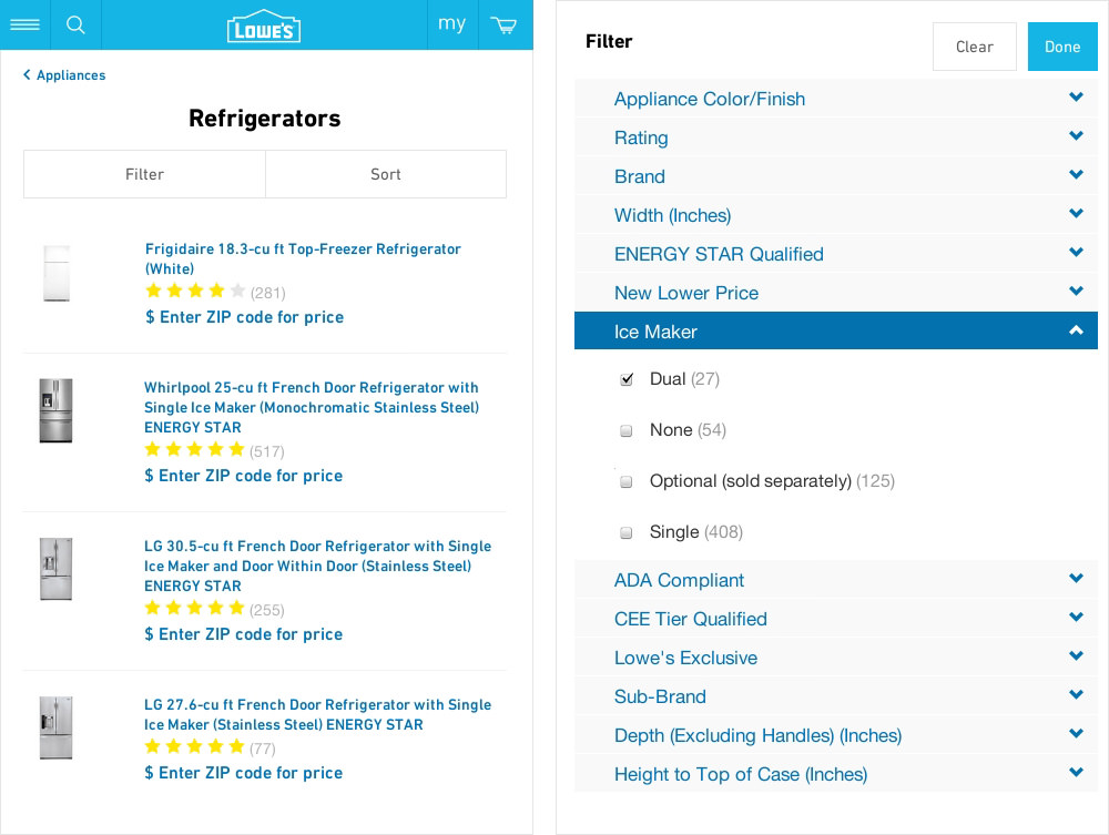
Dynamic filters often require two screens on mobiles, one for the filters and another for the results. (Source: Lowes) (View large version)
Another possibility is to place the filters in a drop-down menu or overlay box.
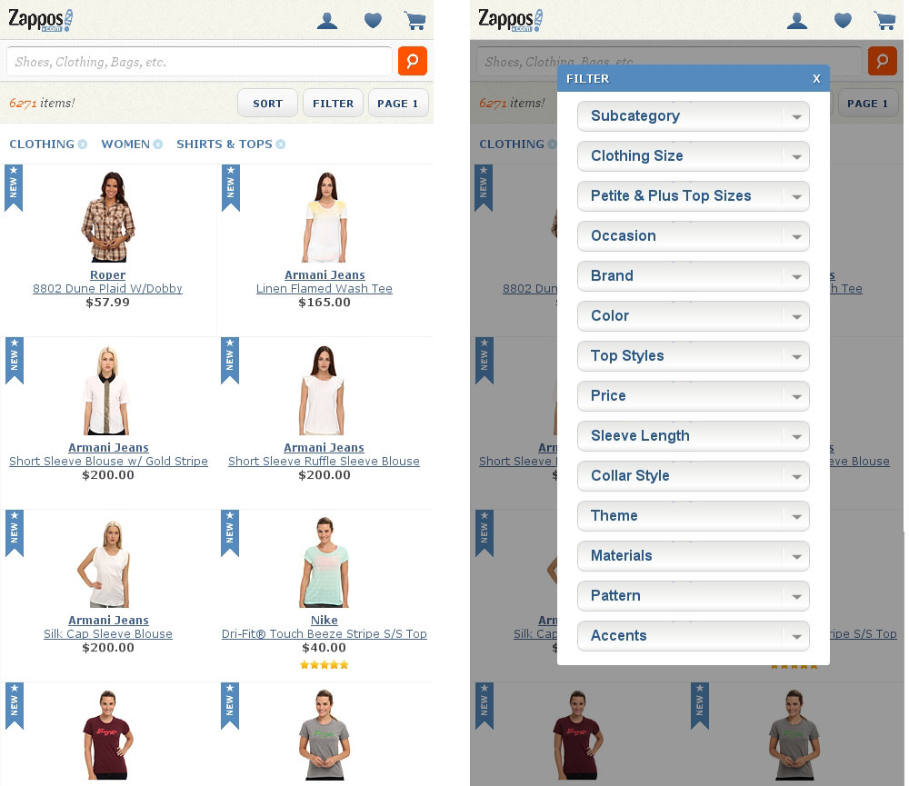
Placing dynamic filters in a drop-down menu or overlay box keeps the context of the products page. (Source: Zappos) (View large version)
The benefit of the latter approach is that it keeps the context of the product page, rather than sending users to a separate screen. However, a separate screen remains the better choice if the filters do not fit on a single screen and users are, thus, required to scroll in order to interact with them.
After choosing a widget and positioning the filters, the next step is to visualize the values. A few simple rules will help with this:
- If the filter values are mutually exclusive, then use radio buttons or tabs or display the values as plain entries in a drop-down menu.
- If the values are independent, then display them along with a checkbox.
- If the values increment in consistent intervals (weight, duration, price, distance, etc.), then use a slider, as shown below.
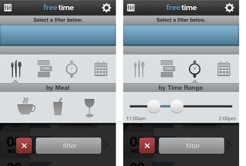
Consistently incrementing values are best represented by a slider. (Source: Free Time) (View large version)
Of course, being able to deselect values is also important. Radio buttons, for example, cannot be returned to their default state once a value has been selected. A reset button would, therefore, come in handy.
Finally, consider whether to implement a separate bar that displays the selected values. The website below lists selected values at the top of the page, along with a “close” button that enables users to remove the values again.
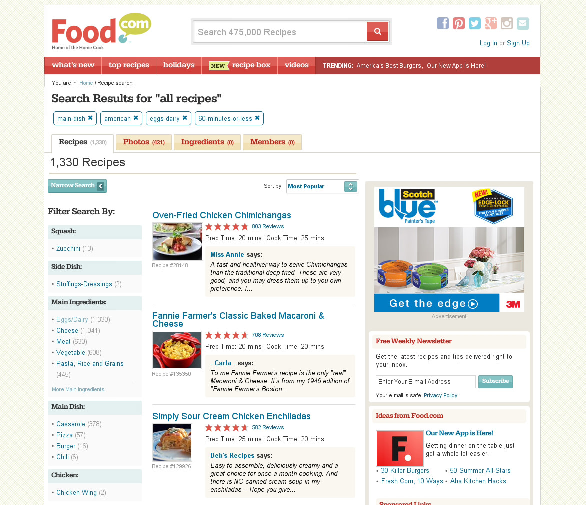
In many interfaces with dynamic filters, a separate bar displays the selected values. (Source: Food) (View large version)
This separate bar provides feedback about the selected values. But it takes up space, which is especially an issue on small screens. Also, the dynamic filters already display the selected values, albeit not as elegantly. A separate bar would, therefore, require users to look at and work with two areas instead of one to basically do the same thing.
So, not repeating the values in a separate area should not be much of a usability issue.
Breadcrumbs
An interesting topic that often comes up in discussions on navigation systems with multiple levels is breadcrumbs. A breadcrumb trail visualizes the user’s current location in the website.
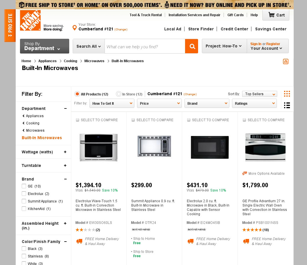
Breadcrumbs visualize the user’s current location relative to the website. (Source: Home Depot) (View large version)
Users rarely interact with breadcrumbs. They occasionally access parent categories in the breadcrumb trail, but if they start navigating from the home page, they will usually only click their way from one category to the next. Likewise, if they land from an external link, then they would not need breadcrumbs. Nonetheless, breadcrumbs have many small benefits that make them worth implementing, the most important one being that they impart a sense of structure and orientation.
Imagine that using a search engine is like parachuting into an unknown forest. If the user only wants some wood, that that would get the job done. But imagine a sign in the forest that says Hoosier Forest > in Monroe County > in the state of Indiana > in the US > on the North American continent. Immediately, users would gain a important sense of orientation.
This is also why breadcrumbs help users who are lost. The first step in knowing where to go is knowing where one is.
Even developers who opt not to use breadcrumbs still implicitly follow its logic by constructing their URLs as a breadcrumb trail, with the domain name as the starting point, followed by a common classification scheme, such as topic or date, and with the levels divided by a forward slash, /.
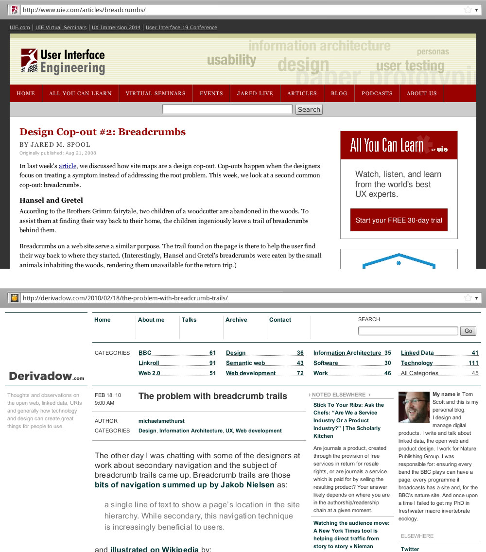
URLs are typically written as a breadcrumb trail. (Source: top: “Design Cop-Out #2: Breadcrumbs,” Jared Spool, User Interface Engineering, bottom: “The Problem With Breadcrumb Trails,” Tom Scott) (View large version)
The example below shows one problem with implementing breadcrumbs. On the desktop, you have enough space, and following best practices is not too difficult. However, breadcrumbs sometimes duplicate the information in the URL bar. The website below has a meaningful and consistent URL architecture. However, because the breadcrumb trail is identical, it seems redundant.
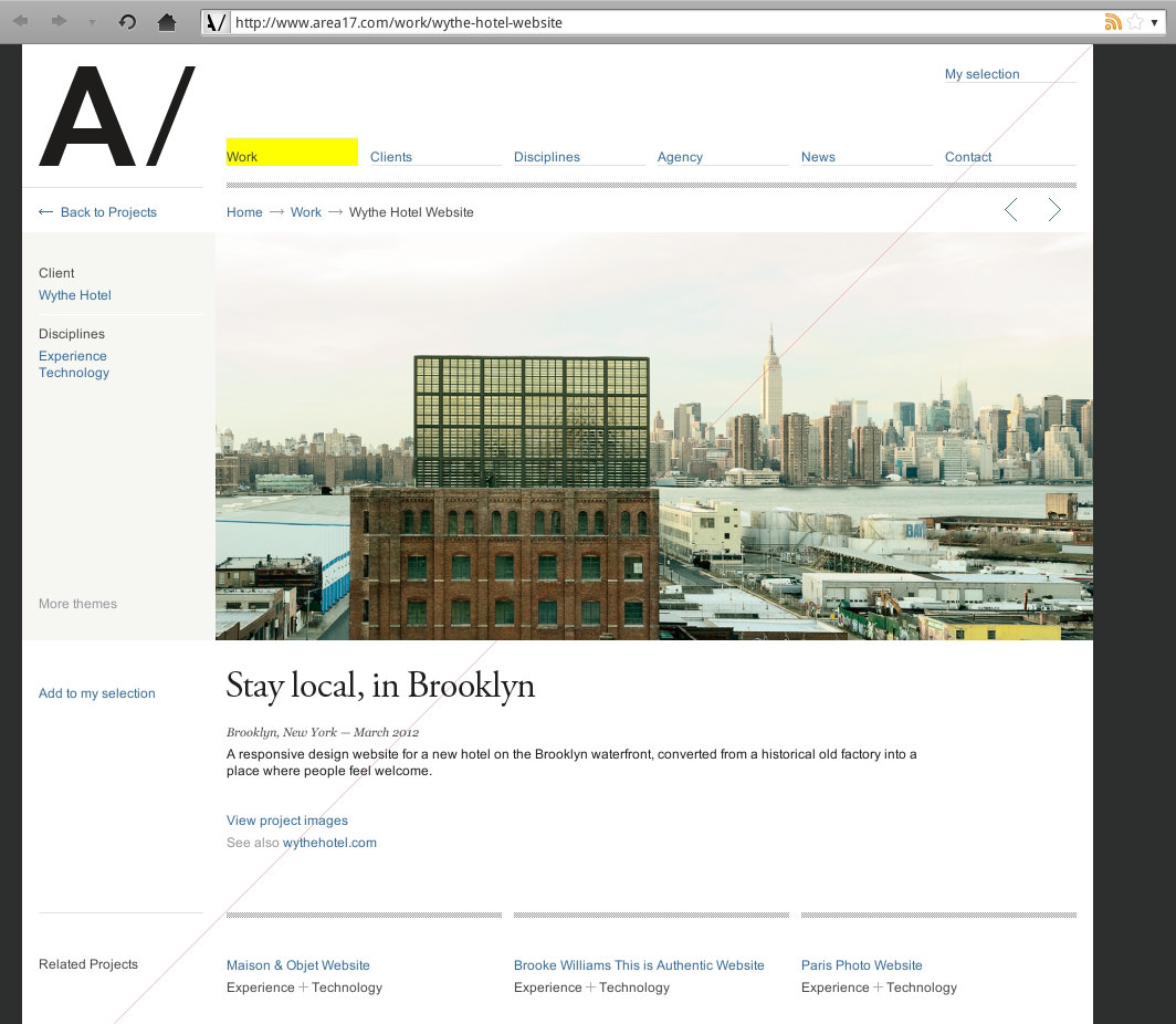
Breadcrumbs sometimes duplicate the information in the URL. (Source: Area 17) (View large version)
Nonetheless, many users expect a dedicated breadcrumb trail, not just a consistent URL architecture. If, however, your navigation system has no more than two levels, and especially if you have tabbed navigation, as below, then a breadcrumb trail is not necessary.
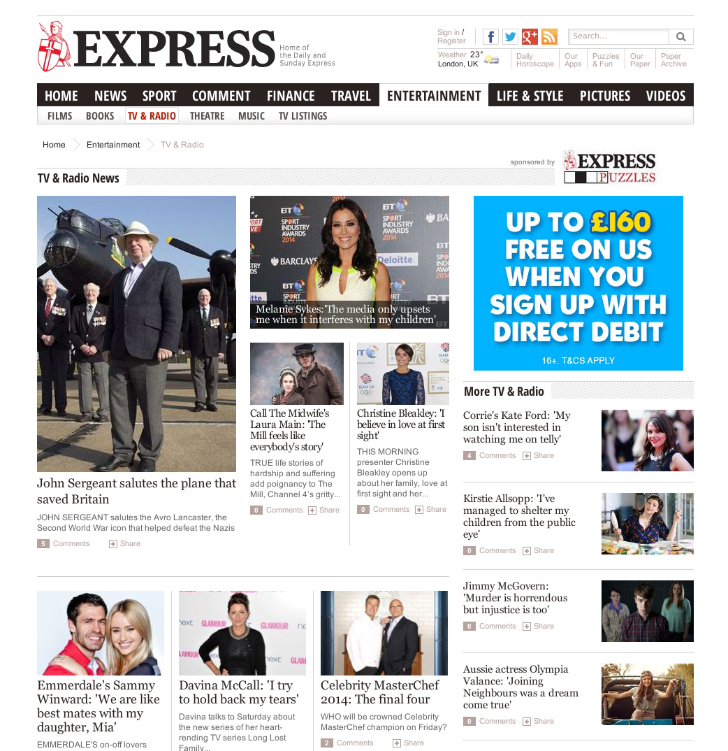
Breadcrumbs are unnecessary in navigation systems with one or two levels. (Source: Express) (View large version)
On mobile, the situation is even trickier. The website shown below demonstrates a good solution. Rather than implementing an entire breadcrumb trail, the designers display only the current category in the center and then show the parent category with a < in the top-left corner.
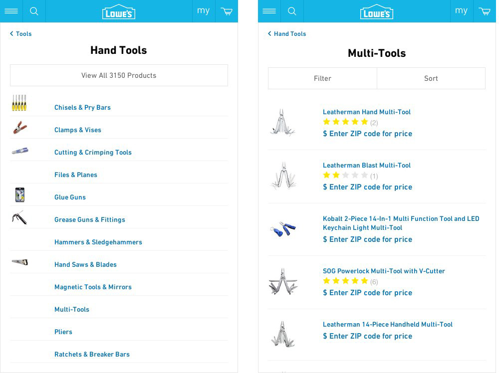
On mobile, showing only the current and parent category in the path will suffice. (Source: Lowes) (View large version)
While this solution does not show the entire path, it will have to do on mobile. The only problem is that Lowes’ designers use up two lines, instead of one. Admittedly, placing both a long label for the parent category and a centered header on one line on a small screen is difficult, but with carefully planning, keeping the labels short, possibly abbreviating the parent category with an ellipses (…), it can be achieved.
Mega-Sites
Finally, a type of website that features many levels is the so-called mega-site.
Mega-sites typically belong to large organizations with many large sub-departments, such as universities, broadcast networks, media conglomerates and governments. The difference, however, is that each sub-department is considered not just the next level in the navigation menu, but a separate, independent mini-site, with its own, distinct audience and image.
First, be aware that mini-websites are not as independent as they may seem. If they were, they would have their own domain. It is not unlikely that users would want to explore other departments, especially if they like the mini-site.
One rule can help you achieve the goal of balancing a unique mini-site with easy-to-use navigation: While the visual design for individual departments can be as unique as you like, keep the interaction across departments as consistent as possible.
In the mega-site shown below, each department has its own visual style, but the interaction across departments is fairly consistent.
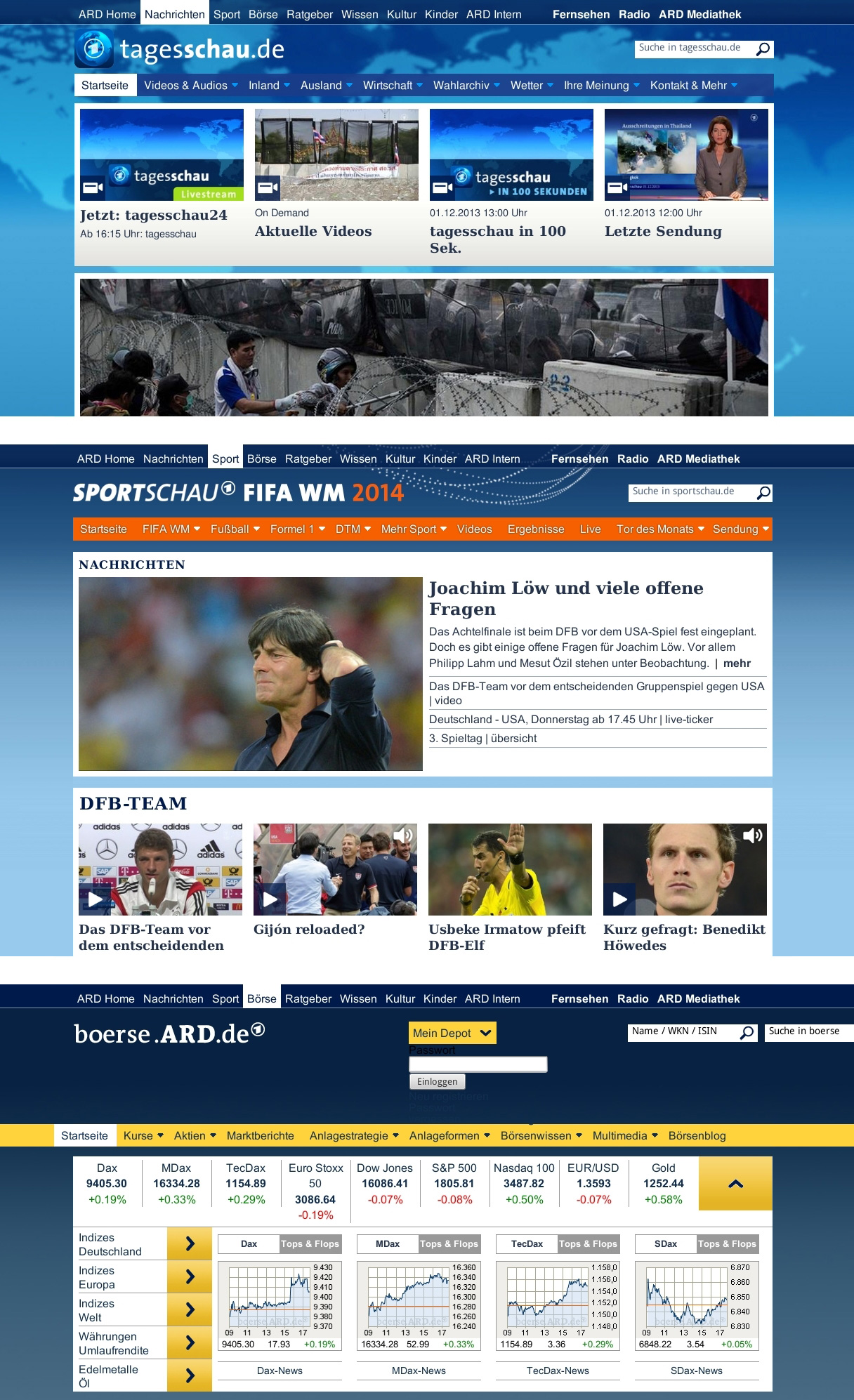
Consistency facilitates navigation in other departments. (Source: Ard) (View large version)
The mega-site pictured below has less consistent navigation, which makes it more difficult to explore departments.
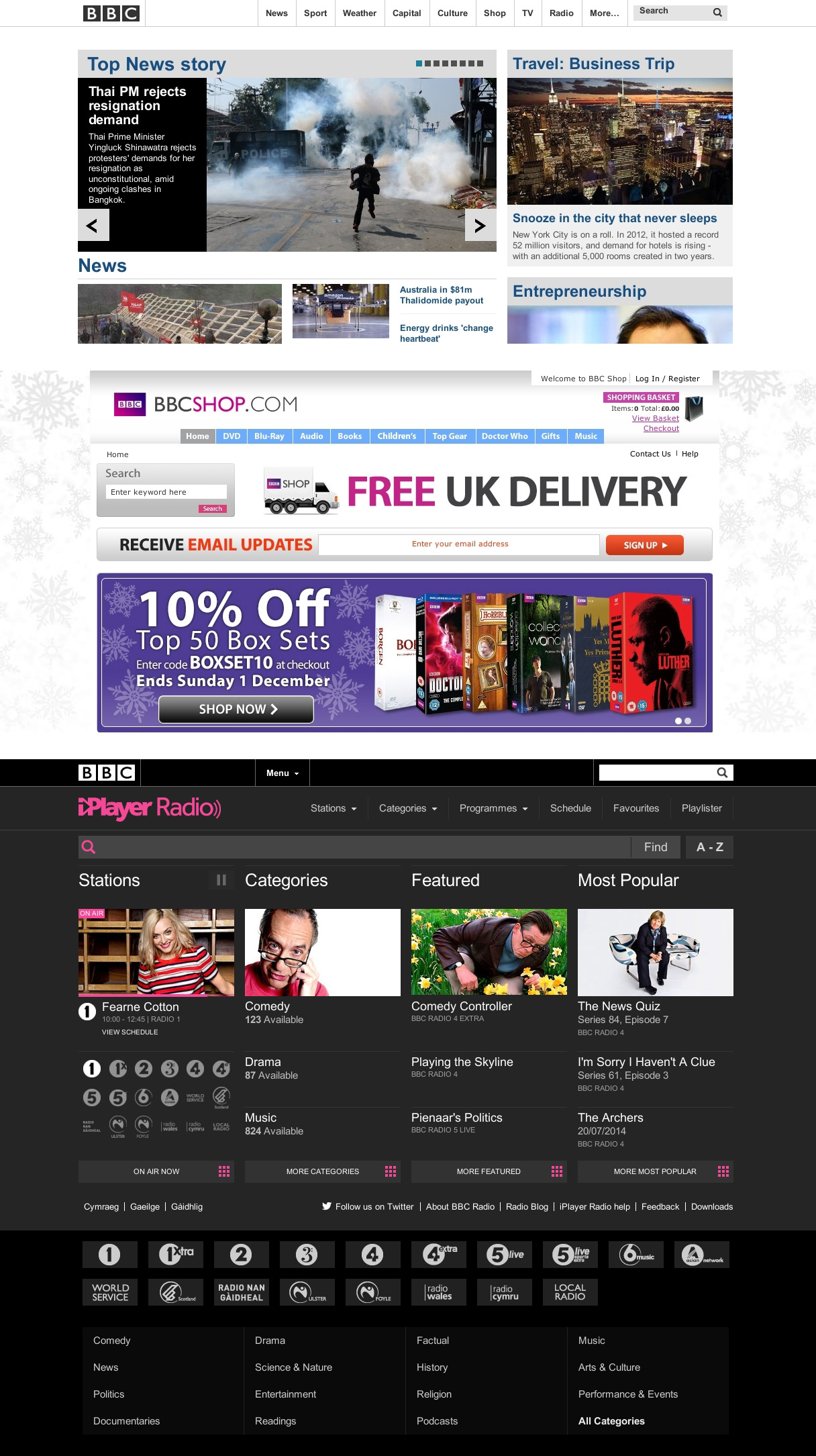
Varying navigation can impede exploration of other departments. (Source: BBC) (View large version)
The reason for distinguishing between visual and interaction design is simple. The user knows that a medical school will look different from a law school and so will expect a unique visual design. But there is no reason why the medical school should put its contact information in the bottom-left corner and the law school in the top-right corner.
Layout
Layout in web design refers to the arrangement of elements in a meaningful, aesthetically pleasing way. However, laying out elements for reading is different than layout out items in a navigation menu.
A piece of content can be complex and unique. Laying out its elements in a specific, sophisticated way might be necessary to explain it. Navigation is different. A menu is made up of categories and subcategories. The items in a category should all match the category’s description, as simple as that. Users do not expect anything else in a navigation menu. Thus, the goal of layout is not to explain items, but merely to sort them.
Sorting Items
Some people suggest not sorting alphabetically, but instead looking for other ways. Be aware, though, that alphabetical sorting is very logical in most cases. The menu pictured below does not use alphabetical sorting.
If the sorting logic is not immediately clear, then browsing and finding items can be difficult. (Source: Verious) (View large version)
The items seem to be arranged arbitrarily. But even if there is a sorting logic, it does not really matter. If users are not able to figure it out immediately, then browsing and finding items will be more difficult. The advantage of alphabetical sorting is that users will figure it out immediately. Also, if the user knows the name of the option they are looking for in that category, they will find it very quickly.
Nonetheless, a sorting logic other than alphabetical can be more helpful to users on occasion. Take the “News” category. The title itself is a clue to an alternative sorting logic. News items are best sorted by publication date, not alphabetically.
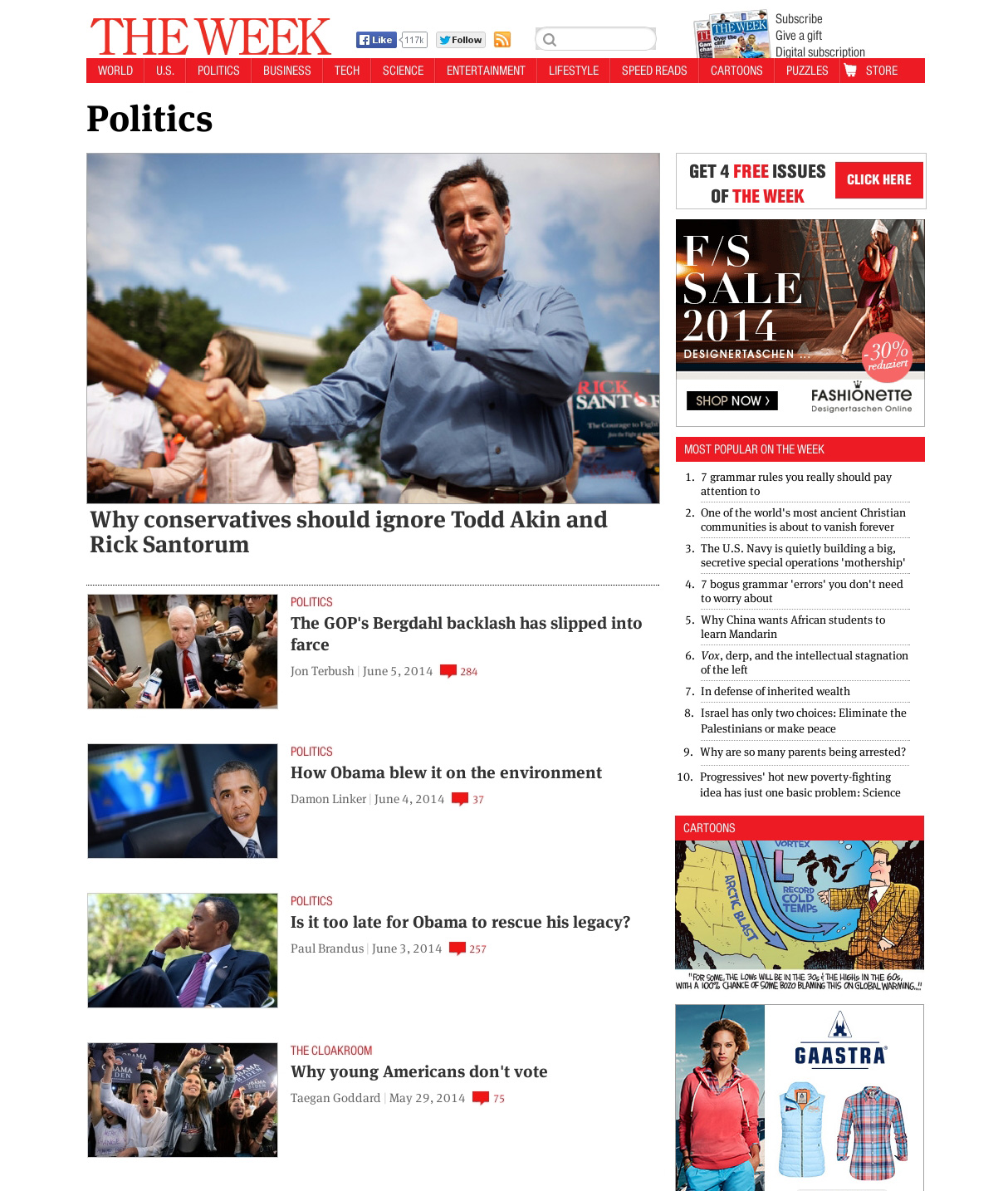
Sometimes, a sorting logic other than alphabetical is more appropriate. (Source: The Week) (View large version)
Finally, some websites offer a widget that enables users to choose how to sort items in a navigation menu. A sorting widget is often added to interfaces with dynamic filters.
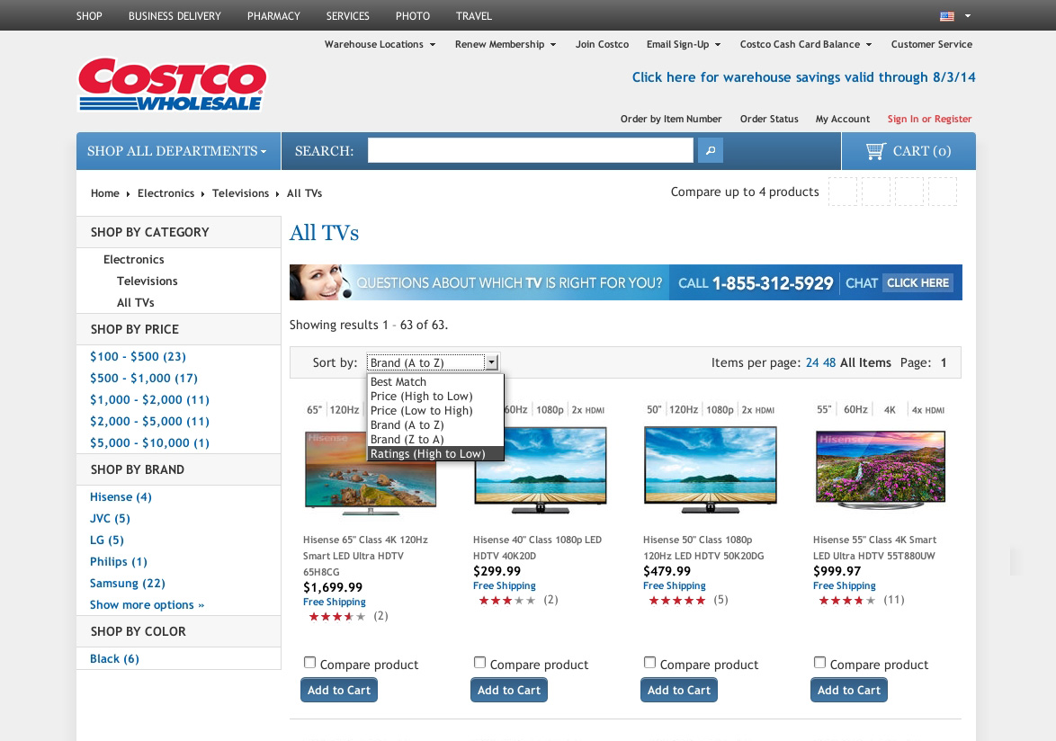
A sorting widget enables users to choose how to sort items in a navigation menu. (Source: Costco) (View large version)
Be aware that users use sorting widgets not so much to sort and then comprehensively browse results as they do to filter out undesired items. For example, if a user sorts items by rating, then they are obviously more interested in higher-rated items than lower-rated ones.
Nonetheless, a sorting widget can be a useful addition. Users will know immediately what it does and how to use it. Also, if implemented as a drop-down menu, it won’t take up too much space. However, as with the more powerful dynamic filters, a widget is only necessary if the menu has more than a few items and if breaking down a long list into subcategories is not called for.
How Users Scan Information
Correctly sorting items can be tricky. And laying out options in that order is not without pitfalls either.
The three most common layouts for a navigation menu are lists, columns and grids. There are additional, more sophisticated layouts, as we’ll see, but keep things as simple and familiar as possible. In the three aforementioned layouts, the user will scan through the items as shown below.
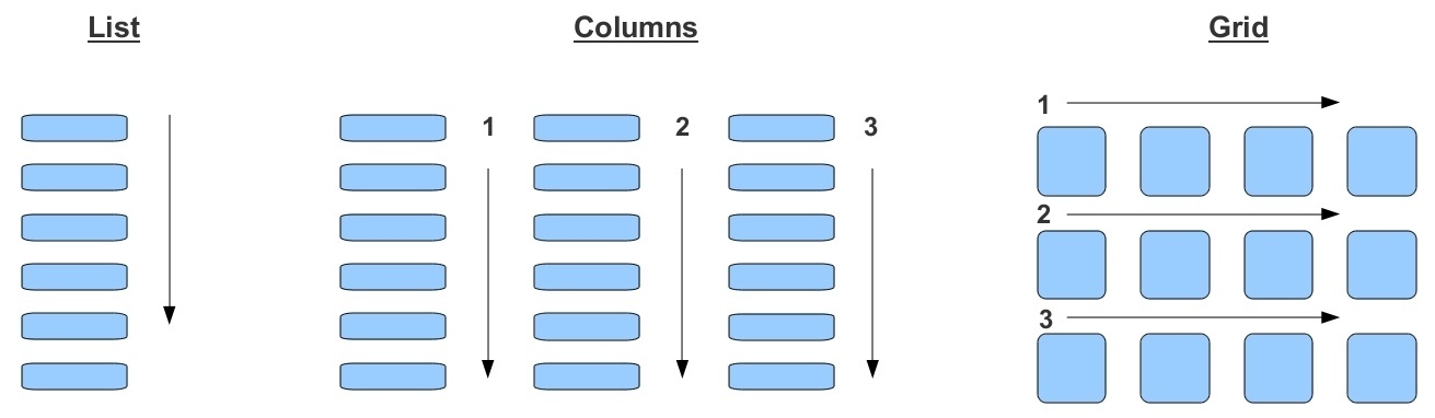
Users typically scan information according to the layout. (View large version)
In addition, the navigation items should be left-aligned, not centered, which is more familiar and easier to read.
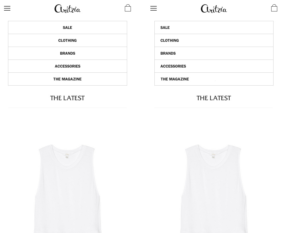
Items in the navigation menu should be left-aligned. (Source: Aritzia) (View large version)
Be aware, though, that the way users scan information is not written in stone, but culturally conditioned.
Choosing The Right Layout
The next question, of course, is when to use which layout. The type and amount of your content is a good guide:
- Labels only. In this case, a list or set of columns is the best choice. Whichever you choose will depend on the available screen space of the device.
- Labels and pictures. Here, a grid is the best choice.
- Labels, pictures and descriptions. In this case, anything but a list would not be feasible. Even if there is enough space for a grid, a list is still the best choice.
To better understand the subtleties of grids and lists, examine the website below, which enables users to switch between a list and grid. First, look at the grid view.
The grid mode is space-efficient and emphasizes the pictures, which helps users quickly spot items they want. (Source: USA Today) (View large version)
The main focus is the pictures, not the labels or, in this case, the titles. The labels could be displayed over top of the picture, which would slightly compromise the pictures, or above and beneath it, which would slightly compromise the space efficiency. A grid is still the most space-efficient view, as well as the best for quickly spotting items — that is, if pictures are sufficient for explaining the options. By contrast, consider the list view:
A list takes up more space and emphasizes descriptions. (Source: USA Today) (View large version)
The focus is on the titles and descriptions, which are centered. The pictures take a supporting role. A list takes up more space than a grid; however, reading is more comfortable in a list.
For news, a list is best. Pictures are not sufficient to explain the options; titles and descriptions, which are missing in the grid view, are required. If the items were not news articles but clothes, paintings or cars, products whose point of interest can be conveyed by a picture, then a grid would be suitable.
These rules apply to all traditional navigation menus. Interestingly, with dynamic filters, the rules change.
First, consider what would be the best view in a regular menu for electronic products, such as mobile phones, computers or cameras. A grid view might seem to be the best choice. After all, users typically want a stylish product, and a grid emphasizes pictures. The pictures below are cropped to emphasize this.
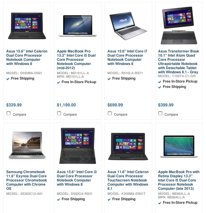
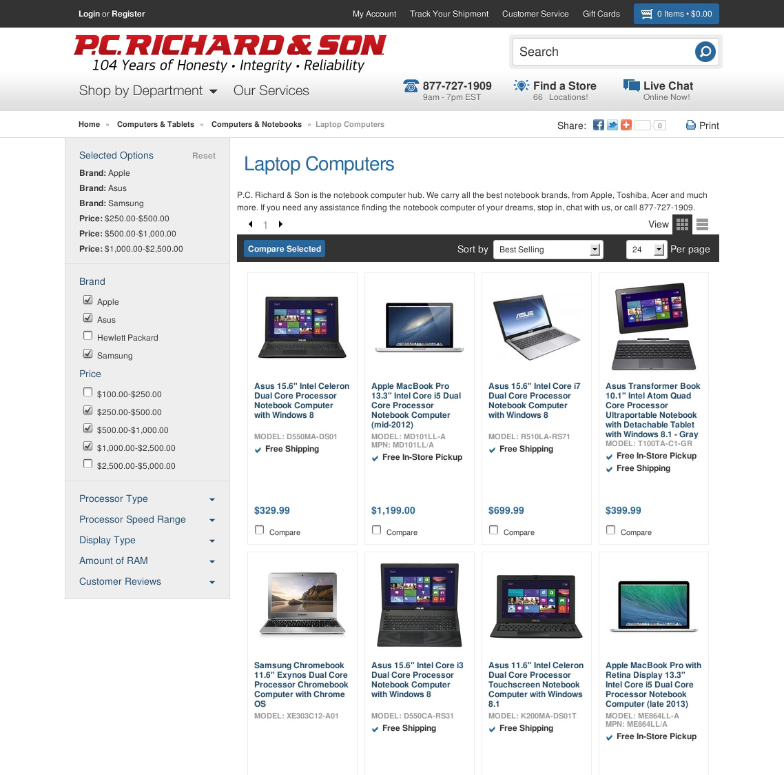
A grid view emphasizes pictures of products. (Source: P.C. Richard & Son) (View large version)
However, users also look for certain features in electronic devices, be it number of pixels, wireless connectivity, CPU speed, etc. So, a list, which is better suited to displaying technical information, would work best for these type of items.
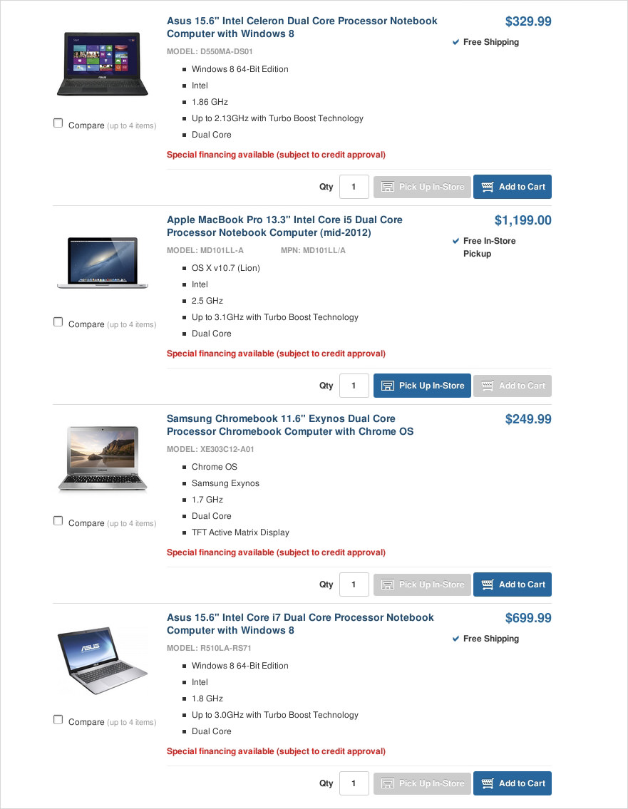
A list is best suited to displaying technical information. (Source: P.C. Richard & Son) (View large version)
Dynamic filters change the equation. Their very purpose is to capture and display meta data. Therefore, displaying the same data in a list would be unnecessary. The better choice would be a grid that only displays the three elements that dynamic filters cannot properly show: the name of the product, a picture and the exact price. The screenshot below demonstrates this, showing the same menu as above but this time with dynamic filters.
A grid is best suited if dynamic filters can accommodate the desired meta data. (Source: P.C. Richard & Son) (View large version)
Of course, if the dynamic filters cannot display the required information properly (for example, descriptions of articles), then a list remains the best view.
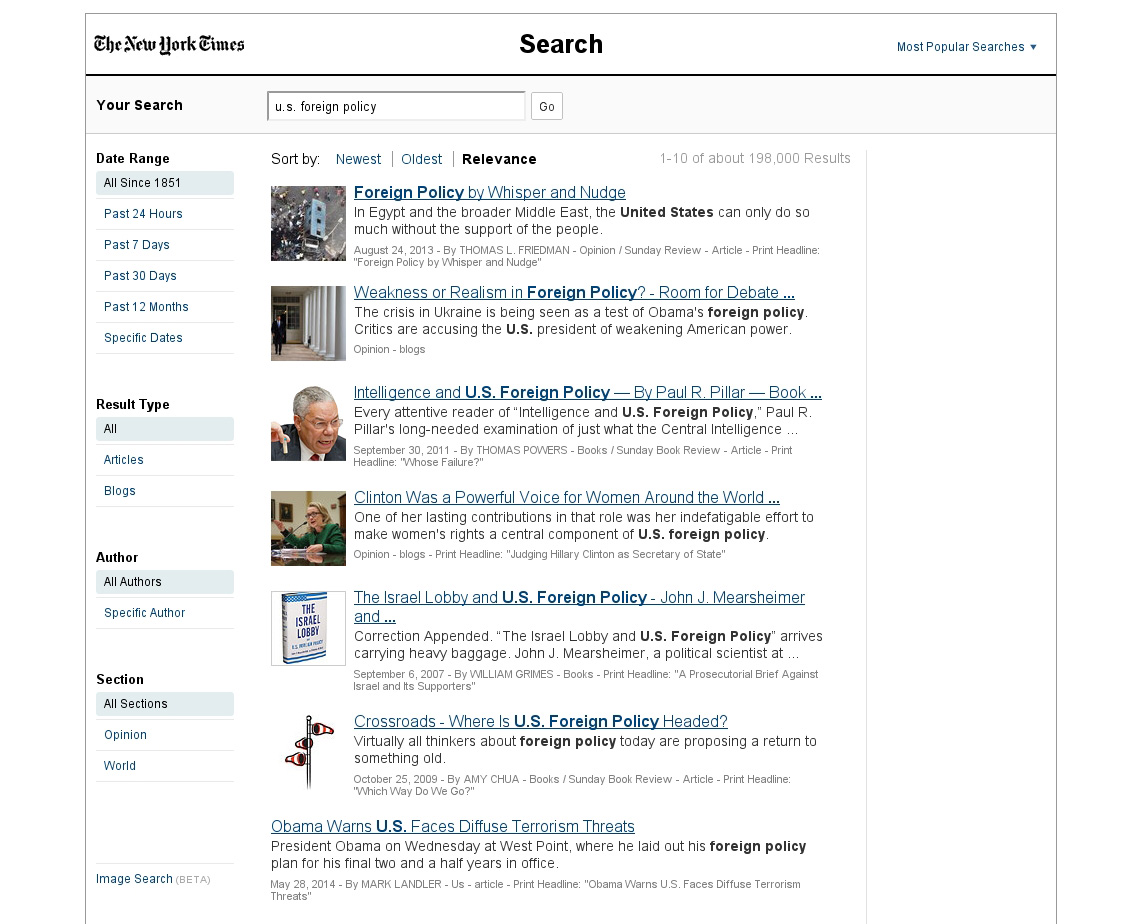
If dynamic filters cannot properly accommodate crucial information, then a list is the best choice. (Source: New York Times) (View large version)
Home Pages
A fourth way to lay out items is often encountered on “Home” or “Featured Items” pages. First, notice that the “US” section in the screenshot below displays items in a simple, traditional list.
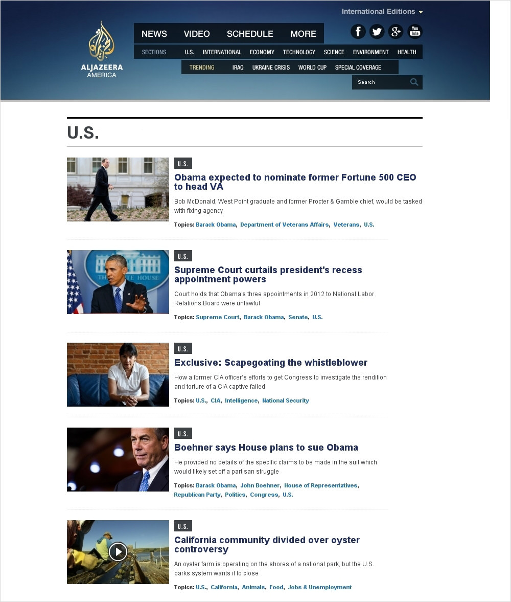
Subsections often have simple, traditional layouts. (Source: Al Jazeera America) (View large version)
All sections of Al Jazeera’s website have the same layout. However, the home page has a different, more sophisticated layout.
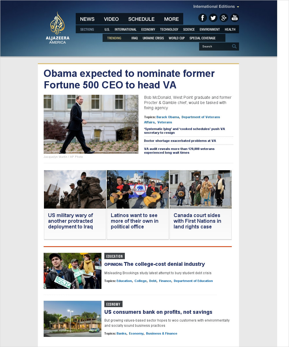
Home pages contain featured items that users would otherwise have to access by going to the corresponding subsections. (Source: Al Jazeera America) (View large version)
The latest news article is given center stage and the largest picture. Links to related articles are next to it. A bar underneath horizontally lists recent items from various subsections. And a vertical list further below shows past articles.
There are a few reasons why “Home” and “Featured Items” pages look the way they do, with their more complex layouts. Users can access featured articles by visiting the corresponding subsection, whereas the home page displays those featured articles from the subsections, making them directly visible and accessible. However, because the home page lacks the descriptive precision of subcategories, the designers highlighted and prioritized the articles through layout.
There are three things to note about the layout of the “Home” and “Featured Items” pages. First, as important as the home page is, users should be able to easily see and access subsections as well. Secondly, the home page is still essentially one big navigation menu, not a page for consumption per se, so the layout should be simple. Thirdly, many large websites have multiple big sections that are designed as “home” pages; keeping their layouts consistent will make it easier for users to find their way around.
Tag Clouds
Finally, a fifth type of layout for navigating to content is the tag cloud. A tag cloud uses gradients, font size and positioning to show the relative importance or recurrence of items in a category.
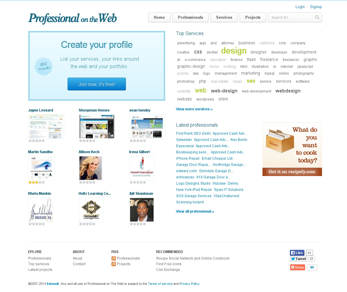
Tag clouds are a complex visualization of weighted navigation choices. (Source: Professional on the Web) (View large version)
Interestingly, tag clouds enable users to visualize items both alphabetically and by importance at the same time. Nonetheless, sorting by name or frequency makes items easier to understand and faster to scan. Apart from that, a tag cloud hardly works with anything but labels.
Functional Context
Functional context refers to the function that a user performs in a particular situation — in this case, whether they are navigating to or consuming content. These functions, however, play different roles in the user’s experience. As mentioned, navigation is merely a means to consuming content, so users expect navigation and consumption to contrast with each other.
Duplicate Navigation Menus
The content of a website could be pictures, videos or statistical data. After adding the main content itself, many developers will add options for the content, such as additional data, a chart view or an option to darken the surrounding page while a video is playing. They do so to make the available content more appealing to consume. However, the situation is the opposite with navigation. While users might want to view the same set of data in different chart types, they need only one type of menu to navigate to the data.
One wrong solution that is all too common is that clicking a navigation link drops down a submenu first.
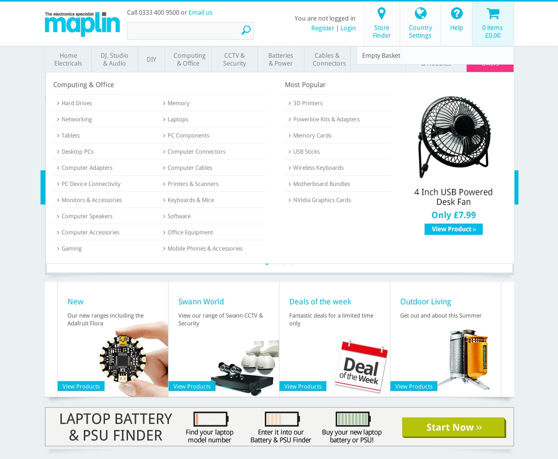
Clicking a menu link often drops down a submenu. (Source: Maplin) (View large version)
However, clicking the same link twice takes users to a separate page, which is for the same content category.
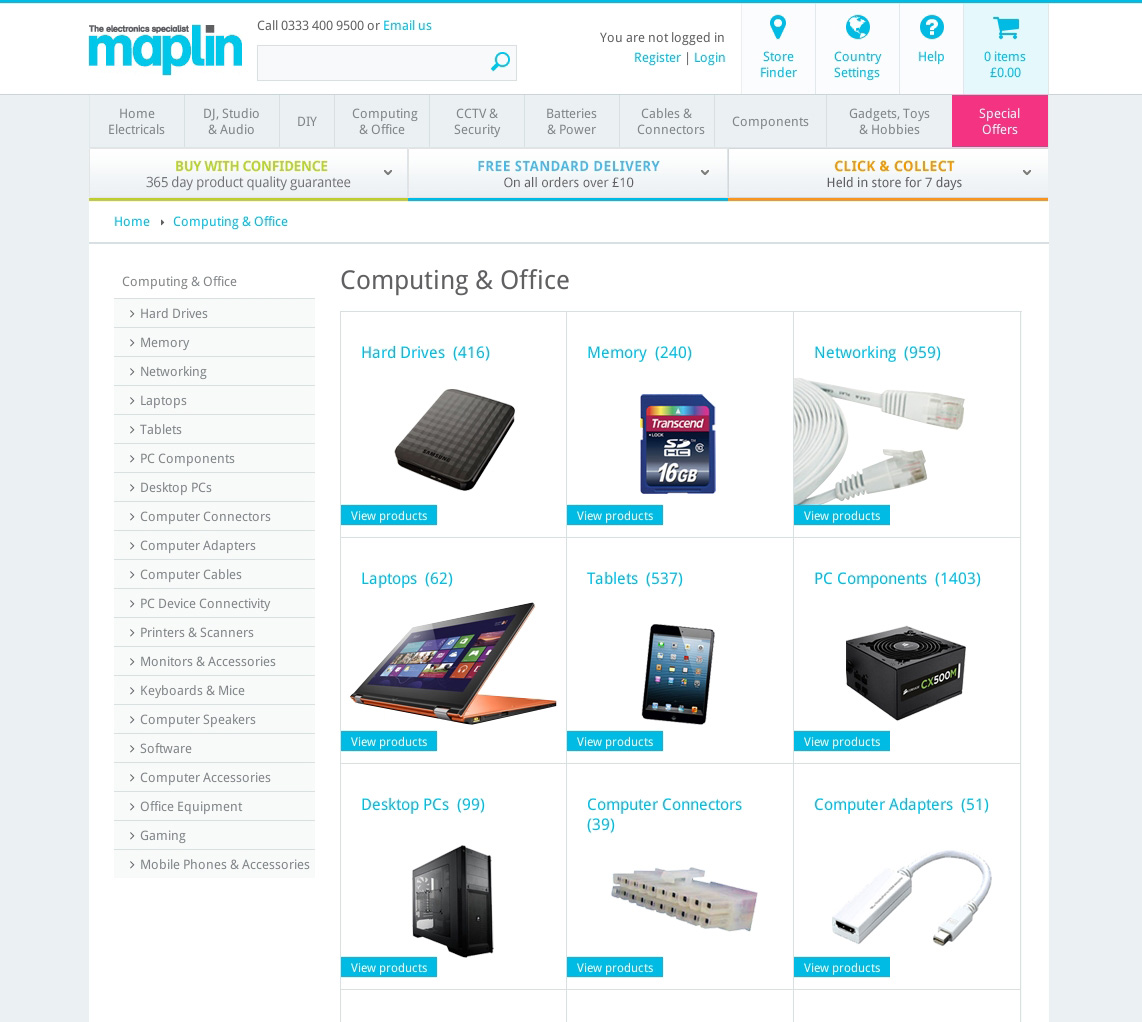
Clicking the same link again will often open a separate page for the same content category. (Source: Maplin) (View large version)
In some cases, as with Maplin, two different navigation menus are even on the same page.
We’d be dealing with one of two scenarios:
- The drop-down menu and the separate page contain the same items, with the separate page usually displaying the items in more detail and with additional information.
- Example: Tiger Direct
- Counter-example: Best Buy
- The drop-down menu contains a few featured items, while the separate page contains the same featured items as well as all other items that match that category.
- Example: Boston Globe
- Counter-example: Time
Unfortunately in both scenarios, effort is duplicated for both users and designers, yet without benefit.
In the first scenario, the user will probably compare the menus first. “Why are there two navigation menus? Do they offer different options? If so, which is better suited to my navigation needs?” What’s more, returning visitors might repeat the process when new content is added. This is time they could have spent navigating to and consuming content from a single menu.
The second scenario has additional problems. If the user does not like the featured items in the drop-down menu, they might be reluctant to see the other options, especially because that would entail loading a new page and finding their way around again.
Again, instead of offering two types of menus, a mega-menu and a separate page, that both navigate to content, ask yourself which would do a better job of it, and then put all your effort into properly designing that one.
Visual Design In Navigation Menus
Another factor in the balance of navigation and consumption of content is visual design.
Mega-menus and separate pages offer ample space for pictures, but pictures should be used merely to explain options, not to present users with a degree of detail that would make them stop and “consume” the menu itself. Below, the car is presented in great detail, both in the large impressive picture and in the information below it.
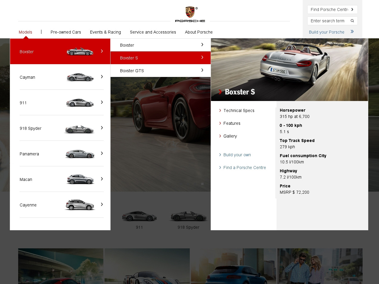
Large pictures and detailed information can create problems in navigation menus. (Source: Porsche) (View large version)
While the menu might look exciting at first, it actually creates a few problems in its interaction and efficiency of space.
First, the large picture and text take up so much space that only one item can be displayed. So, to compare their options, the user has to constantly move their cursor between the small submenu entries in the middle. Secondly, the content page shown below is rightly designed to put the product into the spotlight and to give the user a lot of information about it. However, because the navigation has a similar style, the effect of transitioning to the main content is not as impressive as it could be.
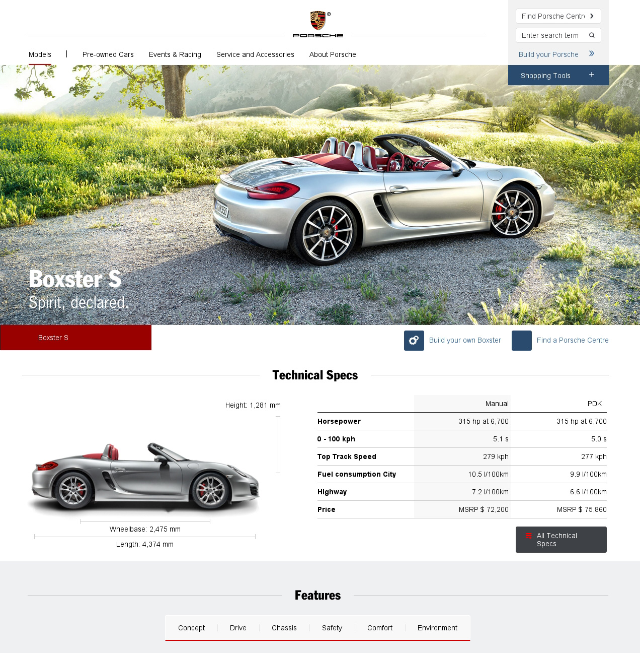
If the navigation is similar in design to the product page, then the latter will look less impressive. (Source: Porsche) (View large version)
By contrast, in the example below, the designs of the navigation and main content are distinct. The pictures in the menu are large and detailed enough for the user to be able to easily distinguish between models but small enough to be lined up horizontally. Also, the text is restricted to helping users decide which model to explore in detail.
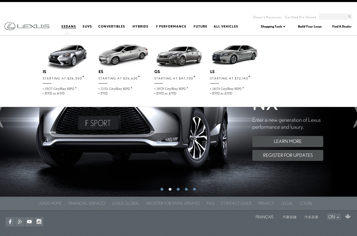
Pictures in navigation menus are best used to explain options, not to present in detail. (Source: Lexus) (View large version)
Then, once users pick a model, they are taken to a dedicated page that presents the product in as detailed and spectacular a fashion as possible.
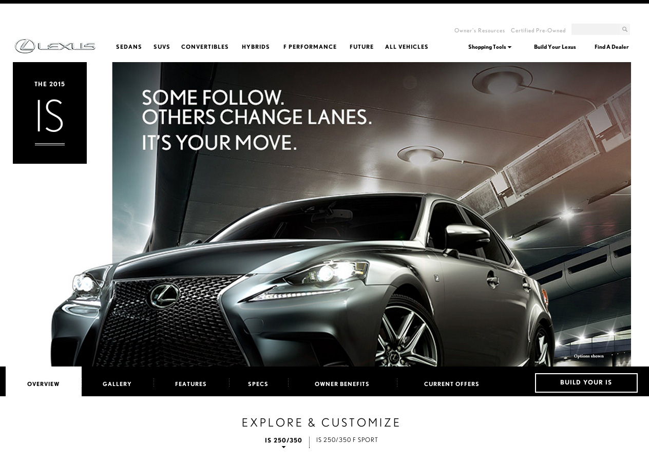
The best way to present a product in detail is on a separate dedicated page. (Source: Lexus) (View large version)
Animation And Navigation
Another reason to make navigation and content distinct has to do with animation.
Some responsive websites have advanced animation, such as off-canvas navigation and flexible navigation. In general, content is moved down or to the side to reveal the navigation. The website pictured below slides in the menu from the left, pushing content to the right.
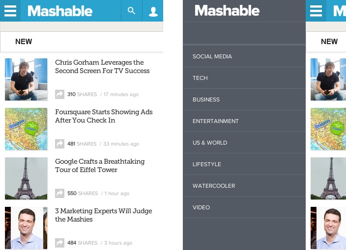
Some websites animate content to reveal the navigation. (Source: Mashable) (View large version)
Animation, if purposefully deployed, can be a useful way to explain transitions on the screen. Left and right sliding animations, for example, visualize the moving back and forth between navigation levels. However, sliding animation should be used only to explain navigation and nothing else.
With the techniques mentioned above, by contrast, both content and navigation are animated. While other developers might be impressed by the effect because they know how technically difficult it is to do, users might think different. Users might ask why the content is moving if they’ve only requested the menu. Building and maintaining such an effect take time and resources, yet the result could be perceived as confusing.
The traditional way to animate navigation is to slide it over top of the content, as mocked up below, which is a simpler, more efficient solution for both developers and users.
Sliding the navigation menu over top of the content is a simpler, more efficient way to present navigation. (View large version)
Immersing The User In The Functional Context
A final point concerns immersing the user in one function by fading out the other.
Many websites that have drop-down navigation also have media such as videos and slideshows that play either automatically or manually, the latter being favorable because it puts the user in control. In either case, be considerate and pause media in the background as soon as the menu is opened to allow the user to assess their navigation options without distraction.
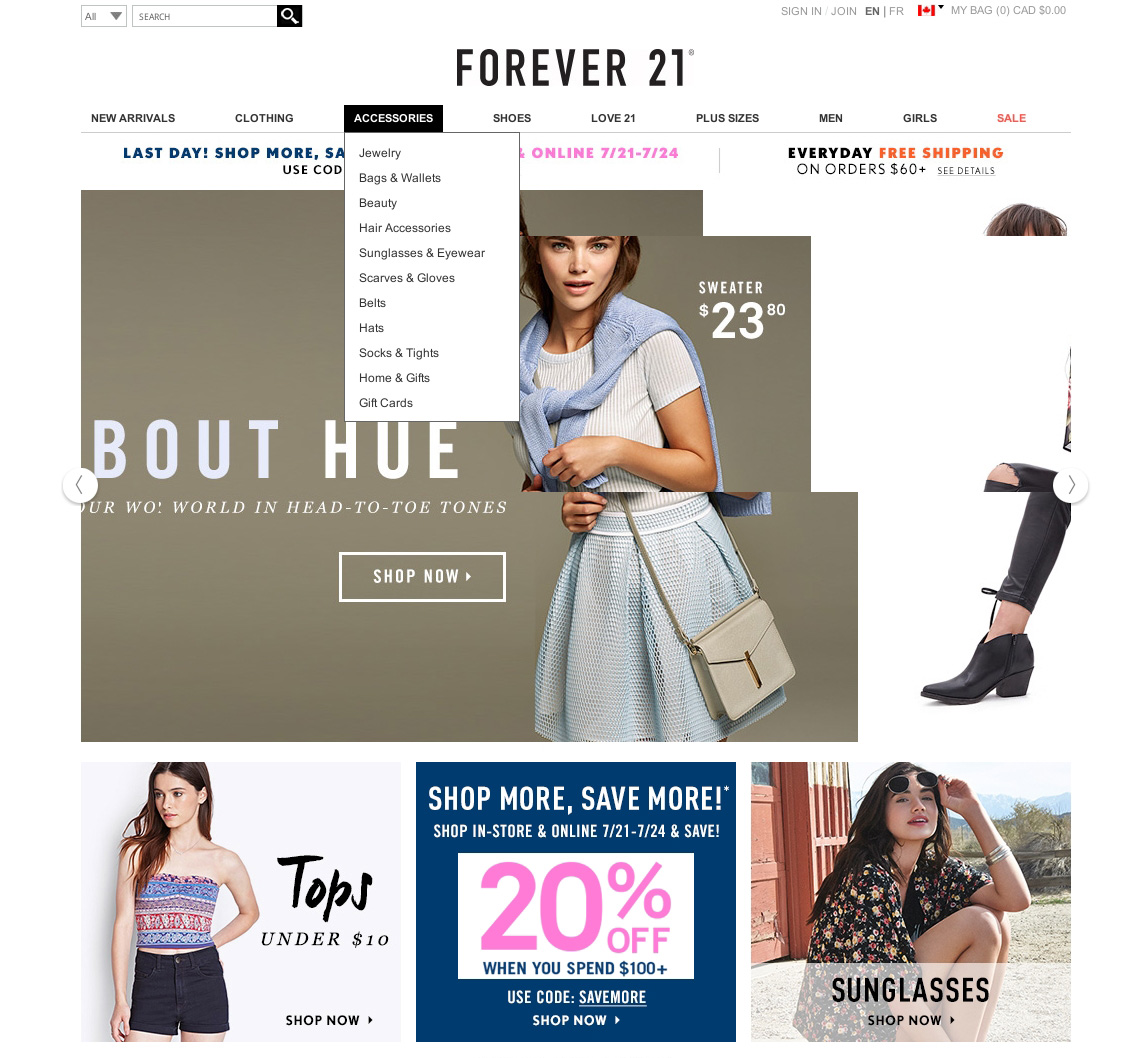
When the user opens the menu, pause carousels and other media to allow for undisturbed navigation. (Source: Forever 21) (View large version)
Summary
The recommendations in this article can be summed up as follows:
- Symbols. Indicate drop-down menus with a symbol; a text label with a triangle is the most reliable indicator. Consistent use of symbols throughout the website will minimize confusion.
- Target areas. Target areas in navigation should be large, easy to read and consistently positioned to make interaction comfortable.
- Interaction event. Interaction with navigation should be based on clicking, not hovering or typing. Scrolling should be allowed only for navigating within, not between, categories.
- Layout. Alphabetical sorting is good, but don’t overlook alternative sorting methods. Lists, columns and grids are the most familiar types of layouts for menus. If short text is sufficient to explain the options, then go for a list or columns. If pictures are best, then choose a grid. If longer descriptions are necessary, then a list is the best choice. If dynamic filters can accommodate crucial information, then use a grid; otherwise, a list.
- Levels. Display the content of no more than a single category at a time. Tabbed mega-menus and sliding menus are the most efficient solutions for mobile. Also, too few levels can complicate navigation by creating long lists that are hard to digest. If you have more than a couple of levels, consider a breadcrumb trail. On a mega-site, give each sub-department a unique visual design, but keep the interaction consistent across departments.
- Functional context. Use only one type of navigation for a website, and use pictures merely to explain the options, not to present in detail. Also, once users activate the menu, pause any distractions, such as video or slideshows.
Final Thoughts
The gist of designing a navigation system that is easy to use is to restrict and follow up the navigation options for your target audience as well as to keep the information in the menu to a minimum.
However, these two steps make up only half the story. Because the users have to interact with the navigation, two more steps are required — namely, to choose and then design the right type of navigation.
As for choosing the right type, the less information that is necessary to explain the options and the less it amounts to, the simpler the navigation will be. Finally, the menu should be designed to be as simple, predictable and comfortable as possible.
Simplicity means using only one type of navigation menu and displaying the contents of a single category at a time. Predictability comes from following consistent and familiar patterns. And comfort follows from reducing mistakes and stress by making the interaction forgiving and inclusive.
These four steps might sound like common sense, but mistakes that break or compromise the user’s experience often happen along the way. Hopefully, this series of articles has helped you avoid mistakes and improve your navigation for users as a result.
Other Resources
Here are some resources you might be interested in:
- “Guide to Website Navigation Design Patterns” Cameron Chapman, Six Revisions
- Welie: Patterns in Interaction Design
- “Designing for Mobile, Part 2: Interaction Design” Elaine McVicar, UX Booth
- “Responsive Navigation Patterns” Brad Frost
- “Complex Navigation Patterns for Responsive Design” Brad Frost
- “Navigation Patterns for Mobile Optimized Retail Websites” Theresa Neil, Slideshare
Further Reading
- The Elements Of Navigation + 6 Design Guidelines
- Responsive Menus: Enhancing Navigation On Mobile Websites
- Can User Experience Be Beautiful?
- Sticky Menus Are Quicker To Navigate
 (al, il, mrn)

