Design Principles: Connecting And Separating Elements Through Contrast And Similarity

Email Newsletter
Weekly tips on front-end & UX.
Trusted by 182,000+ folks.
 Register for Free
 Custom Web Forms for Angular, React, & Vue. Your backend.
 Celebrating 10 million developers


Similarity and contrast, connection and separation, grouped and ungrouped are all ways to describe the varying sameness and difference between elements. Based on the information they carry, we’ll want some elements to look similar, to indicate that they are related in some way. We’ll also want to show that some elements are different and belong to different groups.
Key to showing both is the visual characteristics of elements and their relationships. If two elements are related in some way, then they should show similar visual characteristics. If the elements are different, then they should look different.
Note: This is the third post in a series on design principles. You’ll find the first two posts here:
- “Design Principles: Visual Perception and the Principles of Gestalt”
- “Design Principles: Space and the Figure-Ground Relationship”
Primitive Features
How do you show contrast and similarity between elements? The answer lies in the primitive features of the elements.
Primitive features are the intrinsic characteristics or attributes that an element might have. For example, what color is the element? How big is it? What shape is it?
Each of these things communicates something about the element. If one heading is bigger than another, then we assume the bigger heading is more important. We might view an element with a shape that’s jagged and sharp as being dangerous.
Sometimes, an element’s attributes need to be compared to the same attributes of another element in order to have meaning. The headings from the previous paragraph are a good example. A heading should only be bigger than another heading or another piece of text. The comparison is necessary for bigger to mean anything. It’s through comparisons like these that we communicate similarity and contrast.
By giving visually similar characteristics to multiple elements, we communicate that something is similar about the elements. If two elements on a web page are both red circles, it’s natural for a viewer to ask why. Why are both red? Why are both circles? The likely conclusion is that the elements are related in some way beyond how they look. The elements’ similarity implies that they carry a similar message.
Likewise, by applying visually different characteristics to multiple elements, we communicate that something is different about the elements and the messages they carry.
Any characteristic of an element that can be varied can be used to make elements look the same or different. A few characteristics, however, are most often used to show similarity and contrast. In no particular order, these are:
- size,
- shape,
- color,
- value,
- texture,
- position,
- orientation.
A rectangle and a circle contrast in shape. Two red items are similar in color. A red rectangle and a red circle contrast in shape and show similarity in color. How you balance the similarity and contrast of elements through their visual characteristics will determine much about what those elements communicate to the viewer.
Note: While primitive features are the primary way to visually show contrast and similarity, we have other ways to show both — for example, the actual content that the elements carry. The words “stop” and “go” contrast. The words “stop” and “cease” are similar. Images contrast with text; long paragraphs contrast with short paragraphs; and so on.
Contrast
Human beings are wired to notice difference. It’s a survival mechanism to quickly differentiate a friend from something that wants to eat us. Being able to quickly determine that was vital to returning safely home to the cave at night.
Our ability to quickly notice differences is what makes contrast so powerful. Contrast attracts attention. It draws the eye. It gets noticed. By giving an element characteristics that are visually different from the elements that immediately surround it, we can create points of interest and emphasis. In fact, because the contrast of an element with its surroundings is so good at drawing attention to the element, it’s perhaps the most effective way to add interest and excitement to a design.
Contrast does more than attract attention. It establishes boundaries between elements, too. For example, contrasting the background color of the main content and that of a sidebar is one way to show where one ends and the other begins.
Differences that stand out can provide emphasis, highlighting important elements and information. The greater the difference, the greater the contrast will be. The greater the contrast, the more important the element will appear.
For example, two ways to set off text are bolding and italicizing. Boldness typically shows more contrast and, thus, stands out more. Spotting bold text at a glance or from a distance is easier than spotting italicized text.
If two elements are meant to be different, go big with the contrast. You don’t want viewers to wonder whether the difference is intentional. Make sure the contrast is obvious and clearly intentional. Leave no room for misunderstanding. Don’t contrast text that’s 16 pixels with text that’s 15 pixels. People won’t notice the difference immediately and, once they do, it will appear to be more of a mistake than a conscious decision.
Be careful not to overdo it. Use contrast sparingly. If everything contrasts and tries to draw attention to itself, then nothing will stand out. You’ll end up with visual noise that causes confusion.
Too much contrast can break the harmony and unity in a design, leading to chaos and confusion. This might be what you’re after in a certain design, but more often than not it isn’t. Decide which few elements need to stand out, and make them look very different from everything else.
Contrast And Gestalt
While every gestalt principle is about showing similarity and contrast in some way, I want to point out two of them. Contrast is critical to determining the figure-ground relationship and showing dominance and focal points.
- Figure-ground
One of the first things we do when viewing a composition is to determine what’s the figure and what’s the background. This relationship helps to set context for everything else in the composition. Figure and ground need to contrast with each other or else the viewer will have difficulty determining which is which. - Focal points
These are elements of attraction and interest. They’re designed to look different from their immediate surroundings. The contrast is what helps them stand out and draw attention. The element that stands out the most in the composition is the dominant element. Elements that stand out in a composition but to a lesser degree are focal points.
Similarity
The same survival mechanism that enables us to quickly see difference also helps us to see when things are the same. It points us to who or what we can trust and to what might be dangerous. Being able to recognize similarity is why human beings are excellent at finding patterns. Patterns help us understand the world around us, provide context and make learning quicker, to the point of something becoming intuition or instinct.
When we design two or more elements to look similar, we are indicating that what’s true about one is true about the other. If one of the elements is important, then the other one is likely important, too. If one element is clickable, then other elements that are visually similar will probably be clickable, too. It’s how we can quickly recognize links in a block of text. Visual contrast shows that links are different from the rest of the text, while the visual similarity among links tells us, once we’ve discovered what one does, that all of the links are clickable.
Similarity is about showing connection and showing that multiple items are related in some way. It brings familiarity and consistency to a design.
Similarity complements our natural strategies for processing information. When we take in our visual surroundings and attempt to make sense of it all, we naturally group objects into chunks in order to hold more information in our working memory. We further group, organize and structure everything before it becomes part of our long-term memory.
Designing similar information to be visually similar helps the user to process and comprehend the information, which are two critical goals of design.
The more that primitive features of elements look the same, the more similar they’ll look and the more viewers will think they’re the same. They’ll appear grouped and related in some way, even if just one characteristic is shared; and the more they look the same visually, the more they’ll be perceived as being the same.
We use similarity to build structure and pattern. Any similarity between two elements in a composition implies a structure. Additional similarity fills out the structure and leads to pattern, texture and rhythm.
Not all signals that show similarity are equal. In the image below, would you group the objects by shape or color? Do you see a group of circles and one of squares, or do you see one red group and one blue group?
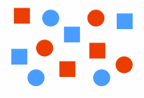
You probably noticed color first, grouping the elements as red and blue. This suggests that color is a stronger communicator of similarity than shape. This is not absolute, however. For example, someone with red-green color blindness wouldn’t likely notice the difference between red and green objects before noticing the shapes of those objects.
Similarity And Gestalt
Again, every gestalt principle is about how we perceive the similarity or difference between objects. Many of them can be read as tips to show similarity.
- closure
different elements that may be part of a similar whole - symmetry and order
mirrored elements that appear to belong together - uniform connectedness
similarity through visually connecting elements - common regions
similar items enclosed together - proximity
similarity through enclosures in space - continuation
similarity through rhythms in space - common fate
similarity through movement - parallelism
similarity through orientation
The Relationship Between Similarity And Contrast
Contrast and similarity show the relationships between elements. Nothing has meaning in isolation. An element needs to be shown in context with other elements.
What does one large element cornering a smaller element in a design imply? What does one block of text being indented more than others with light gray suggest?
Contrast and similarity are really just opposite ends of a scale. On one end of the scale, objects look entirely different; on the other end, they look exactly the same.
Most of the time, we’re somewhere in between the extremes, and the things we design will share some but not all characteristics. Similarity and contrast are expressions of where along the scale objects lie relative to each other.
Even though I haven’t been explicit about it, everything I’ve said about either similarity or contrast applies to the other. Having one is impossible without also having the other. Contrast is a lack of similarity, and similarity is a lack of contrast. It’s all about where it lies on the scale.
Thinking about them together makes them more impactful. You can use a single feature, such as color, to show that several elements are related, and then use a different color to show that several other elements are related but different from the first group. With just two colors, we can create two distinct groups of connected elements.
Color coding in this way is an effective way to categorize information so that the viewer can discover and understand at a glance.
When everything is the same, you get tedium. When everything is different, you get noise. The best designs have a healthy mix of similarity and contrast and show a clear understanding of what they’re trying to communicate.
Examples Of Contrast And Similarity
Contrast and similarity can be found on every website. Both need to be present. Imagine a website having no contrast. We’d all have a hard time reading text if it and the background were the same color. Just as difficult would be each word or phrase having a different style.
I’ll point out some of the contrast and similarity on the websites below. There’s more of each than what I’ll mention. I want to offer enough examples to get you thinking and then let you take over. Look at and study different designs, and work at truly improving your skill in balancing contrast and similarity.
David Simon
One of the first things you’ll notice on David Simon’s website is the contrast between background colors, which makes it easy to distinguish one part of the page from another. The logo stands out as a dark object against a light background of space.
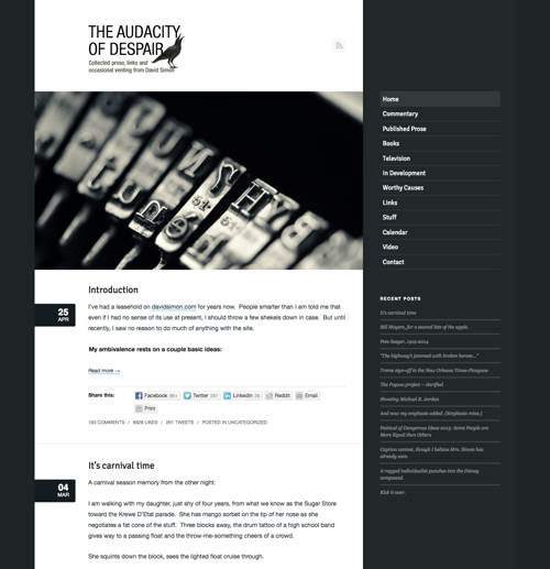
The image contrasts with everything to draw the eye. The background of the posts’ dates, the full uppercase used for the meta data for comments, and the background color of the menu item for the current page are also examples of contrast drawing the eye and communicating something meaningful.
Links in the menu are all styled the same, as are the links to recent posts. Both are separated with horizontal lines. Each menu contrasts with the other to signal difference. Fonts are consistent throughout. The headings and body text contrast in typeface, but their difference is consistent across the website.
Links in the body could stand out more to make clear they’re links, although the designer might have deliberately made them less obvious in order not to interrupt the flow of reading. Headings could also have been made to stand out better, although it is pretty clear that they are not a part of the main text.
Mike Kus
The home page of Mike Kus’ website focuses on different projects that Mike’s worked on. Most of the page is empty, but notice how that makes each element stand out. The text contrasts with the background, as do the paintings against the background wall texture.
Note: Mike has changed his home page since I wrote this. What you see in the screenshot below is the previous version.
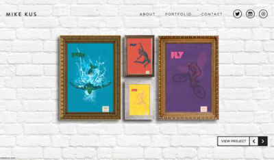
The paintings also contain the only color variety on the page. All other information is in the same dark gray.
Also, notice how the paintings are framed, indicating that they have something in common. In this case, they represent projects. Note, too, that the background shows similarity through its pattern of bricks. It’s clear what is figure and what is ground.
On Mike’s “About” page, below, the lone image of Mike contrasts with everything else. The blue button to “Get in touch” is the only element with color. You might not contact Mike, but it won’t be because you don’t know how. Buttons across the website have the same blue.
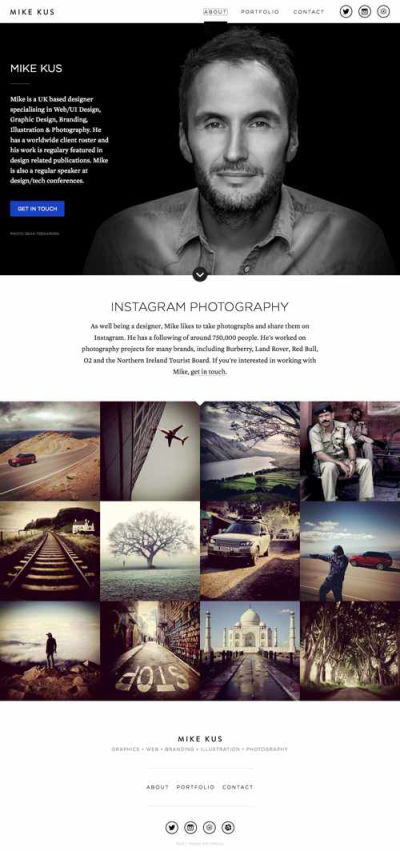
Mike’s name as the logo is repeated as the main heading on the page. The header contrasts with the background, as do the backgrounds of the various sections of the page below. Links in the menu share the same uppercase styling. Social icons at the top are repeated along the bottom.
Fonts are also used consistently, with headings in a sans-serif and body text in a serif, contrasting with each other.
Electric Pulp
The logo on Electric Pulp’s website is a red circle of moderate size. It contrasts well with everything else that is immediately visible. Notice how the color is repeated in the main navigation to indicate the current page.
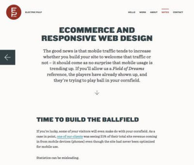
Headings across the website are big, bold and set in all caps. Headings and body text also contrast consistently across the website, with the former in a sans-serif and the latter in a serif.
Click into the “Notes” section and you’ll see previous and next links with background colors that contrast with the main background. Background color is also used to distinguish different sections of the page.
Most buttons on the website are a contrasting red (a color often used to set off elements) and change to blue on hover. However, on the “Work” page, the first button reverses this (it’s blue and changes to red on hover). Whether this is deliberate or accidental is hard to tell. Nevertheless, the principle of contrast is maintained.
Lowdi
One last website to consider is Lowdi’s. The screenshot below is of the home page. Notice how color is used for both contrast and consistency.
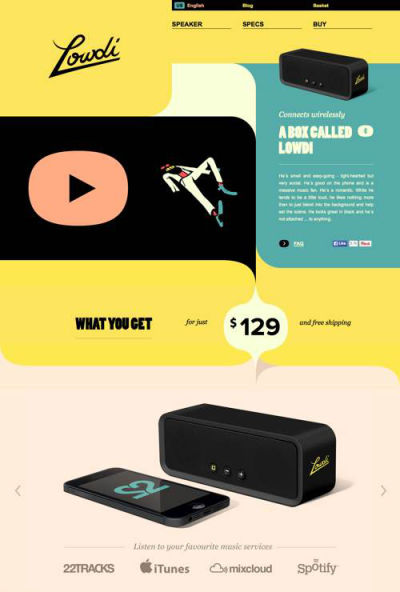
Color clearly delineates the start and end of sections. And the repetition of color creates a rhythm throughout the page. Notice how the yellow background of the price stands out, while also drawing the visitor’s eye down to the picture of the product.
Summary
Contrast and similarity have different functions. They are used in varying degree and in combination. You’ll always see some of both because neither exists without the other. Changing one means also changing the other.
Showing that some things are the same and some are different is the first step in visual communication. It’s the primary way that viewers derive meaning.
Contrast and similarity are clues to design elements. Differences draw our attention, and similarity transfers what we know about one element to another.
Ultimately, the goal is to contrast similar layers: making the elements in one group look similar to each other, but different from another like group of elements. The way we structure contrasting and similar elements creates hierarchy, flow and compositional balance, topics we’ll get to later in this series.
Further Reading
- 55 Free High Quality Icon Sets
- The Ultimate Guide To Cloning In Photoshop
- Hand-Sketching: Things You Didn’t Know Your Doodles Could Accomplish
- Switching From Adobe Fireworks To Sketch: Ten Tips And Tricks


