How To Design A Rocket Icon In Adobe Fireworks

Email Newsletter
Weekly tips on front-end & UX.
Trusted by 182,000+ folks.

 Agent Ready is the new Headless
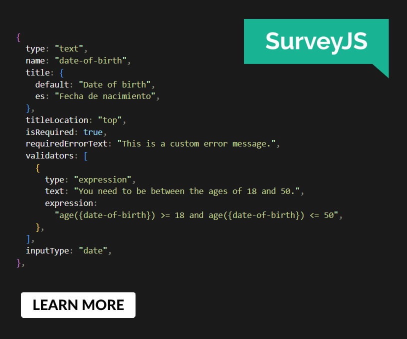 SurveyJS: White-Label Survey Solution for Your JS App

Many people know that Fireworks is a great tool for web design, prototyping and UI design. But what about icon design? Icon design is a very specific skill that overlaps illustration, screen design and, of course, visual design. An icon designer needs to understand lighting, proportions and, most importantly, the context of the icon itself.
The BBC published an interesting article about icon design and skeuomorphism one year ago, titled “What Is Skeuomorphism?” It’s definitely worth reading because it explains why icons often reflect the real world and the thinking behind it.
Another pretty interesting read is “What We Can Learn From Early Icon Design?” It is a quick retrospective of icon design and mentions, among other things, one of the most famous icon designers ever, Susan Kare.
I remember reading an article a few years ago that definitely influenced my career as a designer. Some points in the article were obvious, but they made me think about icons in a different way. Sometimes, the best way to learn is from mistakes you make or from mistakes that people more experienced than you have made. “10 Mistakes in Icon Design” is a good read and a useful resource for anyone who wants to learn more about icons and icon design. It is relatively old, dating back to 2008, but some of the examples are still pretty sound. The article stresses the importance of consistency in an icon set and how composition works (i.e. how many elements to use in an icon), and it gives important tips on dealing with metaphors, with practical examples. This is key in our job.
Is the icon you are designing going to be used on the web? Perhaps in a mobile app? In a toolbar? Somewhere else? These are the questions that icon designers must asks themselves before starting work on a project. The answer will affect the icon’s details, reflections, shadows, background and many other features.
1. Fireworks And Icon Design
Why Fireworks?
I have been using Fireworks now for nine long years, creating work that ranges from web design to complex UI design and, in the last few years, icon design as well. Fireworks has proved to be excellent software for all of these tasks because it combines powerful vector and bitmap editing tools.
I am not going to revisit the long-running debate about what is the best tool for UI design (which usually comes down to Photoshop and Fireworks). Above all, I am not a Fireworks evangelist. Ideas matter most — the choice of tool is up to the designer. Nevertheless, I’ve noticed that many people underestimate the power of Fireworks, dismissing it as second-tier software. Having a vast amount of experience with both Photoshop and Fireworks, I can only respond that, for speed and pixel-perfection, Fireworks is faster for screen design. It’s precise, easy to use and straightforward. That’s why I have picked it as the main tool in this step-by-step tutorial on icon design.
A Word About Icon Design
My dissertation back in university was on symbols, icons and pictograms. This subject was one of my favorites back then (and still is). What utterly fascinated me was that you could convey a message with an icon or symbol. Words aren’t needed for an icon to be understood by the majority of cultures in the world (at least, if the icon is relevant). Designing for the future means exactly that. I’ve always found the idea of a memorable metaphor to be interesting. Designing icons requires a lot of planning and thinking: As in drawing and illustration, the designer is responsible for choosing elements that will make the metaphor more or less relevant. Good icons turn different aspects of culture into something comprehensible in many cultures and countries.
One of the most successful icon metaphors in modern history is the desktop, used in operating systems, where the desktop is treated like a place to hold documents, folders, archives, pictures and files. (We’ll talk about icon design in detail in the following paragraphs. If you like the topic, you’ll find some useful links in the “Further Reading” section at the bottom of this article.)
Note: In this tutorial, we will explore some general principles that relate more to skeuomorphic design than to flat design (light, shadow, size and proportion, etc.). I will also cover some general techniques that I follow in icon design. So, by all means, pick up your favorite tool to follow along, whether it’s Illustrator, Sketch or Photoshop. I’ll be using Fireworks to show its core potential and to draw parallels with other vector tools. (This is my first tutorial for Smashing Magazine. I plan to write a couple of more articles that explore icon design and the features of two other popular tools, Illustrator and Sketch.)
Files For This Tutorial
To follow this tutorial fully, download the icon we will be designing:
- Download Rocket-Icon-Design.fw.png, a layered Fireworks PNG file
This layered Fireworks PNG file will help you follow the process step by step. The file is meant for reference. I encourage you to replicate the steps in a new file, with a blank canvas. Have fun!
![]()
Let’s get started!
All Vector? Yes!
We won’t be using any raster (i.e. bitmap) images. Everything will be created with vector shapes and live filters. This means you will be able to easily adapt the final image to different sizes and resolutions.
Fireworks supports screen illustrations of up to 6000 × 6000 pixels (actually, even up to 10,000 × 10,000), which is more than enough for the super-large HD displays of today’s mobile and desktop devices. And it also exports files to SVG format (with the help of a free extension that was covered in a recent article on Smashing Magazine). Using SVG as an exporting format gives you a lot of flexibility. You can use the resulting image right on the web or edit it further with pretty high fidelity in many other graphic design tools, including Adobe Illustrator CS6 and CC.
![]()
Scale your vector illustrations in Fireworks to any size, while maintaining quality and detail.
2. Ideas And Planning
Brainstorm And Collect Ideas
Before actually designing in your favorite app, do some research. Occasionally, when the icon you are going to design is nice and easy, you can get away with diving into Fireworks right away. Most of the time you’ll need a solid ground, based on research and mood boards.
Sketch On Paper
I prefer to sketch ideas on paper first. It gives me an idea of what might work and what might not. It’s also useful for iterating visually and making notes about your drawings.
The ideas you sketch on paper do not have to be perfect. It’s a good practice, and it allows you to visualize a design at a glance, without switching to “digital mode.” In this phase, you can experiment with shadow, light and perspective. Doing more than one sketch will also help you to determine the best crop for your icon.
![]()
Some of my initial sketches.
![]()
![]()
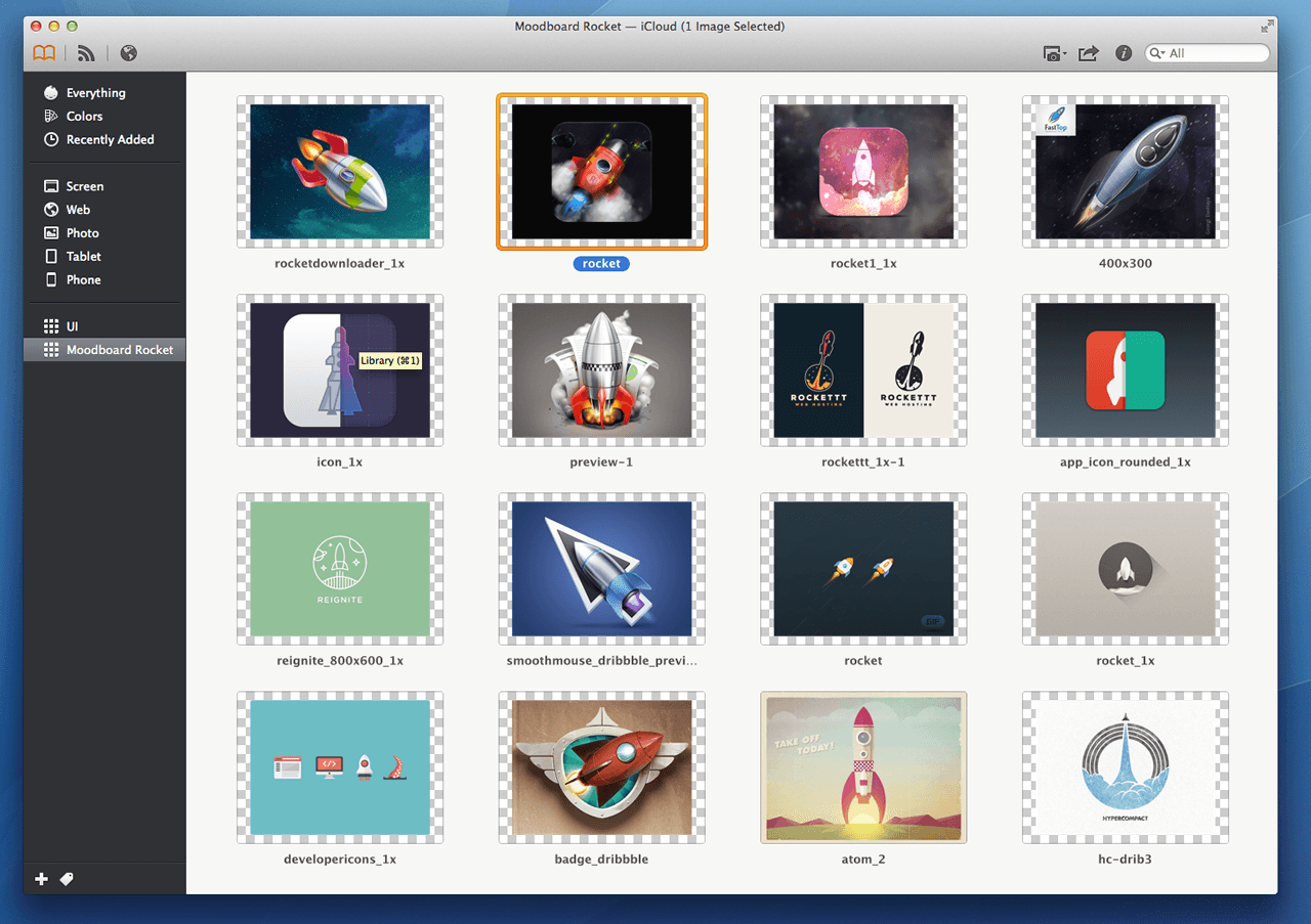
Mood Boards
I always appreciate mood boards, both for clients and my own work. Collecting images from around the web will give you a good starting point for figuring out what an icon could look like. You will see what materials are being used in the real world, and you will grasp the perspective of objects and understand the physics better. Even if you can’t achieve perfection, this exercise will help you to understand the build of an object. An icon needs to communicate a concept quickly; hence, it needs to be as clear as possible.
Some great tools exist to create mood boards and share them with colleagues. I use Ember, which enables me to archive images and take notes. The application syncs in the cloud as well, which is useful for teams whose members use various devices, such as smartphones, tablets and laptops. It is designed by Realmac, and it is pretty useful, especially if you work on the go and need to access your collections of images everywhere.
![]()
Mood board of rockets made with Ember. (View large version)
Think Vector!
Although Fireworks offers great support for editing raster graphics, its true power lies in how it deals with vectors. Most people think of Adobe Illustrator when they need to work with vector images. For screen design, though, Fireworks offers more flexibility. Some effects, such as shadows, glows and curves, are really efficient in Fireworks and can be applied to vector shapes and strokes very smoothly.
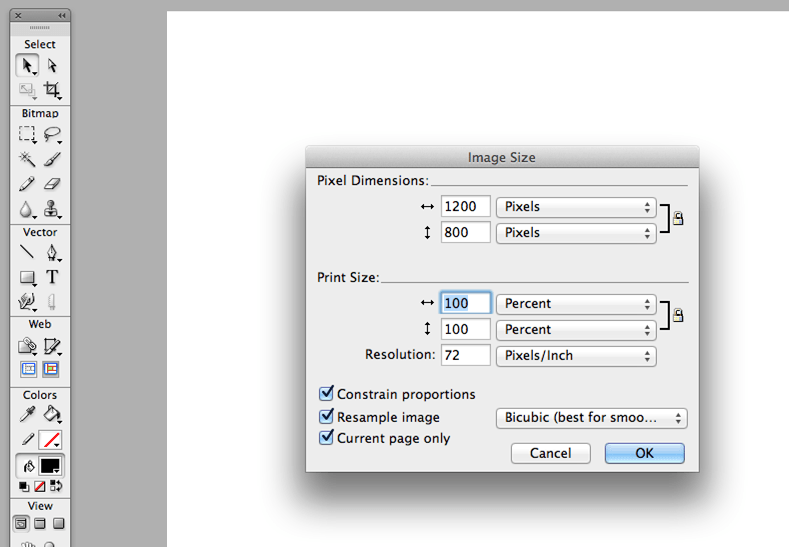
Let’s Get Started: Setting The Canvas
Open Fireworks and set your canvas to 1200 × 800 pixels, at a resolution of 72 DPI. This will give you enough room to play around with the illustration. Having some kind of background behind the artwork you will be designing is always worthwhile, so let’s start with that.
![]()
Fireworks’ “Image Size” pop-up. (View large version)
Background
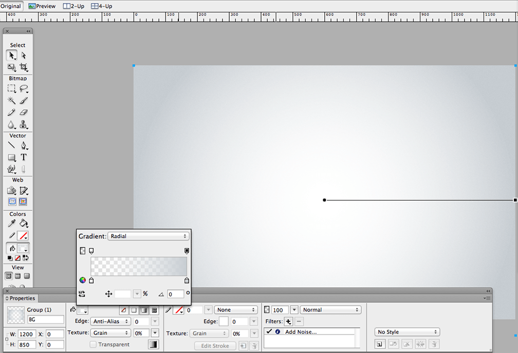
Use the Rectangle tool (shortcut: U) to draw a rectangle as big as the canvas. Then, use the Gradient tool in the Properties panel (as shown in the picture below) to fill the rectangle. You will have a solid white in the middle (the color stop on the left in the Gradient panel pop-up) and a subtle gray at the edges (the color stop on the right).
![]()
Radial gradient background. (View large version)
Next, go to the Live Filters section in the Properties panel, and select the + sign to add some noise (Filters → Noise → Add Noise… → Select Amount: 1. (We’ll deal with live filters in more detail later in the tutorial.)
We want to avoid banding, and this method is pretty reliable for that. It has been used by designers for long time and is a great technique.
Note: When Fireworks CS5 was released, a cool new feature was introduced: the dithering option for gradients. In the Properties panel, you’ll see a square button next to the “Transparent” checkbox. This method is pretty good and works for radial and linear gradients. I like to control banding with a bit of a noise effect to have better control over the output, but you have the freedom to explore all options. (If you want to learn more about this feature, do check out “Adobe Fireworks: Is It Worth Switching to CS5?,” particularly the section titled “New Dithering Option for Gradients.”)
![]()
The dithering option in Fireworks CS5+, and three examples of gradients with and without the option selected.
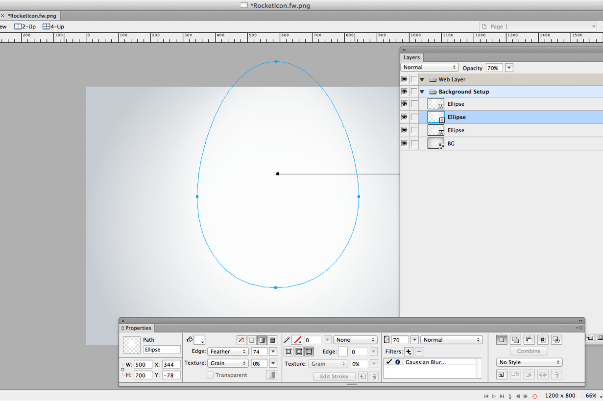
Eventually, we’ll want more highlight points, not just one big highlight in the middle. This will make the composition more interesting. (You could do this at the end of the tutorial, but doing it now makes the process easier.)
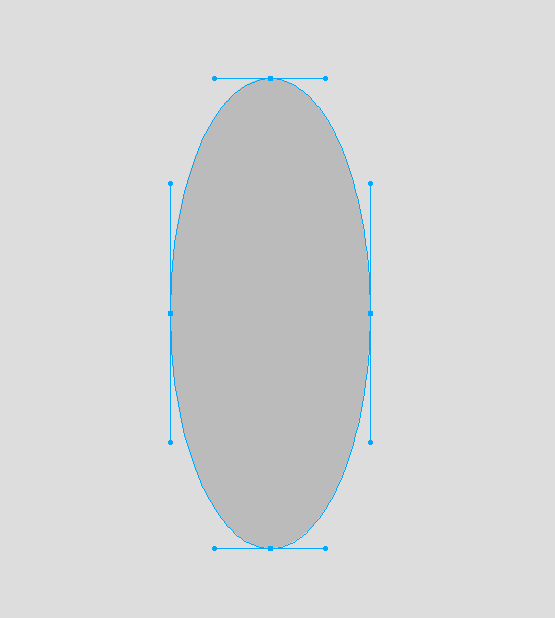
This is the process you will get to when setting up the lights for the background. It is mainly formed by elliptical shapes. The ones in the middle are similar to egg shapes.
![]()
Ellipse vector shape added (then edited) to the center of the canvas. (View large version)
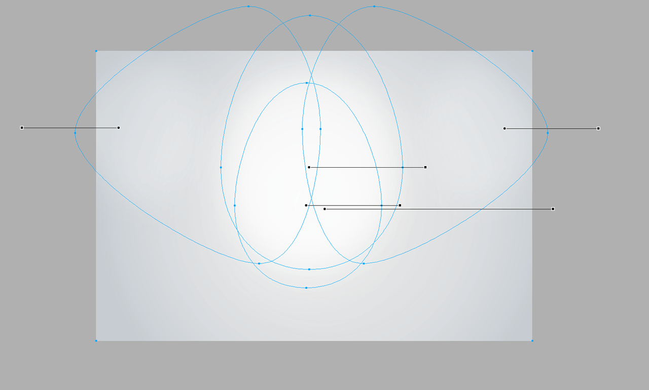
![]()
Various shapes create different highlights in the background. (View large version)
Before moving forward, we must understand how the Gradient tool works in Fireworks. This is key.
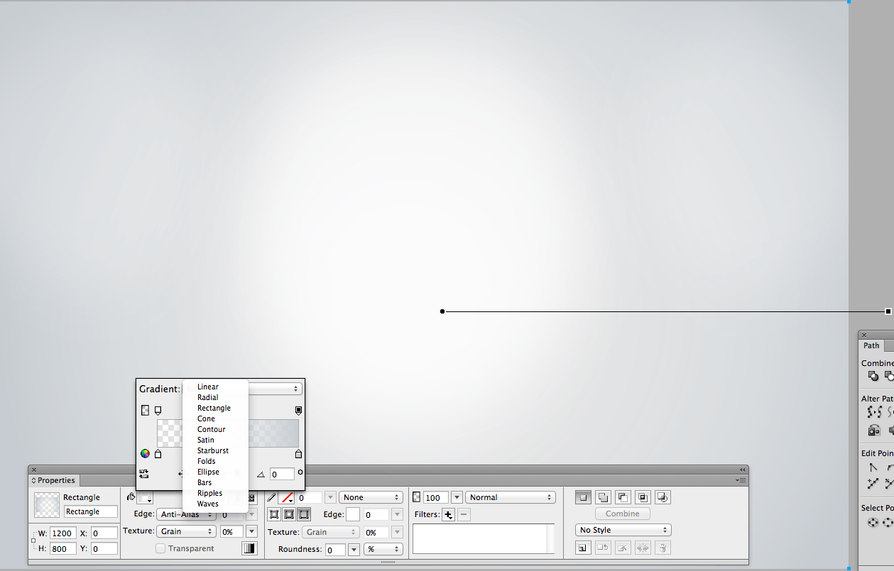
The Gradient tool is one of the best features in Fireworks. You can select different types of gradients to achieve different effects, and the types of gradients are more varied than those available in Photoshop and Illustrator. Linear and radial are, of course, the most common gradients and probably the most used, but Fireworks also has rectangle, cone, contour, satin, starburst, folds, ellipse, bars, ripples and waves.
My favorite is the ellipse, which we’ll use a lot throughout this tutorial.
When you choose the Ellipse gradient, you will see two lines with handles in the middle of the vector shape, displayed on an x- and y-axis, allowing you to select the intensity of light in the shape very precisely.
In the Gradient tool pop-up, you can also select the angle of the gradient numerically, which will change the light effect in your shape. As you see, the possibilities are endless.
![]()
Gradient tool pop-up panel. (View large version)
Understanding How Gradients (And The Gradient Tool) Work In Fireworks
Familiarize yourself with the Gradient tool, and understand where the center of the gradient is. With the color stops (the small dark squares), you can then adjust the size of the fade and achieve awesome results.
The picture below shows how the tool works. The handle is a representation of what you have in the gradient panel, and it will reflect in the gradient of the vector shape you are using (in this example, a rectangle that fades from black to white). The darkest point is where the gradient begins at 0% (black, #000000), and the lightest color is where the gradient ends, at 100% (white, #FFFFFF). You can easily rotate and resize the handle (or handles, depending on the type of gradient) right on the canvas (i.e. without opening the Gradient tool pop-up panel) or adjust their angles with numerical precision.
![]()
The basics of the Gradient tool in Fireworks.
Take a few seconds to explore in detail the Gradient section of the Properties panel. Below is an extensive explanation of the most important features.
![]()
The Gradient tool explained in detail.
Color Gradients Are Powerful When Faded Into Other Colors
Now that we’ve covered the basics of the Gradient tool in Fireworks, let’s explore some of its uses in icon design.
One other great feature of the Gradient panel is that you can set the opacity of the colors that compose the gradient. For example, if you have a linear gradient that fades from orange to orange (#FF8000), you can set the second orange color stop to 0% opacity, so that the gradient fades to a transparent orange.
This is particularly useful when you want a color to disappear against a background. See how the orange disappears against the white background in the area on the right (you can see a better example in the chart below). This is really useful in complex projects, and we will come back to this later in the tutorial.
![]()
Opacity of the colors in the gradients.
Feather And Gaussian Blur
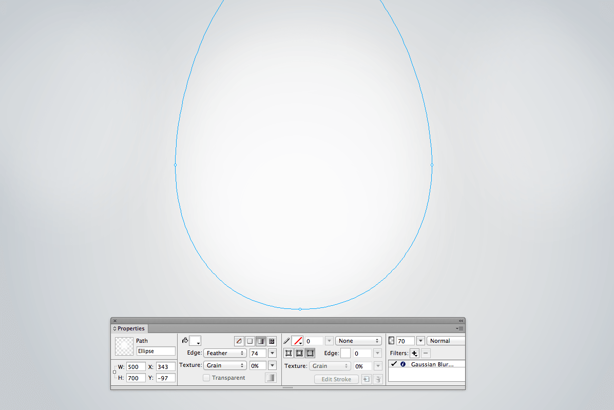
Finally, make sure that the shapes that form the background fit together seamlessly. To do this, use the Feather option and the Gaussian Blur live filter in the Properties panel. You can blur these shapes dramatically; for example, by setting the main light in the middle of the composition to a Feather value of 74 and setting the Gaussian Blur live filters to a value of 34. This will make the shapes smooth and soft.
The Feather option deserves particular mention.
In the Properties panel, you can easily change the edge of a vector shape (as shown below, just change the option in the drop-down menu). If you select the “Feather” edge option (instead of “Anti-Alias” or “Hard”), then you can increase or decrease the blurriness of a vector shape. This feature is awesome.
![]()
The Feather edge option in Fireworks.
![]()
Feather edge and Gaussian Blur live filter. (View large version)
3. Designing The Rocket
Now that the background is set up, we can start designing the rocket.
Let’s start with a few simple shapes. This is what we do every time: go from simple to complex, adding details step by step.
Step 1: The Ellipse
Start by creating a common shape, the ellipse. With the Ellipse tool, draw an elliptical shape that is 200 × 470 pixels. I generally choose a neutral color to start, like gray (#BBBBBB), and then add more complex colors later on. Building the shape is the first step.
There are two ways to do that. The first is to draw the shape with exact dimensions using the Ellipse tool. The second way is to draw a circle or an ellipse of any size, and then set the exact dimensions (width and height) right in the Properties panel. Fireworks is intuitive software and gives you the choice to perform a lot of actions from the Properties panel very quickly.
![]()
A simple elliptical shape created with the Ellipse tool. (View large version)
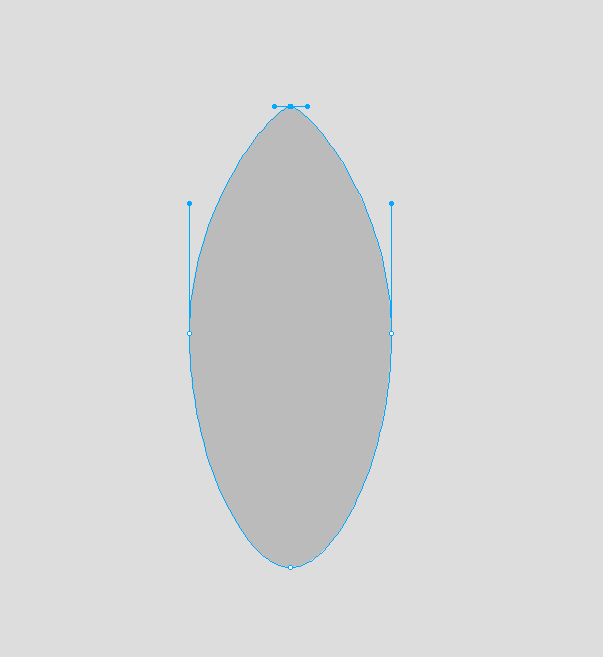
Step 2: Anchor Points And Handles
We want this elliptical shape to look like the body of a rocket, and so we need to make various tweaks. By clicking on the anchor points of the vector shape, you will activate the blue handles, which allow you to change the shape of the ellipse. Dragging the handles towards the center of the anchor point will make the shape more pointed.
![]()
Anchor points and handles. (View large version)
Note: Clicking on a vector shape with the Pointer (or Selection) tool (V) will select the shape and show all of its anchor points (the little blue squares). To highlight and manipulate the anchor points and/or the handles, you have to select the shape with the Subselection tool (A), and then all of the anchor points will show as white squares with a blue outline. Next, clicking on any of the anchor points will show its editing handles; if you hold Shift, you can select more than one anchor point. Because Fireworks is so flexible, we can use one more technique: If you select the shape with the Selection tool and then press and hold Alt, the Selection tool (the black arrow) will temporarily appear like the Subselection tool (white arrow), and the anchor points will change from blue to white. While holding Alt, you can now easily sub-select any of the points and see their handles! Sometimes this alternative approach will save you a bit of time, because you can both select vector shapes and manipulate their individual anchor points (and handles) without having to switch between the Selection and Subselection tools.
![]()
(Selection and Subselection tools in Fireworks and Illustrator.
As you can see, Adobe Illustrator and Fireworks handle the selection tools in a very similar way.
![]()
Selecting anchor points and vector shapes in Fireworks and Illustrator.
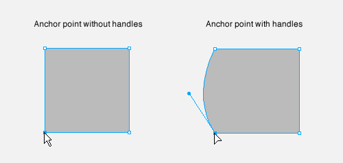
Note: You can have anchor points with or without handles. If you start from simple squared vector shapes (created using the Rectangle tool, for example), then you will have anchor points without handles; so, if you click on such an anchor point with the Subselection tool, you will only be able to move freely around that anchor point. You can add handles to the anchor points of any vector shape, which is quite easy. If you’re currently using the Selection tool (black arrow), hold Control/Command + Alt and click and drag an anchor point, and then a handle will be added to it, which will allow you to create and manipulate a curved line (instead of a straight one). And to add handles, if you’re currently using the Subselection tool (white arrow), the procedure is exactly the same except that you have to hold only the Alt key when you click and drag an anchor point.
![]()
Press Control/Command + Alt to add handles to anchor points with the Selection tool, or only Alt with the Subselection tool. (View large version)
Step 3: Pointy Head
By dragging the handles of the anchor point towards the middle, the shape will change from a rounded shape into a pointed shape (this process is identical in Adobe Illustrator and other vector tools). Avoid making the top of the head completely pointy — a rocket should have a smooth top to look realistic.
Note: If your workflow comprises a lot of editing of vector points and handles, try the Path panel (Window → Path). For example, with the help of the Path panel, you could change one handle and then use the “Make handles equal” option to apply the changes symmetrically to the other side of the rocket head. The Path panel is an integral part of Fireworks, and you can always get the most recent version of it from Aaron Beall.
![]()
How to make a pointy angle in the elliptical shape.
Step 4: The Body
Cut the bottom of the ellipse shape by about 35 pixels. You don’t have to be exact, but we do need to get rid of the bottom part of the ellipse in order to shape the rocket.
To do this, you can use the Knife tool (Y). If you hold down the Shift key while dragging with the Knife tool across the ellipse, the cut will be made precisely horizontally along the x-axis. The Knife tool is similar to the one in Illustrator and is handy for cutting vector shapes quickly.
Note: Once the cut is made, you will get two individual paths. Delete the bottom one and keep the top one. You can then use the Pen tool (P) to connect the two bottom anchor points to get a closed shape again.
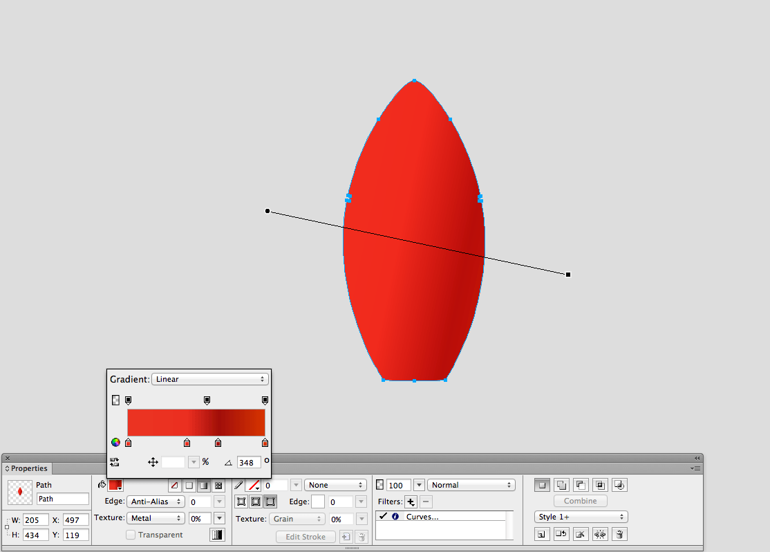
Now, let’s add some color. We want the rocket icon to look cool — a vivid red would achieve this. Set up a gradient as shown below. The color stops will be at 0% (#EB3423), 43% (#EB2E20), 66% (#A10E0A) and 100% (#D93600), and the angle of the gradient will be 348 degrees.
![]()
Setting up a bright red for the body of the rocket. (View large version)
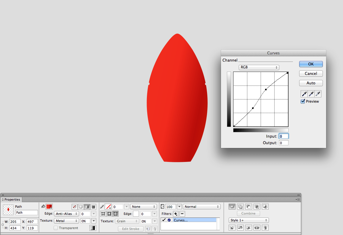
To eliminate some of the banding, we can apply a subtle Curves live filter from the Properties panel.
![]()
To add a Curves live filter, go to the Properties panel and click + → Add live filters → Adjust Color → Curves. (View large version)
Before moving forward, let’s talk a bit about live filters and compound shapes, two important features when working on icon designs in Fireworks.
A Note On Live Filters
Fireworks can apply filters to both bitmap and vector objects. For bitmap objects, filters can be applied either from the Properties panel (these are “live filters” — see details below), or from the Filters menu at the top of the application (these are “regular” filters). Regular filters are “destructive,” meaning that they modify the bitmap object and become a part of it. In other words, you can go back only by undoing the action after applying a particular filter (Control/Command + Z). In most cases, this is not what you want.
A more interesting feature of Fireworks is live filters, which give you many more creative possibilities. Live filters can be applied to both bitmap and vector objects, and they are non-destructive — that is, they are “live” editable. Also, any type of filter can be applied multiple times to the same object; for example, you can add multiple drop shadows to one vector (or bitmap) object, style each of them individually, and even change their stacking order. Live filters can easily be added, removed and switched on and off. Live filters were for a long time exclusive to Fireworks. (Photoshop, for one, only recently has allowed multiple filters of the same type to be added to a single layer.)
This is important, because live filters will very likely become a huge part of your workflow in Fireworks. Whether you are working on a simple UI or a complex web design, you can easily achieve subtle button shadows and other details (such as highlights, inner shadows and crispy glows) with this tool.
To apply a live filter, click on the + button in the Properties panel; then, select the filter you want (for example, “Adjust Color,” “Shadow and Glow,” “Noise”). You can drag a filter up and down in the list (which will change the stacking order), and tick the checkbox next to each filter to temporarily turn it on or off. And editing an already applied live filter is as simple as double-clicking its name in the Properties panel.
![]()
Working with live filters in the Properties panel.
Note: Fireworks also works with Photoshop’s live effects (albeit in a limited way). These can again be accessed from the live filters section in the Properties panel. Because live effects are beyond the scope of this tutorial, I suggest checking out the “Apply Photoshop Layer Effects” section of Adobe Help to learn more.
A Note On Compound Shapes
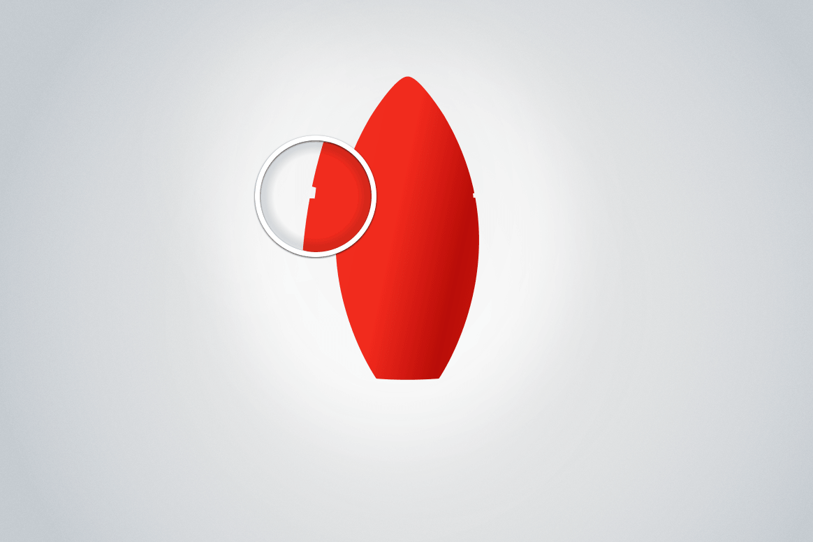
As you may have noticed, we are missing two small tiles on both sides of the body. We will need these gaps later on in the tutorial, when we add the ring to make the rocket more realistic. To remove these parts from the body, use the Subtract/Punch tool in the Properties panel.
![]()
Detail of the body of the rocket. (View large version)
If you are a fan of vector-based apps such as Fireworks and Illustrator, then you are probably aware that compound shapes in Fireworks are an amazing feature to work with. (The Pathfinder panel is a comparable feature in Illustrator.) Without going too deep into explaining how it works, let’s look at the basics of this feature.
In the Properties panel, on the right side, you’ll see five small icons, with a button underneath labelled “Combine.” This is the “Compound Shape” section of the panel.
![]()
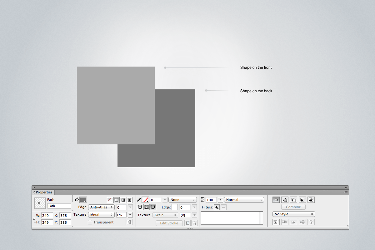
Two vector shapes on the canvas in Fireworks (top) and the “Compound Shapes” section of the Properties panel (bottom right). (View large version)
The five icons are (left to right): Normal, Add/Union, Subtract/Punch, Intersect and Crop. Every icon has a particular task and works effectively together with the “Combine” button.
To see compound shapes in use, let’s create two simple vector shapes (for example, two rectangles). Select them both, and head over to the “Compound Shapes” section of the Properties panel. If you hit one of the buttons (for example, “Subtract”), you will see that the shape on top is subtracted from the shape on the bottom. However, if you don’t press the “Combine” button next, then these two shapes will stay in a sort of group — remaining connected and editable! In fact, you can even move them separately with the Subselection tool (A) to achieve different results. But once you click the “Combine” button, the top shape will be permanently subtracted from the bottom one, and what’s left will be a whole new vector shape.
Note: The changes in the compound shapes of the Properties panel are not permanent until you press the “Combine” button; the original shapes will remain editable until then. What’s more, if you do not press “Combine” to make the path action permanent, you can easily perform an undo action by ungrouping any compound shape: Simply select it and press Control/Command + Shift + G. Finally, the compound shapes can be incrementally created: Create the first shape, select it, and choose the compounding method in the Properties panel; then, each object you draw after this will be combined in that way with the originally selected shape. You can even change the compounding methods along the way to make more complex shapes: Select the compound shape, choose a new compounding method, and then draw more shapes. Using this method, you can punch, add, intersect and crop your way to complex vector paths, and each individual path object will remain fully editable. This is a lot of vector-editing power at your fingertips!
![]()
The “Compound Shapes” section of the Properties panel.
To understand this process, practice is best. Compound shapes in Fireworks and the Pathfinder in Illustrator are great tools to create complex shapes from basic ones.
In our situation, we are subtracting a tiny shape from the body of the rocket. Make sure that you select one shape at the time and subtract them from the primitive shape.
Note: Compound shapes have been in Fireworks since version CS5. In older versions of Fireworks, there was another way to perform these actions. You would select two vector shapes, go to the menu Modify → Combine Paths and then select one of the following operations: Join, Split, Union, Intersect, Punch, Crop. This way differs from the workflow for compound shapes because, when using compound shapes, the individual shapes remain “live” editable until you press the “Combine” button. Because of the simplicity of compound shapes, I would suggest using this method, instead of Modify → Combine Paths → …, even though we’ve had the choice between using either compound shapes or the “Combine Paths” menu since CS5.
Step 5: The Nose
The body and the nose are two of the most important parts of this icon.
To draw the nose, duplicate the red rocket body, draw a large circle or an ellipse on top of it, choose the “Intersect” compounding method in the Properties panel, and then press the “Combine” button to make the resulting vector object permanent. The nose height should be around 180 pixels.
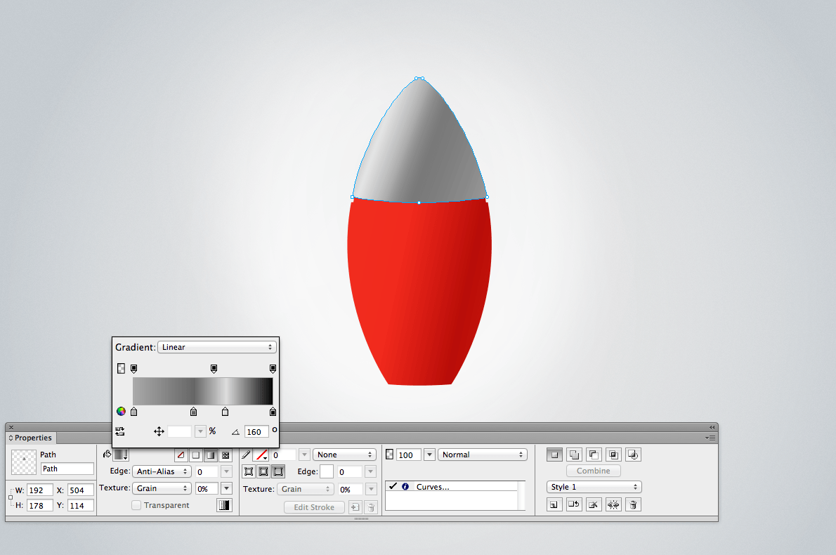
We will make the nose (the top of the rocket) a grayish color because we want it to look like metal. Set the gradient as follows: 0% (#AAAAAA), 43% (#666666), 66% (#DDDDDD) and 100% (#000000), and set the gradient’s angle at 160 degrees.
![]()
The metal effect in the nose of the rocket. (View large version)
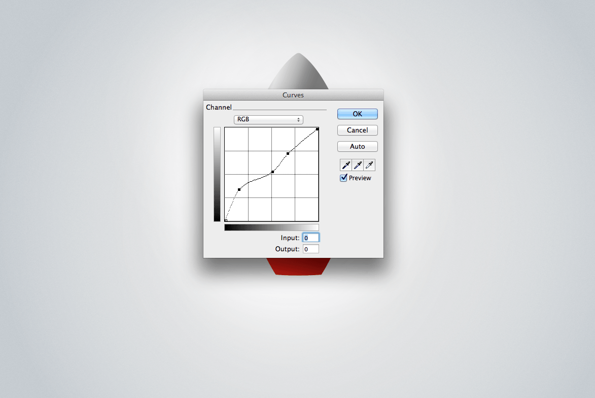
After this, we’ll add another Curves live filter, as shown below:
![]()
Sing the Curves live filter to boost the metal effect. (View large version)
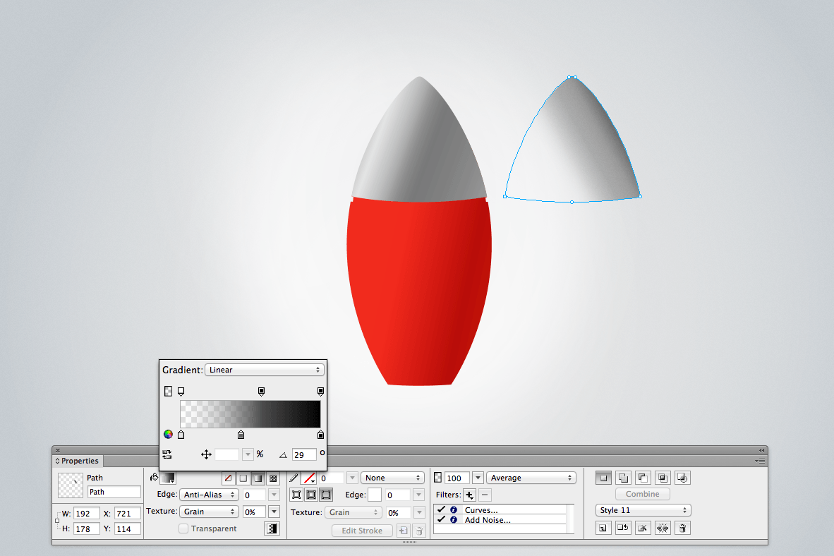
To improve the look of the nose and make the metal more realistic, we need to copy the nose shape and paste it in the exact same place. (A quick way to copy and paste an object in the same place is to “clone” the object: in the menu, Edit → Clone or Control/Command + Shift + D.) Next, we will set the gradient of the copy as follows: 0% (#E5E5E5), 43% (#666666) and 100% (#000000), and set the gradient’s angle at 29 degrees. Set the blending mode to “Average” (see below).
Note: The Curves live filter lets you adjust any color along its tonal range without affecting other colors. So, we will use Curves here to adjust the contrast of the gradient and to make the reflection of the metal more realistic. And, with the help of the Average blending mode, the two gradients will be combined in one smooth and realistic reflective surface.
![]()
Clone the nose and apply a gradient to it. (View large version)
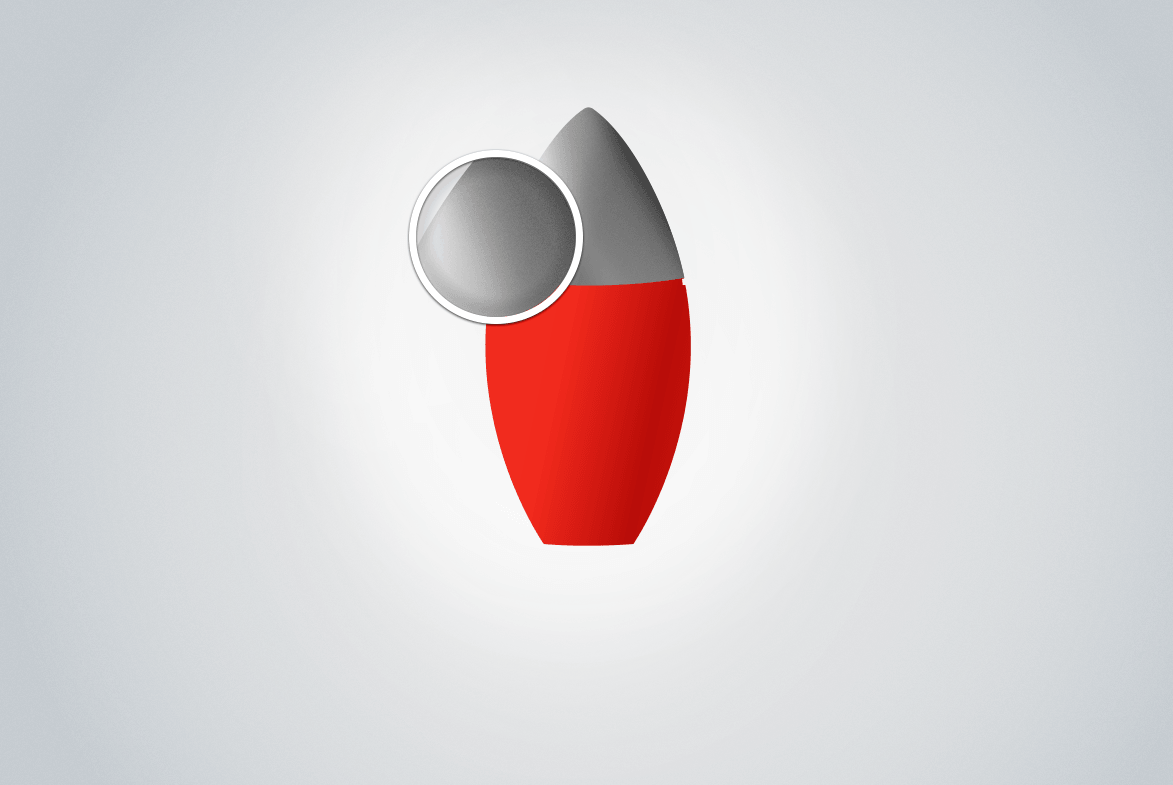
At the end of this stage, you should have achieved a smooth and nice metal effect for the top of your rocket. You could add some noise to the metal texture, although this is optional — 1 or 2% is definitely enough.
![]()
The detail of the metal texture of the nose. (View large version)
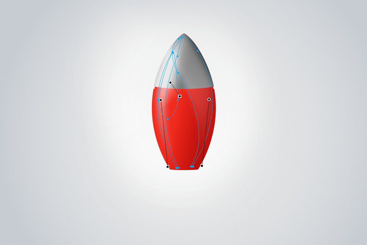
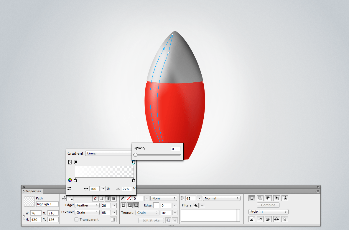
Step 6: Highlights
It’s time to make the rocket look and feel more like a bullet. If we were using a 3D application, we would achieve this by adjusting the lighting. In Fireworks CS6, we need to create custom highlights to make the object look realistic. This is a challenge, of course, because we are using a 2D application, and we’re stuck with a frontal view. Somehow, we need to imagine where the light source is and where the lights are coming from.
The first light, the strongest, will be on left side. Draw a shape that follows the edge of the left side of the rocket. Set up a gradient that ranges from white (#FFFFFF) to white (#FFFFFF), with the opacity set to 0%. (I mentioned this technique earlier in the section titled “Understanding How Gradients (and the Gradient Tool) Work in Fireworks.“)
![]()
Highlights on the rocket. (View large version)
Set the opacity to 45% and the Feather edge in the Properties panel to 20 to make the shape as smooth as possible.
![]()
Setting the opacity in the Gradient pop-up window. (View large version)
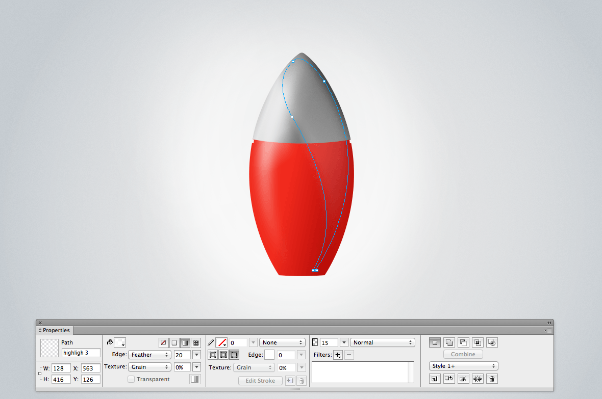
The same process can be repeated for the other two highlights. You can adjust the opacity as you prefer. Having different kinds of opacity will randomize the composition, improving the final result. For example, I deliberately set the highlight on the right side to only 15%.
![]()
One of the vector shapes that make up the highlights on the body of the rocket. (View large version)
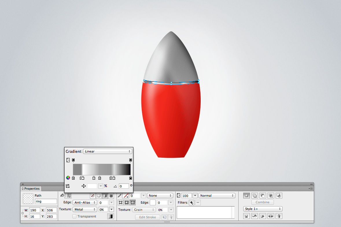
Step 7: The Ring
In the next couple of steps, we’ll design the rings that wrap around the rocket.
![]()
The first ring created with three vector shapes.
The first ring is designed with three vector shapes. These three shapes (top, middle, bottom) sit next to each other. The top shape is very simple: 10 pixels in height, black (#000000), with the opacity set to 50%. This helps to define the ring and gives that sense of indentation to the metal.
The second one is the middle part, and it has a more complex structure, as shown in the image below. The gradient is made of several colors, to give the impression that the metal is catching different light sources. Set the gradient as follows: 0% (#888888), 14% (#868686), 17% (#FFFFFF), 36% (#CCCCCC), 46% (#A3A3A3), 66% (#999999), 71% (#DDDDDD) and, finally, 100% (#000000).
![]()
Gradient for the metal of the ring. (View large version)
The bottom part is a thinner line, similar to the top one, with darker edges and a brighter central part. Set the gradient as follows: 7% (#F53820), 15% (#F5BBB7), 82% (#F6BBB6) and 100% (#BD0B00). Note: the center of the bottom part has a light pink, following the lighting of the composition.
![]()
Gradient in the thin line. (View large version)
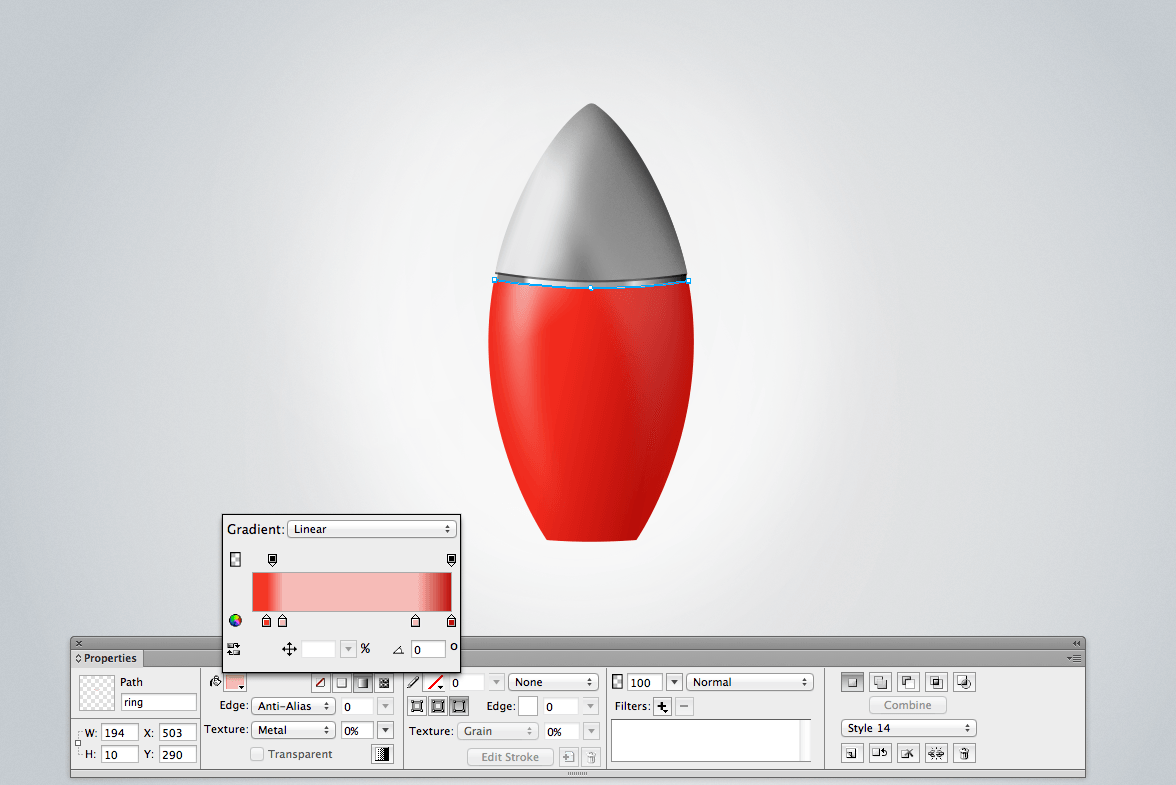
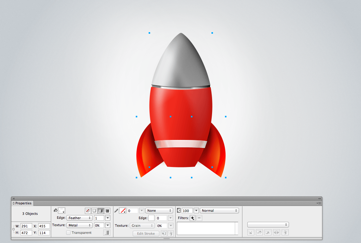
Step 8: The Lower Ring
This step is similar to the previous one. The difference here is that we are designing a lower ring, which is thicker and which wraps around the rocket at the bottom of its body.
The ring is a kind of rectangle, with dimensions of 172 × 27 pixels, slightly bent towards the top. If you add two anchor points in the middle of the shape, select them, and push them up 3 or 4 pixels, then you will get the desired effect. Set the blend mode to “Average,” and set the gradient as follows: 2% (#888888), 16% (#EEEEEE), 50% (#FFFFFF), 85% (#EEEEEE) and 100% (#888888). The edges are slightly darker to give the impression of a curve. Make three copies of the ring, and superimpose them precisely to get a solid look.
![]()
The lower ring of the rocket. (View large version)
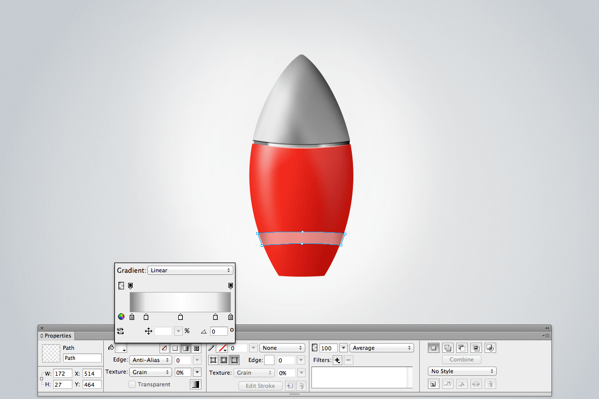
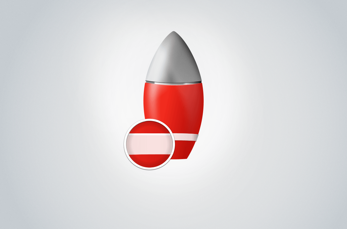
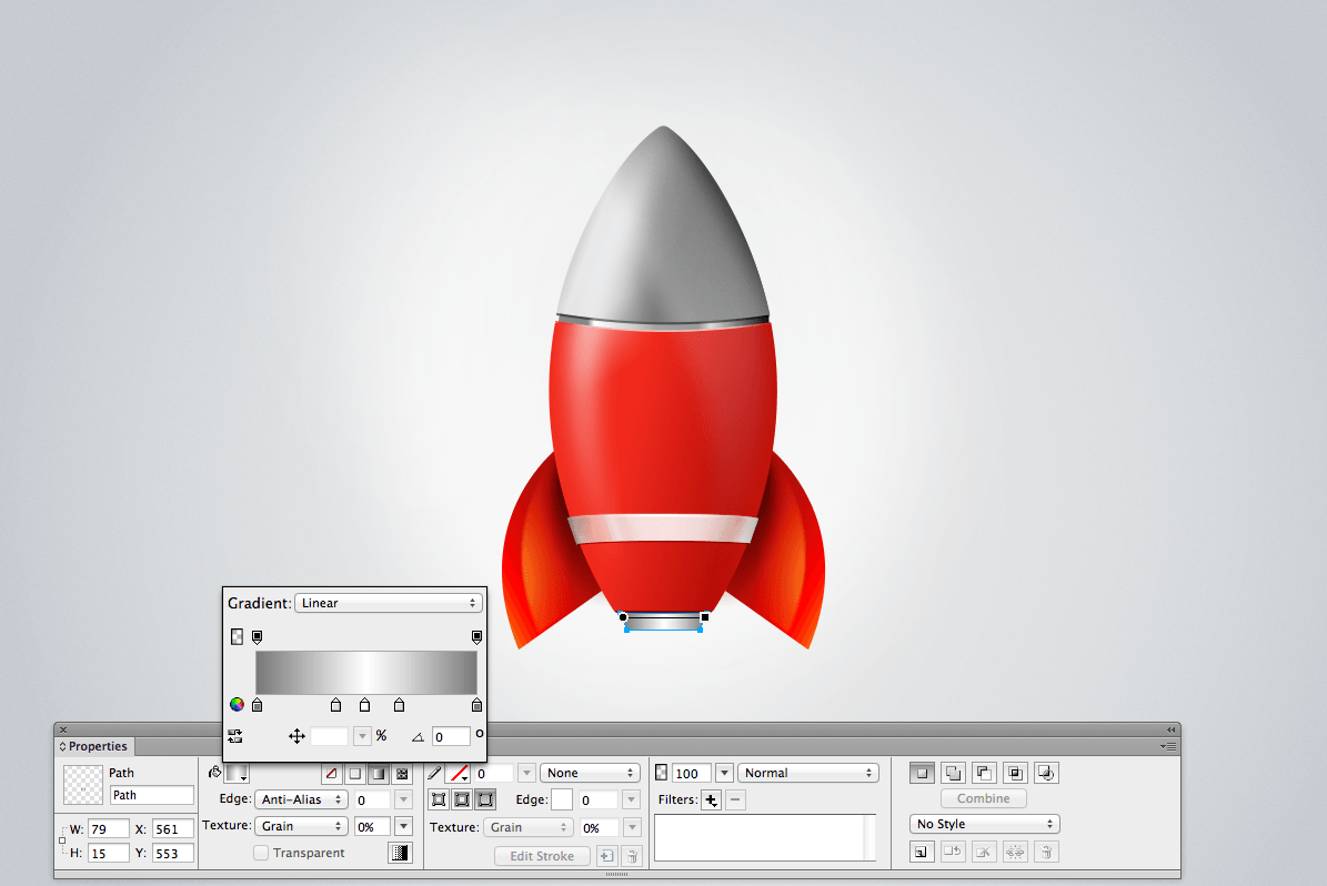
Step 9: Fine Details
Fine details can add a nice touch to an icon. It doesn’t matter which tool you’re using to create the icon (Fireworks, Illustrator, Photoshop or even GIMP), as long as you pay a lot of attention to the details.
In this case, adding a white line to the top of the ring will make clear that the top of the ring is catching more light than the body of the ring. Along with this, you can add a darker red line (#AF1A10) at the bottom of the ring.
![]()
Details of the ring. (View large version)
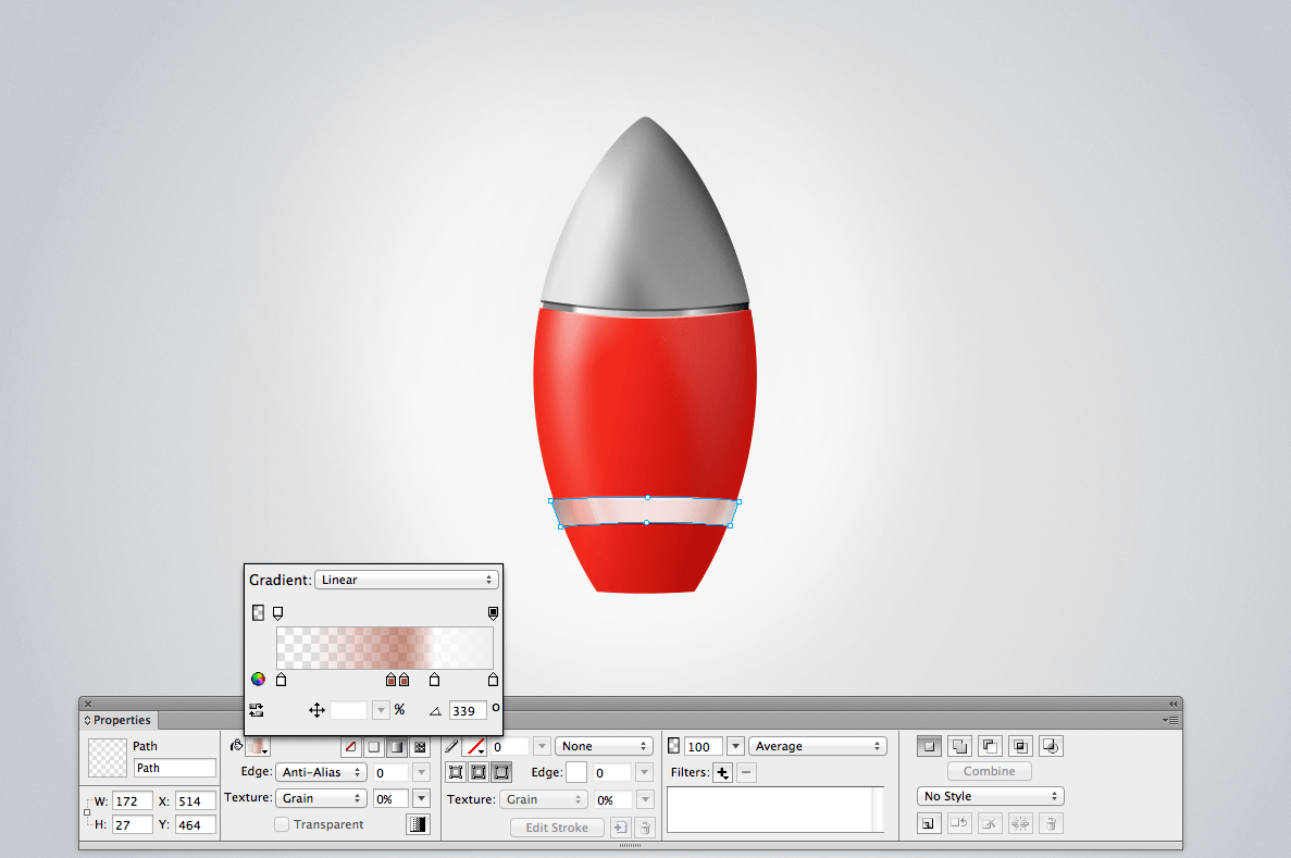
Step 10: Shades Of The Ring
Let’s add some more shading to show how the white ring is catching the bouncing red light of the rocket. Set the gradient as follows: 2% (#FFFFFF), 53% (#A84831), 59% (#A64935), 73% (#FFFFFF) and 100% (#EEEEEE).
![]()
Lights in the ring. (View large version)
Step 11: Creating The (First) Fin
Let’s build some fins.
Building the fins is actually a lot of fun. They are simple shapes and relatively quick to do.
Start by creating a kind of triangular, with an external side that is curved instead of straight. The final shape should look like a triangle, with its longest side curved. To do this, use the Pen tool (P). You can convert a straight side to a curved side by sub-selecting a node (an anchor point) and holding Control/Command + Alt while dragging out a control handle, as explained in the section titled “Step 2: Anchor Points and Handles.”
The behavior of the Pen tool is simple. It’s similar to the Bezier tool in Illustrator (and actually easier to master, in my opinion). To learn more about the Pen tool, check out “Draw Free-Form Paths by Plotting Points With the Pen Tool” in Adobe Help Center.
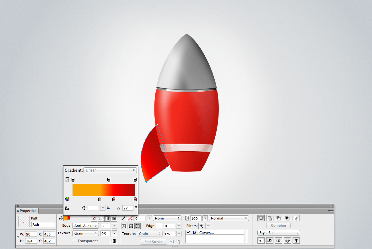
Then, apply the gradient as follows: 43% (#FBA500), 66% (#FF0000) and 100% (#AA0C08). Bear in mind that the shape needs to blend with the existing body of the rocket. We can achieve this with just the right shades of red.
![]()
The left fin of the rocket. (View large version)
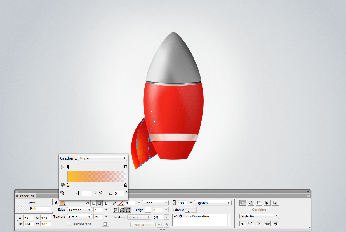
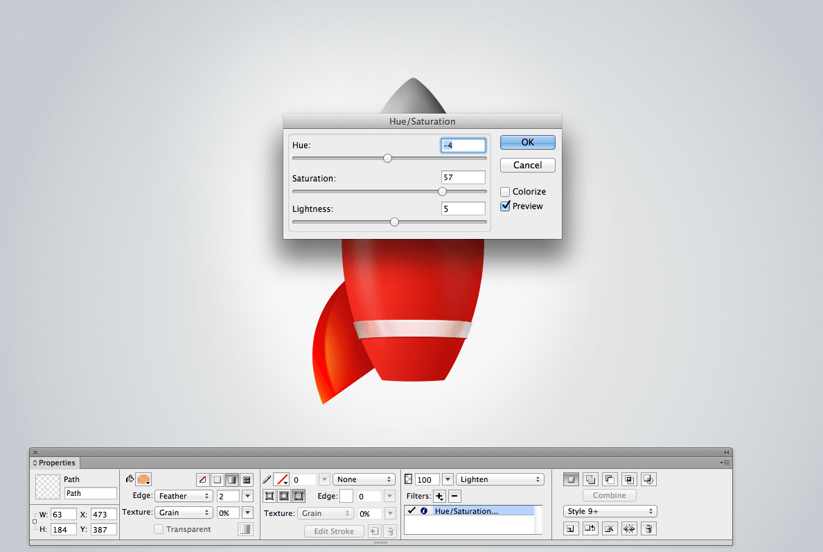
Next, let’s add a nice reflection to the middle of the fin. Set a linear gradient from #FFC926 to #CD0000 (opacity set to 0%), which will make the shade blend in with the rest. Set this shape with a feather edge (its value set to 2), and add a Hue/Saturation live filter, as shown below. Finally, set the blending mode to “Lighten.”
![]()
The left fin’s shade. (View large version)
![]()
Adjusting the Hue/Saturation live filter. (View large version)
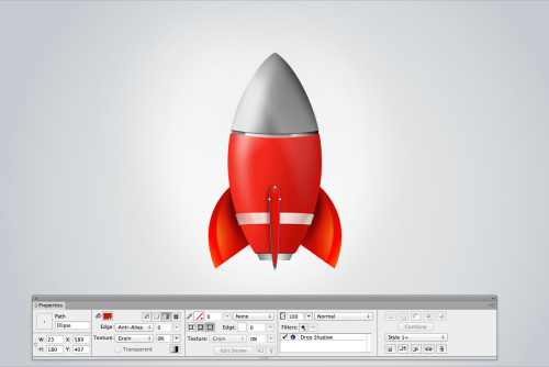
Step 12: Shadow Of The Fin
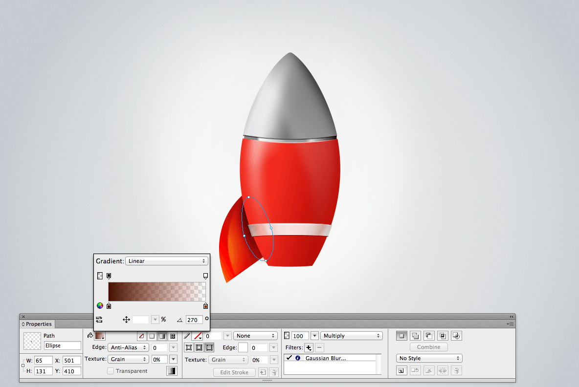
The fin needs a shadow to make the icon look realistic. The shadow will sit between the rocket body and the fin itself.
Note: As you can see, we are creating almost all effects, including shadows and reflections, from simple vector shapes, not Fireworks’ built-in live filters. Using custom-made vector shapes with carefully selected parameters (opacity, gradients, blending modes, etc.) gives us more precise and realistic results.
Create a small ellipse, and set up a gradient from #451100 to #8C2300 (the opacity set to 0%). Then, set the blending mode to Multiply and add a Gaussian Blur live filter (with a value of 6.2) by going in the Properties panel to + → Adjust Color → Blur → Gaussian Blur…).
![]()
Shadow of the fin. (View large version)
Our rocket is starting to take shape. We now have to finalize the form and move on with the details. Once you are ready with the first fin, you can clone the shape (Control/Command + Shift + D). Then, right-click and open the contextual menu, and go to “Transform” and select “Flip Horizontal.” Position the new fin on the right side of the rocket.
![]()
The two fins are ready! (View large version)
Step 13: The Exhaust
Creating the exhaust is simple. Basically, it is formed from only two vector shapes. The top of the exhaust is a straight line that separates the metal from the body of the rocket. The line is 89 × 2 pixels, and the color is a dark red (#7D0600).
The metal of the exhaust is simply formed by a gradient as follows: 0% (#777777), 36% (#DDDDDD), 50 (#FFFFFF), 65% (#DDDDDD) and 100% (#777777).
Note: Notice a pattern here? The metal is almost always lighter in the middle and gets darker at the edges. This effect gives the vector shapes a metallic look with gray tones. It’s like the light is bouncing off the center of the exhaust, the brightest part.
![]()
The metal gradient in the exhaust. (View large version)
One cool feature of Fireworks is that you can align all objects to a perfect-pixel grid, especially when you scale them up or down. To do that, hit Control/Command + K on your keyboard (or, in the menu, Modify → Snap to Pixel), and then any half-pixels will snap to the nearest whole pixel’s grid value. You can get pixel-perfect results in no time using this feature, and it helps a lot when you are designing user interfaces, too, not only icons. (Note: By default, Fireworks always positions objects relative to a whole pixel grid. When you scale a vector shape up or down, a line or point in the object will sometimes fall between two pixels. In such situations, use the Snap-to-Pixel feature to fix the issue.)
![]()
Detail of the exhaust. (View large version)
Step 14: The Third Fin
We will now create the third and final fin. We are viewing the rocket from the front; hence, we can see only three of the four fins.
As in previous steps, create the basic shape of the fin using the Ellipse tool. Now you know that you can control the anchor points and modify the shape of the ellipse easily.
You should achieve the result shown in the image below, with a shape pointing to the ground and slightly wider at the top. Bear in mind that the top part will be more rounded than the bottom part. In general, avoid right angles because they don’t exist in the real world.
![]()
The third fin. (View large version)
To make this shape more realistic, we will have light bouncing on the left and right sides of the fin. The sides will be brighter, and the middle part will be darker. As in previous steps, you can achieve a good result just by using the Gradient tool. Set up a linear gradient as follows: 0% (#D90000), 52% (#B22D00) and 100%, using a pure red (#FF0000).
This time, to separate the fin from the tube of the rocket, I would recommend using a live filter, rather than creating another vector shape. From the Properties panel, select a Drop Shadow live filter (+ → Shadow and Glow → Drop Shadow…), which will add a light shadow behind the fin.
![]()
Gradient and Drop Shadow live filter on the third fin.
We need a bit more shadow to separate the fin from the rocket body.
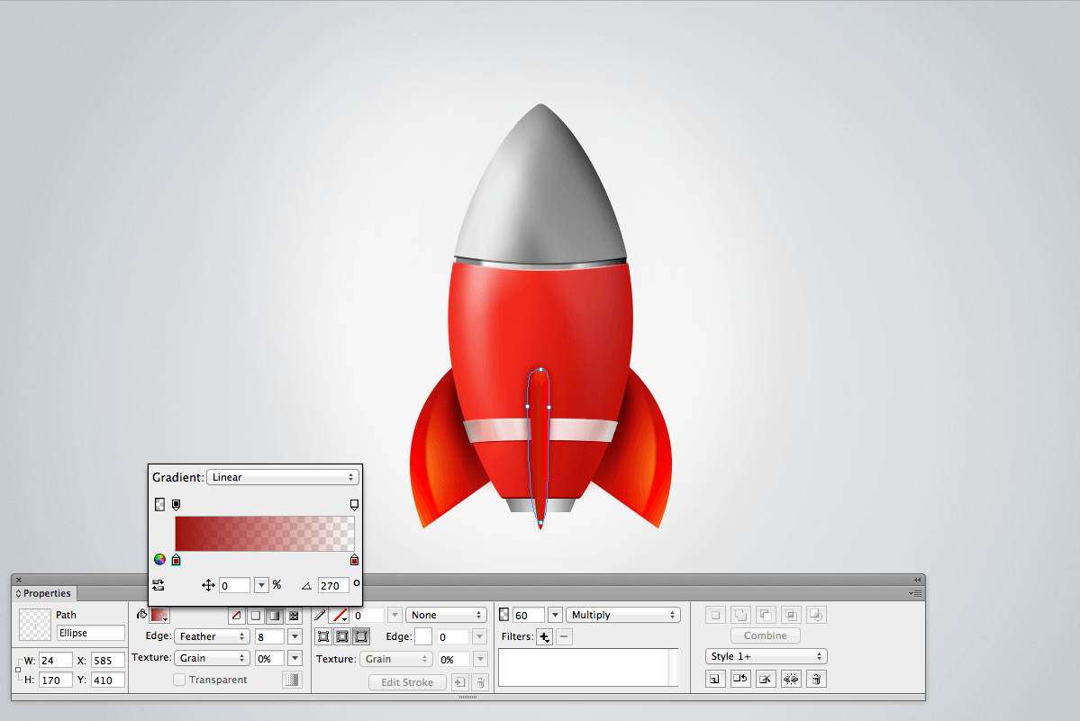
The best thing to do in this case is to create your own shadow. Live filters are pretty powerful, but you can achieve better results (at least with this kind of an illustration) by copying and pasting the shape of the fin, putting it behind the red fin and blurring it out. The color of the shadow will be a red that fades into transparency (see image below). Then, select the Multiply blending mode at 60%, and blur the shape with the Feather, with a value of 8.
Note: Shortcuts will speed up your workflow! Clone the vector shape of the fin (Control/Command + Shift + D), and then send the object backwards (Control/Command + Shift + Arrow Down or, in the menu, Edit → Arrange → Send Backward).
![]()
The elliptical shape that will make the shadow of the third fin. (View large version)
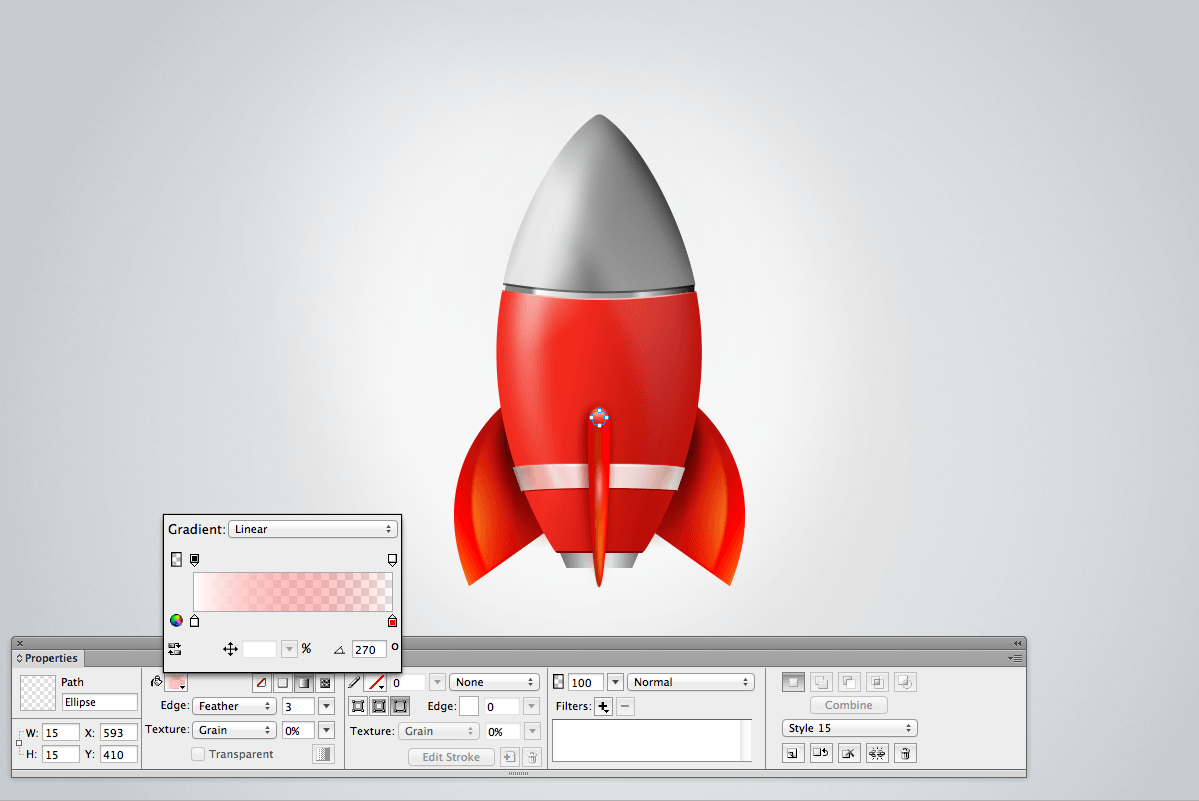
Step 15: Adding Highlights To The Fin
To complete the third fin and make it more realistic, we will add a couple of highlights. Let’s draw a rounded shape at the top of the fin. The circle will have a gradient that goes from 0% (#FFFFFF) to 100% (#FF0000). The red at the end of the linear gradient will have an opacity of 0%, though; hence, the shape will blend with the red of the fin.
If you have been following this tutorial, then you will have gotten used to this process already and now find it pretty straightforward. Repeat the process for the highlight in the middle of the fin. This time, use an elliptical shape, and instead of using a linear gradient, use an ellipse. You can also experiment to achieve the best results.
These highlights don’t have to be perfect shapes. In illustration and icon design, some random elements always make the composition more eye-catching.
![]()
Highlights on the fin. (View large version)
Step 16: Designing The Porthole
![]()
The porthole.
To design a good porthole, we need to take care of the glass reflections, the shape and other details. It might seem complex at first, but when we strip down the shape to its main components, you’ll see that the process really is simple. Once again, we will treat this small item as a final product, dedicating time to the small details in order to design the piece in the nicest possible way. I will explain the process in detail in six steps.
![]()
The six steps to building the rocket’s porthole.
Step 1: First, design a circle of 94 × 94 pixels. We’ll apply a linear gradient to it from top to bottom, going from gray to white. To create the gray border around the circle, use two different Drop Shadow live filters, which will make the outline more subtle.
Step 2: To make the background of the glass, we will use a circle shape once again — this time, though, a circle gradient. The center of the gradient will be light blue, and the edge will be a soft gray. The circle will be almost 10 pixels smaller, so let’s make it 85 × 85 pixels.
Step 3: We need to give the glass a curved look. To achieve this, let’s make another circle. As before, we’ll use a radial gradient, positioning the color stop at 46% (#FFFFFF) and fading the gradient to light blue. Also, give the shape a stroke of 2 pixels (a soft line at #5D5D5D). Set the Feather edge in the Properties panel to a value of 8.
Note: To add a soft stroke to the shape, simply go to the Properties panel, Stroke category → Basic → Soft Line…, and then select a value of 2.
![]()
Applying a stroke to a vector shape.
Finally, we will add a soft shadow and set the opacity of the whole shape to 50%. This will make the shape semi-transparent, and the shadow will give a raised effect, probably the most interesting detail of the porthole.
![]()
Gradients help to achieve a glass effect.
Step 4: The top of the porthole will catch more light, so let’s add a white semi-circular border (refer to the six-step image above). You can create this super-easily by punching together two circles (refer to the compound shapes in the section “Step 4: The Body”).
Step 5: This shade is important. It is basically the shadow inside the porthole that sits between the glass and the white material of the porthole. It adds a nice depth to the composition. Let’s design a circle of 86 × 86 pixels, with a border of 2 pixels (a soft line, #5D5D5D). At the bottom of the Layers panel, let’s add a mask. Next, with the Brush tool (B), set to black, let’s paint on top of the area that we want to remove. Once you are done, the shape will look like a half moon facing down.
![]()
Adding a mask.
Note: To add a mask (a process that is exactly the same as in Photoshop), go to the bottom of the Layers panel and click on the “Add Mask” icon, and then select the Brush tool (B). Make sure that the color is set to black (#000000). Painting with black on top of the mask will erase the rounded gray shape. Switching to white (#FFFFFF) will paint back the missing portions. I rarely use this workflow in Fireworks, but understanding how it works is useful.
Step 6: The final touch is to add some blur reflection. Once again, this can be achieved with a simple circle shape and a linear gradient, going from white to transparent. The shape should be slightly blurred.
Now that all of the parts are there, we can assemble the porthole. The first gray shape will be the background. Then, let’s add the blue circle, then the glass effect, then the inner shadow, and then the top highlight. The blur reflection will be the last part, placed on top of the porthole. You can add a small sparkle in one of the corners if you like, as shown in the final image.
![]()
The porthole is assembled and now part of the rocket’s body.. (View large version)
Note: In the Fireworks source PNG file, you will find this porthole element placed in its own layers folder. The whole Fw PNG file is well organized according to how the various elements are connected together. Fireworks is generally great at keeping things nice and tidy, and it is very intuitive because you work directly with objects on the canvas, not with layers. Unlike Photoshop, Fireworks works with objects and layers folders (and subfolders), so you don’t have to carefully name every layer — in fact, in many situations you can even work with the layers panel closed. On the other hand, when you work on more complex illustrations or on UI designs, organizing things meticulously is a good idea, and this is exactly what I did with the rocket icon.
![]()
Keep things organized!.
Step 16: More Lighting
Lighting is what makes a composition interesting. Lighting can make or break an icon, illustration or visual design. If you are used to working with 3D software, then you’ll know how important lighting is. Again, we are operating in a 2D environment here, so we can’t rely on lighting as we would in 3D. Nevertheless, we can create lighting and reflections pretty easily in Fireworks.
In this step, we will add different sources of light to our rocket. Let’s start with some little enhancements.
All of the small sources of light you see on the rocket (see image below) are done in the exactly same way as in step 15. With a bit of practice and perseverance, you can achieve awesome results.
Let’s examine the samples below closely to better understand how these objects are created, positioned, layered and blended to get these complex lighting effects.
![]()
Using shapes with gradients to get highlights.
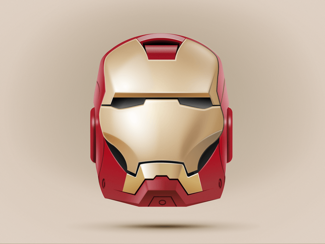
Most of the circles and elliptical shapes have a gradient that goes from 0% (#FFFFFF) to 100% (#FFFFFF). The white at the end of the linear gradient, though, will have an opacity of 0%; hence, the shape will blend into the red of the fin.
I have used this technique in many other icon designs in the recent years, and it has proved to be very effective. (One example is the Iron Man icon, which was created with Fireworks (of course!), all in vectors.)
![]()
Comments and other details about this Iron Man icon can be found in my Dribbble profile, where I first posted it. (View large version)
Another point of interest is the highlight behind the porthole (see image below). As you can see, that wide blurred white area enhances the bouncing of the light on the metal of the nose. (As explained, use a round shape with a linear gradient and Feather edge or Gaussian Blur live filter to blur out the surface.)
![]()
A highlight behind the porthole.
Finally, let’s touch on the other two details that make the shape of the rocket more realistic. The first is the highlight on the left side of the rocket. To achieve this shape, use the compound shapes feature.
![]()
Highlights on the sides of the rocket.
To achieve a half-moon effect, you can copy and paste the first simple shape of the rocket and subtract one shape from the other. Then, you can apply an Ellipse gradient, with an orange at 0% and a dark red at 100% (remember to set the opacity to 0% for the red). To achieve even better results, change the blending mode of the shape to Lighten, at 100%.
![]()
Half-moon shape.
This will give a nice orange shade to the bottom of the tube of the rocket, as if the light was bouncing on the orange of the fin.
The second detail is the darker part on the right side of the rocket. The process is exactly the same as above, but this time the gradient of the shape is substantially different.
![]()
The Ellipse gradient used on the right side of the rocket.
We want the shape to be darker, to make the tube of the rocket look rounder. Use a gradient set to Ellipse. Start with a dark red at 0% (#660000), and at 100% use a lighter red (#D90000). Change the blending mode to Color Burn. At this stage, the rocket shape is completed. Now, we need to focus on other fun details, like the smoke and the fire coming out of the exhaust!
Step 17: Turn Up The Scene!
When you open the Fireworks PNG source file, you will see that many folders in the illustration are dedicated to smoke and fire. Don’t be put off by that. This could have been done in many other ways; this just helps me to organize the scene more efficiently. You could have all of the smoke effects in one or two groups of layers, and that would work, too. As you know, Fireworks works efficiently without your having to deal with many layers, but this time I felt that having a very organized file to hand out to Smashing Magazine’s readers was worth it.
4. Fire And Smoke!
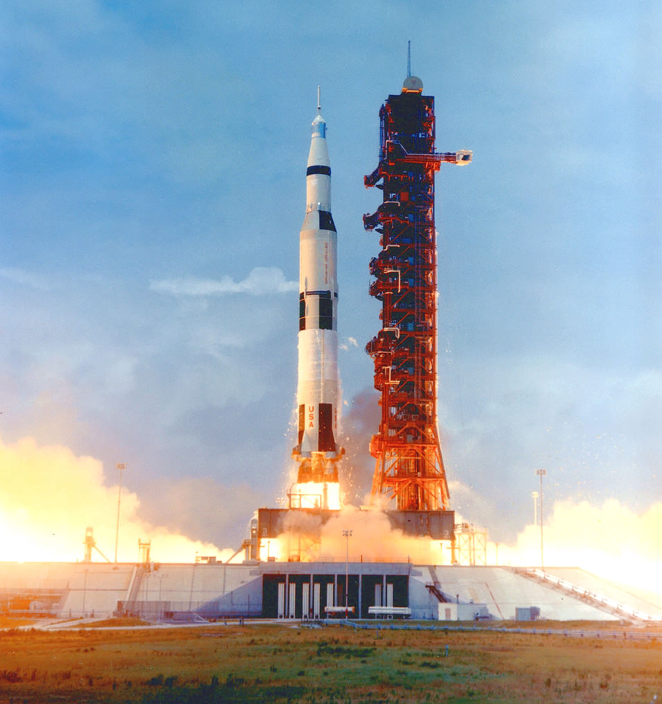
We want the fire to come out of the exhaust. Imagine the rocket taking off: A lot of heat will be coming out of the bottom of the rocket, and a lot of smoke will be coming out from the surroundings. Start with three simple shapes, and create these from simpler ellipses, using the Ellipse tool. At this stage, there is no right or wrong way to model these shapes because the gradient inside is what matters.
![]()
Saturn V rocket lift-off, Apollo 10. (Image: NASA)(View large version)
![]()
Creating the heat.
The dark part behind the exhaust is the shadow, and the two shapes on top of the exhaust give the look of heat in the area. Use a linear gradient that goes from yellow (#FFC926) to red (#CF0000).
Use a Feather edge with a value between 17 and 20, and set the blending mode to Inverse Color Burn. The fire coming out of the exhaust is a mixture of very simple shapes, with the blending modes set to Color Burn and Screen, and blended together with the Gaussian Blur live filter. This is what gives the fire its vivid color.
![]()
How to create the fire effects.
You can overlap the shapes and get really great results simply by experimenting. In my opinion, these steps and setting the blending modes to Color Burn yield the best results.
Note: Blending modes are a great feature in any graphic design tool, and almost every graphic designer uses them at some point. To learn more about them, have a look at “Blending Modes” on Photoshop Help. Fireworks, just like Photoshop, Illustrator and many other graphic design apps, has a large variety of blending modes. I generally use Multiply, Darken, Linear Burn, Lighten, Color Burn and Overlay. The only way to master blending modes is by experimenting. No need to use all of them, of course! I use only five or six regularly, but getting your head around them all would be useful.
Point the shapes towards the ground, and overlap them until you are happy with the result. You should have something similar to the image below.
![]()
The fire.
Step 18: More Fire!
In the image below, you can see the four fundamental steps to create the fire effect. As explained, in the source Fireworks PNG file, you will have different layers folders containing various fire textures. Random effects make for a more interesting composition. This is why I added a layers folder with the label “White fire,” which pulls back on the heat effect slightly and makes the illustration more realistic.
![]()
How to create the fire effect.
To create a column of fire as illustrated below, copy and paste various vector shapes, and overlap them until you reach the desired effect. As long as the column is not precise, you will be totally fine. Remember that the rocket is taking off, and the fire will be blasting from the exhaust very unevenly.
![]()
Fire has no symmetry! (View large version)
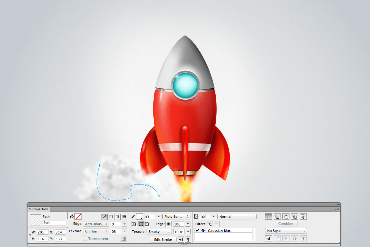
Step 19: The Smoke
We are almost done with our illustration. The last steps will be to create the smoke effect, 100% in vectors. As you may have noticed, we have not used any raster images (i.e. bitmaps) in this tutorial. We have created every shape and effect from scratch, purely in vectors, which will enable us to resize elements (or the entire illustration) later on without losing any quality.
The smoke will give the final touch to the illustration, balancing the left and right sides. We will create many types of smoke. Although smoke is normally perceived as being gray or white, we will use a mixture of white, gray and orange to make the smoke look realistic. The reason is that the red light of the fire will affect the perception of the smoke itself, making it look hot. (Creating smoke is one of the most fun parts of the tutorial, and this is where Fireworks shows how awesome it can really be!)
With the Pen tool (P), draw a few random lines, curvy and with unusual shapes. Go to the Properties panel and select the stroke’s color (#FFFFFF), then Stroke Category → Unnatural → Fluid Splatter. Set the size to 43 pixels. You will get a very soft random shape, similar to a cotton texture. Set the texture of the stroke to Smoky, and add a Gaussian Blur live filter with a size of 3. Repeat this several times until you’ve formed the shape of a cloud.
![]()
Creating the smoky texture. (View large version)
![]()
Selecting the Fluid Splatter stroke category.
Remember that we want to randomize the smokey effect, so set some of the strokes to a light gray, instead of pure white. You can also play with the size of the stroke, varying from 40 up to 70 or 80 pixels. And, of course, you can also play with the opacity. Make it random and unusual; trace new lines and overlap them randomly, and so on.
Step 20: Play With Smoke
As in the previous step, keep creating lines and mixing them together. Copy the smoke from the left side of the rocket and paste it on the right side. Start changing the color of the smoke as well. Blur the shapes as much as possible to look realistic.
![]()
The three steps that illustrate how the smoke spreads out.
Use your imagination: Some part of the smoke could be more of a red or even a brown shade (#EDD1A5). By the end, you should have a result similar to this:
![]()
Smoke — and a lot of it! (View large version)
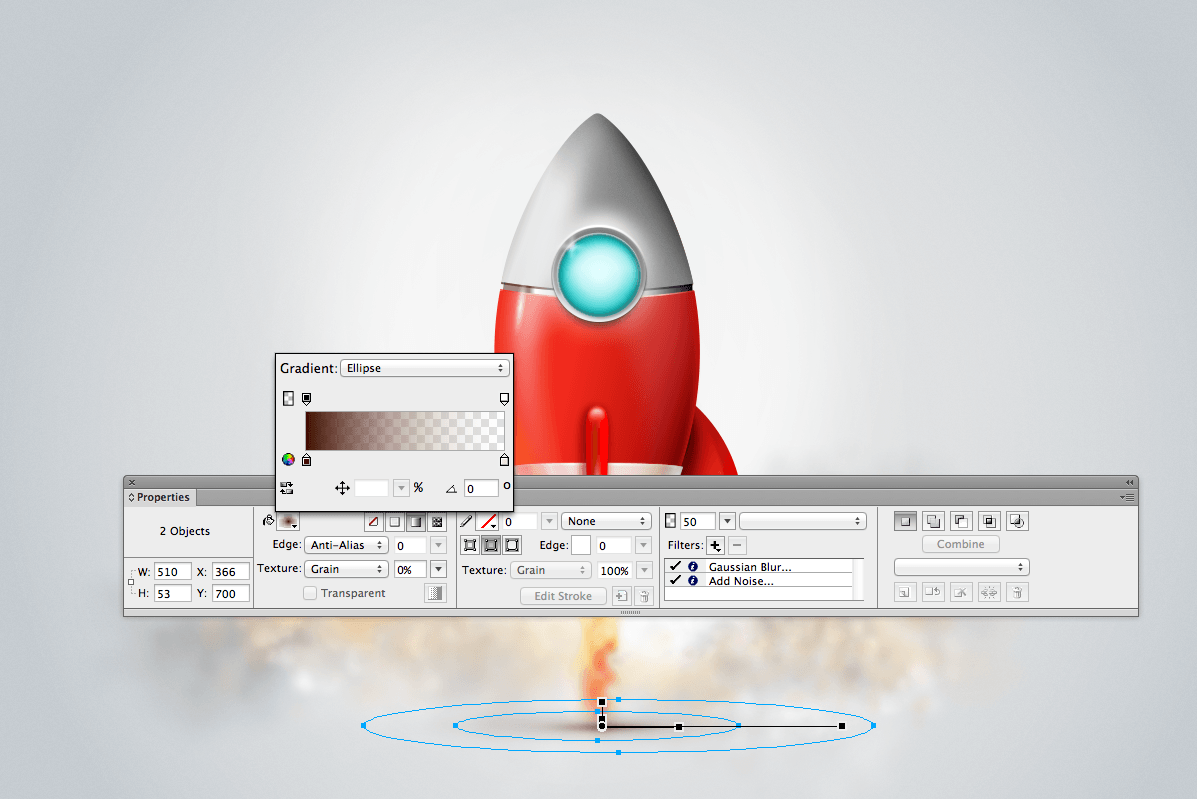
Step 21: Final Tweaks, Details And Fine-Tuning
We are at the end of our tutorial. Let’s add some final touches here and there to make the icon as refined as possible. The last three things we will do are simply to add a shadow to the bottom of the rocket, draw a yellow shade behind the fire, and put a vignette on top of the composition. This will complete the artwork.
The shadow at the bottom is simply done with an Ellipse gradient. Create two elliptical shapes, both of them with an Ellipse gradient going from 0% (#401000) to 100% (#F2E4E2). Set the bigger ellipse to have a blending mode of Average (50%) and the smaller one to have a blending mode of Multiply (50%).
![]()
Creating a shadow at the bottom of the rocket. (View large version)
![]()
Applying the vignette.
Finally, we can add an orange shade behind the fire at the exhaust, and add a vignette around the illustration to blend all of the elements together. (This is worth checking in the Fireworks PNG source file. The vignette is a big rectangle on top of the icon that unifies the composition.)
You’ve made it to the end of the tutorial. Be proud.
![]()
The final rocket icon design. (View large version)
5. Conclusion
When Adobe announced in May 2013 that it would discontinue Fireworks, I must say that I felt pretty sad. Of course, Adobe also said that if Fireworks was a part of your workflow, then you should keep using it. But when software that is deeply embedded in your workflow gets discontinued, you feel slightly uncomfortable.
My take on this is simple. Ideas matter more than the tools you use. As much as I love Fireworks, as long as the result looks great, who cares what tool you use? If you work on a team, you might be asked to use a particular tool for the sake of practicality, but your ideas can be brought to life by the tool you like the most. No restrictions there. (For example, I also use Photoshop, Illustrator and Sketch.)
Why Do I Use Fireworks To Design UIs, Icons And Screens?
I can’t even count how many times I have been asked this question. Most designers pick up a tool and stick with it. I appreciate and respect that. Personally, I like to experiment and try new tools. I think that’s how I discovered Fireworks. One of the first versions I recall using was Fireworks MX 2004. At the time, my favorite tool for illustrating was Illustrator 10.0, and I remember thinking when I discovered Fireworks, “Oh, this tool is pretty easy to use, fast and precise!”
There was something about it that I immediately loved, so I decided to explore it further. That’s what I generally like doing: trying things over and over to find the perfect balance in my workflow.
A few years later, I was hired by a company in the UK that used to work with Fireworks. I was in the early stages of my career; hence, I had a good opportunity to become skilled in the app. I found the tool to be way more powerful than the graphic design industry thought at the time. In just a few years, Fireworks became one of my main tools for designing websites, UIs and icons. With a good reason, too: Its speed, pixel-perfect control and simplicity are remarkable.
I can’t deny that many creative directors, especially in London, were taken aback when I told them that I mainly use Fireworks. Yet this has never prevented me from finding work — and it never should have. As a designer, you should be clever enough to know when to adapt your skills and learn new tools.
I have been using Photoshop for UI design for years, too, but I’ve never left Fireworks behind. If I could not use it in my day job, I would use it in my spare time because I know its worth and my results are better and quicker with it. In a nutshell, you should be able to use whatever software you are asked to work with, but there is no shame in having a favorite and using it. Recently, I have been playing with Pixelmator and Sketch. I think trying new apps is always worthwhile; you could end up learning things and improving your skills.
The icon in this tutorial is not the only one I have been crafting with Fireworks recently. In fact, you can look at some other icons I’ve created for clients (and myself) in my design portfolio on Dribbble.
Alternatives To Fireworks: Sketch And Illustrator
If you are a Fireworks expert, then you’ll know the impact that this software has had on the web and visual design community. And you can happily look to the future because strong new vector-based apps are emerging. Fireworks set the standard for a new way of designing: quick and easy. Being able to move objects on the screen and not having to constantly look at the layers panel are major advantages not shared by many programs of the past.
Sketch by Bohemian Coding was recently updated to version 3.0, and it looks good. You can import shapes from Adobe Illustrator CC, which is a major plus, and the Gradient tool is similar to the one in Fireworks. The Shadows panel and Effects panel are not as intuitive as the ones in Fireworks, but Sketch is still remarkable software, definitely worth looking into.
This tutorial is easy enough to replicate in Illustrator or another vector-based app. There is no reason why you shouldn’t try it. I chose Fireworks because it has been a part of my workflow for years, and I think it is really awesome overall, even as of 2014!
Illustrator offers endless possibilities for digital illustration, and it is the king of apps if you are a print designer because of the way it manages CMYK colors and offers different environments for web and print projects. Sketch, with a few improvements, could be a powerful replacement for Fireworks, and it is already showing how applications can frame UI design differently from Photoshop.
At the moment, these are the digital tools in my bag: Fireworks, Photoshop, Illustrator, Sketch, InDesign and Cinema 4D. But when it comes to screen, icon and UI design, Fireworks remains my weapon of choice.
Note: As mentioned, I am constantly exploring new tools, and I’m planning an article about Fireworks and Sketch workflows. Stay tuned!
Other Resources
If you think icon design is your thing or you are simply fascinated by this area, below is a list of books and websites to check out:
- The Icon Handbook, Jon Hicks
- World Without Words, Michael Evamy
- Susan Kare
- “OS X Human Interface Guidelines,” Mac Developer Library, Apple
- 1,000 Icons, Symbols, and Pictograms: Visual Communication for Every Language, Blackcoffee
- “What Is Skeuomorphism?,” Sam Judah, BBC News
- “Skeuomorphism,” Wikipedia
- “Create a 3D Vector Icon in Fireworks or Illustrator,” Fabio Benedetti, Digital Arts
- “Create a Vector Icon in Adobe Fireworks,” Fabio Benedetti, Creative Bloq
Final Thoughts
I recommend Michel Bozgounov’s great article “The Present and Future of Adobe Fireworks,” in which you will find major insight into the tool’s features, strengths and fate.
If you have never tried Fireworks, play around with it and see how things are done. You’ll find that building UI components is easy, applying live filters to vector shapes is also easy, and using the vector tools is powerful. Why not play around with it a bit? The things you learn might not look so important now, but they will be important to understanding new developments in future, as well as future work and the inspiration behind that work.
Designing with Fireworks is a great experience. And believe me, it is not rocket science!
Further Reading
- The Present and Future of Adobe Fireworks
- 50 Photoshop Tutorials For Sky and Space Effects
- The Power of Adobe Fireworks: What Can You Achieve With It?
- Switching From Adobe Fireworks To Sketch


