Applying Participatory Design To Mobile Testing

Email Newsletter
Weekly tips on front-end & UX.
Trusted by 200,000+ folks.

 Register!


 Flexible CMS. Headless & API 1st
People use their mobile devices everywhere: on the train, while waiting in line, sitting on the couch. As much as we aim to design our mobile apps and websites for contextual use, testing their usability in context can be challenging.
While getting out in the field for user testing is not always realistic, simulating much of that contextual experience in a lab is possible. One approach to mobile testing is participatory design.
A participatory design test session typically takes about an hour and has four parts:
- Uncover the user’s mental model.
- Enable the user to document their entire experience.
- Have the user sketch their ideal experience.
- Ask for the user’s feedback on designs from previous sessions.
I’ve conducted this type of study while researching how visitors to Cars.com’s app use their mobile device while purchasing a car on a dealer’s lot. The artifacts from this study are included in the steps below.
1. Immersed And Aware
A usability test typically starts with warm-up questions. A participatory design session is no different, although the questions are a lot more in-depth. This portion is meant to uncover the participants’ actual usage of your app or website and any pain points they experience.
The goal is to bring awareness to the participant and to put them in the context of how they would be using the product. Start broadly and then narrow the focus. You might want to break down questions into the following categories:
- When do they use the app or website? Is it when a need arises? Is it based on timing?
- Where are they typically during the usage? Is it location-based?
- How long do they use the product in one session?
- What tasks do they usually accomplish in one session?
- How satisfied are they overall with their interaction with the product, and how would they rate the product and how well it enables them to accomplish what they need?
For example, we first asked participants general questions about the duration of their car search and about other cars they’ve test-driven. We then focused on their visit to the dealership to purchase a car. They were asked to assess their satisfaction with the process, as well as their mobile usage. The purpose of the interview here is to place the participant in the right mental context. It also helps the moderator to create awareness of the steps that follow.
2. Document And Express
Once the stage is set and the participant is immersed in the context, the next step is to chart a timeline of their entire journey with the product. This exercise is particularly helpful if it encompasses not just when the participant used the app or website, but the actual goal they were trying to accomplish when using this product as a tool. For example, if the goal was to book a flight on an app, then the timeline would begin with the need to book a flight and would end with the completed transaction.
Here are the items you might need for this portion of the session:
- a timeline drawn on paper and marked with a beginning and an end,
- a pen,
- stickers in two or more colors.
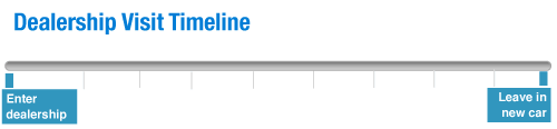
Draw boundaries on the timeline to mark the beginning and end for the user. In the car shopping study, the timeline initially looked like this:
Participants then filled in the steps. This process enabled us to see patterns across all dealership visits, and it triggered the participants’ recollection of details that might have been forgotten with oral recounting.
Once the user has drawn out the timeline, use colored stickers to overlay emotions. The simplest approach is to use two colors, one for negative emotions and one for positive. However, you could get more granular and have participants indicate particular emotions. This enables them to indicate any frustration they felt during the process and at what point the app fell short of solving their problems. Capturing emotion in this way gives you a quantitative measure of a qualitative aspect of the user’s interaction with your product.
After multiple sessions, place the participants’ timelines side by side. The patterns that emerge will tell a story of how people are using the product, where their pain points are and what’s working well. To synthesize the results, create an aggregate timeline based on the number of responses and the frequency of repeated emotions.
Here is the aggregate timeline from the car shopping study:
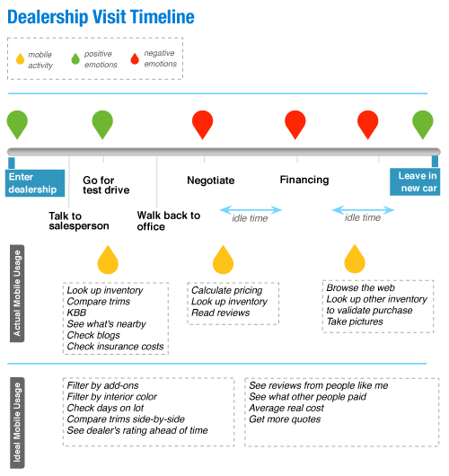
All users followed a similar progression from the time they entered the dealership to the time they drove off the lot in their new car. They also felt similar frustrations during the negotiating and financing phases. The third color in the timeline, yellow, indicates their mobile usage on the car lot. This was helpful because the exercise shows not only when they used their phone as an aid to buying a car, but also when they would have liked to have used their phone to relieve a frustration. Such an exercise is also useful in planning future features.
3. Create Aspiration
After the timeline exercise, the participant is as in-context as they’re going to be in a lab. They have now recalled not only what they did, but how they felt while doing it. Now, have them create a design or feature that they would have liked to have had to solve the problems that arose in either part 1 or 2.
For this portion, have the following items on hand:
- blank sheet of paper with a phone outline;
- writing and drawing utensils;
- cutouts of certain features you’re considering (even if they’re just portions of wireframes);
- stencils, such as form buttons and icons;
- tape and scissors.
This exercise is great for discovering new approaches to a design or new features. As with the timeline, draw boundaries. By cutting out certain features, stencils or shapes, you are giving the participant a starting point. The design at the end of this portion could be a mixture of features that are hand-drawn and taped onto the page.
If the participant has trouble getting started, revisit the timeline from part 2 and have them list a set of features they would have liked to have had. Use this list as a springboard to focus on one feature in particular. If the participant still hesitates to sketch anything, have them work with materials you provide. Using the cutouts of possible features, they can prioritize which features they’d like by taping them to the blank sheet of paper with a phone outline. An alternative is to have them simply write a list. In the car shopping study, several participants who had trouble getting started were prompted to write a list of features they would have liked and then to rank that list in order of priority or interest.
Synthesize the output from this exercise in the same way you did for the timeline in part 2. If most participants used stencils or cutouts to depict possible features, place them side by side to pick out patterns.
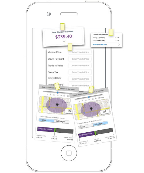
Here is what the synthesis of the cutouts looked like after the car shopping study:
4. Provide Feedback
This last step is a good way to wrap up the session. If you are already considering certain designs, have participants provide feedback on them. By this step, the participant will have essentially become your co-designer. You could also show them designs from previous sessions to get an unbiased perspective. In the car shopping study, we sought the opinions of participants on various designs we were considering. We also asked what they thought of various aspects of the test, so that we could refine our methodology.
Conclusion
When we design new features, we usually get our information in one of two ways. One common way is to fall back on broad assumptions about our users or to rely heavily on large-scale research. The other way is to design a feature and then test it in a very specific setting. Participatory design bridges the gap between the two ways, and it provides context that’s typically absent in a usability lab. This approach accomplishes several things:
- It enables us to uncover the user’s mental model.
- It establishes how the user would interact with the feature in context.
- It gives the user an opportunity to provide feedback on what features would be useful to them.
- It allows participants to flex their creative muscles and to be a co-designer on a product they’ve used before.
- And it gives you a fresh point of view.
Further Reading
- Prioritizing Devices: Testing And Responsive Web Design
- Where Are The World’s Best Open Device Labs?
- A Guide To Simple And Painless Mobile User Testing
- Noah’s Transition To Mobile Usability Testing


