Ready For Retina HD: Create Pixel-Perfect Assets For Multiple Scale Factors

Email Newsletter
Weekly tips on front-end & UX.
Trusted by 182,000+ folks.
 Claim Your Free Spot!


 SurveyJS: White-Label Survey Solution for Your JS App
 Register Free Now
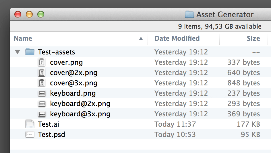
The 6 Plus is the first iPhone that sports a “Retina HD” display — the sharpest display Apple has ever made. It forces designers to provide an additional set of image resources to developers to match that sharpness.
We needed only one set of assets for the original iPhone up to iPhone 3GS. And when iPhone 4 came out with the Retina display, we also needed 2x assets — images twice as detailed. Now, with the display of the 6 Plus being even more detailed than that of the iPhone 4, we will also need to provide 3x assets. The numbers 1x, 2x and 3x are also called “scale factors.”
Of course, Android developers have always had to deal with many different sets of assets. Still, designers are finding themselves questioning their production workflow. In this article, we’ll focus on iOS, but you could easily extend this approach to Android and the web. We won’t try to provide a silver bullet, and perhaps other ways might seem easier at first, but this article lays out a solid workflow that scales up for big projects.
First off, your icon sets should be vector-based. The approach described in this article focuses on generating multiple asset versions from a single vector shape in a Photoshop document that contains all of your icons.
A unified icon document has the advantage of keeping everything together in one file, allowing you to see how well your icons and assets harmonize.
If you’re designing for iOS 7 and above, then you might think that 1x versions aren’t needed anymore. However, you’ll still need them for devices such as the original iPad Mini, the iPad 2 and potentially Android and the web.
Set Up Photoshop
First, I’ll show you how I set up Photoshop. If you know what you’re doing, you can use other settings. But for those curious about how I like to work, this is it:
- Disable eye candy like “Animated Zoom” and “Flick Panning.”
- Disable “Snap Vector Tools and Transforms to Pixel Grid.”
The first point is a matter of personal taste, but not following the second point can get in your way when you’re trying to be precise with the Direct Selection tool.

Then, I’ll configure the Move tool (V) to select layers. You don’t need to check “Auto-Select” because you can select a layer automatically by pressing the Command key while clicking. Disabling this option protects you from moving layers unintentionally.
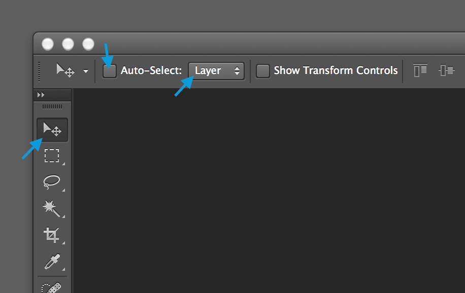
V) to select layers. (View large version)Feel Free
First and foremost, I believe that design and production are two separate phases. When your creativity is flowing, you shouldn’t worry much about production constraints.
Design at your favorite resolution (perhaps 2x), and lay out using the dimensions of a device you’re familiar with. But definitely use a real device, and use apps like Skala Preview and xScope to mirror the design live on your device. You should not be working with apps unless you are constantly checking the design on a real device.
Tidy Up Those Vectors
As noted, I’ll assume that you’re designing your icons in Illustrator. Before copying them to Photoshop, you’ll need to tidy them up. Use Pathfinder to add and subtract paths until you have a single shape.

On the left above is a complex icon made up of multiple shapes, including a white shape to simulate transparency. For the icon on the right, I subtracted the white rectangle from the black one behind it. Do this by selecting the two rectangles and pressing the “Minus Front” button in the Pathfinder panel. Then, select all shapes and click “Unite” to combine them into one.
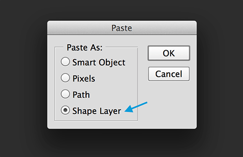
Now, copy the path to Photoshop, and paste it as a shape layer.
If your shape ends up a mess, that means you didn’t tidy the vector graphic properly.
Align Forces
When you paste the icon in Photoshop, it might look something like this:
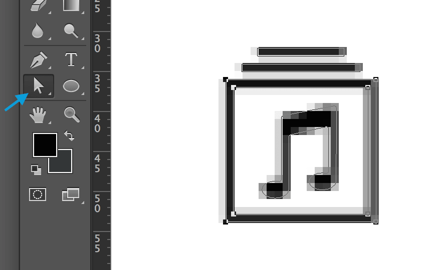
When you zoom in close on the icon, you will probably see those gray pixels around the shape. Those “partial pixels” occur if a shape does not fill an entire pixel. We don’t want any of those.
We want to start working from a 1x version of the icon because, when tidied up properly, you will be able to scale this version up to 2x and 3x without any problems. If you did the original design in 2x, then you’ll need to scale the shape down to 50%.
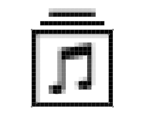
Now it’s time to align the horizontal and vertical lines to the next full pixel. It’s OK if curves and diagonal lines don’t fill up entire pixels.
Use Photoshop’s Direct Selection tool to mark a group of misaligned anchor points, and use the arrow keys to move these points between two pixels.
Note: The closer you are zoomed in (use Option + Shift + mouse wheel), the more precisely you will be able to move the anchor points.
Do A Check-Up
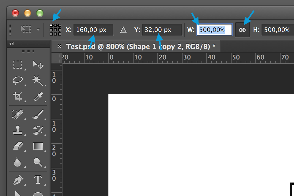
Now, make sure all anchor points are on the grid by scaling your 1x version up to 500%. If you see partial pixels, then align them as described above. If everything checks out, then scale the shape down to 20%.
Remember: From now on, you should always scale proportionally from the upper-left corner, and always make sure that the X and Y values are round numbers.
Scale It
Let’s see how different resolutions of our icon work out. Select the 1x version (V, then Command + mouse click), and duplicate the icon (Option + click and drag) to a position next to the 1x version.
Scale the duplicated icon up to 200% proportionally from the upper-left corner. The 2x version should show no new partial pixels. It should only be bigger.
To keep things simple, we will assume you are happy with the 1x and 2x versions and that you now want to see the 3x one.
Duplicate the 2x version (Option + click and drag), move it off to the side, and then scale it up by 150%. (So, 200% × 150% = 300%)
Later in this article, I’ll tell you what to do if you are not happy with the results. But if you are happy with the 2x and 3x versions, then you know now that 2x and 3x versions can be generated from the 1x version without any problems.
Go ahead and delete the 2x and 3x versions — we will be generating them automatically.
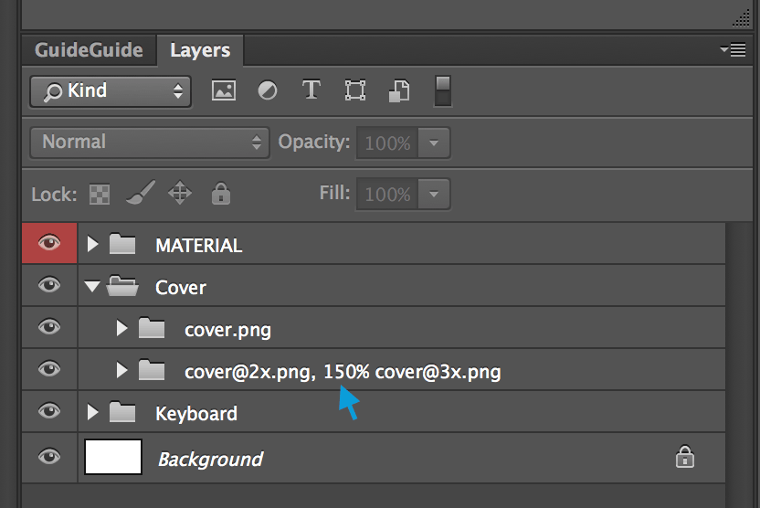
Generate And Enjoy
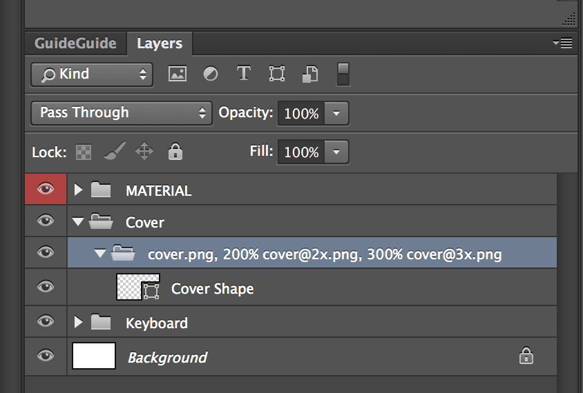
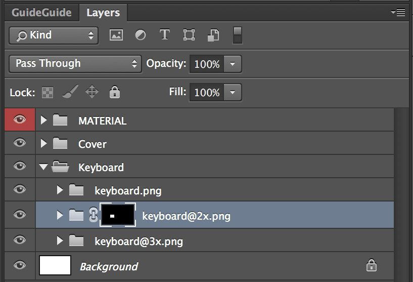
Photoshop has a built-in tool called “Generator” that automatically renders a shape layer to multiple image versions. To do that, we have to create a layer group and give it a special name: the file name and scale factor for each version.
In this case, it should look like this: cover.png, 200% cover@2x.png, 300% cover@3x.png
The commas separate the versions, and the percentage tells Photoshop the amount of scaling.
Now, activate Generator.
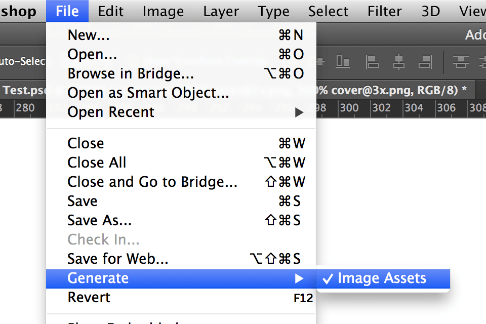
Generator will create a folder next to your PSD file and will automatically save PNG files to it when you save the Photoshop document.
To add a new scale factor at a later point in time, you simply have to alter the layer’s file name.
Get Creative For Different Resolutions
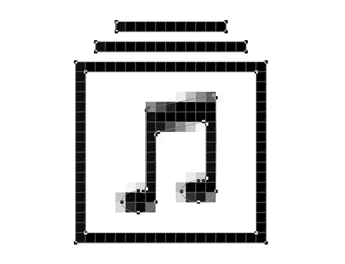
Modifying artwork for different scaling factors is a common practice because you can show more detail in a 2x graphic than you can in a 1x version.
In the following example, the 1x version of the icon contains just a single eighth note, whereas the 2x version contains a beamed note.
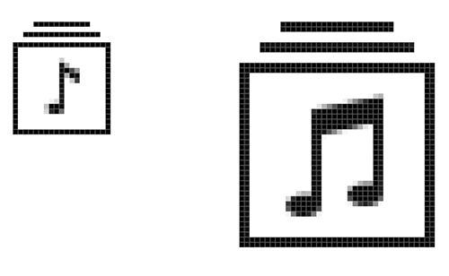
Obviously, you wouldn’t delete the 2x version because it is different from the 1x. Create an extra group for the 2x version, and give it a layer name that is compatible with Generator. Because you’ve already scaled the 2x version in Photoshop, don’t add “200%.”
To end up with a 3x version after working in 2x, you’ll have to scale by 150%. So, you would add this number to the 3x file name.
Size Matters
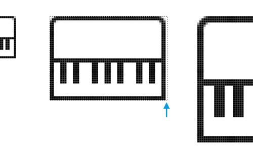
Making the 2x versions of your assets exactly two times larger than the 1x assets is absolutely critical. Sometimes this is harder to do than you think. Consider this keyboard:
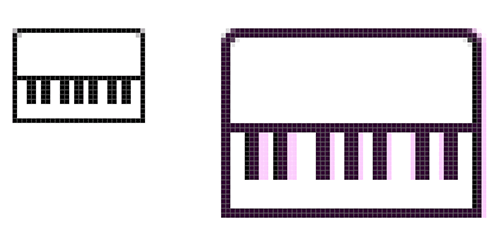
For the 1x version (the smaller keyboard on the left), I decided that 1-pixel-wide black keys were to thin, so I used 2 pixels.
When you scale that version up (marked in pink in the keyboard on the right), you end up with black keys that are 4 pixels wide, which looks a little too wide.
But with 3-pixel-wide keys, the distance between all of the keys changes. To keep everything symmetrical, we need to make the keyboard 1 pixel shorter. And because we can’t scale 3 pixels by 1.5 without ending up with fuzzy graphics, we also need a special 3x version.
To fix the export size of our 2x asset, we can add a layer mask. Generator will always use the dimensions of a layer mask if one is present.
Summary
Hopefully, the methods described here will simplify your workflow. As you can see, creating pixel-perfect assets for different screen sizes and densities isn’t such a chore when you use vector graphics to your advantage and let Photoshop do the grunt work.
Downsides Of This Approach
- Assets are stored at 1x in the Photoshop file.
Upsides Of This Approach
- Create multiple image assets from a single shape layer, potentially saving yourself a lot of time in the future.
- Icons are all in one document.
- Generating assets for other scale factors from your PSD becomes easy for other people.
- Seeing which resolutions of an icon need special attention becomes easy for other designers.
Further Reading
- The Retina Asset Workflow You’ve Always Wanted For Photoshop
- Photoshop Etiquette For Responsive Web Design
- Retinize It: Free Photoshop Action For Slicing Graphics For HD Screens
- How To Create A Flat Vector Illustration In Affinity Designer


