Hybrid Mobile Apps: Providing A Native Experience With Web Technologies

Email Newsletter
Weekly tips on front-end & UX.
Trusted by 182,000+ folks.
 Register for Free


 Celebrating 10 million developers
 Custom Web Forms for Angular, React, & Vue. Your backend.
According to a recent report, HTML is the most widely used language for mobile app developers. The main reasons among developers for selecting web technologies are cross-platform portability of code and the low cost of development. We’ve also heard that hybrid apps tend to be sluggish and poorly designed. Let’s prove whether it’s possible to deliver the native look and feel that we’re used to.

This article provides many hints, code snippets and lessons learned on how to build great hybrid mobile apps. I’ll briefly introduce hybrid mobile app development, including its benefits and drawbacks. Then, I’ll share lessons I’ve learned from over two years of developing Hojoki and CatchApp, both of which run natively on major mobile platforms and were built with HTML, CSS and JavaScript. Finally, we’ll review the most prominent tools to wrap code in a native app.
What Are Hybrid Mobile Apps?
Mobile apps can be generally broken down into native, hybrid and web apps. Going the native route allows you to use all of the capabilities of a device and operating system, with a minimum of performance overhead on a given platform. However, building a web app allows your code to be ported across platforms, which can dramatically reduce development time and cost. Hybrid apps combine the best of both worlds, using a common code base to deploy native-like apps to a wide range of platforms.
There are two approaches to building a hybrid app:
- WebView app. The HTML, CSS and JavaScript code base runs in an internal browser (called WebView) that is wrapped in a native app. Some native APIs are exposed to JavaScript through this wrapper. Examples are Adobe PhoneGap and Trigger.io.
- Compiled hybrid app. The code is written in one language (such as C# or JavaScript) and gets compiled to native code for each supported platform. The result is a native app for each platform, but less freedom during development. Examples are Xamarin, Appcelerator Titanium and Embarcadero FireMonkey.
While both approaches are widely used and exist for good reasons, we’ll focus on WebView apps because they enable developers to leverage most of their existing web skills. Let’s look at all of the benefits and drawbacks of hybrid apps compared to both native and mobile web apps.
Benefits
- Developer can use existing web skills
- One code base for multiple platforms
- Reduced development time and cost
- Easily design for various form factors (including tablets) using responsive web design
- Access to some device and operating system features
- Advanced offline capabilities
- Increased visibility because the app can be distributed natively (via app stores) and to mobile browsers (via search engines)
Drawbacks
- Performance issues for certain types of apps (ones relying on complex native functionality or heavy transitions, such as 3D games)
- Increased time and effort required to mimic a native UI and feel
- Not all device and operating system features supported
- Risk of being rejected by Apple if app does not feel native enough (for example, a simple website)
These drawbacks are significant and cannot be ignored, and they show that the hybrid approach does not suit all kinds of apps. You’ll need to carefully evaluate your target users, their platforms of choice and the app’s requirements. In the case of many apps, such as content-driven ones, the benefits outweigh the drawbacks. Such apps can typically be found in the “Business and Productivity,” “Enterprise” and “Media” categories in the app store.
Both Hojoki and CatchApp are very content-driven productivity apps, so we initially thought they would be a great match for hybrid development. The first three benefits mentioned above were especially helpful to us in building the mobile app for Hojoki in just four weeks. Obviously, that first version lacked many important things. The following weeks and months were filled with work on optimizing performance, crafting a custom UI for each platform and exploiting the advanced capabilities of different devices. The learning in that time was crucial to making the app look and feel native. I’ll share as many lessons as possible below.
So, how do you achieve a native look and feel? To a mobile web developer, being able to use the features of a device and operating system and being able to package their app for an app store sounds just awesome. However, if users are to believe it is a native app, then it will have to behave and look like one. Accomplishing this remains one of the biggest challenges for hybrid mobile developers.
Make Your Users Feel At Home
A single code base doesn’t mean that the app should look and feel exactly the same on all platforms. Your users will not care at all about the underlying cross-platform technology. They just want the app to behave as expected; they want to feel “at home.” Your first stop should be each platform’s design guidelines:
- “iOS Design Resources,” iOS Developer Library
- “Android Design,” Android Developers
- “Design,” Windows Dev Center
While these guidelines might not perfectly suit all kinds of apps, they still provide a comprehensive and standard set of interfaces and experiences that users on each platform will know and expect.
DIY Vs. UI Frameworks
Implementing all of these components, patterns and animations on your own can be quite a challenge. All kinds of frameworks exist to help you with that, ranging from commercial (Kendo UI) to open-source ones (Ionic) and from ones with a common UI (jQuery Mobile and Onsen UI) to many platform-specific UIs (Sencha Touch and ChocolateChip-UI). Some are really good at providing a pixel-perfect layout, while others are rather sloppy, thus making it easy for the user to identify a web app. However, my impression is that their main drawbacks are performance-related, because most UI frameworks try to be as all-embracing as possible. Judge for yourself by taking a few minutes to try the demos on your own device.
At Hojoki, we try to craft all components on our own using CSS3 and minimal JavaScript. This keeps us in control of performance and reduces overhead. We obviously use small libraries for complicated tasks that someone else has solved just fine.
Custom UI Components
Custom UI components also have many good use cases. Deciding between a platform’s UI and a custom UI will obviously depend on your target audience. If you want to do your own thing, you should have a deep understanding of UX design, because the guidelines linked to above were crafted by experts to meet the particular requirements of their platform’s users.
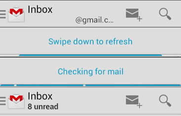
Whether you stick to a platform’s UI guidelines or do your own thing with custom components, know that there are certain design patterns that most people use every day and love. How are people usually introduced to a new app? Through a slideshow walkthrough or an instructional overlay. How do people navigate? With a tab bar or a sidebar drawer. How do users quickly load or refresh data? By pulling to refresh. (Native-like scrolling will be covered extensively further below.)
Resources For Mobile UI Design
- “Mobile UI Design Patterns: 10+ Sites for Inspiration,” Jacob Gube, Six Revisions
- “Cloning the UI of iOS 7 With HTML, CSS and JavaScript,” Côme Courteault
- “Tapping Into Mobile UI With HTML5” (slides), Luke Melia and Yael Sahar, Slideshare
Design A Native-Looking Header Bar
One important part of a UI is the header bar, with its title and navigation elements, most notably the “up” and “back” buttons. To me, many popular frameworks fail to provide a HTML and CSS solution that compares to a native app. Mimicking this part of the UI with a minimal DOM and a few lines of CSS for each platform is actually fairly easy:
<header>
   <button class="back">Feed</button>
   <h1>Details</h1>
   <!-- more actions (e.g. a search button on the right side) -->
</header>
Check out the full code of the native-looking header bar for iOS, Android and Windows Phone on JSFiddle. This is my result:
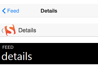
Using the same DOM across all platforms is generally preferable because it results in cleaner code and, therefore, maximizes maintainability. I’ve found this to be easily possible for many UI components on iOS and Android (including the header bar, tab bar, custom navigation menu, settings page, popover and many more). However, this becomes much harder when adding support for Windows Phone, which comes with some very different design patterns.
Support High-Resolution Screens
Nowadays, smartphones and tablets with high-resolution screens make up the vast majority of mobile devices, making up more than 80% of iOS devices and over 70% on Android devices. To make your images look crisp for everyone, you usually have to deliver twice the dimensions than what is actually shown in your app. Serving properly sized images for all different resolutions is one of the most discussed topics in responsive web design. There are various approaches, each with its benefits and drawbacks related to bandwidth, code maintainability and browser support. Let’s quickly review the most popular ones, in no particular order:
- server-side resizing and delivering
- client-side detection and replacement via JavaScript
- HTML5
pictureelement - HTML5
srcsetattribute - CSS
image-set - CSS media queries
- Resolution-independent images (SVG)
As always, there is no silver bullet for responsive images. It pretty much depends on the type of images and how they are used in the app. For static images (such as the logo and tutorial images), I try to use SVG. They scale perfectly without any extra effort and have great browser support as long as you’re fine with Android 3+.
When SVG is not an option, the HTML5 picture element and srcset attributes are definitely where front-end development is heading. Currently, their main drawback is the very limited browser support and, therefore, their need for polyfills.
In the meantime, CSS background images and media queries are the most pragmatic solution:
/* Normal-resolution CSS */
.logo {
   width: 120px;
   background: url(logo.png) no-repeat 0 0;
}

/* HD and Retina CSS */
@media
only screen and (-webkit-min-device-pixel-ratio: 1.25),
only screen and ( min--moz-device-pixel-ratio: 1.25),
only screen and ( -o-min-device-pixel-ratio: 1.25/1),
only screen and ( min-device-pixel-ratio: 1.25),
only screen and ( min-resolution: 200dpi),
only screen and ( min-resolution: 1.25dppx) {
    .logo {
      background: url(logo@2x.png) no-repeat 0 0;
      background-size: 120px; /* Equal to normal logo width */
   }
}
However, your app might already contain a lot of content (such as news articles), and adjusting all of the img tags or replacing them with CSS would be exhausting. A server-side solution is the best choice in this case.
Starting last year, more and more Android manufacturers have gone one step further with what is called XXHDPI (or very very high-resolution) screens. Whichever solution above fits your need, keep in mind that you’ll need images that are three times the original dimensions to support Android’s latest flagship devices.
Use System Fonts
A simple yet important way to make users feel at home is to use system fonts.

These are my recommended font stacks on the major platforms:
/* iOS */
font-family: 'Helvetica Neue', Helvetica, Arial, sans-serif;

/* Android */
font-family: 'RobotoRegular', 'Droid Sans', sans-serif;

/* Windows Phone */
font-family: 'Segoe UI', Segoe, Tahoma, Geneva, sans-serif;
Furthermore, iOS 7 offers some interesting presets that automatically set the correct font family, font size and line height. It’s as easy as using font: -apple-system-body for normal text and font: -apple-system-headline for headings. This not only simplifies font declarations, but also improves accessibility through “dynamic type,” Apple’s system-wide font-size setting. You can dig deeper into iOS 7 font presets in a post by Thomas Fuchs.
An Icon Is Worth A Thousand Words
Iconography is an important part of the user experience on all major mobile platforms. As with fonts, you’re usually best off using icons that your target audience already knows. Recalling what I said about high-resolution screens earlier, make sure that your icons are scaleable. Implementing them as a font via CSS’ @font-face rule is a great way to achieve this, and it comes with wide browser support. It even allows you to change an icon’s appearance (for example, its color, shadow and transparency) seamlessly via CSS. Here are my recommendations:
- Get various platform icon fonts. Ionicons is our baseline set because it includes nearly everything we need. This includes specific icons for iOS and Android in addition to their general ones. The rest come from specific platform icon fonts for iOS, Android set 1 and set 2 and Windows Phone.
- Combine them with a icon font generator. Using multiple icon fonts is confusing and quickly adds up in size. That is why we use Fontello to combine the different sets, adjust key codes and export them for each platform. The result is
<span class="icon">s</span>, which looks like a search icon on iOS, Android and Windows Phone. Also, check out the popular alternatives IcoMoon and Fontastic.
On Windows Phone, you can also get away with the native font-family: ‘Segoe UI Symbol’.
Optimize For Performance
Performance is usually considered to be one of the major disadvantages of a hybrid mobile app. This is mostly true if your app has a lot of heavy animations, contains huge scrolling lists and needs to run on old devices. However, if you are all right with supporting only newer platform versions (Android 4+, iOS 7+ and Windows Phone 8+), then you’ll very likely have satisfying results. It’s ultimately a question of how much effort you put into optimizing DOM and CSS selectors, writing performant JavaScript, reducing rendering time and minimizing the number of reflows and repaints. An endless number of articles and tutorials cover mobile web performance. These are some of my favorites:
- “Performance and UX Considerations for Successful PhoneGap Apps,” Andrew Trice
- “Mobile: Web Performance” (slides), Estelle Weyl
- “Writing Fast, Memory-Efficient JavaScript,” Addy Osmani, Smashing Magazine
- “Minimizing Browser Reflow,” Lindsey Simon, Google Developers
- “How to Make Your Website Faster on Mobile Devices,” Johan Johansson, Smashing Magazine
Beyond that, mobile hardware and rendering engines are improving at a rapid pace, with new devices coming out every other day. Developers can make the performance of a hybrid WebView app difficult to distinguish from that of a fully native app on the iPhone 5 series and on Android phones comparable to Nexus 4 and 5.
Increase Perceived Speed
Building a performant app is one thing, but making it feel fast is a whole other. Whether your app needs some time for a certain task (such as some heavy calculation or client-server communication), presenting instant feedback is crucial to providing a fluid and responsive experience. A common technique is to delay tasks that the user doesn’t need yet, while predicting and preloading the steps the user might take next. A famous example is Instagram, which uploads photos in the background while the user is busy adding tags and sharing. Perceived speed can be very different from actual speed, so let’s use it in our favor. Here are some no-brainers.
Remove The Click Delay On Touch Devices
A normal JavaScript click event handler on a touch device comes with a slight delay between the touchstart and the click being fired (usually around 300 milliseconds). This feature is built into the browser to detect whether the user is performing a single- or double-tap. If you don’t need the “double-tap to zoom” feature, you can safely eliminate these 300 milliseconds to get a much more responsive tap behavior. My favorite solution for this is the FastClick library. Use it on everything except Internet Explorer:
if ('ontouchstart' in window) {
   window.addEventListener('load', function() {
      FastClick.attach(document.body);
   }, false);
}
Internet Explorer 10+ is a bit easier. You just need some CSS:
html {
   -ms-touch-action: manipulation; /* IE 10  */
       touch-action: manipulation; /* IE 11+ */
}
Style The Active State
As soon as the user taps an actionable element such as a button or a link, they should immediately get some kind of feedback that the app has detected their action. While the CSS pseudo-class :hover works great for this on the desktop, you need to switch to :active or a JavaScript solution for it to work on mobile. I’ve compared the three approaches to the active state on JSFiddle. While they all work one way or another, you judge which is best for you.
Furthermore, remove the default tap highlight while adjusting your active states on mobile. I’d also recommend disabling user selections on actionable elements, because the selection menu would be quite disruptive if the user accidentally taps the button for too long.
iOS and Android:
button {
   outline: 0;
   -webkit-tap-highlight-color: rgba(0,0,0,0);
   -webkit-tap-highlight-color: transparent;
   -webkit-touch-callout: none;
   -webkit-user-select: none;
      -moz-user-select: none;
       -ms-user-select: none;
           user-select: none;
}
Windows Phone 8+:
<meta name="msapplication-tap-highlight" content="no">
Indicate Loading
Whenever your app is performing an action that will take some time to finish, even just for a second, consider adding a loading indicator. If you don’t, users will think that your app freezes occasionally, or they’ll click around when they shouldn’t, or they might even break things and then blame your app. From what I’ve experienced, animated GIFs are usually a bad idea in mobile browsers. As soon as there is a load on the CPU, the GIF freezes, thus defeating its entire purpose. I prefer Spin.js for its configurability and ease of use. Also, check out some other JavaScript solutions and CSS loaders.
Cross-platform tools like PhoneGap and Trigger.io also provide access to native loaders, which is great for showing a full-screen loading animation.
Get The Scrolling Right
Scrolling is one of the most important factors in the user experience of many apps. This is both a curse and a blessing because the success of its implementation will depend heavily on the scrolling niceties that your app relies on and on the mobile operating systems that need to be supported.
Scrollable content and a fixed header and/or footer bar are common to nearly all apps. There are two common approaches to achieving this with CSS:
- Enabling scrolling on the
body, and applyingposition: fixedto the header; - Disabling scrolling on the
body, and applyingoverflow: scrollto the content; - Disabling scrolling on the
body, and applying JavaScript custom scrolling to the content.
While the first option has some benefits (such as iOS’s native scroll-to-top action and a simple code structure), I highly recommend going with the second option, overflow: scroll. It has fewer rendering issues (although still a lot), and browser support is great on modern platforms (Android 4+, iOS 5+ and Windows Phone 8+), with a nice little polyfill for some older ones. Alternatively, you could replace overflow: scroll with a custom scrolling library (the third option), such as iScroll. While these JavaScript solutions allow for more flexibility with features (for example, the scroll position during momentum, event handling, customization of effects and scrollbars, etc.), they always penalize performance. This becomes critical when you’re using a lot of DOM nodes and/or CSS3 effects (such as box-shadow, text-shadow, opacity and rgba) in the content area.
Let’s look at some of the basic scrolling features.
Momentum Effect
The touch-friendly momentum effect enables users to quickly scroll through large content areas in an intuitive way. It can be easily activated with some simple CSS on iOS 5+ and in some versions of Chrome for Android. On iOS, this will also enable the content to bounce off the top and bottom edges.
overflow-y: scroll;
-webkit-overflow-scrolling: touch;
Pull Down To Refresh
Various solution for this are available on the web, such as the one by Damien Antipa. While the solutions for iOS and Windows Phone have a similar look and feel, Android recently introduced its own mechanism (see below). We’ve implemented this in CatchApp using some JavaScript and CSS keyframes. (I have yet to wrap it up nicely and put it on GitHub, so stay tuned!)

Scroll To Top
Unfortunately, disabling scrolling on the body will also break iOS’ native feature that enables users to quickly get to the top of the page by tapping the status bar. I’ve written a small script that can be added to any element and that takes care of scrolling to the top using JavaScript, even if the content is currently in momentum. Add it to the header of your mobile website or to the status bar with a native plugin (for example, in PhoneGap).
Many other scrolling features could be implemented on top of the native overflow: scroll, such as snapping to a certain element or just infinite scrolling. If your requirements are more advanced, definitely look at the JavaScript options out there.
Make It Easy To Hit Stuff
When performing a touch action, users will quite often miss their target by a few pixels, especially on small buttons (such as the ones in iOS’ top bar). Developers can assist users while keeping the design elegant by enabling an invisible touch area around small targets:
<button>
   <div class="innerButton">Click me!</div>
</button>
You’ll have to put the event handler on the button element, while restricting the styles to div.innerButton. Check out the full example, including CSS, on JSFiddle.
Using Touch Gestures
A smartphone is all about touching and gestures. We swipe, pinch, zoom, drag and long-tap all the time when interacting with touch devices. So, why not offer users the same means of controlling your hybrid app? QuoJS and Hammer.js are well-known libraries for supporting all kinds of gestures. If you’d like more choice, check out Kevin Liew’s comparison of “11 Multi-Touch and Touch Events JavaScript Libraries.”
Don’t Miss Out On Native Functionality
Building your app with web technology doesn’t necessarily mean that you can’t use native features. In fact, all major cross-platform development tools provide built-in access to the most important functionality. This includes APIs for device data, the file system, the network connection, geolocation, the accelerometer, notifications (including push) and much more.
You can usually even extend a development tool by building custom plugins. At Hojoki, we added many missing features, including reading the user’s setting for push notifications for our app, detecting the user’s time zone, and checking whether a third-party app is installed and launching it. Let’s look at two very simple examples for things that can be realized with native plugins. First, let’s enable JavaScript focus() for input fields on iOS 6+:
if ([[[UIDevice currentDevice] systemVersion] floatValue] >= 6) {
   [YourWebView setKeyboardDisplayRequiresUserAction:NO];
}
And here’s the code to copy a given string to the device’s clipboard on iOS:
[[UIPasteboard generalPasteboard] setString:@"Your copied string"];
Always Provide A Way Out
Web developers often overlook how to handle bad situations in a hybrid app (for example, a connection timeout, a bad input, a timing issue, etc.). A hybrid app is fundamentally different from a website, mainly because there is no global refresh button, and an app can easily run in the background for weeks on some mobile operating systems. If the user runs into a dead end, their only option will be to restart the app, which entails force quitting and then restarting. Many people don’t even know how to do that, especially on Android 2.x (where it’s hidden deep in the app’s settings) and on iOS 6 and below (where you have to double-tap the home button, long-press the icon and kill it).
So, ignore the refresh button during development, and handle bad situations as they come up. For all other situations that would have unexpected outcomes, such as ones involving client-server communication, be prepared for things to go wrong, and provide a way out for users. This could be as easy as showing a full-screen error message — “Oops! Something bad happened. Please check your connection and try again” — with a big “Reload” button below.
How To Wrap It
Developing a hybrid mobile app means using the same tools and processes that you would usually use to develop (mobile) websites. Having said that, one thing I really like about the hybrid approach is that you can deploy HTML, CSS and JavaScript code as a mobile web app with relative ease. Make sure to implement fallbacks for native features, or find elegant workarounds if they are not supported at all. Most mobile developers prefer to keep users in a native app, and you could even advertise the app to your mobile website’s users.
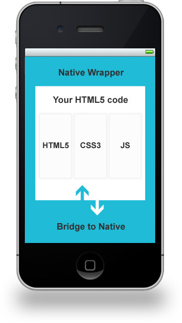
What about the native part? Your mobile web app (plain HTML, CSS and JavaScript) will be loaded in a WebView, which is an internal browser engine that renders an app the way a default browser on the device would render it (there might be slight differences — your mileage may vary). Additionally, native “bridges” are used to expose features of the device and operating system through an API to make them accessible with JavaScript. This usually includes access to the device’s camera, address book, geolocation, file system and native events (for example, via one of the hardware buttons on Android), to name just a few features.
A few cross-platform development tools provide that native bridge and simplify the whole process of wrapping it. Let’s dive into some options.
PhoneGap And Apache Cordova
PhoneGap is certainly one of the most popular tools for cross-platform development. The name itself is often used synonymously with hybrid mobile app development.
There has been some confusion about its name and relation to Apache Cordova, which is understandable. The latter is a top-level Apache project that was formerly called PhoneGap. It offers a set of device APIs to access native functionality from HTML, CSS and JavaScript code running in a WebView. Now, Adobe PhoneGap is a distribution of Cordova — not unlike the way Chrome uses WebKit as its engine.
Both are open-source and free to use, with support for all major platforms and with an active community developing all kinds of plugins and extensions.
PhoneGap has shaped the hybrid lanscape significantly, and many new tools have emerged that offer additional services or that streamline the development process. They usually add a lot of convenience by enabling you to build an app in the cloud, thereby saving you the effort of locally installing all of the different platform SDKs and tools. Each tool has a different focus, level of platform support and price:
- PhoneGap Build
- Telerik AppBuilder (formerly Icenium)
- AppGyver Steroids
- Appery.io (formerly Tiggzi)
- Monaca
- Intel XDK
Sencha Touch
Sencha Touch started out as a UI framework for the mobile web and has been around for years. Traditionally, developers have used Sencha to build an app while using another service, like PhoneGap, to deploy it as a hybrid app. Nowadays, Sencha offers this kind of functionality built in for free. Platform support includes iOS and Android (both via Sencha’s own native packager) BlackBerry, Windows 8 and more (via PhoneGap Build).
Trigger.io
At Hojoki, we started using Trigger.io two and a half years ago because we were looking for a lightweight alternative to PhoneGap. Even though iOS and Android are its only supported platforms, it offers a good set of native APIs, custom plugins and third-party integration (including Parse push notifications, Flurry analytics and parts of Facebook’s SDK). Trigger.io’s command-line tools allowed us to integrate the app’s packaging into our Grunt build process, which is great if you love automation.
One of its key features is Reload, which enables developers to push HTML, CSS and JavaScript updates to an app on the fly. Unlike PhoneGap Build’s Hydration, Reload is specifically designed for development and production apps. This makes it possible to legally bypass Apple’s submission process to push bug fixes and iterate quickly with A/B testing.
Once the 14-day trial is up, Trigger.io’s steep pricing is probably the biggest downside for many developers.
With MoSync having gone offline a couple of days ago, Trigger.io seems to be the only remaining tool that is not associated with PhoneGap. MoSync seems to be another tool that is not associated with PhoneGap, however I’m not sure how actively it is being developed at the moment.
Test On Real Devices
Building a mobile app with web technologies obviously tempts us to do most of our testing in a web browser. This might be fine when developing non-native features, but definitely avoid it when releasing. Test with as many manufacturers, platforms and form factors as possible before submitting the app. Android’s fragmentation brings endless possibilities of differences in browser rendering, unsupported features and manufacturer modifications. While iOS does much better with rendering differences, Apple has a growing number of devices with varying sizes, resolutions and pixel densities. Check out “Prioritizing Devices: Testing and Responsive Web Design” to learn more.
When Facebook famously ditched most of its HTML5 and went native in 2012, it cited missing debugging tools and developer APIs as one of its main reasons. LinkedIn drew the same conclusions half a year later, stating that HTML5 itself is ready, but basic tools and the ecosystem don’t support it yet. From what I’m seeing, the situation is getting better, with remote debugging in WebView on Android 4.4+ and an increasing number of development tools on all platforms:
- “Web Inspector,” Safari (iOS)
- “Remote Debugging on Android with Chrome”
- “Debug Store Apps in Visual Studio” (Windows Phone 8.1), Windows Dev Center
- Weinre (for everything), Patrick Mueller
- Edge Inspect (for iOS and Android), Adobe
Start Thinking In Terms Of Hard Releases
When building an app for web browsers, deploying a hot fix to users is a simple step, which means that testing can lose some of its importance. This obviously needs to be reconsidered when you’re releasing an app through an app store. Think of it like software development in the ’90s: You’re now living in the world of hard releases.
So, why is this bad? First, the submission process could easily take a week or two (Hello, Apple!). Secondly, even if your hot fix is released quickly, that doesn’t guarantee that users will update the app any time soon. Here are my suggestions:
- Make testing a high priority.
- Have some kind of “force update” logic to deprecate old client versions.
- Use mechanisms like Trigger.io’s Reload to fix code on the fly.
- Apply for an expedited app review (Apple only) if you need to be fast.
Get It In The Stores
The tools mentioned above spit out a binary for each platform, which can then be submitted to the relevant store. From this point on, the process is exactly the same as publishing a “normal” native app. Some of the tools we’ve looked at might even have better documentation for this. Nevertheless, here are the official guides:
- “App Distribution Guide,” Apple
- “Get Started With Publishing” and “Launch Checklist,” Android Developers
- “Publish for Windows Phone,” Windows Dev Center
Conclusion
Now that our hybrid mobile apps have been in Apple’s App Store and in Google Play for two years, I’d like to recapitulate some of the benefits and drawbacks mentioned at the beginning of this article.
For us, a web startup company with very limited resources and no native iOS or Android experience, building an app for multiple platforms in just a few weeks would have been impossible. Choosing the hybrid path enabled us to reuse a lot of code from the web app and to iterate quickly based on user feedback. We’ve even managed to publish native apps for Windows 8 for the desktop and Microsoft Surface as well as Mac OS X with exactly the same code base. The effort of moving to another platform will depend largely on the capabilities of the given browser and device and on the level of your need for native functionality. We needed push notifications, in-app purchases and access to the user’s contacts, among other things. Depending on your needs, a lot of native functionality could make you heavily dependent on the native wrapping tool that you choose.
Finally, let’s see whether hybrid apps really can deliver a native look and feel. Below is a compilation of user reviews from the app stores. Both positive and negative comments are included, but many of the negative reviews are for early releases, which had the same UI for all platforms and was comparatively slow in performance.
"★ Great idea, but not a good app. The app runs extremely slow on my Samsung Galaxy Ace and Tab. The app also looks and controls like an iPhone app. This is confusing when you have never had an iPhone. ★★ Another reason apps should not use WebViews for UI. ★★ Service great but WebView app sucks. ★★★ It’s the right app in concept, but it really is too laggy to be practically used. And I’m using Jellybean so there is no excuse. ★★★ It lags a lot and the UI is not beautiful. ★★★ Good but very very slow. ★★★★ This app is very handy, but is a little slow to boot up. ★★★★★ This is working really hard well since the update. It’s a great app to begin with and now it’s working smoother and faster than before. ★★★★★ Extremely smooth and effective. ★★★★★ The app work flawlessly… ★★★★★ Beautiful designed app! Love the interface and the great overview of all your tools! Good job! Keep shippin! ★★★★★ This is an absolutely beautiful aggregate that runs buttery smooth, even on a 3GS. Recommend to anyone doing any sort of project."
We’re definitely moving away from platform-specific app development and towards the many new technologies that are emerging. Larry Page said this when asked at Google I/O last year about the future of the web:
"In the very long term, I don’t think you should have to think about, as a developer, am I developing for this platform or another, or something like that. I think you should be able to work at a much higher level, and software you write should run everywhere, easily."
The (mobile) web is a major success story in this regard. Being able to use this platform and still be able to distribute an app in all stores is a huge step forward. It will be interesting to see how this all plays out. Whatever happens, using a technology that over a third of the world’s population (over two thirds in Europe and the US) relies on probably won’t be a bad choice.
Further Reading
- What Every App Developer Should Know About Android
- How To Design For Android
- Designing For A Maturing Android
- How To Design For Android Tablets
 (da, al, ml)

