A Guide To Conducting A Mobile UX Diagnostic

Email Newsletter
Weekly tips on front-end & UX.
Trusted by 182,000+ folks.
 See User Testing Live
 Custom Web Forms for Angular, React, & Vue. Your backend.


 Celebrating 10 million developers
Today’s mobile users have increasing expectations, they are intolerant of faults in their mobile experiences, and they complain about bad mobile experiences on social media and through word of mouth. How do you make sure that your mobile experience meets or exceeds users’ expectations?
One quick way to identify potential problems is to conduct a user experience diagnostic, by having a few mobile specialists look for potential problems with a mobile presence. A diagnostic can be done during design and development to ensure that the mobile website or app adheres to best practices and guidelines. It also serves as a great starting point for a redesign to identify particular opportunities for improvement.
While a diagnostic can be done by a single evaluator, it is more effective when conducted by multiple evaluators with different strengths and backgrounds. These evaluators should be practitioners well versed in principles of user experience (UX) for mobile interfaces and in mobile platform guidelines, and they should not be closely involved with the design itself. A diagnostic is not a replacement for testing with end users, but rather is a quick method in a user-centered design process.
This article will describe a process you can follow to evaluate a mobile UX, be it for an app or a website accessed on a mobile device. The steps in this process are:
- identify users and scenarios,
- conduct an evaluation,
- conduct a team review,
- document and report.
Alongside the explanation of each step, we’ll illustrate the step using the United States Postal Service as an unwitting real-world example.
Identify Users And Scenarios
A mobile UX diagnostic is conducted by expert evaluators who may or may not be active users of the mobile product. To help the evaluators walk a mile in the user’s shoes, select one to three personas based on the target audience, along with scenarios based on common user tasks and goals. Define the boundaries of the evaluation, and make it quick and efficient by asking the following questions:
- What should the evaluation focus on? Is it a website that would be accessed on a mobile device or a mobile app? If it’s an app, which platform?
- Which devices do your target users use? One way to find out is by looking at web traffic and analytics. If that’s not available, then select popular devices based on market share.
- Which OS versions are being used? Base this on the platform and device.
- Who are the main competitors of the website or app?
- Is any relevant market research available? This could be industry trends, reports, etc. One example would be Forrester’s Customer Experience Index.
We’ll evaluate the app for the United States Postal Service (USPS) — “over 2 million downloads!” — on an iPhone 5 running iOS 7.1. We’ll illustrate it through the eyes of Mary Jane, an average residential postal customer. (The persona and scenarios are made up for this article.)
### Persona I will illustrate the evaluation of the USPS Mobile iOS app ("over 2 million downloads!") on an iPhone 5 running iOS 7.1, through the eyes of Mary Jane, an average residential postal customer (the persona and scenarios were made up for this article).

- Track packages Mary frequently shops online and gets deliveries to her door. She likes being able to track her packages to make sure she receives everything as expected. She wants to be able to use her phone to check the status of pending deliveries.
- Find location Mary is on her way to pick up her kids from school when she realizes that today is the deadline to postmark one of her rebates. She wants to find a nearby manned post office or a drop-off location with late pick-up hours.
- Hold mail The family takes three to four mini-vacations a year, during which time she places a hold on her mail to prevent any packages from being left at her door in her absence. The family’s anniversary getaway is coming up in a few weeks, and she wants to place a hold on her mail.
Conduct The Evaluation
A best practice is to have two or more evaluators independently conduct the evaluation in three parts:
- scenarios and related UX,
- rapid competitive benchmarking,
- overall UX.
Scenarios And Related UX
The first part involves evaluating the UX using defined scenarios of use, followed by an inspection of other aspects of the UX.
Step 1: Pick a device and OS. Test “glanceability” with a five-second test. Launch the app or website and look at it for five seconds. Then, cover the screen and answer the following: What is being offered, and what can the user do? The app or website passes if your answer closely matches its core offering.
Step 2: Put on your “persona hat” and use the website or app to walk through the scenario. Look for and identify UX issues that the persona might face in the scenario — anything that would slow down or prevent them from completing their tasks. Document the issues by taking screenshots and making notes as you go. Where possible, use contextual testing in the field (i.e. outside of the office) to uncover issues that you might not have exposed otherwise (for example, spotty connectivity when using a travel or retail app, or contrast and glare).
Repeat step 2 until every scenario for each persona is completed.
Step 3: Chances are, the scenarios did not cover everything that the website or app has to offer. Switch from your “persona hat” to your “UX specialist hat” to evaluate key areas not yet covered. Use a framework such as the one detailed in “The Elements of the Mobile User Experience” to organize the evaluation, continuing to document issues and take relevant screenshots. I find that focusing on the problems to be more valuable, unless you are using a scorecard, such as Forrester’s, or you specifically need to document strengths as well.
For an app, repeat steps 2 and 3 for the other identified platforms and devices to ensure that the app follows the guidelines and conventions of those platforms. For a website, verify that it renders as expected across devices.
- When the app launches, a splash screen appears for varying lengths of time (as little as a few seconds to over a minute over public Wi-Fi, simulating the guest Wi-Fi network at her children’s school).
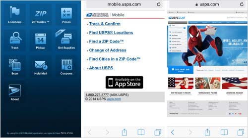
- The home screen does not have a logo or prominent USPS branding — just a screen with icons.
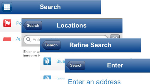
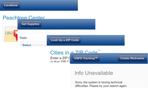
- The screen titles do not assure Mary that she is heading down the right path. Tapping “Locations” leads to a screen titled “Search,” and the titles of subsequent screens don’t match either (one says “Enter” and then “Refine search”).
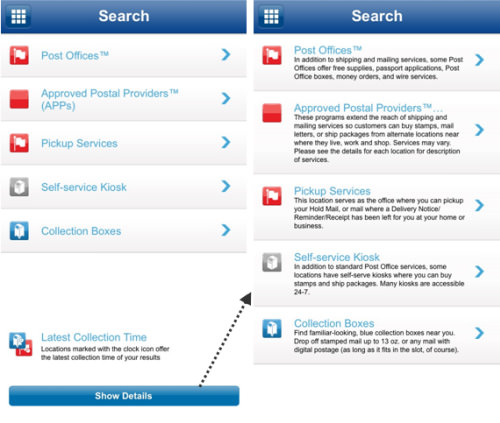
- The “Location” screen does not have sufficient information, forcing Mary to tap “Show Details” to understand the different options. Why wasn’t this made the default view?
- The same icon is used for “Post Offices” and “Pickup Services.”
- Locating all services at once is not possible. Mary is forced to look them up one at a time (for example, first looking up “Post Office” locations, then going back and looking up “Approved Providers”).
- Location services are not activated for the app, and there is no alert or reminder to turn it on to use the GPS. Mary is under the impression that that functionality does not work.
- No option exists to enter a search radius. Results from almost 50 kilometers away are returned.
- The location results do not indicate whether a location is open or closed.
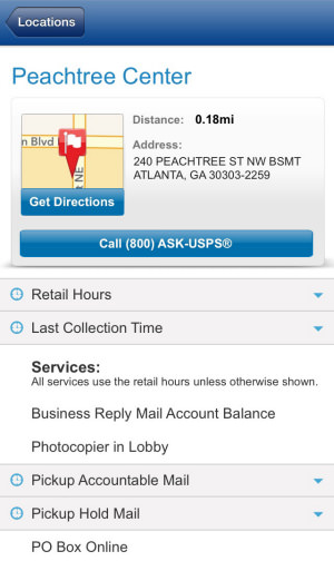
- When Mary selects a location to view its details, she has to expand the boxes for “Retail Hours” and “Last Collection Time” individually to view that information.
- Going back from the “Locations” screen crashes the app. Every. Single. Time. (Even after deleting the app and reinstalling.)
- The titles used in the app are not user-friendly, but rather oriented around features and functionality. For example, “Scan” (Scan what? Why?); and “Coupons” (Get coupons? No. What coupons can one add? No clue is given.)
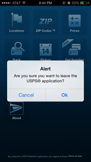
- Tapping the “Terms of Use” on the home screen results in a confirmation prompt to leave the app (taking users to the mobile website). Really?!
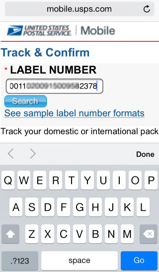
- The input field for the ZIP code does not bring up the appropriate numeric keyboard. In the “Supplies” section, the keyboard that appears for the ZIP code is the alphabetical keyboard, not even the alphanumeric one.
- Many screens do not have titles (for example, try entering an address for “Supplies”).
- The scanning experience is inconsistent. It took a few minutes for one, but was quicker the next time.
- The app is missing expected functionality (such as expected delivery date, app notifications and a change-of-address option). The app has fewer features than the mobile website (such as an option to change one’s address).
- The screen to track a package has a “Scan” button, instead of the conventional camera icon.
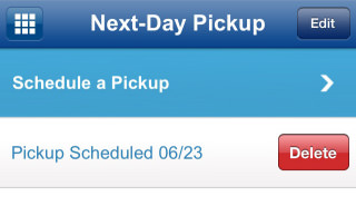
- Information is not shared between screens in the app, forcing the user to enter the same information in multiple places (for example, for “Next day pickup,” “Get supplies” and “Hold mail”).
- Deleting a scheduled pickup in the app does not cancel the pickup, and no warning message is displayed either.
- A minor issue, the “Terms of Use” link on the home screen does not align with the rest of the sentence.
Rapid Competitive Benchmarking
Rapid competitive benchmarking is a quick exercise to compare how your mobile UX stacks up against the competition’s. To do this, pick a couple of primary competitors or services that offer similar functionality, and complete similar scenarios, followed by a quick scan of their functionality. Look for areas where competitors offer a better user experience, and document with notes and screenshots. For a more detailed analysis, compare features to those of key competitors (Harvey Balls do a good job of showing the relative completeness of features).
### Competitive Benchmarking: Notes For “Find Location” Scenario UPS:
- An option exists to view all types of locations, but with no way to distinguish between them.
- Results are displayed only on a map (no list view).
- When location services are turned off, the app gives clear instructions on how to turn it on.
- A single screen contains both “Use current location” and search by ZIP code, with filters to show one or more types of locations.
- Location results can be viewed as a list or map.
- Location results show at a glance whether a location is open or closed.
- Results show multiple types of locations and identify the type of each location.
Overall UX Feedback
The final step in the individual evaluation is to step back and evaluate the big picture. To do this, review the following:
- how the user installs the app or finds the website;
- onboarding help if it’s an app,
- the cross-channel experience (i.e. comparing the app to the website on different devices),
- the cross-device experience,
- reviews in app stores (for apps) and social networks (for websites and apps),
- comments and feedback received by email (if you have access to this).
### Overall UX Notes
- When the app first launches, the user is forced to accept the terms and conditions to use the app. (I’ve fought my share of battles with legal departments on this topic as well — and lost many.) However, there are no terms and conditions to accept before using USPS’ mobile website.
- The app has no onboarding help when first launched, and no help within either.
- The logo on the mobile website is low in resolution, with notable pixelation on “Retina” displays.
- Branding across the three lack consistency in look and feel.
- Carrying over shipment-tracking or any personal information between the three channels is not possible.
- The main functionality is not ordered consistently across channels, nor is key functionality available in all three channels.
- Touch targets are too close together on the mobile website.
- Branding appears on the home screen of the Android app, but not of the iOS app (even though it is shown in Apple’s App Store).
- Location services are inaccurate, and results could be more relevant.
- Scanning doesn’t always work.
- The app freezes and crashes.
Conduct A Team Review
Conduct a team review session to compare, validate and aggregate the findings of the individual evaluations. Evaluators with diverse skills (for example, visual designer, usability analyst) tend to have different areas of focus when conducting evaluations, even though they are using common personas and scenarios and a common evaluation framework.
During the team review, one evaluator should facilitate the discussion, bringing up each problem, verifying whether the other evaluators identified that issue and are in agreement, and then assigning a level of severity to the problem. The evaluators should also identify possible solutions for these issues. The result would be a consolidated list of problems and potential solutions.
For an extended evaluation, invite other designers to the team review session, maybe over an extended catered lunch meeting or towards the end of the day over pizza and drinks. The other designers should have spent some time prior to the session (at least 30 minutes) familiarizing themselves with the website or app. This will enable everyone to explore the website or app together as a team, identify and discuss problems as they find them, and discuss possible solutions.
One evaluator should set the stage by outlining background information and problems identified. This should be followed by a facilitated review of the website or app (often using a structure like the one outlined in “The Elements of the Mobile User Experience” to guide the discussion). Assign a team member to document the session, including the problems identified, ideas, questions and solutions.
Document And Report
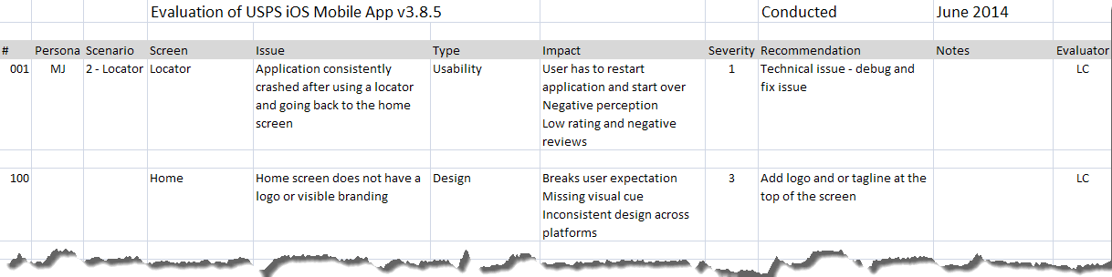
The evaluation spreadsheet is a nice way to capture and organize problems and recommendations, but communicating the issues visually is easier. I usually create a slide presentation, organized by the article linked to above. One slide is dedicated to each severe problem, with screenshots and callouts to elaborate. Less severe problems are grouped together according to the screens they appear on. Along with each problem and its impact, list actionable recommendations. For detailed evaluations, also mock up key recommendations that address the problem and incorporate best practices.
Begin the presentation with slides that set the context and explain the methodology and approach. Mention that the evaluation focuses on identifying problems, so that members of the design and development team do not start passing around antidepressants when they see the laundry list of problems they have to painstakingly work on.
Conclusion
A mobile UX diagnostic is not a replacement for testing with actual users, but rather is meant to quickly identify problems with a mobile website or app using trained eyes. A diagnostic will uncover most of the top usability problems, and because it is relatively inexpensive and quick, it can be conducted at multiple points in a user-centered design process. Diagnostics go a long way to improving a mobile experience, reducing flaws and meeting users’ expectations.
Related Resources
- “Summary of Usability Inspection Methods”, Jakob Nielsen
- “How to Conduct a Heuristic Evaluation”, Jakob Nielsen
- “Conducting Expert Reviews: What Works Best?”, Janet M. Six
- Mobile User Experience Diagnostic Sample Slides (PDF, 500 KB)
- Sample Evaluation List (XLSX, 10 KB)
Further Reading
- Effectively Planning UX Design Projects
- How To Spark A UX Revolution
- The Lean UX Manifesto: Principle-Driven Design
- Lean UX: Getting Out Of The Deliverables Business


