Effective Message Framing To Motivate Users

Email Newsletter
Weekly tips on front-end & UX.
Trusted by 182,000+ folks.


 Celebrating 10 million developers
 Custom Web Forms for Angular, React, & Vue. Your backend.
What you say in a user experience matters. How you say it matters equally. The way you frame communication, or how you say something, could be extremely effective at persuading people to start using your product (or to use it more).
So, how do you frame messages effectively? This article explains how design teams can do so in a way that resonates with their users.
Help! I’ve Been Framed!
- Framing is how you say something, using a “frame of communication.”
- Frames are story lines that make an issue relevant to a particular audience. Framing is not lying. It is putting a particular spin (a frame) on factual details.
- Framing effects occur when a message frame alters someone’s opinion on an issue.
For example, telling someone that smoking causes cancer and that they should consider quitting is not likely to produce any long-lasting change in their opinion towards smoking. Most smokers have heard these words all their life. However, smokers who view this (caution: video may be unsuitable for some viewers) video by the Centers for Disease Control and Prevention (CDC), which frames the consequences of smoking in a very graphic way, have found it to have a long-lasting impact on their attitude towards smoking. In this case, both the message and the medium make the video a more powerful frame of communication.
How Framing Applies To Good Design
We have talked about framing messages, but what’s that got to do with design? Everything. Everyone on a UX design team plays a role in effectively framing messaging and design. Frames consist of the words, images, metaphors, comparisons and presentation styles to communicate an issue.
Communications expert Mathew Nisbet, professor at Northeastern University, states:
"There is no such thing as unframed information, and most successful communicators are adept at framing."
Nisbet makes it clear: Accounting for framing should be a part of your overall content strategy. Good content doesn’t just happen; it requires the same level of detail that you apply to the rest of your design.
Let’s check out some examples of framing, as well as how to use visual design to frame a message for greater impact.
Suppose you are designing for a bank that provides mortgages to clients. The bank’s target demographic is upwardly mobile young professionals: college graduates ages 28 to 35, with a household income at or near six figures annually. Your client would like these customers to apply for mortgages. Your job is to frame the message of the public-facing mortgage page on the website.

Framing Without A Visual Aid (Message Is Words Only)
You find through pre-design user interviews that users in the target demographic often check out the current annual percentage rate (APR) when surfing your client’s website. You can frame the APR for a mortgage as follows:
"Today’s mortgage APR: 3.75% for a 30-year fixed mortgage. Save today!"
Potential borrowers don’t have much to get excited about. The message is short, which is positive. However, the 3.75% APR and 30-year term aren’t concepts that most people find instantly relatable. Is 3.75% good? What was the rate yesterday? What will it be tomorrow? Why 30 years? What can this interest rate do for me over that length of time? Should I wait? It does say “save today,” but I’m pretty busy today. I should probably wait. The bank doesn’t seem to be too concerned that this rate is going anywhere.
You can present the same information like this:
"Today’s mortgage APR is at an all time low of 3.75%. Complete our pre-qualification form now to lock in this rate. This rate would save you enough money on a $250,000 loan over 20 years to send your child to college when compared to an increase of just 1%, which could happen at any time."
You have framed the message to motivate behavior: Act now! Rates could change at any time. You have presented the user with context to motivate them to apply for a mortgage in the near term: Rates are at an all-time low. This means they were higher yesterday or last week. This means they might be higher tomorrow or next week.
While the 3.75% is still a somewhat murky concept, the user does see that this would save them enough to send a child to college in 20 years — unlike a 4.75% rate, which really doesn’t sound like that much more, but must be. The user is thinking of having or adopting a child within the next few years, which would make saving enough to send the kid to college over that time period perfect. Also, it is clear what they need to do next: fill out the pre-qualification form and get in touch with the mortgage officer.
Both of the examples above require reading and a deep level of comprehension to motivate the user. This is where visual framing comes into play. Let’s use the same bank and target demographic. When users land on the APR page, they see the following:
"Today’s mortgage APR is at an all time low of 3.75%."
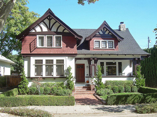

Users will be much more motivated to engage in behavior that leads to their dream home (act now), rather than the very sad shack that might not have enough room for the grandparents when they visit (wait). You have made your point without putting the focus on understanding the 3.75% rate, and you have preempted the user’s internal dialogue from the first two examples.
Let’s consider another example of the impact of visuals on framing information.
Suppose you are going to be giving a presentation on fire safety to first-graders. You need to grab their attention immediately or else you will lose them for the entire session. How might you kick off the visuals in your presentation? Here are two ways to frame fire safety and prevention:


Which opening slide do you think is more likely to grab the attention of a first-grader, or anyone for that matter? You have presented your audience with the same information, but you will likely get two very different reactions. Effective framing in this case means the difference between snores and cheers. The second example will captivate much of your audience for the important stuff that follows.
Now that we have covered framing and design, let’s look at some tried-and-true techniques that you can use to effectively frame messages.
Effectively Framing Messages Sounds Great. How Do I Do It?
Private industry is, predictably, on the cutting edge of marketing techniques. However, nonprofits and the US government are well aware of the importance of effective framing. The CDC in particular has invested a lot of resources into researching how to effectively frame public health issues, including fire, injury and smoking.
The process described below for developing a well-framed message is adapted from the CDC’s research-based guide (PDF, 1.35 MB) on framing messages for injury prevention. I also used this modified method in my dissertation to create different messages to test on zoo visitors.
Identify Your Target Audience
First, decide exactly whom you are speaking to.
You can identify your target audience in a number of ways. Involve as many of your core team members as possible. Have you done any research on audience segmentation? If so, start by creating a message that will appeal to one of your largest audience segments. If you haven’t discussed your target audience, now is a good time to start.
I have one rule for identifying a target audience. Your key audience cannot be everybody!
If you think you can develop a message that will appeal to everyone at the same time, let me save you the effort by saying you can’t. Rather, you would say different things to different people to motivate them.
One-size-fits-all doesn’t work with t-shirts, and it doesn’t work with messages.
In my dissertation, I targeted English-speaking adult visitors to natural history museums, science centers and zoos in the US.
Identify A Frame For Your Messages
Many frames exist. Choose one, and use it consistently throughout your messaging.
Examples Of Frames
- Value-based. We know that people make decisions based on more than just the facts alone. Values-based frames access users’ underlying values to motivate them to engage in a desired behavior. Common Cause has a guide on values and framing.
- Financial benefits. This frame highlights the financial benefits of engaging in a particular behavior.
- Gain. This focuses on what users will gain from engaging (or not engaging) in a particular behavior.
- Loss. A loss frame focuses on what users will lose from engaging (or not engaging) in a behavior.
Researchers continually examine which frames best motivate people to engage in certain behaviors. If you are not in a position to review relevant literature in order to choose a frame, then ask your UX researcher to do this.
Framing Elements
Message creators need to consider additional elements when framing a message:
- Urgency. Messages are more compelling when they contain “best,” “worst,” “first,” “last” and other words that create a sense of urgency.
- Persistence. Users should encounter your message multiple times, in multiple places.
- Simplicity. Users should be able to easily understand the message.
- Use of metaphors. Metaphors make abstract topics more concrete or understandable. Political communication often uses metaphors.
- Use of visuals. Visuals play a key role in framing messages. The Frameworks Institute notes that the importance of visuals doesn’t stop at the raw content. Message creators also need to consider the placement and sequence of visuals.
Make A Strong And Clear Statement About The Product
What do you want people to take away from your message? You can’t assume that you can bury this under an avalanche of witty euphemisms or roundabout references to what your product does. Be clear.
Incorporate the following principles to create a strong and clear message.
Use Positive Language And Avoid Negativity
Focus on how great the product is or how important the cause is, rather than how terrible the alternatives are (doing that would just make your product seem less bad, not more good). If you cast stones at the competition, expect nothing but the same in return.
Highlight Personal Responsibility And Control: Empower Your Users
Your message should explicitly show how using your product will give users more control. For example, telling users that your financial management software will put them in charge of their financial future makes for a much stronger message than simply noting how many options the software provides for sorting transactions in different categories.
Avoid Jargon (Your Field Doesn’t Have Jargon, Right?)
By avoiding jargon, you avoid assuming that your audience has background knowledge of your product. If your target audience is heavily involved in your field, then you might want to incorporate some industry-specific language to make a stronger connection with those users. You don’t always have to target the lowest common denominator; however, doing so allows your message to be understandable to the broadest number of potential users.
Include A Call To Action: Tell Users What You Want Them To Do!
Do you want users to purchase something, to get more information, to call their local politician? Be explicit and direct. If you have constructed an effective message, then be confident in stating what you want the audience to do with that information. Your message’s visual design is critical to this point. Are you clearly displaying what actions your users should take?
For Longer Messages And Persuasive Essays
If you are framing a long message or an essay, consider additional factors. A well-framed longer message includes the following:
- A title or headline that tells the reader what the message is about and why they should care.
- No more than one key message.
- A lead paragraph that captures the reader’s attention.
- A “nut” paragraph (i.e. the heart of your story — the details go here).
- Relevant quotes to make the topic more relatable.
Your chances of successfully framing a message increase by following the guidance presented above. However, there is one more requirement to effectively framing a message.
Test Your Message
Test your message before unleashing it on users. Don’t assume what people know or how they will understand something. By testing your message, you ensure that your frame comes across clearly.
Testing can be simple and not resource-intensive. Everyone on the design team should work together here. Ideally, you would use the frame(s) you are considering to formulate multiple messages. I also recommend testing what your team thinks are the worst one or two messages it’s created. You’d be surprised by what resonates with users. This is the entire point of user research: You can’t assume what the user wants; find ways to get users to tell you what they want!
You can test messages the old-fashioned way by printing out the designs, laminating them and approaching people in scenarios that would be typical for your product. Seeing how someone responds to a message can be eye-opening. Pictures are worth a thousand words, as are facial expressions.
You can also conduct research online. You can easily insert screenshots into survey questions using online survey software, such as SurveyMonkey or SurveyGizmo. Many testing services will also recruit participants according to your specific demographics. Testing through a service such as UserTesting is also very quick and inexpensive.
Ask Seven Questions
Once you’ve developed your messages and designs, ask potential users the following seven questions:
- Does this message make sense?
- How does this message make you feel?
- What do you think this message is asking you to do? (Ask this even if the message isn’t asking for anything.)
- With whom do you think this message will resonate?
- What would you change about this message to make it clearer?
- What would you change about this message to make it speak directly to you?
- What do you feel this message does well?
And if you are comparing multiple messages, then ask this question too:
- Which message do you think resonates the most? Why?
The number of people you test your message on will depend on the outcome you wish to achieve. Test on as many people as you feel is useful; don’t feel you have to conduct a study worthy of publication in an academic journal. If you speak to 10 representative users and they all give you similar responses, then you might be comfortable moving forward. Their feedback will at least give you insight into potential confusion or misunderstanding of the terminology in your messages. If the responses are varied, then your message is probably not coming across clearly. Incorporate the feedback above to make the message clearer, and then retest the new message.
I tested my dissertation messages with visitors to a local art museum before deploying them in my studies. I tested each message on 20 visitors, asking them whether the message was clear. I asked participants to identify which frame they felt I was using (to ensure that I had framed the messages clearly). I also used my committee of four, each with a PhD, to check the quality of the messages. Then, I conducted research using a number of survey questions to determine characteristics of visitors and how they perceived the messages.
Other Methods Of Testing
You can test messages using other methods as well. For example, you could pose the same questions listed above to a focus group. A/B testing will also reveal which of two (or more) messages users prefer.
Putting It All Together
We’ve covered how to effectively frame a message, and how to test it before implementation. Design teams need to give deeper thought to how they are conveying their message, not just what they are saying. Outlined above is a process for creating and testing a message, which will help you communicate clearly and effectively with users. Your messages will resonate with them. Use this information to reassess your current messaging, and to move forward with future messaging.
Additional Resources
- Do Loss-Framed Persuasive Messages Engender Greater Message Processing Than Do Gain-Framed Messages? A Meta-Analytic Review,” Daniel J. O’Keefe and Jakob D. Jensen, Communication Studies, Volume 59, Issue 1, 2008
- “The Strategic Use of Gain- and Loss-Framed Messages to Promote Healthy Behavior: How Theory Can Inform Practice,” Alexander J. Rothman, Roger D. Bartels, Jhon Wlaschin and Peter Salovey, Journal of Communication Volume 56, August 2006
- To Motivate Healthy Behavior, It’s Often Not What You Say, But How You Say It,” American Psychological Association
Further Reading
- A 5-Step Process For Conducting User Research
- Facing Your Fears: Approaching People For Research
- A Closer Look At Personas
- Think Fast! Using Heuristics To Increase Use Of Your Product


