100 Responsive And Mobile Icons [Freebie]

Email Newsletter
Weekly tips on front-end & UX.
Trusted by 182,000+ folks.


 Custom Web Forms for Angular, React, & Vue. Your backend.

 Celebrating 10 million developers
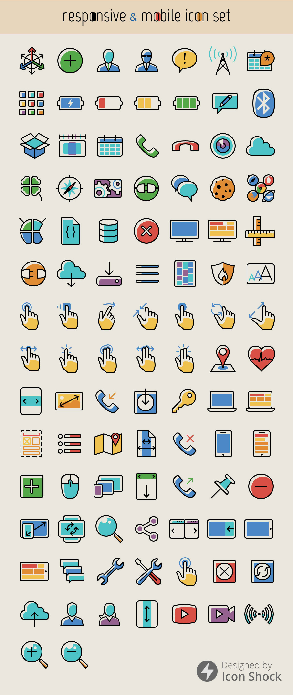
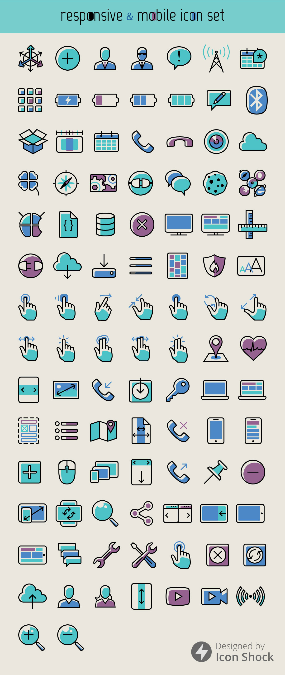
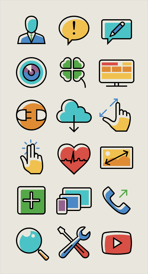
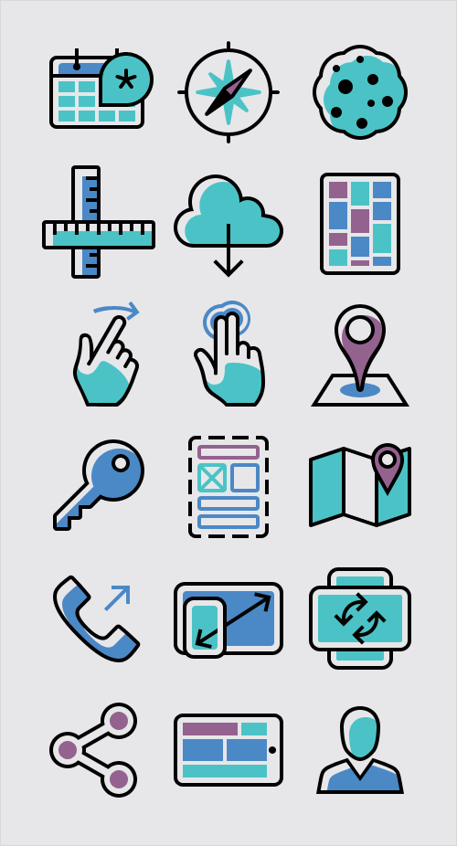
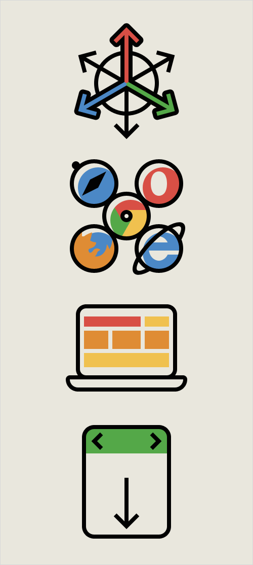
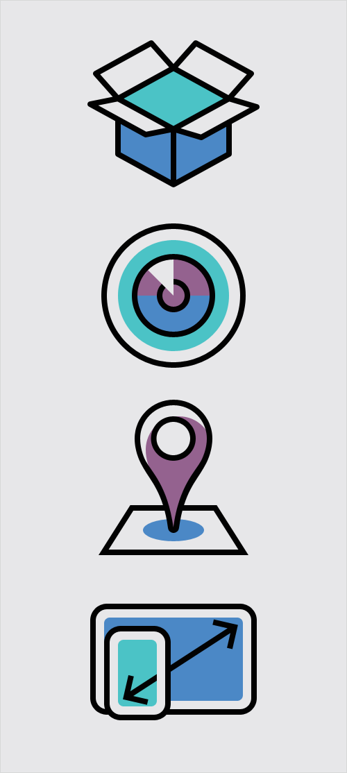
This responsive and mobile-themed icon set, designed by the folks behind Iconshock and Designshock, consists of 100 individual icons merging outlined as well as flat styles, all vectors built in Photoshop, in four transparent PNG image sizes and available in two color versions: a limited cold palette and a warm colorful one. The vector editable source files are included.
Please note that this icon set is licensed under a Creative Commons Attribution 3.0 Unported. You may modify the size, color or shape of the icons. No attribution is required, however, reselling of bundles or individual pictograms is not cool. Please provide credits to the creators and link to the article in which this freebie was released if you would like to spread the word in blog posts or anywhere else.
Download The Icon Set For Free
- Download the Mobile Icon Set (.zip, 8.2 MB)
- Official websites: Iconshock | Designshock
Insights From The Designers
"This is an iconset conceived to fill up the void in responsive-design-related icons, beyond the usual representation of three devices with the same layout that's usually presented more like a whole illustration. Considering the minimum level of detail required, and the design trends of the times, the style opted for was a mixture of outlined and flat, beyond simply rendering stroked and filled icons, giving each color area intention and meaning, as well as crafting two colorschemes, one with full warm colors and other with a cold reduced palette. Finally, to provide a complete and articulated pack, icons for mobile design, use and interaction were added, such as gestures and connection options."
A big thank you to Juan Pablo Sarmiento — we sincerely appreciate your time and efforts. Keep up the brilliant work!
Further Reading
- Smart Responsive Design Patterns
- Leaner Responsive Images With Client Hints
- Responsive Images Done Right: A Guide To
And srcset - Simple Responsive Images With CSS Background Images
 (il, mrn)

