Design Principles: Visual Weight And Direction
Email Newsletter
Weekly tips on front-end & UX.
Trusted by 200,000+ folks.


 Flexible CMS. Headless & API 1st
Every element on a web page exerts a visual force that attracts the eye of the viewer. The greater the force, the more the eye is attracted. These forces also appear to act on other elements, imparting a visual direction to their potential movement and suggesting where you should look next.
We refer to this force as visual weight and to the perceived direction of visual forces as visual direction. Both are important concepts to understand if you want to create hierarchy, flow, rhythm and balance in your composition.
Note: This is the fourth post in a series on design principles. You can find the first three posts in the series here:
- “Design Principles: Visual Perception and the Principles of Gestalt”
- “Design Principles: Space and the Figure-Ground Relationship”
- “Design Principles: Connecting and Separating Elements Through Contrast and Similarity”
Visual Weight
Physical weight is a measure of the force that gravity exerts on an object, but two-dimensional objects (such as elements on a web page) don’t have mass and, therefore, don’t have any physical weight. Visual weight is a measure of the force that an element exerts to attract the eye. Two-dimensional objects can attract attention. The more an element attracts the eye, the greater its visual weight.
In the previous post in this series I talked about primitive features, or the intrinsic characteristics of an element, such as size, color and shape. In that post I mentioned how, through these features, you can show contrast and similarity between elements.
For example, contrasting elements by making one very big and the other very small makes it clear that the elements are different.
Controlling the combination of these features is how you control visual weight. Red tends to attract the eye more than blue, and larger elements attract the eye more than smaller ones. A large red object carries more visual weight than a small blue object.
The sum of these characteristics or primitive features is what determines an element’s visual weight. It’s not any one feature, but rather their combination that determines the visual weight of an element. Some combinations of features will attract the eye more than others. To create elements of different visual weight, you would use different combinations of primitive features.
How Do You Measure Visual Weight?
There’s no way I know of to precisely measure the visual weight of a design element. You use your experience and judgment to determine which elements have greater or lesser weight. Develop an eye and then trust it. The areas of a composition that attract your eye are those that have greater visual weight. Learn to trust your eye.
This doesn’t mean that you have to randomly try things and see what attracts your eye the most and the least. You can isolate each characteristic to know that something bigger weighs more than something smaller, for example. It’s in the combination of features that your eye will help.
Fortunately, others have isolated and tested these characteristics. Below are some of the characteristics you can change on any element and a description of how changing them will either increase or decrease the element’s visual weight.
Let’s start with the primitive features that I mentioned in the last post: size, color, value, position, texture, shape and orientation.
- Size
Large elements have more visual weight than small elements. - Color
Warm colors advance into the foreground and tend to weigh more than cool colors, which recede into the background. Red is considered the heaviest color and yellow the lightest. - Value
Dark elements have more visual weight than light elements. - Position
Elements located higher in the composition are perceived to weigh more than elements located lower in the composition. The further from the center or dominant area of a composition, the greater the visual weight an element will carry. Elements in the foreground carry more weight than elements in the background. - Texture
Textured elements appear heavier than non-textured objects. Texture makes an element appear three-dimensional, which gives the appearance of mass and physical weight. - Shape
Objects with a regular shape appear heavier than objects with an irregular shape. The irregularity gives the impression that mass has been removed from a regular shape. - Orientation
Vertical objects appear heavier than horizontal objects. Diagonal elements carry the most weight.
You don’t have to limit yourself to the primitive features above. You can use additional characteristics to control visual weight.
- Density
Packing more elements into a given space increases the visual weight of the space. The viewer will perceive a larger or darker combined element as opposed to several smaller and lighter elements. - Local white space
White space appears to have no visual weight because it’s seen as empty. Any object placed within that space will seem heavier because of the space around it. - Intrinsic interest
Some things are more interesting than others. The more complex or intricate an element, the more interest it will draw and the more it will attract the eye. Your own interests also play a role. If you’re more interested in cars than in planes, then an image of a car will grab your attention more than an image of a plane. - Depth
A larger depth of field gives an element in focus increased visual weight, likely due to the contrast between the focus and unfocused areas. - Saturation
Saturated colors appear heavier than desaturated colors. - Perceived physical weight
We know that a house weighs more than a shoe. An image of a house will weigh more visually than an image of a shoe, because we expect the house to weigh more.
In the previous post in this series about contrast and similarity, I mentioned that contrast draws attention to an element. In other words, an element that contrasts with its surroundings will appear visually heavier than its surroundings. For example, circles usually appear heavier than rectangles on a web page because most website elements are rectangular.
Not all characteristics contribute equally to visual weight. Most people will notice the color of an element before its shape, which suggests that color contributes more to visual weight. You also have to consider the uniqueness of a given composition, because contrasting elements appear weightier than the elements they contrast with. The specifics of your composition will determine what contrasts and what doesn’t.
Remember that visual weight is a combination of the above attributes. While big carries more visual weight than small, a small dark circle surrounded by a generous amount of white space and located at the top of the page will likely appear to weigh more than a larger yet irregularly shaped object of a cool light color at the bottom of the page.
Visual Weight And Gestalt
One of the ideas behind this series is to point out how much gestalt principles contribute to design principles.
- Figure-ground
Visual weights can be used to separate the two by giving the figure more weight than the background. - Proximity
The space between elements leads to different amounts of local white space and different densities of the objects within the space. - Similarity and contrast
You can use visual weight to signal either. Contrast will lead to greater visual weight in the contrasting element. Elements with similar visual weight will naturally exhibit similarity. - Focal point (the next topic in the series)
Points of attraction in a composition are focal points, and they carry more visual weight than other elements. - Past experience
The viewer’s experience will contribute to how much intrinsic interest they think an element holds.
Visual Direction
If visual weight is about attracting the eye to a particular location, then visual direction is about leading the eye to the next location. Visual direction is the perceived direction of visual forces. Think of it as the direction you would expect an element to move if it were in motion.
Visual direction serves a similar function to visual weight in that it’s trying to get you to notice certain parts of the composition. Whereas visual weight is shouting “Look at me!,” visual direction is saying “Look over there!”
As with visual weight, you can modify the characteristics of an element to suggest different directions, although fewer characteristics are at your disposal than with weight.
- Shape of element
An element’s shape might create an axis through it and this axis can suggest a direction. The prime axis is typically seen as running parallel to an element’s visual direction. - Location of elements
Visual weight is a force that can appear to attract or repel a neighboring element. This force will move in a direction that connects both elements. - Subject matter of element
An arrow, a pointing finger, or the gaze of the eye all suggest looking in a certain direction. - Movement
An element could literally move through your design, and its movement will have a direction. - Structural skeleton
Every composition has a structural skeleton, with forces that naturally run along and through different axes. This probably needs a little more explanation.
Structural Skeletons
In his book Art and Visual Perception: A Psychology of the Creative Eye, Rudolf Arnheim proposed the idea of a structural skeleton behind every canvas.
The idea is that every canvas has a structural network of forces running through it. Even if no elements are inside the canvas, our eye will be drawn to certain parts of the canvas because of this network of forces seen in the image below.
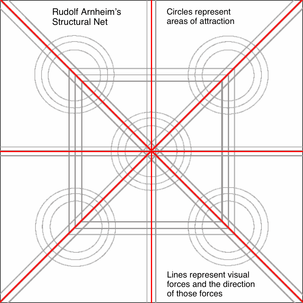
The center and the four corners of a rectangular canvas act like magnets to the eye. The strongest magnet is in the center, though not the geometric center of the canvas. Rather, the center that attracts the eye is the optical center, and it sits just above the true geometric center.
The axes run from corner to corner, and the points along these axes that are midway between center and corner also attract attention. These midway points can, then, be connected with vertical and horizontal lines, which create additional axes of visual force.
We’ll come back to this idea when we get to the post in the series about compositional flow. For now, consider that, in the absence of design, a viewer’s eye will be attracted to certain points in Arnheim’s structural skeleton, and the eye will move from point to point by following the directions of the different axes.
You can make use of the structural net by placing elements where they would naturally attract the eye, thereby increasing their attractive force.
Visual Direction And Gestalt
You can think of direction as real or imaginary lines that point from one element to another or that connect different elements. The lines don’t need to be visible.
- Uniform connectedness
The lines connecting elements have direction. An eye gaze creates an imaginary line between the eye and whatever the eye is gazing at. - Continuation
This principle relates to elements arranged along a line or curve, as though they are moving in the direction of the line or curve. - Common fate
Elements seen as having a common fate are those that move or appear to move in the same direction. - Parallelism
In order for elements to be seen as parallel, their internal axes (the same ones that impart direction) must be established.
The Overall Direction Of A Composition
One more concept of visual direction is that every composition will be seen to have a dominant direction, whether horizontal, vertical or diagonal.
- A horizontal direction makes the composition appear calm and stable.
- A vertical direction adds a sense of formality, alertness and balance.
- A diagonal direction suggests movement and action.
The dominant direction of a composition will be established by the direction of the majority of elements or perhaps a few key elements. The direction will help set a general mood according to the general meaning ascribed to different types of lines.
It is possible for a composition to have no dominant direction. The number of horizontal and number of vertical elements might be equal, for example. In this case, the viewer could decide which direction is dominant.
Examples
For the following examples, I’ve grabbed some screenshots of pages and will share some thoughts on how I see visual weight distributed in each. You might see it differently, and that’s OK.
Different eyes are attracted to different things. Again, I’m aware of no way to measure how much visual weight an element carries. Besides, two people could easily look to different areas of a composition because of their different interests. A bit of subjectivity is to be expected.
An easy way to tell which elements have the most weight is to use the squint test. Close your eyes a little until some elements fade away. Those that remain have more visual weight than those that disappear.
Bureau
Note: The screenshot for Bureau was captured with my browser set wider than 1280 pixels. Anything less and the design would collapse to a single column, instead of the two seen here.
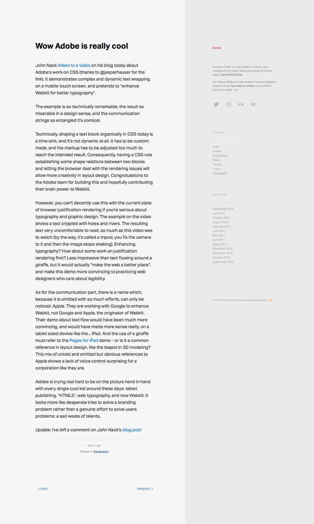
The article from Bureau shown above is nearly all text. The main heading carries the most visual weight. It’s the largest piece of text, and it has some local white space around it as well. It’s arguably the most important information that someone who lands on the page should see, so it makes sense for it to be visually weighty.
Links gain some weight through their contrast with the surrounding text, although the cool color lessens the gain in my opinion.
The element with the least visual weight is the text in the right column. This makes sense because focus is most likely meant to be given to the article and not what’s in the sidebar.
Notice the small bit of red text at the top of the right column. It’s a link to the home page of the website. As small as it is, the red gives the text some additional weight, helping it to stand out from the other text in the column. Everything in the image appears larger when you’re viewing the website directly, so the small red text isn’t quite as small as it is here.
When you apply the squint test, the whole right column disappears, and you’re left with the main heading above the article and a large block of text below it.
The main direction of the composition is vertical because it’s two long columns down the page. The difference in background color between the columns creates a vertical line leading you down the page and adding to the vertical direction of the composition.
Create Digital Media
When the home page for Create Digital Media loads, the colorful elements animate into place, calling a lot of attention to themselves. Even if you miss the animation, you likely see these elements as carrying the most weight, due to the saturated pink, yellow and blue. These elements also occupy the same space, creating a dense area in the middle of empty space.
Note: Between the writing and publication of this post, Create Digital Media has closed its doors. Visit its home page if you’d like to know why.
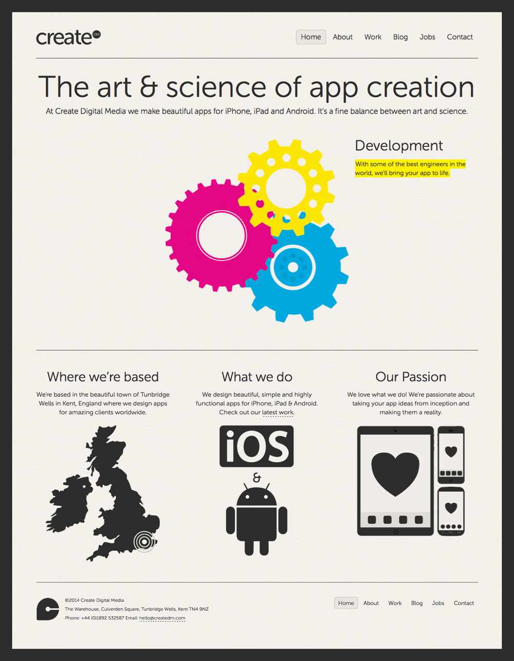
The graphics at the bottom are the next weightiest for me. They’re dark, large and complex in shape. They pull you to each of the three sections, which contain the next most visually prominent elements, the section headings.
The main headline on the page is large and dark; compare it to the text directly below it. Other items that stand out for me, due to their higher visual weight, are the company’s name at the top and the logo at the bottom.
With the squint test, the colored shapes and text and the graphics at the bottom remain after most of the elements have faded away. The main headline fades for me, although I can still tell it’s there. I also somewhat notice the logo in the lower-left corner, although it fades much more quickly than the graphic near it.
Here, I think the main direction is horizontal. The lines run horizontally, as does the main heading and the navigation. Another of the more visually prominent elements, the highlighted text, is also horizontal.
The three gears could be regarded as a single triangular, albeit curvy, shape, thus establishing diagonal directions. They don’t run long, though, and they’re the only diagonals on the page.
Javier Marta
Three elements compete to be the visually weightiest on Javier Marta’s home page. The graphics, the green separators between sections, and the menu items at the top all call for attention.
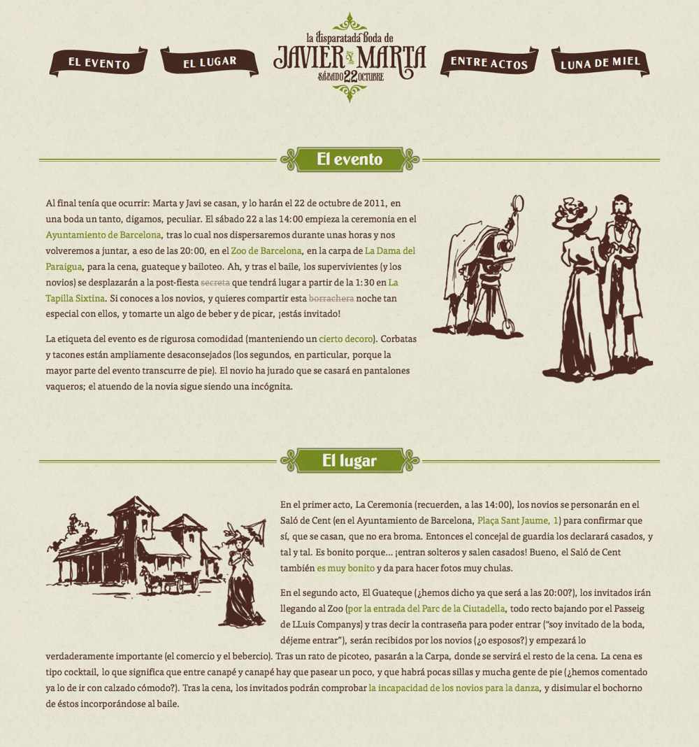
- Graphics
These are large, dark and surrounded by white space. Each graphic intrinsically hold its own interest. - Green separators
These have color, are larger and, like the graphics, are surrounded by white space - Menu items
These are dark, large and, once again, surrounded by white space.
Javier’s logo carries a little less visual weight for me than the menu items around it, although it’s still very prominent among them. It does carry more weight than the text, but not as much as the menu items in my mind. You may disagree.
The squint test causes the menu items and logo to blend into a single unit. The graphics and separators are still visually prominent, and the text remains visible as large blocks. You can still see everything while squinting, even if you can’t make out what any of it says.
On my screen, only the header and the “El evento” section are visible, giving the page a horizontal direction. However, four sections in total are on the page. When the sections are viewed all at once, the alignment of the green separators gives the composition a vertical direction. And, of course, seeing the whole page at once changes the canvas from horizontal to vertical.
I wonder if the two graphics shown in the screenshot above would have been better on opposite sides. In the top graphic, the camera points right, which is where my eye follows. Better would be to guide the eye to the text.
In the bottom graphic, the woman’s umbrella does point right, but she’s walking left, which is where I then tend to look. Both graphics might work better if their direction led back into the text instead of away from it.
Stanford Arts
The image at the top of Stanford Arts’ home page carries the most visual weight. It’s the largest element on the page and, being an image, has a lot of intrinsic interest. It’s also located at the top of the composition. In truth, it takes up most of my screen.
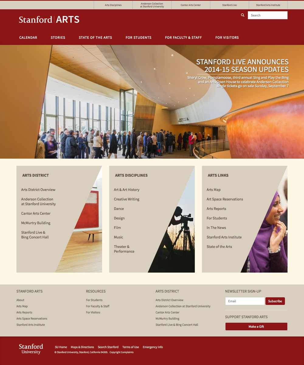
Note: This website rotates images at the top of the page, and the images that rotate change over time. You probably won’t see this particular image if you visit the website and, because of that, you might assess the visual weights in the design differently than I do here.
I think the triangular images against the angular containers are the next weightiest elements. After that are the large red blocks that make up the header and footer.
When I perform the squint test, all of the elements are visible longer than I’d expect. The elements have a good deal of both light and dark contrast, which helps them stand out.
Eventually, the only things that remain are the images, although in less than full detail. I can make out the large image at the top but only the shapes of the triangular images below.
The design is also interesting for its visual direction. Diagonals dominate, and because most web pages are not dominated by diagonal directions, they capture more attention here. They subvert your expectation.
The particular photograph that I captured in the screenshot above also offers something of a diagonal, albeit a bit curved in parts and created by a moving line of people in others.
Both the woman (in the rightmost triangular image) and the photographer (in the center triangle) have a direction leading to the right. Better might have been to reverse the woman to face inward and move the camera to the left block to points inward, too.
Granted, the images change when you hover over any of the links in the blocks. Still, the images tend to lead outward instead of inward.
Summary
The visual weight of an element is a measure of how much the element attracts the eye of the viewer. A visually heavy element will attract the eye to it.
Visual direction is the perceived direction of forces acting on and exerted by elements. The direction is a cue to the viewer’s eye to move elsewhere.
Many intrinsic characteristics can be modified to make an element visually weightier or lighter. A few can be used to establish an element’s visual direction, as can the canvas itself.
Over the remaining posts in this series, we’ll see how visual weight and visual direction lead to principles like dominance and hierarchy, flow and rhythm and, ultimately, compositional balance.
Further Reading
- Falling In Love With The Web: Inspiring Websites And Tools
- Designing Accessible Text Over Images: Best Practices, Techniques, And Resources (Part 1)
- The Principles Of Visual Communication
- Creativity In A World Of Technology: Does It Exist?
Front page image credit: Opensource.


