Prototyping iOS And Android Apps With Sketch (With A Freebie!)

Email Newsletter
Weekly tips on front-end & UX.
Trusted by 200,000+ folks.

 Flexible CMS. Headless & API 1st
After the untimely (and still kind of sad) demise of Fireworks, I found myself looking for other ways to design apps and websites. I also had the desire to produce something more interactive for when I talk about my work with stakeholders. It turned out that Sketch, when paired with some other neat tools, would be a big part of this workflow.
In this article, I’ll talk you through why you should prototype and how you can do it with Sketch and prototyping tools such as Flinto and InVision. You’ll also get a nicely documented freebie Sketch file to help you.
- Getting The Sketch Workflow Right: Meet “The Sketch Handbook”
- Sketch With Material Design
- Using Sketch For Responsive Web Design (A Case Study)
Before we get started, here are a few articles, in case you‘re curious about why I am using Sketch for UI design:
- “Design Tools for Today’s Web,” Anthony Colangelo
- “Fireworks Refugees! Welcome to the Open Arms of Sketch 3,” Adam Howell
- “Discovering Sketch,” Jean-Marc Denis
Why Prototype?
When it comes to showing an app’s design to a team, a client or a stakeholder, I’ve found that an ugly-but-functional prototype beats the static bitmap of one state of a screen that I’d get from Sketch, Photoshop or the like. I’ve found that communicating things like user flow and hierarchy is tougher in static mockups (especially when dealing with responsive websites, but that’s a topic for another day).
Increasingly, animation is playing a stronger role in design. I like how Val Head puts it in “All the Right Moves: Putting Your UIs in Motion” (emphasis mine):
"Motion has meaning in UX design, so don’t overlook the importance of good motion design to enhance the experience. […] Animations are a powerful option to add design details to your work. When used well, motion can bring delightful moments to a user interface and improve interactions."
Motion provides meaning and is also central to the functioning of all native mobile apps — and increasingly for the web as well (see “Material Design” and the Polymer project from Google). So, it’s critical to prototype for and to show motion and animation for all digital design work, but especially for mobile apps.
Side note: You can create pretty robust interactive prototypes right in Adobe Fireworks, including mobile prototypes, web prototypes and iOS prototypes. However, since Fireworks won’t be further developed by Adobe, finding an alternative workflow was vital for me.
I’ve tried several methods of showing mockups to clients. There are a ton of them, and so many look amazing. I ended up trying flat images, clickable PDF wireframes and even prototypes built in Interface Builder. Here’s how they worked out:
- Flat images left people wondering how we’d ever get to SuperAmazingFeature 3000™. This surely wasn’t the right way to go.
- Clickable PDF wireframes upset the scale of our designs by fitting the PDF to whatever size my screen was — clearly, not the right way, either. (There is a way in Adobe Acrobat to specify the zoom level of a page that is the destination of a link within a PDF file so that all pages have a consistent zoom level. But if you do not create the links carefully, then you will need to manually change the zoom level and scroll point on the destination page, because Acrobat usually sets the zoom level for each page to maximize the view of that page, and app screens and web pages often have different lengths and will be displayed at different zoom levels.)
- Interface Builder (part of Xcode) is fun, although it comes with a considerable learning curve and investment of time compared to the others. Not everyone designs on Mac OS X or for iOS, either.
While things built in Interface Builder showed animations, neither flat images nor clickable PDFs did. That’s a bummer, because animation communicates what a flat image can’t: transitions, which are another critical part of good design. Here’s an example of why animation is key: That really cool alert you designed to slide up from the bottom of the screen will most likely get lost in a flat mockup. If you can show it animating in, you’re more likely to get your point across to someone.
It wasn’t until recently that I found a happy medium: building a wireframe kit and making interactive prototypes in services such as Flinto and InVision. I’ve been able to create designs that people view in context, on their devices and on their time. I’ve found that context is important: Showing a screenshot of a mobile app on someone’s computer invites confusion, and we generally want to avoid that.
Flinto has a 30-day trial, while InVision offers a free tier that works with one project. Both have paid plans with more features.
In keeping with the idea of staying lean, I adapted a wireframe kit for iOS (I’m still working on the Android bit!), so that people can focus on structure rather than pixels. I did get a couple of folks asking if that’s how the app would look, but most understood the concept pretty well. I use the metaphor of building a house: Wireframes are the foundation of the house, and painting and moving in the furniture come after we’ve ordered everything just right.
Let’s talk a little about the freebie Sketch file next.
The Sketch Blueprint File
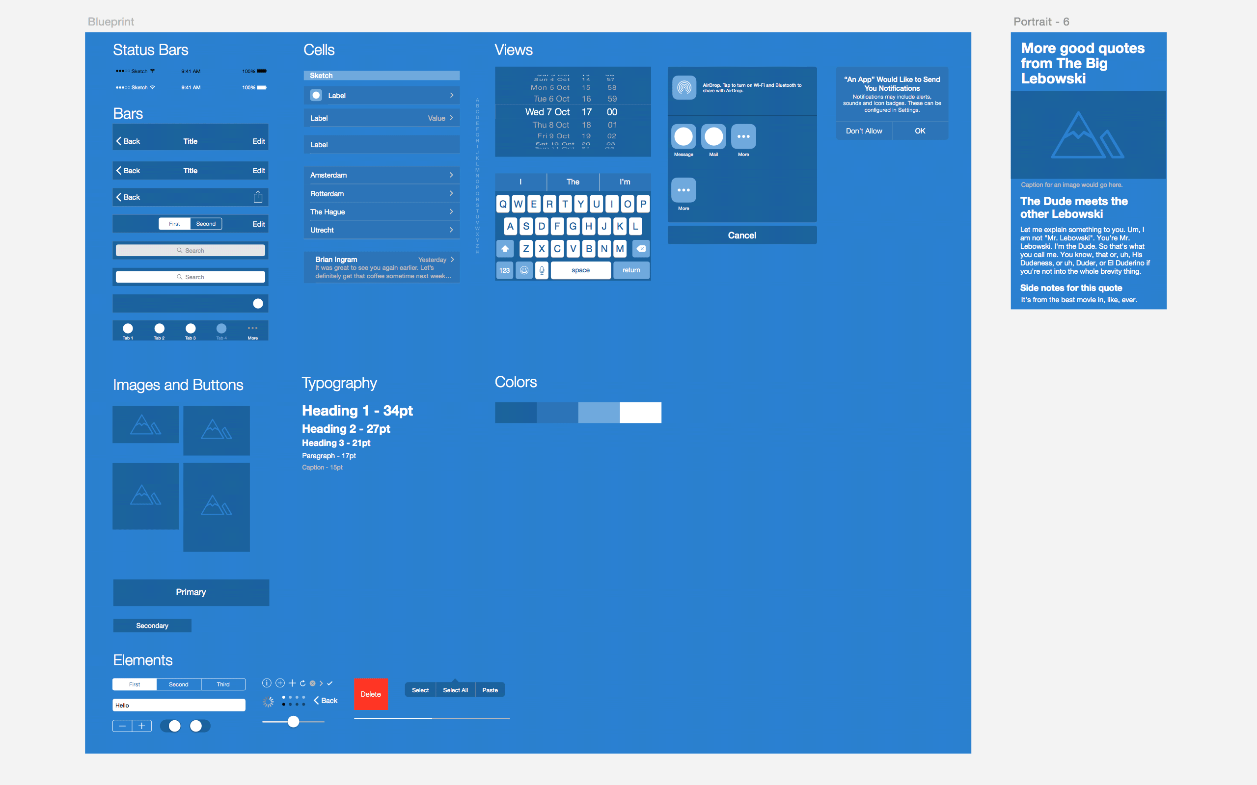
The iOS 7 Blueprint.sketch template file is free to use (I put it under the MIT license), and is intended to help you focus on making interactive prototypes.
- Sketch Blueprint (ZIP file, 1.5 MB)
- Sketch Blueprint, GitHub
Please note that the template requires Sketch version 3.1+. (The folks at Bohemian Coding changed Sketch’s file format in that version, and versions older than 3.1 won’t be able to open the file correctly.)
I’ve included several elements to get you started:
- tab bar,
- menu bar,
- segmented controller,
- search bar,
- tables (with and without icons),
- images of varying proportions,
- alerts,
- various buttons and icons.
You’ll also find linked color and text styles, so you can color and style it as you see fit.
The Sketch file has even been updated for the latest iPhones, 6 and 6 Plus, so it should be up to date as of the publication of this article.
I thought about what the color scheme could be and considered reverting to a grayscale gamma, but that felt too flat to me. Then, I thought more about blueprints and how I use that metaphor when talking about building designs, and I decided to go with the monochromatic blue palette.
Note: You can also download the sample Sketch Blueprint file that I used to build the demo prototype shown in this article, complete with pages and artboards and ready for exporting. You may wonder why I have two Sketch files? My plan is to regularly update the GitHub-hosted Sketch Blueprint file for new mobile devices, and I’m providing the other file in the hope that it is useful to you (although I won’t be maintaining it after this article is published), because you could learn more from it about pages and artboards and how to set up slices for easy image exporting.
How I Organize My Sketch App Files
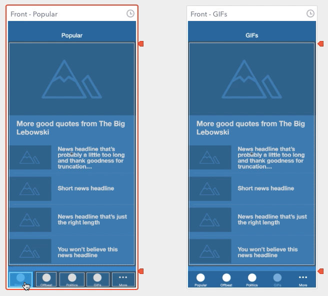
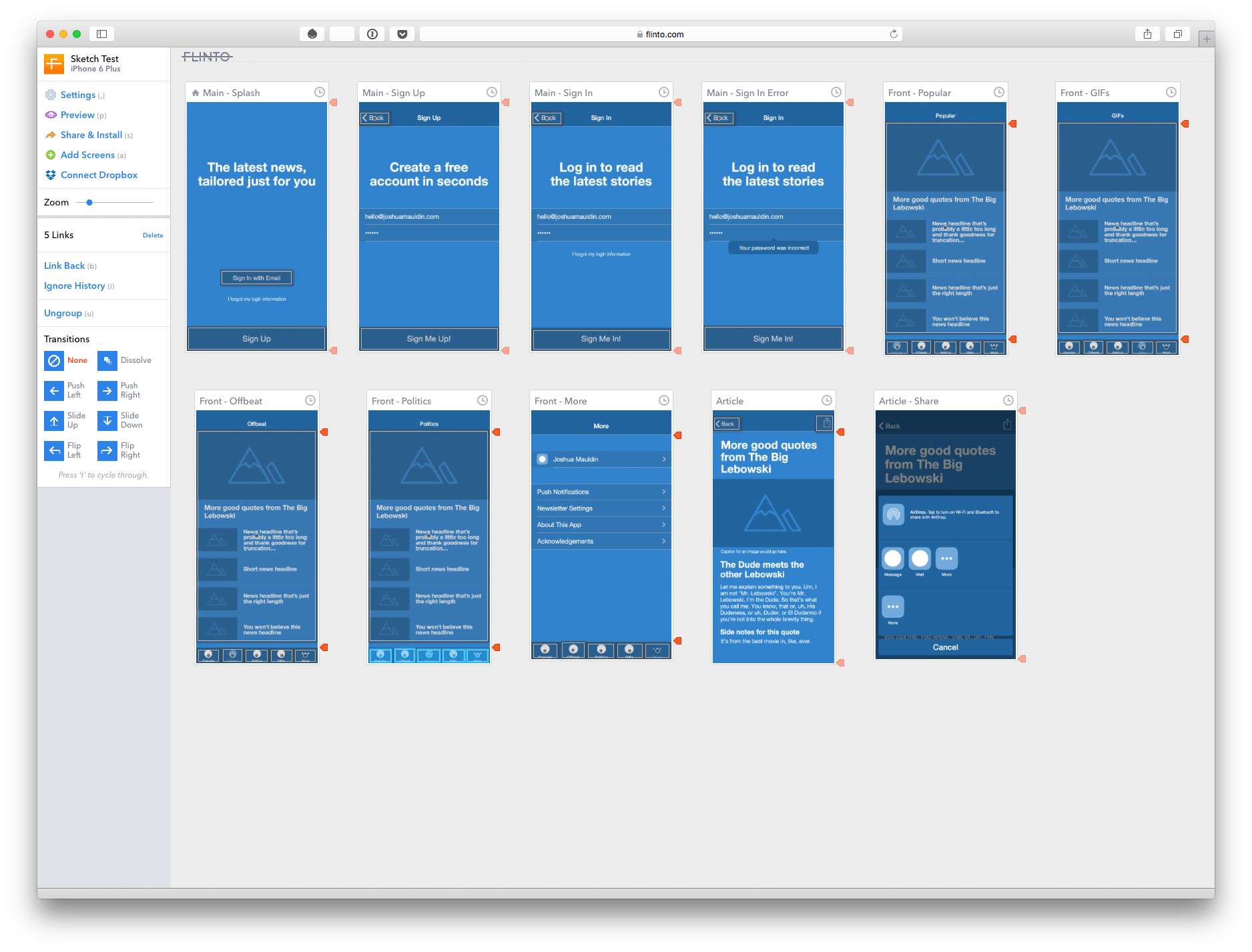
I use a separate page in Sketch for each section. Let’s say we’re talking about a log-in screen. I’ll give each variation of the log-in screen (registration, lost password, incorrect password, etc.) its own artboard. If I’m making an app that requires a log-in or sign-up process, I’ll put the log-in view on its own page with each state (like showing registration and error states).
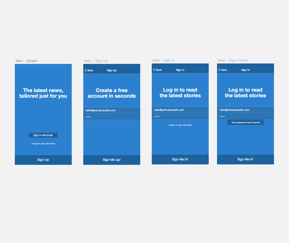
Speaking of all of those views, you’ll find it helpful to name your artboards, especially when you export them. Your naming conventions will probably vary, and maybe your team already has one. If not, here’s how I name my pages and artboards, by following a page name – artboard name convention.
- Log In – Main
- Log In – Sign Up
- Log In – Forgot Password
- Log In – Error
I try to use symbols for repeating elements such as menu bars, images and icons when designing these views. It makes life easier because I can change a symbol once and see its instances update everywhere.
Note: Are you new to Sketch? Learn the basics of artboards, layers, pages, groups, symbols and styles (resources that are part of the official documentation).
Sketch also lets you do this with colors, buttons and text styles, which is neat. I can create one style for headlines, body copy and subheadings that will link throughout every other screen in the document. If I change the color in one spot, every other element that shares the style will be updated. Not having to make the same update manually in 20 other places is nice.
Note: I’ll draw a quick parallel with Adobe Fireworks. Symbols and styles in Sketch work similarly to the way they do in Fireworks, so the concept should be easy to understand. This topic has been covered in depth in the following articles on Smashing Magazine:
- “Collaborating With Adobe Fireworks on Large Design Teams,” Dan Nisbet
- “How to Make an Effective Style Guide With Adobe Fireworks,” Joshua Mauldin
- “iOS Prototyping With TAP and Adobe Fireworks,” Shlomo Goltz
- “Useful Fireworks Techniques and Features for Large Design Teams,” Kris Niles
Fireworks doesn’t have the artboards feature, but it does have pages just like Sketch. So, moving from one app to the other shouldn’t be very hard for experienced Fireworks users.
Also, note that symbols in Sketch aren’t 100% the same as they are in Adobe Fireworks. Fireworks has both symbols and rich symbols. Rich symbols in Fireworks allow a symbol’s instance properties to be edited independently — this means that you can make changes to the instances of a rich symbol without affecting the master symbol. This is a very useful feature for designing user interfaces — think of a button with multiple states, for example, or a text label that you can edit without affecting the design of the UI element itself.
Sketch, on the other hand, doesn’t have the concept of states inside a symbol (yet), so be cautious if you’re trying to make a button with multiple states; in this case, breaking your active and inactive states into separate symbols is probably best.
Exporting Into My Prototyping Tool Of Choice
For this example, I’ll use Flinto. It isn’t the only option out there (I’ll review a few other prototyping solutions later in the article), but it sure is simple. And super-speedy, too.
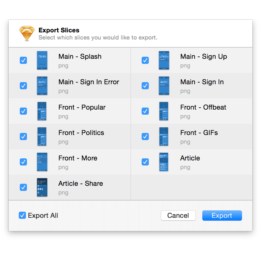
Using slices in Sketch is easy, and you can export everything as a PNG or JPG to the desktop and drag those files right into Flinto. (Alternatively, you can click on your artboard’s name on the canvas and choose “Make Exportable,” define the export optimization settings and export the images.)
Command + Shift + E or choose "File" → "Export" to get here. (View large version)Linking the exported images together in Flinto is easy, as is keeping parts fixed to the top or bottom of the window; for example, you can place a fixed menu bar at the top and a toolbar at the bottom. More on that in a moment.
When I’m finished with my design, I’ll create a new project in Flinto and use the iPhone 6 Plus with a white transparent menu bar. In our case, I’ve been dragging my files from the desktop in the order that I want them presented. I’ll make my menu bar fixed, as well as the tab bar.
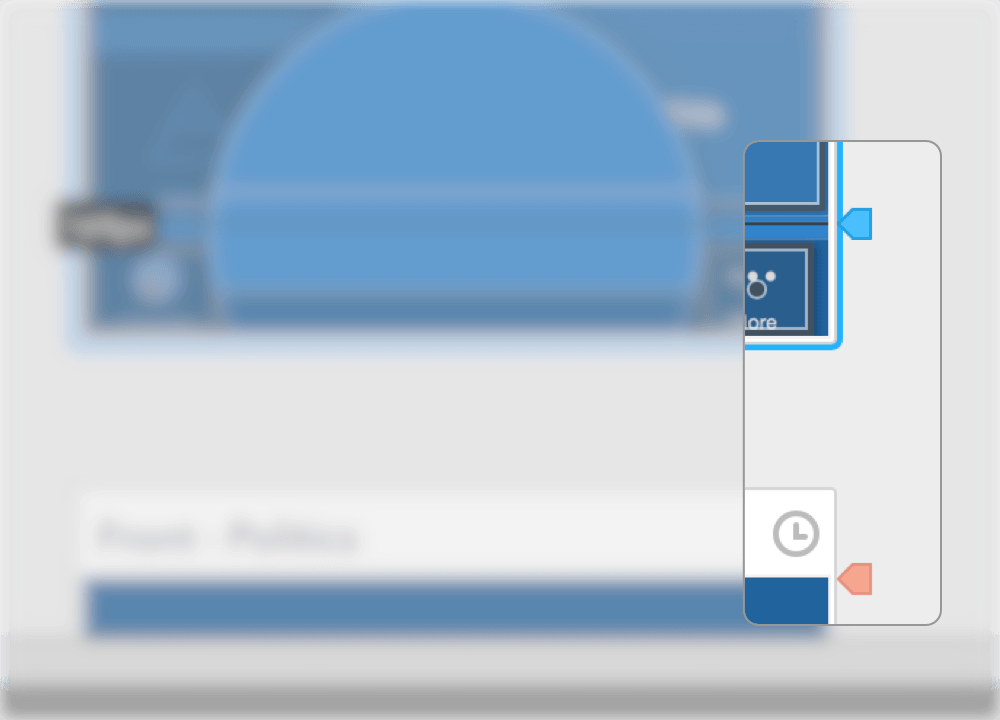
If you need, you can also fix elements to the top and bottom of the page. Just drag these icons down to your desired placement.
Flinto will create an interactive prototype in HTML, CSS and JavaScript. You’ll receive a link via email or SMS to add it to your device’s home screen, and it will look and feel like a real app. Flinto allows you to have the standard transitions of iOS and Android (iOS has a few more than Android does at this point, but they’re all there!). Flinto doen’t support Windows Phone, though.
This is awesome because it lets designers who might not have experience with Xcode or responsive frameworks such as Twitter’s Bootstrap or Zurb’s Foundation to communicate their ideas and user flows more clearly than by sharing a simple flat image.
If you’re making a responsive website, you could argue that getting into HTML is the way to go, and I wouldn’t necessarily disagree. It’s up to you to find out the right approach for your project and team.
Some Handy Tips And Tricks
You can show screens for a certain amount of time, like you would an alert or tooltip. This is helpful if you want to show an alert view that pops up for a short amount of time.
Flinto also lets you duplicate links from one screen to another, which is super-helpful. Just drag the hotspot that you made on one screen on top of the next. Voilà!
Before looking at our prototype, let’s take a peek at the workspace. You should see some of the things we discussed, like where the fixed menu bars and tab bars live, as well as how the link groups look.
Now for the fun part: previewing! Let’s give it a shot. Here’s a screen recording of what it looks like on my iPhone:
Hey, that looks pretty nice! We’re ready to show it to other people and get feedback to move forward.
One other neat thing is that you don’t have to create a new project once you’re ready to add more design elements — you can keep building it up and changing it as the design evolves. If you’re using the same Sketch file, then you’ll be able to replace the images in your current prototype with higher-fidelity ones; export those artboards from Sketch and drag them into the editor. And if you want to keep it, you could simply duplicate your current project by going to “Settings” → “Actions” → “Duplicate This Prototype.”
Other Prototyping Tools
I mentioned earlier that Flinto isn’t the only prototyping service on the market. In fact, there are too many of them! Before I settled on my Sketch and Flinto workflow, I explored a few alternatives.
There’s InVision, which is absolutely lovely. You can prototype a design in a similar way to Flinto, from phone-sized all the way up to desktop-sized. It has a free tier (Yay!), and it offers native support for Sketch files. It also offers gesture support, so you can show people what happens when a user swipes through to the next screen. You can also have fixed headers and footers and a web app that users can install on their devices. It’s pretty neat.
Another thing I enjoy about InVision is that you can add comments directly on a design, so there’s no confusion about whom feedback is coming from.
I recently also looked closely into one other tool, Pixate, which is made specifically for iOS and Android apps. It gives you a lot more control over animation and gestures. I like it because it allows a designer to show more realistic interactions than Flinto or InVision. Say you have a table that you’d like to scroll horizontally, but you want the rest of the screen to remain static. Pixate lets you get that deep when creating the prototype, which is neat. (A terrific demo video that you should watch is on its website.)
There’s also the good old Interface Builder. It’s part of Xcode (a Mac-only tool), and it allows you to prototype iOS apps — as well as Apple Watch apps as a matter of fact (but that’s a discussion for another time). Interface Builder has got a considerably steeper learning curve, but it will produce higher-quality results than Flinto and InVision. Keep in mind that Interface Builder will make an app prototype that runs directly on an iOS device.
If you need to prototype for iOS specifically, you could also use Keynote, because it includes nearly all of the native transitions and animations in iOS, and it’s easy to drop in bitmap images and some live text to create something that behaves like your intended design. Its limitation is that it can make prototypes only for iOS (no Android or Windows Phone support).
It’s worth noting here that most of these prototyping tools require the use of flat images and/or slices, and they do not generate any code or framework for a responsive website. The prototypes they create have certain limitations and are intended for discussion only (although Interface Builder could be taken a little further in making an app).
Here’s a table comparing some of the prototyping apps that I’ve tried and their features:
| Product | Ease of use | Platforms | Animation support | Gesture support | Comments |
|---|---|---|---|---|---|
| Interface Builder | Difficult | iOS | OS, custom | Yes | No |
| Flinto | Easy | iOS, Android | OS | No | No |
| Pixate | Moderate | iOS, Android | OS, custom | Yes | No |
| InVision | Easy | iOS, Android, web | OS | Yes | Yes |
Conclusion
I hope this article has persuaded you to start experimenting with prototypes (if you haven’t already). Something interactive will almost always communicate more than a picture ever could, and you’ll have better conversations because of it. On the other hand, Sketch is an excellent UI design tool, lightweight and quite powerful, and it works great with Flinto, InVision and the like because they live in the borderlands of flat images and HTML or native code; this approach lets you whip up something to discuss in minutes. Prototyping services like these are lightweight enough to help you if you can’t code a prototype yourself.
If you have questions, let me know in the comments!
Other Resources
- “UX Tools,”
- Prototyping Tools A detailed list of prototyping tools for web and mobile, maintained by Javier Cuello.
- “From Design To iOS7 Prototype,” Meng To A decent exploration of how to get prototyping in short order with Flinto. It even has classic iOS 6-style designs. (Ahh, nostalgia!)
- “Prototyping Mobile Animations With Pixate,” Kate Studwell, Viget A good writeup on how to use Pixate.
- “11 Tips for Prototyping With Sketch,” Andy Orsow A list of excellent tips on how to optimally use Sketch for prototyping.
- “Interactive Prototypes and Time-Savers With Adobe Fireworks,” Trevor Kay, Smashing Magazine This tutorial explains how to easily set up Fireworks to create live prototypes. (And if you need it for iOS prototyping, I’ve got you covered!)
- Creating Interactive Prototypes With Keynote, Keynotopia A pretty detailed guide about how to use Keynote for iOS prototyping.
- Rapid iOS App Prototyping With Pixate, Connie Chan and Ryan Coughlin, Thoughtbot
Further Reading
- “How To Create A Flat Vector Illustration In Affinity Designer,”
- “Penpot’s Flex Layout: Building CSS Layouts In A Design Tool,”
- “A Few Interesting Ways To Use CSS Shadows For More Than Depth,”
- “When You Find A Good Idea, Look For A Better One,”


