Design Principles: Dominance, Focal Points And Hierarchy

Email Newsletter
Weekly tips on front-end & UX.
Trusted by 182,000+ folks.
 See the full picture →
 SurveyJS: White-Label Survey Solution for Your JS App

 Celebrating 10 million developers
Fundamental design principles part 5: You can’t emphasize everything. In order for some elements in a design to stand out, other elements must fade into the background.
Has a client ever asked you to make the logo bigger? Maybe they asked that just after you completed their request to make a heading bigger. The new heading stands out, but now the logo is too small in comparison and isn’t getting noticed. The clients wants to make the logo bigger.
Of course, now that the logo and heading are bigger, both are going to attract more attention than the main call-to-action button, which will need to be made bigger. And once the button is bigger, the heading is going to start looking small again.
Note: This is the fifth post in a series on design principles. You can find the first four posts in the series here:
- Design Principles: Visual Perception and the Principles of Gestalt
- Design Principles: Space and the Figure-Ground Relationship
- Design Principles: Connecting and Separating Elements Through Contrast and Similarity
- Design Principles: Visual Weight and Visual Direction
You can’t emphasize everything. It defeats the point. When you try to do that, all of your design elements compete for attention and nothing stands out. They’re all yelling at the same time. Everything is louder, but still nothing is heard.
Emphasis is relative. For one element to stand out, another has to serve as the background from which the first is to stand out. Some elements need to dominate others in order for your design to display any sort of visual hierarchy.
Dominance
Compare any two elements in a design. Either the elements will be equal in every way or one will exert some level of dominance over the other. The more dominant element will attract the eye and get noticed first. It might even appear to exhibit some sort of control over the less dominant element.
The more dominant element likely has greater visual weight than the elements it dominates. It will seem to exert force on what’s around it.
As you develop a composition, you’ll see numerous elements exerting dominance over each other. Some elements will dominate, and some will be subordinate. Without conscious control, you’d just hope that things all work out and that the important information will attract attention. Fortunately, you do have control.
How To Establish Dominance
You design one element to have more dominance than another by giving it more visual weight. The greater its visual weight, the more an element will attract the eye and exhibit dominance.
You create dominance through contrast, emphasis and relative visual weight. Identical items can’t dominate each other. To exert dominance, an element has to look different from the elements it’s meant to dominate.
Your goal is to create elements with noticeable differences in visual weight.
You can vary the same characteristics that we talked about in the last couple of articles in this series. As a reminder, here are the most common characteristics you can vary to set different visual weights:
- size,
- shape,
- color,
- value,
- depth,
- texture,
- density,
- saturation,
- orientation,
- local white space,
- intrinsic interest,
- perceived physical weight,
You can create dominance through visual direction as well. For example, you might surround an element with arrows all pointing to that element. If there are enough directional cues, the element could become dominant even if it’s of lesser visual weight than other elements on the page.
You can also have co-dominance, where two dominant elements exist within a composition. However, both will compete for attention and could ultimately be distracting without the right overall balance in your competition.
Ideally, you want a single dominant element.
The Dominant Element
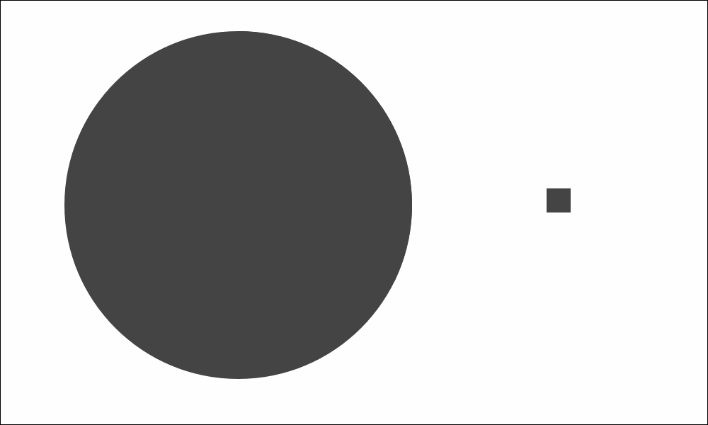
The dominant element in a design is the one with the greatest visual weight (or the one that everything else points to). It’s the element that attracts the eye first, more than anything else on the page.
Be careful not to make the element so dominant that it completely obscures everything else, but do make it stand out in the design.
Your dominant element is the starting point for the story you’re telling. It’s the entry point into your design. It should attract visitors to the first place you want them to look.
This is how you start a conversation with visitors. The dominant element is noticed first and sets the context for what’s seen next. It’s at the top of the hierarchy. It should emphasize your most important information, because it might be the only thing anyone will see. Whatever message you want people to take away should be clearly communicated in or near your dominant element.
Without an entry point, viewers will have to work harder to find their way into your design. They’ll have to pause and think where to look first and think about what’s truly important on the page. A lack of entry point will increase the cognitive load on visitors. Don’t make them think. Provide an entry point into your design.
Focal Points
Focal points are also elements or areas of dominance, just not to the same degree as your one dominant element, which could be defined as your most dominant focal point. Focal points are areas of interest, emphasis or difference within a composition that capture and hold the viewer’s attention.
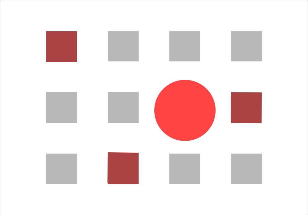
The focal points in your design should stand out but should be noticed after the element with the most dominance. The graphic below shows a lone circle amid a sea of mostly gray squares. The circle is not only a different shape, but is larger and bright red. It’s likely the first thing your eye notices in the graphic.
Three of the four squares are also reddish in color, though not as bright as the circle. They’re the same size as the other squares in the image, but they do stand out from the gray squares due to their color.
The circle and the three reddish squares are all focal points because they stand out from the majority of other elements in the graphic. They contrast with the mass of gray squares. The large bright red circle stands out the most. It’s the dominant focal point, or the dominant element in this image.
As with the dominant element, you can create focal points by giving them more visual weight than everything except the dominant element — which, again, is your most dominant focal point. You can also create visual direction that leads to different focal points.
Contrast is a good way to create focal points, because contrast calls attention to itself for being different. Anything that can be contrasted and anything that can affect visual weight or direction can be used to create a focal point, in the same way that it can be used to create a dominant element. The difference is simply of degree.
Levels Of Dominance
If you create focal points and make one of those points the dominant element, then you’re starting to create different levels of dominance. The dominant element will sit on one level and will be noticed before all others. The remaining focal points will sit on another level. How many levels of dominance can you realistically have in a design?
Three is a good number. As a general rule, people can perceive three levels of dominance. They notice what’s most dominant, what’s least dominant and then everything else. There needs to be enough difference between these levels for people to distinguish one from the next. You want to create distinct levels, not a continuum.
You could create more than three levels of dominance, but each additional level will reduce the contrast between neighboring levels. Unless you’re sure you can contrast each level well enough, stick with three.
- Dominant. This is the level with the most visual weight and the one that gets the most emphasis. Your dominant level will usually consist of a single element in the foreground.
- Sub-dominant. This is the level of focal points, with the exception of the dominant element or dominant focal point. It gets secondary emphasis. Elements on this level get less emphasis than the dominant level but more than the subordinate level.
- Subordinate. This is this level with the least visual weight. It should recede into background to some degree. This level will usually contain your body of text.
It’s possible for different people to look at a composition and think that different elements are focal points or even the dominant element. Remember to go big enough with your differences in visual weight to make clear which level is more dominant. You want your dominant element and focal points to be as obvious as possible.
Visual Hierarchy
As you design distinct levels of dominance, you create visual hierarchy in the design. Ideally, this visual hierarchy will match the conceptual hierarchy of your content. If an article’s heading is more important than a caption in the article, then the heading should be more visually dominant.
Base your visual hierarchy on the actual priorities of the information being presented. First, prioritize everything that will go on the page, and once it’s set, design a visual hierarchy to follow that prioritization.
Visual hierarchy enables visitors to scan information. It helps you communicate a message quickly and effectively. The top of the hierarchy (the dominant element) should help to answer questions a visitor might immediately have upon landing on the page.
Within seconds, visitors should be able to pick up the key points and main message of the page. They can do this if you make the most important information the most visually prominent.
People who stick around longer than a few seconds should be able to scan through the focal points in your design to gain the next most important message(s) that you want to communicate, and so on with the rest of your information.
The Inverted Pyramid Of Writing
Establishing hierarchy in a design is similar to the way journalists use the inverted pyramid of writing. The most important news is all in the first paragraph or two. The lead covers the who, what, where, when, why and how. It tells you everything you need to know.
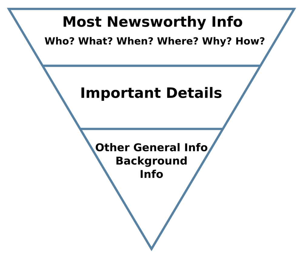
The lead is followed by important details that fill out the story. They’re details that provide context or help you understand the story in greater depth. Toward the end of the article is the general and background information that’s nice to know but not necessary to understand what’s going on.
If someone reads only a sentence or two, they should come away with the most important information. The longer they stick around and the more they consume, the more details they’ll get.
Visual hierarchy works the same way, except that it doesn’t have to flow linearly from the top of the page. You get to control where people look first, second and so on
Again, three level of dominance or hierarchy are recommended, although four or five are still possible.
Gestalt Principles And Visual Hierarchy
One of the reasons I started this series with an article about gestalt principles was to show how they lead to many of the design principles we work with.
Visual hierarchy evolves out of gestalt. Focal points are one of the gestalt principles. Your dominant element is an extreme focal point. Both use contrast to stand out. The other side of the coin is similarity, which helps us to see things as the same. Similarity and contrast are necessary ingredients in hierarchy.
Such laws as the ones of prägnanz and symmetry are about creating order and making things simpler and clearer. That’s exactly what you’re doing when you build hierarchy in a design. You’re organizing design elements to establish a sense of order.
The dominant element is likely seen as the figure. The least dominant elements are likely seen as the ground. Really, any principle related to connection or separation can be applied to dominance and hierarchy.
Examples
As I’ve done throughout this series, I’ve collected screenshots from a few websites, to share what I see as being the dominant elements, focal points and hierarchy.
This is my opinion. You may see the designs differently and that’s fine. Thinking critically about the designs is more important than agreeing on what we think.
An Event Apart
The dominant element on the home page of An Event Apart is the image at the top. It’s the largest element. It’s also an image of people, which we’re typically drawn to. The large white text across the image offers contrast with the image, calling your attention to it.
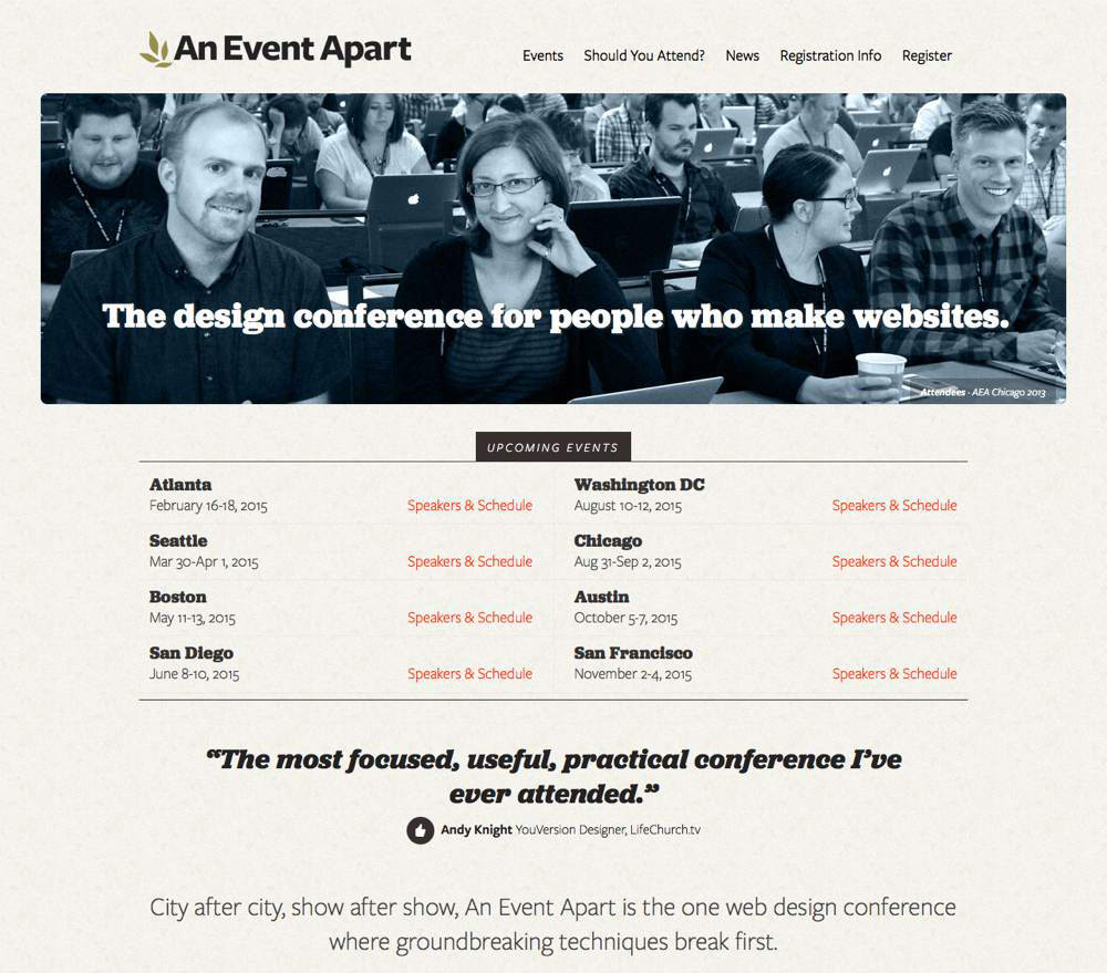
The text “The design conference for people who make websites” is probably the most important information that anyone landing on the page needs to know. It’s a very clear statement about what An Event Apart is and who the website is for. It’s arguably the first thing someone new to the website should see.
Focal points include the website’s logo, the dark background behind “Upcoming Events” and the testimonial set as a large bold heading.
If you scroll down the page, you’ll notice that the design mainly uses size and color to create additional focal points and visual hierarchy. Important information is larger. It’s bold. It might be red. Occasionally an image draws the eye.
If you were to visit the page and merely scan it, you would still come away knowing what the website is about, knowing whether any conferences are coming to your area, and having been convinced by the abundance of testimonials.
Paid To Exist
The dominant element on Paid to Exist’s home page is the graphic of the backpack at the top of the page. It’s an image and larger than everything else around it. It contrasts with its surroundings because it is a graphic with intrinsic interest and a different shape.
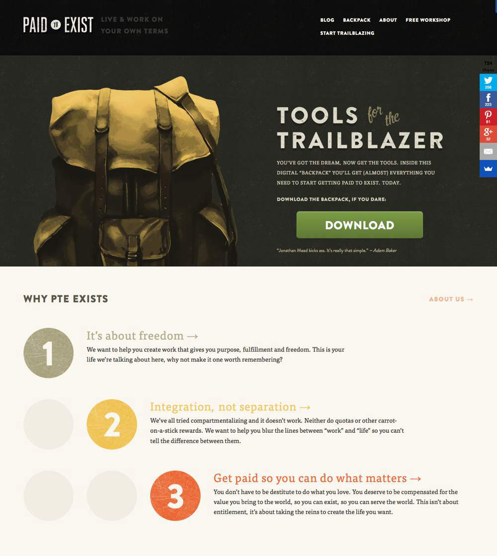
Focal points include the website’s name, some of the text to the right of the graphic, and the big green “Download” button. The social sharing buttons are another focal point.
Looking at the section of content just below, you’ll see three large numbered circles, which serve as focal points and lead you to their accompanying content.
You’re meant to read the information. Notice how the heading above each paragraph reflects the color of its accompanying circle, to draw you in.
Think about the circles and text in terms of visual hierarchy. The big colorful circle (which is one level in the hierarchy) gets your attention and leads you to information that sits on another level of the hierarchy.
Mandy Sims
Mandy Sims has a single-page website. The very top (not shown in the screenshot) includes an image of Mandy, which for me is the dominant element. Mandy’s name is also displayed as the largest text.
However, I want to draw your attention to a section further down the page. As you might expect, the section’s heading is the largest text there, so it becomes a focal point.
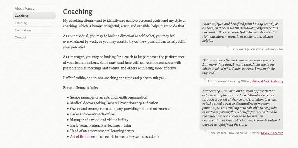
Focal points are also the testimonials down the right side. Notice how the background color of the testimonials is the same as the background color of the active link in the menu.
Without reading the text in this section, you can still clearly see that Mandy offers coaching services to happy clients, because one level of the hierarchy communicates just that.
Vanseo Design
This last example is from my own website. It’s a blog post I wrote a couple of years ago. Forgive the indulgence, but unlike the other examples, I know exactly why every element on the page looks the way it does. Whether or not I’ve succeeded is another matter, but I’m certain of the intent.
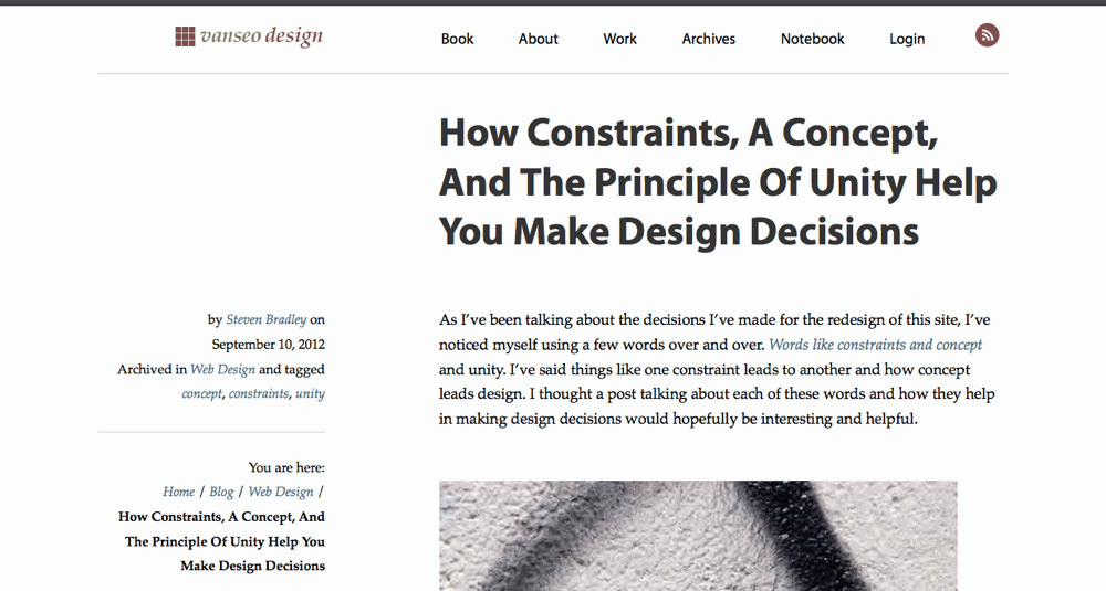
The page’s main heading is meant to be the dominant element. This is a blog post that I want people to read, but I want to give people a sense of what the article is about before they have to invest their time reading.
The partial image also draws the eye, and you might think it more dominant, but an image like this isn’t necessarily visible at the top of every post on the website.
The logo in the top-left and the RSS icon in the top-right are meant to stand out a little more than the other text, and so both are red. Both would stand out more with a brighter red, but I didn’t want people to be distracted by them. The same red is also used in headings throughout.
The meta information on the left is meant to stand out from the main text. Here, I used local white space to increase the visual weight of plain text. Ideally, someone would glance at it and get information about me and the category and tags for the post.
One thing I decided to do with the design was make links in the body less visible than on most websites. I want people to be able to find them, but I don’t want them to pull you out of the content. I used a blue, which doesn’t stand out much from the black text, and I chose italics instead of bold. The links are not meant to be focal points, so I de-emphasized them visually.
My hope is that someone landing on this or another post on the website will be able to very quickly tell what the article is about and discover some basic information about me, such as my name or the name of the website, before hopefully reading the post.
Summary
You can’t emphasize everything. In order for some elements in a design to stand out, other elements must fade into the background.
By varying the visual weight of some elements and the visual direction of others, you can establish different levels of dominance. Three levels is ideal; they’re all that most people can discern.
On one level will sit your dominant element. It’s an entry point into your design, and it should be or be near the most important information on the page. A second level of focal points can draw attention to the next most important information visitors should see. Your third level holds everything else. Most of your content will be on this level.
Designing different levels of emphasis or dominance will create a visual hierarchy in your design, with more important information being more visually prominent. It will help you communicate with visitors quickly and efficiently.
We’re getting close to the end of this series. Next time, we’ll look at compositional flow, movement and rhythm. I’ll talk about leading visitors through a design so that they’re more likely to find information in the order you want them to see it.
Additional Resources
- “Emphasis or Focal Point,” Anabel Damstrom
- “Emphasis,” Jim Saw
- “Developing Emphasis in Web Design,” Patrick Cox, Codrops
- “Primary and Secondary: A Tale of Two Focal Points,” Aaron Diaz
- “Elements and Principles of Design Emphasis or Focal Point” (video), Roxie Mitchell
- “Composition and Design: Finding and Creating a Focal Point,” Katherine Tyrrell
- “How to Create a Focal Point When Designing a Room,” Kristine Lofgren, SFGate
- “Creating a Focal Point: What to Add for a Focal Point in the Garden,” Amy Grant, Gardening Know How
- “Design in Art: Emphasis, Variety and Unity,” Sophia
Further Reading
- Falling In Love With The Web: Inspiring Websites And Tools
- Shines, Perspective, And Rotations: Fancy CSS 3D Effects For Images
- Visual Design Language: The Building Blocks Of Design
- Creativity In A World Of Technology: Does It Exist?


