How To Create Effective App Screenshots For Your App Store Page

Email Newsletter
Weekly tips on front-end & UX.
Trusted by 182,000+ folks.

 Celebrating 10 million developers
 Custom Web Forms for Angular, React, & Vue. Your backend.

Slowly but surely, the official app stores of iTunes, Google Play and Windows Phone Marketplace have transformed into a digital battlefield. App developers have to fight for recognition or otherwise be drowned in an ocean of competing mobile applications.
App store optimization (ASO), a strategy similar to SEO but specifically applied to the app pages in app stores, has become a handy addition to an app developer’s marketing plan, and promises to help increase visibility – and, as a consequence, downloads – of a mobile app.
ASO consists of many elements, and should be considered a key component of publishing an app in an app store of choice. It encompasses every detail of a mobile app’s page, and can be split into on-page and off-page elements.
On-page app store optimization elements include all components that appear directly on an app page on the relevant app store. On-page elements are:
- app name and title
- app description
- app icon
- app screenshots and videos
- app category
Off-page app store optimization elements are external links that lead to the app page. They also encompass reviews by users, as they are not controlled by the publisher of the app. Off-page elements include:
- app rating, reviews and comments
- app recommendation pages
- dedicated app landing page or website
- press coverage
- advertising
- social paid and organic discovery options
While ASO requires some adjustments on all of the above elements, it is vitally important for an app to undergo all checks before being presented to the world. In this article, we’ll take a closer look at app screenshots, one of the two key decision-making helpers for anyone who downloads an app.
Why Care?
In today’s digital age, steady information flow and social media madness are making it almost impossible to get someone to stay focused on what you want to tell them – even if it’s just about a simple app page. We’re constantly distracted, and we (think we) don’t have the time to sit still and listen or read for a moment. Research suggests that our attention span has reduced to eight seconds. The guys over at Slate wrote an interesting article about the same phenomenon, and why you won’t read to the end of an article any more.
We are going back to the principle that the first impression counts: you have a bare few seconds to command attention; use them wisely to arouse interest and get the viewer to click, scroll and download.
The importance of app screenshots is communicated in a clear message. Apple’s iTunes has undergone quite a revolution, where app screenshots have pushed app descriptions to the background and taken the front page on the app search, and the app page as well. This is the change from iOS 6 to iOS 7. Now, with iOS 8 in use, Apple continues to focus on imagery rather than text. Same goes for Android.
The design of an app represents the key factor for almost 50% of people to say yay or nay to an app. This factor is surpassed only by app reviews and ratings. While app reviews belong to the off-page factors and cannot easily be influenced, app screenshots are on-page factors and can be entirely tailored to your needs. App design – and the corresponding screenshots of it – should take the #1 spot in an app developer’s marketing prep list.
Visual communication is certainly faster than verbal communication. Hence, putting sharp focus on your app’s design and creating visually appealing screenshots can only bring good to your mission.
Getting Started With The Basics
App screenshots should not be selected randomly. The best practice is to pick those screenshots that best explain your app’s purpose.
The major app stores allow you a total of five images to relay your message. Is your app a messenger app for teenagers? A fitness app for pregnant women? A mobile scanner? A jump-n-run adventure game? You need to make sure anyone can get the point by viewing your screenshots.
Another way to approach app screenshots is by asking yourself the following questions:
- What problem does my app solve?
- What is unique and special about it?
If you can answer these questions visually with your app screenshots, you’re on to a winner and half of the work is done. Should you struggle to find the answer to these questions at hand, let’s dig further.
About Uniqueness
No matter what task you’d like to accomplish, there is probably an app for that. It might even be that there are 10, 50 or 100 apps for that. Coming up with an app that is truly unique and a first-timer is very rare. Instead, the trend is going in two directions: either building huge interconnected app platforms like Salesforce, providing all-in-one solutions; or creating micro-apps – apps that tackle one little problem in the vast landscape of daily struggles. More often than not, you think you might have a first-timer, only to find a set of competitors when you have already advanced into the development phase of things.
The real world and the digital world today are overstimulated and oversaturated. There are hundreds of options for each thing you need – from tablecloths to entertainment systems – and we’re overloaded with a supply of millions of variations of the same thing.
In this day and age, the key is distinction and not uniqueness. We live in a competitive environment, and even if you were to build something that has glimpse of uniqueness to it, you’d soon be faced with competitors and find yourself again in this competitive situation.
Distinction can be found in a number of aspects that pertain to app design and their screenshots in particular. Here are a few possible examples:
- Your app allows your user to conclude the action in just three steps, where competitor apps take five and more steps to accomplish the task (think of a photo app that allows you to apply filters on the go and upload it to your account instantly).
- Your app builds on advanced touchscreen technology, embraces UX and UI principles, and replaces buttons with swipes (think of a dating app that lets you swipe left and right to like or dismiss a potential match).
- Your app integrates with other services and makes it easier to transfer data from one app to another (think of a scanner app that allows you to upload a document directly to your cloud storage account).
I think you get the point. The objective is to do something better than someone else, and find a way to describe this advantage in a visual demonstration.
About The Technical Ins And Outs
App stores are adamant about the framework they provide. Find some general guidelines for your app screenshots here: sizes, dimensions, number of screenshots, DPI, file formats.
| Google Play | iTunes | Windows Phone Marketplace | |
|---|---|---|---|
| Sizes | According to supported device | According to supported device | According to supported device |
| Dimensions | Minimum 320px Maximum 3840px | According to supported device | According to supported device |
| Number of screenshots | Minimum of 2 Up to 8 total | Minimum of 1 Up to 5 total | Minimum of 1 Up to 8 total |
| DPI | 72dpi | ||
| File formats | JPG or PNG | JPG or PNG | JPG |
About Order
One rule applies: put your most important screenshot first. There is no point in following a logical order – if you think your users need to understand the app’s steps, you’re wrong. You only have a few seconds: it’s in your best interest to put your best foot forward and get them hooked on your app as quickly as possible.
Things You Can Point Out With Your Screenshots
Without any further diversions, let’s take a look at some of the best use cases for app screenshots.
The Main Screen And What Your App Does
The most commonly used screenshot is the “what your app does” capture. Typically, it illustrates the main screen of the app, with an understandable amount of content so that the user can evaluate whether it is a good fit.
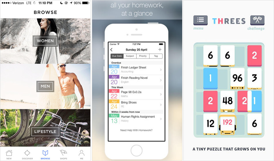
Spring provides a nice screenshot of the directory screen, perfect to display the clean design of the app. The Homework app lays out its most important screen and gives you an overview of what you get. Threes keeps it simple. A real screenshot of what the app really looks like. No added text, no distractions. It so happens to be that their app is really well designed, and won an award for that reason, too!
Important Notes
- Keep it as clear and self-explanatory as possible.
- Highlight the core purpose of your app.
Feature Overviews And What Your App Includes
Other interesting captures are how your app is set up and how it works. Including a screenshot of your menu overview or additional features can help someone decide to choose your app. You must ensure, however, that your screenshot remains easily understandable.
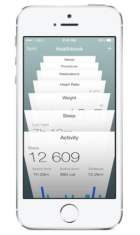
The menu overview of Apple’s Healthbook emphasizes options and design at the same time.
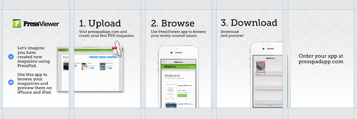
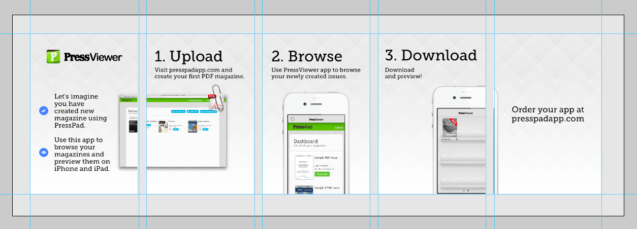
PressViewer approaches the overview question differently. Instead of packing all its features into one screenshot, it uses all five slots to showcase the app’s functions in an easy step-by-step overview (no longer available on the app store).
Important Notes
- This is probably not the best app screenshot to place first.
- You can score with your design skills here. Use them to add value to your app by differentiating from other apps.
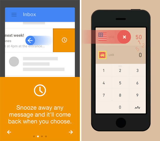
Behavior Of Your App And How Your App Is Used
If your app deviates from the traditional functionalities like tapping and scrolling, don’t be afraid to show it. There are some very interesting ways to showcase your app’s behavior.
Inbox by Google is a very agile app. By swiping left or right, you can mark messages as read or snoozed. Currency uses dragging functionality to spice up the app. Slide to the left to erase the number you previously inserted.
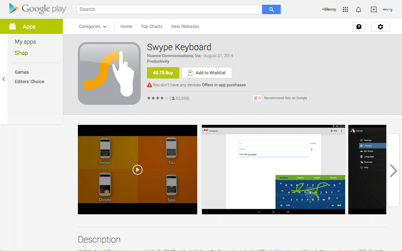
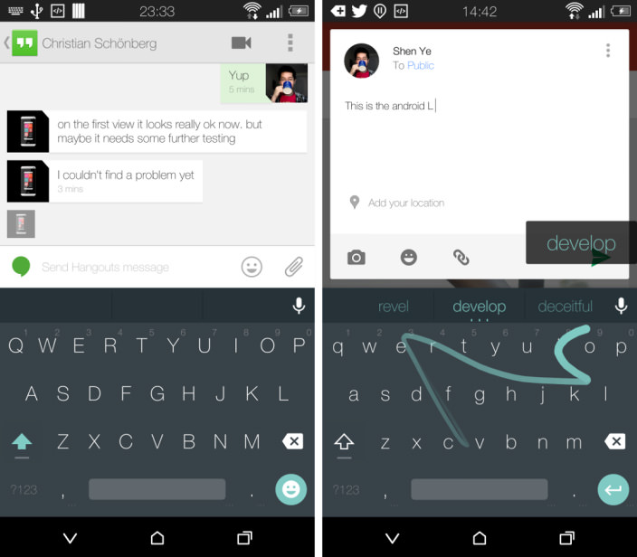
Swype tells the user how to compose words by swiping across the keyboard instead of tapping.
Important Notes
- Creativity is key. Find a way to intrigue the user so they want to try it out!
- Add the intended movements as an overlay to the app screenshot as a means of demonstration.
Additional Text To Describe The App Screenshot
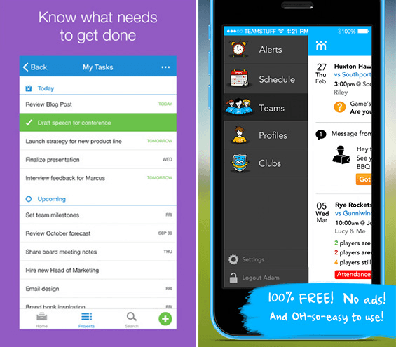
Over time, a clear trend has developed in the app screenshot niche: instead of using the available space to illustrate just the app screen, now developers shrink their screenshots to make space for some additional descriptive text.
Asana briefly describes what the app screenshot demonstrates. TeamStuff uses the extra text strategy, and gets creative with the placement of the text. Instead of the traditional overhead two-liner, the info is placed in the bottom right corner.
Important Notes
- This is one of the very best practices, not to be left out!
- Be careful not to overdo it. Two lines should absolutely suffice to state your case.
- Ensure that your text remains readable.
Including Media Mentions And Awards
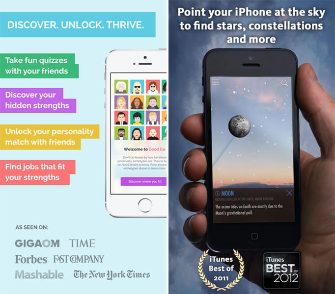
If you have received recognition for your awesome mobile app, don’t be shy to brag about it! Adding award icons to your screenshot can add that extra bit of credibility to the decision-making process.
Good.co emphasizes its app’s four main features, along with some important media mentions to create credibility and interest. SkyView Free includes its awards in the app screenshot.
Important Notes
- Be careful not to clutter up your screenshot space.
- Only use true comments. You wouldn’t want to create a false image.
Understand How Design Works
The design of your app screenshots will greatly depend on the design of your app. While you should follow the same fonts, colors and style you used to create your mobile app, you do have some room to improve the looks of your app in your app screenshots.
Font, Color And Style
Should you decide to add a line or two of descriptive text in your app screenshots (as suggested above), pick a font that corresponds with those you used in your app. It creates a uniform impression. For your app screenshot outline, choose a color scheme that fits your app’s design. You are not restricted to the same colors across all your available screenshots, so feel free to pick custom colors for every screenshot. Stick to your theme and style. If your app is playful, make your app screenshots playful. If your app is minimalistic, apply the same approach to your app screenshots.
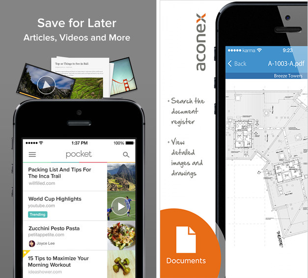
Pocket uses the same font throughout the app and the additional description. Aconex uses extra text (in a creative setting!) to share further details on what the app does and offers. It gives the developer extra room to communicate the app’s purpose. The font is not the same as in the app, but it looks like handwriting and fits the app theme.
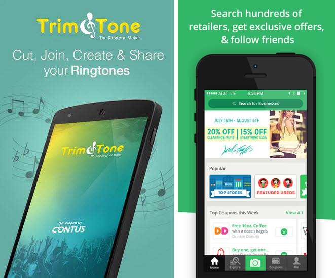
Trim & Tone stands out because the developers opted to tilt the phone instead of making it stand straight. The color scheme and style of the app is seamlessly integrated into the screenshots as well. SnipSnap sticks to the green color scheme in the screenshots.
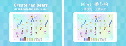
DiscoFingers is available in different countries, and therefore shows the user the app as it is available in that specific country store. All app stores allow you to create app pages for specific languages and countries – a very effective method to personalize a user’s experience.
Important Notes
- Whether you use a solid color or blurred lines, ensure that they don’t interfere with your app screenshot and the message the screenshot sends.
- Consult color palettes to discover interesting color matches you wouldn’t have otherwise considered.
- Less is more. Remember, you are trying to show the viewer what your app really looks like in use.
- Don’t forget to consider customization: create screenshots that appeal to your user’s nationality, culture, language, and so on.
Show Motion
Another up and coming approach is to present an app in use. Applying this practice makes the appearance even more real.
Paper surprised the world with some great new motion features: when tilting the app, the image seems to move along, offering the viewer a wider angle; the app also works with the cards concept, where you can drag and drop topics in and out of your newsfeed. Peek Calendar emphasizes the motion options within the app, showing how conveniently each day can be expanded to display all appointments of the day, or collapsed to get an overview of the workload distributed across the week. Cycloramic shows how it enables the iPhone to rotate around its y-axis to capture a panoramic picture.
Important Notes
- Keep it simple and easily understandable.
- Make it fun! Use your creativity and good design skills to show the user what is so great about your app.
A successful app page depends on many factors - and always on the app itself. Technology is a highly dynamic field, and requires constant updates in order to keep up with the ever evolving environment. Redesigning your app is a necessary step along the way. Most developers choose to time their redesign ideas based on software update requirements given by Google and Apple.
When creating your app screenshots you should pick one or two of the guidelines mentioned in this article and stick with them throughout all your screenshots; you wouldn’t want to overcrowd your designs.
A List Of Tools To Create Screenshots
Now that you’ve been through all the possible tips, tricks and inspiration boards possible, it’s time to get going! Whether you’re a professional or beginner, one of the following tools can come in handy in designing your screenshots:
- Adobe Photoshop and Illustrator are great tools for those who know how to use them! Photoshop Online is available for $19.99 a month as part of Adobe’s Creative Cloud package offering. A 30-day free trial is also available.
- Visme is the best option for those with limited software skills and high ambitions. Visme allows you dive in and create your screenshots with all your desired additions and details. Visme is free for up to three projects, then plans start at $6 a month.
- Screenshot App is probably the fastest option to create screenshots that look good. Pick your format, add the screenshot and put some extra text in it. Done! Screenshot App is free to use.
- Placeit is especially useful if you are looking to use screenshots that represent real-life use. Placeit provides a catalogue of situational scenarios you can choose from to represent your app’s use. Low-res images can be downloaded free. Placeit also offers subscription packages and one-time downloads for as little as $8.
Test-Drive Your Designs
In order to check that your app screenshots really hit the spot, it is necessary to test and monitor their performance. Frequently visit your developer dashboard on iTunes, Google Play or Windows Phone Marketplace and closely monitor user feedback. If you have followers and fans who you can draw feedback from, do so by creating surveys to collect answers. You can create beautiful surveys and questionnaires using Typeform and find out what users think of your app design (don’t forget to reward them for their input!).
Conclusion
As mentioned above, two main elements account for most app downloads; app screenshots and app ratings. This article covered the importance of app screenshots in full.
You have learned why they matter; you have come to understand how to determine what screenshots matter the most. You’ve also gotten examples of apps that do it right, and have immense success because of their visual appeal – which they communicated very well in their app screenshots!
To summarize, the most important takeaway lessons of this article are:
- Use all your available screenshot slots and put your most important screenshot first.
- Follow clear design guidelines and help your user understand your app from the first second.
The success of your app definitely does not depend solely on its looks: it has to be functional and solve someone’s problem (for example, a mobile scanner app), or enhance a current experience (for example, a nice camera app). But, given the human attraction to looks and visual cues, giving app screenshots a good amount of focus cannot be wrong.
In the next article, we’ll examine app ratings, and how you can influence what your users will say about your app.
Do you want to discuss any points that were mentioned here? Please feel free to share your thoughts in the comments below.
Further Reading
- How To Improve Conversions By Localizing An App
- What A/B Testing Taught Us About App Store Optimization
- Beyond The Browser: From Web Apps To Desktop Apps
- Setting Up Photoshop For Web, App and iPhone Development


