How To Automate Style Guide-Driven Development

Email Newsletter
Weekly tips on front-end & UX.
Trusted by 182,000+ folks.
 Register for Free


 Celebrating 10 million developers
 Custom Web Forms for Angular, React, & Vue. Your backend.
Style guides — especially living ones — are useful in many aspects of development and maintenance, so it’s little wonder that developing them has become a highly recommended and a popular practice. But even with the clear benefits, taking the necessary steps to create and start using them is easier said than done, as quite often the challenge is cultural, requiring changes in people’s mindsets.
In order to make the transition as painless as possible, equipping yourself with the most helpful tools and automating as many steps as possible become important. These living style guides promote a systematic approach to composing layouts, which used to be just a task within the user interface development process. Incorporating style guides into the development process places importance on the tools used to build the component catalogue.
Style guides come in many forms and shapes, but in this article we’ll concentrate on style guides that are generated directly from the style definition sources — i.e. CSS and its modern variants.
Time Passes, Development Changes
We used to practice the old-school type of web development workflow that starts with the designer creating a bunch of Photoshop mockups of all the pages and then handing them over to the UI developer, who then translates what he sees into HTML, CSS and JavaScript, and after some fine-tuning and checking, things eventually go into production. When a design lacked consistency, the problems with modelling grew even more complex and development started taking more time than it should have, particularly when the requirements changed.
Modifying an existing interface was the most challenging part, as it demanded actions from everyone in the chain: The designer would edit the PSD, the UI developer would change the code, and the outcome had to be meticulously verified again. Rinse and repeat. In some cases the whole user interface had to be rewritten from scratch. Adding pages to an existing website held similar problems: The team received PSD mockups of the whole interface, which then needed to be reconciled with the existing UI.
Long story short, the old-school process was difficult, time-consuming and prone to error, and it did not yield maintainable results.
Like many others in the web community, we took the “divide and rule” approach and started to modularize our interfaces. Thinking of them as sets of components instead of rigid pages increased the speed of development and made them more consistent and easier to maintain. With that, we realized that living style guides, built from the actual code, served as a much better summary than the PSD or PDF files.
Benefits Of Style Guides
“Process changes are much more profound than the technology that enables them.” – John Albin Wilkins
The history of web development already contains examples of the ways tools and technologies can change the development process. Usually the change is indirect, as new tools shift the focus and challenge the old ways of thinking. The same holds true for automatic style guide generation: Every feature provided can trigger significant changes to your workflow when its full capacity is utilized.
Accurate Overview Of The UI
A style guide visualizes your code and represents it as a UI component toolkit. The list of components may be used as a checklist for all of the things that may have been forgotten or overlooked in the design and implementation. Being able to see each component in every possible state helps to ensure that everything is visually correct and that all the necessary states are present.
Such a UI component catalogue also serves as excellent documentation of the work that has already been done and is a good starting point for further development. Because it is generated from the source code itself and thus shows the components in their current state, any non-coding team member or customer representative can get a nice overview of the whole interface.
Development Playground
The very same living style guide web page can be used as a development playground as well. A developer running a local server can start working on a component and then afterwards tune and tweak the styles with a designer. Having each component displayed separately suits the idea of modular development perfectly and encourages the creation of independent building blocks for the interface.
This is also helpful when refactoring and especially when doing some maintenance work, because any change affecting the components and their states can be easily checked visually, decreasing the chance of something breaking accidentally.
Kickstart For New Pages
A predefined set of components aids in the building of new pages or even in the start of a fresh project based on the same code to ensure a coherent style across all products. Besides promoting code reuse, it automatically results in greater UI conformity. It’s easy to see right from the start whether the existing UI kit is enough for the upcoming page or whether some components or their states need to be implemented first. So, the time and resource needs can be estimated with greater accuracy.
Simplified Testing
Component-based development nicely reveals the power behind “divide and rule.” Even very complex systems can be developed and maintained more easily if they are represented as a combination of simple and small pieces. It also helps when testing a web interface; if something breaks, pinpointing the exact spot with the style guide is easy.
Component Culture
When developers start practicing style guide-driven development, their mindsets begin to change towards breaking an interface down into its components rather than thinking of it as a set of pages. From a technical perspective, it helps by reducing the mental context required down to the single component that is currently being developed and freeing the developer from having to worry about the rest of the system. In addition, it changes the process, giving each piece of the interface its own development cycle, which is iterated as the developer provides changes. This makes it easier to distribute work amongst the team, manage the process and even introduce another developer into the project. Who takes responsibility of updating the style source documentation required for the style guide will depend on the team’s composition, but in general it could be anyone who works with CSS, regardless of role.
It is often argued that this approach is more time-consuming, and we’re not going to disagree with that, but besides getting the application ready and deployed into production in time, one should also consider how it’s going to be maintained in the long run, and how much time and effort the maintenance will require. Nowadays it has become clear that this approach has its benefits, so if it seems expensive time-wise, it’s time to make use of the helpful tools and practices that will alleviate the pain, rather than dismiss the concept without trying.
Communication Benefits
“The roles of designer and developer are increasingly blurred, yet all too often we work in isolation.” – Anna Debenham
With a living style guide, the whole team has the same representation of the UI, and a common vocabulary begins to emerge as everyone has a chance to watch each component evolve and to better understand its functionality and purpose. Magically, a bridge appears between the designers and developers. Collaboration usually improves quality greatly, and, similarly to pair programming, brilliant ideas and new use cases start to blossom and corner cases such as different screen sizes and component combinations are covered more efficiently.
If your designers prefer to work with graphical tools instead of prototype in the browser, you can still take steps towards the style guide-driven and component-based methods. Empower designers and bring them closer to the implementation phase by finding and providing suitable tools for them. By the time the design has been turned into interface components that are represented in the style guide, the PSD mockups will have become obsolete and making small adjustments will have become trivial.
Vision Of A Style Guide Generator Emerges
Our company in Helsinki, SC5 Online, has started the transition from Photoshop mockups to a style guide-driven process. We started out by documenting our customers’ web systems with Knyle Style Sheet (KSS) syntax and generating visual representations of them. That worked great for build-savvy developers, but in order to bring the UI developers and designers closer together we needed to find more suitable tools.
During our search we found some useful and nifty tools, but the same problem remained: Most of them were still incomprehensible to the designers, who quickly retreated to the familiar safety of Photoshop. We initially identified the following use cases as requirements for the tool:
- provide a living, always up-to-date representation and documentation of our websites’ user interfaces;
- allow us to work with all the popular style formats, such as CSS, Sass and LESS;
- be compatible with Knyle Style Sheets (KSS);
- allow us to view and search the styles related to a certain component;
- allow style definitions to be easily editable by non-technical people;
- allow us to easily find where a style variable is used;
- enable us to work with templates as well as with CSS representation;
- improve the testing and verification workflow;
- improve communication between designers, developers and customers.
We couldn’t find one, so we decided to build our own open-source tool that tackles the technical challenges, while the developers and designers strive to overcome the cultural ones.
From the technical point of view, we envisioned the generator to be a module that could be easily used in any new or existing project. So, the logical choice for distribution was to package it as an npm module, as most web projects already utilize npm in one way or another. We also felt that in order to maximize its benefits, the style guide generator should be an integral part of the project it is being used in and, thus, should be easy to embed in any project’s codebase and workflow.
Despite its young age, it has already proven to be successful. It is being used by our customers, who have provided valuable feedback and ideas and have conveyed feature needs for further development.
Overview Of The SC5 Style Guide Generator
The SC5 Style Guide Generator builds a living style guide from style source code. It provides a command line interface and both Gulp and Grunt build tasks wrapped in a single npm package. In the simplest use case, the user defines which files are to be processed and to which directory the generated files should be written.
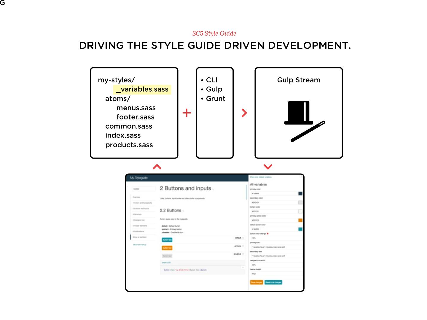
The documentation syntax is based on KSS, so it can even be used in projects with bare HTML and CSS, but some of the most beneficial features, such as variable live editing, apply only to projects that utilize a style preprocessor with support for variables.
The resulting style guide itself is an AngularJS application that provides useful functionality, but your project doesn’t need to have anything to do with AngularJS. The generator does support using AngularJS directives as your component markup, however.
Installation is as easy as this:
npm install sc5-styleguide
Running The Demo
Before you start documenting your own project, seeing an example of what the result would look like might be useful, so we have provided a demo. The demo is a style guide generated from the style guide web application itself. You can run the demo locally from the npm module’s directory:
cd node_modules/sc5-styleguide
npm run demo
This starts a local web server.
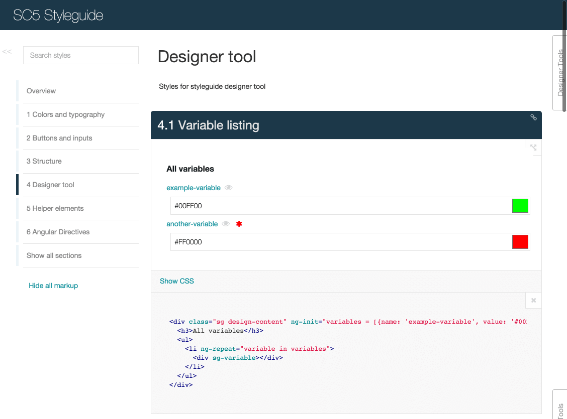
You can navigate around the different sections of the style guide using the top-level section menu on the left-hand side. Each component is presented with its description, a rendered visual example, the corresponding HTML markup and all of the related styling for that particular component. The rendered examples can also be viewed in full-screen mode, where the selected component will be rendered alone on an empty page with your styles applied. In the following paragraphs we will see how this mode is useful for both manual and automatic testing.
On the right side of the main view is a toggleable tab, the “Designer Tool,” that shows all of the variables used by the current section and that also serves as the interface for editing the variables directly in the browser.
Even such a simple interface can convey a lot of useful information. The following sections describe the major features in greater detail and reveal some of the more technical tidbits.
KSS Documentation Inside
We believe strongly that documentation should be kept as close to the code as possible, ideally together in the same file if the code isn’t self-documenting. That way, remembering to update the documentation as the code changes is easier, and documenting becomes a more regular part of the development workflow.
We chose KSS as our style documentation convention because of its popularity, expressiveness and simplicity. The format is human-readable and machine-parsable, and it works with any style definition language, so it’s not going to become obsolete anytime soon. Using its simple and easy-to-remember rules, you can document all the different states of the components, such as hover and pressed states for buttons, and see the different states all at once on the generated style guide pages.
The SC5 Style Guide tool uses the KSS parser as its foundation, so if your styles are already documented with KSS, they can be immediately processed with our style guide generator. If not and even if you’re not familiar with KSS, don’t fret — the concept is very simple. All that is required is to add comment blocks to your components’ styles (CSS, Sass or LESS) with some simple rules. A typical KSS documentation block consists of the following:
- section name,
- section description,
- example markup,
- component modifiers (for different states),
- style guide reference number.
Here is an example of a KSS documentation block for a button in the hover state using Sass:
// Buttons
//
// Buttons can and should be clicked.
//
// markup: <button class="button {$modifiers}">
//
// :hover - Highlight the button when hovered.
//
// Styleguide 1.1
a.button {
  …
  &:hover {
    …
  }
}
All of the additional features in SC5 Style Guide are built upon the unmodified KSS library, so full compatibility with projects that have already been documented with KSS is guaranteed, and you have the possibility of using any and all of the KSS features that the future may bring.
Variables, Components And Relationships
All of the components in the style guide are rendered using their styles, along with their descriptions, the HTML code for recreating them and the related style definitions, which are extracted directly from the source files and shown as is. The “Designer Tool” also lists all Sass and LESS variables that are used in a particular component’s style definitions.
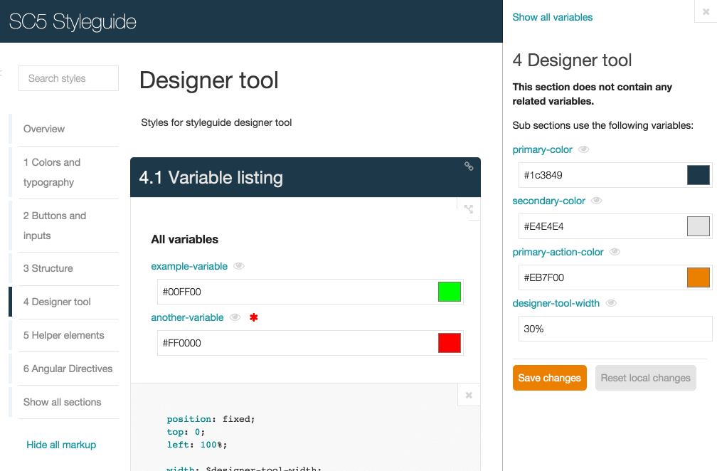
When the style sources are being processed, all Sass and LESS variables and their values are gathered in a list. Simply showing the entire list all of the time would be neither convenient nor useful, especially in a large system with a lot of variables. Instead, only the variables used in the currently active component or section are listed. If the currently active section does not use any variables, then all of the variables of its subsections are listed. This is nice and plays very well with variable live editing (explained in the next chapter).
There is also a reverse listing: “Where is this variable used?” Having a page show all the components that would be affected by changing a variable’s value is obviously not only useful, but a real time- and trouble-saver. No more searching in the editor or grepping and making mental maps of the variable’s usage — just click the variable’s name in “Designer Tool” to see the related components.
To make this work, the source files are preprocessed. First, the sources are split into a list of description-code pairs. The description parts are passed on to the KSS parser, which takes care of extracting the information from the KSS markup. The code parts are searched for variable definitions and references, and finally the two parts are joined, giving us not only the KSS section data, but also the related code and variables.
The splitting and variable searching are both done using the Gonzales Preprocessor Edition parser, which works for SCSS, Sass and LESS. The section splitting works for CSS as well, but obviously no variables can be found.
Full-Screen Mode And Automated UI Tests
Each component and state is reachable via a unique URL, which shows the component in isolation on a separate page, the full-screen mode. This allows you to check its responsiveness, accessibility and behavior across different browsers with different devices and emulators. This is much easier to do with simple, isolated components than with the whole complex system at once.
The full potential of the isolated full-screen component view is best achieved with automated testing, because you can pass the URL to any test system to check different aspects of the component. For example, you can check a component’s behavior with Protractor. For smaller components, a test case would be much simpler. This does not relieve you of testing the whole interface’s interactions, but it will provide much more specific information if something is broken.
Besides testing behavior, you can write unit and regression tests for the components. Comparing screenshots of previously released and current versions might help you to catch a missed border, a wrong padding value or something else that is easily skipped when relying on manual verification. One tool for this is Gemini.
Internally, we utilize our device wall, which can point any and all connected devices to a particular URL; as our style guide UI automatically refreshes when the styles are changed, all devices display the changes in real time. With a development server running on the same network as the device wall, checking all of the components on various devices is easy.

Editing Components And Variables On The Fly
“Designer Tool” is used not only to list the variables, but also to edit them. Change a variable’s value, click the “Save” button and the variable’s new value is written back to the original style source file (CSS, Sass or LESS) on the disk, with the order, comments and indentation of the source file preserved. This is achieved with true AST (abstract syntax tree) parsing; the war stories and explanations of all the problems and drawbacks we encountered in our attempts with the regular expression approach would be enough for an article of its own.
Although the live editing feature is technically quite simple, it can have a drastic effect on the development process, especially when maintenance work is required. Non-technical people can use the browser to adjust such things as colors, fonts, padding and margins and immediately see how the component they’re working on will look like and how the changes will affect the whole system. The technically oriented developer will be happy to commit the changes to version control, without having to try to “make it prettier.”
Changes and additions on the file system are reflected in the browser in nearly real time, so nothing prevents the developer and designer from working in tandem and simultaneously. For example, the developer could add a variable’s definition and change a component to use it, while the designer takes care of finding the most suitable value for it.
CSS Selectors From The Shadows
One of the problems that very few (if any) style guide generators take into account is the very nature of CSS: style cascading. The style guide itself needs some styles, but those definitions should not affect the rendering of user-defined components, and vice versa. Good examples of this are font definitions on the body, resetting li margins, and setting everything to have a magenta background color with *.
A style definition such as the following could easily ruin either the navigation part of the style guide app or the user component representation:
ul li::before {
  content: "*";
}
This can be overcome with style encapsulation — aka the shadow DOM. In our case, the host application includes and uses its own styles, but every user component is wrapped in a shadow DOM root, to which the user styles are loaded. This prevents the user styles from affecting the host application. An AngularJS directive is used to abstract all of this behind a custom tag and to keep everything in a single place.
This is an ideal example of the power of a community that reports issues and even contributes solutions.
Declaring Environmental Markup
Sometimes a component’s representation requires additional HTML around it, such as a list item or a component that depends on the markup into which it is placed. With the SC5 Style Guide Generator, declaring wrapper markup for every component is possible. The wrapper markup is inherited by the child components and can also be extended at that point, so you need to define a wrapper only once in the parent section, making it much easier to document the HTML required for complex structures.
Here is an example of markup for a list item’s wrapper:
// Side nav item
//
// markup:
//  <li>
//    <a class="{$modifiers}">Item</a>
//  </li>
//
// sg-wrapper:
// <nav class="sg side-nav">
//  <ul>
//   <sg-wrapper-content/>
//  </ul>
// </nav>
The same trick also works if your component requires a dark background:
// sg-wrapper:
// <div style="background: black;">
//  <sg-wrapper-content/>
// </div>
Forget Copy And Paste — Use Templates
With style guides taking their place in the development process to make it more efficient, maintaining them should also be as convenient and error-proof as possible. The practice of using comments to document the necessary HTML markup is often criticized for encouraging copying and pasting — and rightfully so because changing the comments when the markup changes is easy to forget. It also gives the style guide’s consumers unnecessary headaches because they will also need to update the markup of the components they are using.
A common solution to this problem is to equip the components with templates that can be reused in the application’s code, as well as to represent the components in the style guide. Because our web application’s UI is built with AngularJS, we added support for declaring an AngularJS directive as the markup, which is then lazy-loaded and rendered where needed in the style guide.
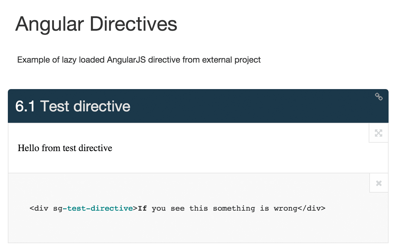
For this, you can declare an additional sg-angular-directive parameter in a KSS block and provide the needed files:
// Test directive
//
// markup:
// <div sg-test-directive>If you see this something is wrong</div>
//
// sg-angular-directive:
// name: NameOfMainAppModule
// template: path/to/template-filename.html
// file: path/to/application-file.js
//
// Styleguide 1.2.3
You can declare more than one file, which allows you to bring in any possible dependencies. A more detailed explanation can be found on GitHub and in the source of the demo project.
Embedded Style Guide
A style guide can make a difference in the development process only if it becomes a natural part of the process. The smoother the integration, the better, and the easiest way for that is to have it generated automatically as part of the build process, without any manual action. That way, the style guide is guaranteed to always be fresh, up to date and available for anyone to review.
With this in mind, the SC5 Style Guide has been designed for easy integration with any project using Gulp or Grunt or the aforementioned command line interface. The generated style guide can be served using the built-in server or copied to your own server along with the rest of the application. Both approaches are already used in our company’s projects, and developers have mentioned that having the style guide as part of their website makes them feel more comfortable getting used to the component-focused way of development.
Using the –server option, you can serve and run the generated website locally, and the –watch option enables automatic style rebuilding and refreshing in the web application when some of the source files are changed. All of the command line options are listed in the documentation and in the styleguide –help output, but the best and the recommended way is to use them as part of your Gulp (or Grunt) build process.
Gulp integration is achieved with a styleguide task in your Gulp file. The documentation describes how to use and configure the styleguide Gulp task, and the npm module includes a minimal Gulp example in node_modules/sc5-styleguide/demo-gulpfile.js.
You need two tasks, one to build the style guide data from your sources and another to apply the processed styles to it.
var styleguide = require('sc5-styleguide');
var sass = require('gulp-sass'),
var outputPath = 'output';

gulp.task('styleguide:generate', function() {
  return gulp.src('*.scss')
    .pipe(styleguide.generate({
        title: 'My Styleguide',
        server: true,
        rootPath: outputPath,
        overviewPath: 'README.md'
      }))
    .pipe(gulp.dest(outputPath));
});

gulp.task('styleguide:applystyles', function() {
  return gulp.src('main.scss')
    .pipe(sass({
      errLogToConsole: true
    }))
    .pipe(styleguide.applyStyles())
    .pipe(gulp.dest(outputPath));
});

gulp.task('styleguide', ['styleguide:generate', 'styleguide:applystyles']);
In the example above, you can see that the styles to apply are built with Sass. Because you can change the task as you wish, you can use any preprocessor you like, even your own patched one. The same would work with pure CSS:
gulp.task('styleguide:applystyles', function() {
  return gulp.src('all.css')
    .pipe(styleguide.applyStyles())
    .pipe(gulp.dest(outputPath));
});
The style-applying task will pick all @ rules from your styles so that, for example, font-face definitions will be loaded correctly in the host document (since it cannot be done in the shadow DOM). It also picks and generates pseudo-classes from pseudo-selectors, such as :hover, so that each state can be rendered without actually having to hover on the component.
Running this as a watch, you can get a live development playground.
gulp.task('watch', ['styleguide'], function() {
  // Start watching changes and update style guide whenever changes are detected
  // Style guide automatically detects existing server instance
  gulp.watch(['*.scss'], ['styleguide']);
});
Every time you change the source, the style guide will rebuild and reload automatically.
The Grunt solution works similarly with the help of grunt-gulp.
Wrapping It All Up
Here at SC5 Online, we are putting style guide-driven development and the component-focused methodology to use. Some of our projects already use these paradigms, some are evolving towards them, and all future projects will certainly be developed this way. The more clearly we see the benefits of these methods, the greater the pang of regret would be if we were forced to give up these practices due to a technological difficulty or inconvenience.
We have decided to stand our ground and solve the technical difficulties we encounter, and this is how SC5 Style Guide is evolving and being developed. Witnessing the project being adopted by the open-source community — which is already reporting issues, suggesting feature ideas, making pull requests for bug fixes and improvements, and even implementing full features — has been a great pleasure. That being said, we encourage everyone to try it out (it’s free!) and participate! Thank you!
Further Reading
- How To Design Style Guides For Brands And Websites
- How To Make An Effective Style Guide
- An In-Depth Overview Of Living Style Guide Tools
- Taking Pattern Libraries To The Next Level
- Free Style Guides Icon Set For Writers And Editors
 (il, ml, al, mrn)

