Fun With Physics In Data Visualization

Email Newsletter
Weekly tips on front-end & UX.
Trusted by 182,000+ folks.
 Celebrating 10 million developers


 Custom Web Forms for Angular, React, & Vue. Your backend.
Data visualization is on the rise. Publishers around the world — individual bloggers and major online publications alike — are realizing that charts, maps and combinations of the two can convey a message far more effectively than plain numbers can. From simple charts to fancy infographics to complex timeline animations, data visualizations are popping up all over the Internet. However, as in any other area, once everyone gets on the train, distinguishing yourself from the pack becomes hard.
Read on to find out how a physics engine can really set your efforts apart.
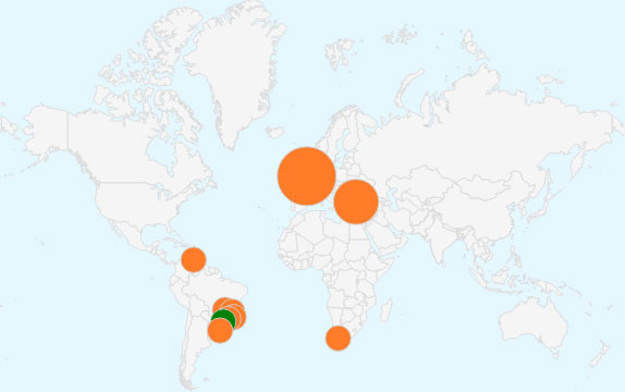
You don’t need to look far for examples of data visualization. Take Google Analytics’ real-time view, which places bubbles of various sizes over top a map to illustrate quantitative information:
Or take the “Map of the Oil World” done by New York Times (which, by the way, does a lot of nice data visualizations). That map does the job, but I’ll bet most of you have come across fancier maps, ones in which the bubbles never overlap to form a distorted map and where the bigger bubbles nudge smaller ones out of place, as in the map below, also by the New York Times:
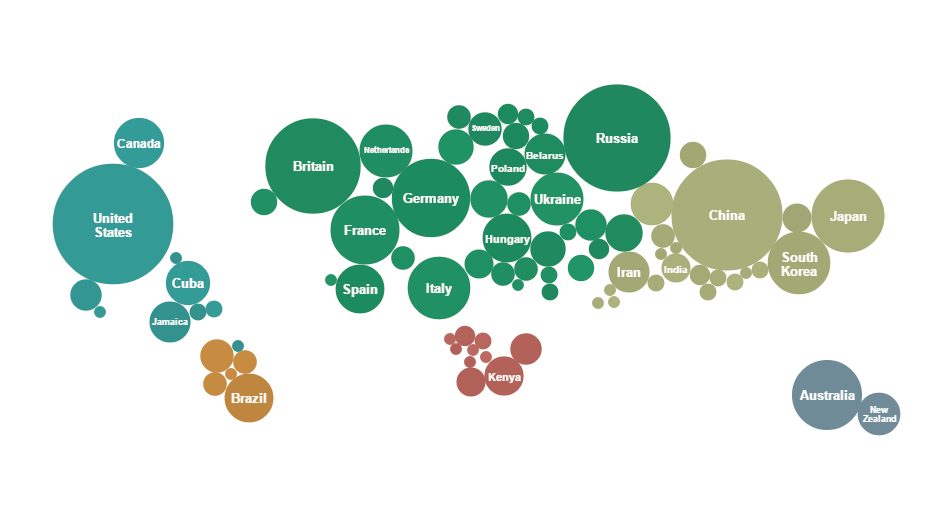
Maps like this are especially good when relatively few countries have assigned values — not all countries win a medal in the Olympics, after all. If the bubbles were to be placed directly over their respective countries, they would overlap and the result would not be as visually pleasing.
Having worked on the data visualization library amCharts for years, I’m always looking out for ways to help users visualize data in ways that are creative and aesthetically pleasing and that effectively convey their message. Maps like the ones discussed in this article are surely good means of relaying quantitative geographical information. Read on to find out how to make this happen.
The default features of our mapping library — JavaScript Maps — enable you to generate a standard bubble map quite easily:
See the Pen Map with Bubbles by amCharts (@amcharts) on CodePen.
The map above already looks nice and implementing it is very easy, but overlapping is still an issue. Let’s solve that.
I could try to write my own script to detect and resolve collisions (not an easy task). From my own experience in game development, I know that all physics simulation libraries have collision detection built in. Let’s use one of those.
But why stop there? Because we’re tapping into the power of these libraries, we can use their other features, too. Let’s make our charts animate with lifelike motion for a truly impressive result that will undoubtedly capture the user’s attention.
A bunch of ready-made JavaScript physics libraries are available. I’ve chosen probably the most famous one — one of the JavaScript ports of Box2D, box2dweb. The idea is simple. We have a map with bubbles, and we have a box2d world (made invisible to the user) of the same size with the same bubbles replicated in it.
We’ll use the (invisible) box2d world to simulate bubble movement and interaction (such as collision detection and other stuff), to monitor the bubbles’ positions and to dynamically modify those positions on the map. I won’t get into the technical details — you can view the source code if you want. To prevent the bubbles from falling, we simply set the gravity to 0. And here is result:
See the Pen Bubbles instead of countries + Gravity by amCharts (@amcharts) on CodePen.
Great, isn’t it? Now, I’m thinking to change the size of some bubbles at runtime and let the other bubbles move accordingly. To do that, we have to scale the box2d world’s bubble and the map bubble together and simply observe what happens. After some testing, I see that this might work by increasing the sizes of bubbles, but not by reducing them — bubbles that are displaced before other big bubbles are reduced in size do not return back:
See the Pen Bubbles instead of countries + change size by amCharts (@amcharts) on CodePen.
We need a more complex solution. After some experimenting, I came to this:
- Create a static object in the middle of each country that always stay in position.
- Make this object a “sensor,” so that other objects don’t collide into it.
- Create a joint between the fixed sensor and bubble, and adjust the properties of this joint to allow for some movement but while always being attracted to the position of the sensor.
That works nicely:
See the Pen Bubbles instead of countries + working resize by amCharts (@amcharts) on CodePen.
Just to show what can be done with a physics engine, below is another demo we made, a map of worldwide coffee consumption. Before you ask, we completely made up the data.
Our technical approach for this map is quite the same as the one for the last demo above. The only difference is that the bubbles initially are not joined to their destined locations, but rather are placed in the middle of the picture, just above the coffee pot. The coffee cup is made up of three rectangles in box2d. If you uncomment all of the lines about “debug draw” (two places in the JavaScript source and in the canvas element in HTML), you could get a box2d debug-draw view (very helpful when doing a job like this):
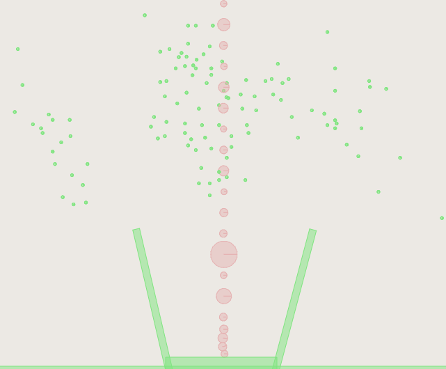
Awesome, isn’t it? And it’s only about 500 lines of code (not counting the data).
See the Pen Map+Physics+Coffee by amCharts (@amcharts) on CodePen.
Conclusion
Physics engines are not just for games and specialized simulations. They enable us to add stunning effects and, with just a few lines of code, to solve geometry problems that would otherwise have taken us weeks if not months to build on our own.
We’ve focused here on the box2d engine, which is robust and powerful, but it might get a bit slow on slower devices. Many engines are available. We encourage you to try some out to see which one clicks with you or is best suited to the task at hand. If you just need to solve a problem of overlapping, for example, then a lightweight option might do the trick just as well, and with a far smaller footprint and much lower processing overhead.
There is virtually no limit to what you can do with the physics of data visualizations. Create column charts and make them fall like dominos, or make pie charts roll, bounce and more. You can make objects in charts and maps roll, spin, bounce, change shape and morph in ways that will capture the viewer’s attention much more quickly than regular static or even interactive versions.
You will find more fancy examples and tools for data visualization on the amCharts website.
Further Reading
- The Do’s And Don’ts Of Infographic Design
- Data Visualizations and Infographics
- Data Visualization: Modern Approaches
- Designing Flexible, Maintainable Pie Charts With CSS And SVG


